Responsive Bar Charts with Bokeh, Flask and Python 3
From translator
Recently I came across a tutorial on Flask + Bokeh in the python digest . Tutorial is aimed at beginners, you do not even need to know the syntax of Python and HTML. The examples work under Ubuntu 16.04, on Windows the work with virtual environments is slightly different.
Introduction
Bokeh is a powerful open source library that allows you to visualize data for web applications without writing a single line in javascript. Studying visualization libraries like d3.js may be useful, but it’s much easier to write a few lines of Python code to solve a problem.
With Bokeh, we can create strikingly detailed interactive visualizations or simpler things, like bar charts.
Let's see how Flask and Bokeh can be used to visualize data in a web application.
Instruments
Everything described below works on both Python 2 and Python 3, however, it is recommended to use Python 3 for new applications. I used Python 3.6.1 at the time of this writing. In addition to Python itself, we need the following dependencies:
- Flask web framework version 0.12.2
- Bokeh Data Visualization Library, version 0.12.5
- Pandas Data Analysis Library, version 0.20.1
- pip and virtualenv come with Python 3. They will be needed to isolate Flask, Bokeh and pandas from other projects.
If you need additional information on setting up the development environment, you can refer to the manual . All sample code is available under MIT license on GitHub.
Installation Bokeh and Flask
Create a clean virtual environment for the project. As a rule, I run this command in a separate folder, venvs, where all my virtual environments are located.
python3 -m venv barchart Activate the virtual environment.
source barchart/bin/activate After activating the virtual environment, the command line prompt will change:
Do not forget that you will need to activate the virtual environment in each new terminal window from which you want to start your application.
Now you can install Bokeh and Flask in the created virtual environment. Run this command to install Bokeh and Flask for the appropriate versions.
pip install bokeh==0.12.5 flask==0.12.2 pandas==0.20.1 After downloading and installing the necessary libraries will be available in a virtual environment. Check the output to make sure everything is fixed.
Installing collected packages: six, requests, PyYAML, python-dateutil, MarkupSafe, Jinja2, numpy, tornado, bokeh, Werkzeug, itsdangerous, click, flask, pytz, pandas Running setup.py install for PyYAML ... done Running setup.py install for MarkupSafe ... done Running setup.py install for tornado ... done Running setup.py install for bokeh ... done Running setup.py install for itsdangerous ... done Successfully installed Jinja2-2.9.6 MarkupSafe-1.0 PyYAML-3.12 Werkzeug-0.12.2 bokeh-0.12.5 click-6.7 flask-0.12.2 itsdangerous-0.24 numpy-1.12.1 pandas-0.20.1 python-dateutil-2.6.0 pytz-2017.2 requests-2.14.2 six-1.10.0 tornado-4.5.1 Now we can go directly to our application.
Running the application on Flask
We will write a simple Flask application and add a bar chart to the page. Create a folder for your project with an app.py file with the following content:
from flask import Flask, render_template app = Flask(__name__) @app.route("/<int:bars_count>/") def chart(bars_count): if bars_count <= 0: bars_count = 1 return render_template("chart.html", bars_count=bars_count) if __name__ == "__main__": app.run(debug=True) This is a simple Flask application that has a chart function. chart takes an integer, which will later be used to determine the amount of data to draw. The render_template function inside the chart will use the Jinja2 templating engine to generate HTML.
The last 2 lines allow us to start the application from the console on port 5000 in debug mode. Never use debugging mode in production, there are Gunicorn WSGI servers for this.
Create a templates folder inside the project folder. Inside it, create a chart.html file. It needs the chart function from app.py , so without it, the application will not work correctly. Fill out the chart.html Jinja2 markup.
<!DOCTYPE html> <html> <head> <title>Bar charts with Bokeh!</title> </head> <body> <h1>Bugs found over the past {{ bars_count }} days</h1> </body> </html> The chart.html will show the number of columns passed to the chart function via the URL.
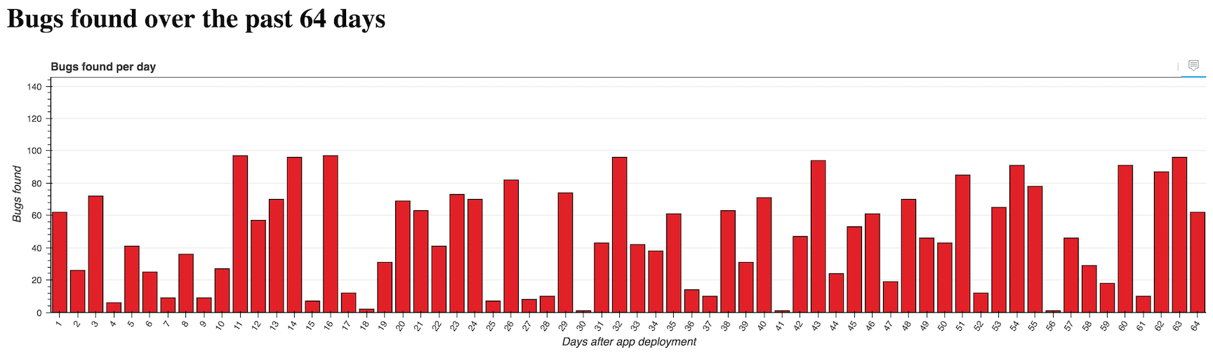
The message inside the h1 tag corresponds to the subject of our application. We will build a graph of the number of bugs found by the automatic testing system for each day.
Now we can test our application.
Make sure the virtual environment is still active and you are in the app.py folder. Launch app.py using the python command.
$(barchart) python app.py Go to localhost: 5000/16 / . You should see a big message that changes when you change the URL.

Our application is already running, but not yet impressive. It's time to add a chart.
Bar chart generation
We just need to add some code that Bokeh will use. Open app.py and add lines to it at the top.
import random from bokeh.models import (HoverTool, FactorRange, Plot, LinearAxis, Grid, Range1d) from bokeh.models.glyphs import VBar from bokeh.plotting import figure from bokeh.charts import Bar from bokeh.embed import components from bokeh.models.sources import ColumnDataSource from flask import Flask, render_template The rest of the file will use Bokeh along with the random module to generate data and a bar chart.
The data for the chart will be re-generated each time the page is reloaded. In a real application, use a more reliable and useful data source!
Keep changing app.py The code after the import should look like this.
app = Flask(__name__) @app.route("/<int:bars_count>/") def chart(bars_count): if bars_count <= 0: bars_count = 1 data = {"days": [], "bugs": [], "costs": []} for i in range(1, bars_count + 1): data['days'].append(i) data['bugs'].append(random.randint(1,100)) data['costs'].append(random.uniform(1.00, 1000.00)) hover = create_hover_tool() plot = create_bar_chart(data, "Bugs found per day", "days", "bugs", hover) script, div = components(plot) return render_template("chart.html", bars_count=bars_count, the_div=div, the_script=script) The chart function generates lists with data using the built-in random module. chart calls 2 functions: create_hover_tool and create_bar_chart . We have not yet written these functions, so we will continue to add code after the chart function:
def create_hover_tool(): # return None def create_bar_chart(data, title, x_name, y_name, hover_tool=None, width=1200, height=300): """ . , , . """ source = ColumnDataSource(data) xdr = FactorRange(factors=data[x_name]) ydr = Range1d(start=0,end=max(data[y_name])*1.5) tools = [] if hover_tool: tools = [hover_tool,] plot = figure(title=title, x_range=xdr, y_range=ydr, plot_width=width, plot_height=height, h_symmetry=False, v_symmetry=False, min_border=0, toolbar_location="above", tools=tools, responsive=True, outline_line_color="#666666") glyph = VBar(x=x_name, top=y_name, bottom=0, width=.8, fill_color="#e12127") plot.add_glyph(source, glyph) xaxis = LinearAxis() yaxis = LinearAxis() plot.add_layout(Grid(dimension=0, ticker=xaxis.ticker)) plot.add_layout(Grid(dimension=1, ticker=yaxis.ticker)) plot.toolbar.logo = None plot.min_border_top = 0 plot.xgrid.grid_line_color = None plot.ygrid.grid_line_color = "#999999" plot.yaxis.axis_label = "Bugs found" plot.ygrid.grid_line_alpha = 0.1 plot.xaxis.axis_label = "Days after app deployment" plot.xaxis.major_label_orientation = 1 return plot There is a lot of code to deal with. The create_hover_tool function create_hover_tool far only returns None, because for now we don’t need to display hints.
Inside the create_bar_chart function create_bar_chart we convert the generated data into an object of type ColumnDataSource , which we can input to the Bokeh functions for plotting. We set the ranges of the x and y axes.
As long as we do not have prompts for hover, the tools list is empty. All magic happens in the function call figure . We give her everything necessary for plotting: the size, the toolbar, the borders, the settings for the behavior of the chart when the browser window is resized.
We create vertical columns using the VBar class and add them to the graph using the add_glyph function, which sets the rules by which the data are converted into columns.
The last 2 lines change the design of the schedule. For example, I removed the Bokeh logo with plot.toolbar.logo = None and added plot.toolbar.logo = None to both axes. I recommend keeping the bokeh.plotting documentation in front of your eyes in order to know how to customize the visualization.
We only need to make a couple changes to the templates/chart.html file to display the chart. Open the file and replace it with the following.
<!DOCTYPE html> <html> <head> <title>Bar charts with Bokeh!</title> <link href="http://cdn.pydata.org/bokeh/release/bokeh-0.12.5.min.css" rel="stylesheet"> <link href="http://cdn.pydata.org/bokeh/release/bokeh-widgets-0.12.0.min.css" rel="stylesheet"> </head> <body> <h1>Bugs found over the past {{ bars_count }} days</h1> {{ the_div|safe }} <script src="http://cdn.pydata.org/bokeh/release/bokeh-0.12.5.min.js"></script> <script src="http://cdn.pydata.org/bokeh/release/bokeh-widgets-0.12.5.min.js"></script> {{ the_script|safe }} </body> </html> 2 of 6 added lines are needed to load Bokeh CSS files, 2 more to load its scripts, and 2 more to generate graphics.
Everything is ready, let's check our application. Flask should automatically reload the app when you save changes to app.py If you stop the web server, you can start it again with the python app.py .
Open your browser localhost: 5000/4 /
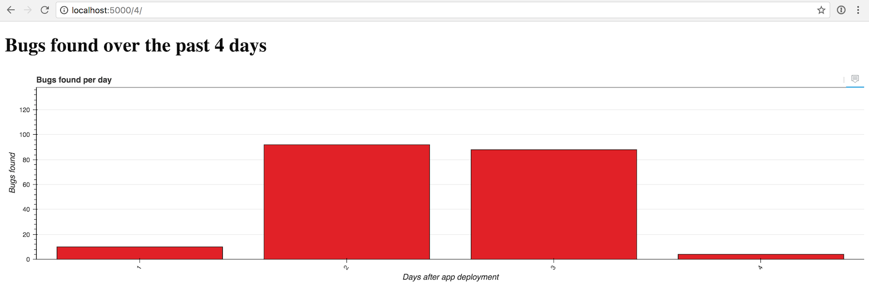
It looks a bit empty, but we can change the number of columns to 16 if we move to / localhost: 5000/16 /
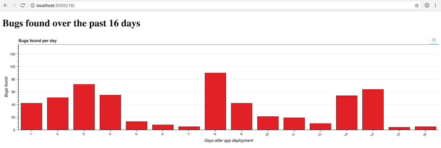
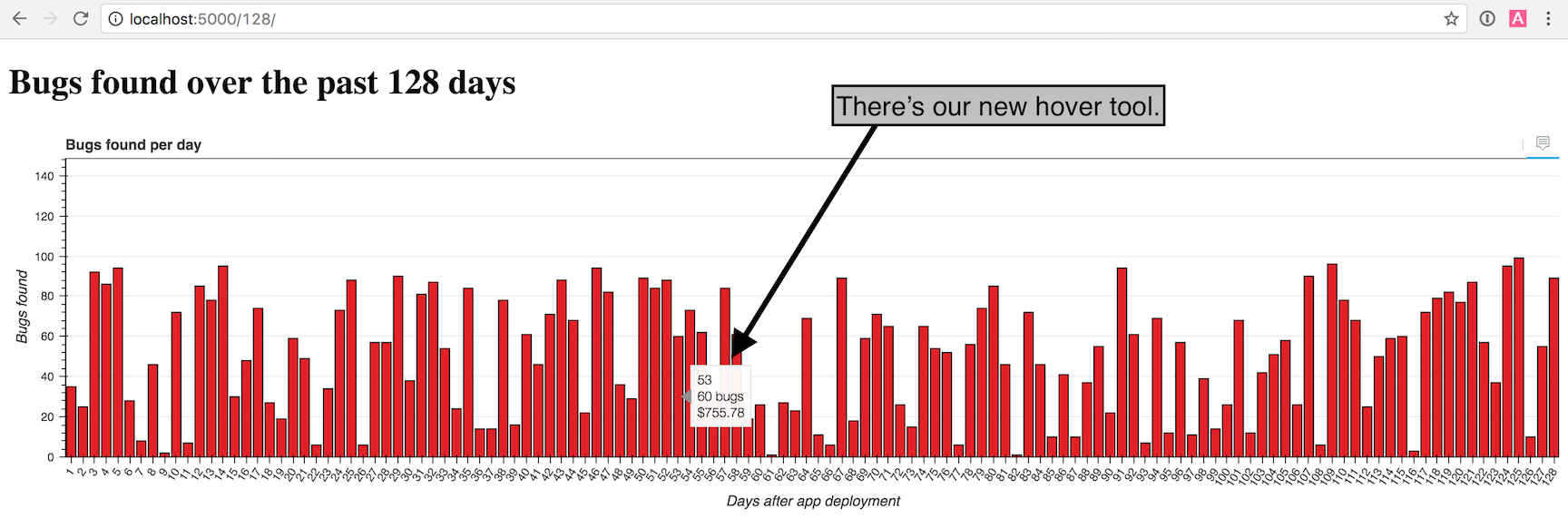
Looks pretty good. But what if we add hints when hovering so that we can examine each column in detail? To do this, change the function create_hover_tool .
Adding hover tips
Inside app.py change the create_hover_tool function
def create_hover_tool(): """Generates the HTML for the Bokeh's hover data tool on our graph.""" hover_html = """ <div> <span class="hover-tooltip">$x</span> </div> <div> <span class="hover-tooltip">@bugs bugs</span> </div> <div> <span class="hover-tooltip">$@costs{0.00}</span> </div> """ return HoverTool(tooltips=hover_html) Embedding HTML in a Python application may seem rather strange, but this is how we determine the type of hint. We use $x to show the x-coordinate of the column, @bugs , to show the "bugs" field of the data source and $@costs{0.00} , to show the "costs" field as 2 decimal places.
Make sure you replace return None with return HoverTool(tooltips=hover_html) .
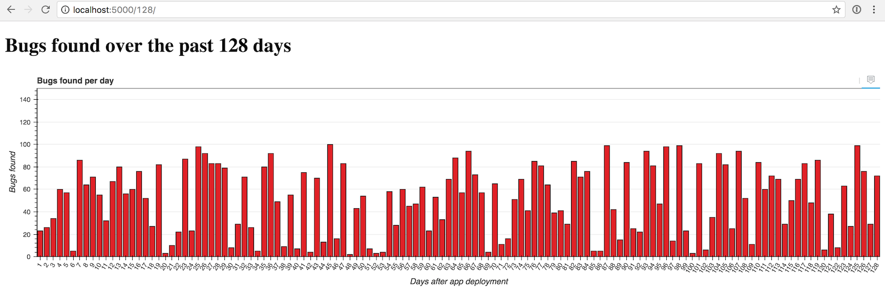
Return to the browser and reload localhost: 5000/128 /
Great job! Try playing with the number of columns in the URL and see how the graph will look.
The graph looks filled with about 100 columns, but you can try to set any value. At 50,000 it turns out a sad picture:
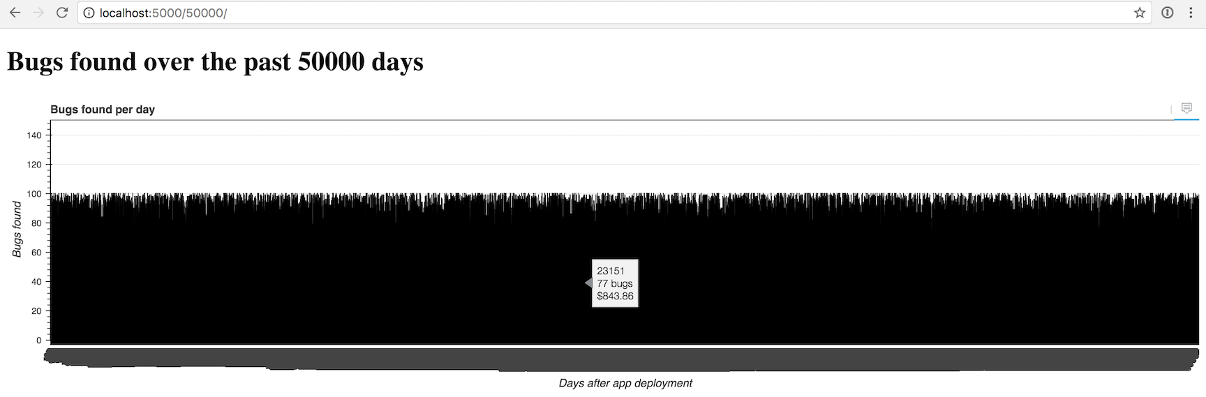
Yes, it seems, we need to do something else so that we can display more than a couple of hundred columns at a time.
What's next?
We created a great schedule on Bokeh. Then you can change the color scheme, connect another data source, try other types of graphs, or figure out how to display huge amounts of data.
With Bokeh, you can do much more, so you should look at the official documentation , the repository on GitHub , the Bokeh page on Full Stack Python .
')
Source: https://habr.com/ru/post/330706/
All Articles