Features –webkit-box or how to “friend” flexbox with old Safari
I’m sure many front end developers are constantly faced with the problem of flexbox support in older versions of popular browsers. Among them are two clear favorites - Internet Explorer (IE) and Safari. With IE, everything is easier, because flex is supported in versions 10.0+. The versions below are no longer relevant, so they are often ignored. In Safari, the situation is different, since support for the modern flexbox specification (according to Caniuse.com) begins with the IOS version Safari 9.2+.
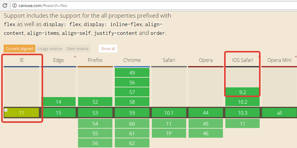
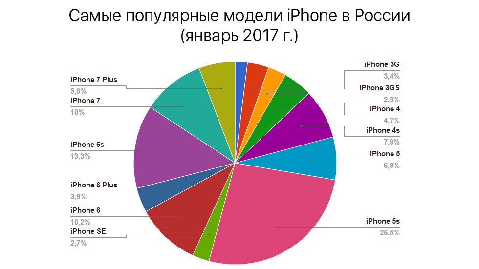
The problem is this! Indeed, according to Apple statistics, only 47% of iPhone owners have the opportunity to use Safari 9.2+.
If we make a beautiful, high-quality and super-adaptive site built on flexbox - it will be displayed just as beautifully and qualitatively only on devices that correctly interpret it.
')
The so-called old flexbox syntax - display: box;
This is an analogue of the display property: flex; Only it is supported by all Safari, starting with version 5.0+.
However, everything is not so simple:
These are the mistakes that I personally caught. In the future, the list will be updated.
Register vendor prefixes for the box and related properties. Wraps inside the box hide elements.

This error is easy to fix. It is enough for elements that have a float to add the position: relative property.
Why not just remove the float? - And here's why:

I will give a list of all working analogs of flex-properties and box-properties:
-webkit-box-orient (flex-direction) - the direction of the axis of the elements.
There are several types in the case of a new syntax:
- column — column;
- row (by default) - row;
- row-reverse - reversal of the row;
- column-reverse — reverses the column.
In the case of the old syntax, I use only two properties:
- vertical - column;
- horizontal - string.
There are two more properties, but they do not work as analogs of the reverse properties of the new syntax, so I do not use them in my practice.
For the reverse there is a property -webkit-box-direction, which has 2 values - normal and reverse.
-webkit-box-pack (justify-content) - sets the horizontal alignment.
New syntax:
- flex-start, flex-end - the elements are pressed to the beginning / end of the parent;
- space-between - distributes the elements evenly inside the parent, without leaving side indents;
- center - centers the elements.
Old syntax:
- start, end - analog of flex-start, flex-end;
- justify - analogue of space-between;
- center is the same as center in the new one.
Space-around has NO analog!
-webkit-box-align (align-items) - vertical alignment. I can rightfully call this one of the main advantages of flexbox.
New syntax:
- flex-start, flex-end - the elements are pressed to the top / bottom of the parent;
- baseline - default value, alignment on the base line of the font without regard to overhangs;
- center - centers the elements;
- stretch - stretches the child blocks in height.
Old syntax:
- start, end - analog of flex-start, flex-end.
Other properties are identical.
-webkit-box-ordinal-group (order) - determines the ordinal number of the element in the group.
In both cases, given a number.
There are no other options, or they do not work. For example:
-webkit-box-lines is, in theory, an analogue of the flex-wrap property, but for some reason it does not work for me.
And finally.
If you need to apply any CSS property only for -webkit-, you can use a working CSS hack. It is checked and it WORKS:
Share your experiences and good luck!
Article author: Victor Ryabovol
The problem is this! Indeed, according to Apple statistics, only 47% of iPhone owners have the opportunity to use Safari 9.2+.
And what about the rest?
If we make a beautiful, high-quality and super-adaptive site built on flexbox - it will be displayed just as beautifully and qualitatively only on devices that correctly interpret it.
')
The so-called old flexbox syntax - display: box;
This is an analogue of the display property: flex; Only it is supported by all Safari, starting with version 5.0+.
However, everything is not so simple:
- Display: box only works with prefixes, in this case with -webkit- (display: -webk2) it-box;).
- Strange working with float.
- There are no analogs to some modern properties.
These are the mistakes that I personally caught. In the future, the list will be updated.
How to solve the problems already found?
Register vendor prefixes for the box and related properties. Wraps inside the box hide elements.
This error is easy to fix. It is enough for elements that have a float to add the position: relative property.
Why not just remove the float? - And here's why:
I will give a list of all working analogs of flex-properties and box-properties:
-webkit-box-orient (flex-direction) - the direction of the axis of the elements.
There are several types in the case of a new syntax:
- column — column;
- row (by default) - row;
- row-reverse - reversal of the row;
- column-reverse — reverses the column.
In the case of the old syntax, I use only two properties:
- vertical - column;
- horizontal - string.
There are two more properties, but they do not work as analogs of the reverse properties of the new syntax, so I do not use them in my practice.
For the reverse there is a property -webkit-box-direction, which has 2 values - normal and reverse.
-webkit-box-pack (justify-content) - sets the horizontal alignment.
New syntax:
- flex-start, flex-end - the elements are pressed to the beginning / end of the parent;
- space-between - distributes the elements evenly inside the parent, without leaving side indents;
- center - centers the elements.
Old syntax:
- start, end - analog of flex-start, flex-end;
- justify - analogue of space-between;
- center is the same as center in the new one.
Space-around has NO analog!
-webkit-box-align (align-items) - vertical alignment. I can rightfully call this one of the main advantages of flexbox.
New syntax:
- flex-start, flex-end - the elements are pressed to the top / bottom of the parent;
- baseline - default value, alignment on the base line of the font without regard to overhangs;
- center - centers the elements;
- stretch - stretches the child blocks in height.
Old syntax:
- start, end - analog of flex-start, flex-end.
Other properties are identical.
-webkit-box-ordinal-group (order) - determines the ordinal number of the element in the group.
In both cases, given a number.
There are no other options, or they do not work. For example:
-webkit-box-lines is, in theory, an analogue of the flex-wrap property, but for some reason it does not work for me.
And finally.
If you need to apply any CSS property only for -webkit-, you can use a working CSS hack. It is checked and it WORKS:
@media all and (-webkit-min-device-pixel-ratio:0) { /*, , -webkit-*/ } Share your experiences and good luck!
Article author: Victor Ryabovol
Source: https://habr.com/ru/post/330410/
All Articles