How to reduce the number of abandoned baskets in online sales
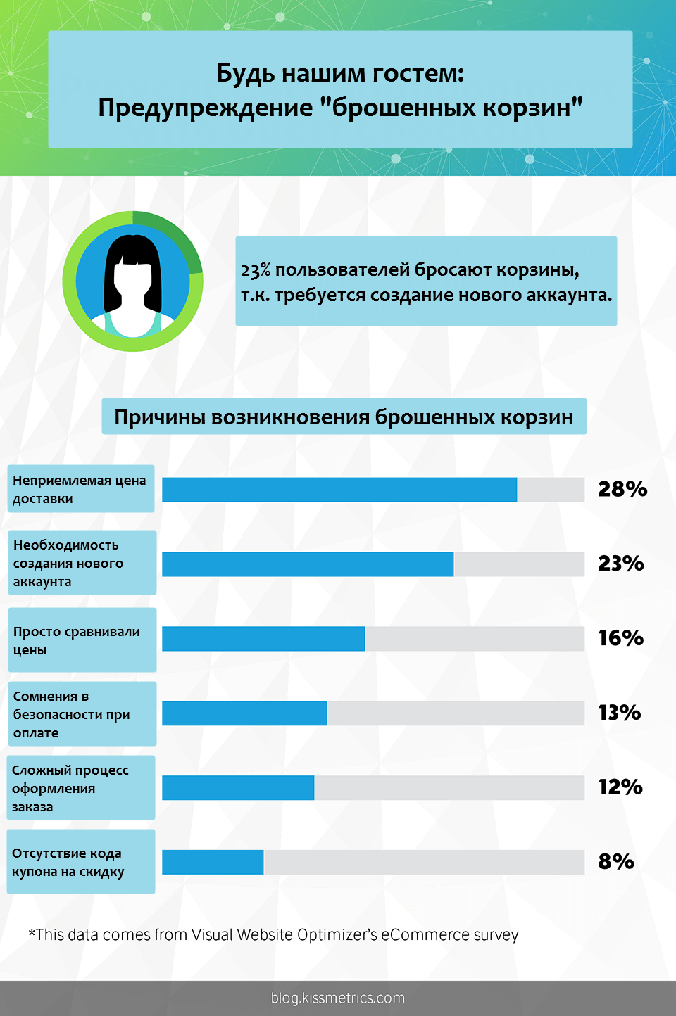
Why do users drop baskets? - this is the main question that all online entrepreneurs ask themselves. Even if you have the makings of Mendeleev, you are unlikely to dream of a universal remedy for this scourge. Yes, of course, nobody will give a clear answer to this question. Appdynamics (manufacturer of Application Performance Monitoring (APM) solutions - application performance monitoring) has published an article in its blog that can give some insight into the nature of abandoned baskets and how to combat this. In one of the following articles, I’ll tell you what analytics tools can offer modern APM solutions. In the meantime, here is this translation, which may show points where your online project could be more effective.
Share your ecommerce usability insights in the comments!

Commerce has become both digital and global: the online sales forecast for 2020 is $ 1.6 trillion. The e-commerce industry adapts to customer requests and improves the mechanisms of aggregation of user data, which can be effectively applied in the development of online business.
')
If your business does not keep pace with the development of the user interface of the online store - do not expect rapid growth - you risk losing a portion of your project’s audience. In 2016, according to studies, buyers made 51% of purchases on the Internet, compared with previous years (48% in 2015 and 47% in 2014). Regardless of the chosen strategy, you should first focus on the convenience of users. The article talks about the key features and best practices of UX, based on serious experience in the e-commerce industry. Regardless of whether your customers are buying from a smartphone or a desktop computer, the basic ideas described in the article are applicable in both cases. Let's start with some important points in the interface elements, and then we will take a closer look at the approaches to UX in each case.
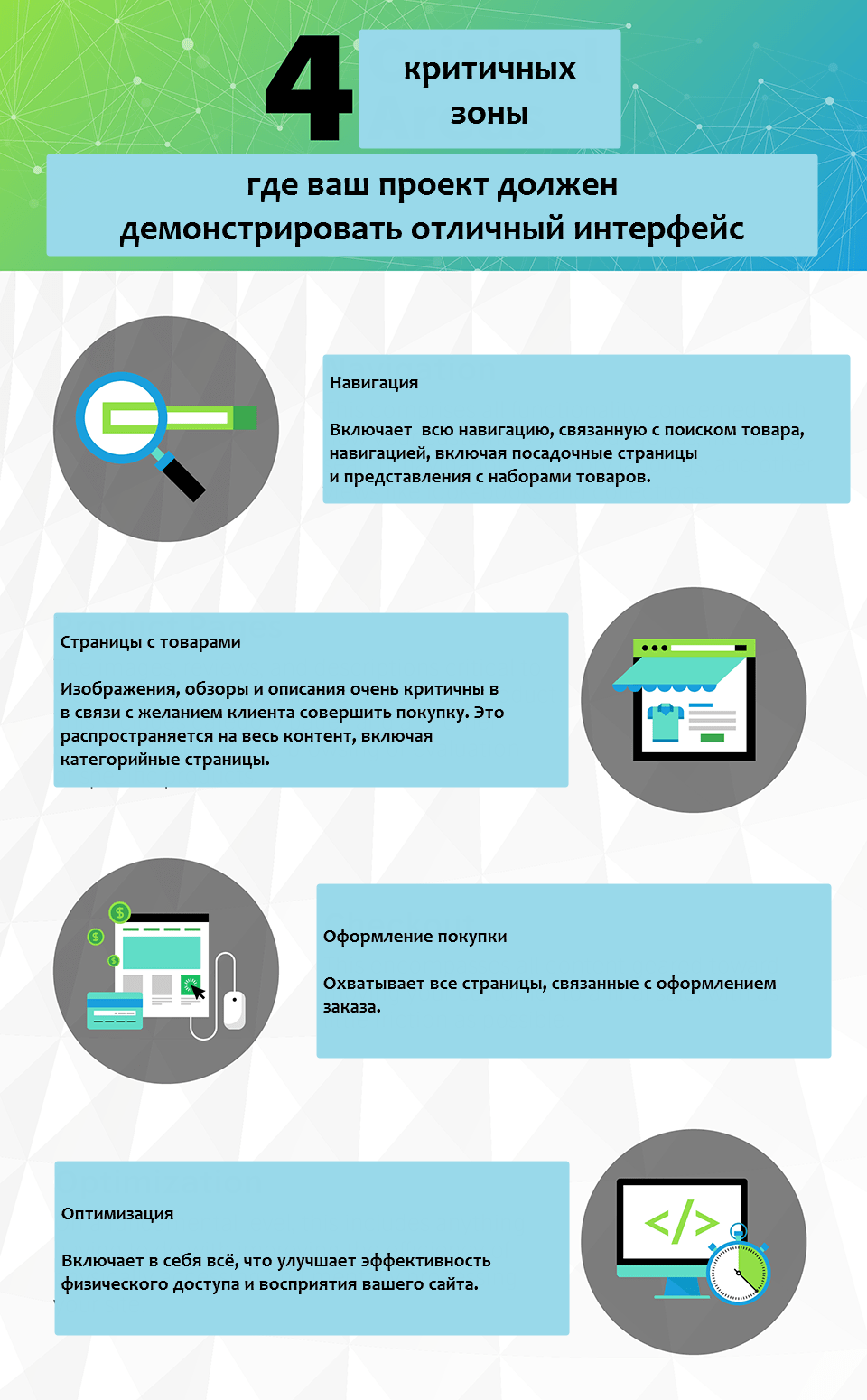
So, there are 4 things that are worth paying close attention (I apologize for the artisanal localization of images. - approx. Translator):

Do not organize products, relying only on your submission. Your customers can have their own idea of grouping products and, if possible, use scientific approaches, for example, cart sorting. Card sorting is a research performed in the laboratory that helps to better structure your website, focusing on the behavior of potential customers. Experiment participants are usually given a representative sample of products and asked to group them into categories. Due to the different approaches of the subjects, templates appear that help to create intuitive navigation categories and product groups.
Search string is crucial. If you plan to use the search function on the site, you should have a clear approach to content management. This is important for two reasons: you must ensure the full availability of objects (product cards, articles, etc.) using search and filtering, because your range is constantly increasing, new product lines should be available in the same way as previously indexed. Proper content management equates to the quality of the metadata for each product. When developing a strategy, you can consider the following questions: what search conditions should be associated with my product (s)? What filtering criteria do I need to make available to customers? In the absence of a specific user request, how to display, sort and organize the default search results correctly?
There is nothing more depressing for a client than the result of a search query that says "Found 0 results." If your site allows you to perform a fuzzy search (due to the correct tagging and content management), give out some products as a result of the search instead of empty. Consider using the auto-complete feature when searching the site. All of the above will allow customers to demonstrate product lines that may also interest them.
An element that can be easily forgotten and which will help buyers not to get lost on your site. According to the best practices, navigation chains should be placed on the page with product categories immediately after the title. Usually, the navigation chain looks like an unobtrusive line of text that displays the location and depth of the client on the site.

Customers will notice the smallest details when comparing your offer with competitors. Post images in high resolution (up to reasonable limits, of course) so that details and functionality are visible. Ideal - 360-degree review of the product or video. Add “carousels” and banners to the main page or page with categories of products that will show similar products.
If a potential buyer is viewing your products, then he has already made some effort to go to this page. This can help a quick view. Properly implemented quick review will help a potential buyer to assess the benefits of the product without distracting from the page with a customized set of products. A properly implemented quick view function creates a temporary container with content above the page. This will demonstrate a brief description of the key details and a larger product image. The transition to the quick view should be clearly visible (for example, the button "Preview"). Without a quick view, the client can not see all your products, because this will require a transition to new pages. This is due to the fact that the client is not sure that he will then return to the original list of goods. In addition, the slow speed of loading pages may also lead to the reluctance of the client to view products on individual pages.
The smaller your company (relative to competitors), the greater the number of buyers will be skeptical about the quality of your products and services. Customers perceive each other's feedback very well. Badly, if you refuse this opportunity. If your site does not have the ability to publish user-generated content, you do not give customers an additional opportunity to evaluate the product and run the risk that they may buy similar product from competitors who allow publishing reviews.
It is extremely important that the prices for each product are displayed not only in a prominent place, but it was also clear under what discount or share this or that product falls. Based on a survey of American buyers, 71% refused to make a purchase due to unclear pricing. Try to combine certain products into groups that are affected by a particular discount or promotion. For each element in the set of products must be clear discount or action.
Customers like to quickly resolve their questions and concerns. Providing the possibility of online chat, as well as clear contact information will help to convert visitors into buyers. Most buyers have come to find help and support in two zones: in the upper right part of the navigation bar next to the authorization button and in the lower part of the page.
When customers begin the checkout process, the need to create an account can be costly for your business. Ordering by unregistered users will allow customers to quickly place an order for a product, if its value is much higher than having an account in your online store. If you still want the client to register, offer it to him after placing the order.
Customers appreciate the visualization of the progress of the purchase. Provide the customer with the opportunity to see his movements from the delivery information, payment details and order confirmation. This will allow customers to estimate how much more time they need to complete the order process. Among other things, it will allow the client to quickly return to any step, if you need to change any data.
With the increasing flow of information, buyers pay more attention to security. They pay attention to the lock icon to see if their transactions will be secure. An additional advantage would be the presence of brand logos on security, for example, Verisign and McAfee. You must be sure that this information is present on the website at the time of ordering.

Download speed varies greatly from the platform used by the user and the capacity of his communication channel. Since the chances of a client using a mobile device are quite high, it is important to ensure that the content is loaded before the client wants to leave the page. Depending on the type of engine used, estimate the degree of influence of calls to the API.
and scripts for the total page load time.
You want to do everything possible to facilitate the purchase process. To do this, you should not ignore the convenience of perceiving important information on your site. Use spaces, minimize large text blocks, highlight the links on the page - all these ways will improve the perception of your site. When users easily perceive the information on your site, they will most likely make a purchase and come again.
Ensuring ease of purchase should be your priority. Since continuous improvement of the interface is your focus, your customers will have a positive buying experience in your project. Paying great attention to intuitive navigation, easy-to-understand details and a simple design process, you can significantly increase the chances of visitors becoming buyers.
Share your ecommerce usability insights in the comments!

Commerce has become both digital and global: the online sales forecast for 2020 is $ 1.6 trillion. The e-commerce industry adapts to customer requests and improves the mechanisms of aggregation of user data, which can be effectively applied in the development of online business.
')
If your business does not keep pace with the development of the user interface of the online store - do not expect rapid growth - you risk losing a portion of your project’s audience. In 2016, according to studies, buyers made 51% of purchases on the Internet, compared with previous years (48% in 2015 and 47% in 2014). Regardless of the chosen strategy, you should first focus on the convenience of users. The article talks about the key features and best practices of UX, based on serious experience in the e-commerce industry. Regardless of whether your customers are buying from a smartphone or a desktop computer, the basic ideas described in the article are applicable in both cases. Let's start with some important points in the interface elements, and then we will take a closer look at the approaches to UX in each case.
So, there are 4 things that are worth paying close attention (I apologize for the artisanal localization of images. - approx. Translator):

Navigation
Invest in intuitive navigation
Do not organize products, relying only on your submission. Your customers can have their own idea of grouping products and, if possible, use scientific approaches, for example, cart sorting. Card sorting is a research performed in the laboratory that helps to better structure your website, focusing on the behavior of potential customers. Experiment participants are usually given a representative sample of products and asked to group them into categories. Due to the different approaches of the subjects, templates appear that help to create intuitive navigation categories and product groups.
Publish content, following the strategy
Search string is crucial. If you plan to use the search function on the site, you should have a clear approach to content management. This is important for two reasons: you must ensure the full availability of objects (product cards, articles, etc.) using search and filtering, because your range is constantly increasing, new product lines should be available in the same way as previously indexed. Proper content management equates to the quality of the metadata for each product. When developing a strategy, you can consider the following questions: what search conditions should be associated with my product (s)? What filtering criteria do I need to make available to customers? In the absence of a specific user request, how to display, sort and organize the default search results correctly?
Avoid dead-end search responses.
There is nothing more depressing for a client than the result of a search query that says "Found 0 results." If your site allows you to perform a fuzzy search (due to the correct tagging and content management), give out some products as a result of the search instead of empty. Consider using the auto-complete feature when searching the site. All of the above will allow customers to demonstrate product lines that may also interest them.
Use navigation chains (breadcrumbs)
An element that can be easily forgotten and which will help buyers not to get lost on your site. According to the best practices, navigation chains should be placed on the page with product categories immediately after the title. Usually, the navigation chain looks like an unobtrusive line of text that displays the location and depth of the client on the site.

Product pages
Post high-quality informative illustrations.
Customers will notice the smallest details when comparing your offer with competitors. Post images in high resolution (up to reasonable limits, of course) so that details and functionality are visible. Ideal - 360-degree review of the product or video. Add “carousels” and banners to the main page or page with categories of products that will show similar products.
Help users efficiently navigate between pages with quick browsing.
If a potential buyer is viewing your products, then he has already made some effort to go to this page. This can help a quick view. Properly implemented quick review will help a potential buyer to assess the benefits of the product without distracting from the page with a customized set of products. A properly implemented quick view function creates a temporary container with content above the page. This will demonstrate a brief description of the key details and a larger product image. The transition to the quick view should be clearly visible (for example, the button "Preview"). Without a quick view, the client can not see all your products, because this will require a transition to new pages. This is due to the fact that the client is not sure that he will then return to the original list of goods. In addition, the slow speed of loading pages may also lead to the reluctance of the client to view products on individual pages.
Use custom content
The smaller your company (relative to competitors), the greater the number of buyers will be skeptical about the quality of your products and services. Customers perceive each other's feedback very well. Badly, if you refuse this opportunity. If your site does not have the ability to publish user-generated content, you do not give customers an additional opportunity to evaluate the product and run the risk that they may buy similar product from competitors who allow publishing reviews.
Specify prices and discounts
It is extremely important that the prices for each product are displayed not only in a prominent place, but it was also clear under what discount or share this or that product falls. Based on a survey of American buyers, 71% refused to make a purchase due to unclear pricing. Try to combine certain products into groups that are affected by a particular discount or promotion. For each element in the set of products must be clear discount or action.
Provide a clear mechanism for soliciting assistance.
Customers like to quickly resolve their questions and concerns. Providing the possibility of online chat, as well as clear contact information will help to convert visitors into buyers. Most buyers have come to find help and support in two zones: in the upper right part of the navigation bar next to the authorization button and in the lower part of the page.
Checkout
Always provide the opportunity to purchase unregistered customers.
When customers begin the checkout process, the need to create an account can be costly for your business. Ordering by unregistered users will allow customers to quickly place an order for a product, if its value is much higher than having an account in your online store. If you still want the client to register, offer it to him after placing the order.
Make a navigation chain of ordering steps
Customers appreciate the visualization of the progress of the purchase. Provide the customer with the opportunity to see his movements from the delivery information, payment details and order confirmation. This will allow customers to estimate how much more time they need to complete the order process. Among other things, it will allow the client to quickly return to any step, if you need to change any data.
Do not forget about safety
With the increasing flow of information, buyers pay more attention to security. They pay attention to the lock icon to see if their transactions will be secure. An additional advantage would be the presence of brand logos on security, for example, Verisign and McAfee. You must be sure that this information is present on the website at the time of ordering.

Optimization
Load time optimization
Download speed varies greatly from the platform used by the user and the capacity of his communication channel. Since the chances of a client using a mobile device are quite high, it is important to ensure that the content is loaded before the client wants to leave the page. Depending on the type of engine used, estimate the degree of influence of calls to the API.
and scripts for the total page load time.
Make up the page with the best customer perception.
You want to do everything possible to facilitate the purchase process. To do this, you should not ignore the convenience of perceiving important information on your site. Use spaces, minimize large text blocks, highlight the links on the page - all these ways will improve the perception of your site. When users easily perceive the information on your site, they will most likely make a purchase and come again.
Conclusion
Ensuring ease of purchase should be your priority. Since continuous improvement of the interface is your focus, your customers will have a positive buying experience in your project. Paying great attention to intuitive navigation, easy-to-understand details and a simple design process, you can significantly increase the chances of visitors becoming buyers.
Source: https://habr.com/ru/post/330158/
All Articles