Chat with your own hands
In this article we describe the subtleties of writing a chat. I understand that already enough ready-made solutions have been invented. After wandering through the nooks and crannies of the boundless, they found a couple of good libraries that provide out-of-the-box chat. They will not be listed in this article. So, the prospect of using a ready-made solution seemed seductive. But, once again thinking about the complexity of the upcoming task, we decided to write from scratch.
So, the task:
Backend based on custom (developed in parallel) XMPP server. Support multiple users in one chat. Cells - starting with ordinary text blocks, ending with sending pictures and messages with a variety of text fields, buttons, animations and varying heights for the event. The status of messages (delivered, read, etc.). Displaying avatars in a cell that starts a series of messages from a particular user. Caching everything and re-sending messages in case of an error. Of course, the smooth loading on low-end devices.
')

The task is not quite typical, and the project requirements are not fully defined. It is risky to drive yourself into a previously unused library. Which, of course, cannot be said about the libs tested in battle like the RxDataSources, which we certainly decided to use. Should it happen that at any moment of development it is easily replaced by the manually prescribed logic for working with cells. Also, it didn’t do without the immediate “gentleman’s set of iOS developers”: RxSwift, Realm, Alamofire and Kingfisher. We also connected them to the project.
The list of messages was implemented through the UICollectionView because of its threefold flexibility. And the animated collection in UIKit is more beautiful than the table. In this case, the animation can be controlled. Storyboard was immediately abandoned as part of the chat, because Autolayout and performance are things, if not from different galaxies, then at least not knowing each other.
It's time to think about the internal architecture of the cells. At first glance, everything seems to be simple: the message can be either your own or someone else's. In addition, it is worthwhile to paint the logic of displaying avatars, rendering the height depending on the content ... On the layouts, the distance between one's own cell and someone else's cell is different, and for this you need to paint the logic. It also turns out that the date of the message in the corner of the cell should push the main text to a new line, if he touched it, and on the devices to the iPhone 6 there will be a separate layout and its dimensions. After a couple of months, the design of the application will change, and it will be necessary to change indents and fonts without serious consequences.
All this suggests that the message architecture must be designed in a particularly careful way.
By trial, error, and multiple reorganizations of the code, the following structure was born: the cell contains three elements (avatar, sender's name and view with content on which the view of a certain message type is placed).
Sales can be configured in just three ways (with an avatar and a name, without information about the sender and with an avatar in the middle over the content):

Content is placed closer to a certain edge of the screen, depending on the type of the message “friend or foe”. The height is standardly calculated using a template cell, depending on the above configuration. It also calculates the distance between the cells. In CollectionViewLayout, it is zero, the distance is simply added to the height of the cell, so that the logic does not spread over the objects.
It is worthwhile to consider in more detail the class of the view placed on the cell. It will be the lion's share of the layout of the entire screen. The process is simple, but long and routine. The main difficulty here is to make a basic class correctly. Applying the Template method pattern, we created a class that encapsulates the initialization algorithm for a view with content (size calculation, event subscription, initialization, and adding subviews), leaving the methods themselves open for overriding.
Technical difficulty manifested in the page load. A dozen messages loaded half a second on the iPhone 6 - a very weak result. Actually, nothing surprising: the cells are heavy and the whole process of their creation and filling took place in cellForRow. From this, the Mainstream suffered a disaster. Pretty quickly, the idea came to create views with content immediately after receiving messages in the Background thread. Some will say that it is impossible, and they will be right. UILabel in the background to create and did not work, the application just crashes. The rest of the UIView-primitives calmly allow you to create yourself in the background, and, specifically, the UIView class is allowed to be created in the background of official documentation.
Practice has shown that frames for objects can also be set from the background. This was enough for us to blur the creation of a cell with a message and bring the logic of calculating the cell size into the background. Also, it is worth noting that by shifting the addition of all the subwoofers to the cell at the time of willDisplayCell, we noticeably increased the smoothness of the load. And in this method, we let the content view understand that it finally got into the Main stream, which means that you can configure all the outlets (create UILabels) and substitute content into them. In fact, immediately after receiving the message, the cell size is formed in the background, then it is generated in this size, and at the last moment before displaying, the entire content is drawn on it:

Cells should have a minimum of transparency. The hardware gland is difficult to digest mixed layers, and therefore translucent views are a scourge of performance, and any complex component must be spared from it. Corner rounding on views still makes them translucent. For clarity, you can in the device simulator put a tick on the Color blended layers, and he draws them in red. Nothing can be done here, at least nothing that can be devised in a short time.
The only minus of the applied approach is the storage of references to views with content.
Once created, the view has never been deployed, except after exiting the screen. This decision was made consciously. This saved us from performance problems. Riteyn view allowed to calculate the size and create them only once and in the background. It had almost no effect on the memory; the main principle is not to drag the pictures along. The image field of the UIImageView should be necessarily reset to didEndDisplayingCell and re-acquire its value only when the cell is displayed new.
Voila, and everything is smooth! Joke. Smoothly in Telegram. But for our terms very good performance. Even on a minimally supported device, the download is barely noticeable, but on modern devices it is not at all visible. Further addition to the message types did not affect the loading performance.
And nothing foreshadowed trouble, when CollectionViewLayout suddenly broke. Well, you understand how it usually happens: the content of the site gets lost, the cells become invisible, etc., and no reloadData () in this case saves ... it broke and that's it \ _ () _ / ¯. It happened at an indefinite point in time, just when scrolling chat. We tried to change the insertion of single cells to a full reboot of the collection, get rid of RxDataSources, transfer the creation of views to the main stream - all to no avail. It happened after a vast merge of branches, so it wasn’t enough to figure out exactly what the break was caused by. The case was curious, and I wanted to get to the truth. The customer wanted an assembly.
"TableView, buddy, we missed you so much! ... in the sense of traitors?"
It was literally a couple of hours before the collection was completely replaced with a table. There was no absolute certainty that this would solve the problem. But the tableview was perfect. It seemed that he worked even a little faster than the collection. But the animation of the cells inserts leaves much to be desired. In the chat, it does not look at all acceptable, because it was decided to update the list via reloadData (). And the failure of the CollectionView remained a mystery: this is one of the most difficult elements in UIKit, and it didn’t work out over the weekend. The main thing is that the task is completed - the chat database is implemented at the proper level.
Performance is a deep and interesting topic. But not the only one with which we are faced. There were still curious nuances. Same table flip.
As everyone knows, chat messages start from the bottom, and collections and tables do not have the appropriate functionality for such a display of cells. Here we used the CGAffineTransform: turned the table upside down, and the cells turned over again - everything is perfect, and without any possible bugs and performance problems.
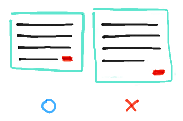
Date pushing with text was implemented by adding non-breaking spaces in the message text with a length slightly larger than the length of the date stamp. If the spaces reached the edge of the message, then the original text concerned the date, and in this case the text was transferred to the next line, increasing the height of the cell, which, in turn, pulled the date tag. With this chip messages look more compact:
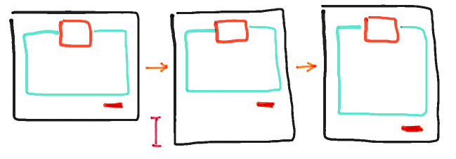
It is worth saying a few words about AutoresizingMask. Some people underestimate its importance, and during the layout of the code it is useful to understand how this technology works. In our case, there were cells that stretched and shrunk around the event. And, in order not to restore the frames each time, the masks were set so that the views changed their size according to the size of their parents. Without a single constraint and line of code - pure magic. Below is an example of its use: we initially have a cell, then we increase its height (without using masks, the content would remain in this position), after which, in the lower right corner, the date is pulled, and the rest of the content is stretched:
The next caveat: when the keyboard appeared, it was possible to see the messages that remained below the table below the bottom set. He also exhibited from above, if a die appeared about the absence of the Internet, and from below, when the field for entering a message changed its height, all this is not counting the upper and lower sets by default. To take away and add the necessary constant in each place is a rather fragile solution and will break if at least one method is called once more. As a solution, a wrapper was written for the UITableView, containing an array of structures with insets for each reason. The reasons were described in the enumeration, and each time the array was changed, all the indents were added and assigned to the table. Thus, it became possible to control each of the insom without breaking the rest. It is worth mentioning: in our case, all the indents were inverted together with the table due to the transformations previously applied, so the upper set was lower and vice versa.
Curious moments and discoveries in the design was enough, not to remember all. Again, you can invest an infinite number of hours, making the application more smooth, fast and flexible. But this, together with the visual part, is the first stage, the minimum necessary for the successful application of chat. The uniqueness of the experience of its use can be attributed to the next step. To go far, let's take a native ios-messenger iMessage. In addition to responsiveness, the messenger has a lot of "fashionable chips", most of which simply do not exist anywhere. For communication, they are not so important, but if you consider chat as a separate entity, the owner of such "chips" looks more perfect and developed against the rest. The stage of implementation of such features in rare cases can be attributed to the first version of the application. Therefore, having released the first version of the chat, we hope to continue working in the future and fill the chat with unique features.
So, the task:
Backend based on custom (developed in parallel) XMPP server. Support multiple users in one chat. Cells - starting with ordinary text blocks, ending with sending pictures and messages with a variety of text fields, buttons, animations and varying heights for the event. The status of messages (delivered, read, etc.). Displaying avatars in a cell that starts a series of messages from a particular user. Caching everything and re-sending messages in case of an error. Of course, the smooth loading on low-end devices.
')
The task is not quite typical, and the project requirements are not fully defined. It is risky to drive yourself into a previously unused library. Which, of course, cannot be said about the libs tested in battle like the RxDataSources, which we certainly decided to use. Should it happen that at any moment of development it is easily replaced by the manually prescribed logic for working with cells. Also, it didn’t do without the immediate “gentleman’s set of iOS developers”: RxSwift, Realm, Alamofire and Kingfisher. We also connected them to the project.
The list of messages was implemented through the UICollectionView because of its threefold flexibility. And the animated collection in UIKit is more beautiful than the table. In this case, the animation can be controlled. Storyboard was immediately abandoned as part of the chat, because Autolayout and performance are things, if not from different galaxies, then at least not knowing each other.
It's time to think about the internal architecture of the cells. At first glance, everything seems to be simple: the message can be either your own or someone else's. In addition, it is worthwhile to paint the logic of displaying avatars, rendering the height depending on the content ... On the layouts, the distance between one's own cell and someone else's cell is different, and for this you need to paint the logic. It also turns out that the date of the message in the corner of the cell should push the main text to a new line, if he touched it, and on the devices to the iPhone 6 there will be a separate layout and its dimensions. After a couple of months, the design of the application will change, and it will be necessary to change indents and fonts without serious consequences.
All this suggests that the message architecture must be designed in a particularly careful way.
By trial, error, and multiple reorganizations of the code, the following structure was born: the cell contains three elements (avatar, sender's name and view with content on which the view of a certain message type is placed).
Sales can be configured in just three ways (with an avatar and a name, without information about the sender and with an avatar in the middle over the content):
Content is placed closer to a certain edge of the screen, depending on the type of the message “friend or foe”. The height is standardly calculated using a template cell, depending on the above configuration. It also calculates the distance between the cells. In CollectionViewLayout, it is zero, the distance is simply added to the height of the cell, so that the logic does not spread over the objects.
It is worthwhile to consider in more detail the class of the view placed on the cell. It will be the lion's share of the layout of the entire screen. The process is simple, but long and routine. The main difficulty here is to make a basic class correctly. Applying the Template method pattern, we created a class that encapsulates the initialization algorithm for a view with content (size calculation, event subscription, initialization, and adding subviews), leaving the methods themselves open for overriding.
Technical difficulty manifested in the page load. A dozen messages loaded half a second on the iPhone 6 - a very weak result. Actually, nothing surprising: the cells are heavy and the whole process of their creation and filling took place in cellForRow. From this, the Mainstream suffered a disaster. Pretty quickly, the idea came to create views with content immediately after receiving messages in the Background thread. Some will say that it is impossible, and they will be right. UILabel in the background to create and did not work, the application just crashes. The rest of the UIView-primitives calmly allow you to create yourself in the background, and, specifically, the UIView class is allowed to be created in the background of official documentation.
Practice has shown that frames for objects can also be set from the background. This was enough for us to blur the creation of a cell with a message and bring the logic of calculating the cell size into the background. Also, it is worth noting that by shifting the addition of all the subwoofers to the cell at the time of willDisplayCell, we noticeably increased the smoothness of the load. And in this method, we let the content view understand that it finally got into the Main stream, which means that you can configure all the outlets (create UILabels) and substitute content into them. In fact, immediately after receiving the message, the cell size is formed in the background, then it is generated in this size, and at the last moment before displaying, the entire content is drawn on it:
Cells should have a minimum of transparency. The hardware gland is difficult to digest mixed layers, and therefore translucent views are a scourge of performance, and any complex component must be spared from it. Corner rounding on views still makes them translucent. For clarity, you can in the device simulator put a tick on the Color blended layers, and he draws them in red. Nothing can be done here, at least nothing that can be devised in a short time.
The only minus of the applied approach is the storage of references to views with content.
Once created, the view has never been deployed, except after exiting the screen. This decision was made consciously. This saved us from performance problems. Riteyn view allowed to calculate the size and create them only once and in the background. It had almost no effect on the memory; the main principle is not to drag the pictures along. The image field of the UIImageView should be necessarily reset to didEndDisplayingCell and re-acquire its value only when the cell is displayed new.
Voila, and everything is smooth! Joke. Smoothly in Telegram. But for our terms very good performance. Even on a minimally supported device, the download is barely noticeable, but on modern devices it is not at all visible. Further addition to the message types did not affect the loading performance.
And nothing foreshadowed trouble, when CollectionViewLayout suddenly broke. Well, you understand how it usually happens: the content of the site gets lost, the cells become invisible, etc., and no reloadData () in this case saves ... it broke and that's it \ _ () _ / ¯. It happened at an indefinite point in time, just when scrolling chat. We tried to change the insertion of single cells to a full reboot of the collection, get rid of RxDataSources, transfer the creation of views to the main stream - all to no avail. It happened after a vast merge of branches, so it wasn’t enough to figure out exactly what the break was caused by. The case was curious, and I wanted to get to the truth. The customer wanted an assembly.
"TableView, buddy, we missed you so much! ... in the sense of traitors?"
It was literally a couple of hours before the collection was completely replaced with a table. There was no absolute certainty that this would solve the problem. But the tableview was perfect. It seemed that he worked even a little faster than the collection. But the animation of the cells inserts leaves much to be desired. In the chat, it does not look at all acceptable, because it was decided to update the list via reloadData (). And the failure of the CollectionView remained a mystery: this is one of the most difficult elements in UIKit, and it didn’t work out over the weekend. The main thing is that the task is completed - the chat database is implemented at the proper level.
Performance is a deep and interesting topic. But not the only one with which we are faced. There were still curious nuances. Same table flip.
As everyone knows, chat messages start from the bottom, and collections and tables do not have the appropriate functionality for such a display of cells. Here we used the CGAffineTransform: turned the table upside down, and the cells turned over again - everything is perfect, and without any possible bugs and performance problems.
Date pushing with text was implemented by adding non-breaking spaces in the message text with a length slightly larger than the length of the date stamp. If the spaces reached the edge of the message, then the original text concerned the date, and in this case the text was transferred to the next line, increasing the height of the cell, which, in turn, pulled the date tag. With this chip messages look more compact:
It is worth saying a few words about AutoresizingMask. Some people underestimate its importance, and during the layout of the code it is useful to understand how this technology works. In our case, there were cells that stretched and shrunk around the event. And, in order not to restore the frames each time, the masks were set so that the views changed their size according to the size of their parents. Without a single constraint and line of code - pure magic. Below is an example of its use: we initially have a cell, then we increase its height (without using masks, the content would remain in this position), after which, in the lower right corner, the date is pulled, and the rest of the content is stretched:
The next caveat: when the keyboard appeared, it was possible to see the messages that remained below the table below the bottom set. He also exhibited from above, if a die appeared about the absence of the Internet, and from below, when the field for entering a message changed its height, all this is not counting the upper and lower sets by default. To take away and add the necessary constant in each place is a rather fragile solution and will break if at least one method is called once more. As a solution, a wrapper was written for the UITableView, containing an array of structures with insets for each reason. The reasons were described in the enumeration, and each time the array was changed, all the indents were added and assigned to the table. Thus, it became possible to control each of the insom without breaking the rest. It is worth mentioning: in our case, all the indents were inverted together with the table due to the transformations previously applied, so the upper set was lower and vice versa.
Curious moments and discoveries in the design was enough, not to remember all. Again, you can invest an infinite number of hours, making the application more smooth, fast and flexible. But this, together with the visual part, is the first stage, the minimum necessary for the successful application of chat. The uniqueness of the experience of its use can be attributed to the next step. To go far, let's take a native ios-messenger iMessage. In addition to responsiveness, the messenger has a lot of "fashionable chips", most of which simply do not exist anywhere. For communication, they are not so important, but if you consider chat as a separate entity, the owner of such "chips" looks more perfect and developed against the rest. The stage of implementation of such features in rare cases can be attributed to the first version of the application. Therefore, having released the first version of the chat, we hope to continue working in the future and fill the chat with unique features.
Source: https://habr.com/ru/post/330044/
All Articles