11 things I learned while reading the flexbox specification
I always thought that flexbox was pretty easy to work with - a breath of fresh air after so many years of float and clearfix.
True, I recently discovered that I was fighting with him; something was stretching when I didn't think it should drag. I corrected here, another element shrank. I fixed it, something else went off the screen. What is George Bush doing here?
In the end, everything worked, but the sun had set, and my process was a familiar game with CSS. Or ... what is the name of the game where you need to hit a mole, and then another mole jumps out and you have to hit him too?
Anyway, I decided that it was time to act like an adult developer and learn flexbox properly. But instead of reading 10 regular blog posts, I decided to go straight to the source and read The CSS Flexible Box Layout Module Level 1 Spec
Here are some good excerpts.
1. Margin has special powers.
I thought that if, for example, you want a header with a logo and the name of the site on the left, and a login button on the right ...

... you should give the flex: 1 name to press the remaining elements to the other end of the line.
That's why flexbox is a very good thing. Simple things are so simple.
But perhaps for some reason, you do not want to pull an element just to press another element to the right. Maybe because the element has an underline, an image, or some third reason that I can't think of.
Great news! Instead, you can say directly: “push this element to the right” by defining a margin-left: auto on the desired element. Think of it as float: right .
For example, if the item on the left is an image:

I do not need to apply flex to the image, I do not need to apply space-between to the flex-container, I just set the margin-left: auto on the “Sign in” button:
.header { display: flex; } .header .logo { /* nothing needed! */ } .header .sign-in { margin-left: auto; } It may seem like some kind of hack to you, but no, it’s right there in the specification overview as a way to press the flex-element to the end of the flexbox. The way even has its own chapter: " Align with auto margins ".
Oh, I should also mention here that I assume flex-direction: row everywhere in this blog post, but everything also applies to row-reverse or column or column-reverse .
2. min-width matters
Perhaps you think that it is easy to force all flex elements inside a flex container to shrink to fit the content. Surely, if you specify flex-shrink: 1 on elements, they will behave, right?
Maybe an example.
Let's say you have a DOM part that displays a book for sale and a button to buy it.
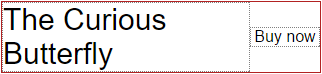
You placed everything with flexbox and everything is fine.
.book { display: flex; } .book .description { font-size: 30px; } .book .buy { margin-left: auto; width: 80px; text-align: center; align-self: center; } (Since you want the “Buy” button on the right - even for very short titles - you, being smart, indicated a margin-left: auto )
The title of the book is rather long, so it uses as much space as it can and then moves to the next line. You are happy, life is beautiful. You are blissfully sending your code into production, with the confidence that it will withstand everything.
And then you get a nasty surprise. Not a good kind at all.
A certain fool, who imagined a lot about himself, wrote a book with a long word in the title.
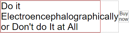
Everything is broken!
If the red border indicates the width of the smartphone, and you hide the overflow (hidden), you just lost your Buy button. Your conversion rate - like the poor author's ego - will suffer.
(Note: fortunately, where I work, there is a good QA team that filled our database with heterogeneous text, like this one. In particular, it was this problem that prompted me to read the specification.)
It turns out that this behavior occurs because the min-width of the description element is initially set to auto, which in this case equals the width of the word Electroencephalographically (electroencephalographically). A flex element is literally not allowed to be narrower than this word.
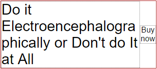
Decision? Redefine this problem min-width: auto min width by setting min-width: 0 , telling flexbox that this element may be narrower than the content inside it.
Now you are responsible for managing the text inside the element. I propose to move the word. So your CSS will look like this:
.book { display: flex; } .book .description { font-size: 30px; min-width: 0; word-wrap: break-word; } .book .buy { margin-left: auto; width: 80px; text-align: center; align-self: center; } The result will be:
Again, min-width: 0 is not some kind of hack to circumvent the absurdity, this is the proposed behavior right in the specification .
In the next section, I will come back to the fact that the “Buy” button is not at all 80 pixels in width, as I quite clearly told her.
3. The authors of flexbox have a crystal ball
As you may know, the flex property is a short record of flex-grow , flex-shrink and flex-basis .
I have to admit, I spent a certain number of minutes, guessing, checking the different values for this triple when I tried to make the elements stretch the way I should.
What I did not know until now is that, in general, I want one of three combinations:
- If I want the element to shrink a little when there is not enough space, but it does not stretch wider than it needs: flex: 0 1 auto
- If my flex-element has to reach to fill all the available space, and shrink a little if there is not enough space: flex: 1 1 auto
- If my element should not be resized at all: flex: 0 0 auto
I hope that you are not at the maximum amazement - it will become even more amazing now.
You see, the Flexbox Brigade (I like to think that the flexbox team wears leather jackets with this inscription at the back — male and female sizes are available). Where was this offer? Oh yeah, the Flexbox Brigade knew that I wanted these three combinations of properties in most cases. Therefore, they gave them keywords specifically for me .
The first case is the initial value, so the keyword is not needed. For the second case, flex: auto is used , and flex: none is a remarkably simple solution so that the element does not drag at all.
Who could blow! (Who woulda thunk it - a pun, approx. Translator)
It’s as if box-shadow: garish , which was 2px 2px 4px hotpink by default because it was considered a “useful default”.
Let's return to the incredibly ugly book example. To make that “Buy” button steadily wide for a finger hit ...
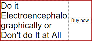
... I just need to set flex on it : none :
.book { display: flex; } .book .description { font-size: 30px; min-width: 0; word-wrap: break-word; } .book .buy { margin-left: auto; flex: none; width: 80px; text-align: center; align-self: center; } (Yes, I could specify flex: 0 0 80px; and save the CSS string. But there is something special about how clearly flex: none demonstrates the intent of the code. This is good for the Future David who will forget how it all works.)
')
4. There is such an inline-flex thing.
In truth, I learned that there is such a thing as display: inline-flex a few months ago. And the fact that it creates an inline flex container instead of a block container.
But in my estimation, 28% of people did not know this yet, so ... now know the bottom 28%.
5. vertical-align does not affect the flex element
Perhaps this is what I knew in half , but I am sure that at some point, when I tried to set the correct alignment, I could try vertical-align: middle and shrug when it did not work.
Now I know for sure, straight from the specification, that " vertical alignment does not affect the flex-element " (as well as the float , I note).
6. Do not use margin or padding in%
This is not just the “best practice” level, it is the “advice-from-grandmother” level, so just do what they say and do not ask questions.
“Authors should completely avoid using percentages in paddings or margins on flex elements,” with love, flexbox specification.
This is followed by my favorite quote from all specifications that ever existed:
Note: this discrepancy sucks, but it accurately reflects the current state of the world (there is no consensus among the implementations, and there is no consensus within the CSSWG) ...
Caution! The bombing honesty continues.
7. Margin's of neighboring elements do not collapse
Perhaps you already know that margins sometimes come together. You may also know that margins are not merged together in some other cases.
And now we all know that the margins of neighboring flex elements never merge.
8. z-index works even if position: static
I'm not sure that I care. But I feel that in one day, maybe this will come in handy. This is exactly the same reason I keep a bottle of lemon juice in the fridge.
One day there will be another person in my house who says “hey, do you have lemon juice?” And I like “of course in the fridge” and he is “thank you, mate. Hey, do I need to specify position if I want to set the z-index on the flex element? ”, And here I am“ not bro, not for flex-elements ”.
9. Flex-basis is a subtle and important property.
When your requirements outgrow the keywords initial , auto and none , everything will become a bit more complicated, and now that I understood flex-basis , it's funny, you know, I can't figure out how to finish this sentence. Leave a comment if you have any ideas.
If you have three flex items with 3, 3, 4 flex values, then they are guaranteed to occupy 30%, 30% and 40% of the available space, regardless of their contents, if their flex-basis is 0. And only if it is equals zero.
However, if you want flex to behave in a more friendly, predictable manner, use flex-basis: auto . In this case, the flexbox will take your flex-values into account, but will also take into account other factors, think a little, and select the widths that you think are suitable for you.
Take a look at this clear chart from the spec:
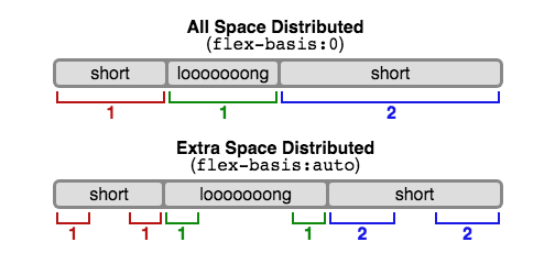
I’m sure this is mentioned in at least one of the flex posts I’ve read, but for some reason I don’t like it until I saw this picture in the specification (schmick pick in the spec) (triple rhyme if you from New Zealand).
10. align-items: baseline
When I wanted to align flex-elements vertically, I always used align-items: center . But as with vertical-align , you have the option of setting the value in the baseline , which might be more appropriate if your elements have a different font size, and you want to align their base.
Perhaps obviously, align-self: baseline also works.
11. I'm pretty dumb
No matter how many times I read the next paragraph, I remained unable to understand it ...
The content size is the minimum size of the content on the main axis, clamped if it has an aspect ratio, using any defined minimum and maximum cross-size properties, converted through aspect ratio, and then further clamped using the maximum basic size property, if defined. .
If you’re trying to find out how to use it, then you’ll be able to make it a little bit. is definite.
The words pass through my holes, transform into electrical impulses traveling through my optic nerve, and arrive just in time to see my brain running through the back door in a puff of smoke.
It was as if Minnie Mouse and Mad Max had gotten a child seven years ago, and now, being drunk with mint schnapps, insults everyone within hearing limits with words that he recognized when Mommy and Daddy were cursing.
Ladies and Gentlemen, we started our descent into nonsense, which means it's time to take stock (or stop reading if you're here to learn something new).
The most interesting thing I learned from reading the specification is how incomplete my understanding was, despite the half dozen blog posts I read, and how simple flexbox is. It turns out that “experience” is not just a lesson of the same thing year after year.
I am pleased to note that the time I spent reading has already paid off. I walked through the old code, set auto margins, flex values in the auto or none short record, and set the minimum width to zero where it was needed.
I feel better about this code now, knowing that I am doing it properly.
I also learned that despite the fact that the specification - in some places - is oversaturated and intended for vendors, as I thought, it still contains many friendly words and examples. It even highlights parts that modest web developers can skip.
However, this is a controversial issue, because I told you about all the good passages, so you don’t need to bother reading it.
Now, if I may, I have to go and read all the other CSS specifications.
PS I highly recommend reading the following list of all flexbox bugs by browsers:
github.com/philipwalton/flexbugs
From the translator: this is my first translation experience of foreign publications, if there are comments / suggestions / remarks on the quality of the translation or on the content, write in the comments.
The original post is here: hackernoon.com/11-things-i-learned-reading-the-flexbox-spec-5f0c799c776b
Source: https://habr.com/ru/post/329820/
All Articles