Visual editor of letters on React + Redux. Overview, example of use and expansion
Introduction
Hello! Not so long ago, I received the task to embed a visual email editor into our internal mailing service, because people are tired of typing html with their hands and composing valid email templates. After surfing the Internet, I found 2 editors who, then, seemed to me, perfectly suited for these purposes. Links to them at the end of the topic. After studying them more carefully ( EmailEditor was written using jQuery , which I studied quite well at one time, and Mosaico was at KnockoutJS , I know him only superficially), I stopped at EmailEditor , and again plunged into the crap from which a year ago was so successful I got out with the help of Angular and Ionic , namely - files with 2-3k lines, ubiquitous and random change of DOM in various ways from different places, etc., well, you understand me).
After spending more than a month trying to fix all the bugs, gash the building blocks we need to send, etc., I gave up ... I decided to try Mosaico and even began to actively explore Knockout , but the problem is that this monster (I mean Mosaico ) was so hard to write that EmailEditor didn't seem so bad. Plus, Mosaico practically has no sane documentation, and if I intuitively understood how everything works and how to create my own units, then no intuition helped me. Maybe it’s just that there wasn’t enough brain, patience and desire to understand, I don’t know, just take a look at the source of these editors at your leisure ... And the time was running out ...
What to do?!
I asked myself, and answered myself “Of course, reinvent the wheel! With a gold chain and crimson wheels!”. It so happened that just at that moment for one of my pet-projects I needed to start exploring the currently popular React + Redux approach to building web applications. After reading about Redux , it dawned on me! Here it is! The state of the application in one place is not the best option to build an architecture in which the JSON representation of the letter template will change! And I began to write ... After a couple of weeks of sleepless nights, a prototype was presented to the authorities and it was decided to try to implement my editor. From the repository, it can be noticeable that at the very beginning it was difficult for me to determine the structure of the template and the principles of operation, but as I studied, trying different approaches, I decided not to complicate things and still came to what I have now, namely:
- template - letter template with blocks, where each block contains:
- id is a block identifier (I use Date.now () and am not worried);
- block_type - block type (hereinafter I will explain why);
- options - styles and properties for the container and block elements, in which:
- container is an object that is then directly substituted into the style of the block, i.e. these are CSS styles;
- elements - CSS styles for block elements and parameters of type source, text (I decided to mix them together);
- common - common CSS settings for blocks;
- components - available to add in blocks;
- tabs - setting tabs visibility;
- tinymce_config - general TinyMCE setting for blocks using it;
- language - application localization;
- templateId - ID of the template to save \ load;
That's the whole store.
Review of work with the editor
Where to start ... Here and below, I assume that you have NodeJS , npm, and preferably MongoDB installed, and also that you have some experience with both them and the React + Redux stack. Running live development is simple because the project is written using create-react-app. So, after copying the repository, just run:
npm install
npm start
in the project folder and in your browser the address http: // localhost: 3000 will open, where you will see something like this:

Of the available locales, only en and ru are currently supported, the download is directly from the JSON file in the translations folder and, unfortunately, I haven’t yet written whether the user locale is available to be substituted by default, but these are trivialities, this is then ... Applications - index.js in the root src / , the initial store is set there, and three actions are dispatched to load the locale, the list of blocks and the template taken by ID from your storage, or, if no ID is specified, the default template. Since the launch initially occurs without any parameters, everything will be loaded from local files, server setup at this stage is not required (but will be needed for the methods of saving / loading the template, loading the image and sending a test letter).
The interface is terribly simple - on the left is the settings panel and blocks, in the center is a letter template, on the sides of the template are buttons. Blocks can be dragged onto the template (they are added as if on top of the target block, shifting everything down); when you hover over the target block, it changes color. Here I think about how to implement the "phantom block", as in some other editors, but this is not a priority task. When you click on a block, the tab in which the settings for the selected block are contained is activated, and this block is highlighted, and the delete block button appears, as seen in the screenshot:

Well, if you select the general settings tab, you will see a set of settings that will be applied to all blocks, except those with the Custom style flag. Also there is an opportunity to set the background of the template container:

Clicks on the buttons allow you to save the template (you will be asked to set the name of the template, but it is easy to cut), send a test letter and delete the block (in the plans also implement Undo \ Redo functionality, now I read about it)
You can also start and play around with the NodeJS server (it’s in the server_nodejs folder) by first copying the build folder that appears if you do npm run build in the main project folder (do not forget to npm install in both folders!). What the server can do: it saves \ produces a template (? Id = your_id) and loads images, and also says 'OK' when sending a test letter =). I think it will not be difficult to figure out the structure of the project is quite simple, I don’t like to complicate it at all ... The entry point is app.js , there is a Controller in the app folder - everything is there, Router - paths are associated and linked to the controller, and TemplateModel - ORM .
Some insides
In the src / components folder there are subfolders of blocks and options in which the block templates and settings of these blocks lie.
import React from 'react'; const BlockHr = ({ blockOptions }) => { return ( <table width="550" cellPadding="0" cellSpacing="0" role="presentation" > <tbody> <tr> <td width="550" style={blockOptions.elements[0]} height={blockOptions.container.height} > <hr /> </td> </tr> </tbody> </table> ); }; export default BlockHr; import React from 'react'; const OptionsHr = ({ block, language, onPropChange }) => { return ( <div> <div> <label>{language["Custom style"]}: <input type="checkbox" checked={block.options.container.customStyle? 'checked': '' } onChange={(e) => onPropChange('customStyle', !block.options.container.customStyle, true)} /></label> </div> <hr /> <div> <label>{language["Height"]}: <input type="number" value={block.options.container.height} onChange={(e) => onPropChange('height', e.target.value, true)} /></label> </div> <div> <label>{language["Background"]}: <input type="color" value={block.options.container.backgroundColor} onChange={(e) => onPropChange('backgroundColor', e.target.value, true)} /></label> </div> </div> ); }; export default OptionsHr; Also in the src / components folder there is a Block.js file, in which all blocks from blocks and switch are connected ... case , in which the block_type (which I mentioned above) determines which block variant will be returned.
The same principle in the Options.js file for settings. And from this architecture I would like to leave as soon as possible (maybe someone has thoughts in which direction to make the transition?). The BlockList.js file contains a letter template, in which you can see how everything is arranged - tr> td elements are built in a cycle, and td in this case is a container inside which a block with elements is already placed. The container settings (styles from block.options.container) are also picked up, and DnD logic is also implemented. In the configuration, too, everything is quite transparent, onCnge handlers are hung on the input , inside of which onPropChange (prop, value, container ?, element_index) is called with parameters ('property to change, for example, color', new property value, element to change (container - true, element - false), element index). In principle, this is the main idea and there is nothing more to tell =). On the mindmap, I tried to schematically depict the work of this pipeline:

PS There are two branches in the repository - master and react_email_editor_wordpress . In principle, there are no special differences, differences in the sagas / api.js files (WP has its own approach to AJAX), feedback and social blocks (there are other paths to pictures ... WP zhezh). Our editor is integrated into WP and is currently being tested.
So how do you make your block?
Very simple! Well, I think so, because I worked with it tightly and every day ...
I'll start by choosing the type of block. Wandering through the internet, I came across one nice template:
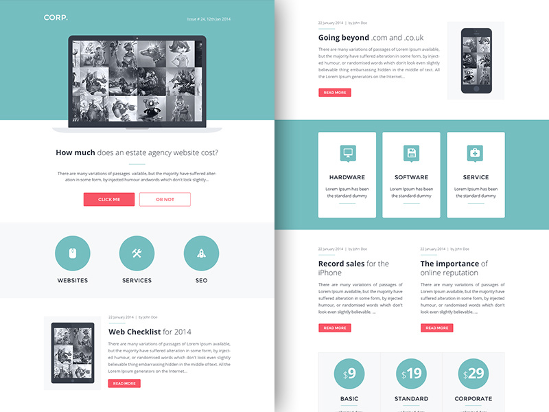
I liked the block with three icons WEBSITES, SERVICES, SEO. Well, I'll try to tell you how to implement such a block. First, let's define the composition of the block. I see 6 elements here: 3 pictures and 3 text elements, well, you can subsequently program your vision of this block. Since I tried to make the setting as flexible as possible, you are free to come up with almost any layout (for example, 3 picture-text elements), and this will be quite realistic. Quite a few words, go code!
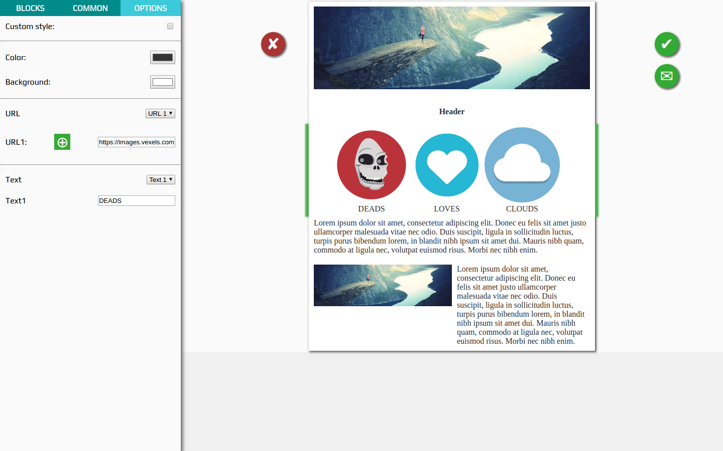
Open the public / components.json file and add the following JSON:
... ... { "preview": "images/3_icons.png", "block": { "block_type": "3_icons", "options": { "container": { "padding": "0 50px", "color": "#333333", "fontSize": "20px", "customStyle": false, "backgroundColor": "#F7F8FA" }, "elements": [{ "source": "https://images.vexels.com/media/users/3/136010/isolated/preview/e7e28c15388e5196611aa2d7b7056165-ghost-skull-circle-icon-by-vexels.png" }, { "source": "http://www.1pengguna.com/1pengguna/uploads/images/tipimgdemo/kesihatan.gif" }, { "source": "https://upload.wikimedia.org/wikipedia/commons/thumb/5/56/Circle-icons-cloud.svg/2000px-Circle-icons-cloud.svg.png" }, { "text": "DEADS", "textAlign": "center" }, { "text": "LOVES", "textAlign": "center" }, { "text": "CLOUDS", "textAlign": "center" }] } } }, ... ... Thus, we have defined a block of type 3_icons with a preview of images / 3_icons.png , a container and six elements. They already have some basic style setting so that when adding it looks more or less decent. Ok, then open GIMP (if installed) and open the preview_template.xcf file in it, which lies at the root of the project. I made this piece in order to rivet the block previews. Using simple manipulations (Cut \ Paste \ Colorize) from the original image of the template, we get a preview for the future block:

Save it to the src / images folder (or public / images , or better in both places) and refresh the page with the editor. You will see that a new block has been added to the position where you inserted it into components.json

Now create a block template. Add a new Block3Icons.js file to the src / components / blocks folder:
import React from 'react'; const Block3Icons = ({ blockOptions, onPropChange }) => { const alt="cool image"; return ( <table width="450" cellPadding="0" cellSpacing="0" role="presentation" > <tbody> <tr> <td width="150"> <a width="150" href={blockOptions.elements[0].source}> <img alt={alt} width="150" src={blockOptions.elements[0].source} /> </a> </td> <td width="150"> <a width="150" href={blockOptions.elements[1].source}> <img alt={alt} width="150" src={blockOptions.elements[1].source} /> </a> </td> <td width="150"> <a width="150" href={blockOptions.elements[2].source}> <img alt={alt} width="150" src={blockOptions.elements[2].source} /> </a> </td> </tr> <tr> <td style={blockOptions.elements[3]}>{blockOptions.elements[3].text}</td> <td style={blockOptions.elements[4]}>{blockOptions.elements[4].text}</td> <td style={blockOptions.elements[5]}>{blockOptions.elements[5].text}</td> </tr> </tbody> </table> ); }; export default Block3Icons; As you can see, the block is the simplest - 2 rows 3 columns. Of the settings for elements, I have so far made available only the source for image elements and text for text elements, the styles of the container are applied in the BlockList.js file, which I mentioned above in the text.
It's time to create a block setting. Add a new Options3Icons.js file in the src / components / options folder:
import React from 'react'; const Options3Icons = ({ block, language, onFileChange, onPropChange }) => { let textIndex = 3; let imageIndex = 0; return ( <div> <div> <label>{language["Custom style"]}: <input type="checkbox" checked={block.options.container.customStyle? 'checked': '' } onChange={(e) => onPropChange('customStyle', !block.options.container.customStyle, true)} /></label> </div> <hr /> <div> <label>{language["Color"]}: <input type="color" value={block.options.container.color} onChange={(e) => onPropChange('color', e.target.value, true)} /></label> </div> <div> <label>{language["Background"]}: <input type="color" value={block.options.container.backgroundColor} onChange={(e) => onPropChange('backgroundColor', e.target.value, true)} /></label> </div> <hr /> <div> <label> {language["URL"]} <select onChange={e => imageIndex = +e.target.value}> <option value="0">{language["URL"]} 1</option> <option value="1">{language["URL"]} 2</option> <option value="2">{language["URL"]} 3</option> </select> </label> </div> <div> <label> {language["URL"]} {imageIndex + 1}: <label> <input type="file" onChange={(e) => { onFileChange(block, +imageIndex, e.target.files[0]); }} /> <div>⊕</div> </label> <input type="text" value={block.options.elements[+imageIndex].source} onChange={(e) => onPropChange('source', e.target.value, false, +imageIndex)} /> </label> </div> <hr /> <div> <label> {language["Text"]} <select onChange={e => textIndex = +e.target.value}> <option value="3">{language["Text"]} 1</option> <option value="4">{language["Text"]} 2</option> <option value="5">{language["Text"]} 3</option> </select> </label> </div> <div> <label> {language["Text"]} {textIndex - 2} <input type="text" value={block.options.elements[+textIndex].text} onChange={e => onPropChange('text', e.target.value, false, +textIndex)} /> </label> </div> </div> ); }; export default Options3Icons; Fine! Almost done! I hope that in what we have already created here, are you orienting at least a little? In the block, everything is stupid (because it is a dumb component , ie, it is rendered only on the basis of its props). In the settings, each input element (checkbox, input, etc ...) is associated with a handler, in which onPropChange is called for properties (I also mentioned this above). Based on these properties, the block is dynamically redrawn. It's simple. Let's now apply the results of works and see, finally, whether it all works at all =).
To do this, add to the src / components / Block.js file the import of a new block and the condition for its return:
//... import'... import Block3Icons from './blocks/Block3Icons'; //... ... //... case'... case '3_icons': return <Block3Icons id={block.id} blockOptions={block.options} />; //... ... Do much the same thing in src / containers / Options.js
//... import'... import Options3Icons from '../components/options/Options3Icons'; //... ... //... case'... case '3_icons': return <Options3Icons block={block} language={language} onFileChange={onFileChange} onPropChange={onPropChange} />; //... ... Now we save all the files, and if you previously run npm start in the project root, you should compile everything without errors. Drag your new block onto the template, select it and play with its settings. Here is an example of how it looks from me:
Total
I tried to make the editor as easy to use as possible and quite comfortable in terms of the interface, and whether it turned out for me or not is of course for you to decide. In my opinion, the editor turned out with a low entry threshold in terms of implementing and expanding the component base as opposed to Mosaico . It also has a much more transparent (again as compared to Mosaico ) and less buggy (compared to EmailEditor ) implementation, which is easy to configure, expand, and rewritten to fit your needs literally in hours (less often - days).
Plans to continue working on the following points:
- styles for responsive template;
- implementation of Undo \ Redo functionality;
- make a nice design (I can not, need help ...);
- isolate TinyMCE in order not to cut it into blocks with text elements;
- use something like styled-components for the editor interface;
- update NodeJS server. I will transfer the locales and other things from files to the database;
- transfer of blocks and settings from the project to the repository, getting rid of the switch ... case;
- maybe I'll do something like a preview of the template (but only after responsive);
- maybe I will do a "Show source code" for a serverless template upload;
- I will probably do the "phantom block" mentioned in the article;
- active work with issues and proposals of course =);
- something else, if I remember, I will add ... yes, and you write
I will be glad to help, advice, criticism, any feedback. Based on this, I decide whether to continue to engage in the project =).
That's all for now ... Thank you for your attention! In the future I will write only about very large changes, if, of course, the project will be useful to someone.
Promised Links
- (Good) Mosaico on KnockoutJS
- (Bad) EmailEditor on jQuery
- (Ugly) My
')
Source: https://habr.com/ru/post/329488/
All Articles