Why do we change color schemes?
Introduction
Do you know what I noticed? We spend a lot of time customizing digital space. It starts with changing the wallpaper and themes of the desktop, goes into a long selection of the skin in Aimp (Winamp, for Old Believers) and ends with the design of a digital workplace.
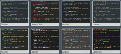
As soon as I change the development environment or code editor, I first go into color schemes and look for my favorite colors. Programmers have already developed whole cults around certain color palettes. Which is better - Obsidian or Monokai? Can I have Selenitic, only the background is darker? And stuff like that. It happened that friends came to me and, before starting to show their project, changed the topic to another, more familiar to them. It is annoying, but I understand them.

... in fact, the comic is not about color schemes, but it sounds great.
A little about the psychology of color perception
On Habré there is a huge number of articles telling (as a rule, from the point of view of design) how people perceive colors, so here we look at this topic very concisely. There is a whole science, color science, which studies the effect of colors on the human psyche. In its framework, the analysis is carried out in terms of physiology, psychology and cultural characteristics.
')
According to studies, there are standard color associations: they may differ slightly in different cultures, but the overall structure remains unchanged. Associations of this kind are listed in the table below. As you can see, each color can be associated with both positive and negative concepts.

Naturally, all people are different and the perception of colors is to some extent individual, but these associations work. Moreover, they have already penetrated into the media sphere and formed the basis of the laws by which designs are built and advertising is created.
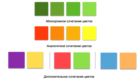
Despite the fact that we have associations with each individual color, in practice their combinations, as a rule, are used in the course, which have an even greater impact on us. There are harmonious colors that are best suited to each other (that is, it is more pleasant for us to look at them) and not harmonious pairs (what we call “pluck the eyes”). Here are some of the most popular color combinations:
A bit about eye strain
Writing code is directly related to reading, and reading is a very complex psychophysical process, which primarily involves our vision. Eyes may get tired. Many articles on Habré and other resources are also devoted to this problem and ways to solve it. This also applies to our stated topic - the load on vision is also provided by colors.
The most common causes of eye strain are the brightness and color temperature of your monitor. For example, if the white color is too bright, then it irritates the eyes.

In addition to brightness, you also need to monitor the color temperature of the monitor. If the image is bluer (cold), then our eyes get tired faster. Blue is short-wave visible light, which is more capable of provoking eyestrain and eye strain than shades of longer waves — orange or red. Therefore, we recommend changing the color temperature in the direction of warm colors. This can be done manually or with the help of programs like f.lux.
Finally, a few words should be said about the ambient light. There are entire protocols with standards for proper lighting conditions at the workplace. From the ambient light directly depends on how comfortable you will work behind the monitor, and the colors on the screen may be perceived differently depending on the lighting. Actually, therefore, there are day and night schemes, which we will discuss below.
Finally about color schemes
We smoothly approached the theme of color schemes directly. Let us summarize what factors influence us when choosing a scheme:
- Cultural and psychological associations with flowers
- Feeling of harmony from different color combinations
- A sense of "relaxation" of our eyes
- Workplace lighting
Problem of choice...
As I said, many people choose to switch between day and night schemes. As a rule, these are light and dark palettes, respectively. Here is an example from Visual Studio:

A dark theme is usually easier to perceive at night, as it does not contain a contrasting and bright white color that will turn your monitor into a flashlight. In the daytime, on the contrary, a dark theme may not seem to be sufficiently contrasting if you work in natural light. In general, contrasting themes greatly increase performance and tone up, while less contrasting soothe and put to sleep. But, of course, it is worth doing an amendment to subjective factors. Some developers prefer dark and contrasting themes regardless of the time of day, others find some sort of medium option.
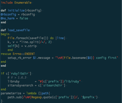
Many contrasting themes (that is, light and dark) seem too weary for the eyes. Therefore, there are a large number of schemes where a smoother contrast is maintained - for example, Solarized Light:

Note: the colors of some text fragments (modifiers, keywords) and background are related. Variable names and types are a similar combination of colors. Thus, the scheme uses several proven color combinations to make the work more enjoyable.
There is a nightly version of this scheme, which, in my opinion, goes too far into the blue spectrum, but it also has enough fans.
The Obsidian theme is neutral to the eyes, regardless of the time of day or the ambient light, as it uses gray as the background.

Almost all popular color schemes use the principles I wrote about at the beginning of the article. This applies not only to code editors, but also to desktop themes, blog styling, media player and audio editor interfaces.
So many color schemes ...
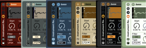
Color Schemes in Ableton Music Studio

Color scheme in Windows 3.1 (I do not advise ...)
Color effects
Even the palette, built in full accordance with the laws of compatibility, will not always give a purely positive effect. There are cases when a theoretically successful choice of a color scheme negatively affects the results of work.
Such a situation may arise if the choice of a color scheme was dictated primarily by the desire to stand out, to show its uniqueness. Most likely, in this situation, the person does not like the colors and knock him off the working mood. Because of this, there may be stupid errors, irrationality of the code, bad decisions in the project.
Or another example: the selection of the color scheme was made long ago and continues to be used simply “by inertia”. This means that the current colors do not correspond to the current emotional and psychological state of the developer:
- If the scheme is dim, he may lack energy and motivation to participate in the work;
- If the scheme is bright, its energy can drive a person into a hurry, make mistakes through inattention;
- If the main colors of the scheme began to cause negative emotions, then negative associations with these colors begin to come to the fore, reducing productivity (what used to cause a surge of energy is now associated with the struggle; what was previously perceived as a creative process and “magic” of creation turns into insecurity, anxiety, etc.).
The way to cope with the negative impact of an inappropriate color scheme, in my opinion, is to experiment. From time to time, try different color schemes for your working space (starting with the desktop wallpaper and ending with the coloring of the syntax of the code). To work with the new scheme, listening to your feelings and evaluating the final result. If with the new scheme it became more comfortable for you to write code, or the performance increased, or you began to make fewer mistakes, then leave this option safely. If the results of work have deteriorated, you can return to the usual scheme (perhaps now it is the most suitable) or try something else.
Conclusion and answer to the main question
We have examined the principles by which people choose certain colors, briefly discussed the features of perception and tested these theses on the example of popular color schemes. But we have not yet answered the main question of the article.
Why do we change color schemes? The main reason is the constant search for a comfort zone that we carry out in the real and digital world. We are trying to arrange everything in accordance with the requirements of convenience: workplace, system desktop, code editor, phone themes, etc.
In addition to comfort, there is another motive, a striving for individuality. Notice how much attention is paid to customization in the digital world. You can customize almost everything. Entire monetization systems in mobile (and not only) games are built on the possibility of customization. The person is trying to make the surrounding space more unique and “his”.
Well, the most banal reason - boredom. How many times a week do you change the wallpaper on your desktop? How many times a month do you change the color scheme of the code editor? If something lasts too long, then inevitably bored, and we want change.
All these factors are formed as a result of our internal needs and constantly have an impact - on someone more, on someone less, but it is. As a result, instead of doing a project, for half an hour we are looking for the “very” topic with which it will be most pleasant for us to work. This in itself is not fatal, but it is better to keep the process under control and separate the organization of the working space from frank procrastination. We hope that with the above information about the background of our actions, it will be easier for you to draw this border.
Work efficiently and have good color schemes!
Source: https://habr.com/ru/post/328680/
All Articles