Dark LinkedIn Patterns or Why You are Spammed by Friends, Encouraging You to Join LinkedIn
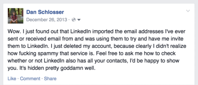
In December 2013, I deleted my LinkedIn account. As I repeated in an emotional post on Facebook , it turned out that I was sending annoying letters to my friends “Dan Schlosser invited you to join LinkedIn”. Embarrassed, I spent a few hours digging through the settings and the LinkedIn menu in search of the cause.
It turned out that when registering an account a few years ago, LinkedIn tricked me into importing an address book. If they used its content only to offer contacts on LinkedIn, maybe I would not mind, but they went further. On the “People You May Know” page, LinkedIn put in a few buttons to invite contacts from your Address Book on LinkedIn and made these buttons in a style as if these people are already on LinkedIn and I can connect with them. The difference between these two types of buttons was negligible. As a result, I sent these spam emails, thinking that I’m sending a friend request within the social network.
Since then, this function has been redone (so I recently found it acceptable to register there again), and these two buttons no longer stand next to each other. Instead, they implemented a feature for inviting with one button all contacts from the address book that have not yet registered on LinkedIn.
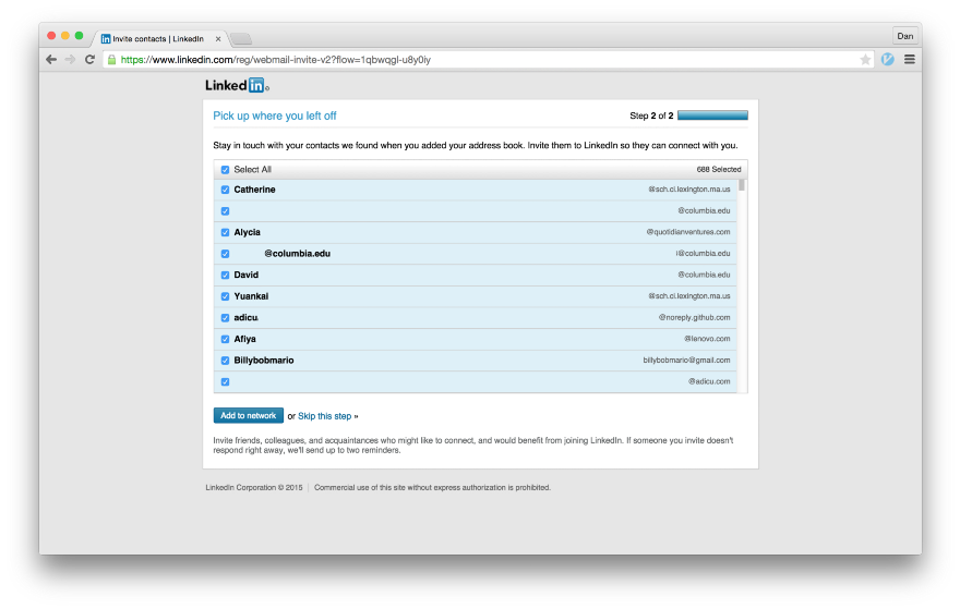
The inscription "Add to the network" actually means "To send 688 letters"
')
It also appears in the contact manager, where with one click you can send requests to all your contacts that are already registered on LinkedIn, and at the same time emails to all people in your contact list who are not yet registered here.
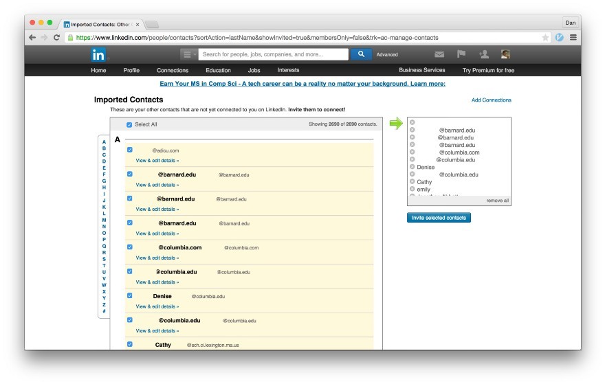
Clicking the button “Invite selected contacts” will send out 2,690 emails: some with an invitation to connect to LinkedIn, others with an invitation to join LinkedIn
Such a system, designed with the expectation that I fraudulently invited people on LinkedIn to people from my contact list, is called a dark pattern . In interface design, a dark pattern is a design that works against users. He can push them to do the wrong thing, or just confuse him to such an extent that the user cannot figure out how to do what the designers do not want him to do. This can be a difficult procedure for deleting a user account or, in the case of LinkedIn, great difficulty in using the service without importing the full address book.
To shed light on LinkedIn spamming techniques, I went through all the steps that are required to register and use LinkedIn without importing the address book. Look, it is almost impossible. Along the way, we'll see how LinkedIn uses the design to trick its users.
Most victims are caught at this stage. The main violation on the whole process is the combination of OAuth with the import of the address book. Take a look:
The page is pretty simple. There are no dark patterns here, with the exception of the fact that the user agreement, the privacy policy and the policy on the use of cookies are automatically accepted with registration in the service. The page is clean.
This page is also clean. LinkedIn uses this information to establish contact with other people who work in your company or go to school with you, this is the expected behavior. On the right in the box is a good explanation. Simple and obvious.
This is where the dirty work begins. After filling out the basic information of the profile, LinkedIn invites you to “Start by adding an email address.” There is an explanation of what this button actually does, but the text is published in a light gray font below the Continue button, so most people blindly press the button. This is definitely a dark pattern. In fact, it is even a hoax. This page is not intended to “add your email address”, but to append the address book.
Detailed consideration of this dark pattern. Notice how the use of color distracts people from the explanatory text.

After clicking the blue “Continue” button on the previous page, a Google OAuth popup appears. Notice that among the permissions is “Manage Your Contacts”. Google could do better here, but not bad either. If someone clicks the “Accept” button at this stage, then the user's entire address book will be imported to LinkedIn. This is where I was wrong for the first time. LinkedIn takes advantage of the fact that Google displays the same OAuth window - the same as in the “Login with Google+” dialog. LinkedIn knows that most users simply click a button without reading the permission.
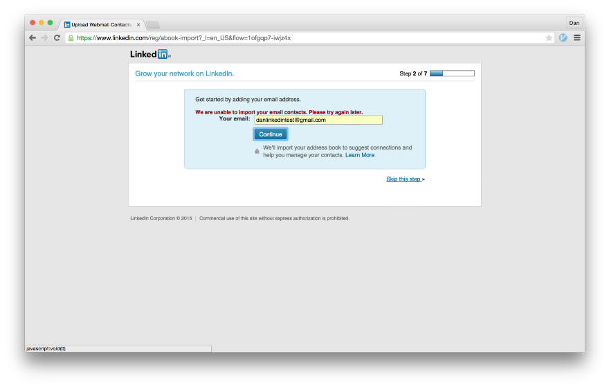
If you refuse to issue permissions in the OAuth window, an error message appears. It says “We were unable to import your mail contacts. Please try again later. ” The “Continue” key again displays the OAuth popup window; You’ll have to look for the tiny “Skip this Step” link in the bottom right corner. Moreover, the link is located outside of the blue rectangular field, which seems to contain all the relevant information for the controls. This page is superbly designed, but with the goal of tricking users.
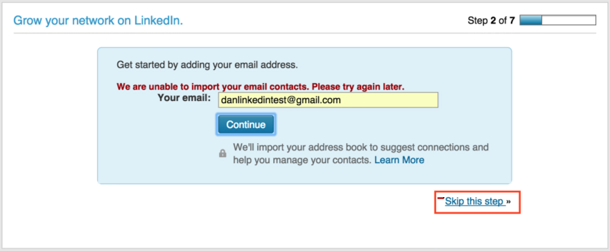
Find the tiny “Skip this step” link in the bottom right corner.
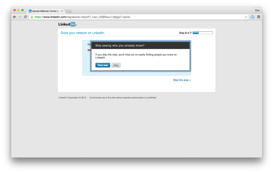
In case you accidentally found a hidden link, LinkedIn asks you to confirm that you really want to refuse to import the address book. Please note that the words “address book” or “contacts” are not mentioned anywhere in the pop-up window. Instead, you are offered a "Find Now". Isn't it nice that LinkedIn shows such a warning when clicking on a button gives them their entire address book?

Why on earth would you skip watching people you already know?

The next page is pretty outrageous. The text prompts the user to “verify” their Google account and “verify” their email address. Nothing is said about the fact that clicking “Confirm my Google Account” synchronizes the user's address book with LinkedIn. The user has already indicated in the previous step that he does not want to synchronize his address book with LinkedIn, but they still try again.
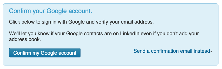
One of the most outrageous screens in the whole process. Since when did "Confirm your Google Account" mean "Send us all the contents of your address book"?

If you refuse the OAuth dialog on the confirmation page, a message appears instead that a confirmation email could not be sent. Finally, the blue button on the page does not mean the import of all your contacts, but only redirects to Gmail.
Such a letter LinkedIn sends to confirm the mailing address. If you press the yellow button, the next page opens.
The link opens a page with a success message: “Thank you for confirming your email address ...”. Next we see the form, where the “Start by adding an email address” is suggested. Do you recognize the screen? It is the same as before . When you have confirmed your mailing address, they are the third time trying to persuade you to "add" it. After the user twice explicitly missed the stage of importing the address book, it is clear that the person does not want to do this. This page is shown here just in case, when someone inadvertently clicks "Continue."

As before, if you click the “Skip this step” link at the bottom of the page, a pop-up window will appear confirming that you have clicked the link is not accidental.
Just to be on the safe side, it’s not by chance that you decide to skip this step past several times.
On the next screen, they offer to send you a link to download the LinkedIn mobile app. If you could not get your address book through the web, you should try to get it through your smartphone.
We did it, finally registered and logged into LinkedIn. The next action of the new user will be filling the profile. Depending on how you count, LinkedIn tried to import the user's address book from three to eight times. It is wrong that it is so difficult to register in the service without giving out extraneous information.
In application design, the interface for new users (new user experience, NUX) refers to content aimed at ensuring that the service remains useful even for beginners who do not yet have connections on the social network. In my experience using LinkedIn, it starts with a welcome letter. Let's see how they use dark patterns to synchronize with your address book, even if you repeatedly abandoned it in the previous steps.
It looks like the “Get Started” and “Stay Connected” links lead to two different pages that do the same thing. First we follow the big yellow “Start” button, because I’m sure many will do so.

Surprise! Here is another attempt to import your address book. To be honest, what is happening here is explained most clearly. The subtitle says “Build your [network] by searching emails in your contacts” and there is no mention of “adding your email address”, which would cause confusion. And again we see the big blue “Continue” button, which as if begs for it to be pressed.
LinkedIn also uses traditional NUX design elements that create the impression that this is more a textbook than an attempt to get an address book. Notice the buttons in the upper right and a solid blue background. They are different from any screen we saw before and from any other LinkedIn section. Users of other mobile or web applications may get the impression that there is a learning interface for beginners, where you have to go through six screens that teach you the basics of working in the system, and at the end of the training you will start working with it. Most users are trained to click through all the training screens, and LinkedIn uses this to their advantage. If you didn’t guess, clicking on the “Continue” button will again bring up the OAuth popup window.

If you managed to find a button to skip the previous step, LinkedIn will ask you to confirm that you are not importing the address book. And here the blue “Continue” button in the pop-up window actually means “I changed my mind, I want to give you all my contacts”. That is, we need the “Skip” button. This is a classic dark pattern from a textbook. On the previous screen, the button to skip this step was hidden on the right, and the "Continue" button stood out on the left, where it is easier to notice. Here they were swapped, so if you found the hidden button before, now you need to change your mindset and notice that now the button is on the left. In addition, the very wording of the question is such that the answer “Continue” seems to be a more appropriate answer. For most people, this word will mean agreement when answering the question “Are you sure you want to skip this step?”. It seems unnatural that the answer “Continue” actually means a negative answer.
This popup is fantastically designed to mislead the user.
We summarize what this popup window does.
Very clever.


The remaining screens are harmless. If you were able to break through the previous screen and your address book was not defrauded, then the remaining NUX screens will help to establish links with companies of interest or download a mobile application.
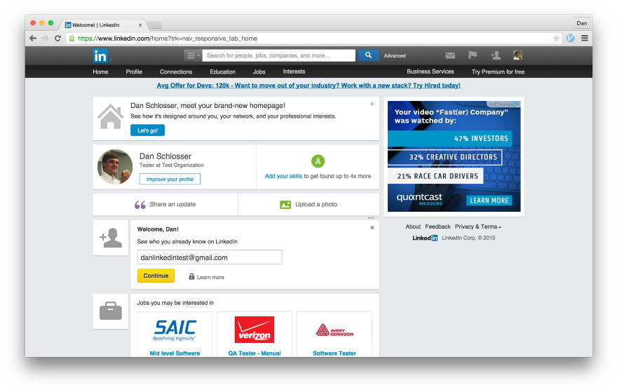
So, we are finally done and are on LinkedIn main page. Now there is a complete mess in terms of design, but I want to draw your attention to the “Welcome, Dan!” Card with the big yellow “Continue” button. I am sure you now know where she leads.
Deja Vu, is not it?
The only consolation I see here is that the page is very littered and it is unlikely that most users will immediately follow this link. But this card will be before my eyes for a while ...
Remember the link "Be in touch"? It looks like it leads to a completely different screen, which also tries to import your address book.
This page is no longer part of NUX, but is a permanent page for the flow “Add your email address”. We see the same tactics that hide the true purpose of the “Continue” button.
I hope you now understand that if you receive spamming letters from friends with an invitation to LinkedIn, then it is LinkedIn’s fault , not your friends.
Many smart people have written about how dark patterns harm a brand and destroy user confidence . I can definitely say that the design of importing contacts on LinkedIn harms their brand, even if it is beneficial for the business in the short term. They make money on the number of connections and the number of users, so it’s profitable for users to import address books.
LinkedIn is not the only social network that uses dark patterns to build its social graph, is not the only one. But this is an extreme case when the dark patterns are used the most. They forced me to leave the service two years ago and ruined the image of the company in my eyes. Dark patterns are a bad design, and a bad design is a bad business. I think it's sad to realize that LinkedIn disagrees with that.
PSA: If you are wondering if LinkedIn imported your address book, I wrote a little tutorial on how to figure it out and delete it. See here .
It turned out that when registering an account a few years ago, LinkedIn tricked me into importing an address book. If they used its content only to offer contacts on LinkedIn, maybe I would not mind, but they went further. On the “People You May Know” page, LinkedIn put in a few buttons to invite contacts from your Address Book on LinkedIn and made these buttons in a style as if these people are already on LinkedIn and I can connect with them. The difference between these two types of buttons was negligible. As a result, I sent these spam emails, thinking that I’m sending a friend request within the social network.
Since then, this function has been redone (so I recently found it acceptable to register there again), and these two buttons no longer stand next to each other. Instead, they implemented a feature for inviting with one button all contacts from the address book that have not yet registered on LinkedIn.
The inscription "Add to the network" actually means "To send 688 letters"
')
It also appears in the contact manager, where with one click you can send requests to all your contacts that are already registered on LinkedIn, and at the same time emails to all people in your contact list who are not yet registered here.
Clicking the button “Invite selected contacts” will send out 2,690 emails: some with an invitation to connect to LinkedIn, others with an invitation to join LinkedIn
Such a system, designed with the expectation that I fraudulently invited people on LinkedIn to people from my contact list, is called a dark pattern . In interface design, a dark pattern is a design that works against users. He can push them to do the wrong thing, or just confuse him to such an extent that the user cannot figure out how to do what the designers do not want him to do. This can be a difficult procedure for deleting a user account or, in the case of LinkedIn, great difficulty in using the service without importing the full address book.
To shed light on LinkedIn spamming techniques, I went through all the steps that are required to register and use LinkedIn without importing the address book. Look, it is almost impossible. Along the way, we'll see how LinkedIn uses the design to trick its users.
Account creation
Most victims are caught at this stage. The main violation on the whole process is the combination of OAuth with the import of the address book. Take a look:
Landing page
The page is pretty simple. There are no dark patterns here, with the exception of the fact that the user agreement, the privacy policy and the policy on the use of cookies are automatically accepted with registration in the service. The page is clean.
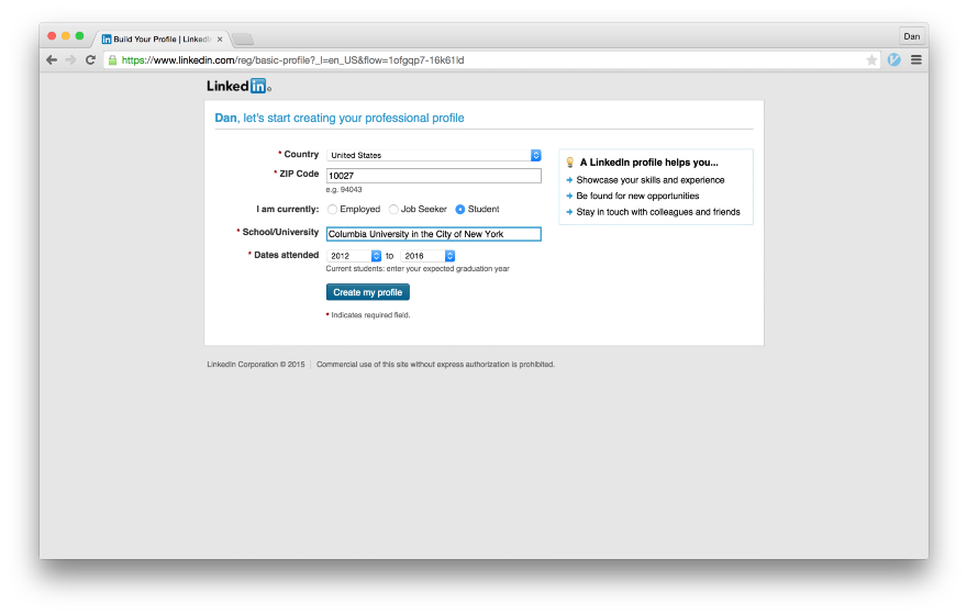
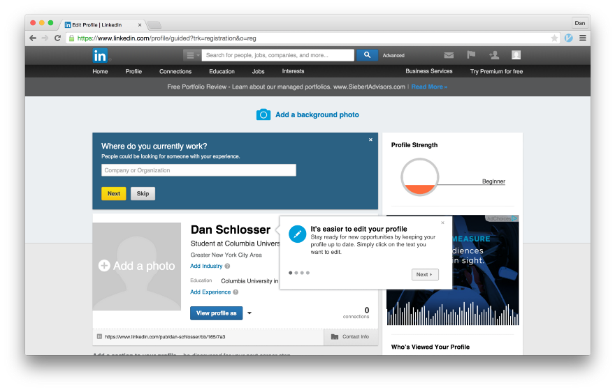
Basic profile information
This page is also clean. LinkedIn uses this information to establish contact with other people who work in your company or go to school with you, this is the expected behavior. On the right in the box is a good explanation. Simple and obvious.
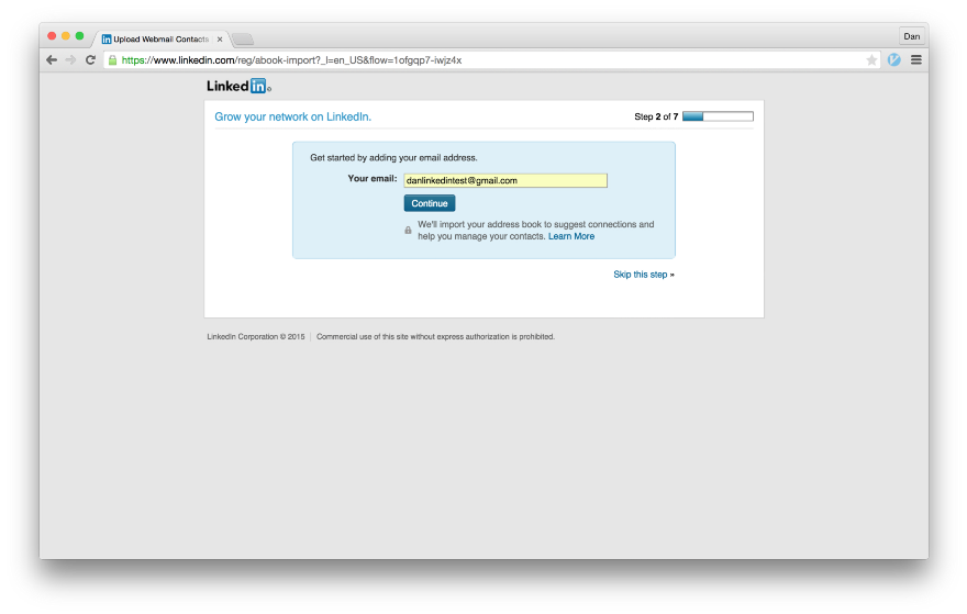
The first dark pattern
This is where the dirty work begins. After filling out the basic information of the profile, LinkedIn invites you to “Start by adding an email address.” There is an explanation of what this button actually does, but the text is published in a light gray font below the Continue button, so most people blindly press the button. This is definitely a dark pattern. In fact, it is even a hoax. This page is not intended to “add your email address”, but to append the address book.
Detailed consideration of this dark pattern. Notice how the use of color distracts people from the explanatory text.
OAuth Dialog
After clicking the blue “Continue” button on the previous page, a Google OAuth popup appears. Notice that among the permissions is “Manage Your Contacts”. Google could do better here, but not bad either. If someone clicks the “Accept” button at this stage, then the user's entire address book will be imported to LinkedIn. This is where I was wrong for the first time. LinkedIn takes advantage of the fact that Google displays the same OAuth window - the same as in the “Login with Google+” dialog. LinkedIn knows that most users simply click a button without reading the permission.
Error Screen
If you refuse to issue permissions in the OAuth window, an error message appears. It says “We were unable to import your mail contacts. Please try again later. ” The “Continue” key again displays the OAuth popup window; You’ll have to look for the tiny “Skip this Step” link in the bottom right corner. Moreover, the link is located outside of the blue rectangular field, which seems to contain all the relevant information for the controls. This page is superbly designed, but with the goal of tricking users.
Find the tiny “Skip this step” link in the bottom right corner.
Are you sure?
In case you accidentally found a hidden link, LinkedIn asks you to confirm that you really want to refuse to import the address book. Please note that the words “address book” or “contacts” are not mentioned anywhere in the pop-up window. Instead, you are offered a "Find Now". Isn't it nice that LinkedIn shows such a warning when clicking on a button gives them their entire address book?
Why on earth would you skip watching people you already know?
Verify your google account
The next page is pretty outrageous. The text prompts the user to “verify” their Google account and “verify” their email address. Nothing is said about the fact that clicking “Confirm my Google Account” synchronizes the user's address book with LinkedIn. The user has already indicated in the previous step that he does not want to synchronize his address book with LinkedIn, but they still try again.
One of the most outrageous screens in the whole process. Since when did "Confirm your Google Account" mean "Send us all the contents of your address book"?
We cannot confirm your shipping address.
If you refuse the OAuth dialog on the confirmation page, a message appears instead that a confirmation email could not be sent. Finally, the blue button on the page does not mean the import of all your contacts, but only redirects to Gmail.
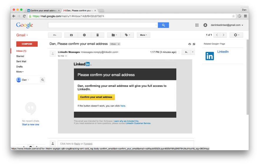
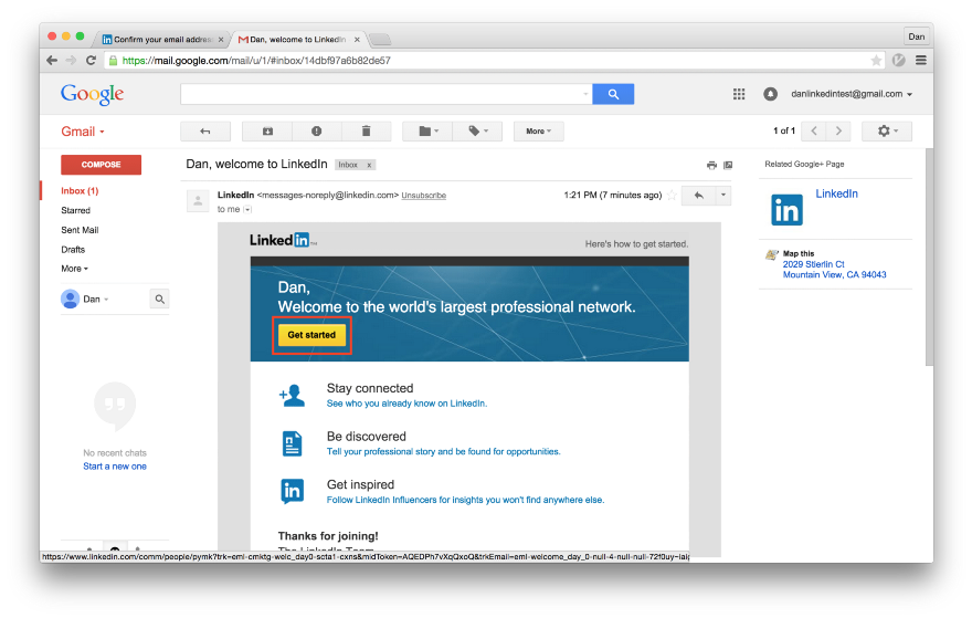
Confirmation letter
Such a letter LinkedIn sends to confirm the mailing address. If you press the yellow button, the next page opens.
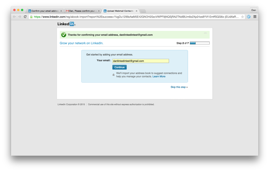
Add your email address ... Again?
The link opens a page with a success message: “Thank you for confirming your email address ...”. Next we see the form, where the “Start by adding an email address” is suggested. Do you recognize the screen? It is the same as before . When you have confirmed your mailing address, they are the third time trying to persuade you to "add" it. After the user twice explicitly missed the stage of importing the address book, it is clear that the person does not want to do this. This page is shown here just in case, when someone inadvertently clicks "Continue."
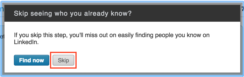
Are you sure ... again?
As before, if you click the “Skip this step” link at the bottom of the page, a pop-up window will appear confirming that you have clicked the link is not accidental.
Just to be on the safe side, it’s not by chance that you decide to skip this step past several times.
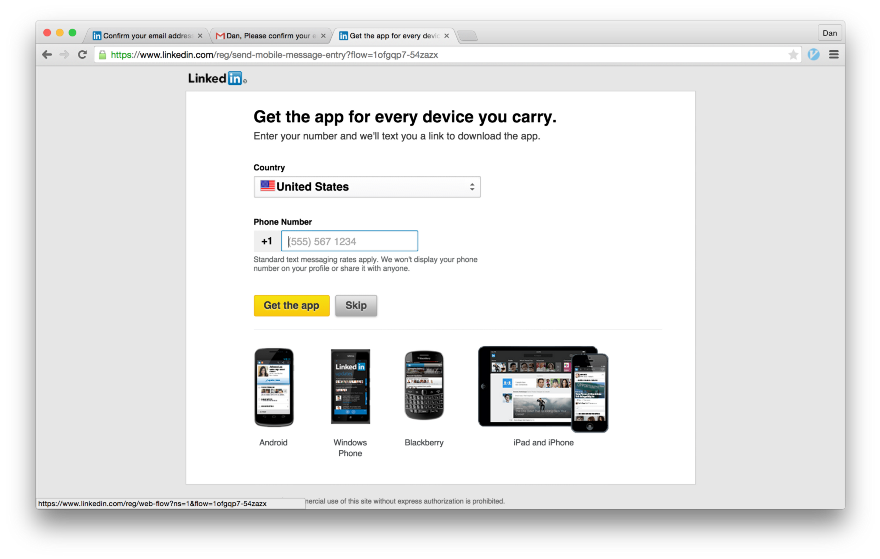
Install the application
On the next screen, they offer to send you a link to download the LinkedIn mobile app. If you could not get your address book through the web, you should try to get it through your smartphone.
Finally done
We did it, finally registered and logged into LinkedIn. The next action of the new user will be filling the profile. Depending on how you count, LinkedIn tried to import the user's address book from three to eight times. It is wrong that it is so difficult to register in the service without giving out extraneous information.
First experience for new users
In application design, the interface for new users (new user experience, NUX) refers to content aimed at ensuring that the service remains useful even for beginners who do not yet have connections on the social network. In my experience using LinkedIn, it starts with a welcome letter. Let's see how they use dark patterns to synchronize with your address book, even if you repeatedly abandoned it in the previous steps.
Welcome Letter
It looks like the “Get Started” and “Stay Connected” links lead to two different pages that do the same thing. First we follow the big yellow “Start” button, because I’m sure many will do so.
Every career needs good connections.
Surprise! Here is another attempt to import your address book. To be honest, what is happening here is explained most clearly. The subtitle says “Build your [network] by searching emails in your contacts” and there is no mention of “adding your email address”, which would cause confusion. And again we see the big blue “Continue” button, which as if begs for it to be pressed.
LinkedIn also uses traditional NUX design elements that create the impression that this is more a textbook than an attempt to get an address book. Notice the buttons in the upper right and a solid blue background. They are different from any screen we saw before and from any other LinkedIn section. Users of other mobile or web applications may get the impression that there is a learning interface for beginners, where you have to go through six screens that teach you the basics of working in the system, and at the end of the training you will start working with it. Most users are trained to click through all the training screens, and LinkedIn uses this to their advantage. If you didn’t guess, clicking on the “Continue” button will again bring up the OAuth popup window.
Do you want a good career?
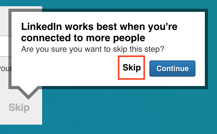
If you managed to find a button to skip the previous step, LinkedIn will ask you to confirm that you are not importing the address book. And here the blue “Continue” button in the pop-up window actually means “I changed my mind, I want to give you all my contacts”. That is, we need the “Skip” button. This is a classic dark pattern from a textbook. On the previous screen, the button to skip this step was hidden on the right, and the "Continue" button stood out on the left, where it is easier to notice. Here they were swapped, so if you found the hidden button before, now you need to change your mindset and notice that now the button is on the left. In addition, the very wording of the question is such that the answer “Continue” seems to be a more appropriate answer. For most people, this word will mean agreement when answering the question “Are you sure you want to skip this step?”. It seems unnatural that the answer “Continue” actually means a negative answer.
This popup is fantastically designed to mislead the user.
We summarize what this popup window does.
- The big blue button means "Send us all your contacts."
- We need the “Skip” link (which we have already clicked once), but it changed places with the “Continue” button, which violates the associations that were unconsciously created on the previous screen.
- The pop-up window essentially asks “Are you sure?”, While the answer “Continue” means “No”
Very clever.
NUX Remaining Parts
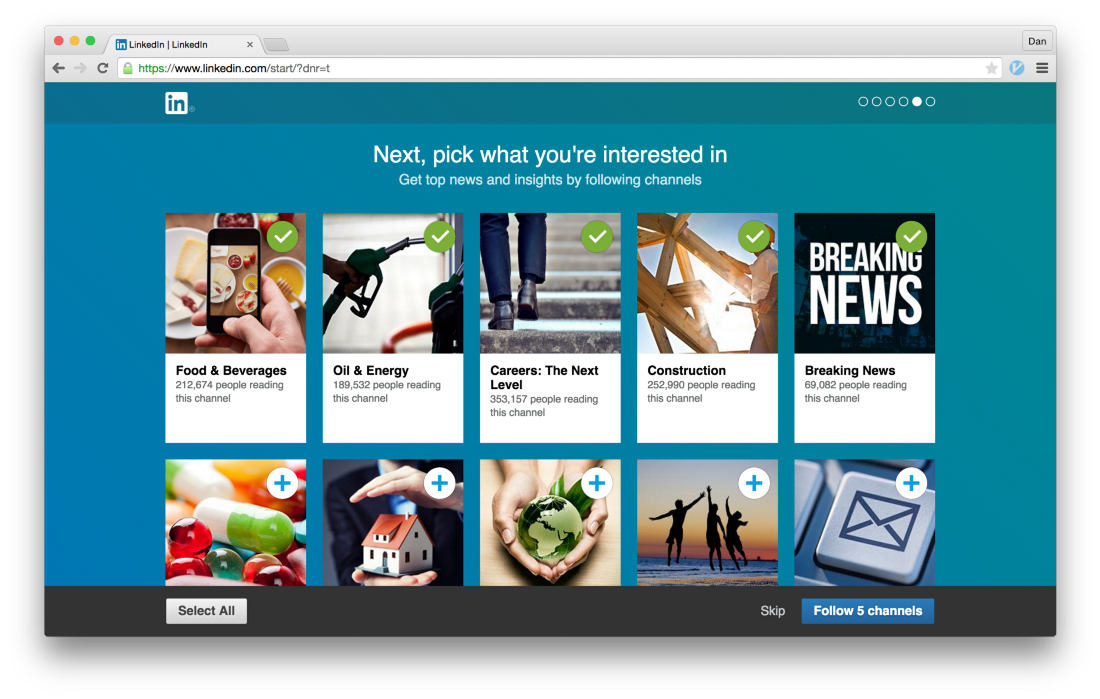
The remaining screens are harmless. If you were able to break through the previous screen and your address book was not defrauded, then the remaining NUX screens will help to establish links with companies of interest or download a mobile application.
Finished with nux?
So, we are finally done and are on LinkedIn main page. Now there is a complete mess in terms of design, but I want to draw your attention to the “Welcome, Dan!” Card with the big yellow “Continue” button. I am sure you now know where she leads.
Deja Vu, is not it?
The only consolation I see here is that the page is very littered and it is unlikely that most users will immediately follow this link. But this card will be before my eyes for a while ...
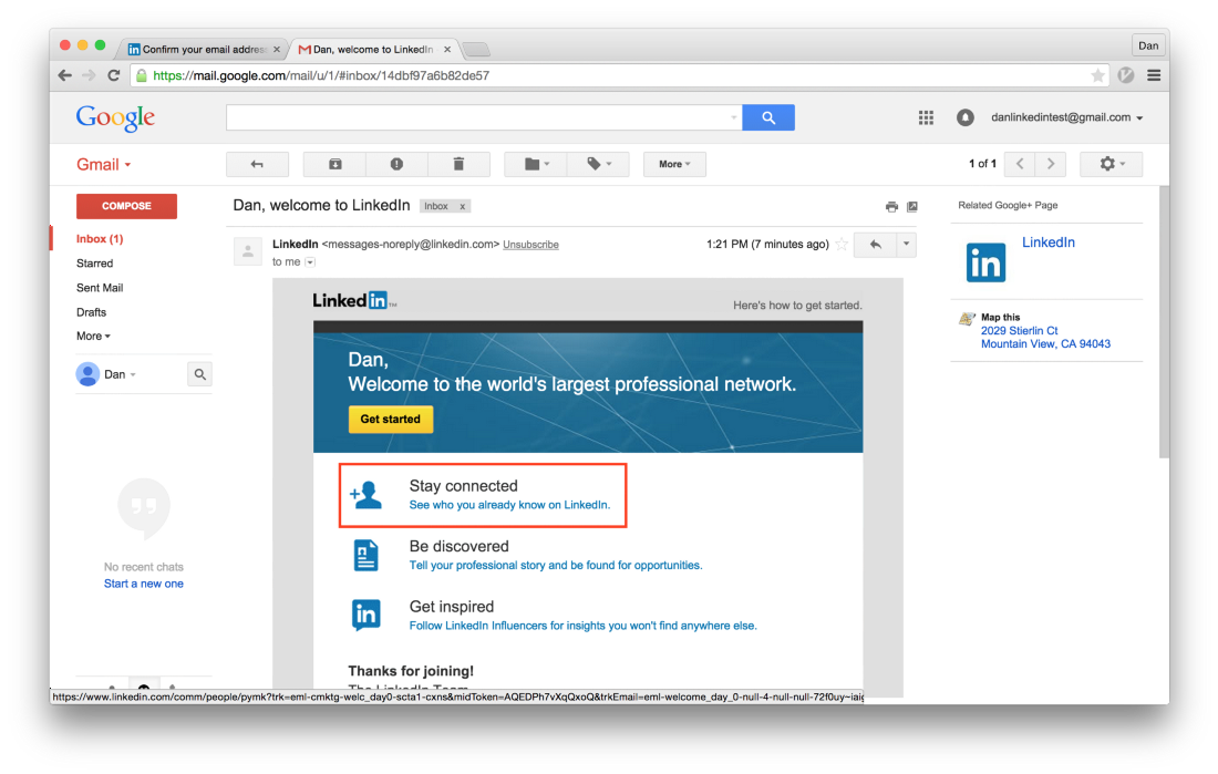
What about the other links in the welcome letter?
Remember the link "Be in touch"? It looks like it leads to a completely different screen, which also tries to import your address book.
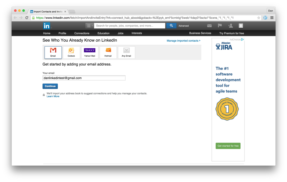
Another way to add your email address
This page is no longer part of NUX, but is a permanent page for the flow “Add your email address”. We see the same tactics that hide the true purpose of the “Continue” button.
Conclusion
I hope you now understand that if you receive spamming letters from friends with an invitation to LinkedIn, then it is LinkedIn’s fault , not your friends.
Many smart people have written about how dark patterns harm a brand and destroy user confidence . I can definitely say that the design of importing contacts on LinkedIn harms their brand, even if it is beneficial for the business in the short term. They make money on the number of connections and the number of users, so it’s profitable for users to import address books.
LinkedIn is not the only social network that uses dark patterns to build its social graph, is not the only one. But this is an extreme case when the dark patterns are used the most. They forced me to leave the service two years ago and ruined the image of the company in my eyes. Dark patterns are a bad design, and a bad design is a bad business. I think it's sad to realize that LinkedIn disagrees with that.
PSA: If you are wondering if LinkedIn imported your address book, I wrote a little tutorial on how to figure it out and delete it. See here .
Source: https://habr.com/ru/post/328554/
All Articles