How not to mess with the design. Instructions for dummies for 5 minutes
Translation " I love FE "
Anyone can learn the principles of good design. From this article, you will gain basic knowledge and practical design skills that you can apply now (and surprise your designer friends).
If you do not believe that you can learn design, just remember the words of the legendary David Grohl ( drummer in the band Nirvana, guitarist and vocalist FooFighters, ed. ) About learning new things:
I never learned to play drums. I never learned to play the guitar. I somehow got to it myself. If you really love your job, are passionate about it and are focused, you can do whatever you want.
And now, remembering these words, are you ready for our crash rate? Fasten your seat belts, we start in no particular order.
1. Use a lot of contrast
The background color and text should be quite different so as not to cause eye fatigue. Usually black text on a white background is best read. Stay away from light gray, yellow and green tones. If you have to squint to read the text, then you have problems.
')
2. Almost black is better than black
If you have a choice, try using color # 333333 RGB (51,51,51) for text instead of pure black. Pure black text on white oscillates for the eyes and does not allow to focus on the letters.

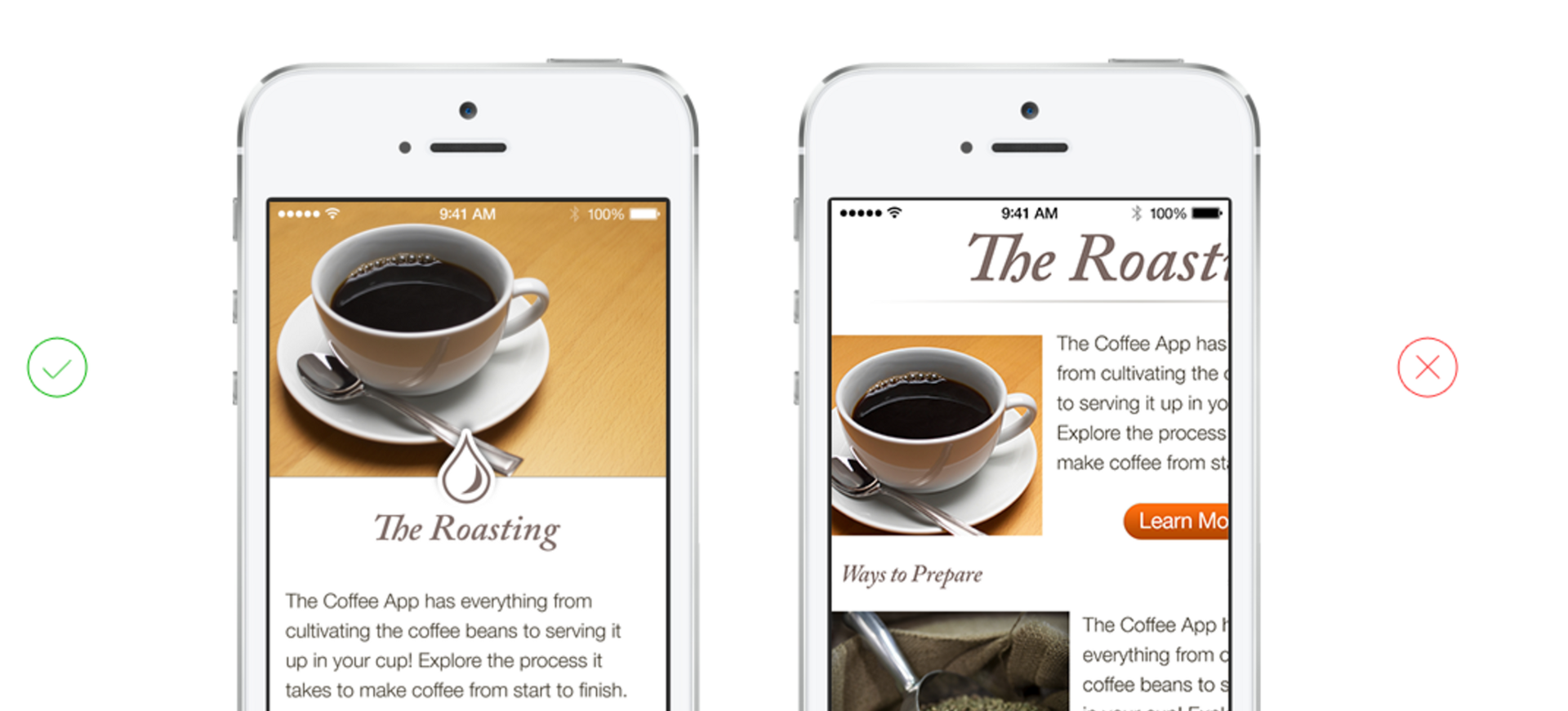
3. Important content first
Place the most important information first to describe the main purpose of your application or site. Important content should be visible without zoom, scrolling or tapes.
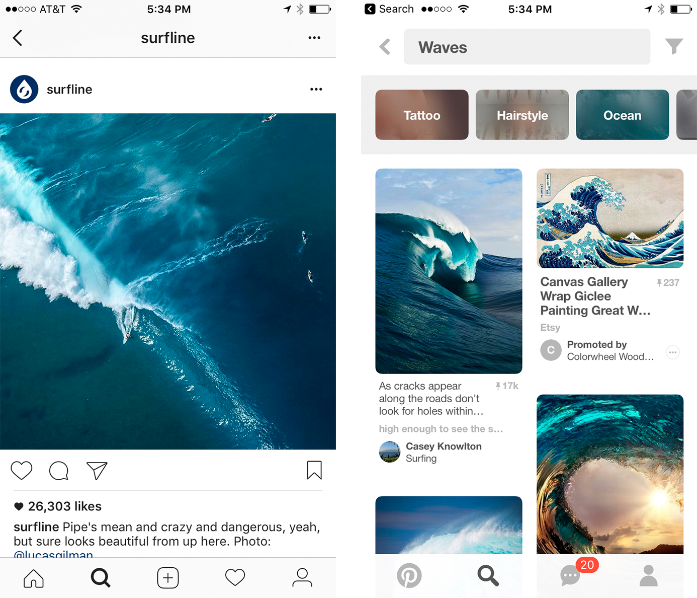
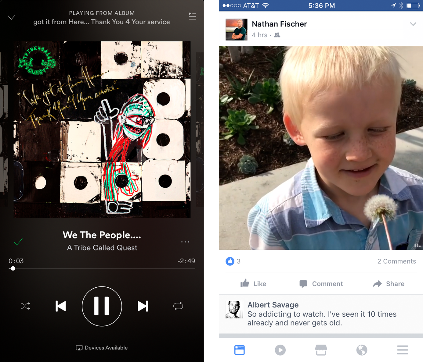
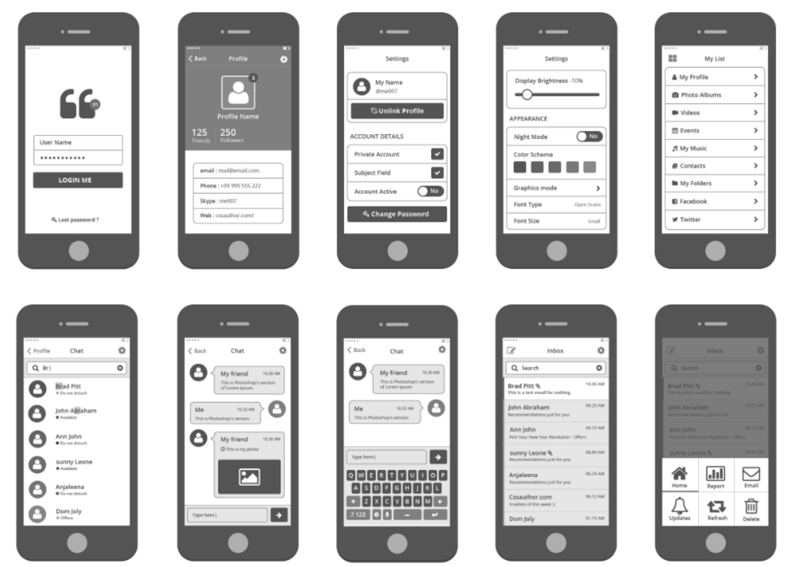
Let's look at some good examples of visual hierarchy in real life.
Instagram (bottom left) focuses on the photo / video that the user posted.
Pinterest (bottom right) starts with a search, after which there is already a beautiful grid. Pinterest does it on purpose. Search is the main function of their app, people use Pinterest to search and find visual information.
Let's look at a couple more examples.
Spotify (bottom left) focuses on the album cover and song title. Although the player control buttons are secondary, Spotify highlights the Play button.
Facebook (bottom right) is very similar to Instagram and puts the content of your friends in the first place.
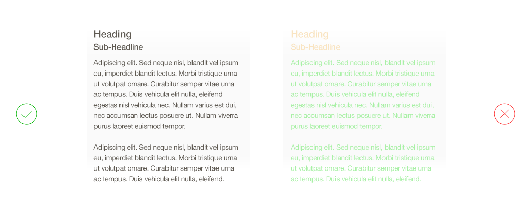
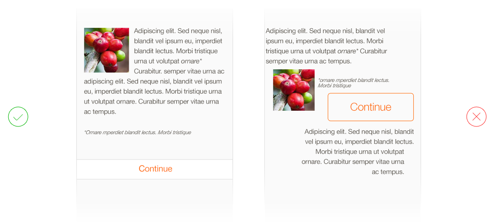
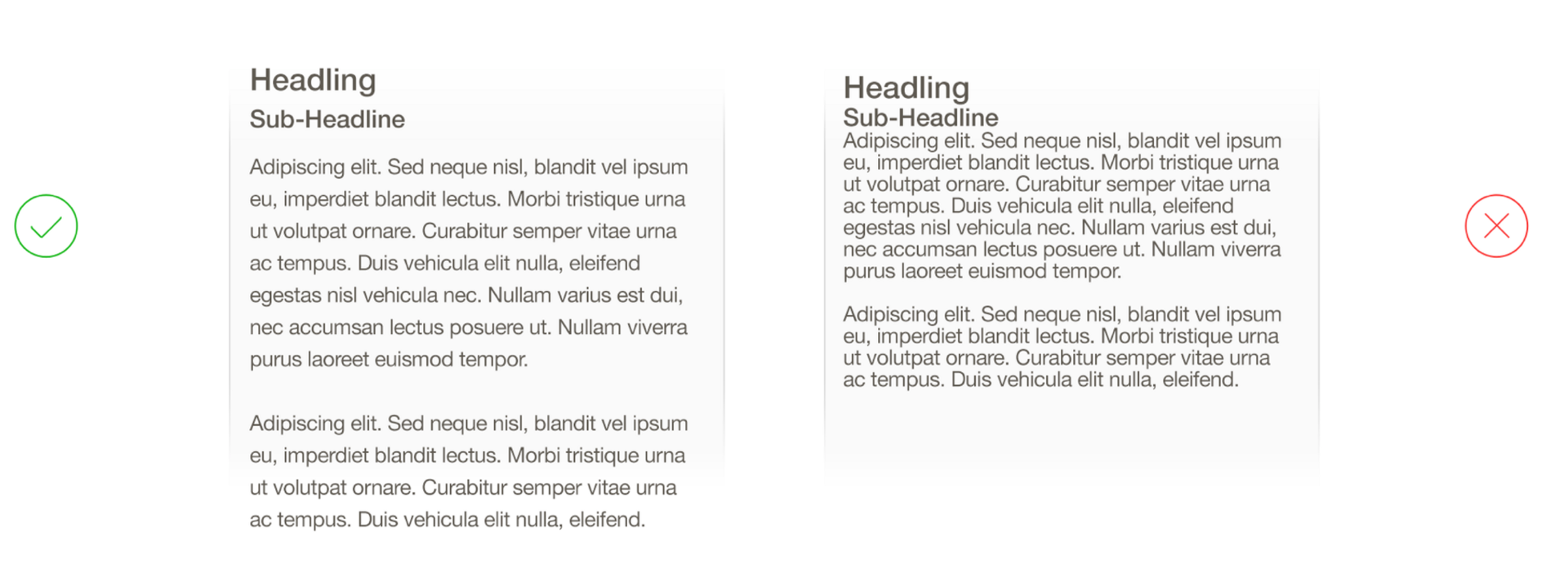
4. Align all elements.
The quickest way to fix an element that looks inappropriate or doubtful is to level it. When designers talk about the need to use a grid, they try to draw attention to the lack of alignment.
Alignment is one of the simplest improvements that can be made on the website or in an application so that they look 10 times better .
Here is another example, this time from Medium. I redesigned the layout a bit. What does he look like? Don't you think something is wrong?
Hint : notice the alignment of the left edge. In the picture on the left, I specifically highlighted his absence. On the right all the main blocks are aligned.
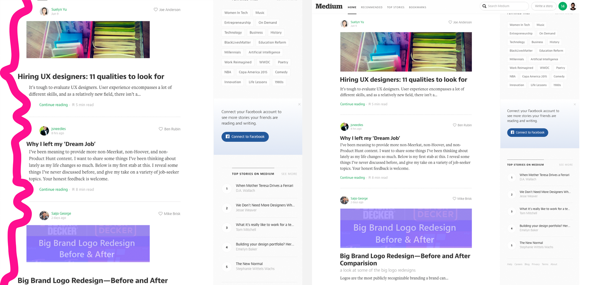
Bad alignment on the left and corrected on the right.
5. Font size and white space
We do design not for ants. By increasing the font size, your content will become much easier to read if there is enough space between the lines.
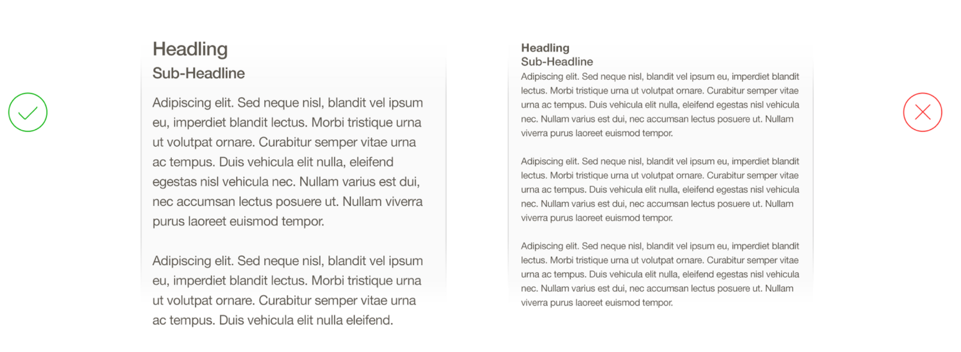
Good and bad font size
Good and bad leading
6. Use the list if order is important.
If the order does not matter and you want to inspire people to search (like Pinterest or AirBnB), then use the grid.

Looks patterns when using the list and grid
7. First make the design in black and white and add color later.
This will allow you to focus on the most important thing in your application.
Color induces a strong emotional reaction and often prevents one from concentrating on solving the main design problem.
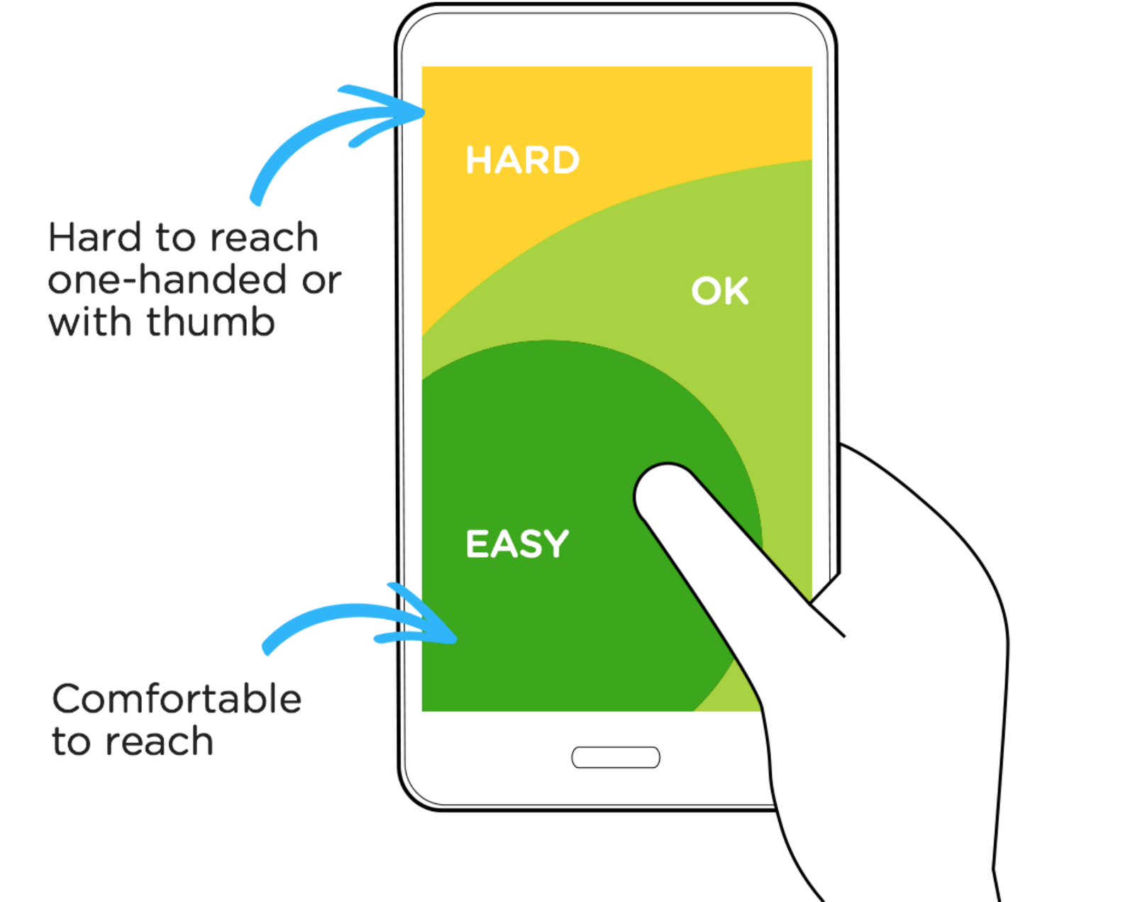
8. Create a comfortable design.
Restricting hand movements is an important issue; look at an illustration from Luke Wroblewski's wonderful article on mobile navigation .
He identifies areas that are easiest to reach with a finger ( at least for right-handers ). I would really like to see applications that make it possible to change the interface from right to left.
Many effective mobile applications have navigation and basic controls in the lower third of the mobile phone screen.
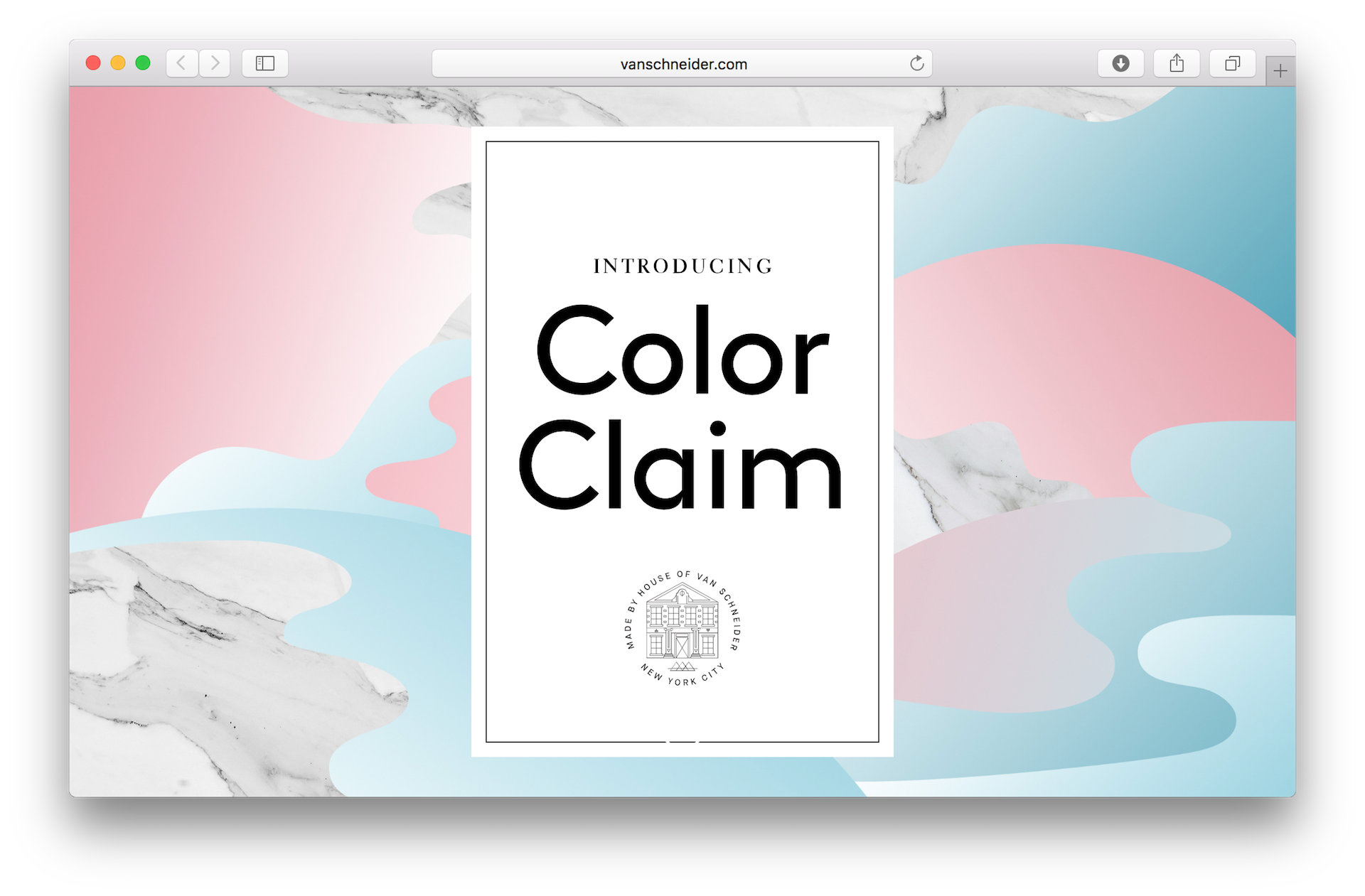
9. Use pre-made palettes.
Color is a little unattainable art. I highly recommend going to Dribbble and looking for color palettes there (“Color Palettes”). Or you can use color generators, for example, Coolors or Color Claim .
Use ready-made palettes and save yourself hours of endless arguing and guesswork .
Note Ed., here are some more sites:
- Colormind - the creation of colors based on artificial intelligence,
- Color Farm - color palettes from popular works on Dribbble,
- Color Lisa - color palettes from paintings by great artists,
- SwissColors - color palettes in the style of Swiss design,
- HTML Color Codes is a very good site for designers and developers about color, the site has an excellent tool for creating color palettes, names of colors in various versions (Hex, RGB, HSL, HTML), ready-made color palettes for Flat and Material design, tutorials on use colors and links to other helpful resources
- Color Hunt - specially selected, beautiful color palettes that are updated every day,
- Colordot is a color palette where you can explore all shades of colors with the mouse.
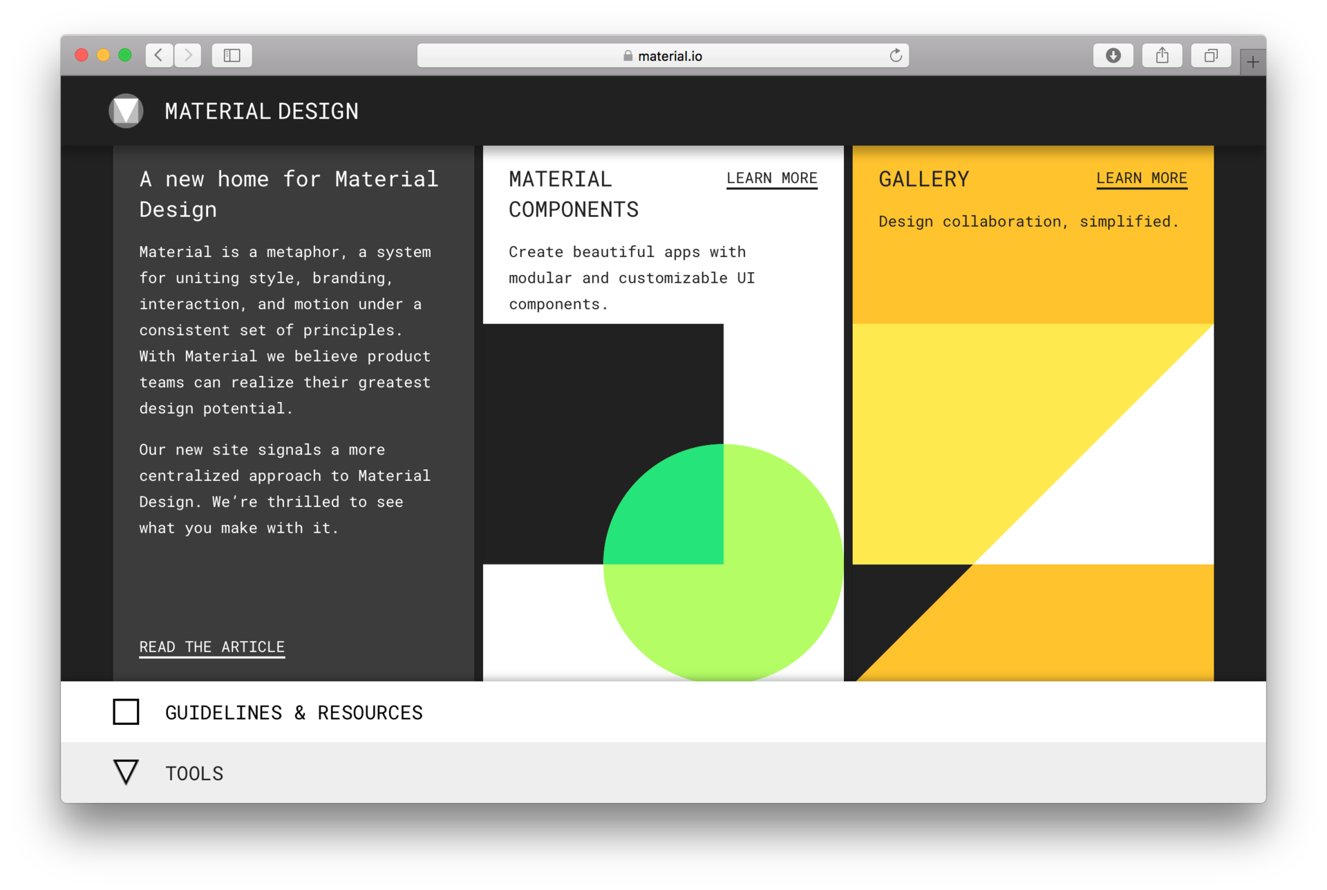
10. Use Apple and Google recommendations.
These companies have excellent resources for developers of applications on iOS or Android.
For example, Google Material Design , which contains instructions, tools, colors, icons and components that will help you get started in the design of your application.
Apple has the Human Interface Guidelines , where you will find everything you need to design an application on iOS.
Remember, the main thing is practice.
It will take time to learn how to see good design, but you will notice how these rules will help you improve your skills.
Cover at the beginning of the article lstore.graphics
Source: https://habr.com/ru/post/328492/
All Articles