As an open password field in registration forms increases conversion
It is 2017 in the yard, the Internet is flying at speeds of hundreds of megabits even from a mobile, the interfaces of the websites have become simpler, one-page landing pages, whose main task is to save people time to receive information, have become fashionable. But is there really no one who infuriates when registering anywhere a double password field with asterisks?
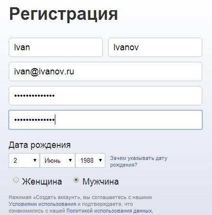
This is utter nonsense, all social networks, services, online stores reduce the registration form as much as possible, literally to “enter a name and email”, but continue to add to this two fields “Make up your password / Confirm password” by hiding it with asterisks! What for? Who are the stars from? Why is this standard still not extinct? Such thoughts have long come to our heads, but we blindly followed traditions.
This is terribly uncomfortable. First, you type your name on the Russian layout, then enter your email (which your browser substitutes for auto-completion), and then you start typing some asterisks ... And nervous, did you switch to the Latin keyboard, did not turn on caps, did you get Shift A special refinement, when you need to blindly type one field, and you need to recruit the second one more ...
')
Of course, the password in the authorization form must be hidden by asterisks.

You have to log in in different situations, from different computers, in different places. The interface of the login form can be seen by many people and they do not need to know what password is being entered ( always check the green https protocol lock in the address bar of the browser before entering your password ).
But when you first register something to hide from? We can not imagine a situation for someone to decide to register on some service at the moment when there are terrible enemies behind his back who are firing from behind his shoulders, what kind of password is invented? Even if you have to register at an online store to receive an order, not from your computer, while in some Internet cafe or public wi-fi, the password will disappear much faster in another way than someone will see from behind the back.
Therefore, the password entry field when registering on any site should be one. And it must be open! Because it is convenient, understandable, clear and fast.

Today, many are taking some steps towards convenience in this regard, but these are half measures. Someone makes the eye “show” the password, for example passport.yandex.ru/registration or my.asos.com/identity/register Someone generally makes registration only from social networks, for example vc.ru , which is clearly more convenient.
In Diafan.Cloud, we also mainly register from social networks, with one click, without entering anything. But if registration passes with a password, then we very little imagine the situation that someone will register to create a website when there is an enemy behind his back who will look at the password and then destroy the business. It is much better to enter the password when registering when it is visible.
Therefore, we abandoned the double password with asterisks on Diafan.Cloud in early October 2016. And as soon as we revealed the password in the registration form, we immediately received an increase in registrations by about 30%

Coincidence? We do not think.
This is utter nonsense, all social networks, services, online stores reduce the registration form as much as possible, literally to “enter a name and email”, but continue to add to this two fields “Make up your password / Confirm password” by hiding it with asterisks! What for? Who are the stars from? Why is this standard still not extinct? Such thoughts have long come to our heads, but we blindly followed traditions.
This is terribly uncomfortable. First, you type your name on the Russian layout, then enter your email (which your browser substitutes for auto-completion), and then you start typing some asterisks ... And nervous, did you switch to the Latin keyboard, did not turn on caps, did you get Shift A special refinement, when you need to blindly type one field, and you need to recruit the second one more ...
')
Of course, the password in the authorization form must be hidden by asterisks.
You have to log in in different situations, from different computers, in different places. The interface of the login form can be seen by many people and they do not need to know what password is being entered ( always check the green https protocol lock in the address bar of the browser before entering your password ).
But when you first register something to hide from? We can not imagine a situation for someone to decide to register on some service at the moment when there are terrible enemies behind his back who are firing from behind his shoulders, what kind of password is invented? Even if you have to register at an online store to receive an order, not from your computer, while in some Internet cafe or public wi-fi, the password will disappear much faster in another way than someone will see from behind the back.
Therefore, the password entry field when registering on any site should be one. And it must be open! Because it is convenient, understandable, clear and fast.
Today, many are taking some steps towards convenience in this regard, but these are half measures. Someone makes the eye “show” the password, for example passport.yandex.ru/registration or my.asos.com/identity/register Someone generally makes registration only from social networks, for example vc.ru , which is clearly more convenient.
In Diafan.Cloud, we also mainly register from social networks, with one click, without entering anything. But if registration passes with a password, then we very little imagine the situation that someone will register to create a website when there is an enemy behind his back who will look at the password and then destroy the business. It is much better to enter the password when registering when it is visible.
Therefore, we abandoned the double password with asterisks on Diafan.Cloud in early October 2016. And as soon as we revealed the password in the registration form, we immediately received an increase in registrations by about 30%
Coincidence? We do not think.
Source: https://habr.com/ru/post/328376/
All Articles