Tables in responsive design - 2
In continuation of the post on the design of tables , I offer examples of practical solutions that will help the user to better interact with the data in a tabular form on any devices.
Almost five years ago I wrote the post “ Data Tables in Responsive Design ”, since then much water has flowed under the bridge, new ways of displaying tables in an adaptive design have appeared.

')
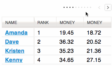
I'll start with my favorite - Responsive Tables . This is an elegant solution on jQuery and Bootstrap 3, which allows you to hide some columns (everything is customizable) or add horizontal scrolling on devices with small screens.
There is a quick option, without additional plugins and piles, which will allow all tables on the site to add horizontal scrolling with just a few lines of CSS:
It is desirable that the tables be wrapped in a DIV with " overflow-x: scroll ".
The disadvantage of this method is that there is no indication of a horizontal scroll.

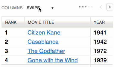
An interesting jQuery solution that has both Bootstrap and a separate version. On small screens it allows to reduce the number of columns, while showing hidden data on a click.
→ Download on GitHub or view demo

jQuery plugin that allows you to turn tables into cards on mobile devices.
→ Download on Github or watch a demo
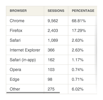
The plugin includes many different ways to display tabular data on mobile devices.
→ Download on GitHub


An example of displaying a table without using a jQuery plugin.
→ Look at Codepen .
Still there is an example on Codepen without Javascript, but using display: block and data attributes.
Implement responsive tables by adding horizontal scrolling using only CSS. Looks very good.
→ Look at Codepen
There are still ways to implement adaptive data tables, but they mostly repeat those described. Here are some of them:
Almost five years ago I wrote the post “ Data Tables in Responsive Design ”, since then much water has flowed under the bridge, new ways of displaying tables in an adaptive design have appeared.
Responsive Tables
')
I'll start with my favorite - Responsive Tables . This is an elegant solution on jQuery and Bootstrap 3, which allows you to hide some columns (everything is customizable) or add horizontal scrolling on devices with small screens.
The easiest way
There is a quick option, without additional plugins and piles, which will allow all tables on the site to add horizontal scrolling with just a few lines of CSS:
@media screen and (max-width: 640px) { table { overflow-x: auto; display: block; } } It is desirable that the tables be wrapped in a DIV with " overflow-x: scroll ".
The disadvantage of this method is that there is no indication of a horizontal scroll.
Footable
An interesting jQuery solution that has both Bootstrap and a separate version. On small screens it allows to reduce the number of columns, while showing hidden data on a click.
→ Download on GitHub or view demo
Stacktable.js
jQuery plugin that allows you to turn tables into cards on mobile devices.
→ Download on Github or watch a demo
Tablesaw
The plugin includes many different ways to display tabular data on mobile devices.
→ Download on GitHub
Example without jQuery
An example of displaying a table without using a jQuery plugin.
→ Look at Codepen .
Still there is an example on Codepen without Javascript, but using display: block and data attributes.
David Bushell Method
Implement responsive tables by adding horizontal scrolling using only CSS. Looks very good.
→ Look at Codepen
More examples
There are still ways to implement adaptive data tables, but they mostly repeat those described. Here are some of them:
- A way from the Zurb Foundation . I wrote about it in a previous post .
- Responsive Tables , by Simon Elvery.
- Patterns of adaptive tables in the directory Responsive Patterns from Brad Frost. This directory may be useful in other examples.
Source: https://habr.com/ru/post/328230/
All Articles