Design Case: MroSupply E-commerce Site
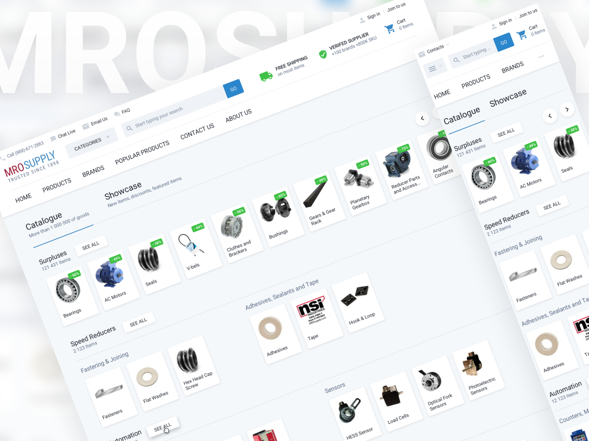
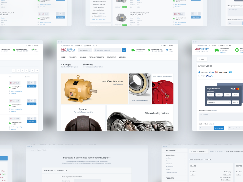
home page of the site
Case Study: MroSupply E-commerce Site
MroSupply is a company that has been selling industrial goods since 1898. The site mrosupply.com is now more than 6 years old, at the moment there are more than 200 brands and 700,000 products available for purchase. Their regular customers include brands like Coca Cola, 7up, United, Whole Foods, Hormel Foods, and many others.
What we did in this project
As part of this project, we did the entire visual part for the user. The list of works included such services as:
- Research
- Strategy
- User Experience (UX)
- Wireframing
- User Interface (UI)
- Visual Design
- Prototyping
- Guides
- Front End Development
That is, in fact, we did all the work except for Back End development, since the customer had his own team that has been working on this project for a long time.
')
Baseline or Highlights
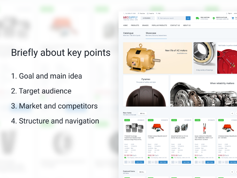
The main theses of the case
In this project, we were very lucky with the customer, he was aware of everything that is happening on the site and clearly knew what needs to be changed and what needs to be improved. The most important thing is that the customer could answer the question - why is this needed?
1. Purpose and main idea
Since the goals of the client quite often diverge from the goals of the project, we share them. This works in the case when you need to redo the finished project.
Customer objectives
Initially, the customer did not have a clear brief, there was an understanding and a list of mandatory requirements for improvement. The list included such items as:
- Update navigation by category;
- Improved UX on the three main pages of the site (product details, product listing, home page);
- Front End from the artist who makes the design;
Project Goals
Since the company and the client are actively engaged in analytics and marketing, they were interested to see the look from the outside. That is, see our Research and proposed solutions. The main ones were:
- Make a responsive version of the site
- Facilitate Registration and Checkout
- Make the design more unified, accessible, understandable
2. Target audience
The site has a rather large market. The main target audience is employees of firms that purchase equipment on stationary computers that are installed at work.
3. Market and Competitors
The market is pretty big. He has not many competitors, but their positions are quite strong. The problems of all competitors are different (delivery, description of goods, the possibility of quick clearance of goods).
4. Site structure and Navigation
The customer did not want to significantly change the navigation on the site, since it would have hit the sales a lot, this is due to the fact that the current audience of the site is not active Internet users and any changes can confuse them.
There were also several bottlenecks such as problems with complex registration and ordering on the site. These problems needed to be fixed.
Project Goals
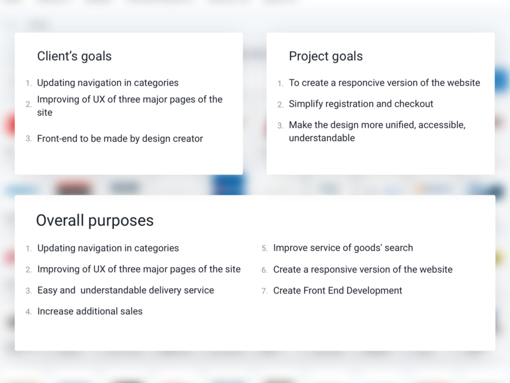
Table with the objectives of the customer, the objectives of the project and common goals
Customer objectives
The customer during the life of the project has accumulated a critical mass of problems, in terms of SEO, functionality, which no longer satisfy current requirements. It was decided to remake the site in accordance with the new goals.
1. Update navigation categories.
With the growth of the site, the number of categories has greatly increased, and the previous design could not display them in a user-friendly form.
2. Improving the UX of the three main pages of the site (product details, product listing, home page).
As it is known in e-commerce sites there are 4 key pages (home page, product listing, product page, checkout) on which users spend the most time and which strongly influence sales. The customer experimented quite a lot with the first three and he had a vision of how they should look.
3. Front End Development
One of the customer's requirements was that the front-end must be fulfilled by the artist who made the design. The customer argued his decision by saying that the contractor more clearly imagines how the project should look from a technical point of view.
Project Goals
During the research, we learned that the project has quite a few other goals that will be useful to users.
1. Responsive version of the site.
It turned out that a large number of users are sitting on a low-resolution site. The current site is designed for a minimum resolution of only 1000px, which means that users with a lower screen resolution already have difficulty using the site. Also responsive version has a very good effect on SEO promotion. Google has recently lowered the position of the site that do not have a mobile version.
2. Increase additional sales.
In the course of studying the site, we realized that in comparison with competitors, he had poorly realized additional sales.
3. Increase user awareness.
After analyzing the site, we came to the conclusion that the user is little involved in the process of buying and interacting with the site.
For example, during registration, no notification is received that a user has registered on the site. If there are no registered goods left in the basket, the site does not remind of this by mail, in order for the user to complete the product clearance. Notifications do not come in the mail after changing the status of the order.
4. Make delivery more understandable.
There are many references to the site that if you place an order for a certain amount, the delivery will be free. Users complained that for them it is not obvious how free shipping is considered. We offered the client to complete this function, it is also possible to make a mobile application in which you can see the delivery status.
General objectives of the project
Usually during the negotiations and after we provide the results of the research, the goals of the customer change in accordance with the new information. As a result, our list of goals looked like this:
1. Update navigation categories.
2. Improving the UX of all the main pages of the site.
3. Make delivery more understandable.
4. Increase additional sales.
5. Improve the search for products.
6. Responsive version of the site.
7. Front End Development.
During the dialogue, we learned some important details:
- the customer decided to remake the site to unload the call center.
- was the original goal in increasing additional online sales.
- MROsupply customers usually make purchases under two scenarios. In the first case, they simply call the support service, in the second they buy on the site using only the search when they know the exact brand and model of what they need.
The target audience
Since the variation in users in the project is very large, we decided that it makes sense to highlight the main features of the target audience.
1. Most users sit on the site with devices with low resolution.
From the customer, we learned that 11% of users sit on IE8, and also use Windows XP. Based on this information, we can assume that users buy products on the site from work devices.
2. They like to call directly to the support service in order to place an order.
The site audience is quite adult 25+.
3. Know about the site offline.
From the customer, we learned that basically the users come to the site via a direct link and use only the search.
That is, we can conclude that the audience of the site is not active Internet users. Enjoy it for a great need. They do not like to understand new technologies. They like constancy, they do not like change. The customer, for his part, made several times the emphasis on the fact that it is not desirable for us to change the structure of the site, since this can be confusing to the user.
Market and Competitors
A small clipping from Research
During the study, we found out that the industry has a large market (an average of 7 million users per month), this is mainly a business related to US light industry, such as:
- businesses related to food production;
- businesses that are associated with the creation of product lines;
- retail stores;
- design companies;
- construction companies and factories;
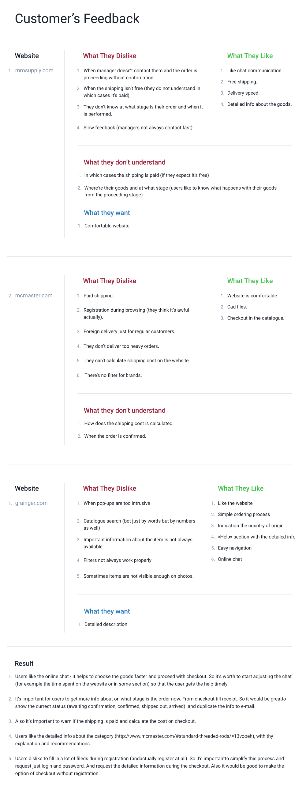
Since not much time was originally allocated for research, we managed to analyze only 2 sites that are in the top-5 industry.
These sites are very different from each other in content, but they have their own problems, advantages and disadvantages to each other.
1. The common thing between these two sites was that it was important for users to see a detailed description of the products on the site.
2. It is important for users that the delivery be transparent and calculated at the product clearance stage.
3. A lot of feedback about registration at an inopportune moment, for example, on one site you need to register to enter the site.
Site Structure and Navigation
Main screens of the site
At the request of the customer, the current structure has not changed. The customer argued his vision with several factors.
1. Current users are not very fond of change, and if they are global, then the audience may be confused.
2. This is not good for SEO. Re-indexing can greatly reduce the position of the site in the issue (now it is more than 50,000 users per month).
On the whole, the site has a fairly clear structure, but the content was arranged a bit chaotically, so we mainly worked on refining what we already have, and expanded the functionality in connection with the new requirements.
Also on the site were a few points that needed to be fixed.
The first moment was related to registration. In order to register on the site, it was necessary to fill out a huge form, which has an auto check on all fields.
Users spoke directly about what is uncomfortable. Therefore, at the first stage, we decided that the user would fill in a simple form of several fields. And after he goes to the design of the goods, offer to fill a large form with all the necessary fields. This solves two problems at once, the first is that the user does not need to bother about filling out long forms at the beginning, the second is that the site will be able to send a reminder to the user about the product left in the cart.
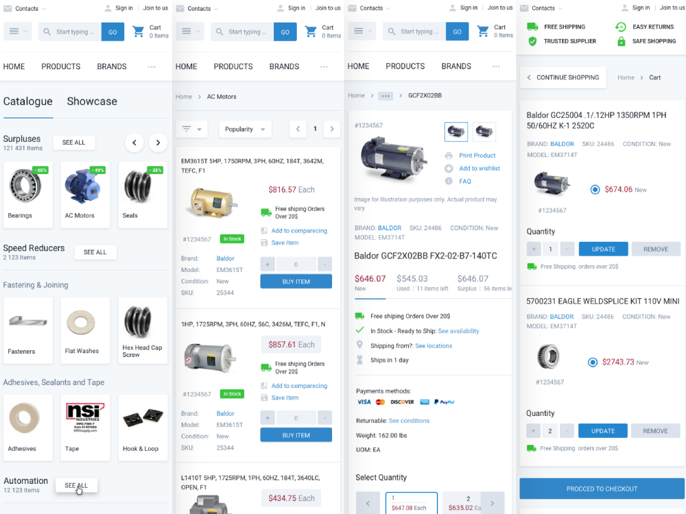
The second moment was related to the basket. Since she was not in sight, but there were a lot of goods in it, it was necessary to make sure that the user could always keep it in sight, therefore, at the request of the customer, they made it look like a jet basket, so that the user always saw a list of their goods.
Wireframing and Prototyping
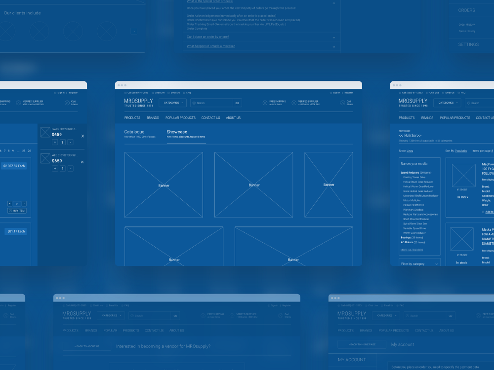
Wireframes for customer
Wireframing is one of the key steps in creating a project. At this stage, according to the data collected from the study, as well as from the customer, we are preparing a frame for the future page, with all the modifications and new functionality. In this step, we agree on all the important details of the future site.
Most of our work at this stage is related to a tool like Invisionapp. In Invisionapp, you can discuss and lead a discussion with the customer about all the visual details of the future product. The service has a fairly simple and powerful prototyping tool that helps create a linked prototype at the wireframes stage.
Design
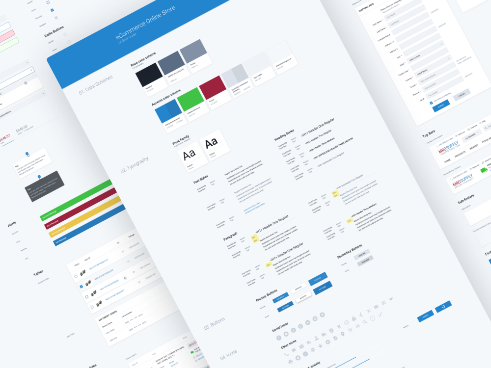
Style
Ui elements
During short negotiations with the customer, it was decided to make a site in the material style. This decision was determined by several factors.
1. The material style has its own guides that Google has created specifically for developers. If there are any loaders, errors in the design, they can be easily filled by looking at the native guides.
2. Material style is quite versatile and clear, it has standard interface patterns.
3. Material style is dynamic. Since our future site will be simple, the animation should give an additional understanding to the user about how certain functions will work.
4. Millions of people are familiar with the material. Returning to the question that the users of the site do not particularly like the changes, it is likely that they have already come across this system and for them the experience of interacting with the updated site will be much easier.
5. In the material style there are a lot of source files in the form of icons, fonts, animations. These files are of high quality and can significantly save time when creating a new design and front end parts, as well as optimize the download speed of the site.
Palette and fonts
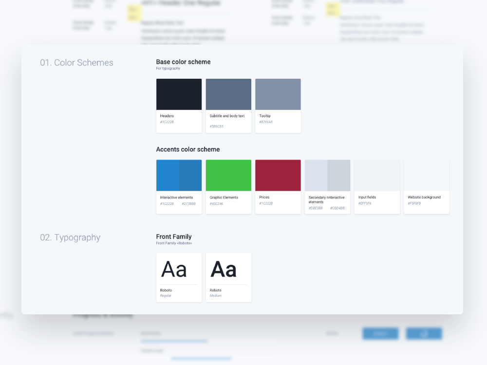
Colors & Fonts
With a palette like the font, we decided not to subtilize, we took the basic colors from the previous site, and added shades of gray to highlight accents. A new font on the site decided to choose roboto. The font is optimized for large and small resolutions and is generally quite good read.
Solution Design
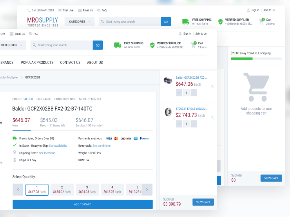
Display an empty and filled cart
At the beginning of the project, the customer said that he needed a basket like on jet.com. In this project, users ordering goods, have a large number of items in the basket. On the old site it was impossible to view and edit the cart during the purchase process. It was necessary to constantly jump between the basket and the site. We have implemented the ability to view the basket from each page. Also for users it was unclear how the delivery works on the site, we added a block to the cart with delivery so that you can clearly see how much more you need to order goods to get free shipping.
Job Search Display
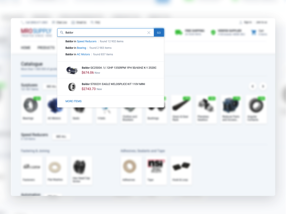
From the customer, we learned that users use on the site basically only the search and product page. We focused on these points special attention. When entering text into the search bar, the site searches for matches for all words in the product name and description, as well as in categories.
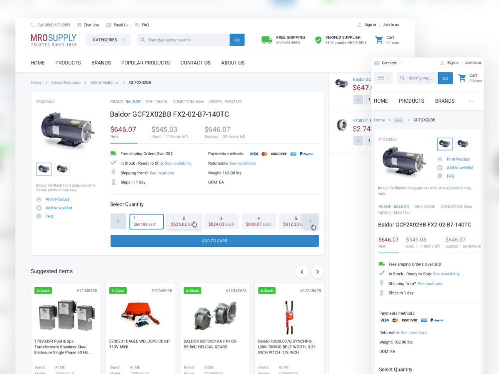
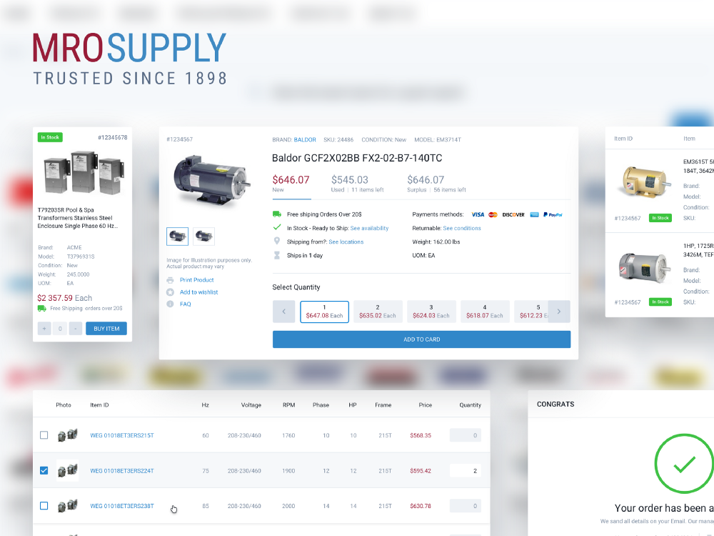
Product page
On MroSupply, the product page is the second most visited page on the site. It has undergone the greatest changes, since a lot of new functionality has been added on the page.
1. Now the site has the opportunity to buy used goods, as well as surpluses that cost significantly less.
2. One click to select the required number of products.
3. The block of alternative products has undergone some changes, now alternative products can be added directly from the product page.
We removed extra. information (on delivery, availability, availability) below in another block. The customer asked her to return to the first screen, since it covers 95% of the questions that come to the call center from users and, accordingly, this information offloads it.
Also an interesting fact was that when adding icons of payment systems that the site receives on the product page, sales increased by $ 10,000 a day.
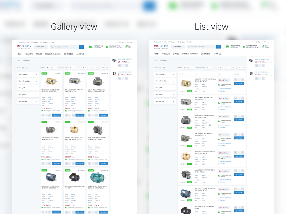
Catalog page V1 and V2
On the catalog page, the main task was to place as many products as possible on the screen. In the course of development, we arrived at two product displays, a tile and a list. When displaying tiles on the page fits more goods, but the list of goods more readable. Also now the goods on the site are listed and users are accustomed to this type.
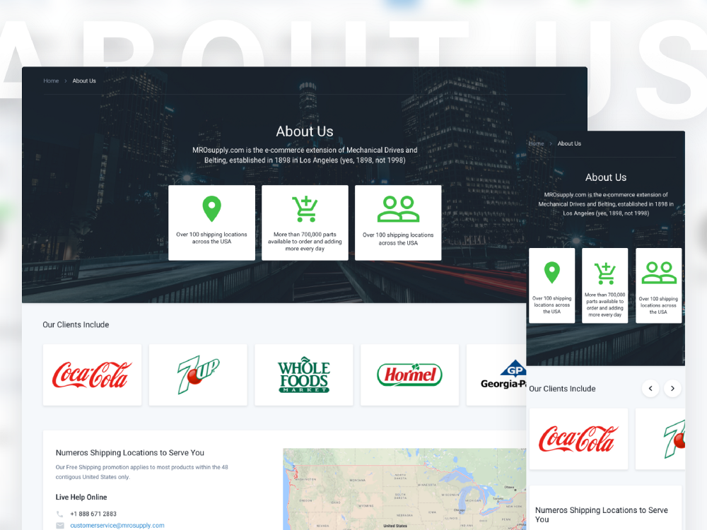
About Us page
On the site MROsupply before this information about the company was scattered across several pages and was not as visual as it has become now. Now on this page all the necessary information for users is more clearly indicated.
Mobile
Pages of the mobile version of the site
Interesting, but not a single competitor has a mobile version of the site, but there are several applications in the stores.
In our project, one of the main tasks was to make the site responsive, since it is useful for SEO, and also because many users access the site from mobile devices. The minimum width for the mobile was made to make 320px. Mobile version of the site for the functionality of 100% corresponds to the desktop.
Technical task
Guidelines for MroSupply
Traditionally, at the end of each project, we draw up terms of reference for developers. This list includes
1. Guideline with all the details of the future design.
2. Interaction with the interface in difficult places.
3. Animations of the interface for more understandable mechanics of the future site.
4. Formulas, calculations that will be used in the work.
In fact, this document should close 90% of the questions from the team that will continue to deal with this project.
In this project we did Front End development. Most of the list above is not needed. We made only a detailed Guideline on the site, so that developers have a visual file of site styles.
Instead of conclusion
By itself, this work does not end there. After the design is updated, there are always many bugs that need to be fixed. When the work on the initial corrections is completed, the process will be smoother and more systematic.
The case described above is an example of how we work in our studio. We are constantly working on this process and try to make it better, more efficient and more convenient for the customer.
We also want to mention that in this project we made the front end and are very pleased with its quality. Often, during the transfer of design in the front end to the customer team, the quality deteriorates. This, as a rule, is connected not with the skills of the team, but a lack of understanding of the mechanics of the work of the future site. Therefore, we recommend that if you do not order the front end from the same developer who made the design, then at least set up communication between designers and front end developers.
PS If you like the case or have any comments, we will be glad to hear them in the comments or write us directly on the site.
Source: https://habr.com/ru/post/327960/
All Articles