GameDev from scratch: How to communicate with the player without words
The journey through the black and white metaphorical world of the platformer OVIVO is fascinating, you are more and more immersed in the atmosphere of minimalism ... And you do not even notice that there is not a single word in the game, everything is on the level of pure intuition. Under the cut, the story of how it works and what mistakes should be avoided when creating such a game. I pass the word IzHard.
1. From the hackathon to our own game development studio: part 1 , part 2 .
2. Unity3D and vector graphics .
3. How to communicate with the player without words .
4. How to get out of chaos and start working .
Hey. Today we will tell about the design in OVIVO, which, despite its simplicity, hides behind itself a lot of hard work and tests. We will talk about how levels were created, and how in a monochrome minimalist game we communicated with a player and taught him mechanics.
')
Our goal was to create a game that would appeal to people who equally appreciate the aesthetics of minimalism and unusual gameplay in games. To implement it, as mentioned in the previous article , we limited ourselves to three rules - use three buttons , two colors, and not a single letter . We were guided by these rules throughout the development, which helped to sift out unviable ideas and focus on the main thing.
The most difficult was the creation of levels. Each of them took from one to three months.
The environment in the game can be divided into two categories:
In other words, we created some parts of the graphics exclusively for the gameplay, and the rest in order to please the eye of the player.

First, the game designer works on the logic of the level and the tasks that the player has to face. At this stage, it is important to write down the thesis how the level looks for the player, his dynamics, alternation of complex and simple tasks, take into account the growth of the player’s skill, and what sensations he should experience at different stages of passing.

Further, the game designer draws up a technical task for the artist in order to convey to him his vision of the level.
It is very important to correctly describe the tasks at the level. For example, in some areas of the level, gameplay is important, and they need to work out the convenience of passing obstacles for the player, and on others to focus on more spectacular art, since the player must take a break from a difficult task.

The artist's task is to draw a future level on paper, based on the concept of a game designer. It is also worth agreeing on how to name the resources in the project. This will speed up and simplify the process of assembling the level in the game engine, especially if several people are engaged in it.
As soon as the whole team approves the level and makes all the changes, the artist draws the final version in the graphic editor and imports the resources into the game engine.

It would seem that this work is completed. But in fact, it is just beginning.
As soon as you start testing the level on a real player, and not on the person from the team, you will immediately understand all your mistakes. For us, this was a complete surprise - "How so? Don't you see the obvious? ” But as soon as you begin to look through the eyes of a player, not a developer, you understand how many problems you have.
In our case, we have identified three main problems:
And found such solutions:
After a number of brainstorms we decided to do this:
Step 1. Design the platforms in the game so that they indicate the direction in which the player should move. In the screenshot below, you can see that the black platform is pointing to the right. This makes the player understand that you need to move to the right.

Step 2. Place the small collected points on the level. Initially, we did not want to add the collected objects, since we do not consider this to be the goal of the game and do not want the players to think so. But, nevertheless, with the help of points we solved several problems at once:

To this we walked long and hard. Each new idea was tested on players until it came to an optimal solution. Of course, there were other ideas, for example, to make explicit direction indicators: arrows at the level, an indicator at the edges of the screen. But we did not want to add such obvious things in order not to disturb the style of the game. Each level was changed 2-3 times, and the tutorial was altered 10 times, since its importance cannot be exaggerated, especially in a game with unusual mechanics and without text.
Nobody likes tutorial . Players do not like him, because they feel that they are being held for fools. The developers don't like it - “How does someone not understand our game that we play every day? Are they fools? ”- and therefore they do it without much desire, and even at the last moment. As a result, the tutorial will not be created until the entire project is ready.
But he is needed . And for us it became a real problem. How to explain to the player that the game has the laws of physics, without words and without clogging up the visual style?
At first our decision was: “But nothing! We are artists, we see it. ”
This led to the fact that when we showed the game on the showcase, no one could go through it without additional explanations. Particularly diligent players reached a maximum of level 2. If we wanted to make a hardcore game like Super Meat Boy, then we would have left everything (but even there is a “tutorial”).
I had to pay special attention to this problem.
We really wanted to give the player the opportunity to study the game himself and understand its mechanics by trial and error. After all, this is the whole buzz when you independently discover something new.
But what about those who did not understand the mechanics?
The article Tutorial how to learn helped to understand this, in which, figuratively speaking, the players were divided into two categories: researchers and theorists .
With researchers, everything is clear - they explore the game. But theorists need to show that yes how, and give it a try. They will pass the game further when they are convinced of their abilities. We had to work with them.
It was decided to make the tips optional and show them when the player finds it difficult to pass. When a player dies on the first difficult obstacle, it is possible to use the hint. But you can also ignore it and try to go through by yourself, which is important primarily for research players.

On this topic there is a good article that talks about several ways to train a player.
So, we come to the main thing - communication with the player through the interface.
We wanted to make it simple and intuitive, but at the same time use interesting features. Several times we thought through the menu logic with several windows, but we managed to make it as simple as possible.
The interface is presented in the form of Mandala (below in undisclosed form so as not to spoil). It serves as a level map and main menu at the same time.
Interface logic:

Interface - Mandala:

Mandala Functionality:
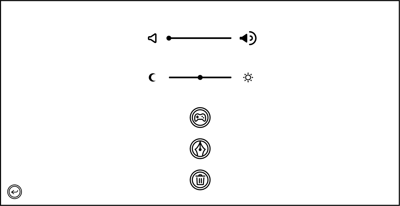
After entering the settings, the player sees the symbols denoting the management, authors, and removal of progress, as well as adjusting the volume and tone of white from cold to warm.
We made it possible to change the tone so that the player did not get tired of the contrast of black / white and could comfortably play at night.
This is the menu screen:
These are the tone settings:
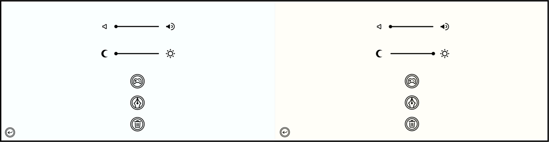
By clicking on the symbol meaning control, the player sees the image of the keyboard and gamepad, as well as the disjunction sign (“or”).

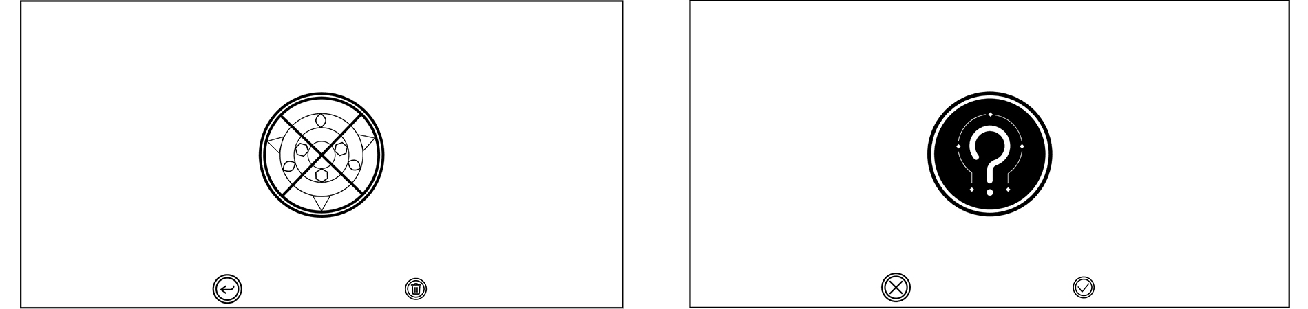
We are faced with the difficulty of creating a clear symbol of erasing level progress. This is an important and dangerous function in the menu, since if the player does not understand the meaning of this button and erase his progress, it will bring a big bad hurt. Therefore, the first window of this function notifies the player what will happen if he presses the “erase” button, and the second window asks if he really wants to erase the progress.
During the passage of the level, the player can open a menu in which it is possible to change the settings, continue the game or go to the mandala. It also provides information on progress at the level.
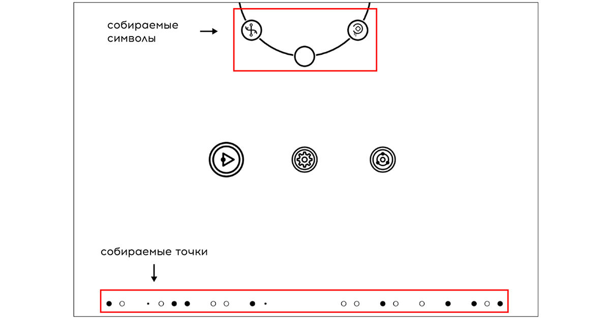
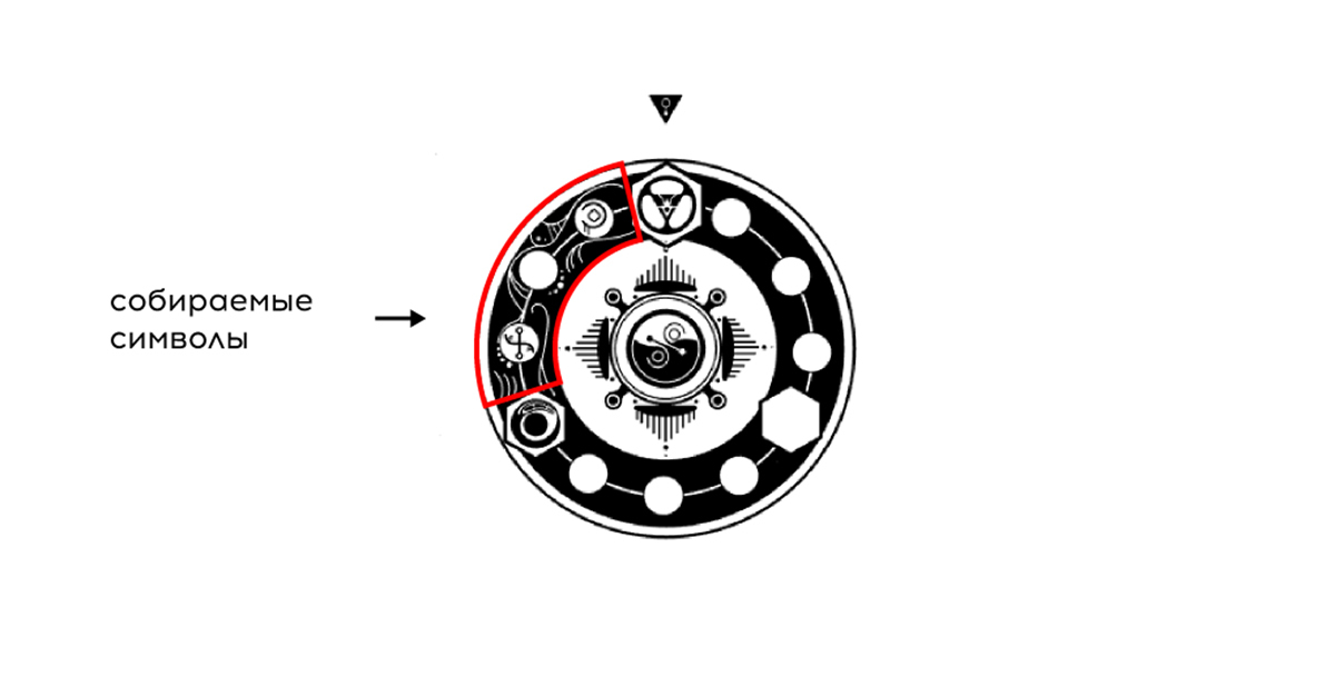
We paid special attention to the progress of passing each level. The player has quick access to information such as: the number of characters collected (out of three at each level) and the number of points collected at levels. Collected characters are displayed on the Mandala itself, as well as in the menu of each level separately.
The player sees information about the number of points collected on the image of the level preview and in the menu at each level.

Summarizing, we can say that the process of interaction of the game with a person needs to be thought out no less than the game itself.
Based on the experience of developing OVIVO, below we wrote a few tips:
That's all. We hope that this article was useful for you and we are waiting for your questions and comments.
PS And this is the last trailer for OVIVO. The release is just around the corner. =)
The series of articles "GameDev from scratch"
1. From the hackathon to our own game development studio: part 1 , part 2 .
2. Unity3D and vector graphics .
3. How to communicate with the player without words .
4. How to get out of chaos and start working .
Hey. Today we will tell about the design in OVIVO, which, despite its simplicity, hides behind itself a lot of hard work and tests. We will talk about how levels were created, and how in a monochrome minimalist game we communicated with a player and taught him mechanics.
')
Creating levels
Our goal was to create a game that would appeal to people who equally appreciate the aesthetics of minimalism and unusual gameplay in games. To implement it, as mentioned in the previous article , we limited ourselves to three rules - use three buttons , two colors, and not a single letter . We were guided by these rules throughout the development, which helped to sift out unviable ideas and focus on the main thing.
The most difficult was the creation of levels. Each of them took from one to three months.
The environment in the game can be divided into two categories:
- An interactive series of platforms on which the player advances to the finish.
- Graphic ryushechki, which are shown both in the course of passage, and in the final.
In other words, we created some parts of the graphics exclusively for the gameplay, and the rest in order to please the eye of the player.
A little about the process of developing a separate level
First, the game designer works on the logic of the level and the tasks that the player has to face. At this stage, it is important to write down the thesis how the level looks for the player, his dynamics, alternation of complex and simple tasks, take into account the growth of the player’s skill, and what sensations he should experience at different stages of passing.
Further, the game designer draws up a technical task for the artist in order to convey to him his vision of the level.
It is very important to correctly describe the tasks at the level. For example, in some areas of the level, gameplay is important, and they need to work out the convenience of passing obstacles for the player, and on others to focus on more spectacular art, since the player must take a break from a difficult task.
The artist's task is to draw a future level on paper, based on the concept of a game designer. It is also worth agreeing on how to name the resources in the project. This will speed up and simplify the process of assembling the level in the game engine, especially if several people are engaged in it.
As soon as the whole team approves the level and makes all the changes, the artist draws the final version in the graphic editor and imports the resources into the game engine.
It would seem that this work is completed. But in fact, it is just beginning.
Level problems in OVIVO
As soon as you start testing the level on a real player, and not on the person from the team, you will immediately understand all your mistakes. For us, this was a complete surprise - "How so? Don't you see the obvious? ” But as soon as you begin to look through the eyes of a player, not a developer, you understand how many problems you have.
In our case, we have identified three main problems:
- Some levels were too difficult.
- The player thought that checkpoints were collected objects.
- The player is lost on the level and does not understand in which direction to move him.
And found such solutions:
- The difficulty is slightly diminished: reduced the length of the level and abandoned some additional mechanics.
- We spent a lot of time on checkpoints, but in the end we decided to abandon them, because they did more harm than good. First, we never managed to explain to the player that checkpoints are not any enemies or objects of interaction. The player tried to collect the checkpoint, which, of course, he did not succeed and delivered badhert. Secondly, the idea failed so that checkpoints also served as direction indicators for the player. In the end, getting rid of checkpoints was one of the best decisions we made.
- What to do with the fact that the player is not clear where to go? This was exactly the work on thinking over the level design.
After a number of brainstorms we decided to do this:
Step 1. Design the platforms in the game so that they indicate the direction in which the player should move. In the screenshot below, you can see that the black platform is pointing to the right. This makes the player understand that you need to move to the right.
Step 2. Place the small collected points on the level. Initially, we did not want to add the collected objects, since we do not consider this to be the goal of the game and do not want the players to think so. But, nevertheless, with the help of points we solved several problems at once:
- They gave the player to clearly understand in which direction to move on the level.
- Added an additional and very familiar task for the player - the collection of objects.
- The points are displayed in the pause window, so the player sees at what stage of the passage he is at.
To this we walked long and hard. Each new idea was tested on players until it came to an optimal solution. Of course, there were other ideas, for example, to make explicit direction indicators: arrows at the level, an indicator at the edges of the screen. But we did not want to add such obvious things in order not to disturb the style of the game. Each level was changed 2-3 times, and the tutorial was altered 10 times, since its importance cannot be exaggerated, especially in a game with unusual mechanics and without text.
Tutorial
Nobody likes tutorial . Players do not like him, because they feel that they are being held for fools. The developers don't like it - “How does someone not understand our game that we play every day? Are they fools? ”- and therefore they do it without much desire, and even at the last moment. As a result, the tutorial will not be created until the entire project is ready.
But he is needed . And for us it became a real problem. How to explain to the player that the game has the laws of physics, without words and without clogging up the visual style?
At first our decision was: “But nothing! We are artists, we see it. ”
This led to the fact that when we showed the game on the showcase, no one could go through it without additional explanations. Particularly diligent players reached a maximum of level 2. If we wanted to make a hardcore game like Super Meat Boy, then we would have left everything (but even there is a “tutorial”).
I had to pay special attention to this problem.
We really wanted to give the player the opportunity to study the game himself and understand its mechanics by trial and error. After all, this is the whole buzz when you independently discover something new.
But what about those who did not understand the mechanics?
The article Tutorial how to learn helped to understand this, in which, figuratively speaking, the players were divided into two categories: researchers and theorists .
With researchers, everything is clear - they explore the game. But theorists need to show that yes how, and give it a try. They will pass the game further when they are convinced of their abilities. We had to work with them.
It was decided to make the tips optional and show them when the player finds it difficult to pass. When a player dies on the first difficult obstacle, it is possible to use the hint. But you can also ignore it and try to go through by yourself, which is important primarily for research players.
On this topic there is a good article that talks about several ways to train a player.
Interface
So, we come to the main thing - communication with the player through the interface.
We wanted to make it simple and intuitive, but at the same time use interesting features. Several times we thought through the menu logic with several windows, but we managed to make it as simple as possible.
The interface is presented in the form of Mandala (below in undisclosed form so as not to spoil). It serves as a level map and main menu at the same time.
Interface logic:
Interface - Mandala:
Mandala Functionality:
- level selection;
- observation of progress in the game (drawing a mandala from the passed level to the next);
- Menu buttons: continue the game, settings and exit.
After entering the settings, the player sees the symbols denoting the management, authors, and removal of progress, as well as adjusting the volume and tone of white from cold to warm.
We made it possible to change the tone so that the player did not get tired of the contrast of black / white and could comfortably play at night.
This is the menu screen:
These are the tone settings:
By clicking on the symbol meaning control, the player sees the image of the keyboard and gamepad, as well as the disjunction sign (“or”).
We are faced with the difficulty of creating a clear symbol of erasing level progress. This is an important and dangerous function in the menu, since if the player does not understand the meaning of this button and erase his progress, it will bring a big bad hurt. Therefore, the first window of this function notifies the player what will happen if he presses the “erase” button, and the second window asks if he really wants to erase the progress.
Level settings
During the passage of the level, the player can open a menu in which it is possible to change the settings, continue the game or go to the mandala. It also provides information on progress at the level.
We paid special attention to the progress of passing each level. The player has quick access to information such as: the number of characters collected (out of three at each level) and the number of points collected at levels. Collected characters are displayed on the Mandala itself, as well as in the menu of each level separately.
The player sees information about the number of points collected on the image of the level preview and in the menu at each level.
Conclusion
Summarizing, we can say that the process of interaction of the game with a person needs to be thought out no less than the game itself.
Based on the experience of developing OVIVO, below we wrote a few tips:
- Weed out unviable ideas, even if they seem very cool.
- Do not be afraid to exclude the standard for your genre elements in the game. If you can see that you cannot successfully visualize one or another element - discard it.
- The reaction of a person to the game is difficult to predict, especially if you are a novice. It is better to do more tests and adapt to the player than to base only on the experience of other developers.
- When conducting tests, be guided by the majority opinion. No need to take into account all the advice of the players, the UI may get too voluminous.
- Help the player understand the game with all the attributes that you have. Use mechanics, visual and audio support to tell him what to do.
- Aim to simplify the interface. The fewer transitions the interface windows should a player make, the less likely it is to get confused in your interface.
- Show more than telling. Visual information is faster absorbed by the player.
- Do not try to adapt to all groups of players. Highlight your main audience and focus on it. There are always people who do not understand something.
That's all. We hope that this article was useful for you and we are waiting for your questions and comments.
PS And this is the last trailer for OVIVO. The release is just around the corner. =)
Source: https://habr.com/ru/post/327786/
All Articles