Apple Music: not trying to hide the pain
When I began to develop the direction of testing at the Live Taiping company, I did not think that the professional deformation would take root so deeply that I would start looking for bugs even where I was not asked. Against this background, the following happened: I cannot work with the Apple Music application. Without cramps, of course. And without bewilderment, like Apple, a respected company that sets the tone in design and development, can make such mistakes and not follow its own guidelines. I actively use music services, and comparing their usability is not in favor of Apple Music.
In this publication, I want to remove the stone from the soul and describe the main shortcomings of the application. Using them brought me enough pain to take up the article. And, as it turned out during the study of the topic, not to me alone.

In June 2016, The New Yorker published an article from Om Malik, the founder of GigaOm , in which he complained that Apple primarily deals with devices, and uses the same approach when developing software.
')
Also, the poorly crafted design of the desktop version was complained by the founder of the design studio Hologram Tom Kozik:
Let's see what we have now. Describing some problems, I will compare Apple Music with competing Spotify and Yandex.Music, which, if running ahead, are much better off.

The pain begins immediately after registering a new user. The user is invited to choose genres and artists to taste. The problem is that the list of preferences is literally a dump of circles with text to tap. This is inconvenient for several reasons:


In the end, you want to either skip this stage because of the chaos and overload on the screen, or to complete, without really going into details, which in the future will affect the recommendations of the application, which are not always accurate.
For example, the list of artists and preferences somehow formed. Now it can be found in the corresponding section in the profile and edit it if desired. Only here is bad luck: if you are not interested in chanson and Oxxxymiron and you deleted them at the registration stage so that you will never encounter them again, then when editing the list, the corresponding circles will appear again. As a result, the process looks like filling in preferences from scratch, and the only thing I want to do is to close this screen and never open it again.
At the same time, restrictions on the content can be disabled on the device and the content with offensive language will be available. At the same time, the application does not say anywhere how to restrict access to such content. It was possible, for example, when clicking on the E icon, to show the user an alert with text explaining where and how to include the necessary restrictions — this is true, for example, for parents. Although, if restrictions are enabled, then when you try to listen to the explicit-song, the user will be instructed how to turn off the restriction of unwanted content.
With slow internet, the screen simply displays an empty area. One gets the impression that either the application is stuck or you need to take some more actions to get to the songs. Recall that Apple's guideline says about downloading content:
Show content as soon as possible. Seeing what they’re looking for.
And what about the situation when it is temporarily unavailable:
Show the screen immediately where it’s not.
In fact, you can see the non-compliance: the application seeks to show content as quickly as possible, but at the same time some of this content (and the main one is songs) is not yet loaded and there is no loader or text explaining that the download is in progress.

Sometimes this leads to a random slip. In Yandex.Music, this problem was solved successfully: the pause and playback button is on the left in front of the album cover, and the toggle button is replaced by a context menu button, through which all necessary manipulations with the track are performed. Switching the tracks themselves is done via a swipe left-right along the widget itself - convenient and intuitive.


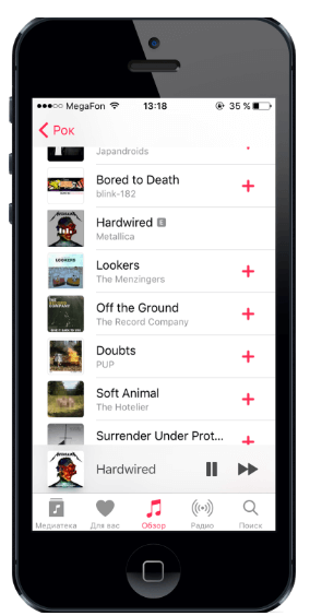
Each addition of a song to the library is accompanied by a huge “Added” pop-up. Although it does not preclude the possibility of immediately adding the following songs, popup overlaps the icons on popular iPhone SE. It seems that while the pop-up is on the screen, the songs are inaccessible. Slightly reduce this popup - and it would no longer be so annoying. In my opinion, changing the icon from the “+” sign to the cloud sign fully reflects the fact that the song was added.
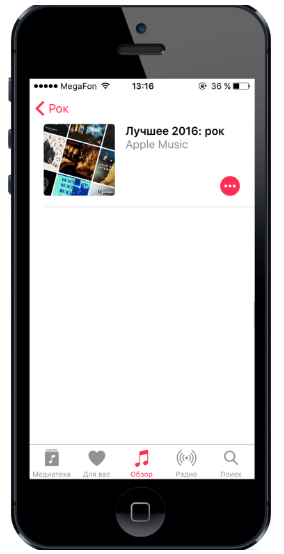
For each collection, you can see the performers whose songs were in the playlist, but it often turns out that one or two artists are not listed.
In the section “My playlists” there are folders already created by the system, which are:
They want to hide down, but sorting it can not do. Sorting by playlist type always brings them up. Bottom line: to get to your playlists, you need to skip unnecessary ones.

Apple Music offers two search modes: on the basis of the application and on its library. If the user forgot to switch from one mode to another, which happens quite often, then it is likely not to find what you are looking for. The same approach is used in Yandex. Music (probably, Apple Music served as an example). In Spotify, the search is always global, and if the user tries to add a track that he already has, the application will warn about it. If you need to search for something in your music collection, then in each of the sections (songs, artists, playlists, etc.) there is your own search.

The localization did not take into account the length of words in other languages, which is why such clumsy abbreviations occur. It is clear that the use of labels instead of icons is more informative, but if the application is multilingual, such situations are important to consider. The problem could be solved by decreasing the size depending on the size of the screen, or transfer by syllables.

This is again the problem of specific languages in which some words may be longer than the English source code. In Spotify, this problem is solved by the fact that the name and description are under the card and, if necessary, a line break is used.


This alert pops up infrequently, because the bug was probably missed. Also in the Russian localization, this alert makes you think about the meaning of each action and drives it into a stupor. It is worth avoiding confusing formulations and checking the display of all the alerts of the application, especially if devices with small screen sizes are supported.

In addition to the artists and groups selected during the preference selection stage, you are automatically subscribed to those who:
a) was uploaded to the device via iTunes;
b) added to the "Media Library" from the archives of Apple Music.
But at the same time, some artists that you listen to regularly are not added to the list.
The application itself decides what the user needs to track and what does not.
In the section of tracked artists next to the symbols “+” (subscribe) and “-” (unsubscribe) there is an @ symbol. This gives me a clear association with the email. Therefore, I thought for a couple of minutes how the tracking happens: will it be unnecessary emails to me or will the tracking still occur inside the application? It turned out that tracking is a tape of tweets of specified artists inside the application.
The artists who follow the user consciously follow this tape. And only in this case, he sees this symbol on the button and in the future understands what he means. But if the user doesn’t follow anyone, then the first contact with the symbol threatens to end in the same misunderstanding as mine. Avoid anything that is interpreted in two ways and confusing. In this case, plus and minus would be enough.
The name of the switch "Automatically follow the news" does not fit on the screen. You can replace it with “Track News” and get rid of the reduction. This is again a question of localization.

There are two problems on the profile screen at once:

More precisely, it is there, but only in the lock screen widget and in the modal window, which must be additionally called. It is clear that it is more convenient to rewind on a large window, but it is convenient to know how much is left until the end of the song - after all, this is recommended by the guidelines, and the creators of Yandex.Music and Spotify understood.

On the screen of the artist there is no button “Listen to all” or something like that. You can listen to a top compilation, a separate song or album, but there is no possibility to put all the songs of the author on reproduction, and in the top compilation the desired song may not be.
When you go to the next song in the playlist, it does not scroll so that the song is on the screen. This makes it difficult to view the next track if the list is long.

While all the interactive elements of the application are pink, there are two green elements on the playlist creation screen: the active switch and the add music button. It looks weird.

It is not clear why not in all cases there is a selection of color. On the profile screen, the “Alias” placeholder was red in color, hinting that it was clickable, and the “Name” and “Description” playlists on the screen to create a new playlist were gray.
In general, this is the standard behavior for iOS: first give us your card details, even if you don’t want to buy anything, and then do what you want. But this causes a subconscious fear: will they save money without my knowledge? And it’s not unreasonable: if you forget to cancel the subscription yourself before the end of the trial period, it will last automatically and the money will be debited. Yandex.Music went the same way.
Even big players can make bad decisions. Do not think that a loud brand automatically means high quality, especially when you want to apply similar solutions in your projects.
In this publication, I want to remove the stone from the soul and describe the main shortcomings of the application. Using them brought me enough pain to take up the article. And, as it turned out during the study of the topic, not to me alone.
In June 2016, The New Yorker published an article from Om Malik, the founder of GigaOm , in which he complained that Apple primarily deals with devices, and uses the same approach when developing software.
')
“For a desktop or mobile version of the operating system, where small updates happen as needed, releasing once or twice a year is quite a normal practice. But when it comes to Internet services, such a long cycle leads to their obsolescence. For normal operation, you need to monitor user behavior and promptly reflect it in the service. ”
Also, the poorly crafted design of the desktop version was complained by the founder of the design studio Hologram Tom Kozik:
“Apple Music has three main problems: a dull appearance, a lack of options that a person needs, and (I don’t believe that I’m talking about an Apple product) there are huge flaws in the design.”
Let's see what we have now. Describing some problems, I will compare Apple Music with competing Spotify and Yandex.Music, which, if running ahead, are much better off.
Problems
Inconvenient preference selection screen
The pain begins immediately after registering a new user. The user is invited to choose genres and artists to taste. The problem is that the list of preferences is literally a dump of circles with text to tap. This is inconvenient for several reasons:
- The instructions on the screen, which are never read, cover the names of genres and artists in circles. To parse what is written, you need to "pull out" circles from under this text;
- New circles appear outside the screen and "float" into it. They have to either wait or pull out manually;
- if a person is poorly versed in performers, then a large number of circles with names confuses. For example, in Yandex.Music, in this case, the artist’s avatar is also shown, and for each genre there is an icon that hints at least a little what music it will be.
- When a user tapes on a circle, he increases, taking up more space on the screen and pushing other circles behind the screen, and if the user wants to see them, then he will have to pull these circles onto the screen again. In the same Yandex.Music it is implemented more conveniently: the circle is filled with yellow color and marked with a “heart” icon.
In the end, you want to either skip this stage because of the chaos and overload on the screen, or to complete, without really going into details, which in the future will affect the recommendations of the application, which are not always accurate.
I never want to edit my preferences
For example, the list of artists and preferences somehow formed. Now it can be found in the corresponding section in the profile and edit it if desired. Only here is bad luck: if you are not interested in chanson and Oxxxymiron and you deleted them at the registration stage so that you will never encounter them again, then when editing the list, the corresponding circles will appear again. As a result, the process looks like filling in preferences from scratch, and the only thing I want to do is to close this screen and never open it again.
An inexperienced user may not know that E is Explicit.
At the same time, restrictions on the content can be disabled on the device and the content with offensive language will be available. At the same time, the application does not say anywhere how to restrict access to such content. It was possible, for example, when clicking on the E icon, to show the user an alert with text explaining where and how to include the necessary restrictions — this is true, for example, for parents. Although, if restrictions are enabled, then when you try to listen to the explicit-song, the user will be instructed how to turn off the restriction of unwanted content.
There is no loader in the transition to the selection
With slow internet, the screen simply displays an empty area. One gets the impression that either the application is stuck or you need to take some more actions to get to the songs. Recall that Apple's guideline says about downloading content:
Show content as soon as possible. Seeing what they’re looking for.
And what about the situation when it is temporarily unavailable:
Show the screen immediately where it’s not.
In fact, you can see the non-compliance: the application seeks to show content as quickly as possible, but at the same time some of this content (and the main one is songs) is not yet loaded and there is no loader or text explaining that the download is in progress.
The pause and jump to next song buttons are too close together.
Sometimes this leads to a random slip. In Yandex.Music, this problem was solved successfully: the pause and playback button is on the left in front of the album cover, and the toggle button is replaced by a context menu button, through which all necessary manipulations with the track are performed. Switching the tracks themselves is done via a swipe left-right along the widget itself - convenient and intuitive.
Huge annoying popups when adding a song to the library
Each addition of a song to the library is accompanied by a huge “Added” pop-up. Although it does not preclude the possibility of immediately adding the following songs, popup overlaps the icons on popular iPhone SE. It seems that while the pop-up is on the screen, the songs are inaccessible. Slightly reduce this popup - and it would no longer be so annoying. In my opinion, changing the icon from the “+” sign to the cloud sign fully reflects the fact that the song was added.
Bug with list of artists in the compilation
For each collection, you can see the performers whose songs were in the playlist, but it often turns out that one or two artists are not listed.
Disturbing system playlists
In the section “My playlists” there are folders already created by the system, which are:
- dreary delete;
- they are almost always unnecessary;
- there is no music in them.
They want to hide down, but sorting it can not do. Sorting by playlist type always brings them up. Bottom line: to get to your playlists, you need to skip unnecessary ones.
Confusing search
Apple Music offers two search modes: on the basis of the application and on its library. If the user forgot to switch from one mode to another, which happens quite often, then it is likely not to find what you are looking for. The same approach is used in Yandex. Music (probably, Apple Music served as an example). In Spotify, the search is always global, and if the user tries to add a track that he already has, the application will warn about it. If you need to search for something in your music collection, then in each of the sections (songs, artists, playlists, etc.) there is your own search.
Flaws in localization
Ugly abbreviation of words
The localization did not take into account the length of words in other languages, which is why such clumsy abbreviations occur. It is clear that the use of labels instead of icons is more informative, but if the application is multilingual, such situations are important to consider. The problem could be solved by decreasing the size depending on the size of the screen, or transfer by syllables.
Trimming headings and subheadings
This is again the problem of specific languages in which some words may be longer than the English source code. In Spotify, this problem is solved by the fact that the name and description are under the card and, if necessary, a line break is used.
Clipped alert with not very clear content
This alert pops up infrequently, because the bug was probably missed. Also in the Russian localization, this alert makes you think about the meaning of each action and drives it into a stupor. It is worth avoiding confusing formulations and checking the display of all the alerts of the application, especially if devices with small screen sizes are supported.
News tracking: incomprehensible icons of buttons, logic of operation and name of the switch too long
In addition to the artists and groups selected during the preference selection stage, you are automatically subscribed to those who:
a) was uploaded to the device via iTunes;
b) added to the "Media Library" from the archives of Apple Music.
But at the same time, some artists that you listen to regularly are not added to the list.
The application itself decides what the user needs to track and what does not.
In the section of tracked artists next to the symbols “+” (subscribe) and “-” (unsubscribe) there is an @ symbol. This gives me a clear association with the email. Therefore, I thought for a couple of minutes how the tracking happens: will it be unnecessary emails to me or will the tracking still occur inside the application? It turned out that tracking is a tape of tweets of specified artists inside the application.
The artists who follow the user consciously follow this tape. And only in this case, he sees this symbol on the button and in the future understands what he means. But if the user doesn’t follow anyone, then the first contact with the symbol threatens to end in the same misunderstanding as mine. Avoid anything that is interpreted in two ways and confusing. In this case, plus and minus would be enough.
The name of the switch "Automatically follow the news" does not fit on the screen. You can replace it with “Track News” and get rid of the reduction. This is again a question of localization.
Problem profile screen
There are two problems on the profile screen at once:
- localization again. The "Edit" button only applies to changing avatars, but because of the name, it seems that it also refers to changing the name and nickname. This is confusing when you first fill out a profile. It’s better to just call the button “Photo” or “Avatar”;
- the message that the alias is busy is completely imperceptible and looks like an explanatory text at the top of the screen. Not enough either color selection or icons.
What would you like to change or add
There is no progress bar in the application.
More precisely, it is there, but only in the lock screen widget and in the modal window, which must be additionally called. It is clear that it is more convenient to rewind on a large window, but it is convenient to know how much is left until the end of the song - after all, this is recommended by the guidelines, and the creators of Yandex.Music and Spotify understood.
There is no possibility to immediately start listening to all the songs of the selected artist
On the screen of the artist there is no button “Listen to all” or something like that. You can listen to a top compilation, a separate song or album, but there is no possibility to put all the songs of the author on reproduction, and in the top compilation the desired song may not be.
No autoscroll playlist for the next song
When you go to the next song in the playlist, it does not scroll so that the song is on the screen. This makes it difficult to view the next track if the list is long.
The colors of the elements are not consistent with the color scheme of the application.
While all the interactive elements of the application are pink, there are two green elements on the playlist creation screen: the active switch and the add music button. It looks weird.
Clickable elements are not red
It is not clear why not in all cases there is a selection of color. On the profile screen, the “Alias” placeholder was red in color, hinting that it was clickable, and the “Name” and “Description” playlists on the screen to create a new playlist were gray.
The card is required even for a trial period.
In general, this is the standard behavior for iOS: first give us your card details, even if you don’t want to buy anything, and then do what you want. But this causes a subconscious fear: will they save money without my knowledge? And it’s not unreasonable: if you forget to cancel the subscription yourself before the end of the trial period, it will last automatically and the money will be debited. Yandex.Music went the same way.
Conclusion
Even big players can make bad decisions. Do not think that a loud brand automatically means high quality, especially when you want to apply similar solutions in your projects.
Source: https://habr.com/ru/post/327540/
All Articles