The book “IDEA BOOK. Graphic design"
 Here is a book on the basics of graphic design from an outstanding professional. Stephen Heller has written 120 books and design textbooks and has led the New York Times magazine for over 30 years. In his new book, he collected the most important ideas and postulates, without which high-quality modern design is impossible. The rules that you need to know, and when they should be broken. The most striking examples of graphic works, demonstrating his theoretical ideas in action.
There are many paths leading to the creation of great design works. You must be talented; Needless to say, talent is a passport to success. However, one should not forget about ambitions and a passionate desire to achieve the intended goal. Suppose you have all three of these qualities.
Details inside
In this case, remember the old joke.
')
“How do I get to Carnegie Hall?”
- Practice, practice and practice again!
So you are ready to start, right?
No, not at all!
In addition to the personal qualities listed, a full knowledge of the language of images, typography, the laws of spatial relationships, color theory, as well as the ability to interact with the client and many other communication skills is required. All this should then be put into practice and filtered out with a sharp design flair and, more importantly, imagination. The designer commands the tools at his disposal to create creatively charged statements. A great designer is one whose imagination transcends the existing tools, creating opportunities for the emergence of new ideas.
This book is not intended to ensure the achievement of excellence and does not claim to introduce any innovation. In general, truly innovative ideas, in the sense of creating something never seen before, have very few chances. As Paul Rand liked to repeat, “being just a good master is already quite difficult, don't worry about being original.” And yet, to be a good master, you must have a bit of originality.
So what does this book offer? This manual (we hasten to admit is quite subjective) on a variety of ideas, approaches and methods used by designers to improve the quality and effectiveness of their work. Graphic design is a combination of a variety of components, allowing you to get informative, engaging and compelling visuals and textual utterances. Our goal is for you to try out the various tools (and imaginative tools) available in the arsenal of a graphic designer — not to copy the suggested patterns, but to have an idea about them. Perhaps these ideas and techniques will be in some way demanded in your own creativity, and if you can manage to create truly great design works with their help, it will be amazing!
Stephen Heller and Gail Anderson
SCULPTURES FROM THE FONT
When the text becomes an illustration
In graphic design, the word "form" refers to the visual configuration of an object, its structure and the relationship between its components. Graphic designers perfectly know how to compose another from key fragments of one visual idea. When applied to typography, this (no offense to designers will be said) is about the same as collecting an animal figure from balloons, although, of course, it is much more practical.
However, for what can be made of balloons, there are certain limitations, but there are no limits to the ability to combine or distort fonts and images when implementing a particular concept. This idea found a famous incarnation on pages with imprints in the design of New York designer Louise Fili, who became the hallmark of dozens of books that she designed during her long career, and quite often revived this rather prosaic element of book design. These pages - a kind of work of art, the typographical autograph of the artist.
Copyright information, necessary and mandatory, usually looks formal. However, the decisions that Fili finds (when the text block is given the outline of an object related to the content of the book) are worth it to admire, and perhaps even read the text itself. So, the copyright in the book about the best tea establishments in England is made in the form of a steaming cup of tea, and in the collection “Caution never hurts: cautionary tales of warning to impatient, curious, and blissfully reckless” (You Can't Be Too Careful: Cautionary Tales for the Impetuous, Curious, and Blithely Oblivious) you can find the outlines of the tombstone - a witty hint at what it says.
Of course, transferring the contents of a book when creating a form and structure is possible not only on the copyright page. For designers, this is one of the ways to deviate creatively from the generally accepted methods of typing, giving the reader an extra reason to read what is most often ignored.
LOTTERING AS A PICTURE
Illustrated letters
Creating images from graphic symbols and turning letters into drawings is an important technique in graphic design, which for decades has repeatedly acquired and lost
popularity. By the beginning of the twentieth century, illustrative lettering — that is, the transformation of human figures or objects into letters — was a generally accepted means of telling stories in Western European art. After repeated repetitions, it turned into a cliche, but in the early 1920s, this practice was modernized by several artists.
including the Soviet constructivist El Lissitzky.
His 1928 poster, Four (Arithmetic) Actions (Four (Arithmetic) Actions) was created by means of a metal set of characters, and the drawings form metal letters. Lissitzky turns the letters of the Cyrillic alphabet into parts of the body of symbolic creatures, each of which plays its own role in history. The letters "USSR", with legs and heads, carry banners, while other letters march victoriously over the sickle and hammer. Recalling figurines from sticks, such a design simultaneously and wittily leads away from serious propaganda, and in an innovative way conveys its idea to the masses. So gaming, almost animated design could not have had an additional positive value. Obviously, like the advertising characters, these guys are our friends, not enemies.
When using this method, designers, however, are on the thin line between talented and relevant, on the one hand, and stupid kitsch - on the other. How and in what form the letters are transformed can determine whether the statement is effective or insufficient. Lissitzky's poster performs its function, since it was created in the form of a comic book or a children's story in pictures. The icons, symbols and letters used in the composition are combined in such a way as to tell the story of the developing Soviet Union. This work by Lissitzky characterizes the style of this period; in modern practice, it should be a starting point, but not a role model.
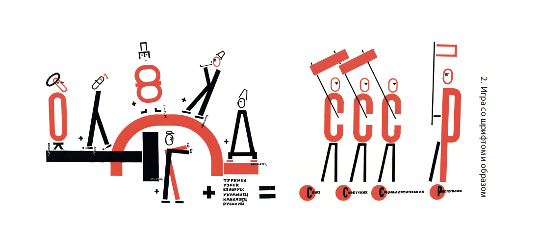
El Lissitzky, 1928.
"Four (arithmetic) actions."
(Four (Arithmetic) Actions)
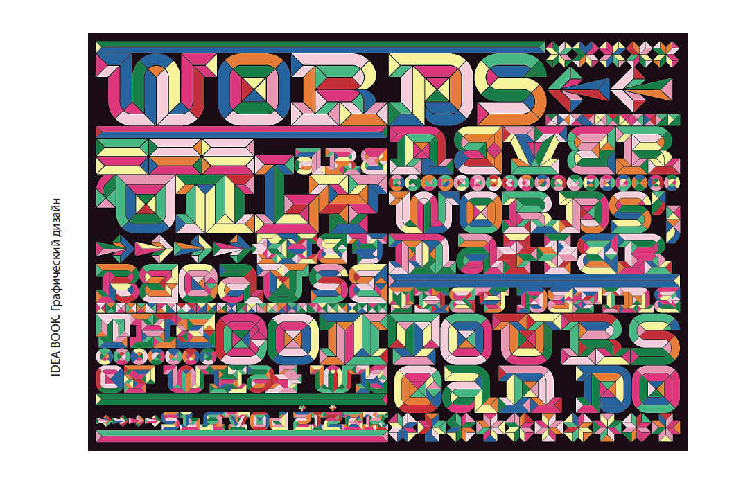
Jonathan Barnbrook and Jonathan Abbott, 2011.
“Words are never just words”
(Words Are Never Only Words)
PROMISCUITY
To hell with readability!
If the legibility of the text is a feature of a good typographical work, then an illegible text is a sign of the negligence of typographers. However, this does not apply to readability, since the text that can be read does not have to be comprehensible for everyone; perhaps it originates in a drawing letter. Whether a font is considered readable or unreadable depends entirely on the context in which it was developed, as well as on the context in which it is perceived. Even a clearly typed text will seem illegible to someone who does not have enough patience to read it. The ability to decipher what is written is based on the free possession of certain pre-learned characters, so the same can be unreadable for most, but absolutely understandable for those who own the right key - think of the Rosetta Stone.
The typographic composition of Jonathan Barnbrook and Jonathan Abbott, created in memory of the revolutions of the Arab Spring of 2011, was conceived as revolutionary. According to the authors, revolutions are expressed in action, but spread through ideas and language. The purpose of this typographic mix was to show the power of language arising from chaos, according to the statement of the philosopher and cultural expert Slavoj izek reproduced in the paper: “Words are never just words. They matter because they define the contours of what we can do. ”
Here, the inviolability of individual letters and words is rejected in favor of combining all the elements, so that each letter becomes part of a common pattern, perceived both as a word and as an image. From a distance, work seems to be just a pattern, but on closer examination words appear in it. Its main meaning is in revealing a hidden, encrypted message. This requires an effort from the reader, but the decoding itself makes what is written for it more valuable and probably more memorable. Regardless of the style of such a technique with hidden text can be applied in any composition on any topic.
NUMBERS
When the numbers add up
Figures are used in graphic design as widely as letters, and can be no less expressive. However, whether they are used as page numbers or play a decorative role — say, as a chapter number in a book, the value of a product on a price tag, or even an hour mark on a dial — it is worth remembering that the more thoughtful the design of a digit is, the more effective will be able to convey the meaning embedded in it. Most languages use Arabic numerals — often when it comes to non-Latin fonts, they are the only recognizable typographic elements. Roman numerals are also found, although not so often and not with so many deviations from standard spelling.
There are several options for approaching the design of numbers. List them in order. First, they can be considered as part of the font family, considering how the individual numbers are combined with upper and lower case letters. The second method is the creation of figures expressing a visual idea when symbolic associations are used that arise when looking at a figure (for example, the number 1 in the form of a skyscraper). The third option is stylized numbers that create an illustrative number series. There is also an approach that combines all three categories, where the numbers stand out due to their own visual weight, endowed with graphic expressiveness or symbolic meaning. An example of this approach is the work of the London studio Sawdust.
Figures from 1 to 9 of straight, curved or concentric black lines, artfully presented in the form of ribbons, have a hypnotic visual effect. A pleasant linear pattern and hidden three-dimensionality of ribbons together form a calm, attention-getting style. Although all the figures look very nice, perhaps the most attractive can be called a four, because it looks exactly like a ribbon, which turned into a figure by happy coincidence. Since this series was tailor-made to order specifically for the customer (the numbers symbolize awards for outstanding achievements), its direct application may be limited. However, the concept of typographic design based on recognizable elements can serve as a basis for other design ideas.
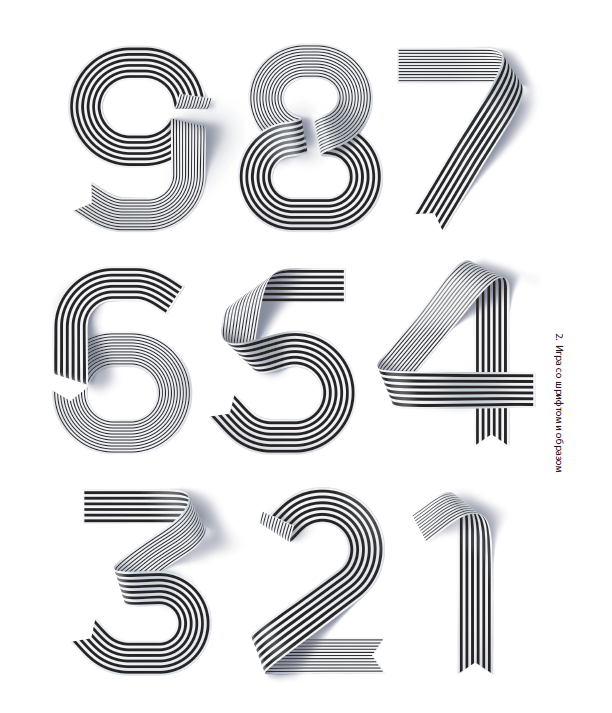
Studio Sawdust, 2013. Design of numbers, designed for the directory
200 leading research universities, rankings,
compiled by Shanghai Jiao Tong University
»More information about the book can be found on the publisher's website.
» Table of Contents
» Excerpt
For Habrozhiteley a 25% discount on the coupon - IDEA BOOK
Source: https://habr.com/ru/post/327318/
All Articles