UX-recipe phone number and email confirmation
Currently, the Internet is replete with various services and other resources through which cash flows take place, applications for the provision of various services and much more are being posted. These resources are working closely with users and access to your profile (personal account) is a very important factor.
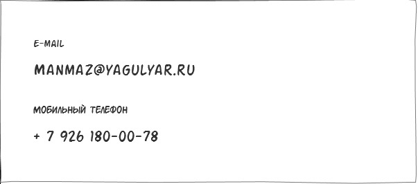
Suppose that a user has registered on the service and has profiles in his profile:
And we have requirements that:
• Mobile phone and email are used for authorization in the service.
• Mobile phone and email address must be real.
• Mobile phone and email address can be changed in the user profile.
')
The above requirements will allow us to imagine what we need to do to meet them.
Based on the first requirement, we assume that mobile phone and e-mail have the same importance, and each of these elements requires confirmation. Therefore, it is necessary to change this data separately.
Add edit icons for each item:
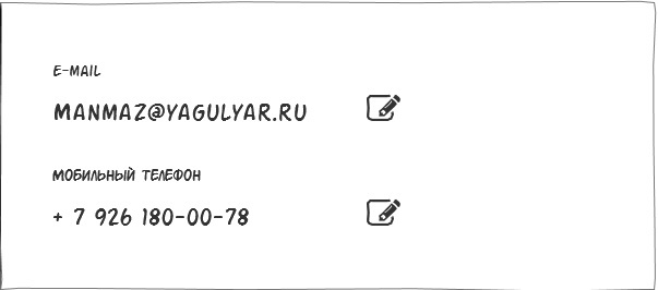
We got the opportunity to change each field separately!
But what to do if during registration it was not possible to confirm your data. Those. the service immediately gave us access to the profile (perhaps not to complicate the registration procedure).
But the service requires confirmation that the user is real and that the entered contact details allow the user to receive important messages.
Therefore, for these checks we need to introduce additional elements causing the steps we need so much:
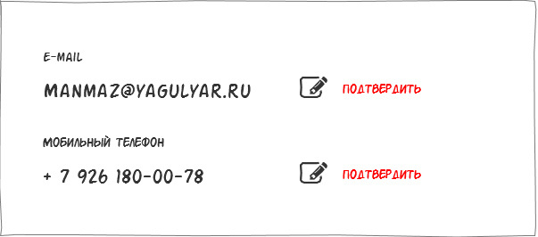
The newly registered user has the opportunity to confirm their details.
But you can ask: - “What if the user is registered and has long confirmed his data”?
I will answer that for a registered user, the ability to confirm at this stage is not needed.
We get:
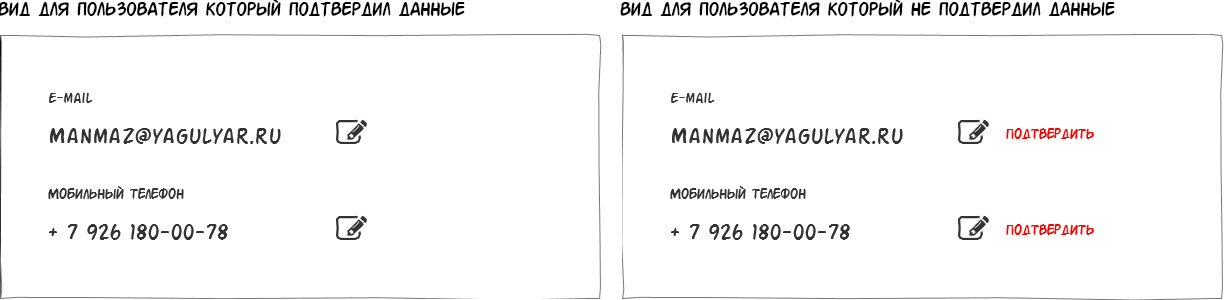
At the output, we get the main ways to interact with the user. Our user can change the data and if he has never confirmed them, then confirm.
There is a basis, but it is required to understand what will happen after the user clicks on the “edit” or “confirm” item.
Also note that the interface changes and confirmation must have the same structure and position of elements. We want to adhere to uniformity in our decisions?
Therefore, I propose for variable elements to display a separate window as follows:
Those. The usual block with the ability to cancel and apply the desired user result.
Now the user is not lost among the rest of the data and his attention is focused on the area we need.
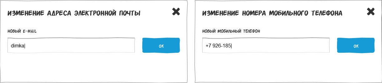
The user enters the data he needs, clicks the "ok" button and gets the following result:
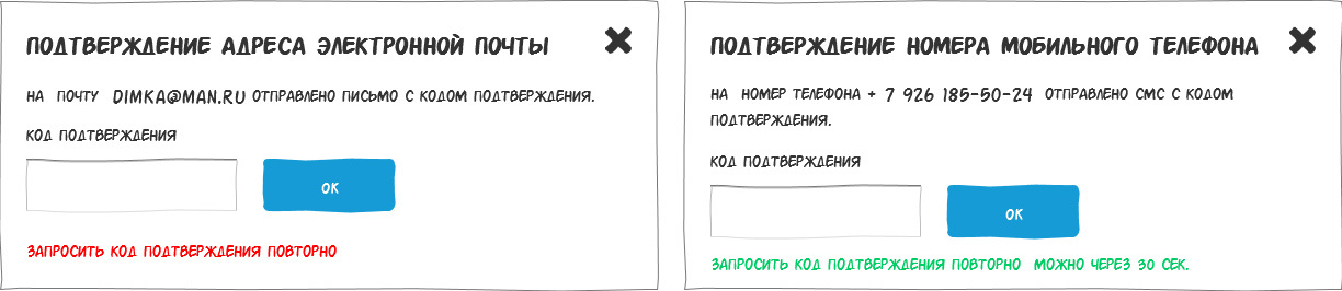
To confirm the email, he sees a brief instruction on how to proceed.
It is very important that the instruction text is short and contains the email address to which the letter was sent. At this stage, he can check his email address for errors and if errors are present, then cancel the operation. If the letter, for some reason did not reach, then we give the user the opportunity to request it again.
People who are familiar with the confirmation of the mail may ask the question: - “Why confirm the mail through the code, when the links work fine”?
Against the standard reference verification method, I can say that:
• When clicking on a link, a new window opens and, in most cases, the user is redirected from a letter to a specific page. And this page is not a profile. Which is terribly annoying, isn't it?
• If you require entering a code right now and resetting the change when you close the page, we encourage the user to urgently take the actions we need. In the case of a letter with a link, the user may not confirm his mail for a long time.
With the confirmation of the phone, the procedure is familiar to everyone and, just as in the case of mail, the instruction should indicate the phone number to which the message was sent.
Any action must have a result. Therefore, we need to add the result of the user change data.

As you can see, we wrote in detail to the user what action was taken and the fact that we changed the old data to new ones. There is no ambiguity in this message and we once again convinced the user that everything went well.
With new (newly registered) users easier. For them, a window is displayed with the entry of a code called up by clicking on the “confirm” element and the procedure is repeated.
As you can see, we have retained the ability to change data for a new user. The reason is simple. When registering, he could make a mistake when entering mail or phone number.
Suppose that a user has registered on the service and has profiles in his profile:
And we have requirements that:
• Mobile phone and email are used for authorization in the service.
• Mobile phone and email address must be real.
• Mobile phone and email address can be changed in the user profile.
')
The above requirements will allow us to imagine what we need to do to meet them.
Based on the first requirement, we assume that mobile phone and e-mail have the same importance, and each of these elements requires confirmation. Therefore, it is necessary to change this data separately.
Add edit icons for each item:
We got the opportunity to change each field separately!
But what to do if during registration it was not possible to confirm your data. Those. the service immediately gave us access to the profile (perhaps not to complicate the registration procedure).
But the service requires confirmation that the user is real and that the entered contact details allow the user to receive important messages.
Therefore, for these checks we need to introduce additional elements causing the steps we need so much:
The newly registered user has the opportunity to confirm their details.
But you can ask: - “What if the user is registered and has long confirmed his data”?
I will answer that for a registered user, the ability to confirm at this stage is not needed.
We get:
At the output, we get the main ways to interact with the user. Our user can change the data and if he has never confirmed them, then confirm.
There is a basis, but it is required to understand what will happen after the user clicks on the “edit” or “confirm” item.
Also note that the interface changes and confirmation must have the same structure and position of elements. We want to adhere to uniformity in our decisions?
Therefore, I propose for variable elements to display a separate window as follows:
Those. The usual block with the ability to cancel and apply the desired user result.
Now the user is not lost among the rest of the data and his attention is focused on the area we need.
The user enters the data he needs, clicks the "ok" button and gets the following result:
To confirm the email, he sees a brief instruction on how to proceed.
It is very important that the instruction text is short and contains the email address to which the letter was sent. At this stage, he can check his email address for errors and if errors are present, then cancel the operation. If the letter, for some reason did not reach, then we give the user the opportunity to request it again.
People who are familiar with the confirmation of the mail may ask the question: - “Why confirm the mail through the code, when the links work fine”?
Against the standard reference verification method, I can say that:
• When clicking on a link, a new window opens and, in most cases, the user is redirected from a letter to a specific page. And this page is not a profile. Which is terribly annoying, isn't it?
• If you require entering a code right now and resetting the change when you close the page, we encourage the user to urgently take the actions we need. In the case of a letter with a link, the user may not confirm his mail for a long time.
With the confirmation of the phone, the procedure is familiar to everyone and, just as in the case of mail, the instruction should indicate the phone number to which the message was sent.
Any action must have a result. Therefore, we need to add the result of the user change data.
As you can see, we wrote in detail to the user what action was taken and the fact that we changed the old data to new ones. There is no ambiguity in this message and we once again convinced the user that everything went well.
With new (newly registered) users easier. For them, a window is displayed with the entry of a code called up by clicking on the “confirm” element and the procedure is repeated.
As you can see, we have retained the ability to change data for a new user. The reason is simple. When registering, he could make a mistake when entering mail or phone number.
Source: https://habr.com/ru/post/327100/
All Articles