Typography: font selection process
One of the most valuable skills a designer can master is the ability to select fonts. This results from the fact that the text is one of the main ways of communication of the designer with the user. Typography is crucial for design.
Typography is a complex and beautiful thing. Some devote their entire career to working with her. Fortunately for us, they describe their experience in detail, so our services have a whole bunch of online resources on typography.
This article was intended as a small introduction for those who want to learn how to select fonts for design. It will push you to expand the set of fonts and their combinations that you use in your layouts, not limited to familiar options.
First of all, determine the goal that your design pursues. What information do you want to convey? What format?
')
In good designs, typography fits the goal. This is important because it is the fonts that help create a certain mood, set the tone and style of design.
If you make, say, a greeting card with a large number of illustrations, choose a font that will be combined with the style in which they are made. The font should be in harmony with the rest of the design.

If you are designing a website with an emphasis on images, choose a simple font that will not distract the user's attention from them. Use the font as a way to highlight the information you want to convey.

Having decided on the purpose of design, decide for which audience you are doing it. This step is of great importance, because information about users (age, interests, cultural background) can influence the decisions you make when choosing fonts.
For example, some fonts are more suitable for younger people. Children who are just learning to read need very legible fonts with sharp outlines of letters. A good illustration of this is Sassoon Primary . Sassoon Primary is a Rosemary Sassoon project, which is based on its research on which fonts are easiest for children to read.
Other fonts are more appropriate for older people. They are usually distinguished by the large size of the letters, pronounced contrast, the lack of prescription and decorative elements.
When choosing a font, consider the features and needs of your target audience. Simply put, put yourself in their place.
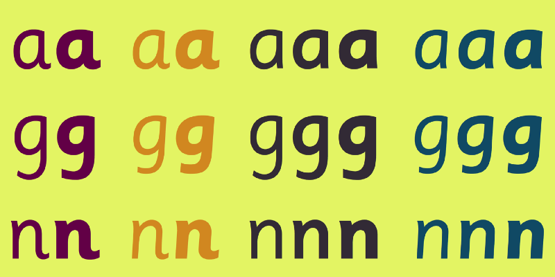
Look at the work of other designers. Try to understand what motivated them by deciding to use these particular fonts.
Inspiration: Fonts
For fresh ideas on fonts, check out The 100 Best Free Fonts from CreativeBloq - this is a great source that will give you the mood you want. In their article, CreativeBloq explains the logic they followed when choosing each of the fonts.
Another useful resource is the 100 Greatest Free Fonts Collection for 2015 from Awwwards .
In addition, Invision has created a huge repository with resources for typography. There you will find a lot of sources for inspiration.
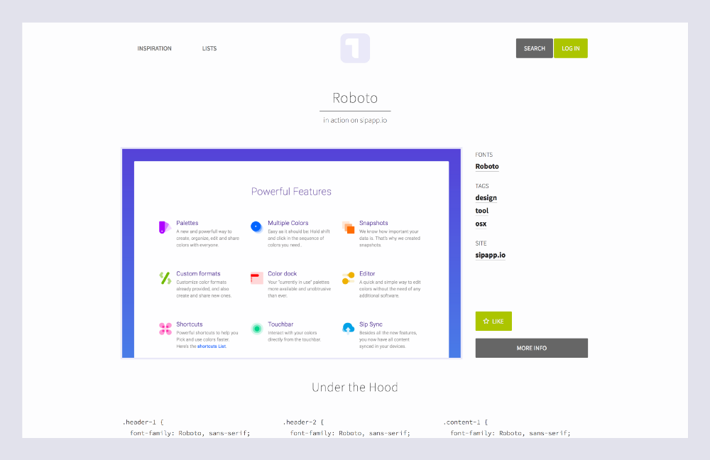
If you want to be inspired by the example of real web pages, I advise you to take a look at Typ.io. The site contains a collection of sources with interesting solutions from across the web. In addition, for each sample, the site displays CSS font parameters below the text.
In addition to specialized sites, you can visit your favorite pages and see what they use there. Here, the WhatTheFont tool comes in handy - an extension for Chrome that displays font information when you move your mouse over text.
Inspiration: combinations
In addition to the fonts themselves, learn the different options for combining them - this is no less important. The right combinations help form the visual hierarchy and make the design easier to read.

The first source of inspiration to visit is Typewolf . On Typewolf collected examples of interesting combinations from different sites. They also offer font guidelines and in-depth typography guides. For those who work with fonts, this is a real treasure.
FontPair is another resource on how best to choose combinations designed specifically for working with Google Fonts . The resource provides the ability to sort by combinations of styles (for example, sans-serif and serif or serif and serif).

And finally, the web is full of sets of ready-made combinations from professional designers. Say Typography: Google Fonts Combinations or Typography: Google Fonts Combinations Volume 2 . Just type in the “font pairing” query on Behance , Dribble and other similar sites.
Now that you are theoretically savvy and stockpiled with inspiration, you can proceed to the selection. In the selection process, remember the three principles: readability, intelligibility, goal.

Choose fonts that have a classic look and are easy to read. Give up fancy fonts in favor of simple and practical. And take into account the purpose of a font: some of them, for example, are more suitable for headings than for the main text.
Accordingly, before choosing a font, consider the purpose for which you will use it.

As for combinations of fonts, do not make them too complicated - limit yourself to three different types, no more. In addition, select contrasting fonts. This will help direct the user’s view: first to the heading, then to the main text. You can also create a visual contrast using different sizes, colors and styles.
For web fonts, you can use Google Fonts , Typekit , and Font Squirrel . On Google Fonts everything is free, Typekit and Font Squirrel offer free and paid options.
Now that you have decided on the combination, the next step is to set the dimensions. To do this, there is the excellent Modular Scale tool by Tim Brown , the main typography specialist at Adobe. Modular Scale is a system that determines the ratios that, as history shows, is most pleasing to the eye, and builds a scale of text sizes based on these ratios.
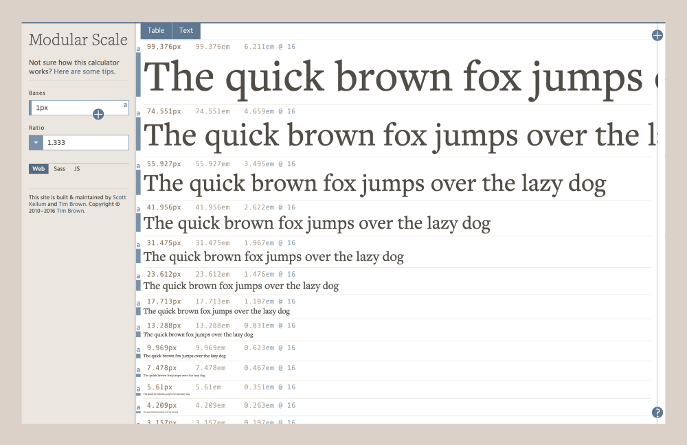
Suppose you choose a scale based on the golden section. Here are the first five values that the system will calculate for you:
Golden Ratio (1: 1.618)
1,000 x 1,618 = 1,618
1.618 x 1.618 = 2.618
2.618 x 1.618 = 4.236
4.236 x 1.618 = 6.854
6.854 x 1.618 = 11.089
One of the problems you may encounter is that some correlations are too large. See what happens if you continue with the scale based on the golden section:
Golden Ratio (1: 1.618)
...
11.089 x 1.618 = 17.942
17.942 x 1.618 = 29.03
29.030 x 1.618 = 46.971
46.971 x 1.618 = 75.999
75.999 x 1.618 = 122.966
As you can see, the difference between the values becomes too big. Most interfaces require smaller intervals. But it is not scary: a wide variety of scales is presented on the Modular Scale - from geometry, nature, music.
Minor Second 15:16
Major Second 8: 9
Minor Third 5: 6
Major Third 4: 5
...
Therefore, instead of the golden section, you can use a different ratio, which will give smaller intervals, for example, Perfect Fourth.
Perfect Fourth (3: 4)
...
9.969 x 1.333 = 13.288
13.288 x 1.333 = 17.713
17.713 x 1.333 = 23.612
23.612 x 1.333 = 31.475
31.475 x 1.333 = 41.956
41.956 x 1.333 = 55.927
By selecting a suitable scale, you can drag the sizes for different types of fonts from your list and round them to whole numbers.
Font Sizes
Header 1: 55px
Header 2: 42px
Header 3: 31px
Header 4: 24px
Header 5: 14px
Body: 17px
Caption: 14px
The Modular Scale method involves calculating the font size with mathematical precision, but this is just a guideline. Use it to get approximate dimensions, and then adjust them by eye.
The last step remains: create a library of styles so that the fonts look identical in all layouts.

In programs like Sketch , you can create generic text styles to quickly insert text with already specified parameters from the style sheet.
It is at this stage that you should finally determine the colors, styles and sizes. Speaking of colors: choose them with an eye on the overall palette. Text colors should be harmoniously combined with it.

Be sure to include the following in your style library: font types, colors, sizes, and patterns. Google's style sheet Material Design typography is a good example of how to compose it. You can also use Mailchimp , Apple , and Focus Labs style libraries as manuals.
Typography is an area of experimentation, art and science in one bottle. I urge you to step out of your comfort zone and actively explore all the possibilities.
Typography is a complex and beautiful thing. Some devote their entire career to working with her. Fortunately for us, they describe their experience in detail, so our services have a whole bunch of online resources on typography.
This article was intended as a small introduction for those who want to learn how to select fonts for design. It will push you to expand the set of fonts and their combinations that you use in your layouts, not limited to familiar options.
Define your goal
First of all, determine the goal that your design pursues. What information do you want to convey? What format?
')
In good designs, typography fits the goal. This is important because it is the fonts that help create a certain mood, set the tone and style of design.
If you make, say, a greeting card with a large number of illustrations, choose a font that will be combined with the style in which they are made. The font should be in harmony with the rest of the design.
If you are designing a website with an emphasis on images, choose a simple font that will not distract the user's attention from them. Use the font as a way to highlight the information you want to convey.
Outline your audience
Having decided on the purpose of design, decide for which audience you are doing it. This step is of great importance, because information about users (age, interests, cultural background) can influence the decisions you make when choosing fonts.
For example, some fonts are more suitable for younger people. Children who are just learning to read need very legible fonts with sharp outlines of letters. A good illustration of this is Sassoon Primary . Sassoon Primary is a Rosemary Sassoon project, which is based on its research on which fonts are easiest for children to read.
Other fonts are more appropriate for older people. They are usually distinguished by the large size of the letters, pronounced contrast, the lack of prescription and decorative elements.
When choosing a font, consider the features and needs of your target audience. Simply put, put yourself in their place.
Look for inspiration
Look at the work of other designers. Try to understand what motivated them by deciding to use these particular fonts.
Inspiration: Fonts
For fresh ideas on fonts, check out The 100 Best Free Fonts from CreativeBloq - this is a great source that will give you the mood you want. In their article, CreativeBloq explains the logic they followed when choosing each of the fonts.
Another useful resource is the 100 Greatest Free Fonts Collection for 2015 from Awwwards .
In addition, Invision has created a huge repository with resources for typography. There you will find a lot of sources for inspiration.
If you want to be inspired by the example of real web pages, I advise you to take a look at Typ.io. The site contains a collection of sources with interesting solutions from across the web. In addition, for each sample, the site displays CSS font parameters below the text.
In addition to specialized sites, you can visit your favorite pages and see what they use there. Here, the WhatTheFont tool comes in handy - an extension for Chrome that displays font information when you move your mouse over text.
Inspiration: combinations
In addition to the fonts themselves, learn the different options for combining them - this is no less important. The right combinations help form the visual hierarchy and make the design easier to read.
The first source of inspiration to visit is Typewolf . On Typewolf collected examples of interesting combinations from different sites. They also offer font guidelines and in-depth typography guides. For those who work with fonts, this is a real treasure.
FontPair is another resource on how best to choose combinations designed specifically for working with Google Fonts . The resource provides the ability to sort by combinations of styles (for example, sans-serif and serif or serif and serif).
And finally, the web is full of sets of ready-made combinations from professional designers. Say Typography: Google Fonts Combinations or Typography: Google Fonts Combinations Volume 2 . Just type in the “font pairing” query on Behance , Dribble and other similar sites.
Choose a font
Now that you are theoretically savvy and stockpiled with inspiration, you can proceed to the selection. In the selection process, remember the three principles: readability, intelligibility, goal.
Choose fonts that have a classic look and are easy to read. Give up fancy fonts in favor of simple and practical. And take into account the purpose of a font: some of them, for example, are more suitable for headings than for the main text.
Accordingly, before choosing a font, consider the purpose for which you will use it.
As for combinations of fonts, do not make them too complicated - limit yourself to three different types, no more. In addition, select contrasting fonts. This will help direct the user’s view: first to the heading, then to the main text. You can also create a visual contrast using different sizes, colors and styles.
For web fonts, you can use Google Fonts , Typekit , and Font Squirrel . On Google Fonts everything is free, Typekit and Font Squirrel offer free and paid options.
Set size
Now that you have decided on the combination, the next step is to set the dimensions. To do this, there is the excellent Modular Scale tool by Tim Brown , the main typography specialist at Adobe. Modular Scale is a system that determines the ratios that, as history shows, is most pleasing to the eye, and builds a scale of text sizes based on these ratios.
Suppose you choose a scale based on the golden section. Here are the first five values that the system will calculate for you:
Golden Ratio (1: 1.618)
1,000 x 1,618 = 1,618
1.618 x 1.618 = 2.618
2.618 x 1.618 = 4.236
4.236 x 1.618 = 6.854
6.854 x 1.618 = 11.089
One of the problems you may encounter is that some correlations are too large. See what happens if you continue with the scale based on the golden section:
Golden Ratio (1: 1.618)
...
11.089 x 1.618 = 17.942
17.942 x 1.618 = 29.03
29.030 x 1.618 = 46.971
46.971 x 1.618 = 75.999
75.999 x 1.618 = 122.966
As you can see, the difference between the values becomes too big. Most interfaces require smaller intervals. But it is not scary: a wide variety of scales is presented on the Modular Scale - from geometry, nature, music.
Minor Second 15:16
Major Second 8: 9
Minor Third 5: 6
Major Third 4: 5
...
Therefore, instead of the golden section, you can use a different ratio, which will give smaller intervals, for example, Perfect Fourth.
Perfect Fourth (3: 4)
...
9.969 x 1.333 = 13.288
13.288 x 1.333 = 17.713
17.713 x 1.333 = 23.612
23.612 x 1.333 = 31.475
31.475 x 1.333 = 41.956
41.956 x 1.333 = 55.927
By selecting a suitable scale, you can drag the sizes for different types of fonts from your list and round them to whole numbers.
Font Sizes
Header 1: 55px
Header 2: 42px
Header 3: 31px
Header 4: 24px
Header 5: 14px
Body: 17px
Caption: 14px
The Modular Scale method involves calculating the font size with mathematical precision, but this is just a guideline. Use it to get approximate dimensions, and then adjust them by eye.
Create a font style library
The last step remains: create a library of styles so that the fonts look identical in all layouts.
In programs like Sketch , you can create generic text styles to quickly insert text with already specified parameters from the style sheet.
It is at this stage that you should finally determine the colors, styles and sizes. Speaking of colors: choose them with an eye on the overall palette. Text colors should be harmoniously combined with it.
Be sure to include the following in your style library: font types, colors, sizes, and patterns. Google's style sheet Material Design typography is a good example of how to compose it. You can also use Mailchimp , Apple , and Focus Labs style libraries as manuals.
Typography is an area of experimentation, art and science in one bottle. I urge you to step out of your comfort zone and actively explore all the possibilities.
Source: https://habr.com/ru/post/327062/
All Articles