How we made a completely new KOMPAS-3D: History in seven chapters → part 2
Continued. Link to the first part (Caution, traffic!).

We continue to sort through the revolutionary interface of the CAD system KOMPAS-3D v17. In the first part, our interface designer Sergey Shvetsov told us what tasks the team faced, what problems they faced when developing a new design. If you don’t understand where the quotes are from or you don’t know the special terms - welcome to the first part of the material !
')
Caution traffic!
Basic metaphors. Behavior.
One of the main tasks, I repeat, was to preserve the continuity between the old and the new interface. The problem was solved in different ways. First, element by element. For example, all the icons of the new interface were redrawn anew on the basis of the previous ones, the old metaphors were preserved, and their unification along the way. An example of the second. The button of a group of commands on the toolbar in the old interface could be "decomposed" into several command buttons with similar functionality. Initially, there was a desire to abandon this functionality, since command group buttons are now present in the Settings panel.
After testing, it was decided to return the old functionality of “unfolding” the button by long pressing it.
Secondly, it is functional. For example, the buttons on the Special Control Panel. The new concept involves the transfer of commands in the context of action. Therefore, the panel was excluded, and all the buttons on it present, moved to the context of user actions or changed. This happened to the command Point again - in the new interface, its function is performed by the “registrar” , which has the functionality of selecting, displaying and deleting objects.
Classic (on the left) and updated (on the right) view of the “Parameters” panel (the image is clickable).
Another example is the Compact Panel in the old interface and the Set List in the new one. The switch function between toolbars is retained and rethought. Switching occurs in a new, more convenient and compact form. Switching is not between the toolbars responsible for a particular type of operation, but between logical sets of commands that are responsible for a particular type of designer activity, be it solid modeling or sheet body modeling.
Compact panel (left) and list of sets (right). The picture is clickable.
Commands. Badges. Controls. The panels. Dialogues. Behavior.
To reduce the mental load on the user, all the elements of the interface were unified (both in appearance and behavior). Those. if the elements are similar in appearance, then the actions of the user and the functionality of them should be similar. What was it for? So that the user, knowing the basic principles, could engage in his immediate activities, and did not recall the rules for working with this or that interface element, but in a slightly different environment.
Work was also carried out on the unification of metaphors of icons (pictograms). Those. all the same metaphors denote the same action or object.

Metaphors of icons.
All panels are now unified and work in a single interface space. The display of the panels is controlled from a single group of the Main Panel. All panels are unified in design and behavior. Those. Any panel can be undocked from the edge of the screen and made floating, docked to other panels or to another side of the screen, and even placed on another monitor.

Floating panel "Variables" (The image is clickable).
Interactive messages have also undergone processing, all of them are built on a single base and have a single message encoding.
The “Save Document” dialog (the image is clickable).
Dialog “Delete objects” (the image is clickable).
Framework, lack of hardcode, vector icons, vector hot points.
When switching to a new interface, there was a need to choose a framework for the interface. I will immediately indicate that in this chapter I consider the framework only from the interface side, leaving the criteria of programmers beyond the limits of the narration. So, the existing libraries of ready-made interface elements did not suit the absence of non-standard interface elements, the lack of flexibility and possible problems with updating and support in the future. Since A third-party library is always a black box. After several tests, WPF from Microsoft was chosen as the most suitable for our purposes.
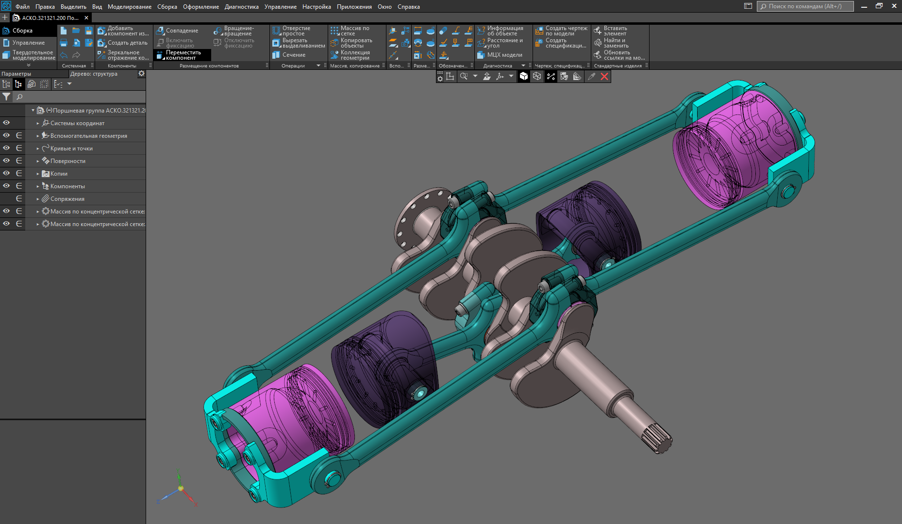
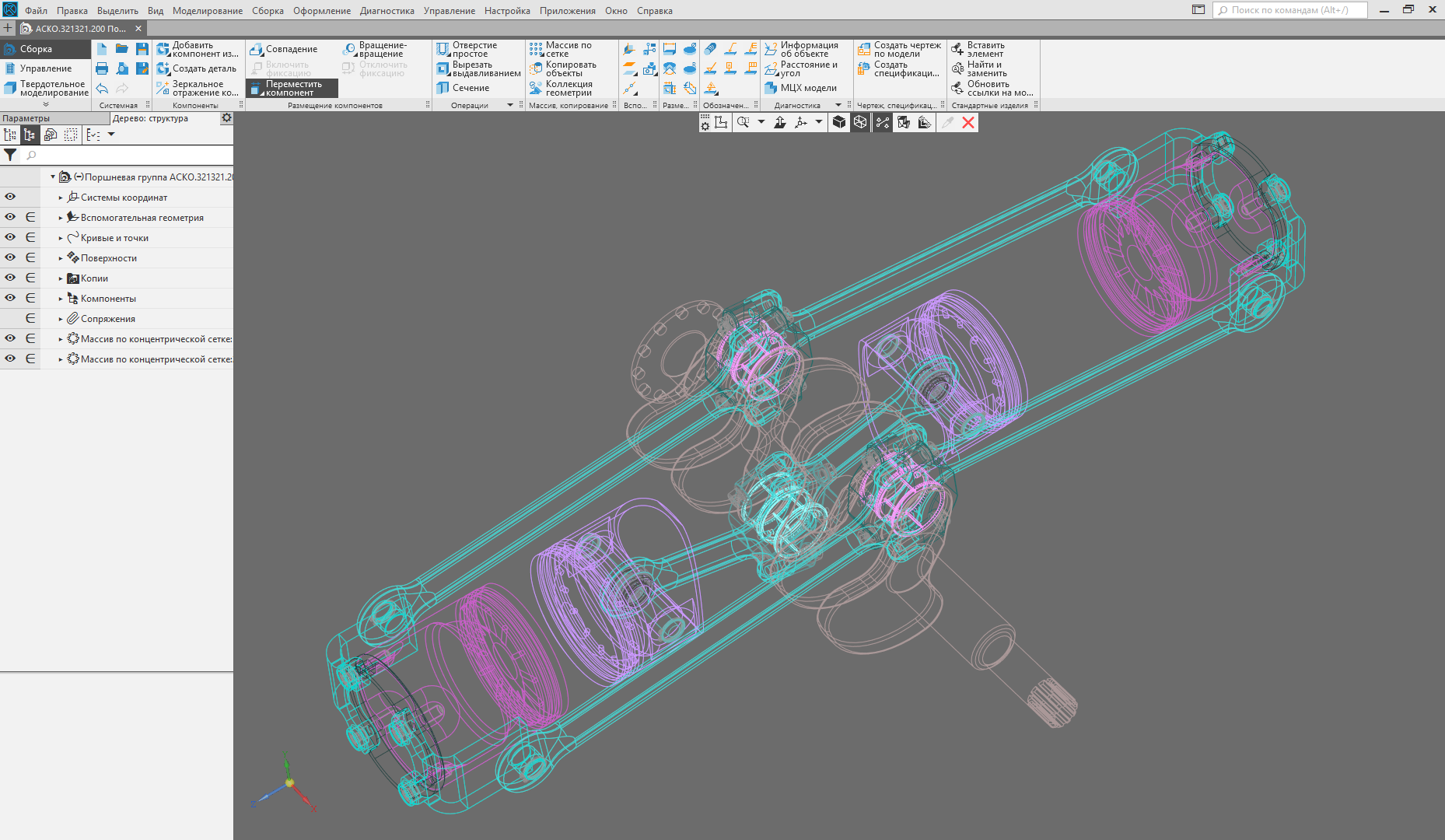
General view of the interface. The display mode is "Halftone with frame". (The picture is clickable)
Conceptually, the interface is designed in such a way that, with minor changes, it can be adapted to future tasks. The focus is on the adaptability of the interface for different screen resolutions. That is, the entire interface (with rare exceptions) adapts to the needs of users. This is achieved as a “correct” interface programming, in which the size of the interface elements are not strictly defined in the code, but depend on the size of the system font, and the almost complete absence of raster images in the interface (except for images in the interface help). To realize this allows our know-how - fully vector icons, both monochrome and color. You ask how it helps the user? I answer. At any screen resolution, the v17 interface remains predictable and stable. All interface elements are proportional to each other and clearly displayed. The user with the help of Windows system settings can now control the size of interface elements and interface text. In the future, we plan to make such support inside KOMPAS-3D. Those. the user will be able to customize the size of the interface text and icons depending on their preferences.
But on this, our work on the vectorization of the interface has not ended. We made vector feature points that can also change their size depending on the system font settings in Windows.
All commands are available, a minimum of dialogs, the dialogs “move” to the “Parameters” panel. Minimum user context switches (working in the stream). Pass-through selection.
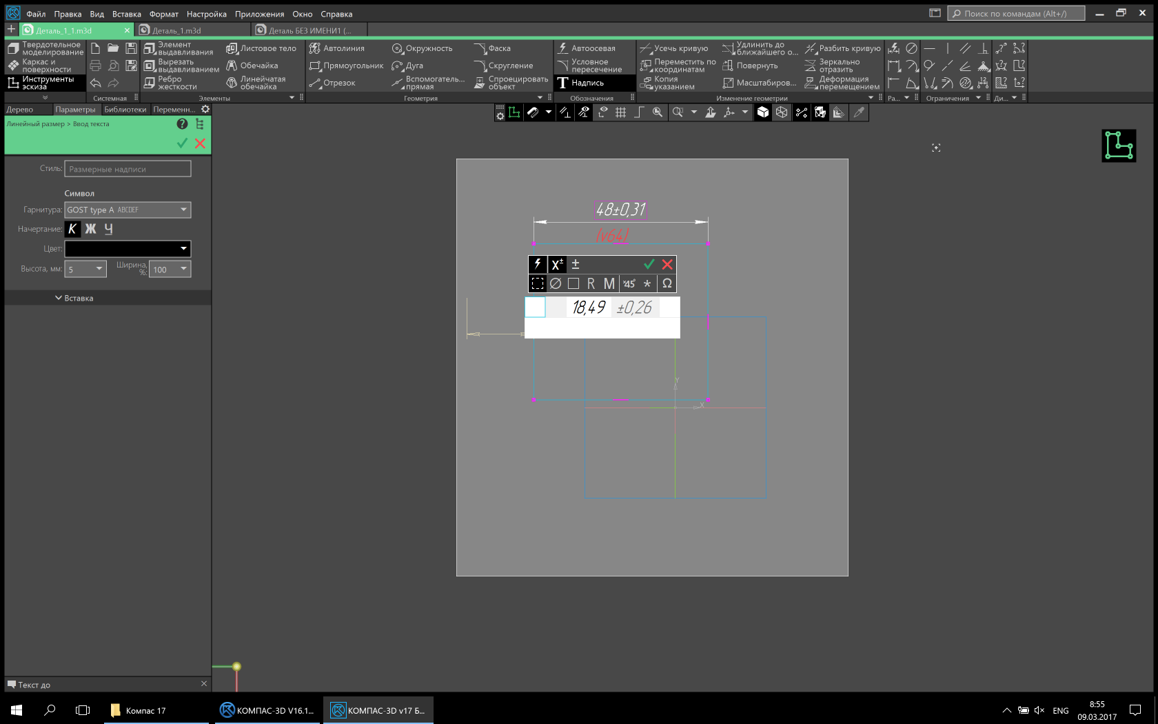
To maintain the streaming state of users, we removed the modality in the teams. Now almost all commands are available at any time. If the action in the command is completed, there are no construction errors and the user switches to another command, then the object is built without confirmation, and the transition to the next command is made. This allows you to work very effectively, without being distracted by artificial interruptions. Also minimized the number of dialog boxes. Some of them were removed completely, and their functionality was transferred to the “Parameters” panel, to the “trees” on the model / drawing. Some have transformed into a more comfortable look. For example, the size setting dialog now looks like a small panel next to the dimension text.
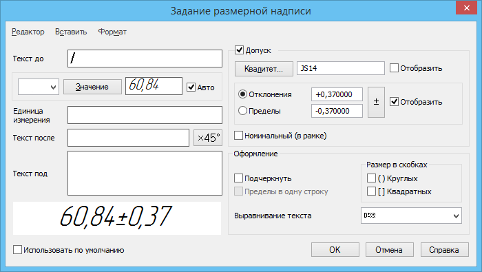
Dialogue for setting dimension text. Classic view (Picture is clickable)
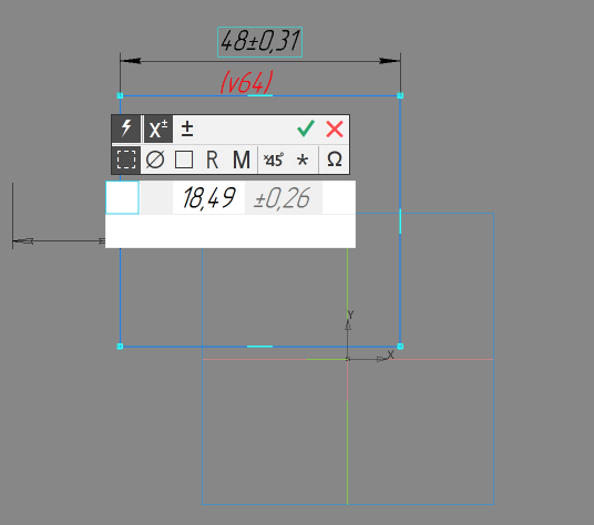
Dialogue for setting dimension text. Updated view (Picture clickable)
To facilitate the location of objects implemented cross-selection. That is, if an object is present in a list or tree, then when it is selected on a model or drawing, it is highlighted in a tree or list and vice versa.
Why 50 shades of gray and why 50 shades darker.
At the very beginning of the article, I already wrote that the interface is evil. But did not decipher why. I do it now. The ideal interface, paradoxically, is the complete lack of interface. If the engineer had the opportunity to design products without any additional interface, then it would be an ideal product and everyone would like it. But historically, the evolution of technology proceeded through the development and improvement of tools, and any tool is an interface. By making the tool more convenient and efficient, you sort of remove it from your consciousness, i.e. don't notice it, it ceases to exist for you. Agree that during work you will often pay attention to the shovel, if its cutting is poorly polished, and you will not pay attention to the well-polished cutting, paying attention to digging. So with the interface. The less noticeable it is, the more you give yourself to your work, the more productive and happier you will become.
By making the gray-neutral the main color for the interface of the KOMPAS-3D v17, we have removed the unnecessary, annoying component of the old interface - the irrational multicolor.
But we have not completely abandoned the color, as it may seem at first glance. Color is now an additional factor that attracts the user's attention. Whether it is a color model, or a drawing, or an indication of the state of the system. It is much easier to notice a bright colored light at dusk than on a festive Christmas tree with toys and tinsel. We did not forget about the contrast. The contrast of the new interface background: text \ icons is 11.2: 1 in the light theme and 5.69: 1 in the dark one. This is consistent with WCAG recommendations. Such a margin of contrast allows you to work with different lighting without straining your eyesight.
Well, perhaps that's all. In the next versions we are not going to stop there and we will continue to improve the interface and working methods.
The “Frame” display mode is turned on (the image is clickable).
Collage of different display modes in one window (The image is clickable).
 Sergey Shvetsov, ASCON user interface designer
We continue to sort through the revolutionary interface of the CAD system KOMPAS-3D v17. In the first part, our interface designer Sergey Shvetsov told us what tasks the team faced, what problems they faced when developing a new design. If you don’t understand where the quotes are from or you don’t know the special terms - welcome to the first part of the material !
')
Caution traffic!
- The elephant is exactly like a palace column!
Chapter 3. We keep continuity
Basic metaphors. Behavior.
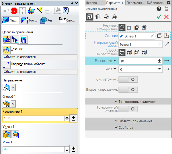
One of the main tasks, I repeat, was to preserve the continuity between the old and the new interface. The problem was solved in different ways. First, element by element. For example, all the icons of the new interface were redrawn anew on the basis of the previous ones, the old metaphors were preserved, and their unification along the way. An example of the second. The button of a group of commands on the toolbar in the old interface could be "decomposed" into several command buttons with similar functionality. Initially, there was a desire to abandon this functionality, since command group buttons are now present in the Settings panel.
An example was in the first part of the article:
Example for a group of commands Extrude.
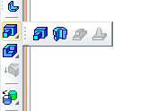
Classic look. The group was displayed by the pressed paint on the icon.
Updated look. Added option to display the group in the upper part of the settings panel (The image is clickable).
Classic look. The group was displayed by the pressed paint on the icon.
Updated look. Added option to display the group in the upper part of the settings panel (The image is clickable).
After testing, it was decided to return the old functionality of “unfolding” the button by long pressing it.
Secondly, it is functional. For example, the buttons on the Special Control Panel. The new concept involves the transfer of commands in the context of action. Therefore, the panel was excluded, and all the buttons on it present, moved to the context of user actions or changed. This happened to the command Point again - in the new interface, its function is performed by the “registrar” , which has the functionality of selecting, displaying and deleting objects.
Classic (on the left) and updated (on the right) view of the “Parameters” panel (the image is clickable).
Another example is the Compact Panel in the old interface and the Set List in the new one. The switch function between toolbars is retained and rethought. Switching occurs in a new, more convenient and compact form. Switching is not between the toolbars responsible for a particular type of operation, but between logical sets of commands that are responsible for a particular type of designer activity, be it solid modeling or sheet body modeling.
Compact panel (left) and list of sets (right). The picture is clickable.
For clarity, this is the list of building kits.
Now the list can be almost endless, before it was seriously limited and on the compact panel there was only one building panel “SPDS designation”.
The remaining panels of construction tools were arranged randomly:

The remaining panels of construction tools were arranged randomly:
- The dispute is empty -
A pipe, a column ... This beast is similar to an ottoman.
Chapter 4. Total Unification
Commands. Badges. Controls. The panels. Dialogues. Behavior.
To reduce the mental load on the user, all the elements of the interface were unified (both in appearance and behavior). Those. if the elements are similar in appearance, then the actions of the user and the functionality of them should be similar. What was it for? So that the user, knowing the basic principles, could engage in his immediate activities, and did not recall the rules for working with this or that interface element, but in a slightly different environment.
Work was also carried out on the unification of metaphors of icons (pictograms). Those. all the same metaphors denote the same action or object.
Metaphors of icons.
All panels are now unified and work in a single interface space. The display of the panels is controlled from a single group of the Main Panel. All panels are unified in design and behavior. Those. Any panel can be undocked from the edge of the screen and made floating, docked to other panels or to another side of the screen, and even placed on another monitor.
Floating panel "Variables" (The image is clickable).
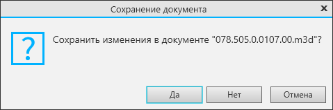
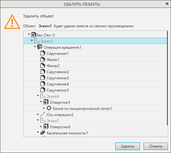
Interactive messages have also undergone processing, all of them are built on a single base and have a single message encoding.
The “Save Document” dialog (the image is clickable).
Dialog “Delete objects” (the image is clickable).
So the dialogues looked like in previous versions.

- The elephant is most likely similar to the Shah's throne!
Chapter 5. Total vectorization
Framework, lack of hardcode, vector icons, vector hot points.
When switching to a new interface, there was a need to choose a framework for the interface. I will immediately indicate that in this chapter I consider the framework only from the interface side, leaving the criteria of programmers beyond the limits of the narration. So, the existing libraries of ready-made interface elements did not suit the absence of non-standard interface elements, the lack of flexibility and possible problems with updating and support in the future. Since A third-party library is always a black box. After several tests, WPF from Microsoft was chosen as the most suitable for our purposes.
General view of the interface. The display mode is "Halftone with frame". (The picture is clickable)
Conceptually, the interface is designed in such a way that, with minor changes, it can be adapted to future tasks. The focus is on the adaptability of the interface for different screen resolutions. That is, the entire interface (with rare exceptions) adapts to the needs of users. This is achieved as a “correct” interface programming, in which the size of the interface elements are not strictly defined in the code, but depend on the size of the system font, and the almost complete absence of raster images in the interface (except for images in the interface help). To realize this allows our know-how - fully vector icons, both monochrome and color. You ask how it helps the user? I answer. At any screen resolution, the v17 interface remains predictable and stable. All interface elements are proportional to each other and clearly displayed. The user with the help of Windows system settings can now control the size of interface elements and interface text. In the future, we plan to make such support inside KOMPAS-3D. Those. the user will be able to customize the size of the interface text and icons depending on their preferences.
Feature points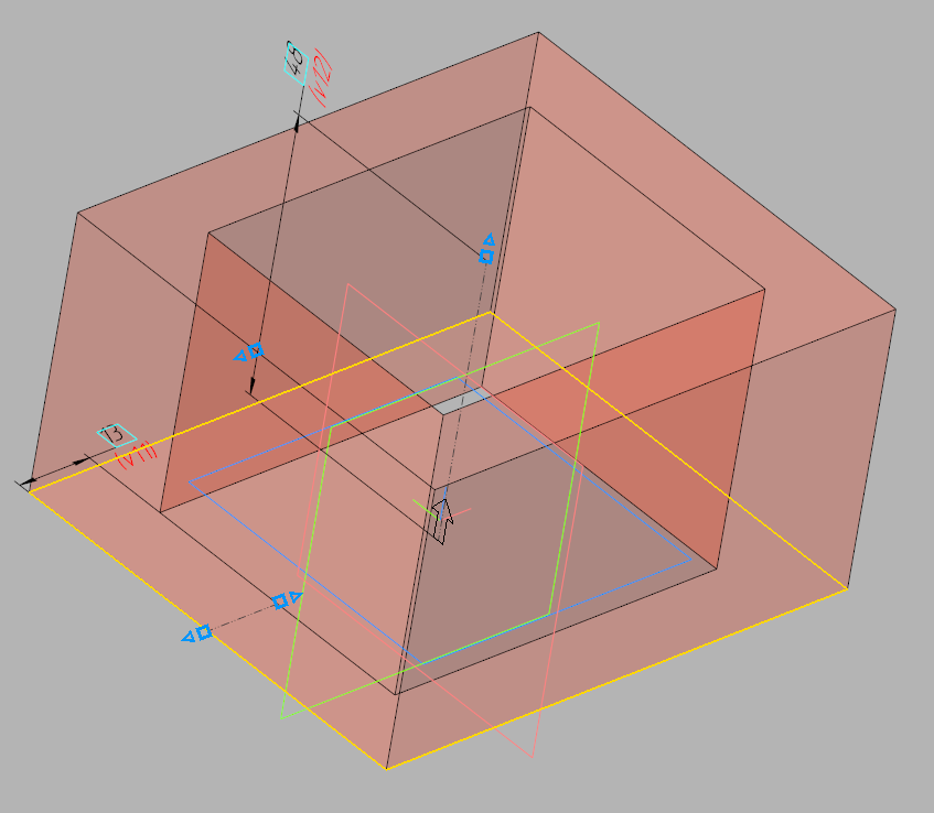
Characteristic points for the extrusion element (blue triangles and squares).
Characteristic points for the extrusion element (blue triangles and squares).
But on this, our work on the vectorization of the interface has not ended. We made vector feature points that can also change their size depending on the system font settings in Windows.
- Your elephant is a big polished peak!
Chapter 6. We remove the modality
All commands are available, a minimum of dialogs, the dialogs “move” to the “Parameters” panel. Minimum user context switches (working in the stream). Pass-through selection.
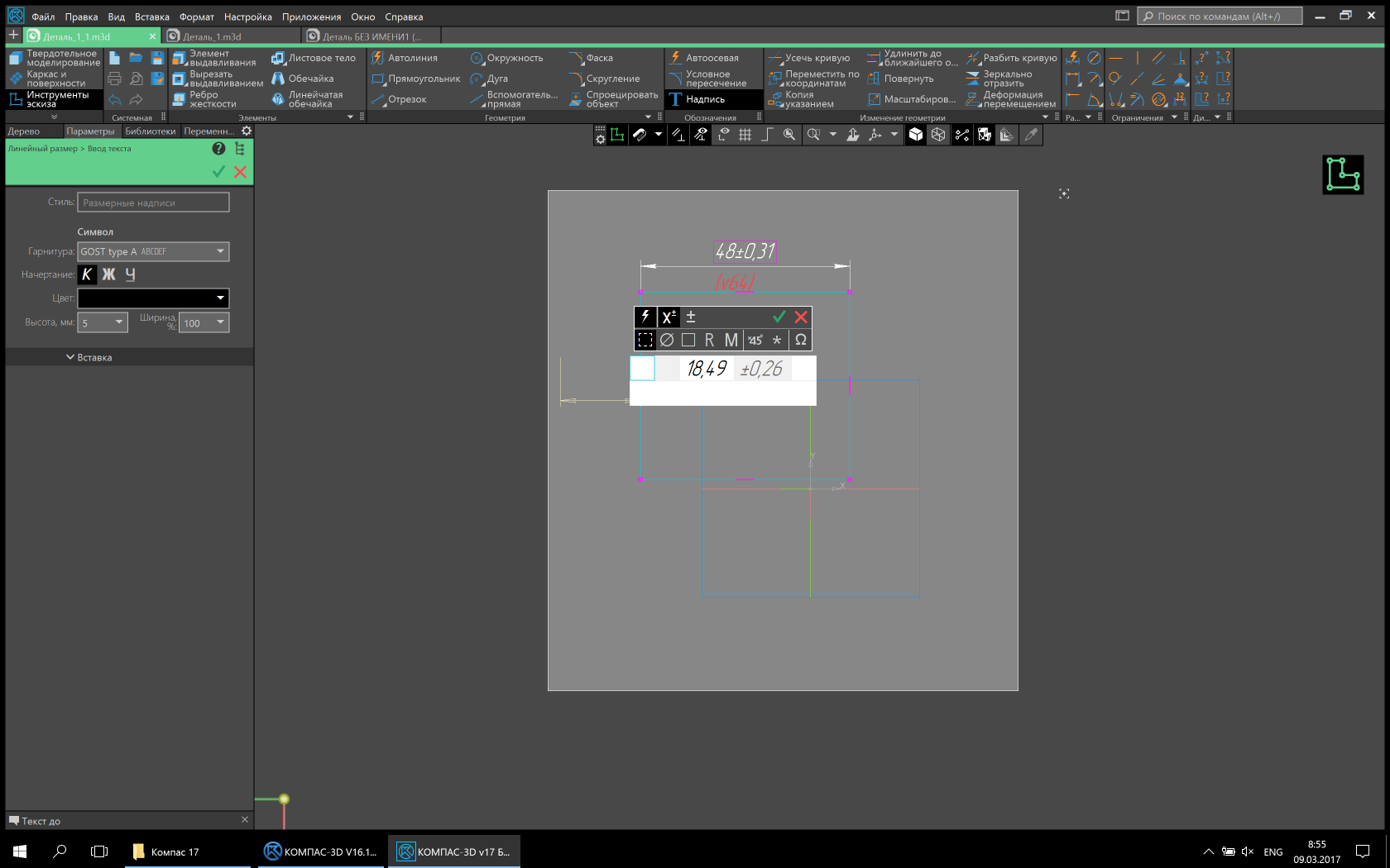
To maintain the streaming state of users, we removed the modality in the teams. Now almost all commands are available at any time. If the action in the command is completed, there are no construction errors and the user switches to another command, then the object is built without confirmation, and the transition to the next command is made. This allows you to work very effectively, without being distracted by artificial interruptions. Also minimized the number of dialog boxes. Some of them were removed completely, and their functionality was transferred to the “Parameters” panel, to the “trees” on the model / drawing. Some have transformed into a more comfortable look. For example, the size setting dialog now looks like a small panel next to the dimension text.
Dialogue for setting dimension text. Classic view (Picture is clickable)
Dialogue for setting dimension text. Updated view (Picture clickable)
To facilitate the location of objects implemented cross-selection. That is, if an object is present in a list or tree, then when it is selected on a model or drawing, it is highlighted in a tree or list and vice versa.
- Alif he straight.
Chapter 7. Contrast Themes
Why 50 shades of gray and why 50 shades darker.
At the very beginning of the article, I already wrote that the interface is evil. But did not decipher why. I do it now. The ideal interface, paradoxically, is the complete lack of interface. If the engineer had the opportunity to design products without any additional interface, then it would be an ideal product and everyone would like it. But historically, the evolution of technology proceeded through the development and improvement of tools, and any tool is an interface. By making the tool more convenient and efficient, you sort of remove it from your consciousness, i.e. don't notice it, it ceases to exist for you. Agree that during work you will often pay attention to the shovel, if its cutting is poorly polished, and you will not pay attention to the well-polished cutting, paying attention to digging. So with the interface. The less noticeable it is, the more you give yourself to your work, the more productive and happier you will become.
By making the gray-neutral the main color for the interface of the KOMPAS-3D v17, we have removed the unnecessary, annoying component of the old interface - the irrational multicolor.
Examples of causeless multicolor

Different display modes of the new interface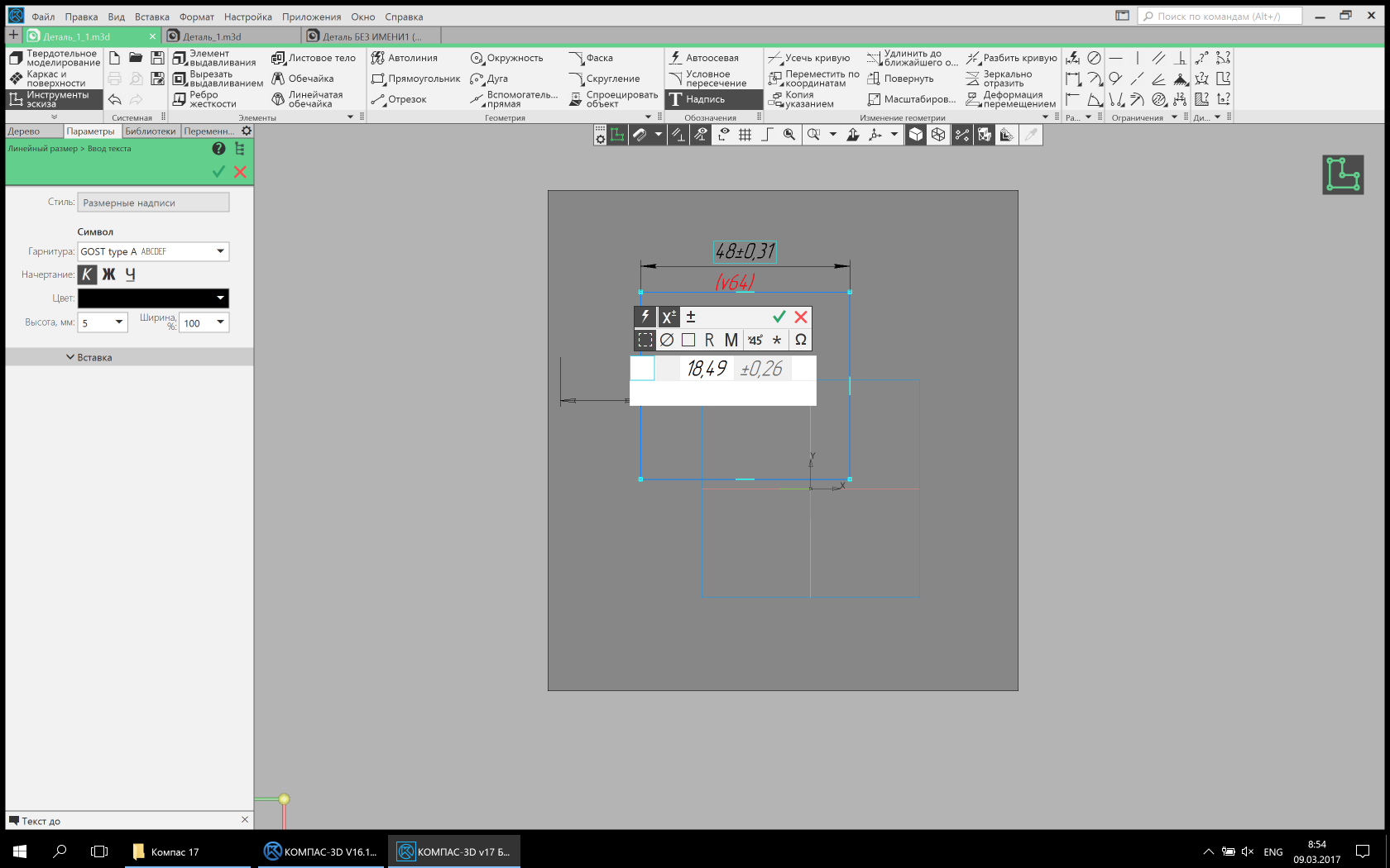
Monochrome icons. Light mode (Picture is clickable).
Monochrome icons. Dark mode (Picture is clickable).

Colored icons. Light mode (Picture is clickable).
Colored icons. Dark mode (Picture is clickable).
Monochrome icons. Light mode (Picture is clickable).
Monochrome icons. Dark mode (Picture is clickable).
Colored icons. Light mode (Picture is clickable).
Colored icons. Dark mode (Picture is clickable).
But we have not completely abandoned the color, as it may seem at first glance. Color is now an additional factor that attracts the user's attention. Whether it is a color model, or a drawing, or an indication of the state of the system. It is much easier to notice a bright colored light at dusk than on a festive Christmas tree with toys and tinsel. We did not forget about the contrast. The contrast of the new interface background: text \ icons is 11.2: 1 in the light theme and 5.69: 1 in the dark one. This is consistent with WCAG recommendations. Such a margin of contrast allows you to work with different lighting without straining your eyesight.
- How far he is bent!
What is ready? Not ready! Haircut just started!
Well, perhaps that's all. In the next versions we are not going to stop there and we will continue to improve the interface and working methods.
The “Frame” display mode is turned on (the image is clickable).
Collage of different display modes in one window (The image is clickable).
Sergey Shvetsov, ASCON user interface designerSource: https://habr.com/ru/post/326886/
All Articles