Logo for 24 hours. Cheap and tasteful?
Often I come across customers who open their business or are rebranding and want to start with the development of a logo. Their wishes are always different - someone likes a simple text logo with a company name or an abbreviation, someone sees the logo complex and ornate (in medieval style, with deep meaning and idea), someone wants to include a picture of his eight-year-old son in the logo.

Most customers have one thing in common - sincere confidence that logo development cannot take more than 2-3 days. And the price of such work is assumed to be appropriate. At the same time, they expect to get several options (preferably even concepts) and the possibility of an unlimited number of edits. They say: "Because I want to see options, for example, correct the color and a couple of lines."
A small study of the pricing policy at the Upwork site confirms: the prices of logos offered to customers, most of them range from $ 20 to $ 100. The timing is even more interesting - if the research on Russian companies showed, on average, from 2 days to 4 weeks to create, then in almost every third case, the result is already required within 24–48 hours in apvorki.
')
But is everything as simple as it seems? A number of pitfalls harbors even the initial definition of the logo.
Logotype (from other Greek. Λόγος - the word + τύπος - imprint) is a graphic sign, emblem or symbol used by territorial entities, commercial enterprises, organizations and individuals to increase recognition and recognizability in the society. A logo is the name of an entity that it identifies, in the form of stylized letters and / or ideograms.
(Wikipedia, the free encyclopedia)
Consider this very “essence” that the logo identifies and which is its cornerstone. The hidden meaning, a certain message that reflects the essence of the company's activities, can be seen in almost all logos (especially in the most well-known and, at first glance, simple).
For example, the well-known Amazon web service logo with an arrow from the letter A to the letter Z below is not just the name of the company with the original sign. The arrow points to specific letters: A and Z. Its creator thus emphasizes: on this web service you will find any necessary goods - from A to Z (in the Russian alphabet - from A to Z).

But in order to fill the logo with meaning, reflecting in it the goals, objectives and principles of the company, it is not enough to know what colors the customer prefers and what style of images is close to him. After all, it is this distinction - the first thing that sees a potential client, partner or candidate for the position. Therefore, the approach must be more thorough. To create something truly unique, you need to follow a certain strategy. Only then a memorable image will be born, which will be fixed in the understanding of potential customers and will be associated with the company of your customer in the future. Not a day, a month or even a year, but much longer.
At the very beginning of the negotiations, it is worth explaining to the customer (and it’s better to show with examples from the portfolio) what hard work you have to do, what are its steps, and most importantly, how high-quality and well-developed will the result be if you act that way.
Let's try to look at the process from the inside. Before the designer sits at the computer and starts drawing the logo, the preparatory stage is important. He plays a crucial role, determines the direction of the designer’s thoughts and the result of his work. Moreover, the completeness of the information received and its suitability for further use is the concern of the sales manager. He should describe the work process as accurately as possible, “talk” the client, get all the important information from him, learn all the nuances and wishes.
Of course, you can send a standard BRIEF to the client or (to simplify and speed up the process) ask questions in the form of an interview. But the first of them should not be about the preferences in terms of design and use of the logo on the press.
These are questions of a slightly different nature:
There can be many more questions, and their essence boils down to a global understanding of the customer's business and the formation of an understanding of the brand as a whole.
Further analysis of your customers' competitors is required. This is useful both for a general understanding of the essence of the activity, and for identifying certain trends in the presentation of logos and corporate style. And if the customer wants to stand out, say something special with your logo, you should not do it “like everyone else” (for example, use a flowery font and plant images for a flower shop). Another example is that many luxury cosmetic brands use black or gold color packaging for decorative cosmetics. And this will have to be taken into account - in the future, the logo will necessarily be placed on the wrapper of goods, on jars of powder or lipstick.
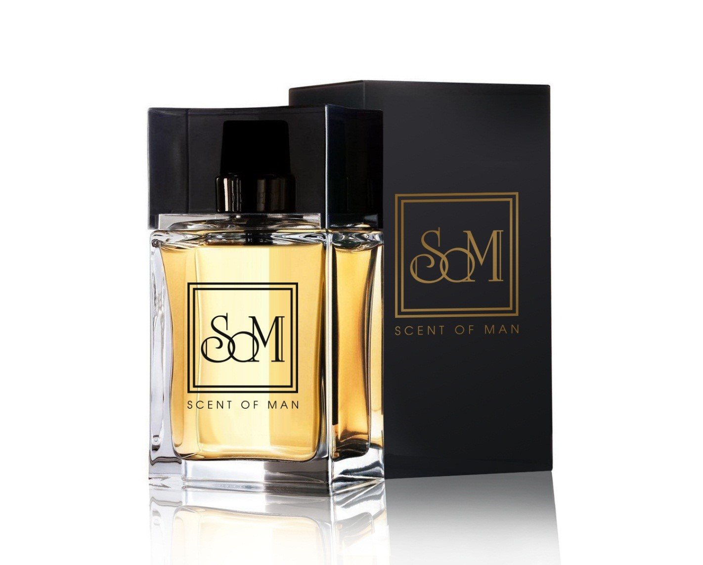
Here is an example of a logo that was developed by our team for the new men's fragrance brand Scent of Man. When working, we immediately took into account the possible color of the package and suggested how the logo would be applied to the bottle of cologne.
All these small and seemingly insignificant details form a complete picture, a brand image and, as a result, a future logo. And only on such studies can take from five days to several weeks - this is the scope of work of a sales manager or a marketer (if the company has this specialist).
After that, having all the information already in hand, you can proceed directly to prototyping and design. Everything here may depend on the creative imagination of the designer himself and a number of factors - the complexity and uniqueness of the field of activity, the features that the customer wants to see in the logo. Therefore, the deadline for the delivery of an order can be determined only conditionally (some ideas are born within an hour or two after the start of work, and some need to be comprehended, tested, revised and reconsidered).
When the logo is ready, you should not hurry and immediately send it to the customer. Since the designer who worked on the creation of the logo, was a direct participant in the whole process, he understands the essence of the idea, knows which way it came to, what inspired or prompted him an image. He sees its continued use and interpretation.
But ... what is obvious to one may be implicit to another. And often a ready-made logo by itself (on a black / white / color background) can cause a mixed customer response. The range of reaction - from "I need to think" to the indignant: "You absolutely did not understand what I told you about." Moreover, if a client has agreed in advance to your price, which is several times higher than what he declared and was ready to wait for the result, he wants to get a logo with the “WOW” effect! Therefore, in the presentation of the logo details are very important. At a minimum, it’s necessary to show how the logo will look on documents, office, T-shirt, diary cover, banner and so on - there are many auxiliary sets of ready mock-ups on which you can apply it.
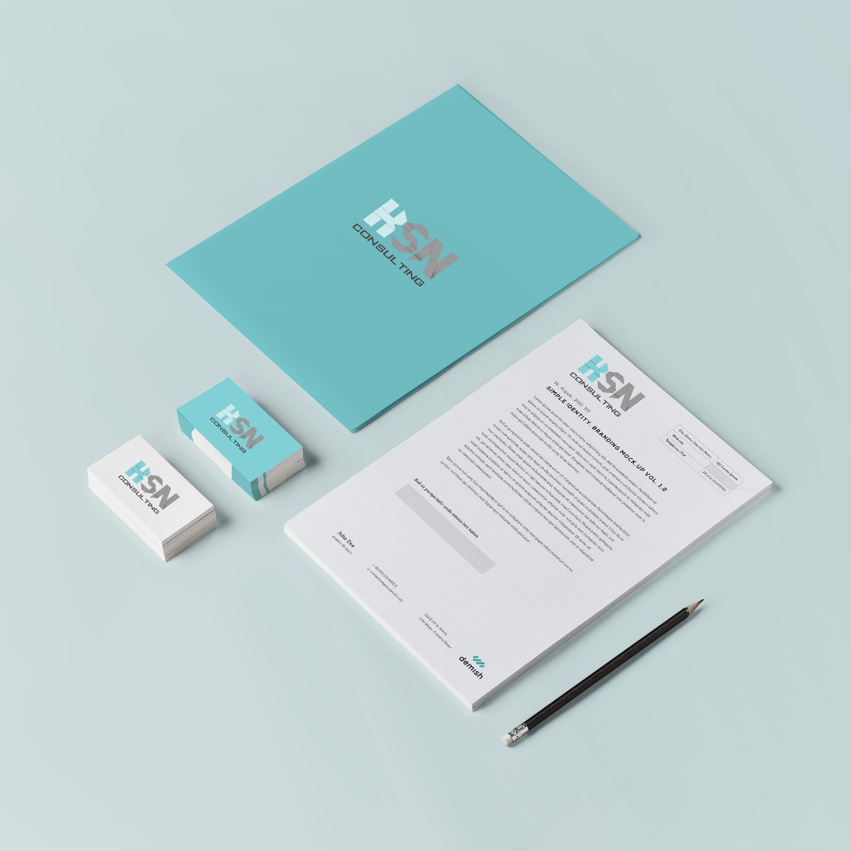
For example, we have developed a logo for a company that provides consulting services in the field of B2B. The colors were chosen by the customer, and one of the requirements was to single out the letter “K”, since the name of the customer’s daughter is Keren. For comparison below - the logo itself and applied to the mocap (by the way - this logo was accepted by the customer without a single edit).

A little harder is to play with variations of the logo idea itself: color, lines, shape (one of the main trends of 2016 was the so-called dynamic logos, and the trend does not lose its relevance). It makes sense to show how you can transform the color scheme depending on the use of the logo on various sites or transforming it for a postcard - congratulations on the New Year or March 8.
Our company logo is used in at least three basic color resolutions:

And the decisive factor can be a detailed presentation, where you describe what the idea was connected with and clearly show how the logo was created (you can include sketches, freehand sketches, photos of objects that prompted you to this idea). You will show the whole process, and the client himself, having familiarized himself with the presentation, will surely like your idea. The finished result may differ from the wishes of the customer, but if you can reveal the leitmotif of your plan and back it up with weighty arguments, the likelihood of handing over the work, having received a positive review, increases several times.
Of course, not all customers understand the essence of this process. For many, it looks like the simplest work for which an experienced designer needs to spend a day (at the same time, they expect that the logo will not yield to global brands). Therefore, communication, a detailed description, examples from the portfolio, a thoughtful presentation and a result orientation are the main components of success. You need to skillfully lead the customer to the idea: a high-quality and thoughtful logo that will not lose its relevance for many years and will distinguish your company from a number of competitors, becoming a worthy trademark of your products or services is the result of a phased work and a competent approach.
Most customers have one thing in common - sincere confidence that logo development cannot take more than 2-3 days. And the price of such work is assumed to be appropriate. At the same time, they expect to get several options (preferably even concepts) and the possibility of an unlimited number of edits. They say: "Because I want to see options, for example, correct the color and a couple of lines."
A small study of the pricing policy at the Upwork site confirms: the prices of logos offered to customers, most of them range from $ 20 to $ 100. The timing is even more interesting - if the research on Russian companies showed, on average, from 2 days to 4 weeks to create, then in almost every third case, the result is already required within 24–48 hours in apvorki.
')
But is everything as simple as it seems? A number of pitfalls harbors even the initial definition of the logo.
Logotype (from other Greek. Λόγος - the word + τύπος - imprint) is a graphic sign, emblem or symbol used by territorial entities, commercial enterprises, organizations and individuals to increase recognition and recognizability in the society. A logo is the name of an entity that it identifies, in the form of stylized letters and / or ideograms.
(Wikipedia, the free encyclopedia)
Consider this very “essence” that the logo identifies and which is its cornerstone. The hidden meaning, a certain message that reflects the essence of the company's activities, can be seen in almost all logos (especially in the most well-known and, at first glance, simple).
For example, the well-known Amazon web service logo with an arrow from the letter A to the letter Z below is not just the name of the company with the original sign. The arrow points to specific letters: A and Z. Its creator thus emphasizes: on this web service you will find any necessary goods - from A to Z (in the Russian alphabet - from A to Z).
But in order to fill the logo with meaning, reflecting in it the goals, objectives and principles of the company, it is not enough to know what colors the customer prefers and what style of images is close to him. After all, it is this distinction - the first thing that sees a potential client, partner or candidate for the position. Therefore, the approach must be more thorough. To create something truly unique, you need to follow a certain strategy. Only then a memorable image will be born, which will be fixed in the understanding of potential customers and will be associated with the company of your customer in the future. Not a day, a month or even a year, but much longer.
At the very beginning of the negotiations, it is worth explaining to the customer (and it’s better to show with examples from the portfolio) what hard work you have to do, what are its steps, and most importantly, how high-quality and well-developed will the result be if you act that way.
Let's try to look at the process from the inside. Before the designer sits at the computer and starts drawing the logo, the preparatory stage is important. He plays a crucial role, determines the direction of the designer’s thoughts and the result of his work. Moreover, the completeness of the information received and its suitability for further use is the concern of the sales manager. He should describe the work process as accurately as possible, “talk” the client, get all the important information from him, learn all the nuances and wishes.
Of course, you can send a standard BRIEF to the client or (to simplify and speed up the process) ask questions in the form of an interview. But the first of them should not be about the preferences in terms of design and use of the logo on the press.
These are questions of a slightly different nature:
- the type of activity of the company, the products it produces or the services it provides;
- the target audience of the company (age, education), why people prefer to work with you;
- positioning the company by the customer (it gives joy, simplifies work, makes the world cleaner and better, delivers unique products, helps to relax and forget about problems, produces healthy food).
There can be many more questions, and their essence boils down to a global understanding of the customer's business and the formation of an understanding of the brand as a whole.
Further analysis of your customers' competitors is required. This is useful both for a general understanding of the essence of the activity, and for identifying certain trends in the presentation of logos and corporate style. And if the customer wants to stand out, say something special with your logo, you should not do it “like everyone else” (for example, use a flowery font and plant images for a flower shop). Another example is that many luxury cosmetic brands use black or gold color packaging for decorative cosmetics. And this will have to be taken into account - in the future, the logo will necessarily be placed on the wrapper of goods, on jars of powder or lipstick.
Here is an example of a logo that was developed by our team for the new men's fragrance brand Scent of Man. When working, we immediately took into account the possible color of the package and suggested how the logo would be applied to the bottle of cologne.
All these small and seemingly insignificant details form a complete picture, a brand image and, as a result, a future logo. And only on such studies can take from five days to several weeks - this is the scope of work of a sales manager or a marketer (if the company has this specialist).
After that, having all the information already in hand, you can proceed directly to prototyping and design. Everything here may depend on the creative imagination of the designer himself and a number of factors - the complexity and uniqueness of the field of activity, the features that the customer wants to see in the logo. Therefore, the deadline for the delivery of an order can be determined only conditionally (some ideas are born within an hour or two after the start of work, and some need to be comprehended, tested, revised and reconsidered).
When the logo is ready, you should not hurry and immediately send it to the customer. Since the designer who worked on the creation of the logo, was a direct participant in the whole process, he understands the essence of the idea, knows which way it came to, what inspired or prompted him an image. He sees its continued use and interpretation.
But ... what is obvious to one may be implicit to another. And often a ready-made logo by itself (on a black / white / color background) can cause a mixed customer response. The range of reaction - from "I need to think" to the indignant: "You absolutely did not understand what I told you about." Moreover, if a client has agreed in advance to your price, which is several times higher than what he declared and was ready to wait for the result, he wants to get a logo with the “WOW” effect! Therefore, in the presentation of the logo details are very important. At a minimum, it’s necessary to show how the logo will look on documents, office, T-shirt, diary cover, banner and so on - there are many auxiliary sets of ready mock-ups on which you can apply it.
For example, we have developed a logo for a company that provides consulting services in the field of B2B. The colors were chosen by the customer, and one of the requirements was to single out the letter “K”, since the name of the customer’s daughter is Keren. For comparison below - the logo itself and applied to the mocap (by the way - this logo was accepted by the customer without a single edit).
A little harder is to play with variations of the logo idea itself: color, lines, shape (one of the main trends of 2016 was the so-called dynamic logos, and the trend does not lose its relevance). It makes sense to show how you can transform the color scheme depending on the use of the logo on various sites or transforming it for a postcard - congratulations on the New Year or March 8.
Our company logo is used in at least three basic color resolutions:
And the decisive factor can be a detailed presentation, where you describe what the idea was connected with and clearly show how the logo was created (you can include sketches, freehand sketches, photos of objects that prompted you to this idea). You will show the whole process, and the client himself, having familiarized himself with the presentation, will surely like your idea. The finished result may differ from the wishes of the customer, but if you can reveal the leitmotif of your plan and back it up with weighty arguments, the likelihood of handing over the work, having received a positive review, increases several times.
Of course, not all customers understand the essence of this process. For many, it looks like the simplest work for which an experienced designer needs to spend a day (at the same time, they expect that the logo will not yield to global brands). Therefore, communication, a detailed description, examples from the portfolio, a thoughtful presentation and a result orientation are the main components of success. You need to skillfully lead the customer to the idea: a high-quality and thoughtful logo that will not lose its relevance for many years and will distinguish your company from a number of competitors, becoming a worthy trademark of your products or services is the result of a phased work and a competent approach.
Source: https://habr.com/ru/post/326776/
All Articles