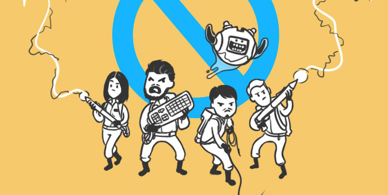
6 fresh examples of parsing and design improvements in simple ways
Last week we launched an experiment - free design assistance. Everyone who wanted was tagged with the #logomachine_help hashtag design that needed advice or refinement, and we chose who we could help and played with fonts, chose a color, improved the layout. I will say straight away that this is not a full-fledged design, but rather visual tips, so they are made on the go in Photoshop and allow inaccuracies and simplifications. But these examples will help everyone understand the problems in their design and improve it in a couple of clicks.

Immediately highlight the problems that appear when using a sticker with this design:
')
1. The elements are small and thin, the name is less than the subscript
2. The sticker is almost all white. From a distance meter it will turn into a spot with gray scribbles
Quickly fix the main problems: increase the name, add color. The carabiner that prevented you from reading the name will be made central. Behind we enclose a bright contour of the mountains and make wide fields to protect the sticker from being stripped off:

Such a sticker will be recognized better than the original due to the bright combination of colors and large text. Let's do the so-called “squint test”:

At the same time let's estimate how the sticker will look in life when it fades and is wrapped around:

Summarize
Pros:
+ The sticker has become more expressive due to accents and bright colors.
+ The name has become better readable and the recognition of the sticker has increased
Minuses:
- “naivety” disappeared. It is evident that not children did, it became stereotypical

This logo had no description, so I had to fantasize. Apparently, this is a sign or sign of a store, made in the form of a lid from the barrel. Probably, in this store everything natural, hand-made, natural, or, as it is fashionable to say, “crafting,” is appreciated. Then the problem is one:
1. Too computer inscription: you can’t write two identical "L"
A simple piece of advice to anyone who wants to make an inscription in handwriting: do not be lazy and actually write by hand. It will be more alive than any computer font. Write “Pally Store” with a marker and pencil on paper:

It now remains to circle the letters in the illustrator and put it in Photoshop on the lid of the barrel. We did not spend a lot of time on it, but even so it is clear that it became more “mentally”, as if someone had painted paint on wood:

To summarize the restyling
Pros:
+ The sign has become more man-made, it gives a feeling of comfort
Minuses:
- The handwritten inscription on the tree is difficult to read. If there is a small format, you will need a simplified version.

And what if you make a business card in the form of the table itself? Let's estimate:


Bottom line: it will turn out cool :)

This example illustrates the rule: effects with fonts are not friendly (with rare exceptions). We highlight the main problems:
1. Effects spoil the readability and bring us back to the nineties, when everyone was crazy about the possibilities of Word Art.
2. The already complex name was squeezed in the way it was done with the inscription “Ministry of Health warns” so that it could not be read.
Simply replace the pinched Impact with two free fonts with no effects:

Compare readability:

Summarize:
+ Having got rid of the effects, the logo stepped from the nineties into the two thousandth
+ Not clamped letters began to be better read.
- The logo has become longer
- If recognition is important, you need to come up with the SibTransNavigation emblem

Sergey is right - the logo needs to be improved:
1. In the text part mixed lowercase and uppercase. Look carefully: it is not written PARAGON and ParaGOn.
2. The sign is falling apart. The idea is clear - the letters P and G and between them S. But the composition is not dynamic and not static - just the lines are heaped.
3. Mutual dimensions of the signature, sign and text part need to be improved - there is no clear emphasis and mutual connection. Everything is about the same in mass.
We proceed to the redesign: we will type the text part, strengthen the composition and at the same time “modernize” the faded blue. Instead of a sign, we use a square — the original sign is to its form:

The composition is assembled, now you can dream up, what could be the sign. Let's take the most graphic element of the original logo, “G” and estimate it directly in Photoshop:
Looks cool, reminds%. And you can pull out the leg for the "P" from the first letter. This will break the symmetry, but will make the original meaning of “PG” explicit:

Total:
+ The logo has become more clear and complete due to the composition, colors and mark
- The original “Greek” motifs disappeared, the sign is no longer a rebus of PG and S

Choose the most promising option and make it more graphical:

We know that this is a store sign, so you can take an important step: think of how the logo will "live." Based on the name “Some people”, you can use different photos of people as corporate identity elements. Take free from unsplash.com :
This will be a step in the direction of what is called a “dynamic identity” - the rules by which brand elements are built, instead of one permanent sign. For “Some people” we can use different photos of people in a large format, and in small ones leave a colored logo. For example, on the box you can take a photo, but on the label you can’t see it anymore, we use color:

Bottom line: a simple sign turned into what is called a "visual hammer." With it, you can easily make recognizable business cards, a sign, arrange posts in social networks. Firstly, it will increase the recognition of “Some people”, and secondly, it will be easy to make each contact point with the client branded. This will show that “Some people” have the strength and resources to pay attention to detail.
Not all solutions are perfect, many should be brought to mind or made more unique. But, I think, as an example of simple improvements, they are quite suitable. Most of them - cutting off the excess, placing accents and increasing awareness "in life." The tendency to simplify is not so much a trend (it is already more than half a century), as a practical step towards improving perception.
If you need our logo design advice and more, use the hashtag #logomachine_help in social networks - we follow it and select candidates for redesign. And, as always, good design for your projects!
"Expedition" sticker: we strengthen elements
Immediately highlight the problems that appear when using a sticker with this design:
')
1. The elements are small and thin, the name is less than the subscript
2. The sticker is almost all white. From a distance meter it will turn into a spot with gray scribbles
Quickly fix the main problems: increase the name, add color. The carabiner that prevented you from reading the name will be made central. Behind we enclose a bright contour of the mountains and make wide fields to protect the sticker from being stripped off:
Such a sticker will be recognized better than the original due to the bright combination of colors and large text. Let's do the so-called “squint test”:
At the same time let's estimate how the sticker will look in life when it fades and is wrapped around:
Summarize
Pros:
+ The sticker has become more expressive due to accents and bright colors.
+ The name has become better readable and the recognition of the sticker has increased
Minuses:
- “naivety” disappeared. It is evident that not children did, it became stereotypical
Pally Store: add man-made
This logo had no description, so I had to fantasize. Apparently, this is a sign or sign of a store, made in the form of a lid from the barrel. Probably, in this store everything natural, hand-made, natural, or, as it is fashionable to say, “crafting,” is appreciated. Then the problem is one:
1. Too computer inscription: you can’t write two identical "L"
A simple piece of advice to anyone who wants to make an inscription in handwriting: do not be lazy and actually write by hand. It will be more alive than any computer font. Write “Pally Store” with a marker and pencil on paper:
It now remains to circle the letters in the illustrator and put it in Photoshop on the lid of the barrel. We did not spend a lot of time on it, but even so it is clear that it became more “mentally”, as if someone had painted paint on wood:
To summarize the restyling
Pros:
+ The sign has become more man-made, it gives a feeling of comfort
Minuses:
- The handwritten inscription on the tree is difficult to read. If there is a small format, you will need a simplified version.
Excel specialist business card: visualize the idea
And what if you make a business card in the form of the table itself? Let's estimate:
Bottom line: it will turn out cool :)
SibTransNavigation: we play with fonts
This example illustrates the rule: effects with fonts are not friendly (with rare exceptions). We highlight the main problems:
1. Effects spoil the readability and bring us back to the nineties, when everyone was crazy about the possibilities of Word Art.
2. The already complex name was squeezed in the way it was done with the inscription “Ministry of Health warns” so that it could not be read.
Simply replace the pinched Impact with two free fonts with no effects:
Compare readability:
Summarize:
+ Having got rid of the effects, the logo stepped from the nineties into the two thousandth
+ Not clamped letters began to be better read.
- The logo has become longer
- If recognition is important, you need to come up with the SibTransNavigation emblem
Paragon: improving the composition
Sergey is right - the logo needs to be improved:
1. In the text part mixed lowercase and uppercase. Look carefully: it is not written PARAGON and ParaGOn.
2. The sign is falling apart. The idea is clear - the letters P and G and between them S. But the composition is not dynamic and not static - just the lines are heaped.
3. Mutual dimensions of the signature, sign and text part need to be improved - there is no clear emphasis and mutual connection. Everything is about the same in mass.
We proceed to the redesign: we will type the text part, strengthen the composition and at the same time “modernize” the faded blue. Instead of a sign, we use a square — the original sign is to its form:
The composition is assembled, now you can dream up, what could be the sign. Let's take the most graphic element of the original logo, “G” and estimate it directly in Photoshop:
Looks cool, reminds%. And you can pull out the leg for the "P" from the first letter. This will break the symmetry, but will make the original meaning of “PG” explicit:
Total:
+ The logo has become more clear and complete due to the composition, colors and mark
- The original “Greek” motifs disappeared, the sign is no longer a rebus of PG and S
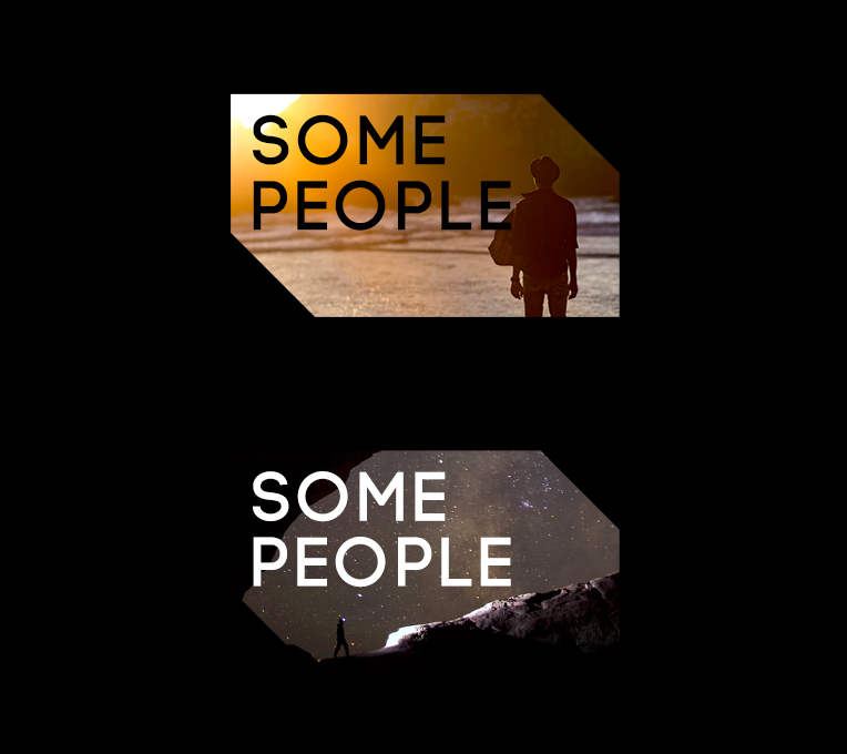
Some people: choose the best option
Choose the most promising option and make it more graphical:
We know that this is a store sign, so you can take an important step: think of how the logo will "live." Based on the name “Some people”, you can use different photos of people as corporate identity elements. Take free from unsplash.com :
This will be a step in the direction of what is called a “dynamic identity” - the rules by which brand elements are built, instead of one permanent sign. For “Some people” we can use different photos of people in a large format, and in small ones leave a colored logo. For example, on the box you can take a photo, but on the label you can’t see it anymore, we use color:
Bottom line: a simple sign turned into what is called a "visual hammer." With it, you can easily make recognizable business cards, a sign, arrange posts in social networks. Firstly, it will increase the recognition of “Some people”, and secondly, it will be easy to make each contact point with the client branded. This will show that “Some people” have the strength and resources to pay attention to detail.
Let's summarize
Not all solutions are perfect, many should be brought to mind or made more unique. But, I think, as an example of simple improvements, they are quite suitable. Most of them - cutting off the excess, placing accents and increasing awareness "in life." The tendency to simplify is not so much a trend (it is already more than half a century), as a practical step towards improving perception.
If you need our logo design advice and more, use the hashtag #logomachine_help in social networks - we follow it and select candidates for redesign. And, as always, good design for your projects!
Source: https://habr.com/ru/post/325994/
All Articles