Surf Studio: machine learning in production
Introducing the guest post from the company Surf Studio ( Certified Google Developer Agency ).
Hi, Habr. My name is Alexander Olferuk ( @olferuk ), I do machine learning in Surf . Since 2011, we have been developing mobile applications for large businesses, and now we are preparing to release a B2B product with TensorFlow. Thanks to colleagues from Google for the opportunity to tell a little about our experience.
In modern machine learning there are many enthusiasts, but critically there are not enough professionals. In our team, I watched the transformation of such enthusiasts into specialists with combat experience. While developing the first commercial product for us related to machine learning, the team was faced with a bunch of nuances. All the favorite competitions at Kaggle were very far from solving the problems of real business. Now I want to share experiences, show examples and tell a little about what we went through.
Task
The task of our system is to predict the optimal margin for retail goods, having a three-year history of sales. The goal is to make the client's business more profitable, of course. The data is aggregated by week: the technical characteristics of the goods are known, how many units of the goods were sold, how many stores the goods are in stock, purchase and retail prices, as well as the resulting profits. This is raw data, sales are influenced by many more factors. All other signs, ranging from inflation and commodity prices, and ending with the weather, we collected on our own. Before us was a catalog with more than 20,000 products. Because of the difference in their types, we came to the construction of not one, but immediately a family of models. Each of them trains on stories about products, in terms of sales behaving the same way.
')
In machine learning competitions, the value for prediction is usually predetermined. In a real business project, we are entitled to choose it ourselves. Which is better: try to predict the profit, mark-up, or maybe the quantity of goods sold? We start from the fact that we can predict effectively, and that will allow the client to earn more money.
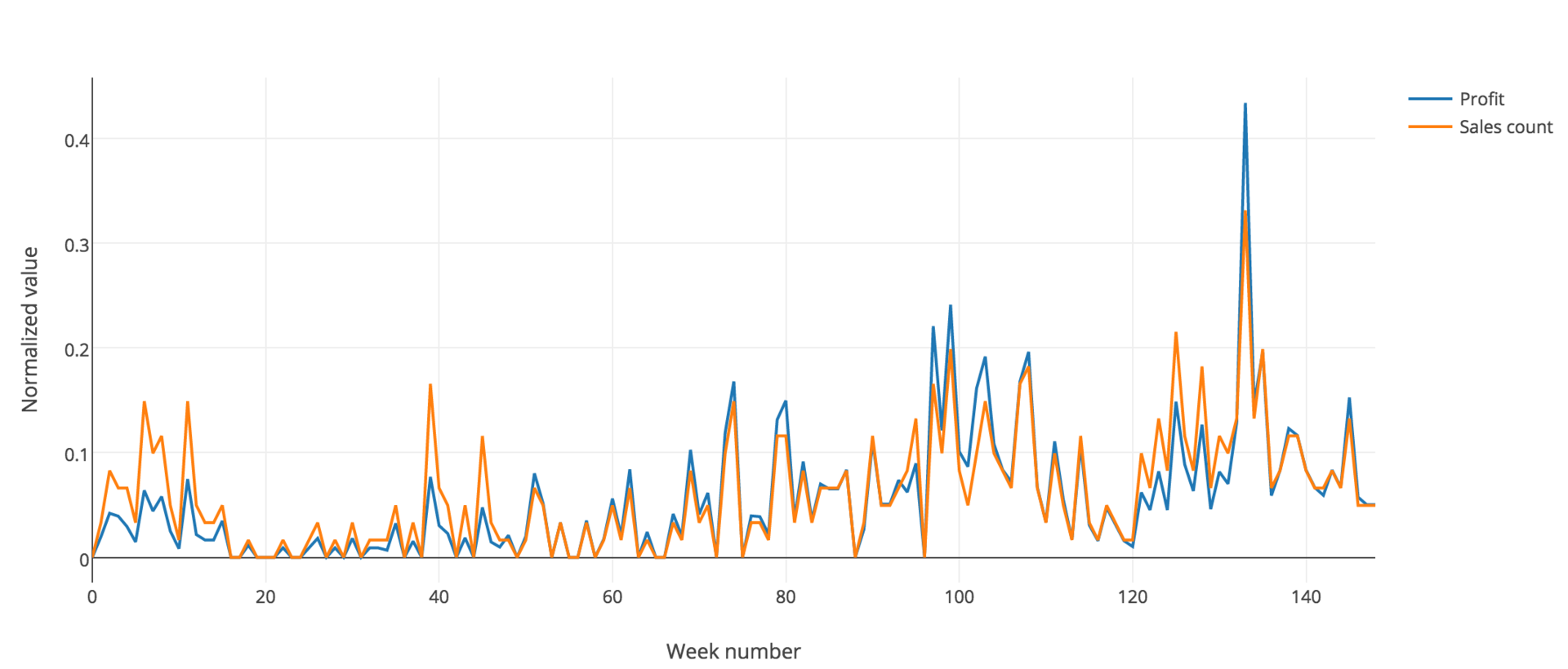
The X axis here is time broken by weeks. Y is the normalized value, including profit (blue line) and the number of sales (orange line). Since they almost coincide, we can rely on or on any of them in our task.
There is another, no less important difference. The real world is not as perfect as artificial models. If in competitions the only important criterion is accuracy, then in a real business project it is vital to keep a delicate balance between accuracy and common sense.
How to start a project?
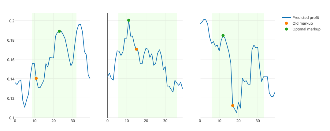
The first thing you need to select the appropriate metric. It should not only reflect the accuracy of the solution, but also correspond to the logic of the subject area. Obviously, when choosing a markup for a product to maximize profits, it is pointless to choose its zero or extremely large. It is unprofitable either to the buyer or to the store. So the solution must be sought in the confidence interval, based on reasonable price limits for a particular product, as well as on its old price.
A lot has been said about cross-validation, many techniques have been described . Our task is connected with historical data, that is, changing over time. Therefore, it is impossible to break the sample into random folds; one can only predict the future values of the profit level, learning from the past.
However, not all data is equally useful. As I said, when building models, we take into account real life. Anomalous data can distort the overall picture and significantly affect the effectiveness of the model. Therefore, the data collected during the crisis of the end of 2015 - the beginning of 2016, we decided not to consider.
Pipeline
After selecting the metric and cross-validation, the team’s efforts must be made to implement the end-to-end structure as early as possible.

The structure on the diagram is constant and should not change with the development of the project. At first, it is better to limit data cleansing at least in the fight against missing values: for most classifiers, the absence of NaN values in the data is critical. It is also necessary to postpone the transformation of signs and the addition of new ones.
After that, you need to choose a baseline model, for example, a decisive forest. Use it to generate the first reporting. Answer two questions: “What would the customer want to see?”, “What kind of results will be understandable and useful for subject matter experts?”. Reports and necessary schedules form based on the answers to these questions. In the course of further development, it is worth going back to this step, replying again, saving the answers, analyzing the progress.
In practice, we received a system with formed reporting rather late. Therefore, to visually see the positive dynamics in the development of the model is very difficult.
In the role of architecture for solving such problems, pipelines, which are abstractions representing a chain of transformations or a combination of functions, have perfectly recommended themselves.
In the initial implementation, each of the stages in this chain is a transformer that accepts an object of class ndarray (is a numpy-object) as input.
We decided to improve this solution. At each stage, I wanted to get a new Pandas dataframe. In this case, the classifiers will receive all the signs necessary for learning from the final table, and visualization will be simplified, because all the explanatory labels are at hand.
We refused such libraries as sklearn-pandas or luigi . In fact, we wrote our own bike. This is a small and very raw helper, which we made exclusively for ourselves. In the near future, the haircut, but you can use it now . We have tried to make a transparent and capacious interface with the above features.
Here are some example steps from our pipeline.
Add metal prices, as well as prices with a lag of 1 and 2 months:
('add_metal', DFFeatureUnion([ ('metal', DFPipeline([ ('load_metal', MetalAppender()), ('metal_lag', Lagger([4, 8])) ])) ])) And one more:
('lags', Lagger(columns_strategies={ 'Z': { 'lags': [1, 2], 'groupby': 'name' }, 'X': { 'lags': [1], 'groupby': 'name' }, 'Y': { 'lags': [1], 'groupby': 'name' }, 'markup': { 'lags': [1], 'groupby': 'name' } })) Here the logic is somewhat more complicated than simply moving the column with the shift operator from the Pandas box. We must bear in mind that each of the signs is shifted only for a particular product, and not in the entire table at once. In order to solve this problem, the Lagger class was created.
Development model
Further development of the project is a spiral model of development. If you have new ideas: connect new signs or another way of processing existing ones - check. With the built architecture, testing your every hypothesis will look like this:
- We modify the data processing pipeline, make the necessary changes;
- retrain estimator, select the optimal hyperparameters;
- we calculate the new score for the obtained classifier;
- We visualize the results, form reports, compare, draw conclusions.
A small clarification on the third paragraph. It is worth paying attention not to the absolute values of the metric, but only to its change. Not only that: you can’t trust this difference if, on the scale of your sample, everything fits into the framework of random deviation.
There are good project organization guidelines. You can read about this and this , for example.
If you open the project folder, here's what we will see inside:
project/ ├── data/ <- ├── cache/ <- pickle- ├── notebooks/ <- ├── scripts/ <- *.py- ├── logs/ <- ├── out/ <- , : └─ reports/ <- , xls- └─ plots/ <- , plotly ├── requirements <- └── README.md How to divide the task between team members to work without interfering with each other? We came up with this scheme: in the working directory there is a set of Jupyter notebooks, Python scripts and the data itself: cache, reports, graphics. Everyone works in a separate notebook. I think it is not necessary to say that the notebook should be well commented, and all calculations in them are reproducible.
How many notebooks do you need and how big should they be? From our experience - a separate notebook for each experiment. Example: "Checking the need to introduce a confidence interval for predictions." This includes both the necessary logic code and visualization. Again, good and see what others advise .
As soon as the experiment is completed and the hypothesis is verified, all the necessary functions are tested and sent to the Python scripts. If the experiment justified itself, of course.
Visualize it
Before submitting data to the entrance to the classifier and evaluate the result, it is necessary to figure out what we are dealing with. Here are some tools that helped us in our work:
• To visualize missing values, use the MissingNo library.
• In order to evaluate the nature of the distribution of the trait , we used histograms: violin plot (it is provided, for example, by the seaborn library), box plot. Why do you need it?
- The nature of the distribution tells you what to do with the missing value: filling with a mod is quite suitable for the beveled ones, but in the case of a normal distribution, you should use the expectation.
- Skewed data needs to be processed accordingly. For example, using logarithmization or finding the root of the Nth degree makes the distribution of a trait more like a normal one. This usually helps to increase accuracy.
• To estimate the importance of the feature , factor plot was used.
• To assess the pairwise correlation of features, the correlation matrix and the scatterplot matrix were used. The goal is to find strongly correlated symptoms and exclude similar ones, if any. They do not bear any clear value for the classifier, they only increase the variance of the predictions.

This is how we tested the effect of inflation. The graph in blue shows the change in the level of the retail price of goods in time. However, it is only necessary to subtract inflation (orange dots), it becomes clear that the retail price fluctuates around a certain level (if you count everything in January 2014 prices, that is, zero week). So, we correctly took into account the influence of the external economic factor.
Moving to the clouds with Google
So, we have built a pipeline that does everything necessary: from loading and processing data to the formation of the final prediction. Now you need to think about how to make models more accurate.
For this we can:
- choose the best signs;
- add new ones;
- search for the best hyperparameters of the models.
If you want to modify the finished pipeline, for example, change MinMaxScaler to StandardScaler - you will have to process the data and adjust the parameters of the models again. Whether you have a lot of data or not much, on home and work computers, to run through dozens of grid search cycles to find the best hyperparameters is for the patient. It is too long. Highly.
Our solution is ripe right away: we are moving to Google Cloud . We, however, had to refuse DataLab : only Python version 2.7 is supported. As part of the task, we did not need a rich infrastructure, we needed a very powerful virtual machine, and we could deploy JupyterHub ourselves.
On the remote machine we created several directories: common and separate for each team member. This allowed everyone not only to work in a common environment, but also, if desired, to organize their own git flow in a separate section. For the sake of security, everyone went over https only, the ssh certificate was also made.
From the interesting: Google's scripts for starting virtual machines are written in Python 3.5 and did not want to be friends with our Python 3.6. Fortunately, everything turned out to be solved.
Was the game worth the candle? Of course! It took a couple of days for the working computers to go through all the hyperparameters for the pipeline. Everything was much faster in the Google cloud. Are you leaving home from work? I came in the morning and everything is ready.
What is the result?
From the client's ERP-system (1C, SAP, Oracle and others), you can download historical sales data on demand. The group of products for which you need to generate forecasts is indicated separately. Add additional data collected from open sources.
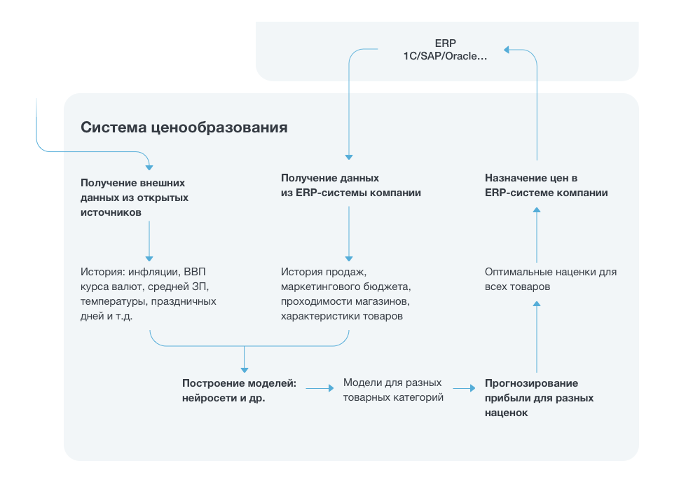
Since the optimal parameters of the model are found and cached, it remains little: to train the model and use it to generate new reports. The reports for the client are collected as aggregated statistics on the available data and forecasts: by company, by product category, by individual goods.
The client can adjust the pricing policy on the basis of the received forecasts.
A / B-test on hardcore
To show business that smart machines can not only recognize pictures of watermelons and write funny poems, results are needed. As long as there are no well-known results in the industry, everyone will look at such decisions with great fear.
We are very lucky with the client. They believed in a new technology for them and gave us an important chance to conduct a hardcore A / B test. Our code was entrusted to formulate price recommendations for all products of the network in the whole region. The total data is comparable with the data for the regions where prices are formed in the old manner. If everything goes well, we will be proud of having changed the world a little bit, made our modest contribution to the industry and the penetration of machine learning into business. Cross your fingers for us?
At the end
Remember that simple solutions are often the best, and the best code is clean.
Brush your teeth twice a day.
Reread McConnell.
Crossfit and sports betting are not worth the time spent.
Spend more time with your family.
Good luck, happiness, health!
Source: https://habr.com/ru/post/325896/
All Articles