Open machine learning course. Theme 7. Teaching without a teacher: PCA and clustering
Hello to all! We invite you to explore the seventh topic of our open machine learning course!
 We will devote this lesson to unsupervised learning methods, in particular, PCA - principal component analysis and clustering. You will learn why to reduce the dimension in the data, how to do it and what are the ways to group similar observations in the data.
UPD: now the course is in English under the brand mlcourse.ai with articles on Medium, and materials on Kaggle ( Dataset ) and on GitHub .
Video recording of the lecture based on this article in the second run of the open course (September-November 2017).
- Primary data analysis with Pandas
- Visual data analysis with Python
- Classification, decision trees and the method of nearest neighbors
- Linear classification and regression models
- Compositions: bagging, random forest. Validation and training curves
- Construction and selection of signs
- Teaching without a teacher: PCA, clustering
- Training in gigabytes with Vowpal Wabbit
- Time Series Analysis with Python
- Gradient boosting
Plan for this article
- Principal Component Method (PCA)
- Intuition, theory and application features
- Examples of using
- Clustering
- K-means
- Affinity propagation
- Spectral clustering
- Agglomerative clustering
- Clustering Quality Metrics
- Homework
- Useful sources
0. Introduction
The main difference between teaching methods without a teacher and the usual classifications and regressions of machine learning is that there are no markup for the data in this case. This creates several features at once - firstly, the possibility of using incomparably large amounts of data, since they will not need to be laid out for training, and secondly, it is the ambiguity of measuring the quality of methods, due to the lack of straightforward and intuitive metrics, as in learning tasks with a teacher.
One of the most obvious tasks that arise in the head in the absence of explicit markup is the task of reducing the dimensionality of the data. On the one hand, it can be considered as an aid in data visualization; for this, the t-SNE method is often used, which we considered in the second article of the course. On the other hand, such a reduction in dimensionality can remove unnecessary strongly correlated features from observations and prepare data for further processing in the teacher’s training mode, for example, to make the input data more “digestible” for decision trees.
1. Principal Component Method (PCA)
Intuition, theory and application features
The Principal Component Analysis method is one of the most intuitively simple and frequently used methods for reducing the dimensionality of data and projecting them onto an orthogonal subspace of features.
 In a very general form, this can be represented as the assumption that all our observations most likely look like some kind of ellipsoid in the subspace of our original space and our new basis in this space coincides with the axes of this ellipsoid. This assumption allows us to simultaneously get rid of strongly correlated features, since the vectors of the basis of the space onto which we project will be orthogonal.
In the general case, the dimension of this ellipsoid will be equal to the dimension of the original space, but our assumption that the data lie in a subspace of a smaller dimension allows us to discard the “extra” subspace in the new projection, namely, the subspace with the least extension of the ellipsoid. We will do this "greedily", choosing in turn as the new element of the basis of our new subspace successively the axis of the ellipsoid from the remaining, along which the dispersion will be maximum.
"There is a lot of space for you, and it’s fourteen 'very loudly. Everyone does it." - Geoffrey Hinton
Consider how this is done mathematically:
To reduce the dimension of our data from n at k , k l e q n we need to choose top k axes of such an ellipsoid, sorted in descending order by dispersion along the axes.
To begin with, we calculate the variances and covariances of the original features. This is done simply by using a covariance matrix. By definition, covariance, for two signs X i and X j their covariance will be
c o v ( X i , X j ) = E [ ( X i - m u i ) ( X j - m u j ) ] = E [ X i X j ] - m u i m i u j
Where m u i - expectation i th sign.
In this case, we note that the covariance is symmetric and the covariance of the vector with itself will be equal to its dispersion.
Thus, the covariance matrix is a symmetric matrix, where the dispersions of the corresponding signs lie on the diagonal, and outside the diagonal lie the covariances of the corresponding pairs of characters. In the matrix form, where mathbfX this is a matrix of observations, our covariance matrix will look like
Sigma=E[( mathbfX−E[ mathbfX])( mathbfX−E[ mathbfX])T]
To refresh the memory - matrices like linear operators have such an interesting property as eigenvalues and eigenvectors (eigenvalues and eigenvectors). These pieces are remarkable in that when we act on the corresponding linear space with our matrix, the eigenvectors remain in place and are only multiplied by their corresponding eigenvalues. That is, they define a subspace that, under the action of this matrix as a linear operator, remains in place or "goes into itself." Formally own vector wi with own value lambdai for matrix M simply defined as Mwi= lambdaiwi .
Covariance matrix for our sample mathbfX can be represented as a work mathbfXT mathbfX . From the Rayleigh relation it follows that the maximum variation of our data set will be achieved along the eigenvector of this matrix, corresponding to the maximum eigenvalue. Thus, the main components on which we would like to project our data are simply the eigenvectors of the corresponding top k pieces of eigenvalues of this matrix.
Further steps are simple to disgrace - you just need to multiply our data matrix on these components and we get the projection of our data in the orthogonal basis of these components. Now, if we transpose our data matrix and the matrix of principal component vectors, we will restore the original sample in the space from which we projected onto the components. If the number of components was less than the dimension of the original space, we will lose some of the information with this conversion.
Examples of using
Iris flowers data set
To begin with, we will load all the necessary modules and twist the usual dataset with irises, following the example from the documentation of the scikit-learn package.
import numpy as np import matplotlib.pyplot as plt import seaborn as sns; sns.set(style='white') %matplotlib inline from sklearn import decomposition from sklearn import datasets from mpl_toolkits.mplot3d import Axes3D # iris = datasets.load_iris() X = iris.data y = iris.target # fig = plt.figure(1, figsize=(6, 5)) plt.clf() ax = Axes3D(fig, rect=[0, 0, .95, 1], elev=48, azim=134) plt.cla() for name, label in [('Setosa', 0), ('Versicolour', 1), ('Virginica', 2)]: ax.text3D(X[y == label, 0].mean(), X[y == label, 1].mean() + 1.5, X[y == label, 2].mean(), name, horizontalalignment='center', bbox=dict(alpha=.5, edgecolor='w', facecolor='w')) # , y_clr = np.choose(y, [1, 2, 0]).astype(np.float) ax.scatter(X[:, 0], X[:, 1], X[:, 2], c=y_clr, cmap=plt.cm.spectral) ax.w_xaxis.set_ticklabels([]) ax.w_yaxis.set_ticklabels([]) ax.w_zaxis.set_ticklabels([]) 
Now let's see how PCA improves the results for the model, which in this case will not cope with the classification due to the fact that it does not have enough difficulty to describe the data:
from sklearn.tree import DecisionTreeClassifier from sklearn.model_selection import train_test_split from sklearn.metrics import accuracy_score, roc_auc_score # X_train, X_test, y_train, y_test = train_test_split(X, y, test_size=.3, stratify=y, random_state=42) # clf = DecisionTreeClassifier(max_depth=2, random_state=42) clf.fit(X_train, y_train) preds = clf.predict_proba(X_test) print('Accuracy: {:.5f}'.format(accuracy_score(y_test, preds.argmax(axis=1)))) Out: Accuracy: 0.88889 Now let's try to do the same, but with the data for which we have reduced the dimension to 2D:
# sklearn PCA pca = decomposition.PCA(n_components=2) X_centered = X - X.mean(axis=0) pca.fit(X_centered) X_pca = pca.transform(X_centered) # plt.plot(X_pca[y == 0, 0], X_pca[y == 0, 1], 'bo', label='Setosa') plt.plot(X_pca[y == 1, 0], X_pca[y == 1, 1], 'go', label='Versicolour') plt.plot(X_pca[y == 2, 0], X_pca[y == 2, 1], 'ro', label='Virginica') plt.legend(loc=0); 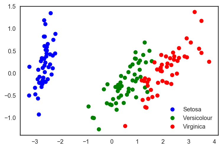
# . X_train, X_test, y_train, y_test = train_test_split(X_pca, y, test_size=.3, stratify=y, random_state=42) clf = DecisionTreeClassifier(max_depth=2, random_state=42) clf.fit(X_train, y_train) preds = clf.predict_proba(X_test) print('Accuracy: {:.5f}'.format(accuracy_score(y_test, preds.argmax(axis=1)))) We look at the increased accuracy of classification:
Out: Accuracy: 0.91111 It can be seen that the quality has increased slightly, but for more complex data of a higher dimension, where the data is not broken trivially along a single attribute, the use of PCA can significantly improve the quality of operation of decision trees and ensembles based on them.
Let's look at the 2 main components in the latest PCA representation of the data and the percentage of the initial variance in the data, which they "explain".
for i, component in enumerate(pca.components_): print("{} component: {}% of initial variance".format(i + 1, round(100 * pca.explained_variance_ratio_[i], 2))) print(" + ".join("%.3f x %s" % (value, name) for value, name in zip(component, iris.feature_names))) 1 component: 92.46% of initial variance 0.362 x sepal length (cm) + -0.082 x sepal width (cm) + 0.857 x petal length (cm) + 0.359 x petal width (cm) 2 component: 5.3% of initial variance 0.657 x sepal length (cm) + 0.730 x sepal width (cm) + -0.176 x petal length (cm) + -0.075 x petal width (cm) Handwritten Number Data Set
Now take a set of handwritten numbers. We already worked with him in article 3 about decision trees and the method of nearest neighbors.
digits = datasets.load_digits() X = digits.data y = digits.target Recall what these numbers look like - let's look at the first ten. The pictures here are represented by an 8 x 8 matrix (the intensities of white for each pixel). Further, this matrix "unfolds" into a vector of length 64, a characteristic description of the object is obtained.
# f, axes = plt.subplots(5, 2, sharey=True, figsize=(16,6)) plt.figure(figsize=(16, 6)) for i in range(10): plt.subplot(2, 5, i + 1) plt.imshow(X[i,:].reshape([8,8])); 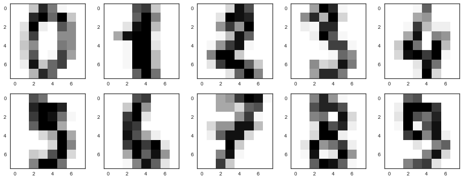
It turns out that the dimension of the attribute space here is 64. But let's reduce the dimension to only 2 and see that even by eye, the handwritten numbers are well divided into clusters.
pca = decomposition.PCA(n_components=2) X_reduced = pca.fit_transform(X) print('Projecting %d-dimensional data to 2D' % X.shape[1]) plt.figure(figsize=(12,10)) plt.scatter(X_reduced[:, 0], X_reduced[:, 1], c=y, edgecolor='none', alpha=0.7, s=40, cmap=plt.cm.get_cmap('nipy_spectral', 10)) plt.colorbar() plt.title('MNIST. PCA projection') 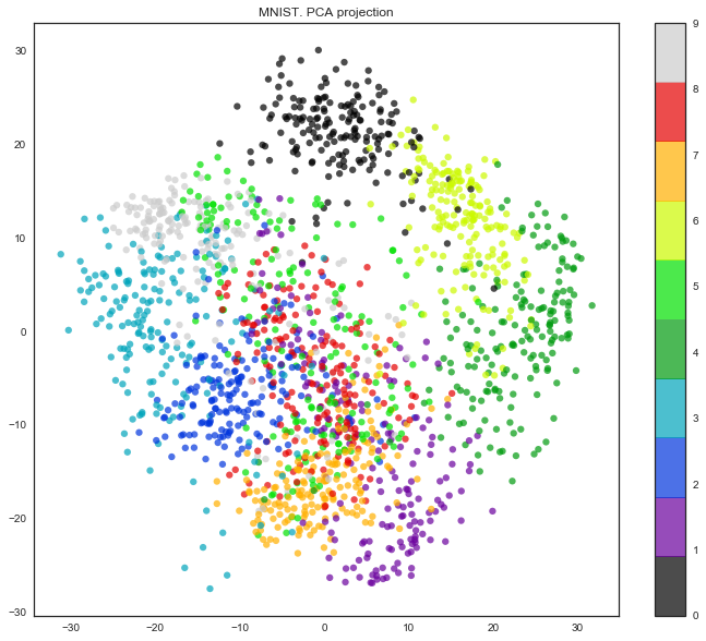
Well, the truth is, the picture is even better with t-SNE, since the PCA has a limitation - it only finds linear combinations of the original features. But even on this relatively small data set, you can see how much t-SNE works longer.
%%time from sklearn.manifold import TSNE tsne = TSNE(random_state=17) X_tsne = tsne.fit_transform(X) plt.figure(figsize=(12,10)) plt.scatter(X_tsne[:, 0], X_tsne[:, 1], c=y, edgecolor='none', alpha=0.7, s=40, cmap=plt.cm.get_cmap('nipy_spectral', 10)) plt.colorbar() plt.title('MNIST. t-SNE projection') 
In practice, as a rule, so many principal components are chosen to leave 90% of the variance of the original data. In this case, it is enough to select 21 main components, that is, to reduce the dimension from 64 features to 21.
pca = decomposition.PCA().fit(X) plt.figure(figsize=(10,7)) plt.plot(np.cumsum(pca.explained_variance_ratio_), color='k', lw=2) plt.xlabel('Number of components') plt.ylabel('Total explained variance') plt.xlim(0, 63) plt.yticks(np.arange(0, 1.1, 0.1)) plt.axvline(21, c='b') plt.axhline(0.9, c='r') plt.show(); 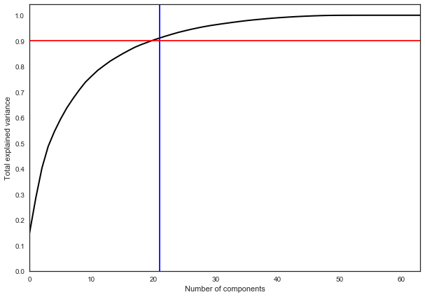
2. Clustering
The intuitive formulation of the clustering problem is quite simple and is our desire to say: "Here I have points. I see that they fall into some piles together. It would be cool to be able to refer these points to piles in the case of new the points on the plane say which pile it falls into. " From this formulation, it is clear that there is a lot of space for fantasy, and this results in a corresponding set of algorithms for solving this problem. The listed algorithms do not in any way describe this set completely, but are examples of the most popular methods for solving the clustering problem.
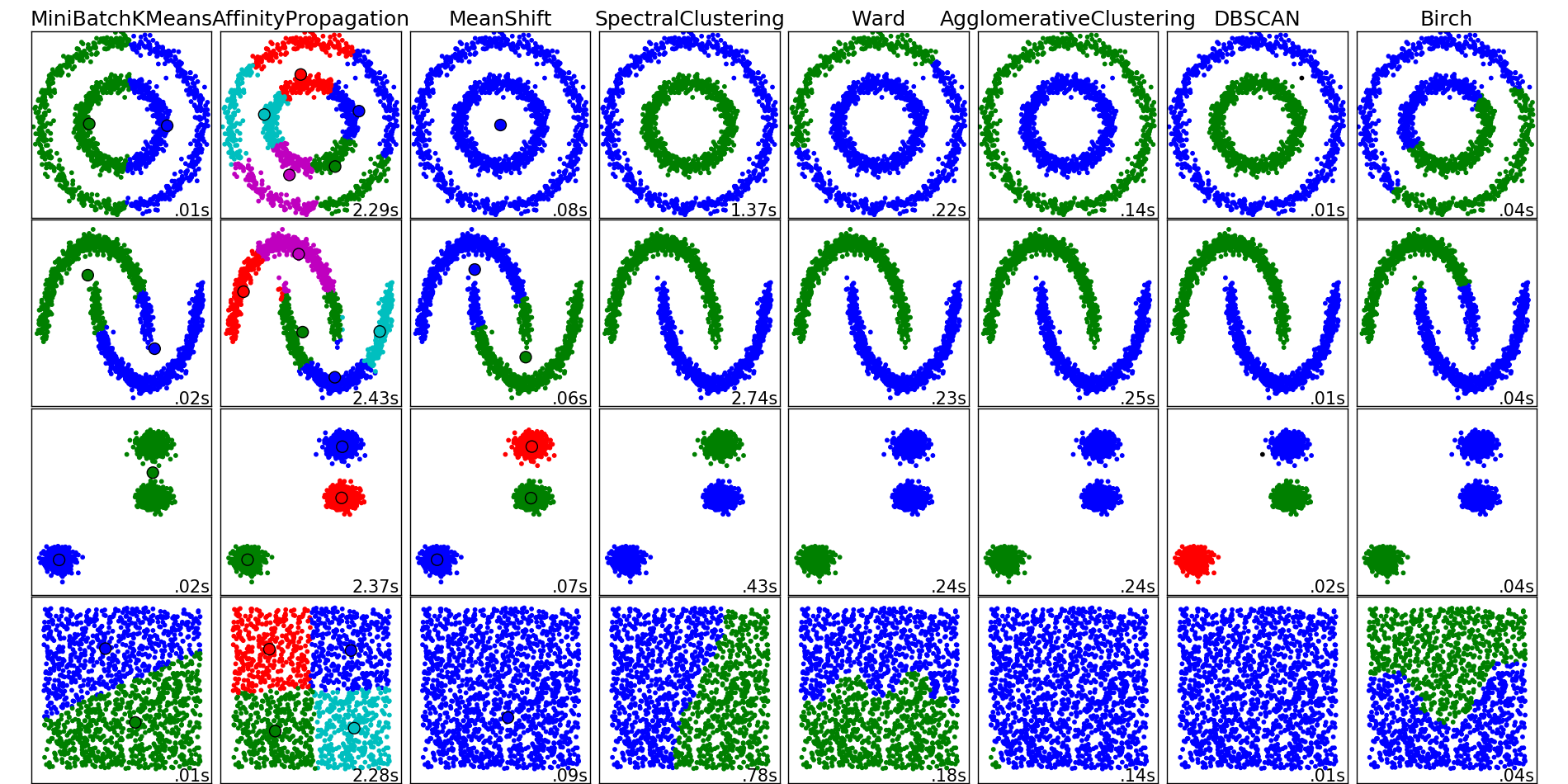
Examples of operation of clustering algorithms from the scikit-learn package documentation
K-means
The K-means algorithm is probably the most popular and simple clustering algorithm and is very easily represented as a simple pseudo-code:
- Select the number of clusters k which seems to us optimal for our data.
- Pour randomly into our data space. k points (centroids).
- For each point of our data set, calculate which centroid it is closer to.
- Move each centroid to the center of the sample, which we attributed to this centroid.
- Repeat the last two steps a fixed number of times, or until the centroids "converge" (this usually means that their displacement from the previous position does not exceed a predetermined small value).
In the case of an ordinary Euclidean metric for points lying on a plane, this algorithm is very simply written analytically and drawn. Let's see the corresponding example:
# , X = np.zeros((150, 2)) np.random.seed(seed=42) X[:50, 0] = np.random.normal(loc=0.0, scale=.3, size=50) X[:50, 1] = np.random.normal(loc=0.0, scale=.3, size=50) X[50:100, 0] = np.random.normal(loc=2.0, scale=.5, size=50) X[50:100, 1] = np.random.normal(loc=-1.0, scale=.2, size=50) X[100:150, 0] = np.random.normal(loc=-1.0, scale=.2, size=50) X[100:150, 1] = np.random.normal(loc=2.0, scale=.5, size=50) plt.figure(figsize=(5, 5)) plt.plot(X[:, 0], X[:, 1], 'bo'); 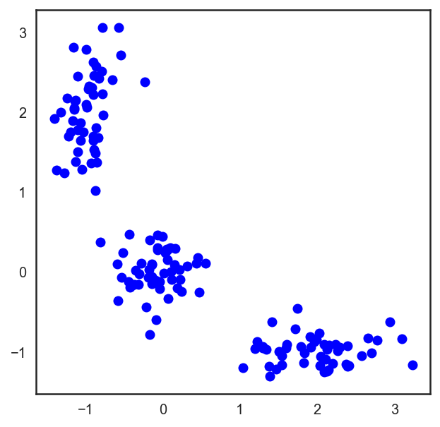
# scipy , # , from scipy.spatial.distance import cdist # np.random.seed(seed=42) centroids = np.random.normal(loc=0.0, scale=1., size=6) centroids = centroids.reshape((3, 2)) cent_history = [] cent_history.append(centroids) for i in range(3): # distances = cdist(X, centroids) # , labels = distances.argmin(axis=1) # centroids = centroids.copy() centroids[0, :] = np.mean(X[labels == 0, :], axis=0) centroids[1, :] = np.mean(X[labels == 1, :], axis=0) centroids[2, :] = np.mean(X[labels == 2, :], axis=0) cent_history.append(centroids) # plt.figure(figsize=(8, 8)) for i in range(4): distances = cdist(X, cent_history[i]) labels = distances.argmin(axis=1) plt.subplot(2, 2, i + 1) plt.plot(X[labels == 0, 0], X[labels == 0, 1], 'bo', label='cluster #1') plt.plot(X[labels == 1, 0], X[labels == 1, 1], 'co', label='cluster #2') plt.plot(X[labels == 2, 0], X[labels == 2, 1], 'mo', label='cluster #3') plt.plot(cent_history[i][:, 0], cent_history[i][:, 1], 'rX') plt.legend(loc=0) plt.title('Step {:}'.format(i + 1)); 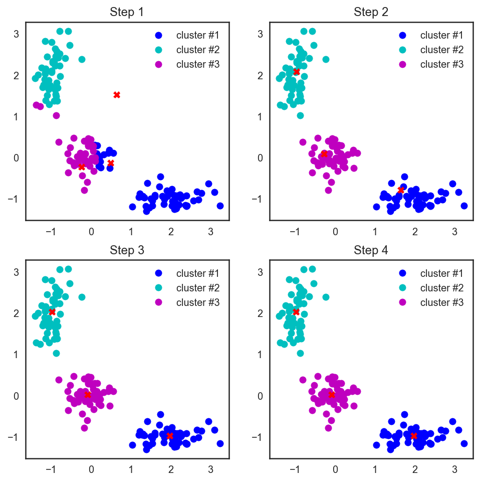
It is also worth noting that even though we considered the Euclidean distance, the algorithm will converge in the case of any other metric, so for various clustering problems, depending on the data, you can experiment not only with the number of steps or the convergence criterion, but also with the metric we consider the distances between points and centroids of clusters.
Another feature of this algorithm is that it is sensitive to the initial position of the centroid of the clusters in space. In such a situation, several consecutive runs of the algorithm are rescued, followed by averaging of the resulting clusters.
Select the number of clusters for kMeans
Unlike the problem of classification or regression, in the case of clustering it is more difficult to choose a criterion by which it would be easy to present the clustering problem as an optimization problem.
In the case of kMeans, the following criterion is common - the sum of squares of distances from points to the centroids of the clusters to which they relate.
J(C)= sumKk=1 sumi in Ck||xi− muk||2 rightarrow min limitsC,
here C - many power clusters K , muk - cluster centroid Ck .
It is clear that there is common sense in this: we want the points to be located in a heap near the centers of their clusters. But here's the ill luck: the minimum of such a functional will be achieved when there are as many clusters as there are points (that is, each point is a cluster of one element).
To solve this issue (choosing the number of clusters), heuristics are often used: choose the number of clusters starting from which the described functional J(c) falls "not so fast anymore." Or more formally:
D(k)= frac|J(Ck)−J(Ck+1)||J(Ck−1)−J(Ck)| rightarrow min limitsk
Consider an example.
from sklearn.cluster import KMeans inertia = [] for k in range(1, 8): kmeans = KMeans(n_clusters=k, random_state=1).fit(X) inertia.append(np.sqrt(kmeans.inertia_)) plt.plot(range(1, 8), inertia, marker='s'); plt.xlabel('$k$') plt.ylabel('$J(C_k)$'); 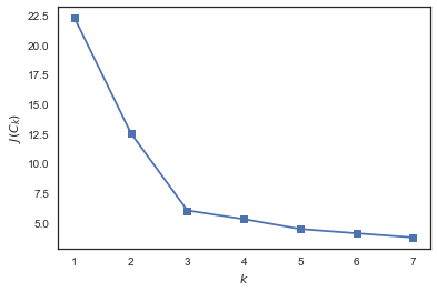
See that J(Ck) falls strongly with increasing number of clusters from 1 to 2 and from 2 to 3 and not so much anymore when changing k from 3 to 4. Hence, in this problem, it is optimal to specify 3 clusters.
Difficulties
In itself, the solution of the K-means problem is NP-hard (NP-hard), and for the dimension d cluster numbers k and numbers of points n is decided for O(ndk+1) . To solve this pain, heuristics are often used, for example, MiniBatch K-means, which does not use all datasets for learning, but only small portions (batch) and updates centroids using the average of all centroid updates from all points related to it. A comparison of the usual K-means and its MiniBatch implementation can be found in the scikit-learn documentation .
The implementation of the algorithm in scikit-learn has a lot of convenient buns, such as the ability to specify the number of launches via the n_init parameter, which will give more stable centroids for clusters in the case of skewed data. In addition, these launches can be done in parallel, without sacrificing computation time.
Affinity propagation
Another example of a clustering algorithm. Unlike the K-means algorithm, this approach does not require determining in advance the number of clusters into which we want to split our data. The basic idea of the algorithm is that we would like our observations to cluster in groups based on how they “communicate” or how similar they are to each other.
Let's create for this some metric of "similarity", determined by the fact that s(xi,xj)>s(xi,xk) if observation xi more like observation xj than on xk . A simple example of this similarity would be the negative square of the distance. s(xi,xj)=−||xi−xj||2 .
Now we describe the process of "communication". To do this, we create two matrices initialized with zeros, one of which ri,k will describe how good k -th observation is suitable to be a "role model" for i of this observation in relation to all other potential "examples", and the second - ai,k will describe how correct it would be for i of that observation to choose k The second is as such an example. It sounds a bit confusing, but a little further we will see an example “on the fingers”.
After that, the matrix data is updated in turn by the rules:
r_ {i, k} \ leftarrow s_ (x_i, x_k) - \ max_ {k '\ neq k} \ left \ {a_ {i, k'} + s (x_i, x_k ') \ right \}
a_ {i, k} \ leftarrow \ min \ left (0, r_ {k, k} + \ sum_ {i '\ not \ in \ {i, k \}} \ max (0, r_ {i', k}) \ right), \ \ \ i \ neq k
ak,k leftarrow sumi′ neqk max(0,ri′,k)
Spectral clustering
Spectral clustering combines several approaches described above to get the maximum amount of profit from complex manifolds of dimension less than the original space.
For this algorithm to work, we will need to define an adjacency matrix. You can do this in the same way as for Affinity Propagation above: Ai,j=−||xi−xj||2 . This matrix also describes a complete graph with vertices in our observations and edges between each pair of observations with a weight corresponding to the degree of similarity of these vertices. For our above selected metric and points lying on the plane, this thing will be intuitive and simple - two points are more similar if the edge between them is shorter. Now we would like to divide our resulting graph into two parts so that the resulting points in the two graphs are in general more similar to other points inside the resulting "own" half of the graph than to the points in the "other" half. The formal name of such a task is called the Normalized cuts problem and you can read more about it here .
Agglomerative clustering
Probably the easiest and most understandable clustering algorithm without a fixed number of clusters is agglomerative clustering. The intuition of the algorithm is very simple:
- We start with the fact that we pour our cluster on each point
- Sort pairwise distances between cluster centers in ascending order.
- Take a couple of the next clusters, glue them together and recalculate the center of the cluster
- Repeat items 2 and 3 until all the data is glued together in one cluster.
The very process of finding the nearest clusters can occur using different methods of combining points:
- Single linkage - minimum pairwise distance between points from two clusters
d(Ci,Cj)=minxi inCi,xj inCj||xi−xj|| - Complete linkage - maximum pairwise distance between points from two clusters
d(Ci,Cj)=maxxi inCi,xj inCj||xi−xj|| - Average linkage - the average pairwise distance between points from two clusters
d(Ci,Cj)= frac1ninj sumxi inCi sumxj inCj||xi−xj|| - Centroid linkage - the distance between the centroids of the two clusters
d(Ci,Cj)=|| mui− muj||
The profit of the first three approaches in comparison with the fourth is that they will not need to recalculate the distances each time after gluing, which greatly reduces the computational complexity of the algorithm.
According to the results of the implementation of such an algorithm, it is also possible to build a wonderful tree of pasting clusters and looking at it to determine at what stage it would be best for us to stop the algorithm. Or use the same elbow rule as in k-means.
Fortunately for us in Python there are already wonderful tools for building such dendrograms for agglomerative clustering. Consider the example of our clusters of K-means:
from scipy.cluster import hierarchy from scipy.spatial.distance import pdist X = np.zeros((150, 2)) np.random.seed(seed=42) X[:50, 0] = np.random.normal(loc=0.0, scale=.3, size=50) X[:50, 1] = np.random.normal(loc=0.0, scale=.3, size=50) X[50:100, 0] = np.random.normal(loc=2.0, scale=.5, size=50) X[50:100, 1] = np.random.normal(loc=-1.0, scale=.2, size=50) X[100:150, 0] = np.random.normal(loc=-1.0, scale=.2, size=50) X[100:150, 1] = np.random.normal(loc=2.0, scale=.5, size=50) distance_mat = pdist(X) # pdist Z = hierarchy.linkage(distance_mat, 'single') # linkage — plt.figure(figsize=(10, 5)) dn = hierarchy.dendrogram(Z, color_threshold=0.5) 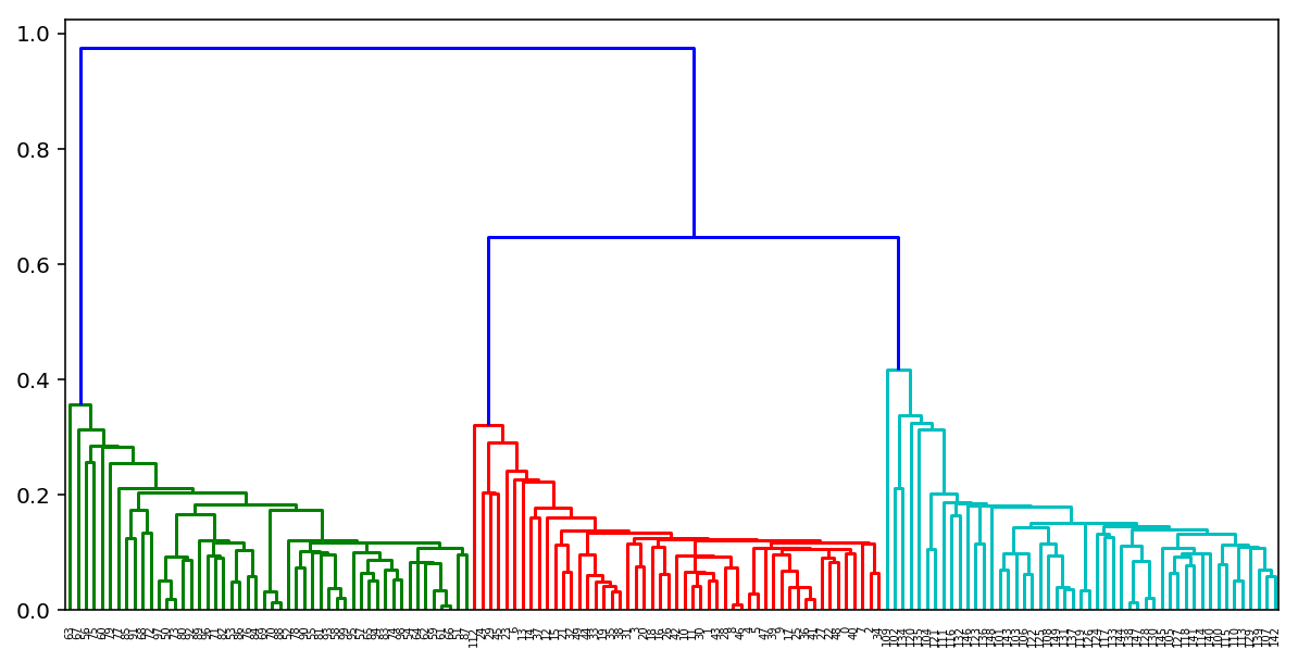
Clustering Quality Metrics
The task of assessing the quality of clustering is more complex compared to assessing the quality of classification. First, such estimates should not depend on the values of the labels themselves, but only on the sample partitioning itself. Secondly, the true labels of objects are not always known; therefore, estimates are also needed to evaluate the quality of clustering using only the unmarked sample.
Allocate external and internal quality metrics. External use information about true clustering, while internal metrics do not use any external information and evaluate the quality of clustering based only on the data set. The optimal number of clusters is usually determined using internal metrics.
All the metrics below are implemented in sklearn.metrics .
Adjusted Rand Index (ARI)
It is assumed that the true labels of objects are known. This measure does not depend on the actual values of the labels, but only on the division of the sample into clusters. Let be n - the number of objects in the sample. Denote by a - the number of pairs of objects that have the same labels and are in the same cluster, through b - the number of pairs of objects with different labels and located in different clusters. Then the rand index is
textRI= frac2(a+b)n(n−1).
That is, this is the proportion of objects for which these partitions (initial and obtained as a result of clustering) are “consistent”. The Rand Index (RI) expresses the similarity of two different clusters of the same sample. For this index to give values close to zero for random clusterings for any n and the number of clusters, it is necessary to normalize it. This is determined by the Adjusted Rand Index:
textARI= frac textRI−E[ textRI] max( textRI)−E[ textRI].
This measure is symmetric, does not depend on the values and permutations of the labels. Thus, this index is a measure of the distance between the various partitions of the sample. textARI takes values in the range [−1,1] . Negative values correspond to "independent" divisions into clusters, values close to zero, to random partitions, and positive values indicate that the two partitions are similar (coincide with textARI=1 ).
Adjusted Mutual Information (AMI)
This measure is very similar to textARI . It is also symmetric, independent of the values and permutations of the labels. It is determined using the entropy function, interpreting sample partitions as discrete distributions (the probability of assignment to a cluster is equal to the fraction of objects in it). Index MI defined as mutual information for two distributions corresponding to the partitioning of the sample into clusters. Intuitively, mutual information measures the share of information common to both partitions: how much information about one of them reduces the uncertainty about the other.
Similarly textARI index is determined textAMI to get rid of the growth index MI with an increase in the number of classes. It takes values in the range [0,1] . Values close to zero indicate independence of partitions, and close to unity, their similarity (coincidence with textAMI=1 ).
Homogeneity, fullness, v-measure
Formally, these measures are also determined using the functions of entropy and conditional entropy, considering the partitioning of the sample as discrete distributions:
h=1− fracH(C midK)H(C),c=1− fracH(K midC)H(K),
here K - the result of clustering, C - true partitioning of the sample into classes. In this way, h measures how each cluster consists of objects of one class, and c - as far as objects of one class belong to one cluster. These measures are not symmetrical. Both values take values in the range [0,1] , and larger values correspond to more accurate clustering. These measures are not normalized as textARI or t e x t A M I , and therefore depend on the number of clusters. Random clustering will not give zero performance with a large number of classes and a small number of objects. In these cases, it is preferable to useARI . However, when the number of objects is more than 1000 and the number of clusters is less than 10, this problem is not so pronounced and can be ignored.
To account for both quantities h and c simultaneously enteredV- measure as their harmonic mean:
v = 2 h ch + c .
It is symmetrical and shows how two clustering are similar to each other.
Silhouette
, , , () . . a — , b — ( , ). :
s=b−amax(a,b).
The silhouette of the sample is the average of the silhouette of the objects in the sample. Thus, the silhouette shows how much the average distance to the objects of its cluster differs from the average distance to the objects of other clusters. This value is in the range[ - 1 , 1 ] .Values close to -1 correspond to poor (scattered) clustering, values close to zero indicate that the clusters intersect and overlap, values close to 1 correspond to "dense" clearly selected clusters. Thus, the larger the silhouette, the more clearly highlighted the clusters, and they are compact, tightly grouped clouds of points.
With the silhouette you can choose the optimal number of clusters. k ( ) — , . , , , , .
, MNIST:
from sklearn import metrics from sklearn import datasets import pandas as pd from sklearn.cluster import KMeans, AgglomerativeClustering, AffinityPropagation, SpectralClustering data = datasets.load_digits() X, y = data.data, data.target algorithms = [] algorithms.append(KMeans(n_clusters=10, random_state=1)) algorithms.append(AffinityPropagation()) algorithms.append(SpectralClustering(n_clusters=10, random_state=1, affinity='nearest_neighbors')) algorithms.append(AgglomerativeClustering(n_clusters=10)) data = [] for algo in algorithms: algo.fit(X) data.append(({ 'ARI': metrics.adjusted_rand_score(y, algo.labels_), 'AMI': metrics.adjusted_mutual_info_score(y, algo.labels_), 'Homogenity': metrics.homogeneity_score(y, algo.labels_), 'Completeness': metrics.completeness_score(y, algo.labels_), 'V-measure': metrics.v_measure_score(y, algo.labels_), 'Silhouette': metrics.silhouette_score(X, algo.labels_)})) results = pd.DataFrame(data=data, columns=['ARI', 'AMI', 'Homogenity', 'Completeness', 'V-measure', 'Silhouette'], index=['K-means', 'Affinity', 'Spectral', 'Agglomerative']) results | ARI | AMI | Homogenity | Completeness | V-measure | Silhouette | |
|---|---|---|---|---|---|---|
| K-means | 0.662295 | 0.732799 | 0.735448 | 0.742972 | 0.739191 | 0.182097 |
| Affinity | 0.175174 | 0.451249 | 0.958907 | 0.486901 | 0.645857 | 0.115197 |
| Spectral | 0.752639 | 0.827818 | 0.829544 | 0.876367 | 0.852313 | 0.182195 |
| Agglomerative | 0.794003 | 0.856085 | 0.857513 | 0.879096 | 0.868170 | 0.178497 |
3.
- Samsung . , (, ) . Jupyter- , - , .
4.
- Open Machine Learning Course. Topic 7. Unsupervised Learning: PCA and Clustering
- – Medium story
- " "
- " (PCA) "
- " , : Affinity propagation"
- " , : DBSCAN"
- scikit-learn (.)
- Q&A PCA (.)
- k-Means EM- (.)
- " "
')
Source: https://habr.com/ru/post/325654/
All Articles