Details that matter
The success of your product is determined by a combination of factors, the most important of which is the user experience as a whole. When creating a new application or a web page, giving preference to proven practices is a sure way, however, thinking through the general concept, we often forget about those little things in design that seem like a pleasant, but not critical bonus. But it is precisely how carefully we thought out these details that can be decisive for the user experience.
In this article, I will look at visual feedback, microtexts, and empty space, and you will see why these little things have the same meaning as the elements that are the first to catch the eye, and how they affect the success of your product.

Visual feedback is often forgotten when considering the overall picture of the design, but it is he who links all the elements together. Without feedback, normal user interaction is not possible. Imagine that you are addressing a person, and he doesn’t react at all - it is clear that the conversation will not work out. So with applications.
')
You must provide the user with some kind of reaction to each action - so he will feel that he is in control of the situation. Visual feedback:
Make buttons and other controls tangible
In physical reality, buttons, control panels and other objects give some kind of reaction when we interact with them, and we perceive it as a normal state of affairs. Users expect the same responsiveness from application design elements.
Operation result
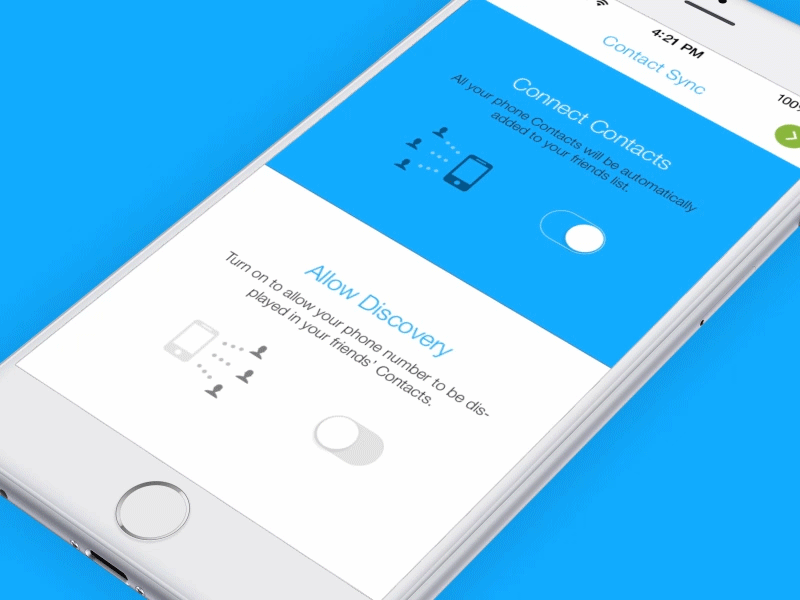
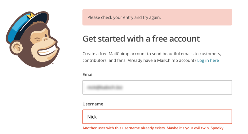
Visual feedback is indispensable when you want to notify the user about the result of the operation. To provide feedback, you can use existing elements.

The system should inform the user about its state.
Users want to constantly be aware of the context of the system state, and applications should not force them to guess - you need to explain what is happening with the help of a visual feedback of the appropriate type. Small, often repetitive actions can give a low-key response, but rare and more significant actions require something more substantial.
Microtexts are all those short text messages that guide the user when working with the application. Examples include the error messages, the inscriptions on the buttons, and hints. At first glance, these small fragments of proposals seem insignificant against the background of the design of the application as a whole. But they have a surprisingly large impact on conversion.
Writing good microtexts is just as important as ensuring the correct operation of the application and a simple, efficient interface.
Show that you are human
A good way to give the interface heartiness and make it less “mechanical” is to speak with the user humanly. If your texts sound as if they were written by an ordinary person, it will be easier for the user to feel confidence in you.

The text should cheer and help in case of failure
How exactly you report the error can be a defining moment for the user experience. This is not a big deal, but an incorrectly worded error message can ruffle the reader.
On the contrary, a wisely composed error message would rather cause not irritation, but delight. Thus, make sure that the texts of messages sounded humanly and were sustained in a tone that your target audience will appreciate.
Develop user concerns
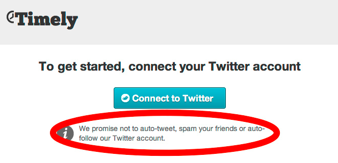
Microtexts are closely related to the context. This is where their value lies. They answer a specific question that a user has, and immediately resolve his difficulties. For example, microtexts can convince a user to subscribe or provide personal information. For a good marketer, perhaps, such things as “do not spam if the user left the e-mail” and “do not post tweets automatically if they gave access to the account in social networks” goes without saying, but the user cannot be sure of that. Therefore, when requesting an email address and access to the pages, do not be lazy to assure him that you also can not tolerate spam.
Free, or empty space - these are areas of design where no elements are placed. It consists of the space around the pictures, fields, spaces between letters and lines of text. Although many consider it a pointless waste of valuable screen space, in fact it is in itself an important element of the interface.
Make the interface more transparent
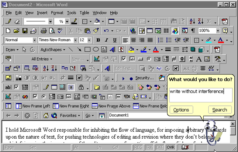
Cluttering the screen is a bad idea. So you overload users with information: each additional button, a picture and a line of text complicate the interface. If it seems to you that you should not deliberately leave some parts of the screen empty, take a look at the example below - and you will immediately feel what it is like when a great many objects try to draw your attention to themselves.
The power of empty space comes from the fact that human memory and attention are not limitless. Our short-term memory is able to hold a very small amount of up-to-date, ready-to-use information (about 7 elements or even less) for a fairly short period of time (10-15 seconds).
The attention of the user is a valuable resource, and it should be spent very carefully.
If an interface oversaturated with elements gives the user too much information, then by getting rid of some of them, you will make it easier to read. A large amount of empty space can give a simple and welcoming look to even the most sloppy design. The more free space, the fewer elements and, accordingly, the easier it is for the user to skim through them. The art of using empty space is to provide users with as much information (in blocks) as they can process, and then remove all unnecessary details.

Draw attention to the elements
Free space forms an empty zone around the element, helping them stand out and separating them from other objects. This is a good way to convey to the user which of them are key and require special attention.
The more free space, the better the focus.
The Google homepage is a great example of how to effectively use empty space. The design helps the user to quickly achieve the goal: the main element (search string) is placed in the center, and plenty of free space is left around to attract attention.

Clarifying communication
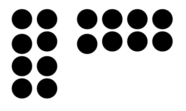
The law of intimacy explains how our eyes make connections between visual elements. He argues that objects located close to each other, seem to us similar. We can use free space to build connections between elements. Look at the picture below - almost everyone sees not sixteen points on it, but two groups of eight.
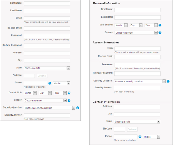
When we break information into thematic groups, it becomes easier to run around and perceive. On the right, the fifteen fields on the form are grouped into three blocks, making the filling process seem simpler. The amount of content remains the same, but now it makes a completely different impression on users.
Design requires careful treatment. Every little thing in the interface of your application deserves close attention, because the user experience is made up of a harmonious combination of all the details.
In this article, I will look at visual feedback, microtexts, and empty space, and you will see why these little things have the same meaning as the elements that are the first to catch the eye, and how they affect the success of your product.
Visual feedback
Visual feedback is often forgotten when considering the overall picture of the design, but it is he who links all the elements together. Without feedback, normal user interaction is not possible. Imagine that you are addressing a person, and he doesn’t react at all - it is clear that the conversation will not work out. So with applications.
')
You must provide the user with some kind of reaction to each action - so he will feel that he is in control of the situation. Visual feedback:
- Makes it clear that the user action has passed;
- Reports the result of this interaction in a clear and understandable form; gives the user a signal that he (or the application itself) performed the action successfully or unsuccessfully.
Make buttons and other controls tangible
In physical reality, buttons, control panels and other objects give some kind of reaction when we interact with them, and we perceive it as a normal state of affairs. Users expect the same responsiveness from application design elements.
Operation result
Visual feedback is indispensable when you want to notify the user about the result of the operation. To provide feedback, you can use existing elements.
The system should inform the user about its state.
Users want to constantly be aware of the context of the system state, and applications should not force them to guess - you need to explain what is happening with the help of a visual feedback of the appropriate type. Small, often repetitive actions can give a low-key response, but rare and more significant actions require something more substantial.
- Animated alerts help the user to quickly understand the current status.

- Loading an animation displays the status of the process in real time, giving the user the ability to quickly navigate what is happening.
Microtexts
Microtexts are all those short text messages that guide the user when working with the application. Examples include the error messages, the inscriptions on the buttons, and hints. At first glance, these small fragments of proposals seem insignificant against the background of the design of the application as a whole. But they have a surprisingly large impact on conversion.
Writing good microtexts is just as important as ensuring the correct operation of the application and a simple, efficient interface.
Show that you are human
A good way to give the interface heartiness and make it less “mechanical” is to speak with the user humanly. If your texts sound as if they were written by an ordinary person, it will be easier for the user to feel confidence in you.
The text should cheer and help in case of failure
How exactly you report the error can be a defining moment for the user experience. This is not a big deal, but an incorrectly worded error message can ruffle the reader.
On the contrary, a wisely composed error message would rather cause not irritation, but delight. Thus, make sure that the texts of messages sounded humanly and were sustained in a tone that your target audience will appreciate.
Develop user concerns
Microtexts are closely related to the context. This is where their value lies. They answer a specific question that a user has, and immediately resolve his difficulties. For example, microtexts can convince a user to subscribe or provide personal information. For a good marketer, perhaps, such things as “do not spam if the user left the e-mail” and “do not post tweets automatically if they gave access to the account in social networks” goes without saying, but the user cannot be sure of that. Therefore, when requesting an email address and access to the pages, do not be lazy to assure him that you also can not tolerate spam.
Free space
Free, or empty space - these are areas of design where no elements are placed. It consists of the space around the pictures, fields, spaces between letters and lines of text. Although many consider it a pointless waste of valuable screen space, in fact it is in itself an important element of the interface.
Make the interface more transparent
Cluttering the screen is a bad idea. So you overload users with information: each additional button, a picture and a line of text complicate the interface. If it seems to you that you should not deliberately leave some parts of the screen empty, take a look at the example below - and you will immediately feel what it is like when a great many objects try to draw your attention to themselves.
The power of empty space comes from the fact that human memory and attention are not limitless. Our short-term memory is able to hold a very small amount of up-to-date, ready-to-use information (about 7 elements or even less) for a fairly short period of time (10-15 seconds).
The attention of the user is a valuable resource, and it should be spent very carefully.
If an interface oversaturated with elements gives the user too much information, then by getting rid of some of them, you will make it easier to read. A large amount of empty space can give a simple and welcoming look to even the most sloppy design. The more free space, the fewer elements and, accordingly, the easier it is for the user to skim through them. The art of using empty space is to provide users with as much information (in blocks) as they can process, and then remove all unnecessary details.
Draw attention to the elements
Free space forms an empty zone around the element, helping them stand out and separating them from other objects. This is a good way to convey to the user which of them are key and require special attention.
The more free space, the better the focus.
The Google homepage is a great example of how to effectively use empty space. The design helps the user to quickly achieve the goal: the main element (search string) is placed in the center, and plenty of free space is left around to attract attention.
Clarifying communication
The law of intimacy explains how our eyes make connections between visual elements. He argues that objects located close to each other, seem to us similar. We can use free space to build connections between elements. Look at the picture below - almost everyone sees not sixteen points on it, but two groups of eight.
When we break information into thematic groups, it becomes easier to run around and perceive. On the right, the fifteen fields on the form are grouped into three blocks, making the filling process seem simpler. The amount of content remains the same, but now it makes a completely different impression on users.
Conclusion
Design requires careful treatment. Every little thing in the interface of your application deserves close attention, because the user experience is made up of a harmonious combination of all the details.
“Details are not just details. Design consists of them. ” - Charles Eames
Source: https://habr.com/ru/post/325630/
All Articles