Round Canvas Chart
Greetings
Most recently, for one project I needed to display percentages in round graphs (?). And, as usual, I began to look for a ready-made solution on the Internet, but I couldn’t find anything worthwhile (perhaps due to the fact that I don’t know exactly how this element is correctly named). More or less, what I need I found in the Knob library , but its functionality was unnecessary, because there is no need to change the values in the graphics, besides this, a bug was created in the library. As a result, I had to compose another bike.
At first I looked in the direction of css, well, judge for yourself - we make a circle through border-radius, and the border-color will show how many percent ... Of course, this applies to 0%, 25%, 50%, 75% and 100%:
html:
<div class="dial procent0"><p>0%</p></div> <div class="dial procent25"><p>25%</p></div> <div class="dial procent50"><p>50%</p></div> <div class="dial procent75"><p>75%</p></div> <div class="dial procent100"><p>100%</p></div> scss:
.dial { width: 80px; height: 80px; font-size: 20px; text-align: center; line-height: 80px; border: 6px solid #262832; border-radius: 100%; margin: 20px; display: inline-block; transform: rotate(-45deg); p { margin: 0; transform: rotate(45deg); } &.procent25 { border-right-color: #689f38; } &.procent50 { border-right-color: #689f38; border-bottom-color: #689f38; } &.procent75 { border-right-color: #689f38; border-bottom-color: #689f38; border-left-color: #689f38; } &.procent100 { border-color: #689f38; } } → jsfiddle
')
If you talk further in this vein, you can use pseudo-elements, and draw one circle above the other. ie, if we need to show 33%, then we draw 2 circles of 25% each, just turn the second circle so that 33% of the border would be overlaid, for this you just need to calculate how many degrees to turn the pseudo-element:
html:
<div class="dial"><p>33%</p></div> scss:
.dial { width: 80px; height: 80px; font-size: 20px; text-align: center; line-height: 80px; border: 6px solid #262832; border-radius: 100%; margin: 20px; display: inline-block; transform: rotate(-45deg); border-right-color: #1390d4; p { margin: 0; transform: rotate(45deg); } &::before { content: ''; display: block; position: absolute; width: 80px; height: 80px; border-radius: 100%; border: 6px solid transparent; border-right-color:#1390d4; margin: -6px -6px; transform: rotate(28.8deg); } } → jsfiddle
Of course, if you need to show a graph of 51% and more, you will need to paint over the border-bottom. The catch is that the percentages in my graphics are not static, but drawing your style for each graphic is not correct, to put it mildly, and fractional values are possible ... Then we need JavaScript, though there is no access to pseudo-elements in Java because they are outside the DOM -tree and cannot be accessed as simple HTML elements. Of course, you can :: before replace with span and twist it ... But if you had to use JavaScript, then you can draw a graphic on the canvas, especially since the canvas has a special function arc - which draws circles.
All that I wrote above, only to show the course of my thoughts
Draw a circle:
var c=document.getElementById("myCanvas"); var ctx=c.getContext("2d"); ctx.beginPath(); ctx.arc(100,75,50,0,2*Math.PI); ctx.stroke(); 
context.arc (x, y, r, sAngle, eAngle, counterclockwise);
At the expense of x , y - everything is clear, r (radius) also raises no questions, optional counterclockwise option - says the direction in which to draw a circle, false by default = clockwise, true = counterclockwise.
sAngle and eAngle is the starting and ending point on the circle in radians, it’s more clear what the radians will explain the gif:

To transfer interest to radians, use the following formula:
Actually this and all that is needed in order to draw a graph.
html:
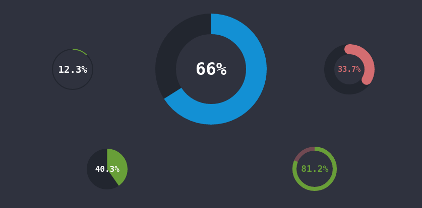
<div class="dial blue" data-width="180" data-lineWidth="41">66.233467</div> scss:
.dial { border-color: #22262f; color: #689F38; display: inline-block; text-align: left; p { text-align:center; font-weight: bold; color: #fff; white-space: nowrap; position: relative; overflow: hidden; z-index: 1; margin: 0; } canvas { position: absolute; } } JavaScript + jQuery:
$(function(){ // class="dial" var dials = $(".dial"); // .dial canvas . for (i=0; i < dials.length; i++){ var width = (typeof $(dials[i]).attr("data-width") != 'undefined') ? Math.round($(dials[i]).attr("data-width")) : 80; var procent = (Number($(dials[i]).html()) > 0 && Number($(dials[i]).html()) < 100) ? Math.round(Number($(dials[i]).html()) * 10)/10 : 0; var lineWidth = (typeof $(dials[i]).attr("data-lineWidth") != 'undefined') ? Number($(dials[i]).attr("data-lineWidth")) : width / 10; if(lineWidth >= width) lineWidth = width+1; var size = width+lineWidth; var lineRound = (typeof $(dials[i]).attr("data-lineRound") != 'undefined') ? true : false; var borderColor = $(dials[i]).css("border-color"); var color = $(dials[i]).css("color"); // .dial data-width="80" // border $(dials[i]).css({"width": size + 'px', "height": size + 'px', "font-size": Math.floor((width-lineWidth) / 4) + 'px'}); // canvas . $(dials[i]).html('<canvas id="dial' + i + '" width="' + size + '" height="' + size + '"></canvas><p>' + procent + '%</p>'); // $("p", dials[i]).css({"line-height": size + 'px'}); var canvas = document.getElementById("dial" + i); var context = canvas.getContext("2d"); // var radian = 2*Math.PI*procent/100; // context.arc(width/2+lineWidth/2, width/2+lineWidth/2, width/2, 0, 2*Math.PI, false); context.lineWidth = lineWidth; context.strokeStyle = borderColor; context.stroke(); context.beginPath(); // context.arc(width/2+lineWidth/2, width/2+lineWidth/2, width/2, 1.5 * Math.PI, radian+1.5 * Math.PI, false); context.strokeStyle = color; // data-lineRound if (lineRound == true && lineWidth < width) context.lineCap = "round"; context.stroke(); } }); To add a round graph (?) To add to the page:
<div class="dial"> (float)</div> As attributes you can add:
data-width - diameter (default 80)
data-lineWidth - line width (by default 1/10 of the diameter)
* graphic size is equal to data-width + data-lineWidth
data-lineRound - round the edges of the segment.
The percentage within the graph is rounded to the tenth, it was possible to the hundredths, but then the font is quite small, and the font directly depends on the size of the graph.
I decided not to add the colors of the graphics to the attributes, but to write them into the styles:
/* */ .dial { &.error { color: #d46d71; p { color: #d46d71; } } &.success { color: #689F38; border-color: rgba(#d46d71, 0.4); p{ color: #689F38; } } &.blue { color: #1390d4; } } - in my opinion it is more convenient, but it is always possible to specify the color in style = “border-color: ***; color: *** "
→ Demo
Thank you all for your attention.
Source: https://habr.com/ru/post/325428/
All Articles