Adaptive Email Guide
The team of the multichannel marketing platform, Sendsay, specifically for Netology, has compiled a detailed guide to the layout of adaptive letters for beginning layout designers: with step-by-step instructions, examples and links to frameworks, tools and templates.

In the guide: the basic principles of adaptive layout, tables with a maximum width limit, rubber pictures, special comments, tools, frameworks, tips and a selection of cool letters.
Misha is a novice freelance master. He has several landing pages and simple WordPress sites. The new client offers to create a website, and with it a series of responsive letters. The money is not bad, but Misha doubts that he has not yet dealt with the layout of letters. It seems to him that there are subtleties here and cannot be mastered in a couple of evenings.
Misha is right, a couple of evenings are not enough. The principles of layout of websites and letters are different - we will tell you about the main ones. We show how to create a simple responsive letter and avoid common mistakes. If you are already an experienced coder, scroll to the end of the article - there links to frameworks, tools and templates may be useful.
Basic principles of adaptive layout
Remember the main thing: when developing websites we use modern block layout, in letters - outdated tabular. We register styles inside tags. And we work with rubber layout and media queries, - not separately, but together, combining both approaches.
Beginner web designers forget about tables and use block layout, as they are used to, because of this the layout “flies”, the letter is displayed incorrectly. This is because most email clients do not see external styles. Therefore, the principle that when you register styles separately and connect them in blocks, in half the cases will not work. Emails built on this principle look bad - especially if you open them in Outlook and in the Gmail mobile app.
Media queries are responsible for the adaptability of sites, they are prescribed in the style sheet. When designing letters, you should not rely on media inquiries - half of mail clients will not see them anyway. These email clients do not work with style sheets and “cut out” media queries from. At the same time, unlike conventional styles, it is impossible to register media queries in inline.

Imagine you have written a letter using media queries. Show to the customer on iPhone, open via iOS Mail - everything works. The customer opens the same letter on the same iPhone, but looks at it through the Gmail app. Be sure, the layout will “fly off”, the work will not be accepted. What to do? You can opt out of media queries and use rubber layout. But it does not give a 100% guarantee.
Our advice: combine rubber layout and media queries. A letter composed according to this principle does not shrink to an unreadable state and does not go beyond the viewing window - even in email clients that do not support media queries.
Combine rubber layout and media queries, basically writing styles inside the tags.
Adaptive layout on the example of a specific letter
We will use rubber tables with a given maximum width in pixels and special comments (conditional comments) for Outlook, since the property (max-width) this email client "does not understand."
Stage 1. Prepare the base
As a container for writing using a table width of 100%. In it, if necessary, you can set the background of the letter and specify the position of the main table:
<table width="100%" cellspacing="0" cellpadding="0" border="0"> <tr><td align="center"> </td></tr></table> The main table with a maximum width limit:
<table align="center" cellspacing="0" cellpadding="0" border="0" style="width:100%; max-width:600px; border:0;" > <tr> <td style="padding-top:20px;padding-bottom:20px;padding-right:30px;padding-left:30px;text-align:center;font-family: Arial, Helvetica, sans-serif;font-size:24px; line-height:32px; color:#222222;"></code> </td> </tr> </table> Then we add inline styles. Text styles are placed inside the td tag or any block elements such as h1 – h6, p, div. The example looks like this:

Add special comments for Outlook:
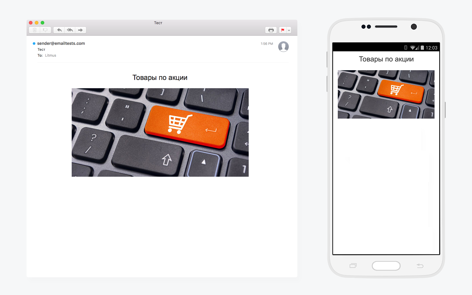
<!--[if (gte mso 9)|(IE)]> <table width="600" align="center"><tr><td style="padding-top:0; padding-bottom:0; padding-right:0; padding-left:0; margin:0px;"> <![endif]--> <table align="center" cellspacing="0" cellpadding="0" border="0" style="width:100%; max-width:600px; border:0;"> <tr> <td style="padding-top:20px;padding-bottom:20px;padding-right:30px;padding-left:30px;text-align:center;font-family: Arial, Helvetica, sans-serif;font-size:24px; line-height:32px; color:#222222;"> </td> </tr> </table> <!--[if (gte mso 9)|(IE)]> </td></tr></table><![endif]--> Add a rubber image that stretches the entire width of the cell:
<tr> <td style="padding-bottom:20px;"><img src="https://habrastorage.org/getpro/habr/post_images/032/086/ab9/032086ab9a7ac06f256a5dee8a6bd461.jpg" width="600" alt="" style="width:100%;max-width:600px;height:auto;"></td> </tr> We get:
We make two columns that will move one under the other on mobile devices:
<tr> <td style="padding-top:0px;padding-bottom:20px;padding-right:0;padding-left:0;text-align:center;" > <!--[if (gte mso 9)|(IE)]> <table width="100%"> <tr> <td width="50%" valign="top" > <![endif]--> <div class="column" style="width:100%;max-width:290px;display:inline-block;vertical-align:top;" > <table width="100%" cellpadding="0" cellspacing="0" style="border-spacing:0;" > <tr> <td align="center" style="padding-top:10px;padding-bottom:5px;padding-right:5px;padding-left:5px;text-align:center;font-family: Arial, Helvetica, sans-serif;font-size:15px; line-height:18px; color:#222222;"> № 1 — 990 </td> </tr> </table> </div> <!--[if (gte mso 9)|(IE)]> </td><td width="50%" valign="top" > <![endif]--> <div class="column" style="width:100%;max-width:290px;display:inline-block;vertical-align:top;"> <table width="100%" cellpadding="0" cellspacing="0" style="border-spacing:0;" > <tr> <td align="center" style="padding-top:10px;padding-bottom:5px;padding-right:5px;padding-left:5px;text-align:center;font-family: Arial, Helvetica, sans-serif;font-size:15px; line-height:18px; color:#222222;"> № 2 — 990 </td> </tr> </table> </div> <!--[if (gte mso 9)|(IE)]> </td> </tr> </table> <![endif]--> </td> </tr> In the standard state, they look like this:

If we want, we change the order of the columns in the column. So that the top was right, and below - left. Dir parameter:
<tr> <td dir="rtl" style="padding-top:0px;padding-bottom:20px;padding-right:0;padding-left:0;text-align:center;" > <!--[if (gte mso 9)|(IE)]> <table dir="rtl" width="100%"> <tr> <td width="50%" valign="top" > <![endif]--> <div dir="ltr" class="column" style="width:100%;max-width:290px;display:inline-block;vertical-align:top;" > <table width="100%" cellpadding="0" cellspacing="0" style="border-spacing:0;" > <tr> <td align="center" style="padding-top:10px;padding-bottom:5px;padding-right:5px;padding-left:5px;text-align:center;font-family: Arial, Helvetica, sans-serif;font-size:15px; line-height:18px; color:#222222;"> № 2 — 990 </td> </tr> </table> </div> <!--[if (gte mso 9)|(IE)]> </td><td width="50%" valign="top" > <![endif]--> <div dir="ltr" class="column" style="width:100%;max-width:290px;display:inline-block;vertical-align:top;"> <table width="100%" cellpadding="0" cellspacing="0" style="border-spacing:0;" > <tr> <td align="center" style="padding-top:10px;padding-bottom:5px;padding-right:5px;padding-left:5px;text-align:center;font-family: Arial, Helvetica, sans-serif;font-size:15px; line-height:18px; color:#222222;"> № 1 — 990 </td> </tr> </table> </div> <!--[if (gte mso 9)|(IE)]> </td> </tr> </table> <![endif]--> </td> </tr> We look at an example:

In this way, you can add as many columns as you like. For example, five:
<tr> <td style="padding-top:0px;padding-bottom:20px;padding-right:0;padding-left:0;text-align:center;" > <!--[if (gte mso 9)|(IE)]> <table width="100%"> <tr> <td width="110" valign="top" > <![endif]--> <div class="column" style="width:100%;max-width:110px;display:inline-block;vertical-align:top;" > <table width="100%" cellpadding="0" cellspacing="0" style="border-spacing:0;" > <tr> <td align="center" style="padding-top:10px;padding-bottom:5px;padding-right:5px;padding-left:5px;text-align:center;font-family: Arial, Helvetica, sans-serif;font-size:15px; line-height:18px; color:#222222;"> № 1 — 990 </td> </tr> </table> </div> <!--[if (gte mso 9)|(IE)]> </td><td width="110" valign="top" > <![endif]--> <div class="column" style="width:100%;max-width:110px;display:inline-block;vertical-align:top;"> <table width="100%" cellpadding="0" cellspacing="0" style="border-spacing:0;" > <tr> <td style="padding-top:10px;padding-bottom:5px;padding-right:5px;padding-left:5px;text-align:center;font-family: Arial, Helvetica, sans-serif;font-size:15px; line-height:18px; color:#222222;"> № 2 — 990 </td> </tr> </table> </div> <!--[if (gte mso 9)|(IE)]> </td><td width="110" valign="top" > <![endif]--> <div class="column" style="width:100%;max-width:110px;display:inline-block;vertical-align:top;"> <table width="100%" cellpadding="0" cellspacing="0" style="border-spacing:0;" > <tr> <td style="padding-top:10px;padding-bottom:5px;padding-right:5px;padding-left:5px;text-align:center;font-family: Arial, Helvetica, sans-serif;font-size:15px; line-height:18px; color:#222222;"> № 3 — 990 </td> </tr> </table> </div> <!--[if (gte mso 9)|(IE)]> </td><td width="110" valign="top" > <![endif]--> <div class="column" style="width:100%;max-width:110px;display:inline-block;vertical-align:top;"> <table width="100%" cellpadding="0" cellspacing="0" style="border-spacing:0;" > <tr> <td style="padding-top:10px;padding-bottom:5px;padding-right:5px;padding-left:5px;text-align:center;font-family: Arial, Helvetica, sans-serif;font-size:15px; line-height:18px; color:#222222;"> № 4 — 990 </td> </tr> </table> </div> <!--[if (gte mso 9)|(IE)]> </td><td width="110" valign="top" > <![endif]--> <div class="column" style="width:100%;max-width:110px;display:inline-block;vertical-align:top;"> <table width="100%" cellpadding="0" cellspacing="0" style="border-spacing:0;" > <tr> <td style="padding-top:10px;padding-bottom:5px;padding-right:5px;padding-left:5px;text-align:center;font-family: Arial, Helvetica, sans-serif;font-size:15px; line-height:18px; color:#222222;"> № 5 — 990 </td> </tr> </table> </div> <!--[if (gte mso 9)|(IE)]> </td> </tr> </table> <![endif]--> </td> </tr> Those same five columns:

This method allows you to align the block columns relative to each other both vertically (vertical-align: top;) and horizontally (text-align: center;).
Stage 2. We work with the text
Edit the text in the typographer . Replace quotes, dashes and other characters with special codes - otherwise they may not be displayed correctly. Use the typographer to get rid of the hanging prepositions and add non-breaking spaces.
If you want to connect beautiful web fonts from Google, add to the link generated on Google Fonts:
<link href='https://fonts.googleapis.com/css?family=Roboto:300,300italic,400,400italic,500,500italic,700,700italic' rel='stylesheet' type='text/css' /> Do not forget to prescribe a style for the text:
<p style=”font-family: 'Roboto', sans-serif;”></P> And add special comments for Outlook to it:
<!--[if mso]> <style type="text/css"> p {font-family: sans-serif !important;} </style> <![endif]--> If you do not do this, Outlook will replace the unknown font with your favorite Times New Roman. Keep in mind that “beautiful fonts”, like media queries, do not always work. If you do not want to risk it, use the “safe” font families: Arial, Verdana, Times New Roman and other “classics”.
Stage 3. We insert pictures
If you are using gif-animation, keep in mind that it does not work in all email clients. There are situations when only the first frame is displayed. So play it safe and place the basic information on the first frame, if it appears only on the 10th, not the fact that it will be seen at all.
Do not forget to add the property "display: block;" to the pictures. If you do not do this, then in Gmail, Mail.ru and other email clients, there will appear 2-3 pixel vertical indents, they are not needed.
Stage 4. We insert separators
Assign the style “border-top: 1px solid #eeeeee;” or “border-bottom: 1px solid #eeeeee;” to td or to any block element.
Step 5. Add a button
<div style="margin:0 auto; width:280px;"><table cellspacing="0" cellpadding="0" align="center" width="280"><tr><td align="center" bgcolor="#ff6600" style="border-radius: 30px; color: #ffffff; padding: 18px 2px 18px 2px;"><a href="#" style="font-family: Arial, Helvetica, sans-serif; width:100%; font-size:18px; font-weight:bold; color:#ffffff; text-decoration: none; text-align:center; text-decoration:none;"><span style="color:#ffffff;"> </span></a></td></tr></table></div> Standard adaptive letter is ready:

To polish and bring the layout to perfection - add media queries. So you solve problems with indents and font sizes on mobile and hide the secondary elements that are not needed in the mobile version.
Adequately drawn letter does not need to zoom and move around the screen. It is conveniently displayed on any device and in any email client.
Tips for typesetters
- Specify as many styles for elements as possible. If there are no styles, they will be “tied up” by the email client and the content will not be displayed in the way you want. Good practice - zeroing styles .
- Pay attention to the margin. For this style to work in Outlook, specify it with a capital M → Margin
- If it is easier or more familiar to someone to type styles in external CSS during layout - no problem, you can add them to the inline before sending or testing the letter using special tools, for example, Inliner .
- Remember about the users who turned off the display of pictures in the browser. Observe the balance of "text-image", in any case, to convey information to the person. And do not forget about the attribute "alt" for the tag "img".
- Adhere to the principles of Mobile-First
Determine which information is key and place it on the first screen. Turn off unnecessary blocks on small screens and put everything that looks good on desktops, and prevents you from seeing the main content on mobiles. Do not try to show "all at once": collapse links to product categories, instead of ten photos, put one or two. Simplify navigation, after all, the subscriber scans the letter from the top down, not from left to right. And do not overload the letter, let it be “easy” and open within 5 seconds.

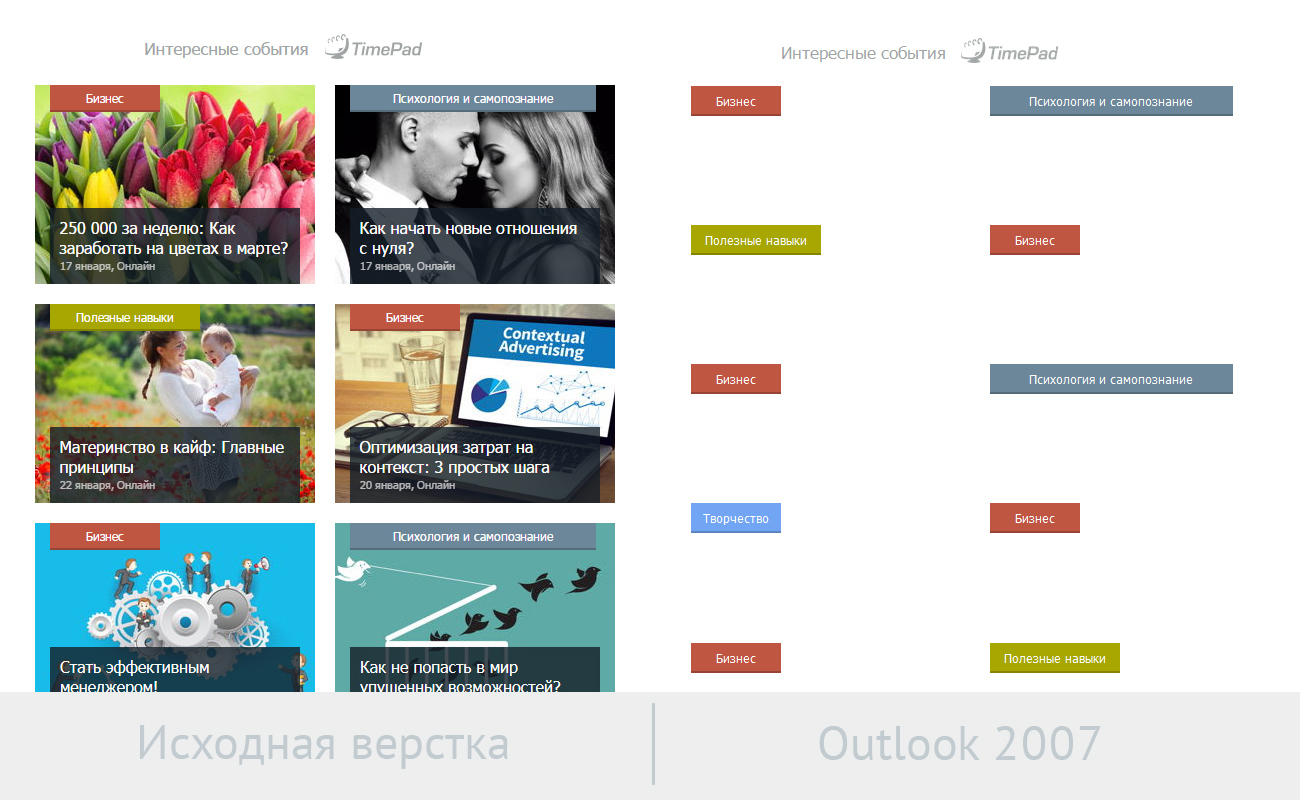
An example of a failed layout. When a letter is opened from mobile, on the first screen it is not key information, but background information. So do not.
- Even if the usual pictures are loaded, the background will not work everywhere. Keep this in mind, especially in cases where the text is on the background image. Reinsure and write in the cell with the background image the background color on which the text will be clearly visible. Even if the picture does not load, the user will see it on the “right” background.
In the end, you can set the background , which will work even in Outlook.
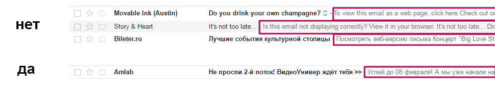
- Learn how to create visible and invisible preheaders - lines of text that appear after the subject line. Remove the link to the web version and other service information at the end of the letter, it is not needed in the preheader.
Tools that facilitate the work of the coder
Layout, like any process, can be automated and simplified. We have selected resources that will help beginners and experienced typesetters.
Frameworks
1) Zurb Ink
The creators promise that the letters written using this framework are adequately displayed on any device and email client that supports media queries. You can start with the templates: a simple single-column, with a large banner, a layout with a side panel and a hybrid from the sidebar and banner.
2) Kilogram
According to the author, "the kilogram template is adaptive everywhere." The author himself - Arthur Koch, famous in the narrow circles of the coder. Recommended.
3) Email Framework
Another handy framework for html letters, which simplifies the installation of buttons, images and links.
Templates
1) Free Email Templates
Dozens of free html letters templates.
2) GraphicMail
Hundreds of ready-made templates. To download - activate a free account.
3) Antwort
A set of adaptive layouts that support most email clients, Outlook and Gmail among them.
4) Templates tested on popular email clients.
5) Templates from MailChimp.
Instruments
1) Installer buttons for letters to VML and CSS
2) Litmus

Allows you to test letters before sending. The principle is simple: download the letter and see how it is displayed in different email clients, browsers and mobile devices.
3) Litmus Scope

It helps to create a web version of an already ready html letter.
See, read, be inspired
1) A selection of interesting adaptive letters
2) A selection of interesting adaptive letters №2
3) A selection of interesting adaptive letters number 3
3) Artur Koch's blog - about the layout of letters, without water and truisms
4) MailChimp lettering instructions (in English)
5) A textbook on the design and layout of letters (in English)
Memo Maker
- Always prescribe styles inside tags;
- Use media queries, combining them with a rubber layout;
- Edit the text in the typographer;
- Put key information on the first screen, in gif-animation - in the first frame;
- Check your email in Outlook and the Gmail mobile app - these are the most insidious email clients.
Author: Konstantin Shumilov. Sendsay .
To be a typewriter, you need to learn html and css , if you want to be a designer, then web design , well, just writing letters and imposing them on templates is enough basic knowledge of html and professional in the field of email marketing .
')
Source: https://habr.com/ru/post/324970/
All Articles