Five important principles of working with data, which we forget when preparing a project presentation

Take an example: at the annual meeting we need to get additional funding for the project.
This will require a presentation of the product, providing statistics and analytical data to management and colleagues, as well as showing business owners that our project is profitable and has potential for growth.
')
We understand that our project is cool and will lead to an increase in profits, satisfying business requirements, but only numbers and data will convince our opponents.
For help, we turn to the book "Management based on data" by Tim Phillips, and more specifically to the second part of it, devoted to the principles of working with data.
Maintain data usability
After collecting the data, store them in digital format, forget about the paper media.
Two formats are suitable for data storage:
- Database. If you operate with a huge array of data, then you should pay attention to the database.
- Tables For the majority of business tasks in storing and processing data, there is enough functional tables. To do this, you can use the good old Microsoft Excel.
Do not store information in PDF or Word documents, in these formats you will not be able to fully work with them.
If you have spent the effort to collect the data set, then take care of their convenient use. Otherwise they will be useless.
Make tables
Unfortunately, not everyone knows how to properly make tables. A well-designed table is the most efficient way to present data at presentations and meetings, but incorrectly, it will only complicate the understanding of the material.
Take for example information on cancer:

This table is not so badly compiled, it happens worse. It contains information from the scientific work of Hermann Brenner "The proportion of surviving cancer patients in the long term at the end of the 20th century: periodometric analysis"
When creating tables, it is worth thinking about how a person thinks, and each design element should help understanding information, and not complicate perception.
For example, in the previous table it will be difficult to understand a non-specialist. But the table, the information from which is perceived easier:
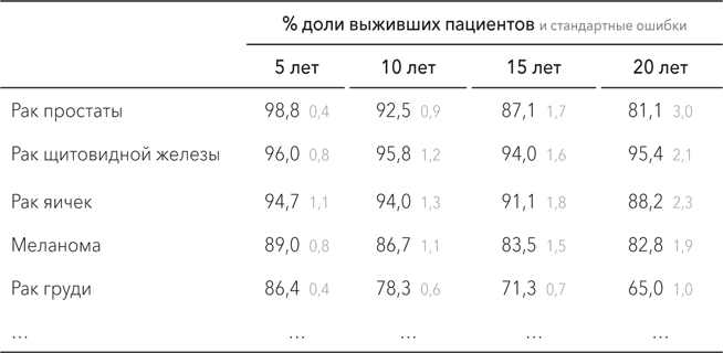
Why did the information become easier to read? For this there are some tips:
- Sort the data. Let the most important information be at the beginning.
- Do not use professional jargon. Few people know what the abbreviation “% (CO)” means, but perhaps some of the users are familiar with the concept of “standard error”.
- Use as few lines as possible, but they should be enough to understand.
- Do not format the table with colored frames and selection - they will distract from the numbers.
A well-designed table may be enough to make a decision, and it will also come in handy for the next step.
Use charts
Charts can both structure information and make it incomprehensible. Here are three basic ways to make diagrams understandable:
Axes of the correct length
Take, for example, a chart showing the growth in the number of employees.
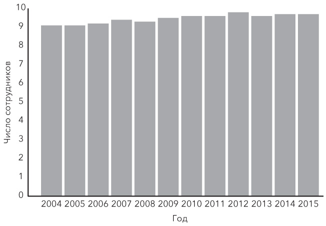
From the title of the chart it is clear that the number of employees is growing, but this is not visible on the image. If you glance at the diagram, it seems that the number of employees is about the same, but in order to see the changes, you will have to strain your eyesight, and this is not always convenient at the meeting.
If the number of employees at the level between 0 and 10 is about the same, then you should not start the axis from scratch. And if the average number of employees per year did not fall below 9, then you should not put lower values in the diagram.
Below is an example of a chart with the same information, but in a different form of presentation.

As you can see, it has become much clearer.
Watch out for 3D
Do not use 3D diagrams, as opposed to flat bars, they will confuse the viewer rather than provide useful information. The worst possible option is to use volumetric illustrations:
Our profit has doubled!

Comparing these two bags, it seems that the profit has not doubled, but increased eight times. After all, it is not only twice as high as the first, but also twice as deep and wider.
This way of presenting information is often used to distort and exaggerate data. You can also use it for your own purposes, but be on the lookout if you want to use it against you.
Too big piece of "pie"
Many presentations use pie charts that resemble pieces of cake. But most often they do not carry useful information, but only confuse.

Looking at this pie chart it seems that the front sector is the largest, but this is only because it is closer to the viewer. In fact, they are almost the same.
How to find out if a pie chart should be used in a presentation: ask someone what it is about, and if the other person spends more than ten seconds to answer, then use a bar chart.

Although this version of the standard bar chart is disgusting in appearance, at least one can see from it that the middle column is the longest.
If you have a small amount of data, then do not complicate the flow of information diagrams. Use a regular table, so it will be much clearer.

This table contains the same information as the two diagrams above, but it cannot be misunderstood and it reads much faster.
Set patterns
Graphs are often used to demonstrate the history of data interconnection, so having understood this story you can make the right decision.

This table shows how often the British government calls wealthy people "producers of material data", year after year.
As can be seen from it: the numbers are increasing, but not much. Now that you have a table with data, you can make a scatter chart from it.
The ratio of the number of articles in the British press with reference to "producers of material wealth" (2000-2012)
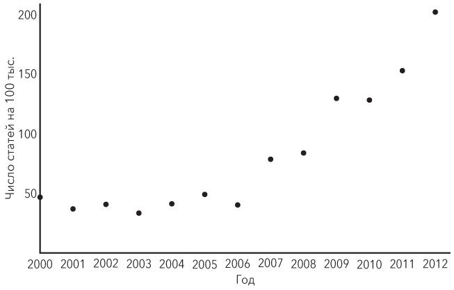
What can be seen on this diagram? Regularity If information were provided only for the first and last year, it would be a difference, but not a pattern. Perhaps in order for the pattern to be more obvious, it is worth connecting the dots.

Visually, information began to be perceived better, but the chaotic line brings clarity to the diagram, and not to the information that stands behind it.
For a clearer designation of patterns is to hold one line. For this, it is best to use the least squares method that is actively used in statistics. To do this, take all the points and calculate the line with the minimum square of the distance from each point to the line. This is called the line of best fit.
However, due to the fact that the points are not located in a straight line, one line will not be informative. To do this, it is better to divide the data into two parts: for the period from 2000 to 2006, where the line of best fit will be direct, and the period from 2006 to 2012, where the line goes up.
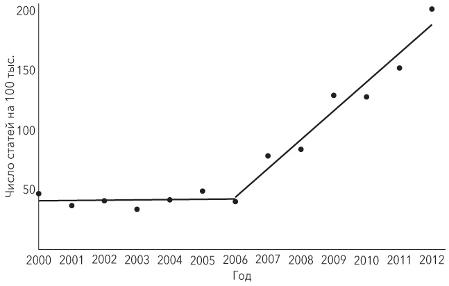
From the last chart it follows that since 2006 the term “producers of material goods” has been actively introduced into use.
Many assumptions can be made, for example, that in 2006 a decision was made to introduce a new term, but this will remain an assumption.
Another thing is important.
Drawing up tables and graphs is not enough to make correct and effective decisions, but using visual data it will be easier to do.
Look for the average
Averaging can make the information clearer, but since there is more than one mean, then choosing the wrong one can hide important data from us.
There are three average values, each of them is applied and is useful, depending on the situation:
- Average. This is the meaning most understand by the mean.
- Median value. The arithmetic mean has one problem: with a sharp deviation of some values, both upwards and downwards, the result will be distorted. The median helps to solve this problem - this is the level of indicators that divides the data set into two equal parts. And this value will be most appropriate in the presence of extremely high or low rates.
- Fashion. In fashion statistics, the value in the set of observations that occurs most frequently. This is an indicator of what the largest group is doing and, based on it, it is possible to build priorities. So, if the arithmetic average of products that buy on your site is 7, but at the same time 8 out of 10 users do not buy anything, then the fashion of purchases will be equal to 0.
Perhaps it is worth paying attention to it if you want to change something?
These are the main, but not all, principles of working with data.
If the information was useful, then in future articles I will try to give additional hints.
 A source:
Tim Phillips
Management based on data. How to interpret numbers and make quality decisions in business
Publisher: Mann, Ivanov and Ferber, 2017
Source: https://habr.com/ru/post/324904/
All Articles