The proximity theory: the main rule of design, which helps to move from subjective feelings to specifics
I first read about proximity theory in 2007. It was formulated as follows: “objects located close to each other are perceived as connected”. Then I thought: “thanks, Cap! I somehow guessed that the letter “M” should be hung closer to the men's room, and not to the women's room ”. Then I did not realize that this is one of the main rules of design, which helps to select the distances between elements, the size of the fields, the location of the buttons, the size of logos and much more. And most importantly, the theory allows you to quickly understand whether you have a good design or not, even if you are not a designer.
Usually, proximity theory is illustrated with different geometric figures that are closer and farther from each other. This looks obvious, like the formulation of the theory itself, but when it comes to practice, problems arise. Therefore, I will try to explain the basics of the theory using the example of letters:

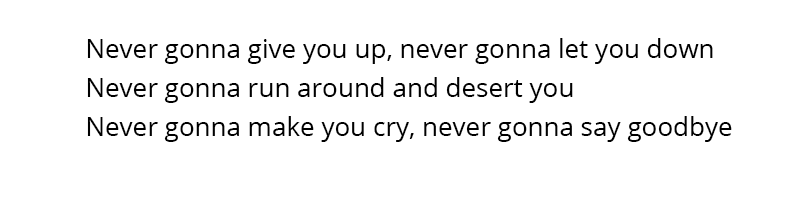
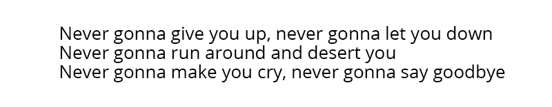
Even here the theory of proximity begins to work: the letters in the words should be closer to each other than the words. As soon as the distance between the letters approaches the width of the gap, chaos ensues:

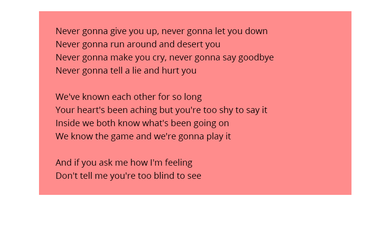
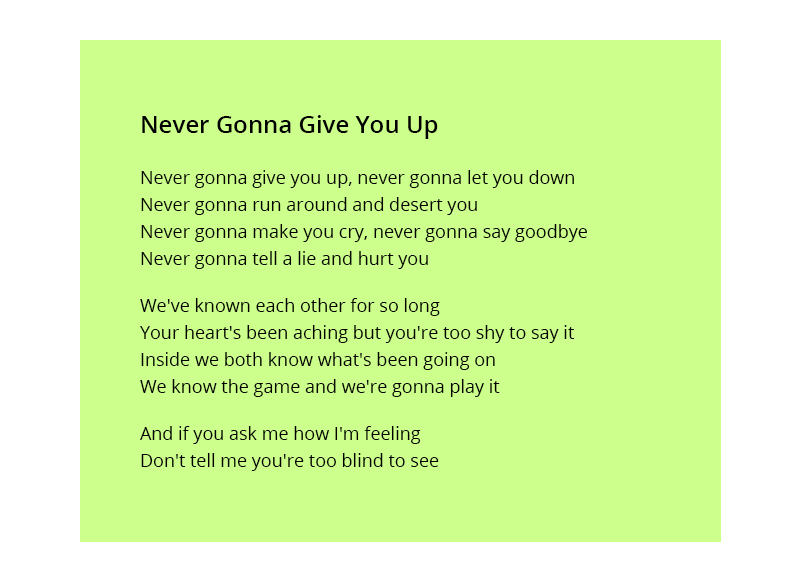
This is obvious, but let's apply the same rule to the distance between the lines. What should be connected more strongly: lines or words in lines? Obviously, the words are connected more strongly, so the distance between the words should be significantly closer than between the lines. What does it mean significantly closer? If you make the line spacing one and a half times more space, they will start to clearly differ:
For comparison - here the line spacing (leading) is clamped and almost equal to the width of the space:
One feels that it needs to be increased, but how much? Thanks to proximity theory, we know the answer: so that it becomes noticeably larger than the width of the gap . Many designers do it at the level of intuition, without understanding the internal logic. Someone gets better, someone gets worse.
Suppose we need to place the text on the plate. The theory of proximity works like gravity - objects that look more massive “attract” smaller ones to themselves. And the borders of the format, be it a page of a book, a browser window, or the edge of a business card, can be represented as borders with a massive black hole - when we approach them, an external attraction begins to work. Place the text on the plate:
It seems to be all neat and smooth. But if you recall the theory of proximity, you can understand that the indents from the edge "argue" with the distance between paragraphs, that is, they are almost equal:
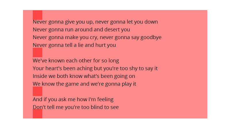
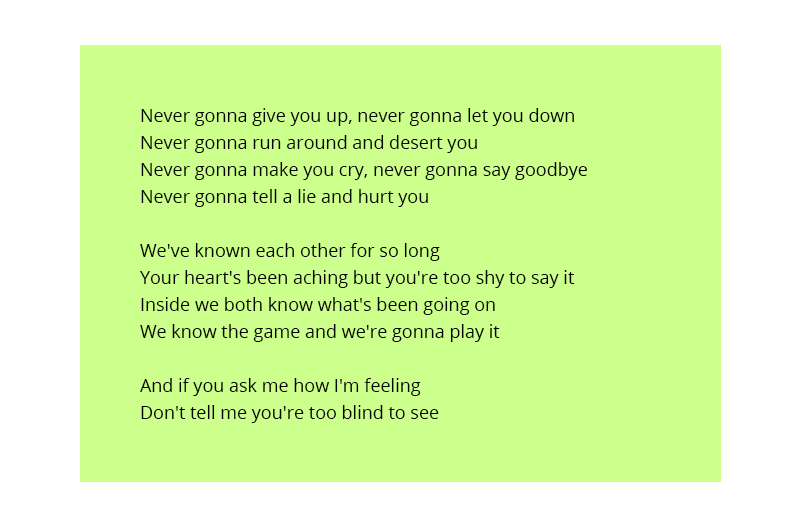
It is necessary to make indents significantly larger than the distance between the paragraphs, then it will definitely be perceived that they are inside the format, and do not seek out:
Let's add a headline:
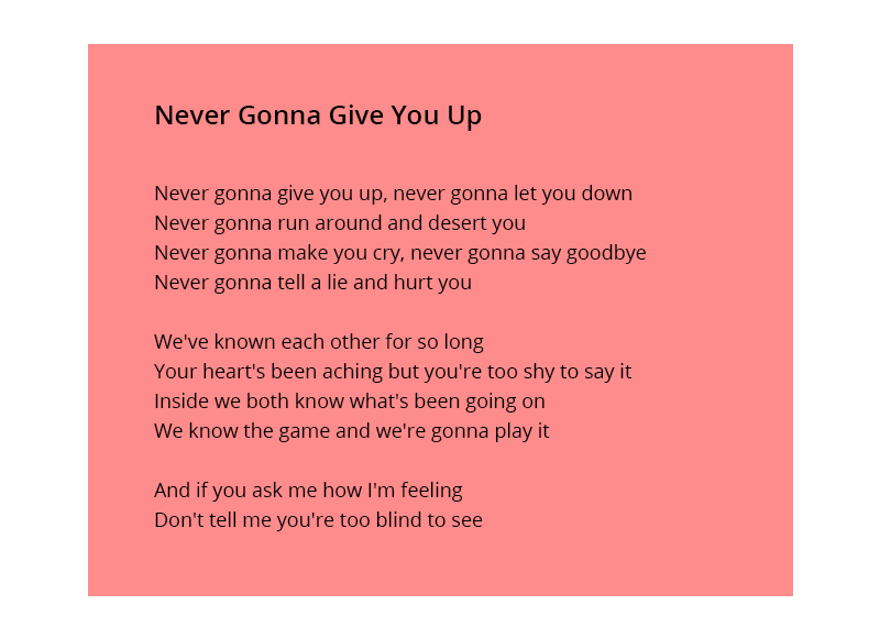
Designers make the same mistake most often. The title or caption must clearly refer to the text. In practice, headlines often hang exactly in the middle between two texts or the illustration interferes with the distance between the heading and the text:
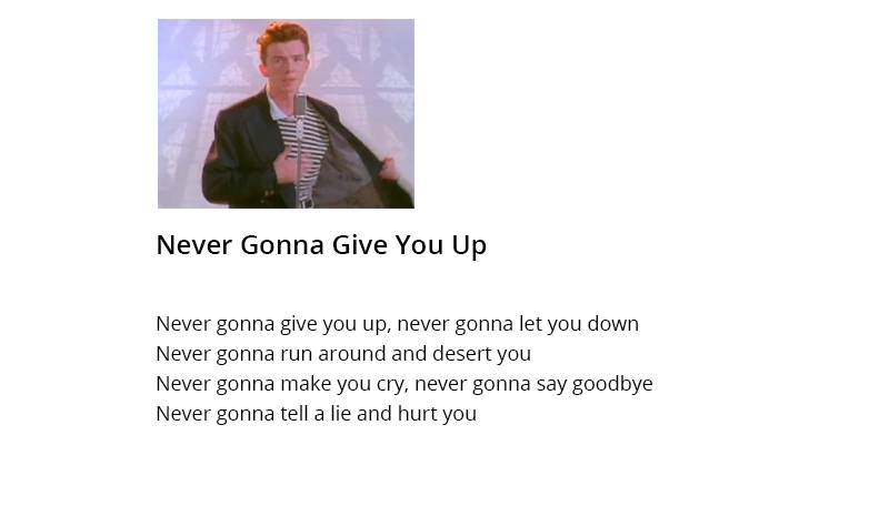
Let's put together a heading and text following the logic of proximity theory: letters in words are connected more than words, words are connected more than lines, lines are connected more than paragraphs, paragraphs are connected more than heading and text, heading together with text are connected inside the format. This will help you find the right distances:
Using the proximity theory, it is easy to move from abstract “too close to the edge” to specifics: “the signature should be closer to the field to which it relates than to the edge of the form”. For example, in this animation, the design of the form is changed step by step using the proximity theory, and logically related elements become closer to each other:

So, connecting and separating elements by distance and weight, you can make logical and neat websites, presentations, booklets. In addition, proximity theory helps to objectively evaluate a design. For example, here the designer did not bother and arranged the elements as horrible:
')

Immediately it is not clear what news has what time of publication, the title is hanging between the text and the illustration. Knowing the theory of intimacy, it is easy to understand whether the designer was thinking about the convenience of perception, and it is also easy to give clear instructions for improvement. While others are asking to "add air" or "comb the design," you can be specific with the proximity theory: "the headline should be closer to the news to which it relates." Of course, one cannot achieve absolute accuracy to the pixel, but you can make a big step towards objectivity, which the design lacks.
I hope I was able to explain the basics of the theory of proximity, not too abstract, but not too confusing. I think they will help you, like me once, better understand the logic of design and move from subjective sensations to concrete and logical actions.
Usually, proximity theory is illustrated with different geometric figures that are closer and farther from each other. This looks obvious, like the formulation of the theory itself, but when it comes to practice, problems arise. Therefore, I will try to explain the basics of the theory using the example of letters:
Even here the theory of proximity begins to work: the letters in the words should be closer to each other than the words. As soon as the distance between the letters approaches the width of the gap, chaos ensues:
This is obvious, but let's apply the same rule to the distance between the lines. What should be connected more strongly: lines or words in lines? Obviously, the words are connected more strongly, so the distance between the words should be significantly closer than between the lines. What does it mean significantly closer? If you make the line spacing one and a half times more space, they will start to clearly differ:
For comparison - here the line spacing (leading) is clamped and almost equal to the width of the space:
One feels that it needs to be increased, but how much? Thanks to proximity theory, we know the answer: so that it becomes noticeably larger than the width of the gap . Many designers do it at the level of intuition, without understanding the internal logic. Someone gets better, someone gets worse.
Suppose we need to place the text on the plate. The theory of proximity works like gravity - objects that look more massive “attract” smaller ones to themselves. And the borders of the format, be it a page of a book, a browser window, or the edge of a business card, can be represented as borders with a massive black hole - when we approach them, an external attraction begins to work. Place the text on the plate:
It seems to be all neat and smooth. But if you recall the theory of proximity, you can understand that the indents from the edge "argue" with the distance between paragraphs, that is, they are almost equal:
It is necessary to make indents significantly larger than the distance between the paragraphs, then it will definitely be perceived that they are inside the format, and do not seek out:
Let's add a headline:
Designers make the same mistake most often. The title or caption must clearly refer to the text. In practice, headlines often hang exactly in the middle between two texts or the illustration interferes with the distance between the heading and the text:
Let's put together a heading and text following the logic of proximity theory: letters in words are connected more than words, words are connected more than lines, lines are connected more than paragraphs, paragraphs are connected more than heading and text, heading together with text are connected inside the format. This will help you find the right distances:
Using the proximity theory, it is easy to move from abstract “too close to the edge” to specifics: “the signature should be closer to the field to which it relates than to the edge of the form”. For example, in this animation, the design of the form is changed step by step using the proximity theory, and logically related elements become closer to each other:
So, connecting and separating elements by distance and weight, you can make logical and neat websites, presentations, booklets. In addition, proximity theory helps to objectively evaluate a design. For example, here the designer did not bother and arranged the elements as horrible:
')
Immediately it is not clear what news has what time of publication, the title is hanging between the text and the illustration. Knowing the theory of intimacy, it is easy to understand whether the designer was thinking about the convenience of perception, and it is also easy to give clear instructions for improvement. While others are asking to "add air" or "comb the design," you can be specific with the proximity theory: "the headline should be closer to the news to which it relates." Of course, one cannot achieve absolute accuracy to the pixel, but you can make a big step towards objectivity, which the design lacks.
I hope I was able to explain the basics of the theory of proximity, not too abstract, but not too confusing. I think they will help you, like me once, better understand the logic of design and move from subjective sensations to concrete and logical actions.
Source: https://habr.com/ru/post/324874/
All Articles