How to escape from the plane: a review of the book "Presentation of Information" by Edward Tufti (1990)
According to the author, Edward Tufti : "This book marks an escape from the plane of the paper sheet and the computer screen." However, not everyone is capable of such an escape. To do this, at least three components are necessary: the ability to see the beauty of complex data, to be surprised at the simplicity of their artistic embodiment and the ability to peer into the smallest details of an information masterpiece. Given that contemplation and detail today is given too little attention, and increasingly requires “fast food” information, simple for consumption, which becomes the same flat, one-dimensional reality. Professor Tufti suggests not to simplify the difficult, but to make it beautiful. "For this, we have our own tools: writing and typography, processing large amounts of data and statistical analysis, line, background and color."
The work consists of 6 parts, in which the principles of information design are formulated and explained. Edward Tufti uses the world's best data visualization patterns, commenting on them in this way: “The principles of information design are universal, like mathematics, and free from the specifics of a particular language or culture. Consequently, our samples are not limited to time and space: illustrations cover 17 countries and 7 centuries, and for that matter, 3 planets and 1 star. ”
Let's take a closer look at each of these parts.
Escape from the plane , that is, the embodiment of the phenomena of the three-dimensional world on the plane, is the main task of information design. The first chapter describes how to visualize data with common artistic means (perspective, unfolding of figures, three-dimensional images) and special infographic (tables, graphs, maps of time and processes).
')
Professor Tufti formulates two goals of statistical studies, and accordingly their visual implementation, averaging and oscillation around the average. He says that there are two of the most frequent actions with arrays of data - this is a comparison and a choice . It is for these purposes that most infographics are created. For this purpose, in infographics, small sets are used (not all data, but average, maximum and minimum). The viewer should be able to compare the necessary facts, see their dynamics and draw their own conclusions. Visual presentation of information differs from speech in that in the presence of large amounts of data, it is easier to control them - to summarize, compare, find patterns.
Compare bad and good informational designs. The first is called "graphic garbage", it "clogs" the information, coming to the fore. However, the subject of interest should focus on the content - on the information itself, and not on its form. “Graphic garbage” is rather close to the poster (vivid images, large fonts, minimal facts), while the real infographic focuses on high-quality maps containing “general view of the area, several detailed semantic layers” and high-quality, “dense” data.
The essence of the second chapter of the book “Micro and macro levels of perception of information” is proclaimed at the very beginning: “to make it easier, add details”. Further, the author argues, proves, illustrates this absurd, at first glance, thesis. He says: "Each unit of information is both an independent semantic entity, and part of a huge aggregate of its own kind, which, in turn, carries a more global idea."
The peculiarity of infographics and information design is that the viewer can see the whole picture and consider a single point of the overall picture, indicator, signature. In the process of perception, the basic laws of human thinking, peculiarities of cognition work: initially we select an interesting object from the mass of others, that is, we perceive its general, most obvious characteristics, then we look at its details, learn qualities that we did not pay attention to at first sight. All together it gives a complete picture of the subject of interest. Thus, a correct, harmonious design of a graph, chart or table should force each point to work twice - at the micro and macro level (for close and distant consideration).
Work with layers - the third chapter of the book, devoted to the technique of "stratification", the visual separation of different types of information by layers. Layers help to structure the data, bring them into the system.
Color (tone) helps to separate one sense layer from another, for example, black and white drawing and red explanatory signatures. Other indispensable tools for this purpose are texture and shape. The most valuable information should be brighter than other parts of the image so as to stand out from the background of information noise.
“Randomness and confusion are not properties of information, it’s a design failure,” which is not easy to cope with. The difficulties are connected with the fact that the elements of the image begin to interact with each other, apart from the designer’s will, at the intersection of existing forms, counter-forms arise (or optical illusions). The effect is called “1 + 1 = 3”, the simplest example would be the following: draw two black stripes side by side, the white space between them is perceived as the third strip. It does not carry any semantic load, but only complicates the perception of existing forms. This negative effect is most clearly manifested in contrasting images (black on white), therefore, to reduce visual “noise”, the author recommends using light-colored figures against the light background.
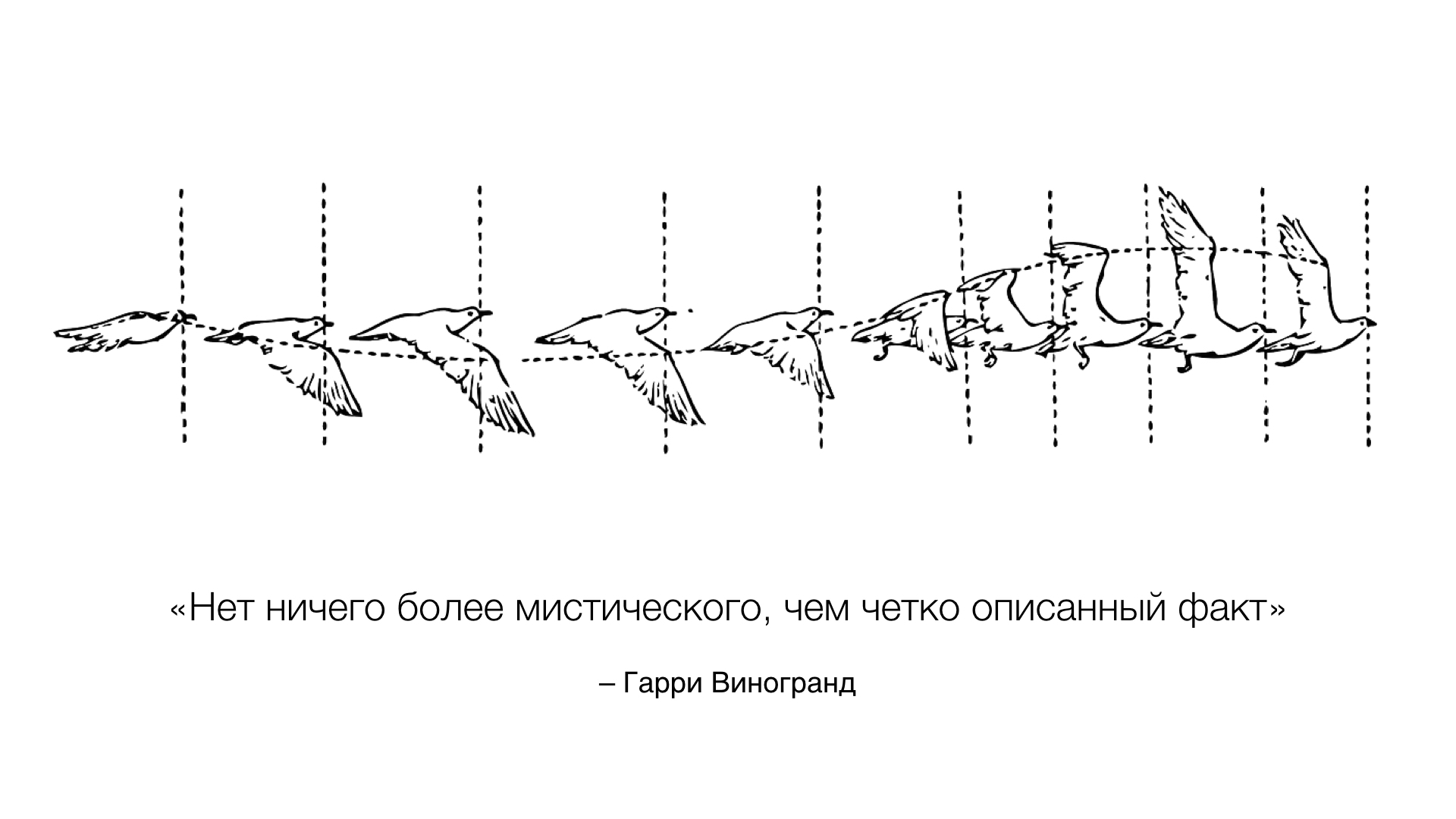
The fourth chapter, “Small Sets,” is devoted to another effective reception of information design - the use of several objects in a row to demonstrate external differences or a chronology of changes. "Reception with the use of small sets allows you to immediately reveal a number of properties of information."
Any infographic acquires meaning only when there are objects of comparison. Moreover, these objects should be within sight (on one sheet) and should be related by meaning, because erroneous comparisons of data not related to each other are frequent. For example, the famous proof of the hypothesis of global warming (see the documentary “Inconvenient Truth”) was a graph of the connection of climate warming in the twentieth century and an increase in carbon dioxide in the atmosphere, which many today consider erroneous because Comparing warming should, first of all, with solar activity.
The penultimate chapter “Information and color” is devoted to the features of using color. Using the example of several exemplary maps, Edward Tufti shows how the fundamental laws of color in infographics work: “marking (used to denote entities), comparison (to indicate quantity), representation (symbolic use), imitation of reality (to enhance realism) and decoration.”
The author is skeptical about the active use of color in infographic design, because This is too difficult task to implement. The main principle here is the principle of "do no harm."
From the chapter there are several specific, basic rules of info-design :
- background and large colored areas are better to do neutral, grayish tones,
- important elements - should be small bright areas, for giving expressiveness of which the use of contours is possible,
- “if there is more than one large spot of the same color in the picture, then it visually decays”; to restore unity, smooth color transitions are needed,
- “a win-win strategy is to use natural colors, especially light colors, shades of blue, yellow and gray”,
- it is necessary to remember about the interaction, "subtracting" colors.
This gives good examples that violate the rules, and the main thing is the relevance and the need to use color.
In the final part of the work, Edward Tufti focuses on the "Description of the Place and Time" and the most popular types of infographics - maps and time sequences, schedules. According to him: “Schedule design is the very heart of infographics as a field of knowledge — huge arrays of numbers with lengthy descriptions, high information density, proximity of typeface and graphics, numerous narrative techniques.” The task is complicated by the fact that schedules are created for the most diverse public, and most often, for ordinary people who are not dedicated to design wisdom.
Examples of time transfer on paper are analyzed, including, in the form of spirals, curved graphs and cylindrical time scales, textual and graphical schedules, dance schemes are compared, successful and unsuccessful examples of informational graphic design are described.
Source: https://habr.com/ru/post/324854/
All Articles