Learn to think in REM. Talk about the obvious and about productivity in a small web studio
For some time I got into the hands of various layouts made by well-known designers, and not so, as well as sites that were put on these layouts. Some were pretty, others were a bit old-fashioned, and others were just awful. Periodically, he himself solved layout tasks, including pixel-perfect, and gradually came to the realization that all sizes in layouts are almost always selected. from shit relatively randomly, which brings to the result some heterogeneity, and in the layout process - an extra headache, crutches and time spent. In this article I would like to share some thoughts and experiments about this.
Mess in my head
It's about a small company that is creating websites in relatively large numbers. There will be no reasoning on the theme of color, photo processing or drawing logos and icons. We will talk about the size. There are different sizes - indentation sizes, font sizes for plain text and headings, icons, buttons, border-radius, indents for shadows, elements displacement ... in general there are a lot of them. A person who does not design, most likely never thinks about how these dimensions are chosen. Yes, and I did not think about it either, until I caught myself at the aforementioned thought about random choice.
In order to understand the designer’s thinking, I went to TyTruba and looked for web design lessons for beginners. Indeed, in many small studios, it is the beginner designers who have been studying for this kind of lessons. There is no one to fix them and they do everything as they are used to. After reviewing several dozen popular lessons a strange feeling arose. Very strange. It seems that not a word was said about the ideology of choosing sizes for interface elements. But often there were expressions like "there are about 50 pixels here", "you need to do a little more", "add indent", "5-6-7 ... well, about 8 pixels". Some elements are clearly positioned to the eye. As a result, novice designers also begin to do something by intuition and operate with abstract concepts and numbers taken from the ceiling. It is good if a good stylegide caught the eye of a beginner and he understood that unification is good. But all the sites are different, but the style-guides are not universal, and again something strange begins ...
At first glance - well, okay , because the coder does not complain, and the customer, who in the design does not understand at all (in his mind, the yellow text on a pink background is exactly what is needed) approved the layouts:

But what if ... is there still a problem? Especially strongly it manifests itself in a situation when, for some reason, they decided to make pixel-perfect. In order to understand the pain of a situation, you need to look at everything from the point of view of the layout designer. When creating a layout, a significant part of the work (with a pixel-to-pixel layout, this can approach 80-90% of the total time spent ) takes the transfer of dimensions from the layout. If initially the dimensions were chosen in a strange way - this process turns into an endless stream of numbers: the same size of indents, font sizes for text and headings, icons, buttons, border-radius, indents for shadows, displacement of elements, numbers, numbers, numbers ... from element to element, they swim, creating an incredible mess in my head. Some tools speed up this process, but do not eliminate it. The code turns into a set of magic constants and supports for several pixels. The layout of one page can take an incredibly long time. Faced with this problem, some thoughts appeared head-on, which gave a rather amusing effect in the long run.
Thought the first.
We need a limited set of sizes that are used on the page. Under the conditions of a studio, through which dozens of sites with different designs can pass every month, the concept of a stylgide can be quite difficult to apply. But a certain set of universal rules can be distinguished - corporate identity is usually associated with color and fonts, but not with dimensions.
Goals:
- Reduce porridge in the head
- Remove mountains of magic numbers from code
- Add monotony to the interface
Second thought
All sizes must be intuitive. So that the layout designer can, with his eyes looking at the layout, determine with confidence which indent or size of the element. And in the future, I could add some element to the page without resorting to the help of a designer - just having a sketch on paper in my hands.
Goals:
- Increase the productivity of the coder
- Free up some designer time
Trying to put it into practice.
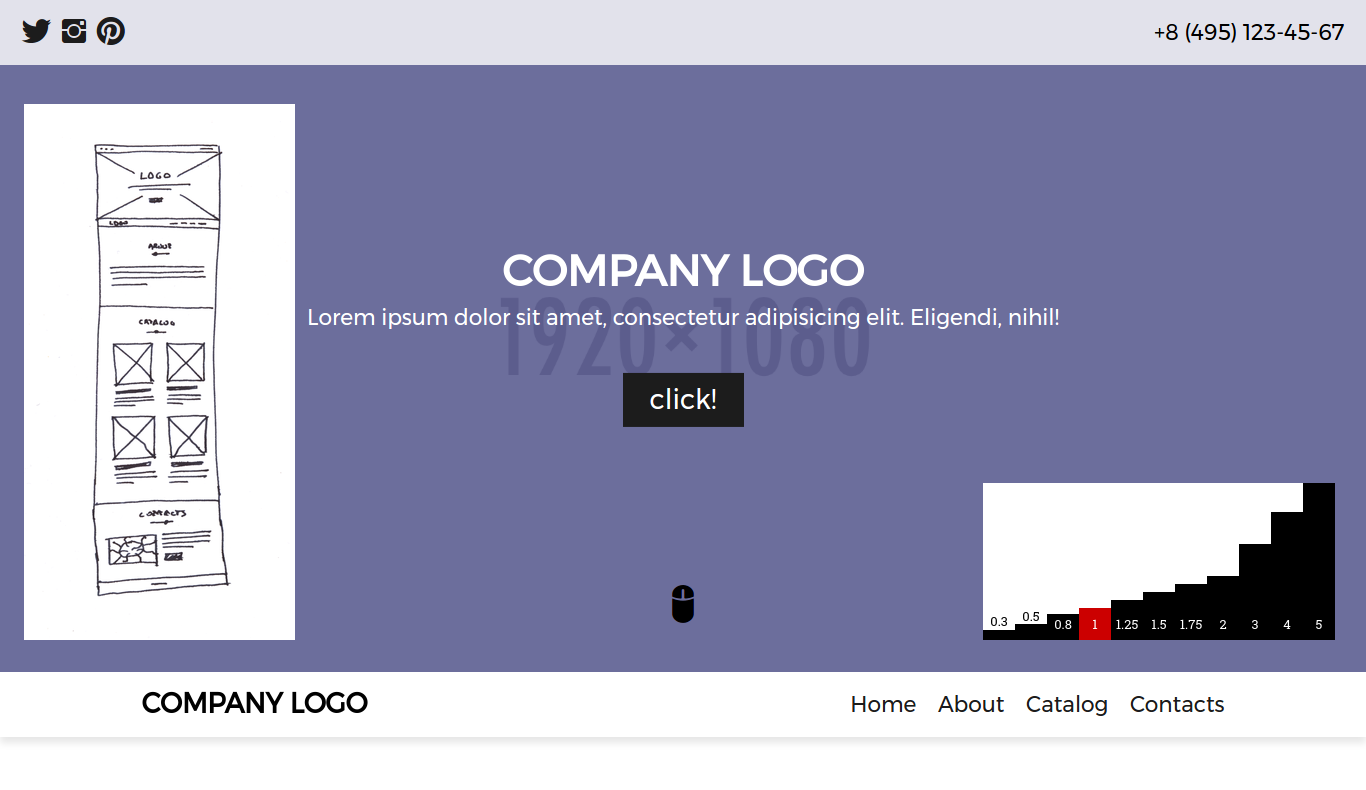
The first thing you need to think about - units of measurement. A rather obvious fact is that a pixel is not an intuitive unit. We cannot determine with certainty 7, 12, 18, or 23 pixels on the screen. Moreover, such values are not simple and memorable. Based on the css capabilities, it was concluded that it would be a good idea to try rem units. Since having one “reference” font size (1rem) on a page, we can calculate the size of other elements from it. And it happens at the level of intuition. It is only necessary to select a set of more or less distinguishable values.
The human eye allows us to well distinguish about 1/4 from the subject. Based on such a simple idea, the following set of values was constructed: 1, 1.25, 1.5, 1.75, 2, 3, 4, 5.

As you can see, the set is simple and memorable. For some technical needs, we sometimes need sizes smaller than the standard, for this purpose we chose 0.3, 0.5 and 0.8:

Why exactly these? I do not know. At random The trial and error method was obtained exactly such values. In addition, each value from the set has its logical meaning:
- 0.3 : small border-radius, some technical stuff like underscores
- 0.5 : large border-radius, horizontal indents between the icon and the text, some indents between the fonts of different sizes in the headers
- 0.8 : small font size (tags, post dates, signatures, etc.)
- 1 : default reference font, vertical and horizontal indent for all that is (including indents in the grid, of course)
- 1.25 : enlarged font
- 1.5 : enlarged font for large headers
- 1.75 : enlarged font for large headers (replaces 1.5 for some fonts)
- 2 : large font, large indents in all directions
- 3 : large vertical indent
- 4 : big space between sections
- 5 : large-large indentation between sections (makes sense in the landing, when at the junction of the sections in the upper indent is more than the bottom)
Some cases are negotiated separately, but the general meaning should be clear. Having such a set of sizes, you can, without hesitation, make up even a sketch on paper. When creating a layout, the designer operates on the same size, but multiplied by the default font size.
Try something to do
The reader probably thinks: he has nothing to do, he comes up with something here ... A working example here will be very useful. In order not to load much of the brain to the reader, let's take some classic small landing page.
How do we start making a website? - make a sketch with the location of the blocks. It is likely that right at the client. We get something like this:

Next, the designer starts to do something there, selects colors, draws icons ... In the meantime, he does all of this, we will make a blank for the page. We look at the plate (if not yet remembered) and begin to impose. Yes, just like that. And who said that it is impossible? It is even possible.
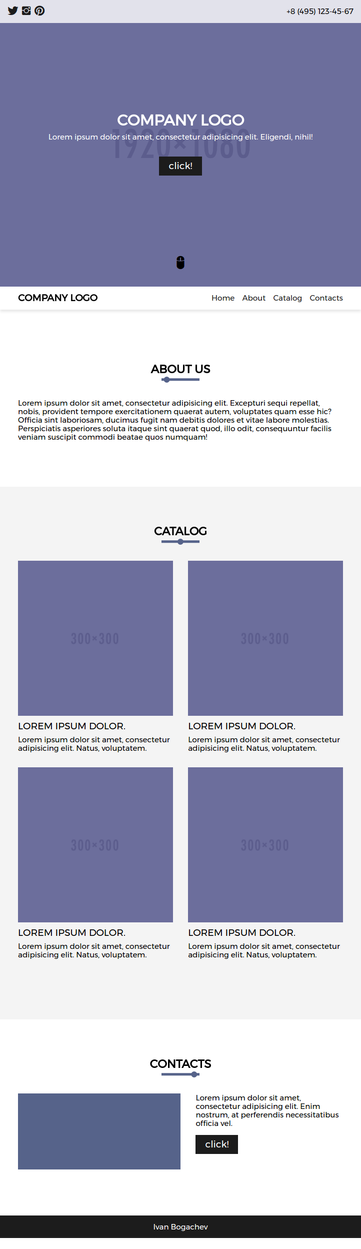
As you can see, it already turns out at least not very nasty. It is clear that this is just a blank, but it suggests that in some cases you can do without a designer. Yes, revision is required (adaptability is absent, but this is not an illustration of it), but in general, it already looks better than what half of the provincial studios do . At the same time, it all took quite a bit.
Along the way, the designer gives us the right colors, pictures, fonts, etc. In other words, while the designer was thinking - we already have a blank. While he was processing photos and drawing icons, we’ve almost done everything and we sit and do different animations, adapt them to phones or whatever else we need to do. There is no such thing that the designer is already engaged in another site, and it is difficult for him to switch to answer some questions or discuss something.
With this approach, productivity in the bundle designer + layout designer increases incredibly. There are certain thoughts on the theme of reducing working hours and alternating dense work with no less dense rest, but this is a topic for a separate article.
If we still work according to the classical scheme “first, the layout, then everything else” - the time it takes to make-up does not practically increase, as the reasoning regarding the size remains the same. It turns out that in any case we can spend less time on monotonous work. Although there are certain requirements for the designer in terms of “using sizes from the list”, this is not very convenient for some.
Conclusion
According to the results of the experiment, we can say with confidence: the porridge in the designer's head has noticeably decreased, the code has become more understandable and readable due to the removal of a mountain of magic numbers and supports. Labor productivity has grown. It turned out that in some cases you can do without a full-fledged layout, which saves all the participants in the process.
It would be interesting to hear your opinion on this issue. Did you try to introduce a similar universal system, to impose without having a layout, and what came of it? How satisfied is your coder with what he does, and were there any ideas about improving the productivity of his work?
')
Source: https://habr.com/ru/post/324814/
All Articles