Create a design system
No doubt about design systems I am asked more often than about anything else. Over the past few years, I have spent a lot of time thinking about how to build, implement and present design systems for products such as Marvel , Bantam and Modulz , and now decided that it was time to share what I learned in the process.

What is a design system?
')
It's no secret that designers love good UI whales. But, according to my observations, lately, more and more attention has been paid not just to toolboxes and style guides, but to creating systems that tie together whole products. Companies like Shopify and Intercom form special teams that deal exclusively and exclusively with design systems. People are beginning to realize how important a systems approach is in design. This is encouraging. Who knows, maybe one day a tool for designers will appear that will not assume that in every new project we start from scratch.
A design system (applied to IT products) is not just a framework, a set of UI tools or a library of components. This is more than a style guide or a set of instructions for writing code. More even than all of the above. A design system is a constantly evolving rulebook that determines the order in which a product is created.
A good design system is multifaceted - it includes everything from the culture and mission of the company and right up to branding, copywriting, component libraries and other design languages. Elements of the highest level can be called the most important aspects of the system (although this is a controversial point), but in this article we will assume that you, as a company, know who you are, what your mission is, what your products should look like, what impression you should leave and how to work.
Having defined these key parameters, you can harmoniously and consistently present your vision by means of design.
Create a style palette
Before we take on the components themselves, we need to lay the foundation for them. We will have to decompose the product to the smallest components.
Even such a component as the simplest heading is in fact a combination of a number of styles that are used repeatedly in design.

So we have to disassemble each component until the smallest elements remain that can not be decomposed - these will be basic styles. You can start with a list of CSS style attributes . Most of the attributes can only take predefined values and, accordingly, can be used on any website on the Internet. Those attributes that take arbitrary values, ultimately make up what distinguishes our product from all others. These arbitrary values will determine the style palette at the global level. We will use the global style palette when creating absolutely all aspects of each of the company's products.
When everything is ready, the product should not use a single style that was not originally included in the global styles palette.
Colour
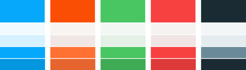
Let's start with color, the most obvious attribute of style - the only one that, apparently, modern tools recognize as something that can be called, saved and reused.
Let's take blue as the main color. Accordingly, as a secondary, its complementary color will be orange.

Brand colors
Using color to express the idea of success or failure is a common pattern in design, so we’ll add red and green to our palette for this purpose. A pair of yellow-black is also good.

Colors to indicate success / failure
Finally, we still need gray. Most interfaces require at least the following shades of gray:
Of course, it is possible that you will need other shades. For example, you might want to use three different shades of gray for the main text or two for stroke. The bottom line is that you must think in advance what styles you will use, so that you can then apply them at any stage of the work on the product.
As a finishing touch, it would be nice to add variety in shades for both primary and secondary branded colors. This can be useful when creating components, if you want to make somewhere the background is lighter and the stroke is darker.
The final version of the palette
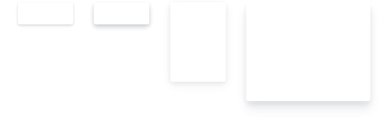
Shadows
Shadow is another common style attribute that is used in most interfaces. According to my observations, designers often decide how to apply it, spontaneously, during the work on the component. Such an isolated approach often leads to the fact that the design is not consistent.
Let's digress from the specifics and think about why we need shadows. Obviously, we are trying to add perspective to the interface, but this effect would be useful for other components. So let's look at the shadows apart from the individual components and incorporate them into our styles palette.
Four types of shadows should be enough to implement any component in the system:
All kinds of shadows, from light to distant
Font size
To build on each screen the desired visual hierarchy, we need to decide which font sizes will be used.
Fonts in our design should be arranged in a range, like notes in tune. It helps to maintain a slender rhythm vertically. All these comparisons may have been a little discouraged, but, fortunately, smart people have already managed to figure it all out for us. Tim Brown has created an excellent website that presents sets of fonts of various sizes. Adam Morse made public his implementation of the diatonic scale of fonts . In my opinion, the third is suitable for most products.
The next step is to figure out what font sizes we need, and then put them on the main third of the typographic scale.
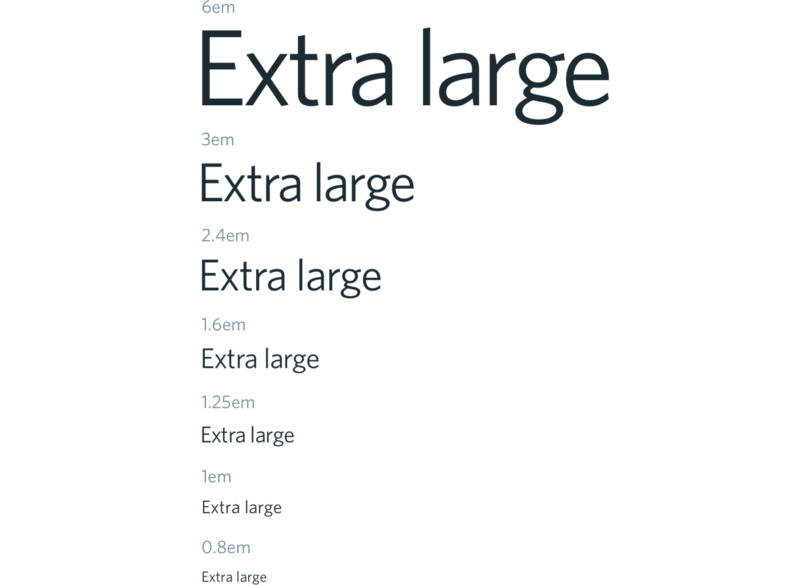
Font scale
Rounding corners
The general idea is to apply the same scheme from time to time for each attribute that takes arbitrary values. To round the corners, we will need the following radial values:

Different rounding radii: 2px, 4px and 8px
Note : you will also need the value of 50% to create round components - avatars and so on.
Distance
The most common attribute of style in almost any design is empty space. It doesn't matter where we apply it — between links in the header, elements in the grid, an icon and a link or drop-down menu items — empty space should never appear randomly or arbitrarily on the interface.
As is the case with the font, only by adhering to a certain scale, we can be sure that all components and layouts will look the same. I personally love the most and most often use the 8dp grid from Material Design as a scale. Elliot Dahl wrote an excellent article about the benefits it provides.
Keeping in 8dp pitch, we can calculate the distance between the various components in the layout of any of our product lines.
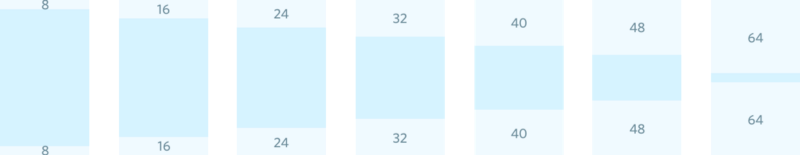
We can also use these values to set the height, width and line spacing, which can be repeatedly used in determining the size of buttons, input fields, avatars and the like. These components often appear in bundled web products, so it will be more convenient if the ratio of their sizes is always the same, in order to avoid unwanted discrepancies.
Discharge
As I already mentioned, the size is not the only style attribute that we will need to set for the font. The spacing between letters is another useful attribute that can be used to make large headers more compact and give small headlines to small headers.
3-4 values for discharge should be enough.

Create a component library
Now that we have decided on a global palette of styles, we can take all these elements and start building a library. For the most part, in this process there is no place for creativity - we simply take the given styles and impose them on the components.
At this stage there should not be such that we have a need for a style that was not previously included in the palette. We were engaged in creative work at the previous step, when we made up the palette. From this point on, colors, font sizes, margins and padding sizes — in a word, any style that we use when creating components or layouts should be drawn from the palette, and nothing else. Nothing new (with rare exceptions) can not be entered. It may seem that this is too categorical or unreasonable, but I believe that on the contrary, it is here that many are confused.
Dave Rupert recently tweeted a readership survey on the following topic: where to put the code that overrides the style of the button component, for example, if this button is in turn inside the modal component.
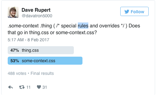
Harry Roberts (be sure to check out his work) later expressed his views on this issue in the article. Later, Jonathan Snook opened the topic by adding his thoughts. Although I agree with the conclusions reached by both of them, it seems to me that this whole discussion could not even begin.
This is a paradox - to create a design component with the intention to use it repeatedly at the global level, and then modify it for some separate part of the product. Then the creation of the component library itself loses its meaning. When I see how one style overrides another, this is usually due to either desperate attempts to push the component somewhere where it does not fit, or because the design was not sufficiently planned in the early stages, and now the designer has to resort to variations.
Every time you redefine a global component in a particular area of a product, you break the constancy of the design system. When such spontaneous changes accumulate throughout the product, the output is a design system that does not have internal consistency - inconsistencies stick out from all the cracks.
Now let's take a few standard components and analyze how you can build them, applying only those styles that the palette we created includes.
Just a button
Let's start with the simplest example - the buttons and see if it is possible to make a component from a predefined style palette.

Other components
And again: all these colors, font sizes, shadows and indents were taken directly from the palette that we made in the previous paragraphs.
Let's try something more ...
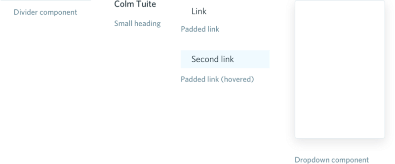
Now that we have several components ready, we can start composing more complex elements from them — for example, a drop-down menu.

Nothing but styles from our basic palette was used to create this menu. In this way, we can design the entire component library, then move on to more detailed layouts, and finally, on whole screens.
A couple of tips for last
What is a design system?
')
It's no secret that designers love good UI whales. But, according to my observations, lately, more and more attention has been paid not just to toolboxes and style guides, but to creating systems that tie together whole products. Companies like Shopify and Intercom form special teams that deal exclusively and exclusively with design systems. People are beginning to realize how important a systems approach is in design. This is encouraging. Who knows, maybe one day a tool for designers will appear that will not assume that in every new project we start from scratch.
A design system (applied to IT products) is not just a framework, a set of UI tools or a library of components. This is more than a style guide or a set of instructions for writing code. More even than all of the above. A design system is a constantly evolving rulebook that determines the order in which a product is created.
A good design system is multifaceted - it includes everything from the culture and mission of the company and right up to branding, copywriting, component libraries and other design languages. Elements of the highest level can be called the most important aspects of the system (although this is a controversial point), but in this article we will assume that you, as a company, know who you are, what your mission is, what your products should look like, what impression you should leave and how to work.
Having defined these key parameters, you can harmoniously and consistently present your vision by means of design.
Create a style palette
Before we take on the components themselves, we need to lay the foundation for them. We will have to decompose the product to the smallest components.
Even such a component as the simplest heading is in fact a combination of a number of styles that are used repeatedly in design.
So we have to disassemble each component until the smallest elements remain that can not be decomposed - these will be basic styles. You can start with a list of CSS style attributes . Most of the attributes can only take predefined values and, accordingly, can be used on any website on the Internet. Those attributes that take arbitrary values, ultimately make up what distinguishes our product from all others. These arbitrary values will determine the style palette at the global level. We will use the global style palette when creating absolutely all aspects of each of the company's products.
When everything is ready, the product should not use a single style that was not originally included in the global styles palette.
Colour
Let's start with color, the most obvious attribute of style - the only one that, apparently, modern tools recognize as something that can be called, saved and reused.
Let's take blue as the main color. Accordingly, as a secondary, its complementary color will be orange.
Brand colors
Using color to express the idea of success or failure is a common pattern in design, so we’ll add red and green to our palette for this purpose. A pair of yellow-black is also good.
Colors to indicate success / failure
Finally, we still need gray. Most interfaces require at least the following shades of gray:
- very light shade for backgrounds;
- the tint is slightly darker for borders, lines, strokes and separators;
- a hue of medium saturation for subtitles and auxiliary text;
- dark gray for headings, main text and background.
Of course, it is possible that you will need other shades. For example, you might want to use three different shades of gray for the main text or two for stroke. The bottom line is that you must think in advance what styles you will use, so that you can then apply them at any stage of the work on the product.
As a finishing touch, it would be nice to add variety in shades for both primary and secondary branded colors. This can be useful when creating components, if you want to make somewhere the background is lighter and the stroke is darker.
The final version of the palette
Shadows
Shadow is another common style attribute that is used in most interfaces. According to my observations, designers often decide how to apply it, spontaneously, during the work on the component. Such an isolated approach often leads to the fact that the design is not consistent.
Let's digress from the specifics and think about why we need shadows. Obviously, we are trying to add perspective to the interface, but this effect would be useful for other components. So let's look at the shadows apart from the individual components and incorporate them into our styles palette.
Four types of shadows should be enough to implement any component in the system:
- a light shadow that will emphasize the interactive elements and make the design more intuitive;
- more pronounced shadow for selecting components when you hover the cursor;
- thick shadow to give perspective to drop-down menus, pop-up windows and other similar components;
- remote shadow for modal components.
All kinds of shadows, from light to distant
Font size
To build on each screen the desired visual hierarchy, we need to decide which font sizes will be used.
Fonts in our design should be arranged in a range, like notes in tune. It helps to maintain a slender rhythm vertically. All these comparisons may have been a little discouraged, but, fortunately, smart people have already managed to figure it all out for us. Tim Brown has created an excellent website that presents sets of fonts of various sizes. Adam Morse made public his implementation of the diatonic scale of fonts . In my opinion, the third is suitable for most products.
The next step is to figure out what font sizes we need, and then put them on the main third of the typographic scale.
- as the source (1em) text size, which will often appear on our marketing website, in the interface, and so on, I suggest taking 16px, as the size that is set in browsers by default;
- larger size for large text - blog posts, for example;
- a couple more options for headings and subtitles;
- a huge font to the obscene - we will use it, for example, to highlight the prices on the relevant pages;
- You also need to include several smaller options for notes in small print, prompts in the input fields and other supporting texts.
Font scale
Rounding corners
The general idea is to apply the same scheme from time to time for each attribute that takes arbitrary values. To round the corners, we will need the following radial values:
- small radius for small components - flags, tags, labels;
- average radius for buttons, input boxes and the like;
- large radius for cards, modules and other large components.
Different rounding radii: 2px, 4px and 8px
Note : you will also need the value of 50% to create round components - avatars and so on.
Distance
The most common attribute of style in almost any design is empty space. It doesn't matter where we apply it — between links in the header, elements in the grid, an icon and a link or drop-down menu items — empty space should never appear randomly or arbitrarily on the interface.
As is the case with the font, only by adhering to a certain scale, we can be sure that all components and layouts will look the same. I personally love the most and most often use the 8dp grid from Material Design as a scale. Elliot Dahl wrote an excellent article about the benefits it provides.
Keeping in 8dp pitch, we can calculate the distance between the various components in the layout of any of our product lines.
We can also use these values to set the height, width and line spacing, which can be repeatedly used in determining the size of buttons, input fields, avatars and the like. These components often appear in bundled web products, so it will be more convenient if the ratio of their sizes is always the same, in order to avoid unwanted discrepancies.
Discharge
As I already mentioned, the size is not the only style attribute that we will need to set for the font. The spacing between letters is another useful attribute that can be used to make large headers more compact and give small headlines to small headers.
3-4 values for discharge should be enough.
Create a component library
Now that we have decided on a global palette of styles, we can take all these elements and start building a library. For the most part, in this process there is no place for creativity - we simply take the given styles and impose them on the components.
At this stage there should not be such that we have a need for a style that was not previously included in the palette. We were engaged in creative work at the previous step, when we made up the palette. From this point on, colors, font sizes, margins and padding sizes — in a word, any style that we use when creating components or layouts should be drawn from the palette, and nothing else. Nothing new (with rare exceptions) can not be entered. It may seem that this is too categorical or unreasonable, but I believe that on the contrary, it is here that many are confused.
Dave Rupert recently tweeted a readership survey on the following topic: where to put the code that overrides the style of the button component, for example, if this button is in turn inside the modal component.
Harry Roberts (be sure to check out his work) later expressed his views on this issue in the article. Later, Jonathan Snook opened the topic by adding his thoughts. Although I agree with the conclusions reached by both of them, it seems to me that this whole discussion could not even begin.
This is a paradox - to create a design component with the intention to use it repeatedly at the global level, and then modify it for some separate part of the product. Then the creation of the component library itself loses its meaning. When I see how one style overrides another, this is usually due to either desperate attempts to push the component somewhere where it does not fit, or because the design was not sufficiently planned in the early stages, and now the designer has to resort to variations.
Every time you redefine a global component in a particular area of a product, you break the constancy of the design system. When such spontaneous changes accumulate throughout the product, the output is a design system that does not have internal consistency - inconsistencies stick out from all the cracks.
Now let's take a few standard components and analyze how you can build them, applying only those styles that the palette we created includes.
Just a button
Let's start with the simplest example - the buttons and see if it is possible to make a component from a predefined style palette.
Other components
And again: all these colors, font sizes, shadows and indents were taken directly from the palette that we made in the previous paragraphs.
Let's try something more ...
Now that we have several components ready, we can start composing more complex elements from them — for example, a drop-down menu.
Nothing but styles from our basic palette was used to create this menu. In this way, we can design the entire component library, then move on to more detailed layouts, and finally, on whole screens.
A couple of tips for last
- For some components, we will need values that we did not define in the palette (say, the width of the side panel). Sometimes these values will be defined simply as “one third of the width of the viewing area” or something like that. In other cases, these will be arbitrary values that are used only in this particular case - there is nothing wrong with that. The point is to think about which values can be used repeatedly (most of them), and which - not.
- Let the components live their lives. Do not try to set the field size for buttons, input boxes, headers, and so on. At the component level, you should define only those styles that have the same appearance in all cases when this component is used. Since the width of the field differs from case to case, it is better to use a wrapper. Harry Robberts wrote an excellent article on this topic.
Source: https://habr.com/ru/post/324774/
All Articles