Designing animation or how I got involved in a design adventure
Already a week has passed a little bit, as I decided to get involved in a designer adventure! Daily UI is an optional challenge for any professional graphic developer. Every day - new design. Anything: buttons, tablets, heder, cards, and any element up to the whole section. According to the results of this “marathon”: first, skills are pumped; secondly, karma and followers are pumped; thirdly, how many intriguing consequences can this have. Usually such a marathon lasts 100 days.
However, I adapted a little the conditions of this personal competition for myself. I do not limit the number of days, I rest on weekends, and the result of each day will be not * .sketch / psd sources, but HTML / CSS / JS files. And, yes, you can download and apply all this for your needs. That is why at the weekend I rest! All clear? :)
By the way, if you use Figma , I recommend paying attention to our ready-made design systems . They help freelancers complete more orders per month, programmers can create beautiful applications on their own, and the Timlids run sprints faster using ready-made design systems for teamwork.
')
And if you have a serious project, our team is ready to deploy a design system within the organization based on our developments and tailor it to specific tasks using Figma. Web / desktop, and any mobile. We are also familiar with React / React Native. Write to T: @kamushken
Please note that I work in Axure and the code will be appropriate. That is, I can not please you with perfect semantics. However, the code is valid and cross-browser. I take responsibility only for the visual component, the rest is done by software. By the way, the question of good code is open as part of the competition. That is, if you, like me, are an enthusiast and are ready to “comb” all this, I am waiting for you in PM.
What you most likely will like:
- Spectacular modern design for your products.
- Designed styles for all active elements
- Neat padding within a 10 pixel grid
- Google Fonts & Icons
- Some interactivity
How can this material be used:
- Just as a source of inspiration.
- A tool for everyday tasks
- Making your own resources
For me, since the start, a week has passed and a few days, it means you can show and tell what and how I did.
Day 1: We must start somewhere

In which direction to start? Something light and business? Or material? Or can it cover current western trends? Need versatility! Just a little bit to fit everywhere. In addition, I want the design to evolve depending on the feedback. He began by assembling a neutral and business typeface from popular fonts Roboto / Montserrat. The first goes for paragraphs, the second for headings and action-elements. On the first day I released three versions of the vertical menu, a table and some strange “half-card” :)
→ Preview
Day 2: Social Cards

In fact, they do not have to be social. If there is a fantasy, then it can be used for different purposes. The most right, for example, is suitable to make a mosaic of the latest news on the media site. Or even under the product card in the online store. Additionally developed several types of buttons. So far everything is quite basic.
→ Preview
Day 3: Horizontal Navigation

Three types of menus. On the left is a temporary logo, you can insert your own. You can also simply enter the name of your project text. In dashboard style right avatar + example notifications. The blue will come under the mobile menu, or somewhere else. Animated drop-down menu will get at three points onhover. I could have hanged the disappearance of the pop-up event onMouseOut, but that evening I didn’t want to go as far as perfectionism. I still suffer in the following days ...
→ Preview
Day 4: Input and text input

We must go back and make the simplest elements that are more often used than the set or module. Therefore, on the fourth day, I designed my input (with a slight indentation). This effect gave a gradient. By the way, I'm still in the "trial and error" about the use of gradients. It seems they are again in trend, but only in slaughter contrasts. And this can go sideways in a clean business interface. Therefore, while thinking about it. All styles, soft fade-onkhovery and other trifles are taken into account. By the way, here's a bomonic link to introduce gradients that are now fashionable - webgradients.com
→ Preview
Day 5: Modal Popups

That day again drifted from the simplest to the complex and began to make modal pop-ups. In my example, I consider the successfully realized appearance: the modality leaves together with the pop-up from below. It will look good if the previous action was somewhere below. In the opposite case, simply change the slide effect in the code to appear on top. Of course, if the event that triggered popup was there. Clicking the “Exit” or “Stay here” buttons will show the animation of the locked window. You can hang on any item potentially. I do not pretend to originality, but I myself investigated how to do it in the environment of Axure.
→ Preview
Day 6: Login Modules

Two types of entry widgets. To heap shoved the choice of roles. If not needed, you can simply cut out the code and nothing will suffer. For a password reminder, made a flip effect - click on Forgot. When you click on the reset, you will receive another flip confirming the positive experience. Something similar can also be declined to confirm successful entry, by the way.
→ Preview
Day 7: Selection. Checkboxes and radio buttons.

On this day, for the first time I felt some kind of positive pumping from previous days. I can sometimes be carried away to work out trifles, instead of a general concept, and then I understand that time is wasted inefficiently. But that day I quickly thought out a plan for the implementation of small things: I grouped checkboxes or radio buttons into specific sets and link each element with a click on the line to the right. And all this with fast flip-animation. I also hang the unlock status for the Submit button strictly after the first click on the radio button. In the end, I think it turned out positive and unobtrusive. The central unit is an already developed component, made according to the same principles. A click on an avatar marks the entire line with a similar animation for a photo.
→ Preview
Day 8: Item Card

It is good to have a plan for several days in advance. In general, I planned to work on this day dropdown elements. But there was the idea of animation, and then realized what component it fits. The slide effect is excellent for changing the status of the button if the item is added to the cart. Additionally, the fade effect is added to the photo when it is added. A homing on a round XS button will show a one-time hint. Such is the secret hint!
→ Preview
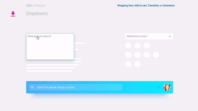
Day 9: Drop-down lists.
Back to the main elements. I set myself the goal to make dropdowns. It simply did not work out, because I wanted for them a soft disclosure. It would seem that it began with a complex module: displaying recommendations / recent searches when clicking on a search line. Due to the fact that there are onFocus / onLostFocus events for the input, the whole animation is tied to them. Then I turned to seemingly obviously simple elements - the usual drop-down list, but it only seemed that way. Since I did not use the inputs there, I had to look for other triggers for animation. And I wanted to make the optimal element: it is necessary to minimize the open list, without requiring a click. Just for the onMouseOut event. As a result, it turned out that if there were no actions in the window, it will be minimized if you move the cursor. No need to click! But a lot of events had to be hung up on one item by onClick.
→ Preview
That's all that was done in a week and a half. I would be glad if I was helpful. I certainly want to understand the demand and interest of the reader. And maybe in a week I'll be back with a new release.
Source: https://habr.com/ru/post/324742/
All Articles