Geometry of machine learning. Splitting hyperplanes or what is the geometric meaning of a linear combination?
In many machine learning algorithms, including neural networks, we constantly have to deal with a weighted sum or, otherwise, a linear combination of components of the input vector. And what is the meaning of the scalar value obtained?
In the article we will try to answer this question with examples, formulas, as well as a multitude of illustrations and Python code, so that you can easily reproduce everything and conduct your own experiments.
In order for the theory not to break away from real-world cases, let’s take as an example the problem of binary classification. There is a dataset: m samples, each sample is an n-dimensional point. For each sample, we know what class it belongs to (green or red). It is also known that dataset is linearly separable, i.e. there is an n-dimensional hyperplane such that the green dots lie on one side of it, and the red dots lie on the other.
')

The solution to the problem of finding such a hyperplane can be approached in different ways, for example, using logistic regression (logistic regression), the linear core support vector method (linear SVM), or the simplest neural network:

At the end of the article we will write from scratch the perceptron learning mechanism and solve the problem of binary classification with our own hands, using the knowledge gained.
Consider detailed math for straight. For the general case of a hyperplane in n-dimensional space, everything will be exactly the same, adjusted for the number of components in the vectors.

A straight line on the plane is defined by three numbers - (w1,w2,b) :
w1x1+w2x2+b=0
or:
sum2i=1wixi+b=0
or:
wTx+b=0
First two coefficients w1,w2 set the whole family of straight lines passing through the point (0, 0). Ratio between w1 and w2 determines the angle of the straight line to the axes.
If a w1=w2 get a line running at a 45 degree angle ( frac pi4 ) to the axes x1 and x2 and dividing the first / third quadrants in half.
Non-zero coefficient b allows the line to not pass through zero. At the same time, the slope to the axes x1 and x2 does not change. Those. b sets a family of parallel lines:

Geometrical meaning of the vector (w1,w2) Is normal to straight w1x1+w2x2+b=0 :
(If you do not take into account the offset b then wTx Is a scalar product of two vectors. Equality of zero is equivalent to their orthogonality. Consequently, x - family of vectors, orthogonal (w1,w2) .)

PS It is clear that there are infinitely many such normals, as well as triples (w1, w2, b) defining a straight line. If all three numbers are multiplied by a non-zero coefficient k - the line will remain the same.
In the general case of n-dimensional space, (w1,...,wn,b) defines an n-dimensional hyperplane.
w1x1+w2x2+...+wnxn+b=0
or:
sumni=1wixi+b=0
or:
wTx+b=0
If the point x(x0,...,xn) lies on the hyperplane then
wTx+b=0
And what happens to this sum if the point does not lie on the plane?
The hyperplane divides the hyperspace into two hypersubspaces. So, the points that are in one of these subspaces (conditionally speaking “above” the hyperplane), and the points that are in another of these subspaces (conditionally speaking “below” the hyperplane) will give a different sign in this sum:
wTx+b>0 - the point lies “above” the hyperplane
wTx+b<0 - the point lies "below" the hyperplane
This is a very important observation, so I suggest to double-check it with simple Python code:

It should be understood that the “above” and “below” here are conditional concepts. This is specifically reflected in the example - the green dots are visually lower. From a geometrical point of view, the “higher” direction for this particular line is determined by the normal vector. Where the normal looks, there is the top:

So the sign of a linear combination allows to refer a point to an upper or lower subspace.
And the value? The value (by module) determines the distance of a point from the plane:
Those. the farther the point is from the plane, the greater will be the value of the linear combination for it. If we fix the value of a linear combination, we get points lying on a line parallel to the original one.
Again, the observation is important, so we recheck:
It all fits together.
From the point of view of binary classification, the last statement can be reformulated as follows. The more distant the point from the hyperplane, which is the decision boundary (decision boundary), the more confident we are that our sample (sample) determined by this point falls into one or another class.
Close and far away - concepts are purely subjective. And in the classification, we need to answer clearly - either the part is suitable for building a rocket for a flight to Mars, or it is a marriage. Either the person clicks on the advertisement, or not. It is possible to answer with some confidence - to give the probability of a positive (true) outcome.
For this purpose, the activation function can be applied to a linear combination (in the terminology of neural networks).
If we apply the logistic function (see graph below):
we get at the output of probability and the following picture:

Reds are definitely not (false, just a marriage, definitely won't click). Greens are exactly yes (true, it’s just right, it will click right). All that in a certain range of proximity to the hyperplane (the boundary of solutions) gets some probability. On the most direct probability exactly 0.5.
PS "Exactly" is defined here as less than 0.001 or more than 0.999. The logistic function itself tends to zero at negative infinity and one at plus infinity, but never takes these values.
NB Please note that this example only demonstrates how to squash the distance with a sign in the probability interval. (0,1) . In practical problems to search for the optimal mapping, a probability calibration is used. For example, in the Platt scaling algorithm (Platt scaling), the logistic function is parameterized:
and then the coefficients A and B matched by machine learning. For details, see: binary classifier calibration, probability calibration.
It would seem clear - we are in data space X (data space) in which the samples lie x . And we are looking for the optimal separation by the plane defined by the vector. w .
wTx+b>0 for green dots
wTx+b<0 for red dots
But in our binary classification problem, the samples are fixed, and the weights change. Accordingly, we can replay everything by going into the space of weights. W (weight space):
xTw+b
Samples from the training set x1...xm in this case ask m hyperplanes and our task is to find such a point w which would lie on the right side of each plane. If the original dataset is linearly separable, then there is such a point.

When training a model, it is more convenient to reason in the space of weights, since the weights are updated, and the sample vectors from the training set define the normals to the hyperplanes. For example:

Suppose that the sample x corresponds to the green class corresponding to the inequality
xTw+b>0
Since on illustration vector w looks against the normal x , the value of the linear combination will be negative - hence we have a classification error.
Accordingly, it is necessary to update the vector w in the direction indicated by the normal:
wnew=wold+ lambdax where lambda>0
with some "speed" lambda . Thus, in the next step, the prediction will be either correct or less incorrect, since addend lambdax , co-directed with normal, will “turn” the weights vector into the green area.
To solve the problem of binary classification in the case of linear separability of samples, you can train the simplest perceptron arranged according to the following scheme:
This construction implements exactly the principle described above. Calculate linear combination:
sumni=1wixi+b
According to the value of which the solver (decision unit) decides to assign the sample to one of two classes according to the following principle:
wTx+b ge0 class +1 (green dots)
wTx+b<0 class -1 (red dots)
Initially, the weights are initialized randomly, and at each training step, the following algorithm is done for each sample:
Calculates prediction (predicted label). If it does not coincide with the real class, then the weights are updated according to the following principle:
Where yn - real sample class xn . Why it works is described above in a speculative exercise with a transition into the space of weights. Briefly:
This is what happens:

Let's look now in the space of weights. W (weight space):

The red and green lines are the original samples, the blue dot is the final weight.
And what other weights give the correct classification? We look:
The red and green lines are the original samples, the blue dot is the final weight, the purple dots are other possible weights.
And we turn everything inside out again, moving back to the data space X (data space):

Those weights that in the space of weights in the illustration above were marked with purple dots, here, in the data space, became lines of other possible solution boundaries.
Exercise (simple): In the last illustration there are four characteristic lines of lines. Find them among the purple dots in the space of weights.
Thanks to all habrovchanam for critical reviews regarding the first version of the article, including yorko , which together with the community of Open Data Science makes a super open machine learning course - I recommend to everyone.
It became clear that the material lacked the final touch and the article was sent for revision. The second (also current) version is supplemented with an example of perceptron training.
I hope this article will allow you to better understand and feel the geometric meaning of linear combinations. Below are links to materials used in the preparation of the article and interesting in terms of deepening into the topic. (All materials are in English.)
In the article we will try to answer this question with examples, formulas, as well as a multitude of illustrations and Python code, so that you can easily reproduce everything and conduct your own experiments.
Model example
In order for the theory not to break away from real-world cases, let’s take as an example the problem of binary classification. There is a dataset: m samples, each sample is an n-dimensional point. For each sample, we know what class it belongs to (green or red). It is also known that dataset is linearly separable, i.e. there is an n-dimensional hyperplane such that the green dots lie on one side of it, and the red dots lie on the other.
')
The solution to the problem of finding such a hyperplane can be approached in different ways, for example, using logistic regression (logistic regression), the linear core support vector method (linear SVM), or the simplest neural network:
At the end of the article we will write from scratch the perceptron learning mechanism and solve the problem of binary classification with our own hands, using the knowledge gained.
From a straight line to a hyperplane
Consider detailed math for straight. For the general case of a hyperplane in n-dimensional space, everything will be exactly the same, adjusted for the number of components in the vectors.
A straight line on the plane is defined by three numbers - (w1,w2,b) :
w1x1+w2x2+b=0
or:
sum2i=1wixi+b=0
or:
wTx+b=0
First two coefficients w1,w2 set the whole family of straight lines passing through the point (0, 0). Ratio between w1 and w2 determines the angle of the straight line to the axes.
If a w1=w2 get a line running at a 45 degree angle ( frac pi4 ) to the axes x1 and x2 and dividing the first / third quadrants in half.
Non-zero coefficient b allows the line to not pass through zero. At the same time, the slope to the axes x1 and x2 does not change. Those. b sets a family of parallel lines:
Geometrical meaning of the vector (w1,w2) Is normal to straight w1x1+w2x2+b=0 :
(If you do not take into account the offset b then wTx Is a scalar product of two vectors. Equality of zero is equivalent to their orthogonality. Consequently, x - family of vectors, orthogonal (w1,w2) .)
PS It is clear that there are infinitely many such normals, as well as triples (w1, w2, b) defining a straight line. If all three numbers are multiplied by a non-zero coefficient k - the line will remain the same.
In the general case of n-dimensional space, (w1,...,wn,b) defines an n-dimensional hyperplane.
w1x1+w2x2+...+wnxn+b=0
or:
sumni=1wixi+b=0
or:
wTx+b=0
The geometric meaning of a linear combination
If the point x(x0,...,xn) lies on the hyperplane then
wTx+b=0
And what happens to this sum if the point does not lie on the plane?
The hyperplane divides the hyperspace into two hypersubspaces. So, the points that are in one of these subspaces (conditionally speaking “above” the hyperplane), and the points that are in another of these subspaces (conditionally speaking “below” the hyperplane) will give a different sign in this sum:
wTx+b>0 - the point lies “above” the hyperplane
wTx+b<0 - the point lies "below" the hyperplane
This is a very important observation, so I suggest to double-check it with simple Python code:
Python Sample Code
# # , import seaborn import matplotlib.pyplot as plt import numpy as np # : w1 * x1 + w2 * x2 + b = 0 def line(x1, x2): return -3 * x1 - 5 * x2 - 2 # x2 = f(x1) ( ) def line_x1(x1): return (-3 * x1 - 2) / 5 # np.random.seed(0) x1x2 = np.random.randn(200, 2) * 2 # for x1, x2 in x1x2: value = line(x1, x2) if (value == 0): # — plt.plot(x1, x2, 'ro', color='blue') elif (value > 0): # — plt.plot(x1, x2, 'ro', color='green') elif (value < 0): # — plt.plot(x1, x2, 'ro', color='red') # plt.gca().set_aspect('equal', adjustable='box') # x1_range = np.arange(-5.0, 5.0, 0.5) plt.plot(x1_range, line_x1(x1_range), color='blue') # plt.xlabel('x1') plt.ylabel('x2') # ! plt.show() It should be understood that the “above” and “below” here are conditional concepts. This is specifically reflected in the example - the green dots are visually lower. From a geometrical point of view, the “higher” direction for this particular line is determined by the normal vector. Where the normal looks, there is the top:
So the sign of a linear combination allows to refer a point to an upper or lower subspace.
And the value? The value (by module) determines the distance of a point from the plane:
dist(x)= frac|wTx+b|||w||
Those. the farther the point is from the plane, the greater will be the value of the linear combination for it. If we fix the value of a linear combination, we get points lying on a line parallel to the original one.
Again, the observation is important, so we recheck:
Python Sample Code
# # # , import seaborn import matplotlib.pyplot as plt import numpy as np # : w1 * x1 + w2 * x2 + b = 0 def line(x1, x2): return -3 * x1 - 5 * x2 - 2 # x2 = f(x1) ( ) def line_x1(x1): return (-3 * x1 - 2) / 5 # np.random.seed(0) x1x2 = np.random.randn(200, 2) * 2 # for x1, x2 in x1x2: value = line(x1, x2) # , — # — [0, 0.75] # (0) — , - (0.75) — color = str(max(0, 0.75 - np.abs(value) / 30)) plt.plot(x1, x2, 'ro', color=color) # plt.gca().set_aspect('equal', adjustable='box') # x1_range = np.arange(-5.0, 5.0, 0.5) plt.plot(x1_range, line_x1(x1_range), color='blue') # plt.xlabel('x1') plt.ylabel('x2') # ! plt.show() It all fits together.
findings
- A linear combination allows n-dimensional space to be divided by a hyperplane.
- Points on different sides of the hyperplane will have a different sign of a linear combination. wtx+b .
- The farther the point from the hyperplane, the greater the absolute value of the linear combination.
From the point of view of binary classification, the last statement can be reformulated as follows. The more distant the point from the hyperplane, which is the decision boundary (decision boundary), the more confident we are that our sample (sample) determined by this point falls into one or another class.
Close and far: how is it?
Close and far away - concepts are purely subjective. And in the classification, we need to answer clearly - either the part is suitable for building a rocket for a flight to Mars, or it is a marriage. Either the person clicks on the advertisement, or not. It is possible to answer with some confidence - to give the probability of a positive (true) outcome.
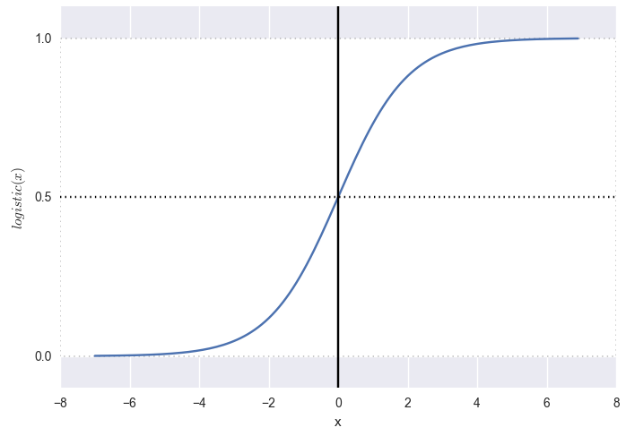
For this purpose, the activation function can be applied to a linear combination (in the terminology of neural networks).
If we apply the logistic function (see graph below):
logistic(x)= frac11+e−x
we get at the output of probability and the following picture:
Python Sample Code
# # , import seaborn import matplotlib.pyplot as plt import numpy as np # def logit(x): return 1 / (1 + np.exp(-x)) # : w1 * x1 + w2 * x2 + b = 0 def line(x1, x2): return 3 * x1 + 5 * x2 + 2 # x2 = f(x1) ( ) def line_x1(x1): return (-3 * x1 - 2) / 5 # np.random.seed(0) xy = np.random.randn(200, 2) * 2 # for x1, x2 in x1x2: # — value = logit(line(x1, x2) / 2) if (value < 0.001): color = 'red' elif (value > 0.999): color = 'green' else: color = str(0.75 - value * 0.5) plt.plot(x1, x2, 'ro', color=color) # plt.gca().set_aspect('equal', adjustable='box') # x1_range = np.arange(-5.0, 5.0, 0.5) plt.plot(x1_range, line_x1(x1_range), color='blue') # plt.xlabel('x1') plt.ylabel('x2') # ! plt.show() Reds are definitely not (false, just a marriage, definitely won't click). Greens are exactly yes (true, it’s just right, it will click right). All that in a certain range of proximity to the hyperplane (the boundary of solutions) gets some probability. On the most direct probability exactly 0.5.
PS "Exactly" is defined here as less than 0.001 or more than 0.999. The logistic function itself tends to zero at negative infinity and one at plus infinity, but never takes these values.
NB Please note that this example only demonstrates how to squash the distance with a sign in the probability interval. (0,1) . In practical problems to search for the optimal mapping, a probability calibration is used. For example, in the Platt scaling algorithm (Platt scaling), the logistic function is parameterized:
f(x)= frac11+eAx+B
and then the coefficients A and B matched by machine learning. For details, see: binary classifier calibration, probability calibration.
What space are we in? (useful speculative exercise)
It would seem clear - we are in data space X (data space) in which the samples lie x . And we are looking for the optimal separation by the plane defined by the vector. w .
wTx+b>0 for green dots
wTx+b<0 for red dots
But in our binary classification problem, the samples are fixed, and the weights change. Accordingly, we can replay everything by going into the space of weights. W (weight space):
xTw+b
Samples from the training set x1...xm in this case ask m hyperplanes and our task is to find such a point w which would lie on the right side of each plane. If the original dataset is linearly separable, then there is such a point.
Python Sample Code
# # , import seaborn import matplotlib.pyplot as plt import numpy as np # 1 def line1(w1, w2): return -3 * w1 - 5 * w2 - 8 # w2 = f1(w1) ( ) def line1_w1(w1): return (-3 * w1 - 8) / 5 # 2 def line2(w1, w2): return 2 * w1 - 3 * w2 + 4 # w2 = f2(w1) ( ) def line2_w1(w1): return (2 * w1 + 4) / 3 # 3 def line3(w1, w2): return 1.2 * w1 - 3 * w2 + 4 # w2 = f2(w1) ( ) def line3_w1(w1): return (1.2 * w1 + 4) / 3 # 4 def line4(w1, w2): return -5 * w1 - 5 * w2 - 8 # w2 = f2(w1) ( ) def line4_w1(w1): return (-5 * w1 - 8) / 5 # w1_range = np.arange(-5.0, 5.0, 0.5) w2_range = np.arange(-5.0, 5.0, 0.5) # (w1, w2), for w1 in w1_range: for w2 in w2_range: value1 = line1(w1, w2) value2 = line2(w1, w2) value3 = line3(w1, w2) value4 = line4(w1, w2) if (value1 < 0 and value2 > 0 and value3 > 0 and value4 < 0): color = 'green' else: color = 'pink' plt.plot(w1, w2, 'ro', color=color) # plt.gca().set_aspect('equal', adjustable='box') # () 1 plt.plot(w1_range, line1_w1(w1_range), color='blue') # 2 plt.plot(w1_range, line2_w1(w1_range), color='blue') # 3 plt.plot(w1_range, line3_w1(w1_range), color='blue') # 4 plt.plot(w1_range, line4_w1(w1_range), color='blue') # — plt.axis([-7, 7, -7, 7]) # plt.xlabel('w1') plt.ylabel('w2') # ! plt.show() When training a model, it is more convenient to reason in the space of weights, since the weights are updated, and the sample vectors from the training set define the normals to the hyperplanes. For example:
Suppose that the sample x corresponds to the green class corresponding to the inequality
xTw+b>0
Since on illustration vector w looks against the normal x , the value of the linear combination will be negative - hence we have a classification error.
Accordingly, it is necessary to update the vector w in the direction indicated by the normal:
wnew=wold+ lambdax where lambda>0
with some "speed" lambda . Thus, in the next step, the prediction will be either correct or less incorrect, since addend lambdax , co-directed with normal, will “turn” the weights vector into the green area.
Practice. We teach perceptron
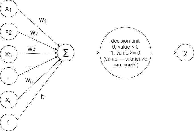
To solve the problem of binary classification in the case of linear separability of samples, you can train the simplest perceptron arranged according to the following scheme:
This construction implements exactly the principle described above. Calculate linear combination:
sumni=1wixi+b
According to the value of which the solver (decision unit) decides to assign the sample to one of two classes according to the following principle:
wTx+b ge0 class +1 (green dots)
wTx+b<0 class -1 (red dots)
Initially, the weights are initialized randomly, and at each training step, the following algorithm is done for each sample:
Calculates prediction (predicted label). If it does not coincide with the real class, then the weights are updated according to the following principle:
wnew=wold+ynxnbnew=bold+yn
Where yn - real sample class xn . Why it works is described above in a speculative exercise with a transition into the space of weights. Briefly:
- We turn the weight vector in the direction of the correct class: normal xn in the case of class +1; against normal xn in the case of class -1. (The normal itself always looks towards class +1.)
- We update the offset by a similar principle.
This is what happens:
Python code
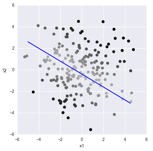
# # , import seaborn # import matplotlib.pyplot as plt import numpy as np # — np.random.seed(17) # x1x2_green = np.random.randn(200, 2) * 2 + 21 # x1x2_red = np.random.randn(200, 2) * 4 + 5 # x1x2 = np.concatenate((x1x2_green, x1x2_red)) # : +1, -1 labels = np.concatenate((np.ones(x1x2_green.shape[0]), -np.ones(x1x2_red.shape[0]))) # indices = np.array(range(x1x2.shape[0])) np.random.shuffle(indices) x1x2 = x1x2[indices] labels = labels[indices] # w1_ = -1.1 w2_ = 0.5 b_ = -20 # ( ) def lr_line(x1, x2): return w1_ * x1 + w2_ * x2 + b_ # -1 # +1 def decision_unit(value): return -1 if value < 0 else 1 # lines = [[w1_, w2_, b_]] for max_iter in range(100): # # mismatch_count = 0 # for i, (x1, x2) in enumerate(x1x2): # value = lr_line(x1, x2) # (-1, +1) true_label = int(labels[i]) # (-1, +1) pred_label = decision_unit(value) # if (true_label != pred_label): # , .. # — (x1, x2) — +1 # — (-x1, -x2) — -1 # .. +1 w1_ = w1_ + x1 * true_label w2_ = w2_ + x2 * true_label # b_ = b_ + true_label # mismatch_count = mismatch_count + 1 # if (mismatch_count > 0): # lines.append([w1_, w2_, b_]) else: # — break # ( ) for i, (x1, x2) in enumerate(x1x2): pred_label = decision_unit(lr_line(x1, x2)) if (pred_label < 0): plt.plot(x1, x2, 'ro', color='red') else: plt.plot(x1, x2, 'ro', color='green') # plt.gca().set_aspect('equal', adjustable='box') # plt.xlabel('x1') plt.ylabel('x2') # x1_range = np.arange(-30, 50, 0.1) # , # x2 = f(x1) = -(w1 * x1 + b) / w2 def f_lr_line(w1, w2, b): def lr_line(x1): return -(w1 * x1 + b) / w2 return lr_line # it = 0 for coeff in lines: lr_line = f_lr_line(coeff[0], coeff[1], coeff[2]) plt.plot(x1_range, lr_line(x1_range), label = 'it: ' + str(it)) it = it + 1 # plt.axis([-15, 30, -15, 30]) # plt.legend(loc = 'lower left') # ! plt.show() Let's look now in the space of weights. W (weight space):
Python code
# NB . . # w1_range = np.arange(0, 10, 0.1) for i, (x1, x2) in enumerate(x1x2): if (labels[i] == 1): color = 'green' else: color = 'red' # x1 * w1 + x2 * w2 + b = 0 # w2 = f(w1) # ( ) def line(w1): return -(x1 * w1 + b_) / x2 # ; — plt.plot(w1_range, line(w1_range), color = color) # , plt.plot(w1_, w2_, 'ro', color='blue') # plt.axis([0, 10, 0, 10]) # plt.gca().set_aspect('equal', adjustable='box') # plt.xlabel('w1') plt.ylabel('w2') # ! plt.show() The red and green lines are the original samples, the blue dot is the final weight.
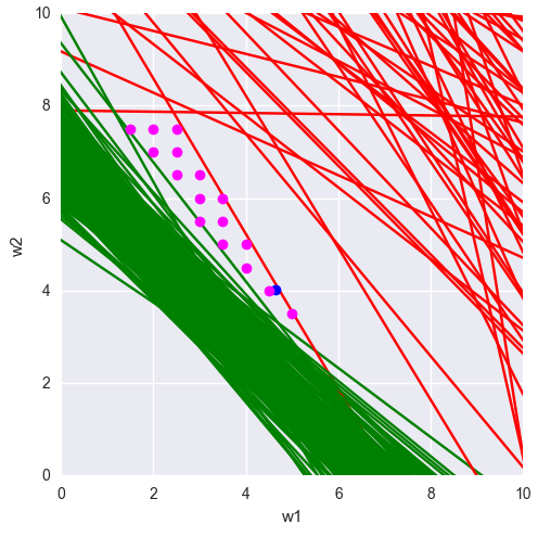
And what other weights give the correct classification? We look:
Python code
# NB . . # w1_range = np.arange(0, 10, 0.5) w2_range = np.arange(0, 10, 0.5) # , for i, (x1, x2) in enumerate(x1x2): def line(w1): return -(x1 * w1 + b_) / x2 if (labels[i] == 1): color = 'green' else: color = 'red' plt.plot(x1_range, line(x1_range), color = color) # (), plt.plot(w1_, w2_, 'ro', color='blue') # def f(w1, w2, x1, x2): value = x1 * w1 + x2 * w2 + b_ return -1 if value < 0 else 1 # ( ) # (data space) good_weights = [] # , # for w1 in w1_range: for w2 in w2_range: in_range = True for i, (x1, x2) in enumerate(x1x2): if (labels[i] != f(w1, w2, x1, x2)): in_range = False break if (in_range): good_weights.append([w1, w2, b_]) # () plt.plot(w1, w2, 'ro', color = 'magenta') # plt.axis([0, 10, 0, 10]) # plt.gca().set_aspect('equal', adjustable='box') # plt.xlabel('w1') plt.ylabel('w2') # ! plt.show() # ( ) def lr_line(x1, x2): return w1_ * x1 + w2_ * x2 + b_ # -1 # +1 def decision_unit(value): return -1 if value < 0 else 1 # ( ) for i, (x1, x2) in enumerate(x1x2): pred_label = decision_unit(lr_line(x1, x2)) if (pred_label < 0): plt.plot(x1, x2, 'ro', color='red') else: plt.plot(x1, x2, 'ro', color='green') # x1_range = np.arange(-30, 50, 0.1) for (w1, w2, _b) in good_weights: # , x1, x2 — def w_line(x1): return -(w1 * x1 + b_) / w2 # plt.plot(x1_range, w_line(x1_range)) # plt.axis([0, 25, 0, 25]) # plt.gca().set_aspect('equal', adjustable='box') # plt.xlabel('x1') plt.ylabel('x2') # ! plt.show() The red and green lines are the original samples, the blue dot is the final weight, the purple dots are other possible weights.
And we turn everything inside out again, moving back to the data space X (data space):
Those weights that in the space of weights in the illustration above were marked with purple dots, here, in the data space, became lines of other possible solution boundaries.
Exercise (simple): In the last illustration there are four characteristic lines of lines. Find them among the purple dots in the space of weights.
From the author
Thanks to all habrovchanam for critical reviews regarding the first version of the article, including yorko , which together with the community of Open Data Science makes a super open machine learning course - I recommend to everyone.
It became clear that the material lacked the final touch and the article was sent for revision. The second (also current) version is supplemented with an example of perceptron training.
Results
I hope this article will allow you to better understand and feel the geometric meaning of linear combinations. Below are links to materials used in the preparation of the article and interesting in terms of deepening into the topic. (All materials are in English.)
- Geoffrey Hinton. An overview of the main types of neural network architecture
Learn more about perceptron training with the transition into the space of weights from the guru of neural networks Jeffrey Hinton. - Supervised Learning / Support Vector Machines
About solving binary classification problems by the support vector method and how, from the point of view of this algorithm, to choose the optimal separating plane. - Hyperplane based classification: Perceptron and (Intro to) Support Vector Machines
Again about perceptrons, casual about the support vector method. The issue of training and adjustment of weights is considered in detail. - Polyhedra and Linear Programming. Polyhedra, Polytopes, and Cones
Linear algebra of linear combinations (theory) with many illustrative examples.
Source: https://habr.com/ru/post/324736/
All Articles