We make a more or less universal calculator of services for the site.
A cursory analysis of open data shows that on average 5 people leave requests for a calculator on the freelance exchanges every day - and a few hundred more are interested in the search question. Often, requests are standard - and, of course, there is a whole set of ready-made offers on the market: from plug-ins for specific CMS to calculators that can be purchased from studios. The record we found (see in the first comment) is 24,999 rubles for a fairly common decision.
Yes, the market is the market. But since we mainly work with people whose sites are made on designers, they do not have 25 thousand for one widget. So there was a desire to write a calculator that they could use on their own - and without studying HTML, JS, JQuery and CSS.
')
In the process of working on the project, we were able to implement several finds in the logic of the work and the design of the calculator. These, as well as useful tools, and want to share with the community.
In fact, we have a fairly versatile online calculator builder, the result of which can be embedded on any platform that supports HTML insertion.
Starting the project, we discussed pretty hardcore ideas, but eventually we came to a drag-n-drop build interface, plus an admin panel in which a person can store and customize their calculators.
In the beginning there was an empty field. When registering on the service for the first time, a person really sees a blank page with a single button for adding a new calculator project.
In the future, this page will contain snapshots of links to the user's calculators, like this:

To create a screenshot preview of a calculator in the office, we used PhantomJS . The thing is very convenient, when you have already created several calculators, when entering the office it is immediately clear which project is where.
People love the slider. It became clear when we launched the first people to the service, and they began to choose which elements to create the widget from.
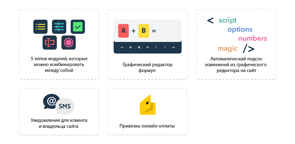
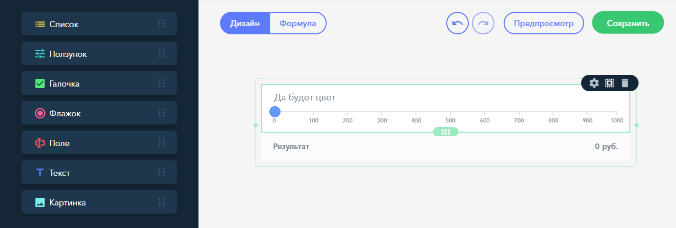
The calculator creation interface itself is arranged similarly with an LC — there is a large empty field to which elements from the side panel can be added. For the start, we chose 8 elements. Five are responsible directly for the calculator - this is a slider, a drop-down list, a check mark, a text field (for collecting mail, addresses, etc.) and a switch. Three more - for the attractiveness (picture) and the order option - a text block and a button. The most popular element of all was the slider.
First, we chose jQuery Scrollbar extensions to create a slider, but the thing behaved strangely on mobile. Therefore, we have taken and modified the JQuery-Range-Slider extension. The remaining elements are written and stylized themselves.
Manipulations with elements and data of calculators are made on the client side of the project - therefore, it was important in the process to figure out how to save browser resources as much as possible.
This moment became one of the most troublesome at debugging. But now the record of the processes occurring on the page, when a person drags an item into the calculator (this is the most resource-intensive moment), looks like this:
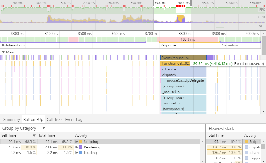
We cut the handlers as much as possible, leaving only the required minimum. With the optimization on the client side, the Timeline tool from Google Chrome Developer Tools helped us a lot.
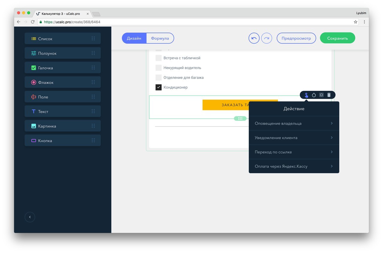
Initially, all elements are stored in the FIELDS object — each has a typical HTML template and a list of options. After dragging an item into the workspace, the necessary options arrive from the server and are inserted into the template — for example, the button sends the order information to the owner and client: by mail via our server, or by SMS — while using the SmsSimple API, but we are looking for another service (and we will be glad to recommendations).
To substitute options, we wrote our Signe method to the prototype line. It works like this:

At the same time, we are trying to protect ourselves from inserting executable codes into the template: first of all, the <script> tags are removed on the server side, and the main protection is based on the escaping of special characters + escape tags.
Drag'n'drop in its own way. The idea of “take more - throw further”, in our opinion, is the most convenient way to build anything for the average user. Well, if only because it is beautiful.
When we looked at existing solutions for creating calculators, they were confused by some “nailing down of elements with nails” - the fact that elements can be arranged in a rather strictly definite way: for example, just under each other, and not next to each other. I wanted to get away from this, for which we came up with a system of points.
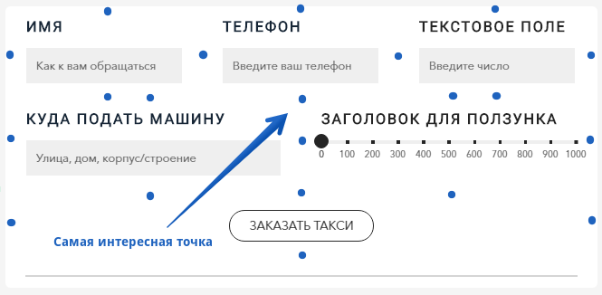
Grid of invisible user points
Before dragging a new element, we create a map of points to which you can add a new field - for this, the script refers to all elements of the workspace and evaluates their boundaries.
What does this give? The user can immediately choose between:
And here is a variant of the location of the element:

When moving, we constantly check whether the mouse is above the calculator, and under the hood we remember the type of field being dragged and the position into which to throw it.
Dragging an item by itself does not spend a lot of browser resources, but checking where the user is aiming directly depends on the number of fields that have already been added to the calculator. To save browser resources, we began to determine only the coordinates of the fields that are near the mouse, and to identify the field nearest to it:
To create the visual effects themselves when building the calculator, we used the jQuery UI and Animate.css
We abstract from the system of weights and measures. Since the solution was to be made universal and simple, we abandoned additional fields in which a person would choose meters, grams or rubles when creating a calculator. Legend can be entered - but purely for convenience and reference. For all text elements we used Medium Editor engine - a very convenient and simple text editor.
To prove that the constructor is suitable for anything, we have made different examples. And one of the examples made noise among the first testers:
“The“ calculation of the amount of meat ”template simply killed me: in the picture it is clear that the kebab, and according to the gradations, it seems as though all of these people were going to make a kebab) They bellowed the whole department.”

Feel for the calculator-template, which amused the whole department, here
Pictures are important. For a better acquaintance with a product or service, it is logical to add images over the same checkmarks or other field responsible for the choice. Thanks to the grid of points, it turned out to realize the insertion of the image in any area of the working field. Sometimes this is useful:

Thanks to Vladimir Gingazov, author of the channel “Adobe Muse in Russian” for the topic with Christmas trees
The implementation of the image download itself was done through the FileSystem API & File API - the whole process is perfectly described in this article .
“And play with ...?” It is logical to give the user the ability to adjust the colors of texts, buttons, background, etc. under the colors of the site. To call and create a color palette, we used the Spectrum widget.

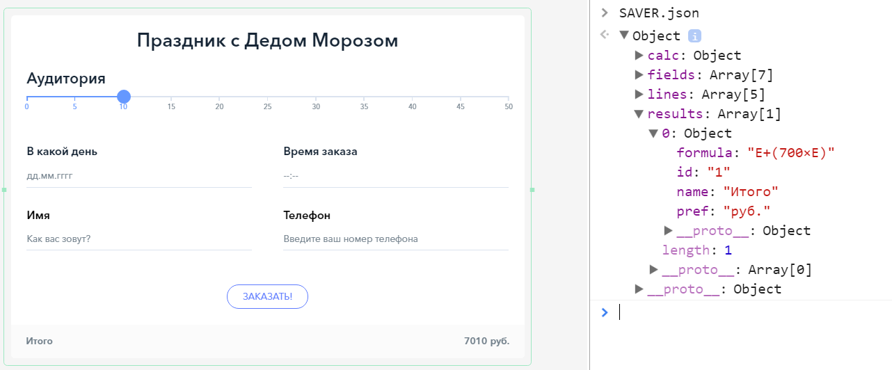
Data storage and autosave. Data on the client side of the calculator is stored in JSON format. You can see their structure simply by writing in the SAVER.json console on the service.
Autosave occurs at every action, if there is activity in the calculator. Changes are also saved in parallel in DOM, and each time we check:
If within 4 seconds nothing happens, the calculator stops the autosave until new edits - so we get rid of senseless requests to the server.
Preview In order not to waste client browser resources, we decided not to animate the preview interface using jQuery - since CSS3 does an excellent job with animation: just change the class at the root of the interface, and the viewing area will change the width and appearance, styled as a smartphone and tablet.

Focus on console
The creation of an adaptive version of the calculator itself has become a separate song.
The uKit site builder, for which our project was originally created, uses the Twitter Bootstrap grid — a popular and well-deserved solution to tailor web elements to the visitor's screen. But bootstrapping involves two design options: a table or column. Therefore, we have developed our own version of the adaptation of the calculator.
Since The structure of the calculator is stored in JSON, we have a parent array with strings, and in each row is an array of cells. In addition, there is an array of sub-rows (and sub-cells) in the cell so that there is not one field inside, but several. The cell structure is shown below:

The calculator has a parent block with the display: table style, inside it has a table-row and a table-cell , respectively. The calculator itself is drawn on the site in the frame. Styles for adaptation are placed inside the frame - and when the frame becomes narrow enough, the calculator, without changing the HTML grid, moves the fields to new lines. This is done by changing the display style: if it is a table-cell on a wide calculator, then the block becomes narrow, and our field is on a new line.

The initial desktop view of the calculator depends on the width of the container in which it is located, and the calculator tends to show as many fields as possible in one line. When the screen narrows, the function that rebuilds the grid passes through all the lines of the calculator, and if there are “extra” cells in the line, a new line is created below.
Similarly, in the editor: when the user changes the width of his project, a frame with a copy of his calculator is displayed in front of him. As soon as the resize is completed, a new grid is drawn under the frame, the frame is hidden for the user, and you can continue working with fields and formulas.
Since we have a full-featured calculator control room, we decided to abandon the use of something external and effective, and ideally, complex formulas when creating and editing forms.
Instead, all in a separate tab there are elements of the calculator in the form of a diagram. The scheme contains the names of variables and ranges of values for each of the elements of the calculator.
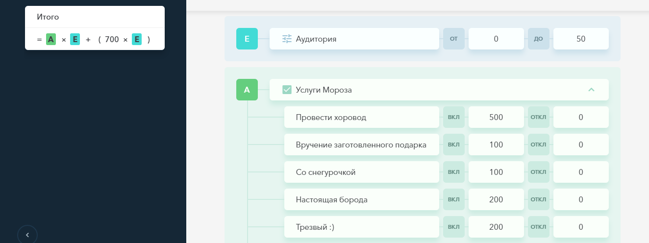
To use some field in the calculation, it is enough to specify its variable in the box on the left. There can be several formulas: in this case, the calculator displays several results, for example, “Regular price” and “Discount price”.
Variables begin with the letter “A”. If there are more fields than letters in the Latin alphabet, one more letter will be added to the variable name: “AA” and so on. Each letter is associated with the numeric id of a specific field in the calculator. We did not manage to find a ready-made solution for converting numbers into Latin letters and combinations of letters. Therefore, we wrote the following method:
We will be glad if you find it useful (with questions you can knock on the condor-bird ).
The further, the more we dealt with the service interface. But the ultimate goal is for a person not only to collect his calculator from us, but also to put it on his site as a widget (although you can also publish a calculator by reference and use it on some social network).
That is, it was time to cut off achunk calculator from the service. There was a choice between two ways:
Quick. In the same preview, the calculator widget is loaded - you can hide all the elements of the designer interface, leaving the fields, the grid and the calculation - and here it is, in essence, a widget for a third-party site.
But the fast path was rejected - because it slowed down the load: we would get 1959 kilobytes, 269 of which would occupy all the CSS used in the service. But one of the main requirements for the widget on the site is that it loads quickly.
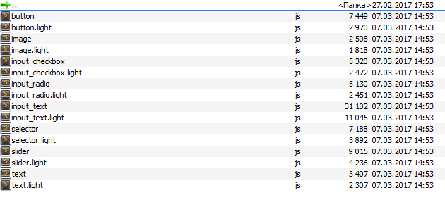
And correct. Here we went to the GULP - in order to trim everything superfluous, like line breaks, and collect one minified file with the most clean code possible. Why gulp? There is an important reason for that - we had 41 files (and, accordingly, 41 server requests), and we wanted to fit everything into one request. And we got what we wanted.
This is our default template . There was a download speed smoker

Began loading speed of a healthy person
Now we leave from 140 to 180 kilobytes - depending on the number of fields. For each type of field there are two versions: short and twice as short - for a third-party site.
And what about the speed of execution of the script, you ask?
This is a huge wedding expenses calculator created by a real user. It was like this.
The same project. It became so
As can be seen in the picture below, the text field remains the most heavy - we will optimize it further, giving the site only the option the user has chosen (in the field settings there is a choice between phone, mail, text, numeric value, etc.). For the rest, for each calculator, we connect only used modules.
After downloading on a third-party site, the calculator no longer refers to our server: all the formulas and other necessary things are sewn into the code loaded on the site.
In the ideal case, the user has collected a calculator, received a code for embedding it on the site - and happiness has come.
But installation on the site does not always mean that the person will no longer touch the finished calculator. The most obvious case when changes are required is a rise or fall in the price of a service.
Therefore, for each embedded calculator, we make two versions:

For this purpose, the system has a large green “Save” button - until you touch it, we don’t transfer the changes made in the editing version to the site, but simply memorize them through autosave.
The fact is that when creating an online calculator and its admin, a task with a lot of ready-made solutions, there is plenty of room for new products. Someone new is everything like brizing - the calculator designer was the first combat project in which he was entrusted with the work of the junior. But the rest have discovered many new things.
There will obviously be more discoveries - and you can give us more ideas and tasks: uCalc is at the stage of open testing, and we will be grateful to everyone who takes the time to touch the solution and unsubscribe thoughts and feelings in the comments, or in a personal, brizing and condor- bird .
UPD. Thanks to everyone who took part in testing the service. A list of upcoming updates can be found here .
Yes, the market is the market. But since we mainly work with people whose sites are made on designers, they do not have 25 thousand for one widget. So there was a desire to write a calculator that they could use on their own - and without studying HTML, JS, JQuery and CSS.
')
In the process of working on the project, we were able to implement several finds in the logic of the work and the design of the calculator. These, as well as useful tools, and want to share with the community.
In fact, we have a fairly versatile online calculator builder, the result of which can be embedded on any platform that supports HTML insertion.
How does the constructor calculators
We write our adaptability
Life hacking: how to simplify formulas to the alphabet
Clean the code with a gulp (not what you might think)
Is there life after life?
How does the constructor calculators
Starting the project, we discussed pretty hardcore ideas, but eventually we came to a drag-n-drop build interface, plus an admin panel in which a person can store and customize their calculators.
In the beginning there was an empty field. When registering on the service for the first time, a person really sees a blank page with a single button for adding a new calculator project.
In the future, this page will contain snapshots of links to the user's calculators, like this:
To create a screenshot preview of a calculator in the office, we used PhantomJS . The thing is very convenient, when you have already created several calculators, when entering the office it is immediately clear which project is where.
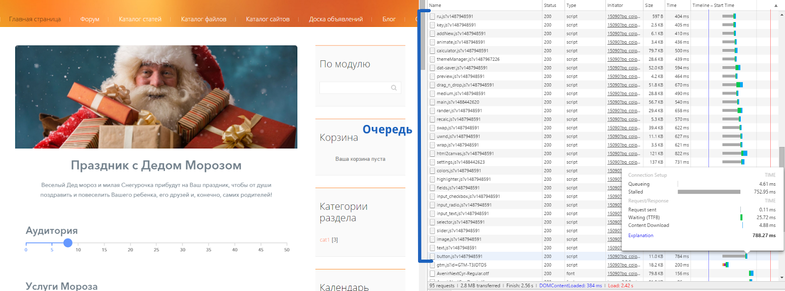
People love the slider. It became clear when we launched the first people to the service, and they began to choose which elements to create the widget from.
The calculator creation interface itself is arranged similarly with an LC — there is a large empty field to which elements from the side panel can be added. For the start, we chose 8 elements. Five are responsible directly for the calculator - this is a slider, a drop-down list, a check mark, a text field (for collecting mail, addresses, etc.) and a switch. Three more - for the attractiveness (picture) and the order option - a text block and a button. The most popular element of all was the slider.
First, we chose jQuery Scrollbar extensions to create a slider, but the thing behaved strangely on mobile. Therefore, we have taken and modified the JQuery-Range-Slider extension. The remaining elements are written and stylized themselves.
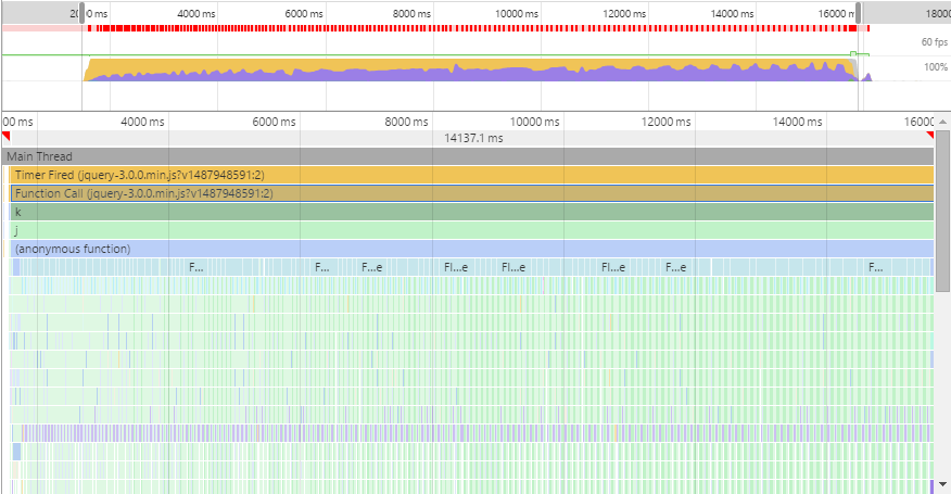
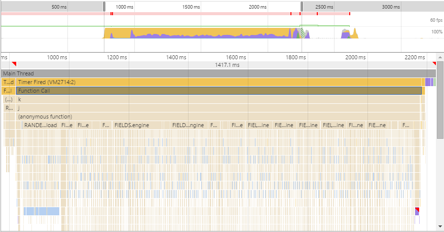
Manipulations with elements and data of calculators are made on the client side of the project - therefore, it was important in the process to figure out how to save browser resources as much as possible.
This moment became one of the most troublesome at debugging. But now the record of the processes occurring on the page, when a person drags an item into the calculator (this is the most resource-intensive moment), looks like this:
We cut the handlers as much as possible, leaving only the required minimum. With the optimization on the client side, the Timeline tool from Google Chrome Developer Tools helped us a lot.
Initially, all elements are stored in the FIELDS object — each has a typical HTML template and a list of options. After dragging an item into the workspace, the necessary options arrive from the server and are inserted into the template — for example, the button sends the order information to the owner and client: by mail via our server, or by SMS — while using the SmsSimple API, but we are looking for another service (and we will be glad to recommendations).
To substitute options, we wrote our Signe method to the prototype line. It works like this:
At the same time, we are trying to protect ourselves from inserting executable codes into the template: first of all, the <script> tags are removed on the server side, and the main protection is based on the escaping of special characters + escape tags.
Drag'n'drop in its own way. The idea of “take more - throw further”, in our opinion, is the most convenient way to build anything for the average user. Well, if only because it is beautiful.
When we looked at existing solutions for creating calculators, they were confused by some “nailing down of elements with nails” - the fact that elements can be arranged in a rather strictly definite way: for example, just under each other, and not next to each other. I wanted to get away from this, for which we came up with a system of points.
Grid of invisible user points
Before dragging a new element, we create a map of points to which you can add a new field - for this, the script refers to all elements of the workspace and evaluates their boundaries.
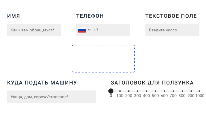
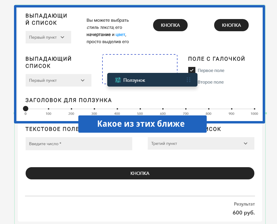
What does this give? The user can immediately choose between:
And here is a variant of the location of the element:
When moving, we constantly check whether the mouse is above the calculator, and under the hood we remember the type of field being dragged and the position into which to throw it.
Dragging an item by itself does not spend a lot of browser resources, but checking where the user is aiming directly depends on the number of fields that have already been added to the calculator. To save browser resources, we began to determine only the coordinates of the fields that are near the mouse, and to identify the field nearest to it:
To create the visual effects themselves when building the calculator, we used the jQuery UI and Animate.css
We abstract from the system of weights and measures. Since the solution was to be made universal and simple, we abandoned additional fields in which a person would choose meters, grams or rubles when creating a calculator. Legend can be entered - but purely for convenience and reference. For all text elements we used Medium Editor engine - a very convenient and simple text editor.
To prove that the constructor is suitable for anything, we have made different examples. And one of the examples made noise among the first testers:
“The“ calculation of the amount of meat ”template simply killed me: in the picture it is clear that the kebab, and according to the gradations, it seems as though all of these people were going to make a kebab) They bellowed the whole department.”
Feel for the calculator-template, which amused the whole department, here
Pictures are important. For a better acquaintance with a product or service, it is logical to add images over the same checkmarks or other field responsible for the choice. Thanks to the grid of points, it turned out to realize the insertion of the image in any area of the working field. Sometimes this is useful:
Thanks to Vladimir Gingazov, author of the channel “Adobe Muse in Russian” for the topic with Christmas trees
The implementation of the image download itself was done through the FileSystem API & File API - the whole process is perfectly described in this article .
“And play with ...?” It is logical to give the user the ability to adjust the colors of texts, buttons, background, etc. under the colors of the site. To call and create a color palette, we used the Spectrum widget.
Data storage and autosave. Data on the client side of the calculator is stored in JSON format. You can see their structure simply by writing in the SAVER.json console on the service.
Autosave occurs at every action, if there is activity in the calculator. Changes are also saved in parallel in DOM, and each time we check:
- Does JSON have all the data from the DOM.
- Does the DOM have all the data from JSON.
If within 4 seconds nothing happens, the calculator stops the autosave until new edits - so we get rid of senseless requests to the server.
Preview In order not to waste client browser resources, we decided not to animate the preview interface using jQuery - since CSS3 does an excellent job with animation: just change the class at the root of the interface, and the viewing area will change the width and appearance, styled as a smartphone and tablet.
Focus on console
The creation of an adaptive version of the calculator itself has become a separate song.
Divine layout: write your adaptability
The uKit site builder, for which our project was originally created, uses the Twitter Bootstrap grid — a popular and well-deserved solution to tailor web elements to the visitor's screen. But bootstrapping involves two design options: a table or column. Therefore, we have developed our own version of the adaptation of the calculator.
Since The structure of the calculator is stored in JSON, we have a parent array with strings, and in each row is an array of cells. In addition, there is an array of sub-rows (and sub-cells) in the cell so that there is not one field inside, but several. The cell structure is shown below:
The calculator has a parent block with the display: table style, inside it has a table-row and a table-cell , respectively. The calculator itself is drawn on the site in the frame. Styles for adaptation are placed inside the frame - and when the frame becomes narrow enough, the calculator, without changing the HTML grid, moves the fields to new lines. This is done by changing the display style: if it is a table-cell on a wide calculator, then the block becomes narrow, and our field is on a new line.
The initial desktop view of the calculator depends on the width of the container in which it is located, and the calculator tends to show as many fields as possible in one line. When the screen narrows, the function that rebuilds the grid passes through all the lines of the calculator, and if there are “extra” cells in the line, a new line is created below.
- If the site itself with a calculator is adapted for mobile devices, the container with the calculator will occupy the entire width of the device without scaling.
- If the site is not adapted for mobile devices, the calculator will be displayed on a smaller scale - and its appearance will be repeated for the PC.
Similarly, in the editor: when the user changes the width of his project, a frame with a copy of his calculator is displayed in front of him. As soon as the resize is completed, a new grid is drawn under the frame, the frame is hidden for the user, and you can continue working with fields and formulas.
Simplify working with formulas
Since we have a full-featured calculator control room, we decided to abandon the use of something external and effective, and ideally, complex formulas when creating and editing forms.
Instead, all in a separate tab there are elements of the calculator in the form of a diagram. The scheme contains the names of variables and ranges of values for each of the elements of the calculator.
To use some field in the calculation, it is enough to specify its variable in the box on the left. There can be several formulas: in this case, the calculator displays several results, for example, “Regular price” and “Discount price”.
Variables begin with the letter “A”. If there are more fields than letters in the Latin alphabet, one more letter will be added to the variable name: “AA” and so on. Each letter is associated with the numeric id of a specific field in the calculator. We did not manage to find a ready-made solution for converting numbers into Latin letters and combinations of letters. Therefore, we wrote the following method:
DAT.varName(9) // I
DAT.varName(39) // AM
DAT.varName(9650215) // UCALC
We will be glad if you find it useful (with questions you can knock on the condor-bird ).
Optimize download speed
The further, the more we dealt with the service interface. But the ultimate goal is for a person not only to collect his calculator from us, but also to put it on his site as a widget (although you can also publish a calculator by reference and use it on some social network).
That is, it was time to cut off a
Quick. In the same preview, the calculator widget is loaded - you can hide all the elements of the designer interface, leaving the fields, the grid and the calculation - and here it is, in essence, a widget for a third-party site.
But the fast path was rejected - because it slowed down the load: we would get 1959 kilobytes, 269 of which would occupy all the CSS used in the service. But one of the main requirements for the widget on the site is that it loads quickly.
And correct. Here we went to the GULP - in order to trim everything superfluous, like line breaks, and collect one minified file with the most clean code possible. Why gulp? There is an important reason for that - we had 41 files (and, accordingly, 41 server requests), and we wanted to fit everything into one request. And we got what we wanted.
This is our default template . There was a download speed smoker
Began loading speed of a healthy person
Now we leave from 140 to 180 kilobytes - depending on the number of fields. For each type of field there are two versions: short and twice as short - for a third-party site.
And what about the speed of execution of the script, you ask?
This is a huge wedding expenses calculator created by a real user. It was like this.
The same project. It became so
As can be seen in the picture below, the text field remains the most heavy - we will optimize it further, giving the site only the option the user has chosen (in the field settings there is a choice between phone, mail, text, numeric value, etc.). For the rest, for each calculator, we connect only used modules.
After downloading on a third-party site, the calculator no longer refers to our server: all the formulas and other necessary things are sewn into the code loaded on the site.
Simplify auto-update calculator embedded on the site
In the ideal case, the user has collected a calculator, received a code for embedding it on the site - and happiness has come.
But installation on the site does not always mean that the person will no longer touch the finished calculator. The most obvious case when changes are required is a rise or fall in the price of a service.
Therefore, for each embedded calculator, we make two versions:
- Published - the one that is directly embedded on the site.
- Editable - the one that you can open and start editing in your account.
For this purpose, the system has a large green “Save” button - until you touch it, we don’t transfer the changes made in the editing version to the site, but simply memorize them through autosave.
First conclusions
The fact is that when creating an online calculator and its admin, a task with a lot of ready-made solutions, there is plenty of room for new products. Someone new is everything like brizing - the calculator designer was the first combat project in which he was entrusted with the work of the junior. But the rest have discovered many new things.
There will obviously be more discoveries - and you can give us more ideas and tasks: uCalc is at the stage of open testing, and we will be grateful to everyone who takes the time to touch the solution and unsubscribe thoughts and feelings in the comments, or in a personal, brizing and condor- bird .
UPD. Thanks to everyone who took part in testing the service. A list of upcoming updates can be found here .
Source: https://habr.com/ru/post/324620/
All Articles