Best practices for search results
The search is a kind of conversation between the user and the system: the user formulates his need for information as a request, and the system gives an answer in the form of a list of results. Search output is a key component in the search process: it allows you to start a dialogue and set the direction for user research.
In this article, I would like to share 10 practitioners who can help you improve UX pages with search results.

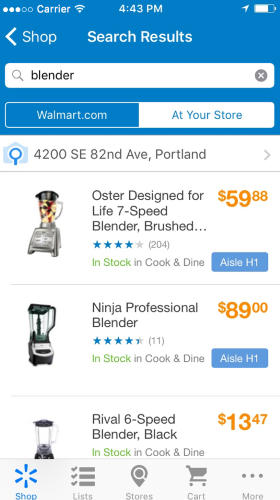
1. Do not delete the user request after clicking on the "Find" button.
')
Save the original text. Changing the query language is an important step in many search processes. If the user could not find what he needed, he may want to try again with a slightly adjusted query. To simplify the task, leave the text entered in the search bar - so he will not have to re-enter the request.
2. Provide accurate and relevant results.
The first results page is worth its weight in gold. Search results are the prime focus of the entire search process, it can have a huge impact on page conversion. Users, as a rule, very quickly form an opinion about the value of the site, based on the quality of the issue for a couple of requests.
Therefore, it is obvious that you should give users the results that exactly match the query, otherwise the search function will not cause them to trust. As a result, it is necessary to build the results in an optimal way - all the most useful should go to the first page.
3. Autofill should work
Inefficient autofilling can lead to a spoiled search experience. Make sure that the function is performed at a high level. Useful tools include root recognition, predicative text input, and sentences that appear as you type. All this helps to speed up the process and directs the user to action, which will increase the conversion.
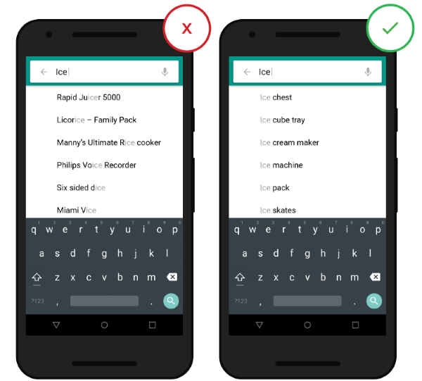
Source: ThinkWithGoogle
4. Correct typos
The printing process rarely goes without errors. If the user made a typo in the request and you managed to find it, you can show him the results for that request, which you guessed and “corrected”. So you will save him from the message "nothing is found" and the need to enter the request again - and all this pretty nerves.
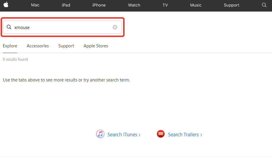
There is no autocorrection support in the Apple Store.
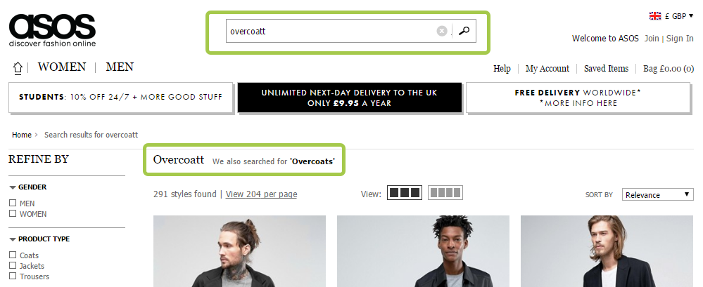
Asos is good at producing alternative results in case of a typo and not offending the user. If someone enters the Overcoatt query, they add a diplomatic postscript: "We also included the results for Overcoat."
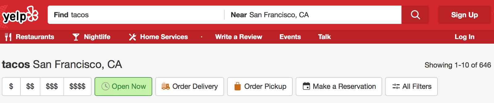
5. Show how many pages are found.
Display the number of available results in search results, so that the user can decide for himself how much time he is willing to spend on viewing the results.
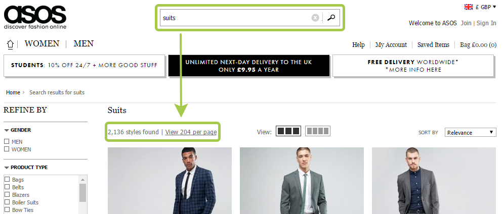
Also, the number of results helps the user to make more meaningful decisions about changing the query wording.
6. Save search history
Even if the user is familiar with the search function, he has to remember some information in order to use it. To compile a meaningful request, he needs to think about which attributes of the search are most relevant, taking into account the set goal, and include them in the request. Building a search process, do not forget the basic rule of usability:
Your site should save all recent requests to provide this information the next time the user wants to perform a search.

Search history is useful to the user in order to save time and effort when re-searching for a particular query.
Tip : give no more than 10 options (and do not use the scroll bar), so as not to overload the user with information
7. Choose the correct markup type.
One of the most difficult moments in the display of search results is that for different types of content you should choose different types of markup. The two main types of content presentation are list and grid. General rule:
Let's look at this rule on the example of online stores. It is very important what we sell. For such goods as household appliances, characteristics like models, ratings, sizes play a significant role in the selection process - accordingly, it is more logical to display them as a list.
The list is more suitable for design with an emphasis on information.
The grid is also a good option for applications with products that require less information in the selection process, or for products that differ little from each other. When it comes to clothes and the like, the decision is made to a lesser extent on the basis of the text description and more on the basis of the appearance. In this case, it is more important for users to be able to visually assess the differences between products, and it is more convenient to scroll through one long page to the end than to constantly jump from the issue page to the individual product pages.

The grid is more suitable for design with an emphasis on visual
Tips :
8. Show progress
Ideally, the results should be displayed instantly, but if this is not possible, you should use the process indicator as a source of feedback for the user. Users need to clearly see how long they will have to wait.

Aviasales website warns the user that the search will take some time
Tip : If the search takes a long time, try an animation. Cute animation can distract the user and make you forget about the long wait.
9. Connect the ability to sort and filter results
If the issue is too extensive and contains irrelevant options, the user may feel disoriented. It should be given the opportunity to apply filters relevant to this search, and several pieces at a time.
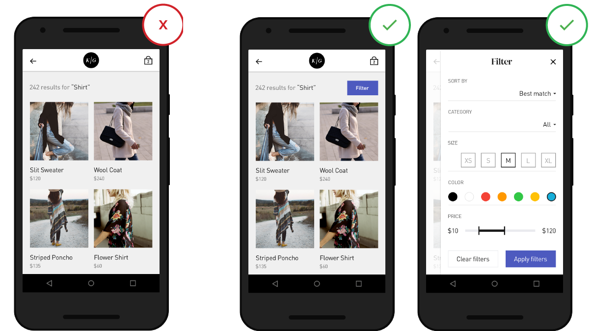
Filters can help thin out and organize the results if you otherwise would need to scroll a lot or move from page to page.
Tips :
10. Do not give out "Nothing found"
It's a shame when you get to a blank page with no results, especially if this is not the first attempt. During the search, users should not be at a deadlock, even if the site does not have pages matching their query. In such cases, you should provide alternatives that are valuable to the user (for example, an online store can offer products from a similar category as an alternative).
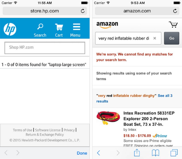
On the HP website, the “No Results Found” page is essentially a dead end for the user. This is significantly different, for example, from the corresponding page on the Amazon site, where alternative query options are offered in the context of the category .
Conclusion
Search is a key element for creating a website that would make a profit. Users expect that the process of searching and assimilating information will run smoothly, and quickly form an opinion about the value of the site based on the quality of the issue on one or two requests. A quality search function should help users quickly and easily find what they need.
In this article, I would like to share 10 practitioners who can help you improve UX pages with search results.
1. Do not delete the user request after clicking on the "Find" button.
')
Save the original text. Changing the query language is an important step in many search processes. If the user could not find what he needed, he may want to try again with a slightly adjusted query. To simplify the task, leave the text entered in the search bar - so he will not have to re-enter the request.
2. Provide accurate and relevant results.
The first results page is worth its weight in gold. Search results are the prime focus of the entire search process, it can have a huge impact on page conversion. Users, as a rule, very quickly form an opinion about the value of the site, based on the quality of the issue for a couple of requests.
Therefore, it is obvious that you should give users the results that exactly match the query, otherwise the search function will not cause them to trust. As a result, it is necessary to build the results in an optimal way - all the most useful should go to the first page.
3. Autofill should work
Inefficient autofilling can lead to a spoiled search experience. Make sure that the function is performed at a high level. Useful tools include root recognition, predicative text input, and sentences that appear as you type. All this helps to speed up the process and directs the user to action, which will increase the conversion.
Source: ThinkWithGoogle
4. Correct typos
The printing process rarely goes without errors. If the user made a typo in the request and you managed to find it, you can show him the results for that request, which you guessed and “corrected”. So you will save him from the message "nothing is found" and the need to enter the request again - and all this pretty nerves.
There is no autocorrection support in the Apple Store.
Asos is good at producing alternative results in case of a typo and not offending the user. If someone enters the Overcoatt query, they add a diplomatic postscript: "We also included the results for Overcoat."
5. Show how many pages are found.
Display the number of available results in search results, so that the user can decide for himself how much time he is willing to spend on viewing the results.
Also, the number of results helps the user to make more meaningful decisions about changing the query wording.
6. Save search history
Even if the user is familiar with the search function, he has to remember some information in order to use it. To compile a meaningful request, he needs to think about which attributes of the search are most relevant, taking into account the set goal, and include them in the request. Building a search process, do not forget the basic rule of usability:
Respect user effort
Your site should save all recent requests to provide this information the next time the user wants to perform a search.
Search history is useful to the user in order to save time and effort when re-searching for a particular query.
Tip : give no more than 10 options (and do not use the scroll bar), so as not to overload the user with information
7. Choose the correct markup type.
One of the most difficult moments in the display of search results is that for different types of content you should choose different types of markup. The two main types of content presentation are list and grid. General rule:
For details - list, for images - grid
Let's look at this rule on the example of online stores. It is very important what we sell. For such goods as household appliances, characteristics like models, ratings, sizes play a significant role in the selection process - accordingly, it is more logical to display them as a list.
The list is more suitable for design with an emphasis on information.
The grid is also a good option for applications with products that require less information in the selection process, or for products that differ little from each other. When it comes to clothes and the like, the decision is made to a lesser extent on the basis of the text description and more on the basis of the appearance. In this case, it is more important for users to be able to visually assess the differences between products, and it is more convenient to scroll through one long page to the end than to constantly jump from the issue page to the individual product pages.
The grid is more suitable for design with an emphasis on visual
Tips :
- Let users choose how to display output — by list or grid. So they will have the opportunity to decide for themselves which method is preferable.
- If you are presenting content as a grid, set the correct size of the pictures - they should be large enough to make the image easy to see, but still compact enough to display several pieces on one screen.
8. Show progress
Ideally, the results should be displayed instantly, but if this is not possible, you should use the process indicator as a source of feedback for the user. Users need to clearly see how long they will have to wait.
Aviasales website warns the user that the search will take some time
Tip : If the search takes a long time, try an animation. Cute animation can distract the user and make you forget about the long wait.
9. Connect the ability to sort and filter results
If the issue is too extensive and contains irrelevant options, the user may feel disoriented. It should be given the opportunity to apply filters relevant to this search, and several pieces at a time.
Filters can help thin out and organize the results if you otherwise would need to scroll a lot or move from page to page.
Tips :
- It is important not to overload the user with too many options. If the search requires a lot of filters, display by default only some of them.
- Do not hide hide the sort function among the filters - these are two different operations.
- If the user decided to narrow the search, list the selected area above the list of results.
10. Do not give out "Nothing found"
It's a shame when you get to a blank page with no results, especially if this is not the first attempt. During the search, users should not be at a deadlock, even if the site does not have pages matching their query. In such cases, you should provide alternatives that are valuable to the user (for example, an online store can offer products from a similar category as an alternative).
On the HP website, the “No Results Found” page is essentially a dead end for the user. This is significantly different, for example, from the corresponding page on the Amazon site, where alternative query options are offered in the context of the category .
Conclusion
Search is a key element for creating a website that would make a profit. Users expect that the process of searching and assimilating information will run smoothly, and quickly form an opinion about the value of the site based on the quality of the issue on one or two requests. A quality search function should help users quickly and easily find what they need.
Source: https://habr.com/ru/post/324358/
All Articles