Logo is clothing
Everyone has an opinion about design. Under each news about the new logo, you can find comments: “I'll draw this for free”, “the logo should be simple”, “it looks like ...”. It is easy to judge design, therefore everyone considers that he is right.

In this case, no professional designer, can not once and for all dot the i. There is no program that says: "this logo will be 46% more successful than the previous one and will attract an audience of housewives of 30-45 years old." Instead, we have archetypes for Jung, brand platforms and communication strategies. But the failures that large agencies and brands allow show that all this does not work very clearly.

Therefore, in the design of so many myths, delusions and taste. To navigate this chaos and not to slide into metaphysics, I use a metaphor that has not let me down yet. I hope it will help you to better understand the world of design.
')
Brands are often compared with people - they have character, aspirations, friends and enemies. I propose to treat the logo and corporate identity as clothing brands. See how it works:
“ How much is the logo? "Is like" how much is clothing? ". The answer is obvious: in different ways. You can get dressed in the market and save money, you can buy an expensive suit, but not everyone will appreciate it. It is worth proceeding from earnings and common sense.
“ Does my company need a logo? "Turns into" is working clothes important to me? ". If you are a lawyer and personally meet every potential client, the purchase of an expensive suit will definitely pay off. And if you carry rubble on Kamaz to the same client, it is probably not so important what you are wearing. But if the driver Kamaz dressed in an expensive suit, it is a reason to be alerted. In the logos also: the icon for the application is important, and no one pays attention to the state contractor’s logo - surely there’s an eagle, a flag or a contour of Russia. And if not, it is a reason to be wary.
“ Make me a recognizable logo ” sounds like “sew me recognizable clothes.” Obviously, there will be a turtleneck with jeans, if you present a new iPhone in them every year. Also in the logos - we will begin to recognize the yellow letter M on a red background, if it hangs on each post. There is no special "recognizable" clothing. There is clothing that catches the eye, but more often it is vulgar and inappropriate. Ultimately, recognition depends on how many people see you in these clothes and what you do in them.
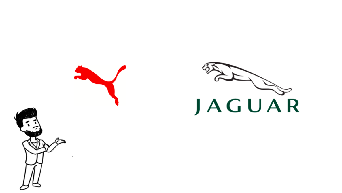
" The logo must be unique " turns into "clothing must be unique." Coming to a party in absolutely identical dresses is embarrassing. But trying to sew the coats from the coat to the jacket, because the guards in the mall are also wearing jackets, this is insanity. So with the logos: they should not be the same, but the rest is a matter of taste. You should not worry that the company from another sphere on the logo also has a jumping cat - they will definitely not confuse you.
Let's apply this clothing metaphor more broadly.
The logo, like clothing, should not just please. No one stands in front of the cafe, trying to understand whether they like the logo or not. Rather, the design works as a “friend or foe” filter: this, judging by the sign, is a cheap snack bar for truckers, this is fast food, and this is an expensive restaurant. We know how they look.
Therefore, there is little point in asking people: “I’ve made a logo, do you like it?”. No one really knows what your project is, and rarely anyone evaluates logos on a “like-dislike” scale. If you go back to the analogy with clothes, you risk being in a tailcoat at a rock concert. After all, the tailcoat is so beautiful!
But if no one really understands the design, why bother working on corporate identity? Again, just like in clothes: rarely anyone sews jackets or keeps a close eye on fashion. But everyone can draw conclusions in appearance: this is a gopnik, this is a biker. But the guy in a T-shirt and jeans can be a student, and a young millionaire - you need to talk in order to understand. The programmer can wear whatever he wants, the main thing is to work well. But still nice when it is not stretched to the floor sweater.

Let's summarize - what kind oflogo clothing should be?
First, quality made. Even if these are jeans that are torn at the knees, the legs should still be of the same length, and the zipper should be in the front, not the back.
Secondly, clothing must meet the goal. If you want to join the ranks of entrepreneurs at a meeting with investors, choose a jacket and trousers. And if on the contrary you need to stand out, put on a bright T-shirt, jeans and sneakers - you will definitely be noticed against the background of the jackets.
Thirdly, you should feel comfortable in these clothes. The guy in the bright T-shirt is either an eccentric genius or a local idiot who did not understand that he should come in a jacket. If he sweats, stutters and shakes, it’s probably an inappropriate image.
I think everyone will translate it into the language of logos. And, of course, they are met according to their clothes — they are escorted by the mind.
In this case, no professional designer, can not once and for all dot the i. There is no program that says: "this logo will be 46% more successful than the previous one and will attract an audience of housewives of 30-45 years old." Instead, we have archetypes for Jung, brand platforms and communication strategies. But the failures that large agencies and brands allow show that all this does not work very clearly.
Therefore, in the design of so many myths, delusions and taste. To navigate this chaos and not to slide into metaphysics, I use a metaphor that has not let me down yet. I hope it will help you to better understand the world of design.
')
Analogy
Brands are often compared with people - they have character, aspirations, friends and enemies. I propose to treat the logo and corporate identity as clothing brands. See how it works:
“ How much is the logo? "Is like" how much is clothing? ". The answer is obvious: in different ways. You can get dressed in the market and save money, you can buy an expensive suit, but not everyone will appreciate it. It is worth proceeding from earnings and common sense.
“ Does my company need a logo? "Turns into" is working clothes important to me? ". If you are a lawyer and personally meet every potential client, the purchase of an expensive suit will definitely pay off. And if you carry rubble on Kamaz to the same client, it is probably not so important what you are wearing. But if the driver Kamaz dressed in an expensive suit, it is a reason to be alerted. In the logos also: the icon for the application is important, and no one pays attention to the state contractor’s logo - surely there’s an eagle, a flag or a contour of Russia. And if not, it is a reason to be wary.
“ Make me a recognizable logo ” sounds like “sew me recognizable clothes.” Obviously, there will be a turtleneck with jeans, if you present a new iPhone in them every year. Also in the logos - we will begin to recognize the yellow letter M on a red background, if it hangs on each post. There is no special "recognizable" clothing. There is clothing that catches the eye, but more often it is vulgar and inappropriate. Ultimately, recognition depends on how many people see you in these clothes and what you do in them.
" The logo must be unique " turns into "clothing must be unique." Coming to a party in absolutely identical dresses is embarrassing. But trying to sew the coats from the coat to the jacket, because the guards in the mall are also wearing jackets, this is insanity. So with the logos: they should not be the same, but the rest is a matter of taste. You should not worry that the company from another sphere on the logo also has a jumping cat - they will definitely not confuse you.
Let's apply this clothing metaphor more broadly.
The logo, like clothing, should not just please. No one stands in front of the cafe, trying to understand whether they like the logo or not. Rather, the design works as a “friend or foe” filter: this, judging by the sign, is a cheap snack bar for truckers, this is fast food, and this is an expensive restaurant. We know how they look.
Therefore, there is little point in asking people: “I’ve made a logo, do you like it?”. No one really knows what your project is, and rarely anyone evaluates logos on a “like-dislike” scale. If you go back to the analogy with clothes, you risk being in a tailcoat at a rock concert. After all, the tailcoat is so beautiful!
But if no one really understands the design, why bother working on corporate identity? Again, just like in clothes: rarely anyone sews jackets or keeps a close eye on fashion. But everyone can draw conclusions in appearance: this is a gopnik, this is a biker. But the guy in a T-shirt and jeans can be a student, and a young millionaire - you need to talk in order to understand. The programmer can wear whatever he wants, the main thing is to work well. But still nice when it is not stretched to the floor sweater.
Conclusion: what should be the logo
Let's summarize - what kind of
First, quality made. Even if these are jeans that are torn at the knees, the legs should still be of the same length, and the zipper should be in the front, not the back.
Secondly, clothing must meet the goal. If you want to join the ranks of entrepreneurs at a meeting with investors, choose a jacket and trousers. And if on the contrary you need to stand out, put on a bright T-shirt, jeans and sneakers - you will definitely be noticed against the background of the jackets.
Thirdly, you should feel comfortable in these clothes. The guy in the bright T-shirt is either an eccentric genius or a local idiot who did not understand that he should come in a jacket. If he sweats, stutters and shakes, it’s probably an inappropriate image.
I think everyone will translate it into the language of logos. And, of course, they are met according to their clothes — they are escorted by the mind.
Source: https://habr.com/ru/post/324126/
All Articles