How to make a sidebar in 5 lines of code
Sidebars are good in two cases: if they have something so important that they should always be in front of them (take, for example, any email client, and at least Gmail) or if you need to be able to hide this most important thing for saving places (again, as in Gmail, but in the mobile version). Taking up the creation of sidebars from scratch is not a task for average minds, and generally meaningless. For this task, it is better to use the appropriate framework. We will talk about one of such examples today.

Before going directly to the code, let's briefly mention what kind of library it is. So, Webix is a library of UI components of varying complexity, from a simple button to a Spreadsheet Widget , with which you can create online tables in Excel style. In addition to the actual components, there is an event handling mechanism, support for offline mode , integration with jQuery, AngularJS, Vue.js, Backbone.js, online tools: Skin builder , Form builder . Declared compatibility with Angular 2.
You can learn more on the documentation page , and we smoothly proceed to the practical part.
')
If you download the archive with the library, inside the codebase folder you will find the necessary js and css files:
You can also use CDN:
Or NPM :
Or even NuGet :
Or if you prefer Bower :
All of the above applies directly to Webix. In order to be able to create sidebars, we will need a couple more files . Access to them via CDN:
Since we have already started talking about e-mail clients, we will not deviate from this topic and will create just such an application as an example. Using the DataTable component, I took this email viewer, to which we will add a sidebar:
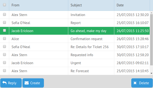
Since the DataTable review is not included in our plans, I will not dwell on it in detail, the source code of the example can be viewed below.
Let's start with the basics. To add a specific component to an application, the view property is used in Webix. For example, we want to create a button:
To initialize a Webix application, we need the following code:
The code above will create a one-button page. Since our application consists of several components, we need to think about creating a layout. For this, the rows and cols properties are used, which are used to create rows and columns.
For example:
Already create two columns, one button each. Combining these properties, adding nested columns and rows, changing their sizes, for example, using the gravity property, you can create a layout of necessary complexity.
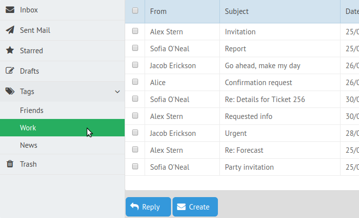
Now we can go to the sidebar. It is based on the Tree component and also uses the JSON format to describe its structure. For convenience, it is better to store such a description in a separate variable.
Our sidebar will consist of the following menu items:
Each item must have a unique ID. value determines what the text of the menu item will be, and icon the icon. Webix uses the Font Awesome icon set. Pay attention to the item Tags. It contains nested submenus that will be opened by click.
So, to summarize all of the above, we can go to our application:
In principle, this is all that is required to create a basic sidebar: indicate what exactly this component we want to create, as well as select the source of data about its structure.
As a result, we got this sidebar:
Sample code and demo can be found here .
If we want to save some space or simply do not want the sidebar to hurt the eyes, you can add a hamburger button to your application, familiar to us from mobile (and not only) applications. To do this, you need to add an upper toolbar to the application, which will make our layout a little more difficult. Now it will consist of two rows. In the first of these, the top row, we will place the toolbar. The second, lower, will remain unchanged and will consist of a viewer with a sidebar:
Let's deal with the code that we need to create the title. As mentioned, the type of component being created is determined by the value of the view property. In this case, this value will be the toolbar. Its content is determined by the value of the elements property. In our case, we will place the following elements on the toolbar: a hamburger button, a header, and several notification icons:
The properties type: " icon " and icon: "icon-name" create icon buttons. The click property allows you to define a function that will be called on a click. In this case, it switches the sidebar state. We added the badge property to the last two buttons, which allows the use of orange badges with numbers corresponding to the property value.
Here's what happened in the end:
In the minimized view, the sidebar menu icons remain visible. Hovering over them, you can view the contents of the menu and select one of the items.
Open sidebar has already familiar to us the form:
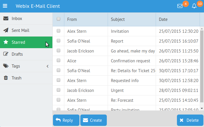
And yes, pay attention to the notification icons at the top right. It is for these orange circles that we used the badge property.
You can try this example and play with the code at this link .
The given example does not describe all the capabilities of this component. Among other things, you can set templates for sidebar elements: specify the CSS class that you want to apply to them, change the appearance of the arrows for multi-level menus, etc. Sidebar inherits the API component of the Tree , and also provides a set of unique methods for it. You can read more about them on the documentation page .
Briefly about webix
Before going directly to the code, let's briefly mention what kind of library it is. So, Webix is a library of UI components of varying complexity, from a simple button to a Spreadsheet Widget , with which you can create online tables in Excel style. In addition to the actual components, there is an event handling mechanism, support for offline mode , integration with jQuery, AngularJS, Vue.js, Backbone.js, online tools: Skin builder , Form builder . Declared compatibility with Angular 2.
You can learn more on the documentation page , and we smoothly proceed to the practical part.
')
We connect the necessary files
If you download the archive with the library, inside the codebase folder you will find the necessary js and css files:
<link rel="stylesheet" href="./codebase/webix.css"> <script src="./codebase/webix.js"></script> You can also use CDN:
<link rel="stylesheet" href="http://cdn.webix.com/edge/webix.css"> <script src="http://cdn.webix.com/edge/webix.js"></script> Or NPM :
npm install webix Or even NuGet :
nuget install Webix Or if you prefer Bower :
bower install webix All of the above applies directly to Webix. In order to be able to create sidebars, we will need a couple more files . Access to them via CDN:
<script src="//cdn.webix.com/components/sidebar/sidebar.js"></script> <link rel="stylesheet" href="//cdn.webix.com/components/sidebar/sidebar.css"> Sidebar on the example of e-mail client
Since we have already started talking about e-mail clients, we will not deviate from this topic and will create just such an application as an example. Using the DataTable component, I took this email viewer, to which we will add a sidebar:
Since the DataTable review is not included in our plans, I will not dwell on it in detail, the source code of the example can be viewed below.
Let's start with the basics. To add a specific component to an application, the view property is used in Webix. For example, we want to create a button:
view: "button" To initialize a Webix application, we need the following code:
// . webix.ready(function(){ // webix.ui({ // view: "button", }); }); The code above will create a one-button page. Since our application consists of several components, we need to think about creating a layout. For this, the rows and cols properties are used, which are used to create rows and columns.
For example:
webix.ui({ cols: [ { view: "button"}, { view: "button"} ] }); Already create two columns, one button each. Combining these properties, adding nested columns and rows, changing their sizes, for example, using the gravity property, you can create a layout of necessary complexity.
Now we can go to the sidebar. It is based on the Tree component and also uses the JSON format to describe its structure. For convenience, it is better to store such a description in a separate variable.
Our sidebar will consist of the following menu items:
var menu_data = [ {id: "inbox", icon: "envelope", value: "Inbox"}, { /* */ }, {id: "tags", icon: "tags", value:"Tags", data:[ { id: "friends", value: "Friends"}, { id: "work", value: "Work"}, { id: "news", value: "News"} ]} ], Each item must have a unique ID. value determines what the text of the menu item will be, and icon the icon. Webix uses the Font Awesome icon set. Pay attention to the item Tags. It contains nested submenus that will be opened by click.
So, to summarize all of the above, we can go to our application:
webix.ui({ cols:[ /* , */ { view: "sidebar", data: menu_data, }, /* */ { /* dataview component */ } ] }); In principle, this is all that is required to create a basic sidebar: indicate what exactly this component we want to create, as well as select the source of data about its structure.
As a result, we got this sidebar:
Sample code and demo can be found here .
Add a button to hide the sidebar
If we want to save some space or simply do not want the sidebar to hurt the eyes, you can add a hamburger button to your application, familiar to us from mobile (and not only) applications. To do this, you need to add an upper toolbar to the application, which will make our layout a little more difficult. Now it will consist of two rows. In the first of these, the top row, we will place the toolbar. The second, lower, will remain unchanged and will consist of a viewer with a sidebar:
webix.ui({ rows:[ { /* */}, {cols:[ { /* */ }, { /* */ } ]} ] }); Let's deal with the code that we need to create the title. As mentioned, the type of component being created is determined by the value of the view property. In this case, this value will be the toolbar. Its content is determined by the value of the elements property. In our case, we will place the following elements on the toolbar: a hamburger button, a header, and several notification icons:
{view: "toolbar", elements: [ /* - */ { view: "button", type: "icon", icon: "bars", width: 37, align: "left", css: "app_button", click: function(){ $$("$sidebar1").toggle() } }, /* */ { view: "label", label: "Webix E-Mail CLient"}, { /* */ }, /* 1 */ { view: "button", type: "icon", icon: "envelope-o", width: 45, css: "app_button", badge:4}, /* 2 */ { view: "button", type: "icon", icon: "bell-o", width: 45, css: "app_button", badge:10} ] }, The properties type: " icon " and icon: "icon-name" create icon buttons. The click property allows you to define a function that will be called on a click. In this case, it switches the sidebar state. We added the badge property to the last two buttons, which allows the use of orange badges with numbers corresponding to the property value.
Here's what happened in the end:
In the minimized view, the sidebar menu icons remain visible. Hovering over them, you can view the contents of the menu and select one of the items.
Open sidebar has already familiar to us the form:
And yes, pay attention to the notification icons at the top right. It is for these orange circles that we used the badge property.
You can try this example and play with the code at this link .
Conclusion
The given example does not describe all the capabilities of this component. Among other things, you can set templates for sidebar elements: specify the CSS class that you want to apply to them, change the appearance of the arrows for multi-level menus, etc. Sidebar inherits the API component of the Tree , and also provides a set of unique methods for it. You can read more about them on the documentation page .
Source: https://habr.com/ru/post/323934/
All Articles