Predicting the future with the Facebook Prophet library
 Forecasting time series is quite a popular analytical task. Forecasts are used, for example, to understand how many servers an online service will need in a year, what will be the demand for each product in a hypermarket, or for setting goals and evaluating team work (for this you can build a baseline forecast and compare the actual value with the predicted one).
There are many different approaches for predicting time series, such as ARIMA , ARCH , regression models, neural networks, etc.
Today we will get acquainted with the library for predicting the time series of Facebook Prophet ( translated from English, "prophet", released in open-source on February 23, 2017 ), and also try in the task of life - predicting the number of posts on Habrehabr.
Library
According to the Facebook Prophet article , it was designed to predict a large number of different business indicators and builds fairly good default forecasts. In addition, the library makes it possible, by changing the human-readable parameters, to improve the forecast and does not require deep knowledge of the device from the analysts of the predictive models.
Let's discuss a little how the Prophet library works. In essence, this is an additive regression model consisting of the following components:
y ( t ) = g ( t ) + s ( t ) + h ( t ) + e p s i l o n t
- Seasonal ingredients s ( t ) responsible for modeling periodic changes associated with weekly and annual seasonality. Weekly seasonality is modeled using
dummy variables. 6 additional attributes are added, for example,[monday, tuesday, wednesday, thursday, friday, saturday], which take the values 0 and 1 depending on the date. The sign ofsunday, corresponding to the seventh day of the week, is not added, because it will linearly depend on other days of the week and this will affect the model.
The annual seasonality is modeled by Fourier series. - Trend g ( t ) Is a piecewise linear or logistic function. With linear function everything is clear. Logistic function of the form g (t) = \ frac {C} {1 + exp (-k (tb))g (t) = \ frac {C} {1 + exp (-k (t-b)) allows you to simulate growth with saturation, when with an increase in the rate of its growth decreases. A typical example is the growth of an application or site audience.
Among other things, the library is able to choose the optimal points of trend change based on historical data. But they can also be set manually (for example, if you know the release dates of the new functionality, which greatly influenced the key indicators). - Component h ( t ) responsible for user-defined anomalous days , including irregular days , such as, for example, Black Fridays.
- Mistake e p s i l o n t contains information that is not considered by the model.
More information about the algorithms can be found in the publication Sean J. Taylor, Benjamin Letham "Forecasting at scale" .
This publication also presents a comparison of mean absolute percentage error for various methods of automatic time series prediction, according to which Prophet has a significantly lower error.

Let's first look at how the quality of the models is assessed in the article, and then proceed to the algorithms with which Prophet compared.
MAPE (mean absolute percentage error) is the average absolute error of our prediction. Let be y i - is an indicator, and h a t y i - this is the corresponding forecast of our model. Then ei=yi− hatyi - this is a forecast error, a pi= fraceiyi - This is a relative forecast error.
MAPE=mean(|pi|)
MAPE often used to assess quality, since this value is relative and it is possible to compare quality even across different data sets.
In addition, it is useful to look at the absolute error MAE - mean absolute error , in order to understand how much the model is mistaken in absolute terms.
MAE=mean(|ei|)
It is worth saying a few words about the algorithms with which Prophet compared in the publication, especially since most of them are very simple and are often used as a baseline:
naiveis a naive forecast, when we forecast all subsequent values by the last point;snaive - seasonal naive- this forecast is suitable for data with a pronounced seasonality. For example, if we are talking about indicators with weekly seasonality, then for each subsequent Monday we will take the value for the last Monday, for Tuesday - for the last Tuesday, and so on;mean- the average value of the indicator is taken as a forecast;arima - autoregressive integrated moving average- details on the wiki ;ets - exponential smoothing- details on the wiki .
Practice
Installation
First you need to install the library. The Prophet library is available for python and R I prefer python , so I used it. For python library is PyPi using PyPi as follows:
pip install fbprophet Under R , the library has a CRAN package . Detailed installation instructions can be found in the documentation .
Data
As an indicator for prediction, I chose the number of posts published in Habrahabr. I took the data from the educational competition on Kaggle "Forecast of the popularity of an article on Habré" . It tells more about the competition and the machine learning course in which it is held.
import pandas as pd habr_df = pd.read_csv('howpop_train.csv') habr_df['published'] = pd.to_datetime(habr_df.published) habr_df = habr_df[['published', 'url']] aggr_habr_df = habr_df.groupby('published')[['url']].count() aggr_habr_df.columns = ['posts'] aggr_habr_df = aggr_habr_df.resample('D').apply(sum) First, let's look at the data and build a time series plot for the entire period. On such a long period it is more convenient to look at the weekly points.
For visualization, as usual, I will use the plot.ly library, which allows you to build interactive graphics in python . You can read more about it and visualization in general in the article Open Machine Learning Course. Topic 2: Data Visualization with Python .
from plotly.offline import download_plotlyjs, init_notebook_mode, plot, iplot from plotly import graph_objs as go # plotly init_notebook_mode(connected = True) # , dataframe line plot def plotly_df(df, title = ''): data = [] for column in df.columns: trace = go.Scatter( x = df.index, y = df[column], mode = 'lines', name = column ) data.append(trace) layout = dict(title = title) fig = dict(data = data, layout = layout) iplot(fig, show_link=False) plotly_df(aggr_habr_df.resample('W').apply(sum), title = ' ') 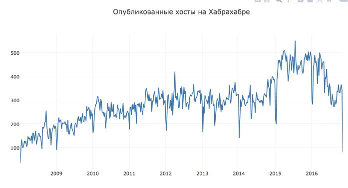
Forecasting
The Prophet library has an interface similar to sklearn , first we create a model, then we call its fit method and then we get a prediction. As an input to the fit method, the library takes a dataframe with two columns:
ds- time, the field must be of typedateordatetime,yis the number we want to predict.
In order to measure the quality of the forecast, we remove the last month of data from the training and predict it. The creators are advised to make predictions for several months of data, ideally a year or more (in our case there are several years of history for learning).
# from fbprophet import Prophet predictions = 30 # dataframe df = aggr_habr_df.reset_index() df.columns = ['ds', 'y'] # 30 , train_df = df[:-predictions] Next, create an object of the Prophet class (all the parameters of the model are set in the class constructor, first we take the default parameters) and train it.
m = Prophet() m.fit(train_df) Using the auxiliary function Prophet.make_future_dataframe we create a dataframe that contains all the historical time points and another 30 days for which we wanted to build a forecast.
In order to build a forecast, we call the model predict function and pass the dataframe future obtained at the previous step dataframe future .
future = m.make_future_dataframe(periods=predictions) forecast = m.predict(future) The Prophet library has built-in visualization tools that allow you to evaluate the result of the constructed model.
First, the Prophet.plot method displays the forecast. Honestly, in this case, this visualization is not very revealing. The main conclusion from this graph that I made is in the data of many outlier 's. However, if the prediction will be less historical points, then it will be possible to understand something.
m.plot(forecast) 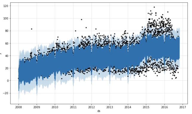
The second function Prophet.plot_components , in my opinion, is much more useful. It allows you to look separately at the components: trend, annual and weekly seasonality. If anomalous days / holidays were specified when building the model, they will also be displayed on this graph.
m.plot_components(forecast) 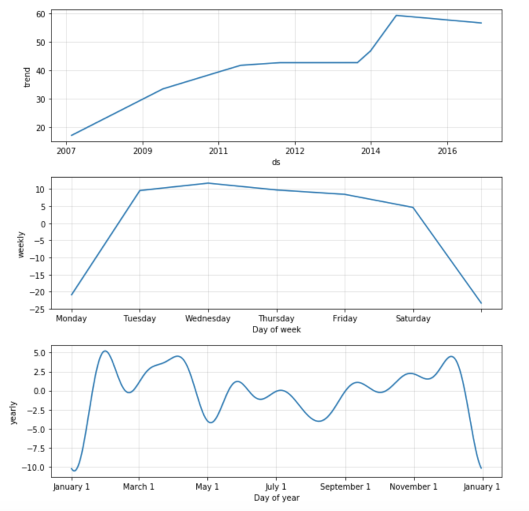
The graph shows that Prophet well adjusted to the growth of the number of posts by the “step” at the beginning of 2015. By weekly seasonality, it can be concluded that fewer posts fall on Sunday and Monday. On the graph of annual seasonality, the failure of activity during the New Year holidays is most prominent, the decline is also visible at the May holidays.
Model quality assessment
Let's evaluate the quality of the algorithm and calculate MAPE for the last 30 days we predicted. For the calculation we need observations yi and forecasts for them hatyi .
First, look at the forecast object that the library generates. In fact, this dataframe , which has all the information we need for the forecast.
print(', '.join(forecast.columns)) ds, t, trend, seasonal_lower, seasonal_upper, trend_lower, trend_upper, yhat_lower, yhat_upper, weekly, weekly_lower, weekly_upper, yearly, yearly_lower, yearly_upper, seasonal, yhat Before proceeding, we need to combine the forecast with our original observations.
cmp_df = forecast.set_index('ds')[['yhat', 'yhat_lower', 'yhat_upper']].join(df.set_index('ds')) Let me remind you that we initially postponed the data for the last month in order to build a forecast for 30 days and measure the quality of the resulting model.
import numpy as np cmp_df['e'] = cmp_df['y'] - cmp_df['yhat'] cmp_df['p'] = 100*cmp_df['e']/cmp_df['y'] print 'MAPE', np.mean(abs(cmp_df[-predictions:]['p'])) print 'MAE', np.mean(abs(cmp_df[-predictions:]['e'])) As a result, we got a quality of about 37.35% , and on average, the model makes a mistake in the forecast for 10.62 posts.
Visualization
Let's make our visualization of the model built by Prophet : with actual values, forecast and confidence intervals.
First, I want to leave the data for a shorter period so that they do not turn into a mash of points. Secondly, I want to show the results of the model only for the period in which we made the prediction - it seems to me that the schedule will be more readable. Third, make the plot interactive with plot.ly
# def show_forecast(cmp_df, num_predictions, num_values): # upper_bound = go.Scatter( name='Upper Bound', x=cmp_df.tail(num_predictions).index, y=cmp_df.tail(num_predictions).yhat_upper, mode='lines', marker=dict(color="444"), line=dict(width=0), fillcolor='rgba(68, 68, 68, 0.3)', fill='tonexty') # forecast = go.Scatter( name='Prediction', x=cmp_df.tail(predictions).index, y=cmp_df.tail(predictions).yhat, mode='lines', line=dict(color='rgb(31, 119, 180)'), ) # lower_bound = go.Scatter( name='Lower Bound', x=cmp_df.tail(num_predictions).index, y=cmp_df.tail(num_predictions).yhat_lower, marker=dict(color="444"), line=dict(width=0), mode='lines') # fact = go.Scatter( name='Fact', x=cmp_df.tail(num_values).index, y=cmp_df.tail(num_values).y, marker=dict(color="red"), mode='lines', ) # - data = [lower_bound, upper_bound, forecast, fact] layout = go.Layout( yaxis=dict(title=''), title=' ', showlegend = False) fig = go.Figure(data=data, layout=layout) iplot(fig, show_link=False) show_forecast(cmp_df, predictions, 200) As you can see, the function described above allows you to flexibly customize the visualization and display an arbitrary number of observations and predictions of the model.
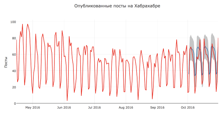
Visually, the forecast of the model seems to be quite good and reasonable. Most likely, such a low quality rating is due to the anomalous high number of posts on October 13 and 17 and a decrease in activity from October 7.
Also, according to the schedule, it can be concluded that most of the points lie within the confidence interval.
Comparison with ARIMA model
The forecast turned out to be quite reasonable, but let's compare it with the classic SARIMA - Seasonal autoregressive integrated moving average model SARIMA - Seasonal autoregressive integrated moving average with a weekly period.
On Habrahabr, there are already several articles about ARIMA models, I advise anyone interested to read them: Building a SARIMA model using Python + R and Analyzing time series using python .
To build a forecast, I was also inspired by the course materials Applied data analysis tasks atoursera, which describes in detail ARIMA models and how to build them in python .
It is worth noting that building the ARIMA model is much more expensive than Prophet : you need to investigate the original series, bring it to a stationary one, pick up initial approximations and spend a lot of time selecting the hyper-parameters of the algorithm (on my computer the model was chosen for almost 2 hours).
But in this case, the efforts were not in vain, and the prediction of SARIMA turned out to be more accurate: MAPE=16.54%, MAE=7.28 . The best model with parameters: D=1, d=1, Q=1, q=4, P=1, p=3 .
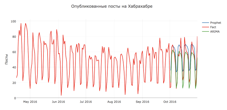
But Prophet , of course, can still be pushed. For example, if we predict not the original series in this library, but after the Box-Cox transformation , which normalizes the dispersion of the series, we will get a quality increase: MAPE=26.79%, MAE=8.49 .
from scipy import stats import statsmodels.api as sm def invboxcox(y,lmbda): if lmbda == 0: return(np.exp(y)) else: return(np.exp(np.log(lmbda*y+1)/lmbda)) train_df2 = train_df.copy().fillna(14) train_df2 = train_df2.set_index('ds') train_df2['y'], lmbda_prophet = stats.boxcox(train_df2['y']) train_df2.reset_index(inplace=True) m2 = Prophet() m2.fit(train_df2) future2 = m2.make_future_dataframe(periods=30) forecast2 = m2.predict(future2) forecast2['yhat'] = invboxcox(forecast2.yhat, lmbda_prophet) forecast2['yhat_lower'] = invboxcox(forecast2.yhat_lower, lmbda_prophet) forecast2['yhat_upper'] = invboxcox(forecast2.yhat_upper, lmbda_prophet) cmp_df2 = forecast2.set_index('ds')[['yhat', 'yhat_lower', 'yhat_upper']].join(df.set_index('ds')) cmp_df2['e'] = cmp_df2['y'] - cmp_df2['yhat'] cmp_df2['p'] = 100*cmp_df2['e']/cmp_df2['y'] np.mean(abs(cmp_df2[-predictions:]['p'])), np.mean(abs(cmp_df2[-predictions:]['e'])) Total
We got acquainted with the open-source library Prophet and its use to predict time series in practice.
I would not say that this library works wonders and perfectly predicts the future. In our case, the forecast turned out worse than the standard SARIMA . However, the Prophet library is quite convenient, it is easy to customize (which only makes it possible to add previously known anomalous days), so it is useful to have it in your analytic toolbox'e .
useful links
Some materials for more in-depth study of the Prophet library and time series predictions, in general:
ProphetGitHub repositoryProphetdocumentation- Sean J. Taylor, Benjamin Letham "Forecasting at scale" is a scientific publication explaining the algorithm based on the
Prophetlibrary - Forecasting Website Traffic Using Facebook's Prophet Library - a case study for predicting traffic to a website
- Rob J Hyndman, George Athanasopoulos "Forecasting: principles and practice" - and finally, a good online book on the basics of time series forecasting
- jupyter notebook with the code for the example analyzed in this article
')
Source: https://habr.com/ru/post/323730/
All Articles