Instagram redesign: experience analyzing and rethinking the interface
I set myself the task: to take an application that I love and use every day, and to test my creative abilities as a designer, re-creating it from scratch.
I chose Instagram because I became a devoted follower back in 2011, that is, a year after its launch.
Initially, I started using Instagram for the sake of filters. But over the past 6 years I have been able to see and appreciate the various changes and innovations that have appeared in the application. And now I constantly use Instagram for self-expression and tracking modern trends.
')
You can say that I am an Insta-veteran.
Note : I do not work on Instagram and in this study I express exclusively my own views. Unlike designers who work on Instagram, I do not have full access to all user data that influenced the current design. As a result, this case study is not exhaustive and, of course, I am not suggesting that Instagram abandon its current design and accept my version.
My goals in terms of redesign:
My goals for personal development are:
The roles that I had to perform in the process of creating this redesign:
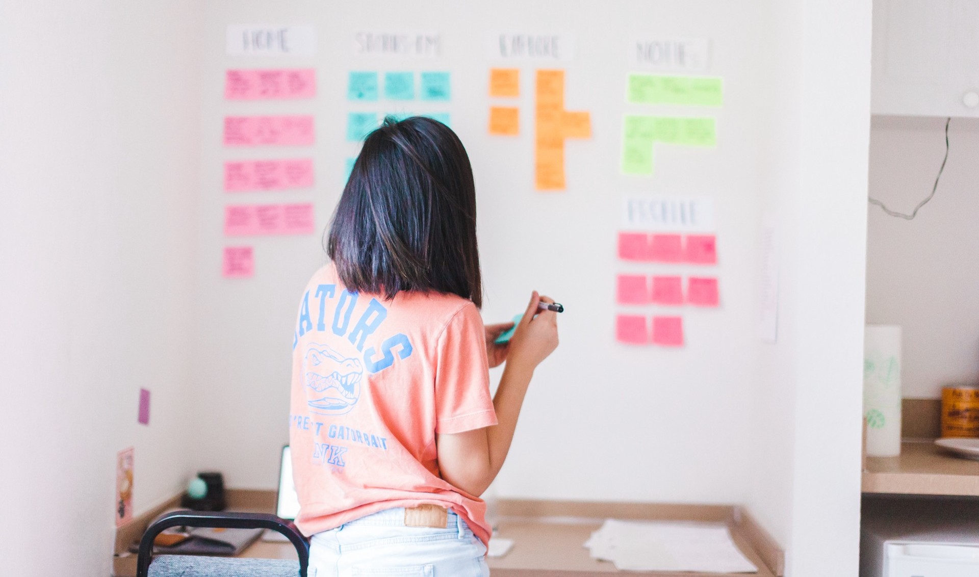
For brevity, I did not include my sketches and wireframes in this article, but if you want, you can view them here .
Instagram is a visual narrative application that provides users with a platform for storing and sharing beautiful and vivid moments from life. Since the release of the application in 2010, the Instagram user base has grown to hundreds of millions, allowing people from all over the world to join the social network and share moments of their lives.
In order to keep an ever-growing number of users, Instagram is constantly inventing innovative ideas to promote its mission of “sharing moments from around the world.”
Before embarking on the redesign project, I interviewed 40 Instagram users to get a more detailed portrait of those for whom I would develop:
I conducted these interviews in person, by telephone, or through video calls.
Demographic portrait of the target audience
Among the 40 instagrammers with whom I spoke, there were 10 men and 30 women. The age of male users ranged from 22 to 27 years, and for women from 19 to 25 years. 65% of respondents are currently college students or graduates of secondary schools with plans for higher education.
I thought that such a sample from the current Instagram-user base would be representative, since 90% of Instagram users are younger than 35 years old . In addition, in the US, 55% of people in the 18-29 age group are Instagram users .
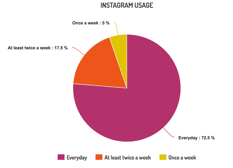
What is even more interesting, 67.5% of surveyed users attributed Instagram to the top three applications they use the most. In addition, 72.5% of people surveyed use Instagram daily.
I asked 40 instagrammers I worked with to describe Instagram with three adjectives. What do you think about Instagram? What do you feel using it?
I received a total of 64 adjectives.
The most popular of them were the following: Creative , Interesting , Simple .
I also asked what they like on Instagram. Here are the three most common answers:

Who do you look like more? On Alex, who uses Instagram to share moments of his life, and sometimes uses the search function to find interesting things? Or rather, Sam, who uses Instagram to stay in touch with friends who share her interests? Or both?
In any case, while creating my own version of the design, I will take into account the needs of users like you, Sam and Alex.
Now that you have a presentation for whom I am developing, we can go on to the most exciting!
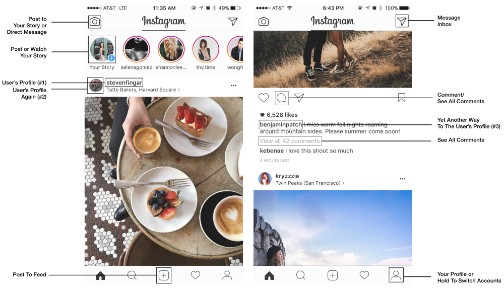
In addition to the repetitive functions on the home page, I noticed three other major issues.
The first thing that meets an Instagram user when launching an application is two main functions that compete for his attention. What should he do - look through the stories or view the news feed?
Both functions are very rich in content; there may even be a feeling that there will be no end to all this scrolling. According to studies on the paradox of choice , the abundance of options, oddly enough, can lead to a less positive experience, causing fatigue, guilt or fear of missing something important (FOMO). This is especially true, given that almost half of the instagrammers I surveyed, in their own words, view Instagram immediately after waking up and / or in the evening before going to bed.
Note : I decided to keep the minimalist design and color scheme that Instagram implemented in 2016, because, in my opinion, the reasoning and logic of this choice were truly ingenious. You can read about it here .
To fix the problem, I decided to integrate instas directly into the news feed for several reasons:
Now the news feed and stories will work together to provide the user with a more seamless experience.
The integration of stories into the news feed also prevents the so-called “roof effect” that Julie Chjo (vice president of product design on Facebook) mentioned. In the form in which the Instagram design is implemented now, Instastories are easily forgotten as soon as the user starts scrolling through the news feed. Out of sight, out of mind.

Thanks to the introduction of stories in the tape, Instagram will now work on a reinforcement scheme through a variable ratio. This is the most powerful incentive tool that provides maximum response for any target behavior - in our case, interaction with instastories.

Note : do not worry, I have not removed Instastories at all. I just moved them to the page with incoming messages, where you can go by clicking on the icon in the upper right corner of the main page. Below I will tell about it in more detail.
One of the main questions that I tried to answer in the course of my research of the audience: can the swipe function on the main page be considered intuitive?
Simply put, do Instagram users know that scrolling left and right corresponds to the functions placed on the top navigation bar?
To answer this question, I conducted a relatively simple experiment during the interview.
Method (n = 40)
Before starting this experiment, I reminded respondents that they should not pry on Instagram during this part of the interview. Then I asked each user to visualize the Instagram interface, describing the view of the standard Instagram profile from top to bottom. And then do the same with the main page. After they described the homepage, I asked them four simple questions.
Questions about svaype:
Top navigation bar questions:
Note : If the user answered this part of the question "swipe left / right", I suggested giving an alternative answer (Do you know another way to get to ______?)
Here are all the data that I collected.
Based on my results, in general, users' knowledge of how to apply svayp on Instagram leaves much to be desired:
Top navigation:
Some more interesting facts and statistics:
Analysis of the results shows that Instagram users do not see the connection between the top navigation and the functions of the svayp.
One way to make the scrolling gesture intuitive is to link it to the bottom navigation bar. However, I saw here an excellent opportunity for myself to realize a completely new function ...

Scrolling to view new and old messages
Part of my audience research was to read Instagram reviews on the App Store. One of the main complaints of Instagram users was that posts in the news feed did not line up in chronological order.
I wanted to understand why people want their tape to be chronologically ordered? Why are they so upset about this change? Plunging deeper into the question, I discovered that users associated chronology with thoroughness. With the current Instagram algorithm, popular posts (regarded as posts you'd like to see) are located at the top of the feed. This frustrates Instagram users because they often miss content that is really interesting to them (in other words, they are experiencing FOMO - the fear of missing something important).
To find a compromise between the current Instagram algorithm and the user's need in chronological order, I decided to implement this scrolling feature with an indicator, and thereby reassure users a little:
Suppose the indicator is in the middle. Accordingly, you understand that this is not the newest entry, and you can scroll to the right to see more recent posts. If the indicator is on the left, you can be sure that you see the most recent post of this user. To view old entries, just keep scrolling left.
People keep their phone differently . But in any way, one thing remains the same: the upper left corner of the screen will always be the most inconvenient and painful place to place the navigation bar for users. Because you drag, drag, drag * phone falls on your face * ... or something like that.
Studies show that the most accessible and least painful place to place navigation elements will be the lower part of the phone - next to the user's thumb.
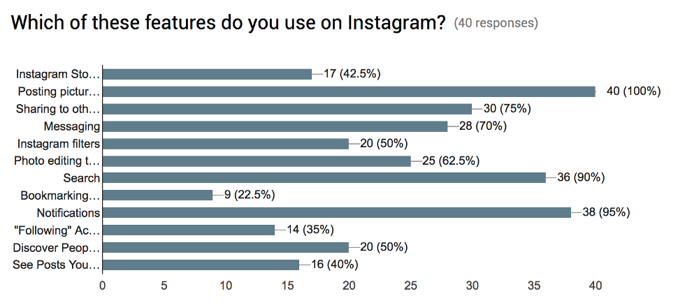
According to my data, 100% of people surveyed know how to send posts to their channel (because they do it regularly). However, only 57.5% of the same people either do not know how to publish their story, or simply do not use this feature at all. To increase the activity of posting stories, I decided to combine the two functions of publication, because: 1) it is now readily available and 2) you can cross your fingers and hope that the popularity of the news feed will spread to stories.
Now you have the opportunity both to search spontaneously, using the built-in Instagram algorithm, and “aiming” to search for content through your personal collection of saved hashtags. Therefore, Sam and Alex can simply plug in "#ecgtracing" or "#fitness" to see what's new on topics that interest them.
In my case, I probably would have tracked "#coffeefliicks" and "#dametravelers" to admire beautiful shots of coffee and various places. You can click on each hashtag in turn to open them one by one, and then pull down to refresh the page and see all the active hashtags at once. You also have the option of adding new hashtags by clicking, deleting old ones, or searching within your collection (and yes, they are all arranged in alphabetical order).

Only 42.5% of surveyed users used Instastories. Two of the main reasons why people did not use Instastories were that 1) they already have a Snapchat and 2) they constantly come across stories from people who are not particularly interesting to them.
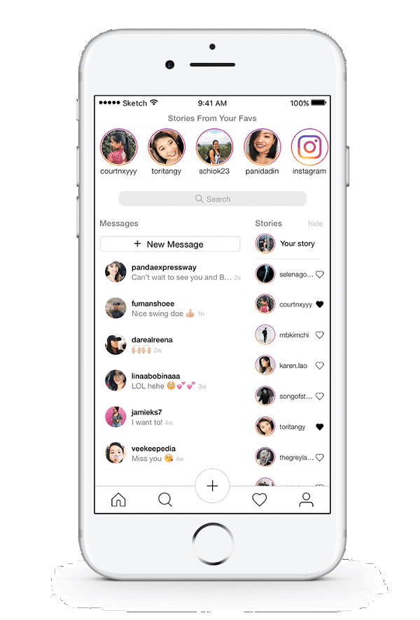
To deal with the second reason, I implemented a new feature called “Stories From Your Favs”, so that people could use Instastories more meaningfully and purposefully.
Now stories about people you love, adore or admire are in the top of your tape so that you can always start watching on a positive note. That's what I understand - keep in touch!
You can easily remove or add people to your favorites list by clicking on the heart next to their nickname. (Is it really cute?)

For reference : Why did I decide to move the stories in the DM? First, I had to attach them somewhere, since I removed them from the news feed. Secondly, when you send a comment or photo in response to stories, they go straight to your inbox. Therefore, it makes sense to group Instastories and DM into one big fun package.
Another note: there is no lower navigation pane in the current inbox interface. Users will be able to return to the main page only if they know how to use the scrolling functions, and, as I mentioned above, only 20% of the surveyed users knew that scrolling to the left leads them to DM. With this in mind, I decided in this case to make the lower navigation static so that users are not lost.
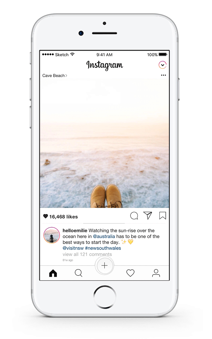
And here is the last spurt. On the pages with alerts and profile I wanted to leave more free space in the interface by grouping and combining similar elements.

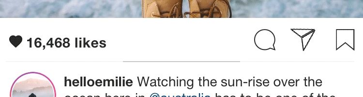
In addition, you can now like and comment on posts directly from the alert page - just click on the username and hold (short press will transfer you to his profile). A long press activates the appearance of a comment field in which @ username will already be entered. All you have to do is type the text and click on the “Send” button.
It seemed to me that such a function would be very useful - because on Instagram it is sometimes so easy to drown in the comments under the post. What is his name there? Where is that comment? What was it all about?
Alerts
And the last interesting fact for today: only 35% of Instagram users I polled regularly view the posts of those people who are subscribed to. Leaving this function or removing turned out to be the most difficult decision that I had to take. I decided to save it all the same and limited myself to correcting the design so that the photos became larger and attracted more attention.
Profile
Frankly, I like the current Instagram design. To further enhance minimalism, I slightly changed the design of the icon, and also added free space to make it more similar to the interface of other pages.
When I took on this project, I understood that this is a great opportunity to polish my designer skills. I'm just starting to learn the profession of a product designer: before this semester, I was engaged in medicine. Therefore, I decided that the best way to learn a bit is to rush headlong into some project, and then really figure it out.
Looking back, I must say that my expectations were lowered. Over the past two months, I was able to study not only what I planned to work with the project, but much more.
It seems to me that one of the most pleasant aspects of self-education and the creative process is that you yourself supervise. You find out what works and what does not work. You learn how to make faster, better, more efficient. You learn all sorts of things along the way in trying to learn what for the sake of what it all started.
And the most cool thing: there is no end to it. The learning process can continue indefinitely.
That's all. Thanks for attention! You can see the full interactive prototype here .
I chose Instagram because I became a devoted follower back in 2011, that is, a year after its launch.
Initially, I started using Instagram for the sake of filters. But over the past 6 years I have been able to see and appreciate the various changes and innovations that have appeared in the application. And now I constantly use Instagram for self-expression and tracking modern trends.
')
You can say that I am an Insta-veteran.
Note : I do not work on Instagram and in this study I express exclusively my own views. Unlike designers who work on Instagram, I do not have full access to all user data that influenced the current design. As a result, this case study is not exhaustive and, of course, I am not suggesting that Instagram abandon its current design and accept my version.
My personal goals in doing all of this.
My goals in terms of redesign:
- provide a simpler and smoother user experience when searching for content and when communicating
- create a more representative and intuitive user interface
- create a user-oriented design ( HCD ).
My goals for personal development are:
- learn how to conduct audience research and analyze results, create flowcharts and wireframes, work with Sketch, create animation using Principle and prototypes in Invision
- complete my first design project from start to finish, adhering to my design principles .
The roles that I had to perform in the process of creating this redesign:
- Audience researcher
- Analyst
- UI / UX designer
- Product designer
For brevity, I did not include my sketches and wireframes in this article, but if you want, you can view them here .
Instagram company insight
Instagram is a visual narrative application that provides users with a platform for storing and sharing beautiful and vivid moments from life. Since the release of the application in 2010, the Instagram user base has grown to hundreds of millions, allowing people from all over the world to join the social network and share moments of their lives.
In order to keep an ever-growing number of users, Instagram is constantly inventing innovative ideas to promote its mission of “sharing moments from around the world.”
My audience research and results
Before embarking on the redesign project, I interviewed 40 Instagram users to get a more detailed portrait of those for whom I would develop:
- What does a typical Instagram user look like?
- What are his reasons for using Instagram?
- What makes him come back again and again?
I conducted these interviews in person, by telephone, or through video calls.
Demographic portrait of the target audience
Among the 40 instagrammers with whom I spoke, there were 10 men and 30 women. The age of male users ranged from 22 to 27 years, and for women from 19 to 25 years. 65% of respondents are currently college students or graduates of secondary schools with plans for higher education.
I thought that such a sample from the current Instagram-user base would be representative, since 90% of Instagram users are younger than 35 years old . In addition, in the US, 55% of people in the 18-29 age group are Instagram users .
What is even more interesting, 67.5% of surveyed users attributed Instagram to the top three applications they use the most. In addition, 72.5% of people surveyed use Instagram daily.
The fun continues
I asked 40 instagrammers I worked with to describe Instagram with three adjectives. What do you think about Instagram? What do you feel using it?
I received a total of 64 adjectives.
The most popular of them were the following: Creative , Interesting , Simple .
I also asked what they like on Instagram. Here are the three most common answers:
- Images dominate there
- It is clear and easy to use.
- It helps to keep in touch with other people.
Instagram typical user image
Who do you look like more? On Alex, who uses Instagram to share moments of his life, and sometimes uses the search function to find interesting things? Or rather, Sam, who uses Instagram to stay in touch with friends who share her interests? Or both?
In any case, while creating my own version of the design, I will take into account the needs of users like you, Sam and Alex.
Now that you have a presentation for whom I am developing, we can go on to the most exciting!
Experience number 1: Home
In addition to the repetitive functions on the home page, I noticed three other major issues.
Problem number 1: Too much content (Insta-stories vs News feed)
The first thing that meets an Instagram user when launching an application is two main functions that compete for his attention. What should he do - look through the stories or view the news feed?
Both functions are very rich in content; there may even be a feeling that there will be no end to all this scrolling. According to studies on the paradox of choice , the abundance of options, oddly enough, can lead to a less positive experience, causing fatigue, guilt or fear of missing something important (FOMO). This is especially true, given that almost half of the instagrammers I surveyed, in their own words, view Instagram immediately after waking up and / or in the evening before going to bed.
Note : I decided to keep the minimalist design and color scheme that Instagram implemented in 2016, because, in my opinion, the reasoning and logic of this choice were truly ingenious. You can read about it here .
To fix the problem, I decided to integrate instas directly into the news feed for several reasons:
Now the news feed and stories will work together to provide the user with a more seamless experience.
The integration of stories into the news feed also prevents the so-called “roof effect” that Julie Chjo (vice president of product design on Facebook) mentioned. In the form in which the Instagram design is implemented now, Instastories are easily forgotten as soon as the user starts scrolling through the news feed. Out of sight, out of mind.
Thanks to the introduction of stories in the tape, Instagram will now work on a reinforcement scheme through a variable ratio. This is the most powerful incentive tool that provides maximum response for any target behavior - in our case, interaction with instastories.
Note : do not worry, I have not removed Instastories at all. I just moved them to the page with incoming messages, where you can go by clicking on the icon in the upper right corner of the main page. Below I will tell about it in more detail.
Problem number 2: The lack of a bundle between the top navigation and swipe
One of the main questions that I tried to answer in the course of my research of the audience: can the swipe function on the main page be considered intuitive?
Simply put, do Instagram users know that scrolling left and right corresponds to the functions placed on the top navigation bar?
To answer this question, I conducted a relatively simple experiment during the interview.
Method (n = 40)
Before starting this experiment, I reminded respondents that they should not pry on Instagram during this part of the interview. Then I asked each user to visualize the Instagram interface, describing the view of the standard Instagram profile from top to bottom. And then do the same with the main page. After they described the homepage, I asked them four simple questions.
Questions about svaype:
- Where will you go if, being on the home page, you spend on the screen from left to right? Answer: Camera, new post, history.
- Where will you go if, being on the home page, you spend on the screen from right to left? Answer: Inbox Messages
Top navigation bar questions:
- How to go to the screen to create a new story? Answer: Camera icon in the upper left corner
- How to go to your inbox? Answer: Arrow icon in the upper right corner
Note : If the user answered this part of the question "swipe left / right", I suggested giving an alternative answer (Do you know another way to get to ______?)
Here are all the data that I collected.
Based on my results, in general, users' knowledge of how to apply svayp on Instagram leaves much to be desired:
- Only 20% of respondents answered all questions correctly.
- 30% gave at least one correct answer, 50% did not give any.
- 50% of people know that if you hold the screen from left to right, the camera will open.
- 20% of people know that if you navigate around the screen from right to left, a list of incoming messages will open.
Top navigation:
- 72.5% of people know that you can get into your inbox by clicking on the icon with the arrow at the top right.
- 55% of people know that you can post a story by clicking on the camera icon at the top left.
Some more interesting facts and statistics:
- Only 3 out of 40 respondents correctly answered all four questions.
- When I asked to rate my knowledge of Instagram navigation on a scale of 1 to 5, 75% of people set themselves 4 or higher. Only 30% of these people answered correctly at least one of the questions about the svaype.
- 92.3% of people who answered incorrectly thought or suggested that scrolling to the left would lead them to the search page. (And this is the logic, since the search icon is located next to the "home" icon in the lower navigation block).
Analysis of the results shows that Instagram users do not see the connection between the top navigation and the functions of the svayp.
“I don't know myself. I just click on the buttons until I find what I need, and then suddenly I see my face ... ”- a random Instagram user to the question of how he gets into the inbox.
One way to make the scrolling gesture intuitive is to link it to the bottom navigation bar. However, I saw here an excellent opportunity for myself to realize a completely new function ...
Scrolling to view new and old messages
Part of my audience research was to read Instagram reviews on the App Store. One of the main complaints of Instagram users was that posts in the news feed did not line up in chronological order.
I wanted to understand why people want their tape to be chronologically ordered? Why are they so upset about this change? Plunging deeper into the question, I discovered that users associated chronology with thoroughness. With the current Instagram algorithm, popular posts (regarded as posts you'd like to see) are located at the top of the feed. This frustrates Instagram users because they often miss content that is really interesting to them (in other words, they are experiencing FOMO - the fear of missing something important).
To find a compromise between the current Instagram algorithm and the user's need in chronological order, I decided to implement this scrolling feature with an indicator, and thereby reassure users a little:
Suppose the indicator is in the middle. Accordingly, you understand that this is not the newest entry, and you can scroll to the right to see more recent posts. If the indicator is on the left, you can be sure that you see the most recent post of this user. To view old entries, just keep scrolling left.
Problem number 3: The upper left corner is out of reach (out of sight, out of mind).
People keep their phone differently . But in any way, one thing remains the same: the upper left corner of the screen will always be the most inconvenient and painful place to place the navigation bar for users. Because you drag, drag, drag * phone falls on your face * ... or something like that.
Studies show that the most accessible and least painful place to place navigation elements will be the lower part of the phone - next to the user's thumb.
According to my data, 100% of people surveyed know how to send posts to their channel (because they do it regularly). However, only 57.5% of the same people either do not know how to publish their story, or simply do not use this feature at all. To increase the activity of posting stories, I decided to combine the two functions of publication, because: 1) it is now readily available and 2) you can cross your fingers and hope that the popularity of the news feed will spread to stories.
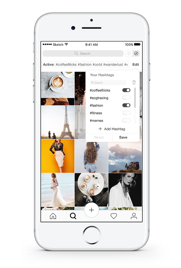
Experience number 2: Search mode and detection
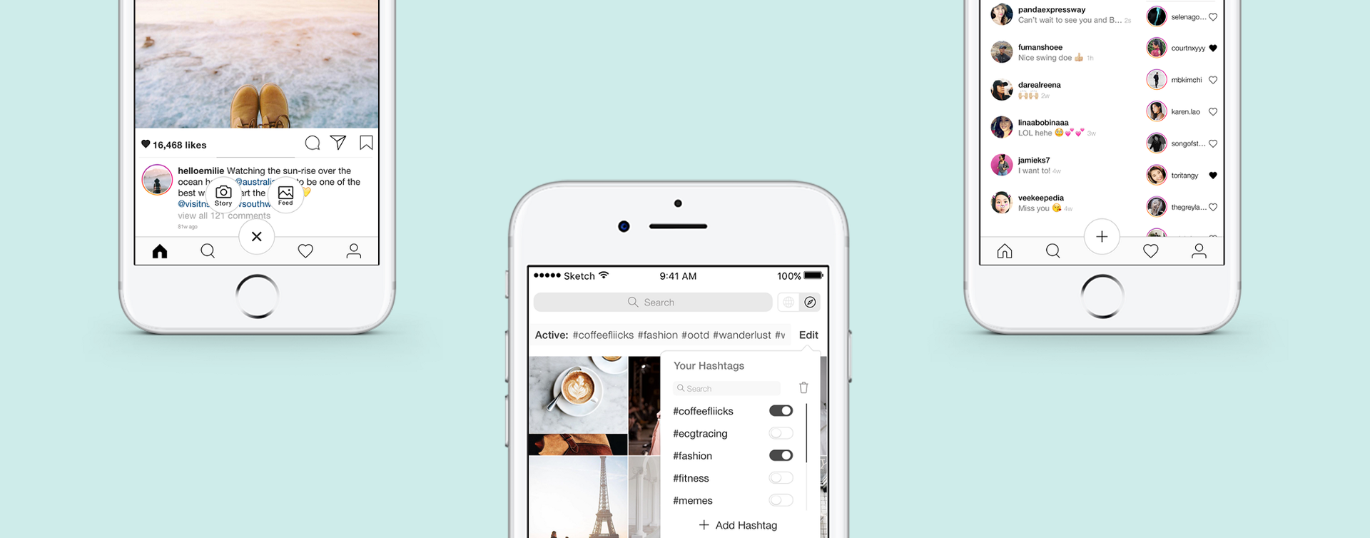
Now you have the opportunity both to search spontaneously, using the built-in Instagram algorithm, and “aiming” to search for content through your personal collection of saved hashtags. Therefore, Sam and Alex can simply plug in "#ecgtracing" or "#fitness" to see what's new on topics that interest them.
In my case, I probably would have tracked "#coffeefliicks" and "#dametravelers" to admire beautiful shots of coffee and various places. You can click on each hashtag in turn to open them one by one, and then pull down to refresh the page and see all the active hashtags at once. You also have the option of adding new hashtags by clicking, deleting old ones, or searching within your collection (and yes, they are all arranged in alphabetical order).
Experience number 3: Go to the DM and history
Only 42.5% of surveyed users used Instastories. Two of the main reasons why people did not use Instastories were that 1) they already have a Snapchat and 2) they constantly come across stories from people who are not particularly interesting to them.
To deal with the second reason, I implemented a new feature called “Stories From Your Favs”, so that people could use Instastories more meaningfully and purposefully.
Now stories about people you love, adore or admire are in the top of your tape so that you can always start watching on a positive note. That's what I understand - keep in touch!
You can easily remove or add people to your favorites list by clicking on the heart next to their nickname. (Is it really cute?)
For reference : Why did I decide to move the stories in the DM? First, I had to attach them somewhere, since I removed them from the news feed. Secondly, when you send a comment or photo in response to stories, they go straight to your inbox. Therefore, it makes sense to group Instastories and DM into one big fun package.
Another note: there is no lower navigation pane in the current inbox interface. Users will be able to return to the main page only if they know how to use the scrolling functions, and, as I mentioned above, only 20% of the surveyed users knew that scrolling to the left leads them to DM. With this in mind, I decided in this case to make the lower navigation static so that users are not lost.
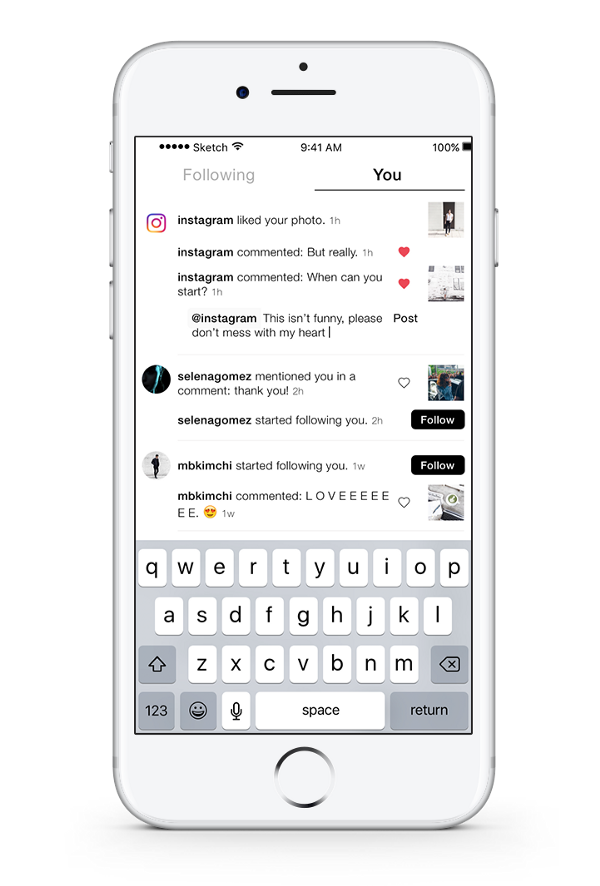
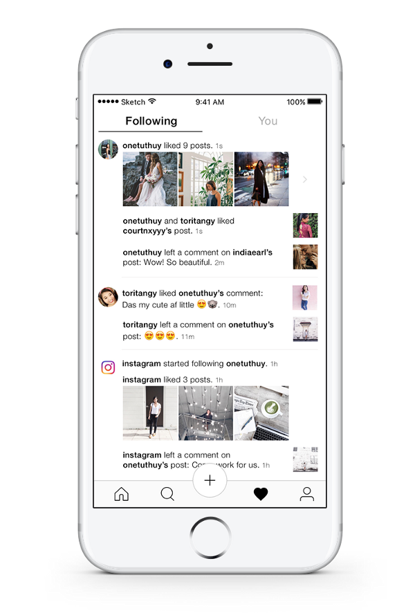
Experience # 4: Alerts and Profile
And here is the last spurt. On the pages with alerts and profile I wanted to leave more free space in the interface by grouping and combining similar elements.
In addition, you can now like and comment on posts directly from the alert page - just click on the username and hold (short press will transfer you to his profile). A long press activates the appearance of a comment field in which @ username will already be entered. All you have to do is type the text and click on the “Send” button.
It seemed to me that such a function would be very useful - because on Instagram it is sometimes so easy to drown in the comments under the post. What is his name there? Where is that comment? What was it all about?
Alerts
And the last interesting fact for today: only 35% of Instagram users I polled regularly view the posts of those people who are subscribed to. Leaving this function or removing turned out to be the most difficult decision that I had to take. I decided to save it all the same and limited myself to correcting the design so that the photos became larger and attracted more attention.
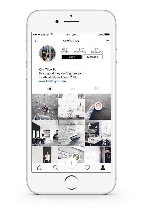
Profile
Frankly, I like the current Instagram design. To further enhance minimalism, I slightly changed the design of the icon, and also added free space to make it more similar to the interface of other pages.
Analyzing the work done
When I took on this project, I understood that this is a great opportunity to polish my designer skills. I'm just starting to learn the profession of a product designer: before this semester, I was engaged in medicine. Therefore, I decided that the best way to learn a bit is to rush headlong into some project, and then really figure it out.
Looking back, I must say that my expectations were lowered. Over the past two months, I was able to study not only what I planned to work with the project, but much more.
It seems to me that one of the most pleasant aspects of self-education and the creative process is that you yourself supervise. You find out what works and what does not work. You learn how to make faster, better, more efficient. You learn all sorts of things along the way in trying to learn what for the sake of what it all started.
And the most cool thing: there is no end to it. The learning process can continue indefinitely.
The design does not become simpler, it is getting better for you.
That's all. Thanks for attention! You can see the full interactive prototype here .
Source: https://habr.com/ru/post/323672/
All Articles