What do 90% forget when writing section headings for a landing page? What prices and discounts attract and help sell?

Surely they have seen dozens of landings with section headings in the form “How we work”, “What we are better than others”, “Work stages”, “Our benefits”, “About us”, “About the company”, etc. Without tears you will not look. Such headlines do not work at all. Because you are not writing a table of contents for reading, but a text with which you want to sell the product to your potential customers. For this you need to use the various schemes and techniques that we want to share.
What was in the previous parts of the Landing Page creation course:
Headers for single-page blocks and sections
The title of each block (“how we work”, “portfolio”, “cases”, “reviews” and others) encourages a person to read useful information about you or your offer. In this regard, all the headers carry some value for your customers. This is not a phrase for the sake of presence in the text.
Headers are written using certain techniques. They allow you to create the effect of the “Shugermann Slide”. Users are interested first. He is drawn into the reading and then simply can not stop, because it goes from one to another, or rather, he is led by headlines and subheadings. He is gradually immersed in what he can get by taking an absolutely simple step.
')
You are interested in the user and forced him to read all the information on a one-page? This means that he:
- receive confirmation of benefits;
- will close most of its objections;
- Increases the percentage of conversion, i.e., buys a product, orders a service, or performs any other action desired by the site owner.
Models for creating block headers
1. Call to action
There are certain models that help create block headers for any subject of the resource. The following are popular among them:
- a call to action + benefit + the essence of the section;
- a call to action + due to the fact / numbers + the essence of the section.
Examples:
Good
- Read why you like it.
- Choose the package that suits you
- See how easy it is to do it.
- Find out what is right for you
- Learn how our customers saved 10 million rubles.
- Find out which stars ordered the design from us
- Get a design like stars
- View the results of 300 customers
- Learn how to get a backpack as a gift.
poorly
- 3 advantages of our company ...
“Why are we better than others ...”
- We will provide what others do not give ...
- So on, that sort of thing ...
How it might look
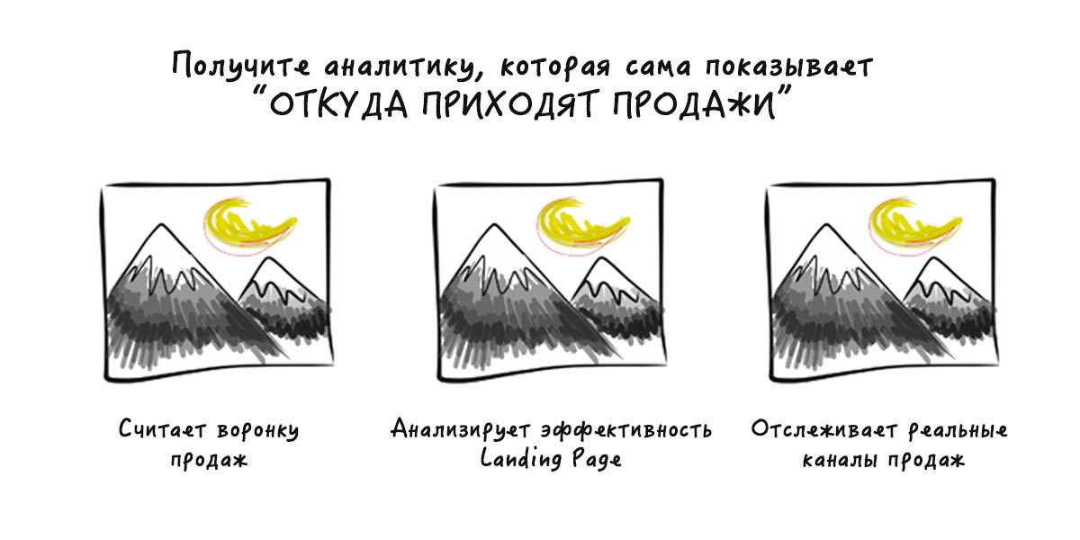
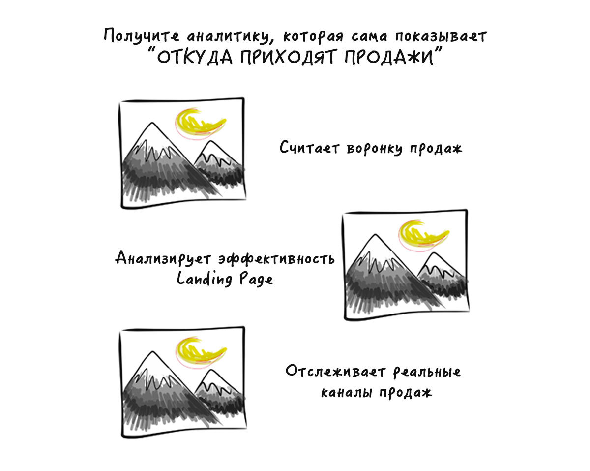
2. We confirm the benefits with the imperative
The header contains what the user will receive and due to what (immediately confirming with a fact / figure). The model is as follows:
- verb in the imperative mood + benefit + fact / figure.
Examples:
- Create a quality landing page on your own in 15 minutes without experience due to the unique technology
- The perfect wedding of your dreams, at the expense of a professional team with 5 years of experience
- Start speaking English on day 3 with our unique technology.
An example of how this might look like in landing format:

3. Ask a question
A question always allows you to project a situation on yourself, so we strive to answer it at the subconscious level.
Examples:
- Want to get passive income in 3 days?
- Do you know why celebrities order our photographers?
There is a good checklist for a block or a benefit.
Such a title is capable of:
- create a desire to buy / order / perform another action;
- prove the advantage of the product with a figure / fact;
- explain what the client will receive (always think about the client);
- inform about specific figures and facts, without water;
- contain an emotion that affects the second hemisphere.
Font size hierarchy
We remember that each block is an independent unit. He has his own title! Each benefit has its own title-benefit (in one word). They differ in font sizes. Descending fonts are distributed as follows:
- main title;
- header section;
- heading benefit;
- plain text.
Product card
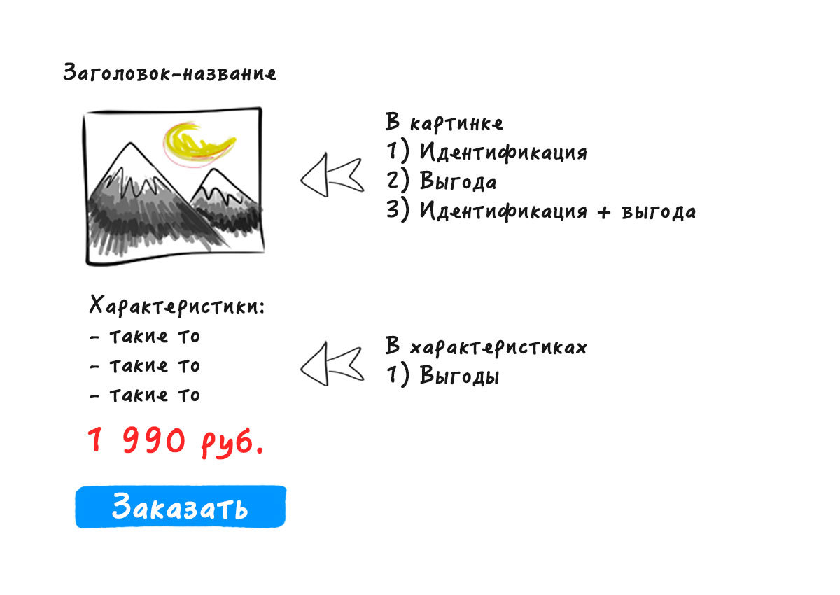
The product card is one of the important landing blocks. It is a brief description of the product, which traditionally contains:
1) title (product name);
2) image (confirmation of benefits);
3) identification (according to the catalog position);
4) characteristics (important, which will justify the benefits);
5) the actual benefits;
6) call to action;
7) cost (minimum or price fork);
8) restriction (per product).
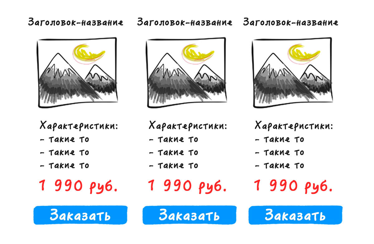
In width, place no more than 3-5 products (product or service). Ideally - 3 in a row. It is hard to perceive a larger number of people on a one-page page. The maximum number of products that are placed on one page is 30, and the most advantageous ones or those that are preferable to be implemented as quickly as possible (rotation is provided).
What to do if a lot of goods?
- Split the product into categories and offer characteristic categories.
- Show examples of the best product from the categories (1-N images).
Next, we offer to leave contacts in order to send more detailed information about the product, a full price list for all products / services from each category (we will help you to choose / advise, etc.).
An example of a block with a card of the 1st product.
An example of a block with 3 products cards.
An example of a block with cards 2 products.
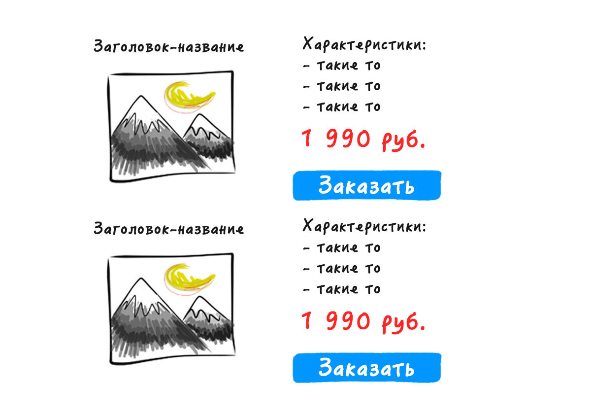
At the end of the article there is a link to examples, as it is implemented here.
How to lure numbers: discounts and prices
Note that people do not value things in absolute terms. They are accustomed to perceive anything in relation to something else. For example, the novelty is compared with previous experience.
Against the background of comparisons, a person has a belief that it is expensive or cheap. Such is the psychology of our analytical thinking. The most correct answer to the client's question “why do you have it so expensive” - “compared to what”?
Imagine: I offer you a movie ticket for 2,000 rubles. You are in shock. You say: this is incredibly expensive, because you go to the movies and you know the cost of tickets for even the most popular blockbusters.
If I offer you to fly into space for 100,000 rubles, how will you respond to this offer? You say it is expensive or cheap? You can not appreciate, because you have nothing to compare!
More real comparison:
- the price of a TV in one store is 20,000 rubles. and with a discount - 15 000 rubles. (saving 5 000 r.);
- in another store you are offered the same TV, but for 15,500 rubles, and with a discount - for just 14,900 rubles. (saving 600 rub.).
Feel the difference? What offer you seem more attractive? 75% of the surveyed audience will choose the first. Why? It is more profitable, because the discount is more significant. They do not know that there is another offer somewhere, or they don’t want to dig deeper.
The human brain is sensitive to large and small numbers. For evidence, refer to your practice. Remember: you pay 200 rubles for something. In another place you are offered the same thing for 50 rubles more. Perceptible? Of course!
You buy something for 100,000 rubles. Is an increase of 100 rubles noticeable for you? You won't even react much to 900 rubles!
Discount or Act 3000
Discounts of up to 3,000 rubles and more than 3,000 rubles are also significantly different. In the first case, a percentage discount will be more attractive to a potential consumer.
Put yourself in the place of a representative of the target audience and answer the question: what is more profitable, a discount of 25% or 750 rubles? Now imagine that you are selling a product or service that costs more than 30 thousand rubles. In this case, in rubles will be more noticeable than a percentage.
Feel the difference: only 10% or as much as 3,000 rubles!
Justify the price indicated
Low prices and discounts can not hang in the air. They need justification, otherwise you just will not believe. The potential consumer will decide that you offer him a low-quality product, and in most cases the reason is not important and the price is not important.
It is necessary to convince by fact or logically.
Examples of persuasion:
- We have such a price, because there are professionals with a wealth of experience.
- We have discounts today, because our company is one year old.
- We have such a price, because we give a guarantee on the result.
- We have such a price, because that's that.
Stability of the stated price
The price that is put on the site can not change when paying and calling the company. Do you accept online payments? Take the commission, increase the initial price, but the client must pay exactly the amount he saw on the site. So you can increase the conversion rate and reduce the bounce rate.
Provided paid delivery? It is better to increase the price of the product, including the delivery in it, but indicate that the delivery is free. It worked and continues to work win-win! Such is the human and consumer psychology.
Personally, I can not pay for delivery if the goods cost more than 5,000 rubles, and you?
PS Team Bloxy , we are not trying to open America, we just want to help simplify the creation and speed up the development of landing pages and small online stores. Make the process of launching projects faster and cheaper.
By the way, who cares how we implemented the product cards at home, examples can be viewed by reference.
Source: https://habr.com/ru/post/323544/
All Articles