Algorithm for creating multipage web forms in MyTaskHelper
Let's make this form using our service MyTaskHelper . Go to the menu "Forms" → "Create a new form" → "Create a form from scratch." Here we also enter the necessary name for the future web form. We have this "Order goods with delivery" (Fig. 1).
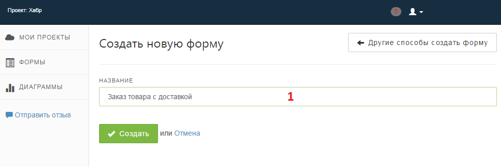
Fig. one
Add the required fields to the form. We will have it:
- Full name (data type - text string);
- Address (data type - section);
- Region (field type - subjects of the Russian Federation);
- Locality (field type - text string);
- Street, house number, entrance number, apartment number (field type - text line);
- Index (field type - integer);
- Coordinates for feedback (data type - section)
- Contact phone (field type - text string);
- Email for communication (field type - Email address).
Adding fields, do not forget to specify validation options. We have this "can not be empty."
- Choose a convenient delivery method (field type - radio button, in the list of values we indicate options, for example, self-pickup at Kutuzovskoye shosse, 36, office 18, delivery by courier within Moscow Ring Road (free), delivery by courier to MO, Russian Post, international transport company);
- Choose a convenient payment method (field type - radio button, in the list of values we indicate options, for example, cash on delivery, transfer to card, payment QIWI, payment WebMoney, payment Yandex Money, payment in cash to the courier);
- Comments to the order (field type - multi-line text).
- Order status (field type - radio button) - with the values “Accepted for execution”, “Prepared for delivery”, “Transferred to the delivery department”, “Delivered”. We will need this field in the future, so now we will not dwell on it. The only thing that remains is the need to hide the last field on the form so that customers who leave the application simply do not see it. This is done as follows: go to the "Widgets" menu, the "Form" section, the "Fields" tab, and here, in front of the "Order Status field, uncheck". Thus, the required field is hidden and is not displayed on the web form.
A preview of the form (Fig. 2) shows that the module is quite large and does not interfere with breaking it into several pages. For this, MTH has a special type of field, namely “Page break” (it is located on the tab with delimiters).

Fig. 2
To give our online order web form a more pleasant appearance, after the “Index”, “E-mail for communication”, “Choose a convenient delivery method” and “Choose a convenient payment method” fields, we embed such a separator (“Page break”) .
After setting up a web form design, we get a result that is no longer embarrassing to embed in any site:
Fig. 3
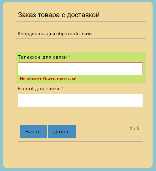
Fig. four
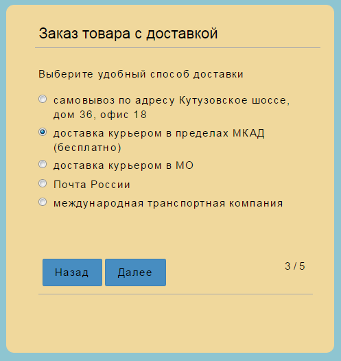
Fig. five
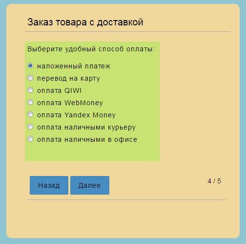
Fig. 6
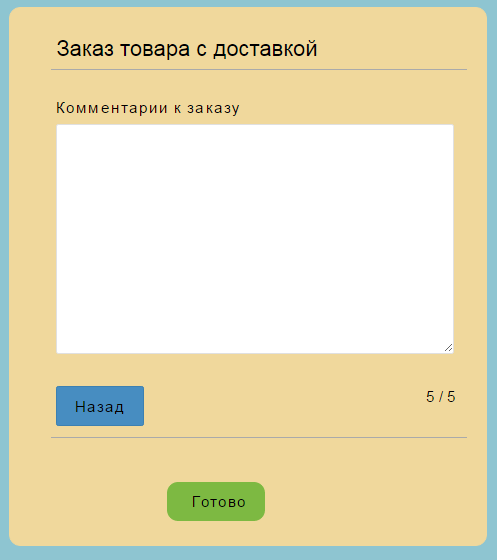
Fig. 7
Such a cute 5-page form turned out :) And for those who wish to test the resulting module personally, I leave a link to the newly created form: tynts .
In the following publications I will talk about the rules for the fields, with the help of which the product order form described above will become even more interesting and functional.
And look at the material that represents the MTH as a whole, it is possible in this habratopic .
')
Source: https://habr.com/ru/post/323368/
All Articles