Interactive UX prototype: parsing on a real example
An article on how to get user experience at the design stage. Showing it on the current version of the working UX prototype. Created in the program UXPin, look for the link only on the desktop, mobile version separately.
On his example in detail: about terminology than an interactive prototype is better than the traditional (10 points) how to use it + a few conclusions.
But, most importantly, he gives the one desired UX.
')
The site can be assembled without content and design. How? Make a UX prototype. These will be html-page templates with all the links. It will look realistic: on all pages a clickable logo, working menu items, a full structure (sections, steps), all working buttons, forms, etc.
Put it on the web so that you can open in the browser and send links to each other. Open this prototype of the site, try to use it on different devices, that is, to test.
Such a prototype is called differently: complete , accurate , interactive , etc. For example, Nielsen Norman Group calls it “ clickable ”. The name is closer to me according to the purpose: an interactive UX prototype (or just a UX prototype). After all, this approach allows you to get the real UX. "User experience" translation is incorrect. "Experiencing" is not just an experience, but something emotional, the user experiencing interaction with the product.
Sets of graphic thumbnails or flowcharts do not provide this. Namely, such sets we often see under the name of the prototype. Let's call it traditional.
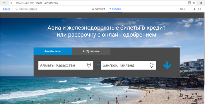
1) Accents and Priorities
You can control the user's attention by creating accents:
And during the prototype test, test these accents by observing user behavior and conducting polls. Also, having full navigation, we can create a heat map of each template, estimate clicks and transitions. Further, by changing the accents, we will change the user's movement, make this process manageable at the design stage.
Example: Picture above. We show on the website of air tickets first of all in the form of the UTP text - sale of tickets on credit. If the test results show that the decision is unsuccessful - move it down.
2) Adaptive or fixed? Workspace size
For each site there is a question of the size of the workspace (content and navigation). And if you plan to be adaptive, then from what to what size it should drag. A prototype with the exact size of the blocks and their correct location will help determine this issue before the designer does it.
Example: We see what the optimal page width is and what to show on monitors that are wider (background image).
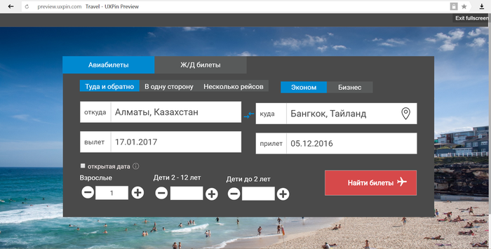
3) Site navigation elements + filters, lists, etc.
Filling the menu with real names of items will allow you to estimate its size and how harmoniously they look. Page construction and modeling of filter development (for example, a list of products) will show how effective they are and what specific it makes sense to include in the functionality (by price, novelty, popularity, etc.). The principle of switching between filters (list, buttons, etc.) will also be worked out for convenience.
A separate mention is the CTA-button.
Its size, location, content (call-to-action text), change when hovering and clicking. All this can and should be defined precisely in the prototype. with it, we can give testers the opportunity to interact (click), but not just in the design picture. And this is very important, especially for commercial projects.

Example: CTA-button with real text and simulation of interaction moments (color change on hover - picture on the right).
4) Preloaders and content uploading
In the event that a form or page requires content uploading (by a separate button or scrolling), we can simulate this by connecting a virtual preloader and changing the page after loading. So we can understand how successful this solution is and whether it is worth making a simple transition to another page.

Example: Preloader on the ticket search page. The prototype also contains 10 seconds of its processing time, which is close to the actual search.
5) Content and site structure
The use of real content (not in full, of course, but as part of the prototype) significantly reduces possible changes in both design and functionality.
To do this, you can put several real-life news, product cards and content pages with design in the sections. Then the prototype will be close to the real site, but will contain no more than 20-30 pages.
6) Pictures, their size and quality
Standard situation: a rectangle is depicted on the site of a future picture. Such a unit not only does not form the experience of interaction (no picture), but even the interface. It does not give an understanding of how this image affects accents, how it supports text, etc. But, most importantly, we cannot understand the size of a picture (or its preview) that can be used later on the site.
Conclusion: In the prototype it is good to use real images (for example, from the customer) and without their improvement by the designer i.e. simulate future operation.
Also an important point in this paragraph is the size of advertising banners. They are well defined immediately and use the standards of advertising systems. So, you can take a real banner or its code and insert it into the prototype.
Example: A background image is inserted in the demonstration prototype. If it shows itself well, it will be used on the site. Its size, weight and load time are also close to operational, but can be changed during the test.
7) Service messages
This is something that is often neglected during the prototyping stage. And after all, the system’s response options and the user's further reaction to them (refusal, return to the main one, transition to help) form the UX-picture. No other way.
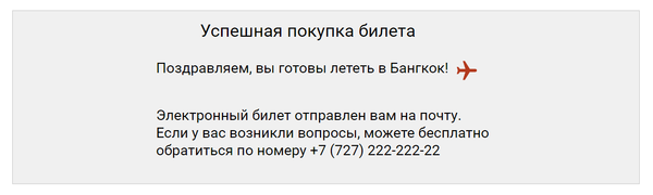
Example: System responses in the prototype at the last last stage.
8) Forms and input fields
Working with forms we can define:
Checking the duration and complexity of filling out forms on the test, we get the most valuable information from testers and can immediately correct them (for example, refuse to make a field mandatory).
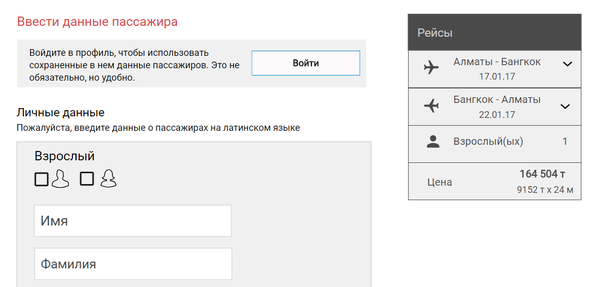
Example: Data entry form for buying tickets. Also simulated the possibility of logging in place and the choice of passport data from past purchases.
9) Tactility and mobility
For hybrid and adaptive sites, as well as mobile versions, we can check how convenient elements are by tap, their size, how standard they are for an iOS or Android user. And all this will be checked on different mobile devices in a window of different browsers. With screen rotation, scrolling, etc. Perhaps of all the points this one gives the most true experience.
10) Technical capabilities
Each CMS under which the site or external system will work (integration) has its own characteristics, technical limitations. The opportunity to try a really working prototype will allow people who know these systems well (programmers, partners) to quickly assess where there may be bottlenecks and what will be difficult or impossible to implement.

Example: Open Date Checkbox. When pressed, a special form can be displayed with dates on the second page. Employees of the Amadeos partner system can assess how feasible this scheme is.
Give designers and programmers and continue to bring it in parallel with the development. A prototype can be a place for a consolidated view of a project.
You can also conduct several versions of the prototype at once, if there are disputes over the options for a future product.
The prototype and MVP (minimum product version) have different tasks. The minimum version of the product can be a simple landing page with an application form. This is enough to check the business model (buy traffic, collect bids, calculate the margin from them). Even in our case with air tickets it also works. That is, MVP does not require a prototype and can be done before or in parallel with it.
Either MVP will be the first version of the product created on the basis of the prototype, but this is a long way.
The role of the designer, as an interface builder, with this approach to the prototype is reduced. But:
TK in this case is placed on one page with the main technical introductory, all the details in the prototype.
The UX prototype can be given to a focus group of acquaintances (mother test), for professional testing, in a usability laboratory, put it in public access for discussion with the audience, insert web viewer codes and observe user behavior. The choice is wide and there are many possibilities. Perhaps, only full-fledged AB tests are not done, the prototype is not suitable for real traffic (unlike MVP).
For me, one requirement is that the system can create a convenient set of web pages for further work with it through a browser. And whether it is Akshura, Pensil Project, it does not matter to whom in which program it is more convenient. Mobile application developers are lucky, they have a handy tool that simulates almost the full functionality and appearance - proto.io
The UX prototype works well on small projects as well as medium size. On the little ones, they show themselves even better, fewer approvals for its creation.
Large companies usually have their own development philosophy, taking as their basis a water-pool, edgail or something else. Which is better is the subject of big controversy among the developers (hi project managers). And what place in it the prototype - respectively. I do not dare to comment on this and participate in such disputes.
Creating an interactive UX prototype is time consuming. But it reduces the total time and labor resources of the project at the expense of the following points:
But, most importantly, it gives a real UX and drive! Everything that we love so much in our projects.
Application:
A prototype for a ticketing system site. They illustrated the article, it is fully working. Created by Sanjar Surshanov under my supervision. We cannot advertise the company, therefore the logo has been replaced with a house icon.
See also: How to get maximum revenue from advertising systems on your website .
On his example in detail: about terminology than an interactive prototype is better than the traditional (10 points) how to use it + a few conclusions.
What gives a UX prototype?
- Significantly reduces development resources (20–40% less software and design improvements and changes).
- Reduces the number of product versions (beta may already be a 3-4 version).
- Reduces the number of design errors.
- It enables the team, partners and investors to quickly show how the product will look.
But, most importantly, he gives the one desired UX.
')
What is this beast?
The site can be assembled without content and design. How? Make a UX prototype. These will be html-page templates with all the links. It will look realistic: on all pages a clickable logo, working menu items, a full structure (sections, steps), all working buttons, forms, etc.
Put it on the web so that you can open in the browser and send links to each other. Open this prototype of the site, try to use it on different devices, that is, to test.
Such a prototype is called differently: complete , accurate , interactive , etc. For example, Nielsen Norman Group calls it “ clickable ”. The name is closer to me according to the purpose: an interactive UX prototype (or just a UX prototype). After all, this approach allows you to get the real UX. "User experience" translation is incorrect. "Experiencing" is not just an experience, but something emotional, the user experiencing interaction with the product.
Sets of graphic thumbnails or flowcharts do not provide this. Namely, such sets we often see under the name of the prototype. Let's call it traditional.
What is the difference between the UX prototype and the traditional
1) Accents and Priorities
You can control the user's attention by creating accents:
- the size of the elements;
- color;
- activity encouraging texts;
And during the prototype test, test these accents by observing user behavior and conducting polls. Also, having full navigation, we can create a heat map of each template, estimate clicks and transitions. Further, by changing the accents, we will change the user's movement, make this process manageable at the design stage.
Example: Picture above. We show on the website of air tickets first of all in the form of the UTP text - sale of tickets on credit. If the test results show that the decision is unsuccessful - move it down.
2) Adaptive or fixed? Workspace size
For each site there is a question of the size of the workspace (content and navigation). And if you plan to be adaptive, then from what to what size it should drag. A prototype with the exact size of the blocks and their correct location will help determine this issue before the designer does it.
Example: We see what the optimal page width is and what to show on monitors that are wider (background image).
3) Site navigation elements + filters, lists, etc.
Filling the menu with real names of items will allow you to estimate its size and how harmoniously they look. Page construction and modeling of filter development (for example, a list of products) will show how effective they are and what specific it makes sense to include in the functionality (by price, novelty, popularity, etc.). The principle of switching between filters (list, buttons, etc.) will also be worked out for convenience.
A separate mention is the CTA-button.
Its size, location, content (call-to-action text), change when hovering and clicking. All this can and should be defined precisely in the prototype. with it, we can give testers the opportunity to interact (click), but not just in the design picture. And this is very important, especially for commercial projects.
Example: CTA-button with real text and simulation of interaction moments (color change on hover - picture on the right).
4) Preloaders and content uploading
In the event that a form or page requires content uploading (by a separate button or scrolling), we can simulate this by connecting a virtual preloader and changing the page after loading. So we can understand how successful this solution is and whether it is worth making a simple transition to another page.
Example: Preloader on the ticket search page. The prototype also contains 10 seconds of its processing time, which is close to the actual search.
5) Content and site structure
The use of real content (not in full, of course, but as part of the prototype) significantly reduces possible changes in both design and functionality.
To do this, you can put several real-life news, product cards and content pages with design in the sections. Then the prototype will be close to the real site, but will contain no more than 20-30 pages.
6) Pictures, their size and quality
Standard situation: a rectangle is depicted on the site of a future picture. Such a unit not only does not form the experience of interaction (no picture), but even the interface. It does not give an understanding of how this image affects accents, how it supports text, etc. But, most importantly, we cannot understand the size of a picture (or its preview) that can be used later on the site.
Conclusion: In the prototype it is good to use real images (for example, from the customer) and without their improvement by the designer i.e. simulate future operation.
Also an important point in this paragraph is the size of advertising banners. They are well defined immediately and use the standards of advertising systems. So, you can take a real banner or its code and insert it into the prototype.
Example: A background image is inserted in the demonstration prototype. If it shows itself well, it will be used on the site. Its size, weight and load time are also close to operational, but can be changed during the test.
7) Service messages
This is something that is often neglected during the prototyping stage. And after all, the system’s response options and the user's further reaction to them (refusal, return to the main one, transition to help) form the UX-picture. No other way.
Example: System responses in the prototype at the last last stage.
8) Forms and input fields
Working with forms we can define:
- Mandatory data entry in the field;
- template for input (text, date, numbers, number of characters);
- auxiliary elements (default fill, subscript, help when you hover the cursor);
- division into several stages.
Checking the duration and complexity of filling out forms on the test, we get the most valuable information from testers and can immediately correct them (for example, refuse to make a field mandatory).
Example: Data entry form for buying tickets. Also simulated the possibility of logging in place and the choice of passport data from past purchases.
9) Tactility and mobility
For hybrid and adaptive sites, as well as mobile versions, we can check how convenient elements are by tap, their size, how standard they are for an iOS or Android user. And all this will be checked on different mobile devices in a window of different browsers. With screen rotation, scrolling, etc. Perhaps of all the points this one gives the most true experience.
10) Technical capabilities
Each CMS under which the site or external system will work (integration) has its own characteristics, technical limitations. The opportunity to try a really working prototype will allow people who know these systems well (programmers, partners) to quickly assess where there may be bottlenecks and what will be difficult or impossible to implement.
Example: Open Date Checkbox. When pressed, a special form can be displayed with dates on the second page. Employees of the Amadeos partner system can assess how feasible this scheme is.
How to continue to work with the UX-prototype?
Give designers and programmers and continue to bring it in parallel with the development. A prototype can be a place for a consolidated view of a project.
You can also conduct several versions of the prototype at once, if there are disputes over the options for a future product.
What will we do with MVP?
The prototype and MVP (minimum product version) have different tasks. The minimum version of the product can be a simple landing page with an application form. This is enough to check the business model (buy traffic, collect bids, calculate the margin from them). Even in our case with air tickets it also works. That is, MVP does not require a prototype and can be done before or in parallel with it.
Either MVP will be the first version of the product created on the basis of the prototype, but this is a long way.
How does the role of the designer, programmers and TK?
The role of the designer, as an interface builder, with this approach to the prototype is reduced. But:
- no one bothers him to bring to the design and it will be right. It is also good to attract a programmer-designer.
- the designer will only say thank you, when a myriad of small design refinements will be reduced that will get any normal person.
TK in this case is placed on one page with the main technical introductory, all the details in the prototype.
How to get feedback?
The UX prototype can be given to a focus group of acquaintances (mother test), for professional testing, in a usability laboratory, put it in public access for discussion with the audience, insert web viewer codes and observe user behavior. The choice is wide and there are many possibilities. Perhaps, only full-fledged AB tests are not done, the prototype is not suitable for real traffic (unlike MVP).
Systems for creating UX prototypes
For me, one requirement is that the system can create a convenient set of web pages for further work with it through a browser. And whether it is Akshura, Pensil Project, it does not matter to whom in which program it is more convenient. Mobile application developers are lucky, they have a handy tool that simulates almost the full functionality and appearance - proto.io
What projects are suitable for?
The UX prototype works well on small projects as well as medium size. On the little ones, they show themselves even better, fewer approvals for its creation.
Large companies usually have their own development philosophy, taking as their basis a water-pool, edgail or something else. Which is better is the subject of big controversy among the developers (hi project managers). And what place in it the prototype - respectively. I do not dare to comment on this and participate in such disputes.
Total
Creating an interactive UX prototype is time consuming. But it reduces the total time and labor resources of the project at the expense of the following points:
- Allows you to identify difficulties (with content, coordination, terminology, functionality, etc.) at the initial stage and solve them in parallel with other processes.
- Gives quick feedback, based on which you can make adjustments without a designer and programmer.
- It helps to immediately determine the important points in the interfaces and configuration. Fewer branches and product versions.
But, most importantly, it gives a real UX and drive! Everything that we love so much in our projects.
Application:
A prototype for a ticketing system site. They illustrated the article, it is fully working. Created by Sanjar Surshanov under my supervision. We cannot advertise the company, therefore the logo has been replaced with a house icon.
See also: How to get maximum revenue from advertising systems on your website .
Source: https://habr.com/ru/post/323156/
All Articles