Browser frontend optimization

Optimization is necessary to increase the speed of loading and operation of sites, which ultimately increases user satisfaction.
- From the point of view of User Experience (UX), the frontend should provide fast loading and operation of web pages.
- And from the point of view of the Developer Experience (DX), we want the front end to work fast too, be easy to use, and generally be an example to follow.
All this makes users and developers happier, and at the same time significantly improves the ranking of sites by search engines. For example, Google pays special attention to optimizing the frontend. If you have struggled long enough to get your site to earn more points in Google Pagespeed Insights , then we hope this article will help you better understand what all this is for and what is the variety of frontend optimization strategies.
Prehistory
Recently, our entire development team began using ReactJS. It made me think about how we need to develop our frontend. Soon I realized that in our approach the browser should play one of the main roles.
Description of the approach
First of all
We do not have the ability to control the browser or strongly influence its behavior. But having understood how it works, we can optimize the code transmitted to it. Fortunately, browsers are built on fairly stable and well-documented principles that are unlikely to change much in the long run.
So we can confidently set goals in front of which we will strive to achieve.
Secondly
Although browsers are not in our power, we can manage code, stack, architecture, and patterns. They change faster and provide us with a wider range of possibilities.
Further
I started by thinking about how I see the code, which should be our team. And based on this vision, I formulated an opinion on how to approach the writing of code. In this article we will consider all the necessary aspects of the browser.
What the browser does
Let's look at the work of the browser on the example of execution of a simple code:
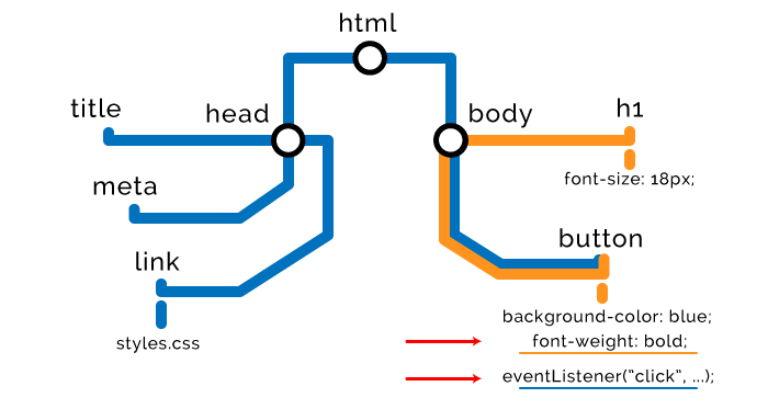
<!DOCTYPE html> <html> <head> <title>The "Click the button" page</title> <meta charset="UTF-8"> <link rel="stylesheet" href="styles.css" /> </head> <body> <h1> Click the button. </h1> <button type="button">Click me</button> <script> var button = document.querySelector("button"); button.style.fontWeight = "bold"; button.addEventListener("click", function () { alert("Well done."); }); </script> </body> </html> How to render a page in the browser
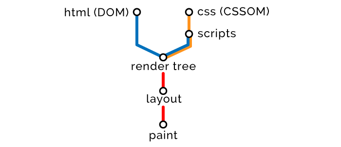
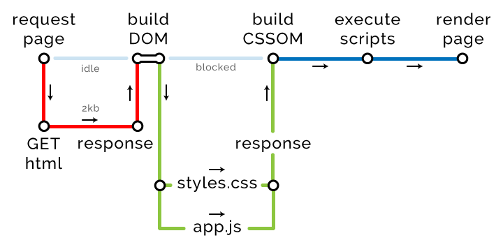
After receiving the HTML code, the browser parses the document and converts it into a presentation that is clear to itself. It is universal for all browsers and is defined by the HTML5 DOM specification . Further, the browser performs a series of actions, after which a web page is displayed on the screen. In general terms, the procedure is as follows:
- Based on the resulting HTML, a DOM tree (Document Object Model) is built.
- Based on the resulting CSS, a CSSOM tree (CSS Object Model) is built.
- With reference to built DOM and CSSOM, scripts are executed.
- Based on DOM and CSSOM, a rendering tree is formed.
- Based on the rendering tree, a page layout is generated indicating the size and coordinates of all elements.
- The page is rendered - displayed on the screen.
Step One: HTML
The browser reads the markup from top to bottom and converts the nodes of the DOM tree.

HTML delivery optimization strategies
- Styles - first of all, scripts - at the last.
Of course, there are exceptions to any rule, but in general, you need to load styles as early as possible, and scripts as late as possible. Since we need to complete HTML and CSS parsing before executing the scripts, we deliver the styles early in order to process them before the time comes to compile and execute the scripts.
Below we look at how you can customize the delivery of styles and scripts as part of optimization.
- Minification and compression.
These procedures apply to all data: HTML, CSS, JavaScript, images, and other resources. When minifying, we delete “redundant” characters: spaces, comments, semicolons, and so on. When compressing, duplicate pieces of data in the code and resources are replaced with pointers to the “original”, original, instances of the pieces. We will actively use file compression, and the client part will be responsible for unpacking them.
The use of minification and compression will reduce the amount of data by about 80–90% .
- Increased availability.
In this case, it’s not about speeding up the page load, but about taking care of users with a slow connection. Your pages should be accessible to all users, regardless of the speed of their channels! For page elements, use ARIA attributes, provide images with text descriptions using the alt tag and use other means .
To understand what else can be done on the page to increase its availability, you will be helped by tools like WAVE .
Stage Two: CSS
When detecting style nodes (external, internal or embedded styles), the browser stops rendering DOM and builds a CSSOM tree based on these nodes. Therefore, they say about CSS that it blocks rendering. Here are some of the advantages and disadvantages of different types of styles .
// <link rel="stylesheet" href="styles.css"> // <style> h1 { font-size: 18px; } </style> // <button style="background-color: blue;">Click me</button> CSSOM nodes are created in the same way as DOM nodes. They will be merged later, and at this stage it looks like this:

Building a CSSOM tree blocks the page rendering process. Therefore, within the rendering tree, it is necessary to load styles as early as possible and minimize their size as much as possible. Where this will be effective, it is necessary to apply delayed loading of styles.
CSS delivery optimization strategies
- Use of media attributes .
With the help of media attributes, we determine the conditions that must be met to load certain styles. For example, media attributes allow you to load different styles depending on the screen resolution on the client device, and so on.
Today, mobile devices are much inferior in performance to "full-fledged" computers, so to ensure good performance and download speed, we must transfer them data as little as possible. For example, using media attributes, you can make it so that styles for mobile devices will be transmitted first, and then for desktops and laptops. With this approach, styles will be loaded without blocking the loading of the page itself.
// CSS . // media="all" — . , -. <link rel="stylesheet" href="mobile-styles.css" media="all"> // CSS . <link rel="stylesheet" href="desktop-styles.css" media="min-width: 590px"> // - CSS (print view). <style> @media print { img { display: none; } } </style> - Postponed loading of CSS.
If you have styles that can be painlessly loaded and processed after the first useful screen is displayed, then using the script you can postpone their loading. These can be styles for data that are located below the first useful screen, that is, to see them, you need to scroll through the page. You can also postpone the loading of styles for data, the correctness of which is not critical until the page begins to respond to user actions, that is, it does not become interactive.
<html> <head> <link rel="stylesheet" href="main.css"> </head> <body> <div class="main"> Important above the fold content. </div> <div class="secondary"> Below the fold content. Stuff you won't see until after page loads and you scroll down. </div> <script> window.onload = function () { // load secondary.css } </script> </body> </html> Examples of implementing deferred loading of styles:
https://jakearchibald.com/2016/link-in-body/
https://www.giftofspeed.com/defer-loading-css/
- Decreased specificity.
The high level of specificity of styles has two obvious drawbacks. Firstly, we have to transfer more data related to elements and styles over the network, and secondly, the load on client devices that have to process all this increases.
// == .header .nav .menu .link a.navItem { font-size: 18px; } // == a.navItem { font-size: 18px; } - Delivery is only necessary.
For many, this will be obvious, but still. If you have at least some experience developing the frontend, then you probably know that one of the key problems of CSS is the unpredictable increase in the size of styles. They seem to be specially designed to grow constantly. Therefore, it is recommended to use tools like UnCSS , which help to remove all unnecessary from CSS. There are a lot of web tools.
Stage Three: JavaScript
The browser builds DOM / CSSOM nodes until it encounters external or internal JavaScript scripts.
// <script src="app.js"></script> // <script> alert("Oh, hello"); </script> The fact is that the script may want to access previous HTML and styles, or even convert them. Therefore, the browser suspends the parsing of nodes, completes the construction of the CSSOM tree, executes the script, and then resumes the parsing. Therefore, it is said that JavaScript blocks parsing.
Each browser is equipped with a preloading scanner, which checks if the scripts are mentioned in the DOM, and preloads them. At the same time, the loaded scripts will be executed in the prescribed order, but only after the previous CSS nodes are formed. Suppose we have such a script:
var button = document.querySelector("button"); button.style.fontWeight = "bold"; button.addEventListener("click", function () { alert("Well done."); }); This script will have this effect on our DOM and CSSOM:
JavaScript delivery optimization strategies
Optimization of work with scripts is one of the main tasks, the solution of which on most sites leaves much to be desired.
- Asynchronous loading scripts.
If you assign the async attribute to the script, the browser will load it in another thread with a lower priority without blocking the page load. As soon as the script is loaded, the browser will execute it.
<script src="async-script.js" async></script> Since we do not know when exactly the script will be executed, two situations are possible:
- The script runs a long time after the page has finished loading. The situation is not very good if the inoperability of the script can affect the user experience of your product.
- The script runs until the page loads. In this case, it may simply not get access to the necessary elements of DOM / CSSOM, which is fraught with failure.
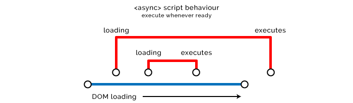
The async attribute is recommended for use with scripts that do not affect the DOM or CSSOM. Also, asynchronous loading is ideal for external scripts that do not depend on code and are non-critical for UX. Vivid examples: analytics and tracking scripts, although this is not an exhaustive list at all.
- Delayed loading of scripts.
The defer attribute defer similar to async in the sense that using it does not block page loading. But the scripts will be executed in the order of appearance in the code only after the HTML parsing is completed.

This is a good solution for scripts that affect the rendering tree, but non-critical for downloading content for the first meaningful screen, and for which work does not need to run the preceding scripts.
<script src="defer-script.js" defer></script> Another good use case for delayed load strategies. You can also use something like addEventListener . Useful thread on the topic.
// DOM , , . window.onload = function () { }; // DOM, . document.onload = function () { }; // jQuery $(document).ready(function () { }); Unfortunately, async and defer useless in the case of embedded scripts, because by default browsers compile and execute them as soon as they are encountered in the code. If the script is embedded in HTML, then it starts immediately, and applying the async and defer to external resources allows us to abstract or delay the transfer of scripts to DOM / CSSOM.
- Clone nodes before subsequent manipulations.
This approach can be resorted to only under one condition: if the introduction of numerous changes in the DOM leads to undesirable results. In this case, first try to clone the entire DOM node, make the necessary changes to the clone, and then replace the original clone. So you will avoid numerous redrawing and reduce the load on the processor and memory. In addition, cloning will protect you from FOUC (Flashes of Unstyled Content) and making spontaneous changes.
// . var element = document.querySelector(".my-node"); var elementClone = element.cloneNode(true); // (true) , (false) elementClone.textContent = "I've been manipulated..."; elementClone.children[0].textContent = "...efficiently!"; elementClone.style.backgroundColor = "green"; element.parentNode.replaceChild(elementClone, element); But remember that when you clone a node, you do not clone event listeners. Although in some cases this may be the goal. Once, when we did not have jQuery-methods .on() and .off() , and listeners did not know how to call named functions, we used this approach to reset listeners.
- Using Preload / Prefetch / Prerender / Preconnect attributes.
These attributes have “talking” names, so it makes no sense to explain what they are doing. But they appeared relatively recently and are not yet supported by all browsers. For this reason, most developers are now hardly interested in these attributes. You can read more about them here:
https://css-tricks.com/prefetching-preloading-prebrowsing/
https://www.keycdn.com/blog/resource-hints/
Stage Four: Tree Rendering
All nodes are read - you can combine DOM and CSSOM. The browser proceeds to the formation of a rendering tree. Metaphorically speaking, nodes are “words”, object models are “sentences”, and tree is “page”.

Fifth stage: page layout
After the rendering tree is formed, the browser proceeds to the layout. To do this, it determines the size and coordinates of all elements on the page.

Sixth Stage: Display
The last stage, the page appears on the screen.

The total duration of all these stages is from tenths of a second to several seconds. And we need to make the pages load even faster.
If any JavaScript makes a change to any part of the page, then the steps of forming the rendering tree and layout are performed again and then displayed on the screen. Fortunately, modern browsers can redraw not the whole page, but only the changed part. But we cannot rely on them when it comes to performance.
However, it is obvious that JavaScript is largely dependent on events on the client side. We need him to manipulate our DOM, that's what he will do. The main thing - to prevent or reduce unwanted side effects.
By the way, I recommend to familiarize yourself with the performance of Tali Garciel. It was in 2012, but the information presented in it is still relevant. You can also read a great browser tutorial .
For a more detailed study of the issue, study the HTML5 specification .
How browsers make network calls
Let's now talk about how best to transfer the data needed to render the page to the browser.
When the browser makes a request to the URL, the server sends some HTML code in response. Let's go from simple to complex. Suppose this is the HTML code of our page:
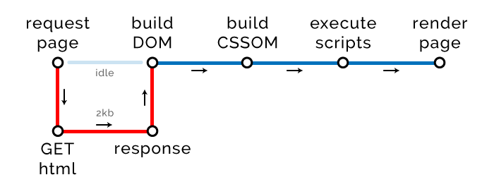
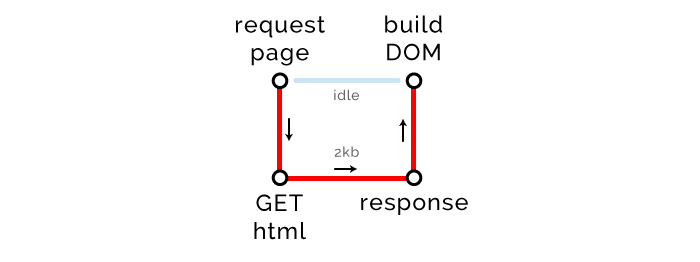
<!DOCTYPE html> <html> <head> <title>The "Click the button" page</title> </head> <body> <h1> Button under construction... </h1> </body> </html> There is such a thing as “Critical Rendering Path” (CRP). It characterizes the number of procedures required to render a page. At the moment, our CRP scheme looks like this:

The browser makes a GET request, waits until we send back one kilobyte of the HTML code of our page (we have not added CSS or JavaScript yet), then builds a DOM tree and renders the page.
Critical path length
CRP has three parameters (metrics). The first one is the length. Obviously, it should be as small as possible.
To get the HTML needed to render the page, the browser communicates with the server (round trip). He doesn’t need anything else, that is, now the length of CRP is 1.
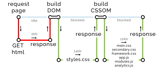
Let's complicate the task and add internal styles and javascript.
<!DOCTYPE html> <html> <head> <title>The "Click the button" page</title> <style> button { color: white; background-color: blue; } </style> </head> <body> <button type="button">Click me</button> <script> var button = document.querySelector("button"); button.addEventListener("click", function () { alert("Well done."); }); </script> </body> </html> The scheme of our CRP has changed:
Due to the emergence of internal styles and scripts that need to be processed, the critical path has increased by two new stages: the construction of a CSSOM tree and the execution of scripts. Fortunately, we do not make any external requests, so they have no effect on the path length.
But not everything is so simple. Please note that the size of our HTML has increased to 2 Kb. And this can (and will) backfire.
Size of critical resources
This is the second parameter of the critical rendering path. It is measured in the number of bytes that need to be transferred to the browser for rendering the page. Note: this is not about all the resources that will eventually be uploaded to the page, but only about those that are needed to display a page with which users can interact. As you understand, the size of these resources should be as small as possible.
If you think that you can get rid of external resources without any problems, making them only internal or embedded, then you are mistaken. This approach scales very poorly. If you place all the resources they need into modern pages, they will become very heavy, and browsers will hardly process them. There is one interesting article in which analyzed the performance of pages created using ReactJS (external styles are not used, only embedded). It turned out that the size of the DOM is quadrupled, and the DOM tree is built twice as long, and it also takes one and a half times more time for the page to respond to user actions.
In addition, external resources can be cached. Therefore, if the user came back to the page or previously visited pages that use the same resources (like my global.css ), the browser will pull them from the cache, and will not query over the network. From this we only benefit. So let's use styles and scripts as external resources.
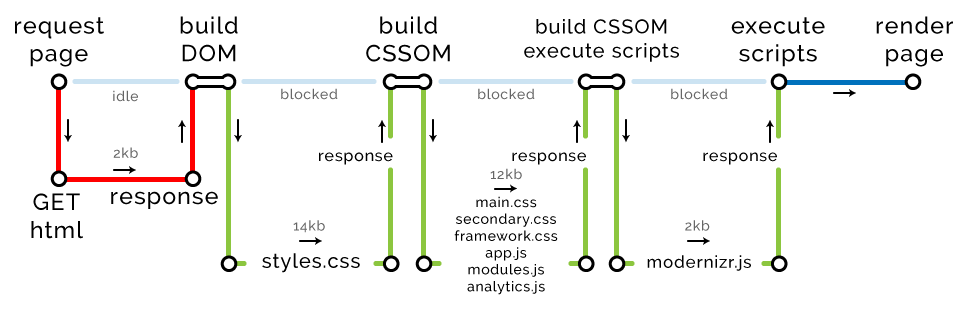
At the moment we have one external CSS file, one external JavaScript file and one asynchronously loaded external JavaScript file.
<!DOCTYPE html> <html> <head> <title>The "Click the button" page</title> <link rel="stylesheet" href="styles.css" media="all"> <script type="text/javascript" src="analytics.js" async></script> // async </head> <body> <button type="button">Click me</button> <script type="text/javascript" src="app.js"></script> </body> </html> This is how our critical path has changed:
In response to its request, the browser receives the page and builds a DOM tree. As soon as it stumbles upon any external source, the preloading scanner begins to work. It initiates the download of all external resources that can only be found in HTML. At the same time CSS and JavaScript are assigned a higher priority than other resources.
The scanner finds styles.css and app.js and creates one more critical path to download them. At the same time, the scanner does not pay attention to analytics.js , because this script has the async attribute. Of course, the browser will download it, but only in a different thread and with low priority. Loading this script does not block the rendering of the page, so it does not change the length of the critical path. By the way, Google’s algorithms, which rank sites according to the degree of optimization, pay attention to this.
Files with Critical Resources
The third and final parameter of our critical path is the number of files that the browser must download for the subsequent rendering of the page. Now there are three: HTML, CSS and JavaScript (asynchronously loaded script is not considered). As the logic dictates, the smaller the size of files with critical resources, the better.
And again about the length of the path
So, in our example, the browser for page rendering should download three files (HTML, CSS and JavaScript), and it will do it in just two sessions of data exchange with the server (round trip). , ?
HTTP/1.
HTTP/1.1 , . , Chrome — , Edge — . , .
— .
Attention! CSS . DNS .
HTTP/2
HTTP/2, . , .
round trip
!
TCP 14 . -, HTML, CSS .
HTML- 14 , round trip. , .
.
<!DOCTYPE html> <html> <head> <title>The "Click the button" page</title> <link rel="stylesheet" href="styles.css"> // 14kb <link rel="stylesheet" href="main.css"> // 2kb <link rel="stylesheet" href="secondary.css"> // 2kb <link rel="stylesheet" href="framework.css"> // 2kb <script type="text/javascript" src="app.js"></script> // 2kb </head> <body> <button type="button">Click me</button> <script type="text/javascript" src="modules.js"></script> // 2kb <script type="text/javascript" src="analytics.js"></script> // 2kb <script type="text/javascript" src="modernizr.js"></script> // 2kb </body> </html> , CSS JavaScript, , .
, HTML gzip. 2 round trip. DOM- — HTML.
CRP: – 1, – 1, – 2
CSS-, (CSS JavaScript) . : CSS- 14 , .

CRP: – 2, – 2, – 16
. 12 , round trip. , HTTP/2, — Chrome, .
CRP: – 3, – 8, – 28
DOM.
CRP: – 4, – 9, – 30
, 30 . , , .
- PageSpeed Insights.
PageSpeed Insights , . audit Chrome Developer Tools.
- Chrome Developer Tools.
. , Google .
- , — .
, Macbook Pro SSD 1 32 . , : . network Chrome Developer Tools.
- / .
CSSOM-, . , round trip, . , .
- (above the fold) header.
, : CSS JavaScript , , DOM , .
, , , . .
- / .
. .
- .
- .
- «» - . , - - . , , FOIT (Flash Of Invisible Text).
- JavaScript/ CSS.
? - HTML-. / , , SVG .
- CDN.
, , , .
, . Udacity , . High Performance Browser Networking .
(Critical Render Path). , -. CRP :
- .
- .
- ( round trip , ).
, Google PageSpeed Insights .
, CRP DOM , . .
, , . .
. 2000 CMS, . .
')
Source: https://habr.com/ru/post/322988/
All Articles