Material UI and A / B tests are outdated - the future is behind adaptive interfaces
When a company prepares a prototype of an application, anything is possible, even the invention of a new approach in building an interface. Previously, on the basis of comparative tests or personal perception of designers, one version of the interface was chosen, which inevitably left a significant portion of users behind. These people open traditional games, sites and applications, experience discomfort and leave. Opponents have even the Material Design, the appearance of Apple technology and Tesla cars. But the complex customization for themselves scares modern users, the service should be good out of the box.
We decided to go the other way and saved all the interface options (different shapes, colors, animations, positions, etc.), and then we learned to understand which combinations would be closer for each user so that the Visera assistant automatically adapted to his interests. Want to know how this is possible? Welcome under the cut!
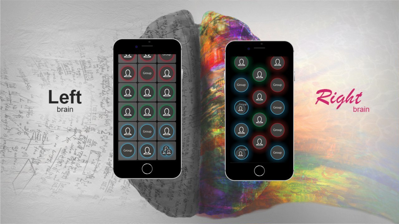
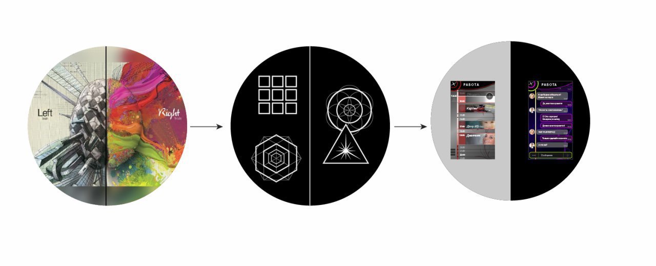
We created Visera to improve personal productivity, especially in work and creative groups, but the app will also be useful for families and personal use. It combines a task manager, messenger and a number of other cloud technologies, which we would be happy to talk about in the future. But the main feature of the application lies outside its functions - at the registration stage, the user is given a small test with figures, allowing him to know the type of personality and offer the optimal interface for him. It looks like it consists of two steps:
')
It all started at the test stage, when the same solutions seemed to the first users to be incredibly successful, sometimes disgusting. Traditional A / B (in our case A, B, C, D) testing led to inconsistent results. Collecting statistics, we realized that it was only possible to choose one version of the interface by sacrificing at least a quarter of the audience who would dislike it. Those who liked the interface very much also turned out to be about a quarter, and the rest remained neutral. So during the tests, we set an ambitious task - to bring the perception of typical UI elements to the level of abstraction, to create a quick analysis of the personality in a game form, and then from abstract forms to return to the usual and user-friendly combinations.
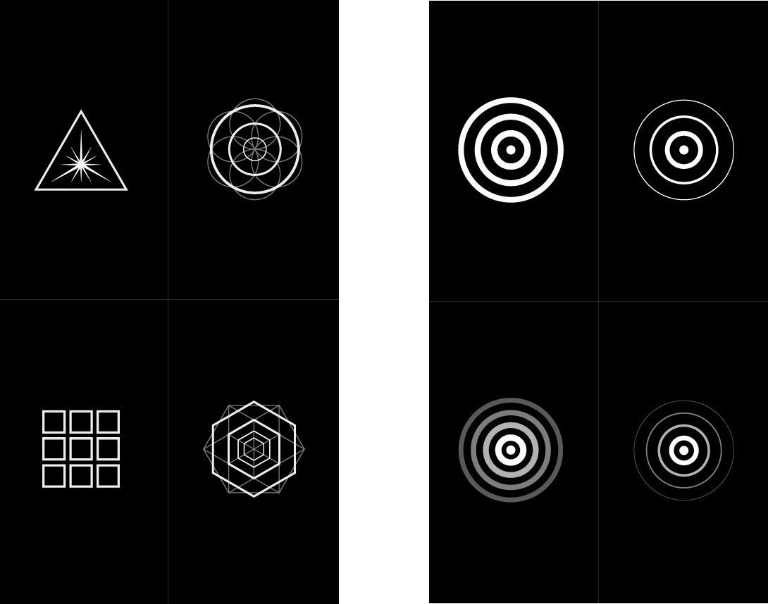
It was necessary to conduct a large-scale study with the participation of more than 150 people, but the result is worth all the effort. For the subjects, polls were conducted that determine the successful and unpleasant details of the interface: we searched for opposites, and then suggested that they choose the successful images in the images in order to find the common in each type of personality. Since the whole idea is based on antipodes, the number of categories will always be equal to a power of two: in our case at least 4 and no more than 64 combinations, to be exact. How it works? Let's start with simple examples:
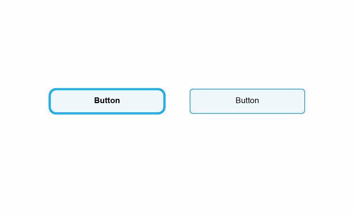
In the picture above, two variants of one button - on the left a noticeable outline, and on the right a thin one. A typical application chooses one option, but we do not. This means that there is a chance to offer a harmonious interface to almost everyone, significantly reducing the bounce rate (for modern programs, it exceeds 25%). Let's add another parameter and complicate the selection:
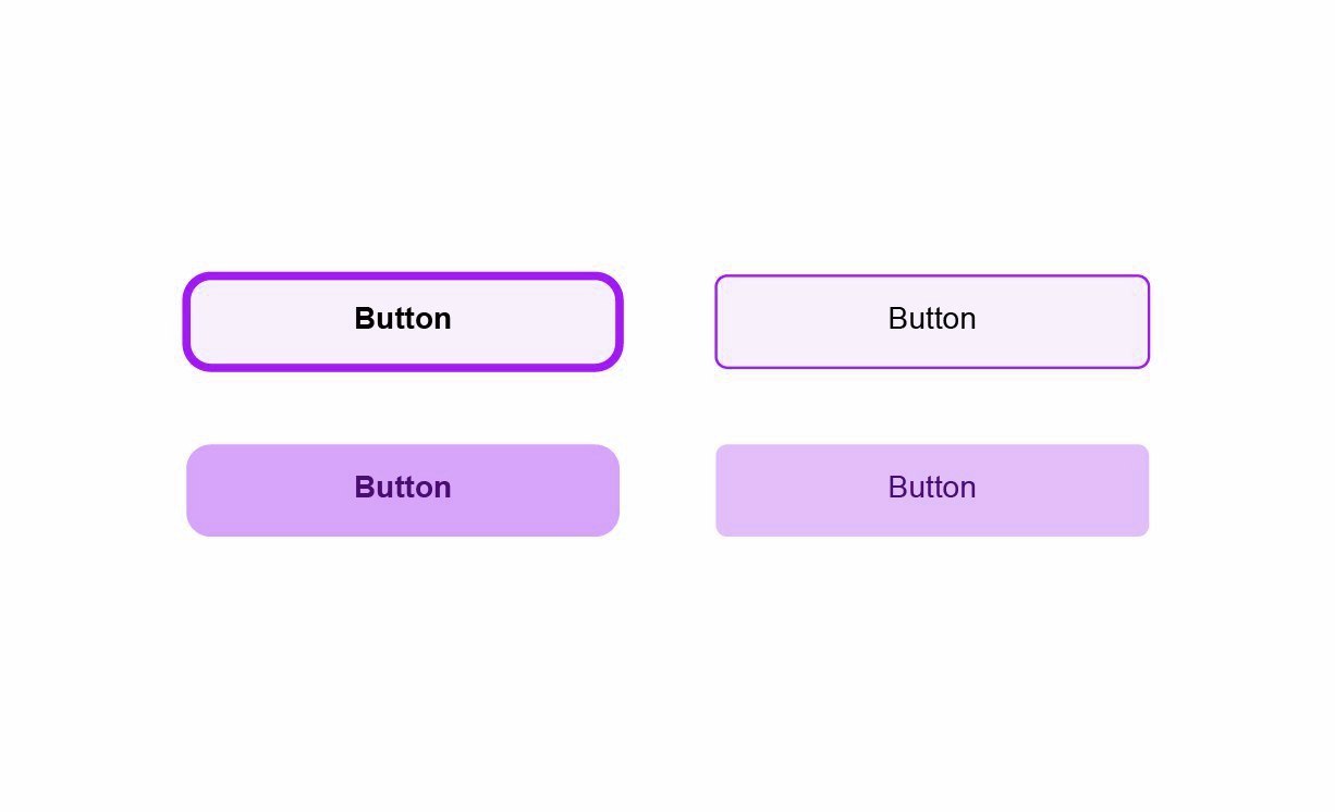
In both examples it seems to the reader that there is “obviously the best option”, with people projecting their preference at all. But this is only a button. After collecting such differences, it was necessary to find abstract representations in order to draw a parallel between people who have common preferences in the interface.
We managed to find solutions thanks to a variety of natural and geometrical forms, including 4-dimensional figures (hypersphere, tesseract, simplex, etc. - more precisely, their projections, of course). We found suitable elements that influence the choice of one or another interface variant, not only in terms of appearance, but also in terms of behavior - what should be the speed of the animation, how to group the elements, and so on. We realized that we were close to the goal, when, on the basis of tests, most of the subjects began to show their optimum result (abstract figure) over and over again, and they liked the resulting interface.
There were also unexpected results, such as the emergence of common preferences between people in relationships (husband and wife) and the disappearance of such a connection after separation. And we managed to collect quite a few such trifles, so they needed to be implemented into a new method of working with UI / UX, where there is no end state and the program always adapts to each user and even his mood.
We will not give out all the subtleties of technology now, but we are happy to take new participants into the closed testing stage and listen to the opinion of experienced fellow developers. This will be useful not only for us, but also for specialists in UI / UX, as well as any developers of modern applications. Adaptability has great potential, especially in the world of neural networks and big data, where artificial intelligence can bring the result to the ideal.
Ps. The disadvantages of such a system are obvious: the development will spend more time programming the interface, drawing the necessary elements and tests. However, in the future it is possible to standardize such solutions, including on the basis of our research. This means that using text and guidelines on responsive design, you can create a truly universal product, be it an application, a game, or even a news site.
Source: https://habr.com/ru/post/322958/
All Articles