What does the Landing Page structure consist of and how to write a marketing headline
Hello! We continue our course on the creation of selling pages. Today we will look at how an effective Landing Page works, analyze the structure of the first screen and learn how to create working headlines for 3 different models that will interest visitors and help you get around 90% of competitors. Well, as usual, many examples.
What was in the past parts:
We have collected enough information. It's time to start creating a landing page!
Briefly about the structure of the Landing Page: understand how it works. Any landing page is divided into 2 parts:
')
- Part 1 - the first screen - what the visitor sees when opening our page, without using scrolling;
- Part 2 - what goes below the first screen by scrolling the mouse wheel.
The task of the first part to interest the user! We arouse his interest by acting on both hemispheres of the brain, but above all on the one that is responsible for emotions. The first screen needs to be done so that the visitor thinks: “Well, wow, how do they do it?”.
In the second part we will press on the hemisphere, which is responsible for the information with logic. The task is to convince the user of your offer, which he saw in the first screen. The goal is to get in touch, register or place an order.
Fulfilling the task of this large second part, which may take a lot of the following screens, obliges you to bring facts, figures, form blocks for confirming benefits and closing objections.
First screen: 3 seconds without permission for error
What is the first screen? This is the height of the screen of your visitors, which in average 90% of kids traffic averages 700 pixels. All of us today are representatives of the scrolling era. Remember how we are looking for something on the Internet?
- Open Yandex or Google.
- We drive in the request and immediately press the wheel on 3-5 sites from the search results.
- We start browsing the pages, trying to spend a minimum of time (3-6 seconds for one) to decide whether the site is worth our further attention or go to close it and look further. For 3-6 seconds of a quick glance, the first screen is evaluated. We understand if it corresponds to what we were looking for and if the information is interesting to us.
- If the site is not scary, and the content attracts something, we begin to scroll.
- If you don’t like something, we close the site and go to another.
A similar situation with advertising. The site owner spends money on it, and the user in 3-6 seconds evaluates how cool it is or how totally cool it is. The first screen is the most important thing, and therefore the conclusion suggests itself: you should spend 70% of your time on it when creating a site.
You can compare the first screen with an acquaintance with a girl. This is you, your face, your clothes, the first 5 words - this is the very first screen! A little bit wrong and nothing happened.
How to make the first screen
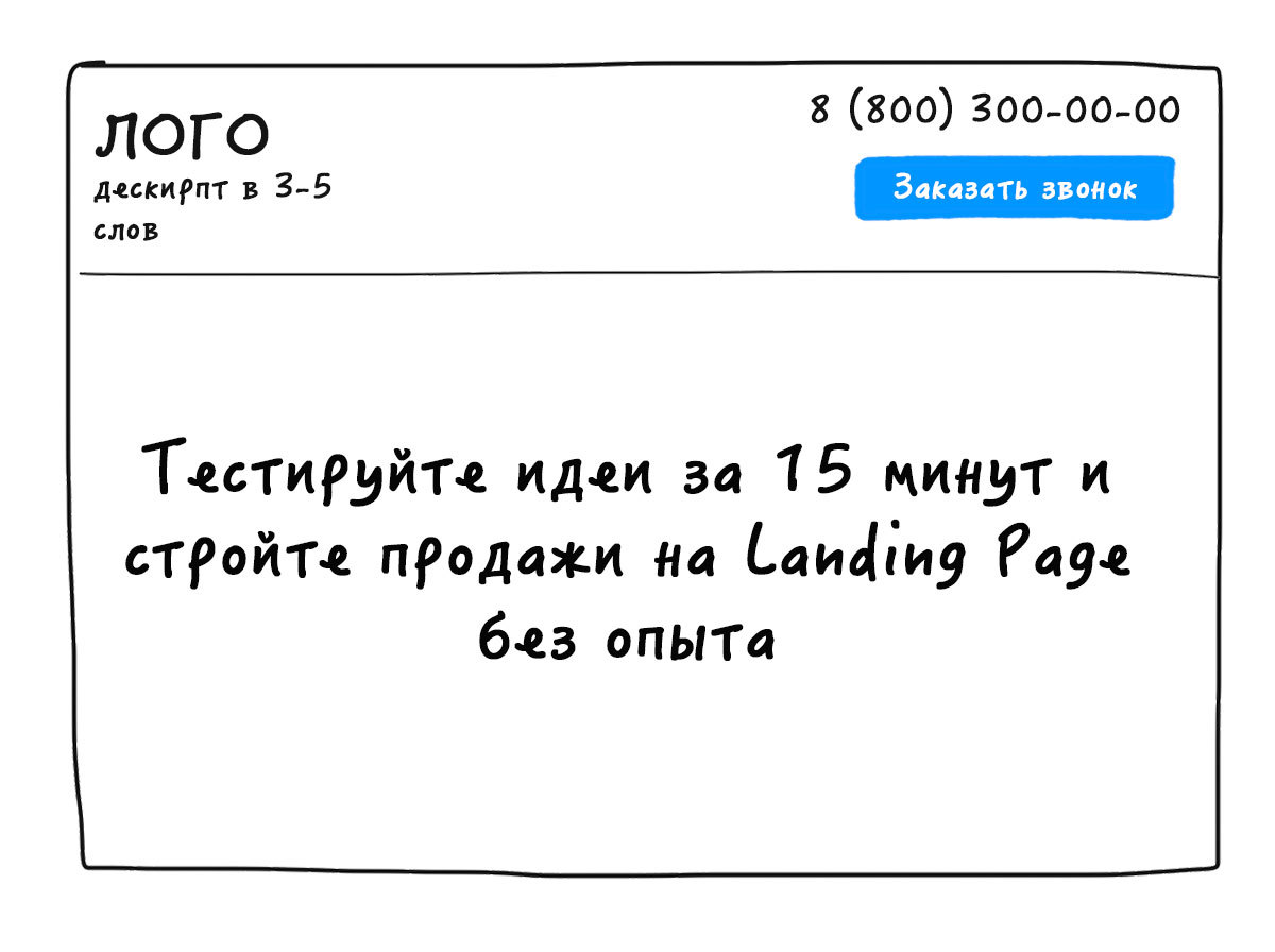
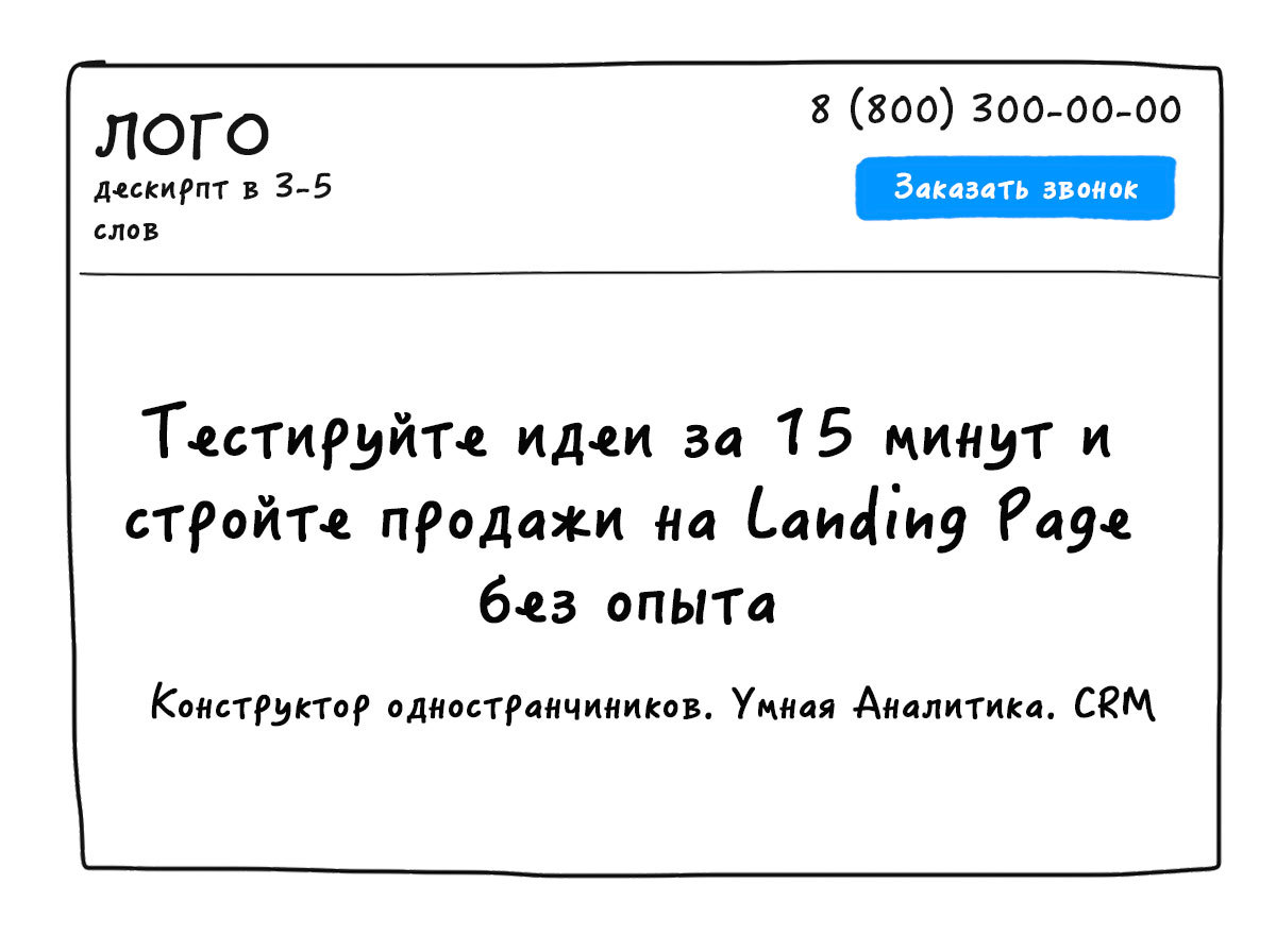
The first screen traditionally contains the following elements:
- Logo (optional)
- Descript
- Contact,
- Menu (as needed)
- Heading
- Subtitle (variable)
- Product image / video
- CTA (Form or Button),
- Identification,
- Benefits (variable).
We will understand in more detail.
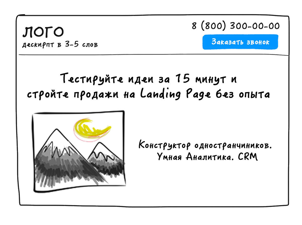
1. Logo
His presence is optional, but very good if he is. A logo is a graphic sign, emblem or symbol that forms the visual recognition of a company, participates in the creation of a common corporate style.
2. Handle
The descriptor falls into the category of triggers. He informs the user about where he got and what the company does. In other words, this is a description of the activity that needs to be laid down in 2-4, maximum of 6 words. Descript list:
- accurately describes what a company does with niche specification (for example, Landing Page Designer, Organization of professional conferences );
- indicates a specialization (for example - Wedding photography, Agency of elite real estate );
- may contain identification ( example - Consultations for beginner businessmen, Trainings for top managers );
- can demonstrate benefits ( example - Turnkey Sales Department )
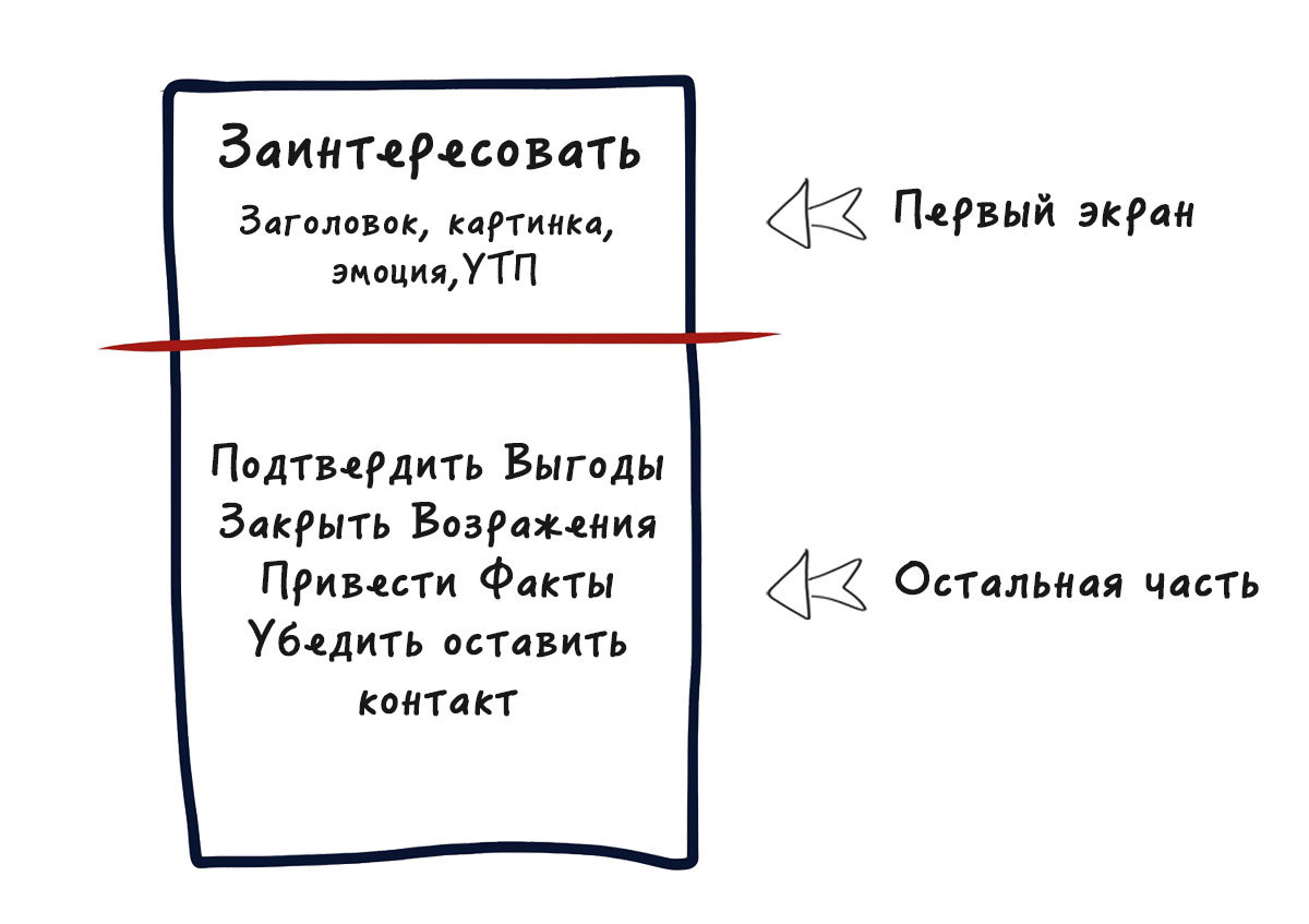
3. Contact
Usually indicate the phone number, put the order button call. You can specify any other method of communication. Somewhere whatsapp and viber work well. Contacts always increase confidence in you. People have a feeling that they can call at any time (or during working hours), if something goes wrong. And it is better to answer them at this moment.
Examples of what this might look like:
Examples of the location of the logo, descript, phone and call order at the top of the first screen
The theory is good, but practice is the main thing! I promised that you will get a selling landing page at the end of the course. We have a service for testing hypotheses and creating landing pages. There is a simple page builder who is capable of much.
Understand in 10 minutes. Create a page and consolidate knowledge from the course with it can be completely free. If suddenly something is not clear, please contact tech support at support@bloxy.ru, we will definitely help.
Let's immediately fix what you learned!
What to do:
- Open another tab in the browser
- Go to bloxy.ru and register
- Go to the editor
- To make a descript, a logo, a button to order a call and write a phone or choose from ready-made sections in the section "First screen - logo"
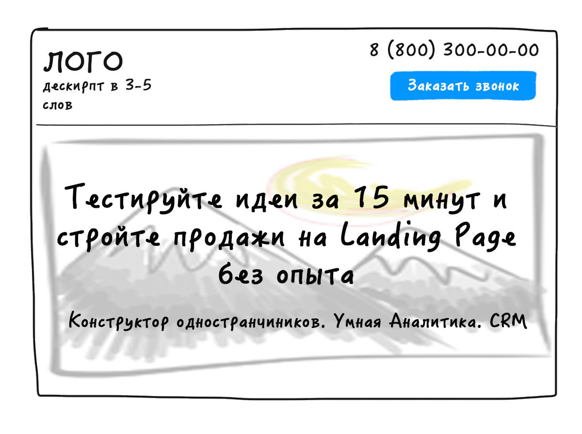
5. The title or most important part of the Landing Page.
We missed the menu, as landing page is not always required. Go to a very important element on the page, which greatly affects the conversion. The header for the landing page is responsible for generating user interest. After reading it, the visitor decides whether to look at the site further.
Technology 1. How to make a selling header: 4U
Michael Masterson is an entrepreneur who invented and implemented this technique. He did not think that it would literally explode the sales market. With the help of 4U, many entrepreneurs doubled, tripled the conversion of sites, and increased the discovery of e-mail newsletters. They only changed the title! What is the essence of 4U?
Usefulness
Your offer should be obviously helpful to potential customers. People don't like to think. Write down what benefits a person will receive if he performs the action you need. Why is it only here that he will solve his problem, and moreover he will decide the way he needs? Sell not a drill, but a hole in the wall. Remember the "three why" technique? The only thing that is needed from you is to give a solution to the problem of the visitor. This is 1U.
Urgency (Urgency or Relevance)
Relevance is the match of the Landing Page header and customer problems. If the user began to search for something, then, most likely, he needs it not the day after tomorrow, and today, even better, yesterday. Most hot clients from advertising traffic (for example, Yandex Direct, Google Adwords) need what they are looking for right now. Give a specific number when he gets what he wants? Therefore, the urgency and urgency is 2U.
Uniqueness (Uniqueness)
Your visitors are browsing many pages. According to one report by Tim Esch (a professional marketer and one of the best conversion specialists), it works like this:
The process of learning visitors one page
If your headline is similar to the one that has already been seen somewhere, you lose a client and reduce the conversion. From the site go. Information will not even be studied. Uniqueness is obligatory! All sell red brick, and you sell green, purple, but at least with butterflies. Give customers something new. Show the technology or something, due to which you effectively solve his problem, and the solution is the best on the market. This is 3U.
Ultra-specificity
Specify the utility in numbers. It is important to show exactly how you solve a user's problem. Demonstrate how much, what and where the visitor will receive. This is 4U.
How to correctly create a headline? Refer to the examples. It is always clearer.
Example 1
Original title: Interior Design.
Add a favor. Why design? Save time and money and get a cozy and comfortable accommodation:
- We will develop an interior design that will make the house more comfortable.
We add uniqueness. Explain how much more convenient:
- We will develop an interior design that you want to return to.
Add urgency:
- We develop an interior design in which you want to return, saving 30% of the budget in 2 weeks.
Ultra specificity for a snack. Due to what:
- Professionals individually develop interior design, in which you want to return, saving 30% of the budget for 2 weeks.
Compare:
- Custom interior design
- Professionals individually develop interior design, in which you want to return, saving 30% of the budget in 2 weeks
Feel the difference. She is huge. Such is the difference in sales performance.
Example 2
Original title: Buy tires.
Benefit - why are they? It is safe to drive or drive depends on the target audience:
- Increase vehicle safety on the road.
Ultra specificity. How safe is it:
- Increase vehicle safety by 35%.
Urgency. How fast:
- Increase vehicle safety by 35% in 1 hour.
Uniqueness. How:
- Increase vehicle safety on the road by 35% in 1 hour at the expense of innovative rubber tires "Shinus".
Compare:
- Buy the best tires from us
- Increase vehicle safety on the road by 35% in 1 hour at the expense of innovative rubber tires "Shinus"
It works magically, is not it? It remains to think and train for the result. Do you need him? Use all 4U, not 1U, 2U or 3U. You will bypass 97% of competitors.
What to do:
- Write 5 headings on 4U technique.
- Add to the smart card in the heading section.
Technology 2. How to create a selling header: 3B
The point is that you can simply combine the benefits. The formula looks like this: Benefit + Benefit + Benefit = Success.
Examples:
- Earn 30% more in 1 day after the site audit by professionals
- Make milkshakes for 1 minute at home with a blender
- We will increase the profit of your site by 2 times with the technology of creating 4U headers
Technology 3. Creating a header: 2M
Make the Minimum Effort - Get the Maximum Results.
Examples:
- How to sell a car for 3 hours at 10% more profitable without leaving home
- How to earn 1000 rubles lying on the couch for 1 day
- How to increase the conversion in 2 times in 10 minutes without investment
So, we learned how to create cool headlines for the first screen. Good headline checklist:
- there are powerful benefits of the product;
- excites interest / intrigues / captures / attracts attention;
- specifies the sentence in numbers;
- talks about what the customer will get;
- contains emotions.
An example of what this might look like:
An example of the title on the first screen of the Landing Page.
If you do not fix the received material in practice, you will not benefit from the course. It's time to add one of theories to your title on your experimental first screen. If you have not used the editor yet, register and create!
What to do:
- Go to editor
- Add caption to first screen
6. Subtitle
In essence, this is the same heading, which is an additional element. It is needed to:
- describe in more detail what the company does, if a complex product or service is offered;
- highlight another significant benefit;
- increase the pain of a potential client.
Example:
- Title: Earn 30% more in just 1 day after the site was audited by professionals.
- Subtitle: Still missing the new Ferrari? Call right now and we will increase your sales.
An example of what this might look like:
What to do:
- Go to editor
- Add a subtitle to the first screen.
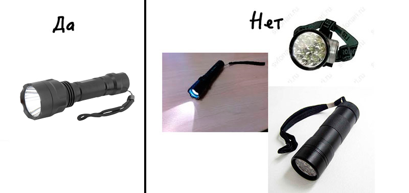
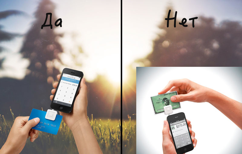
7. Picture
In the structure of the landing page is always present graphics. Images work on emotions and illustrate a sentence. Any picture should have a goal. This also applies to background images. You can not just sculpt everything to demonstrate the work on the design.
The main thing in the images is quality. Did not pay attention to it, did not eliminate the noise, placed a fuzzy image, are the pixels visible? Conversion "killed"!
An example of high-quality photos and low-quality:

We use clear, no noise, bright pictures.
An example of high-quality and low-quality images on a one-page
In product cards, the background must be the same as the block background. Use the image format .png. Examples on the right conversion kill immediately. The difference is obvious.
An example of high-quality and low-quality images on a one-page
Never impose an image with a background on the background. We use .png images, and it’s better to take real photos, rather than drawings from a photobank.
What characteristics should meet the picture? She is:
- Meets and confirms the value, benefits, features of the product, the benefits of the acquisition
- closes the objection (read on);
- shows the process or result of interaction with the product;
- causes an emotion that clearly coincides with the product;
- takes into account when depicting a person by external national characteristics of the region;
- looks directly at the user, or at the CTA (eyes of the person in the photo).
Where to look for images? I recommend free photos of excellent quality:
- unsplash.com ;
- allthefreestock.com ;
- Google search for pictures in English (translate with the help of an online translator and go!).
Examples of what this might look like:
An example of a first screen for a title and image for the Landing Page.
What to do:
- Go to editor
- Add an image to the background or next
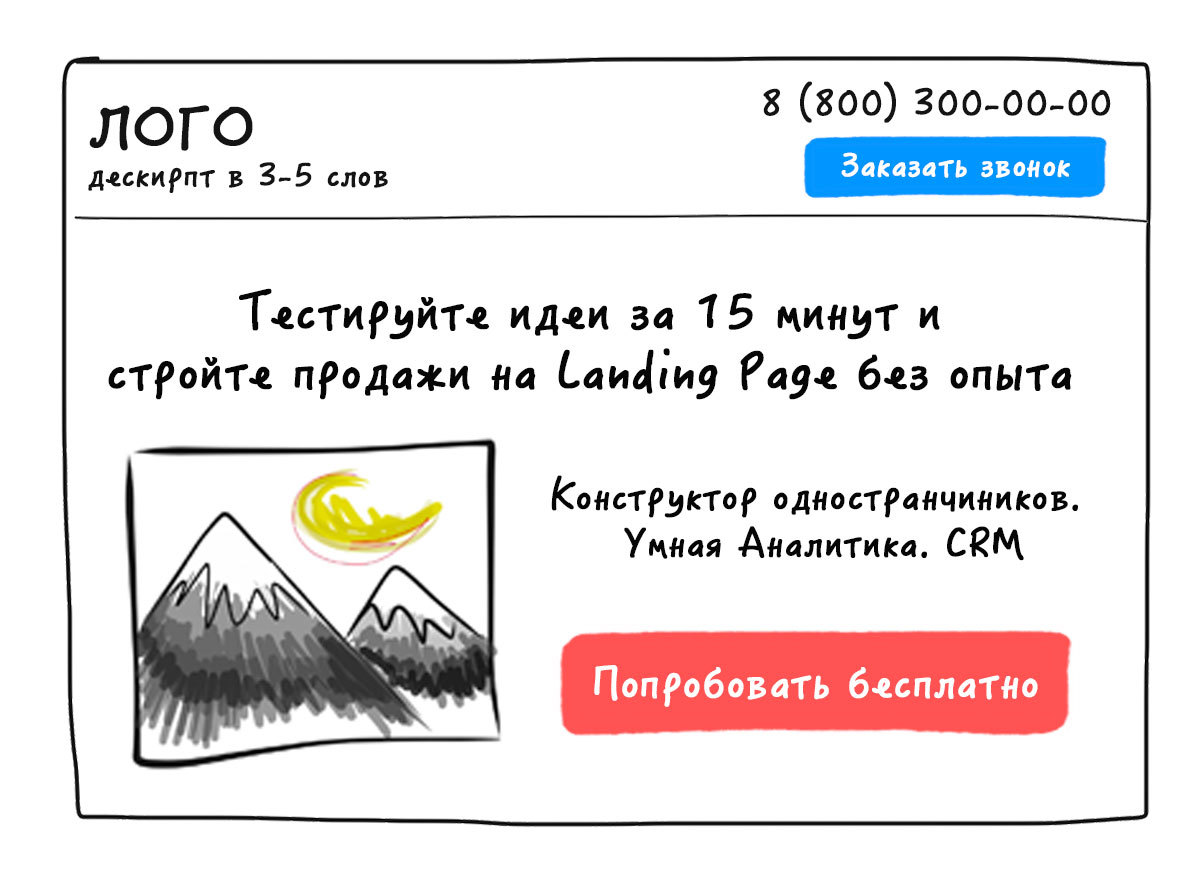
8A. Button
This is a very important one-page item. The call to action is written on the button. It is she who converts the visitor to the next funnel step. Button checklist:
- you can click on it (link);
- words that clearly and logically call for action;
- large size, highlighting the background of other graphics;
- contrast to the background.
With the button, it seems, everything is simple. It contains that call-to-action (CTA), which we identified earlier from the sales funnel.
An example of what this might look like:
Call to Action Examples
Good:
- To get the consultation
- To learn more
- Get my gift
- Increase sales
- Get free
- Participate
Poorly:
- Submit
- To order
- Buy
8.B. The form
A special module with which the user enters the data you need. The form consists of the following elements:
- title;
- subtitle;
- input fields;
- button;
- signature;
- CTA + benefit.
An example of a form in the blog of one of the coolest Western marketers Neil Patel:
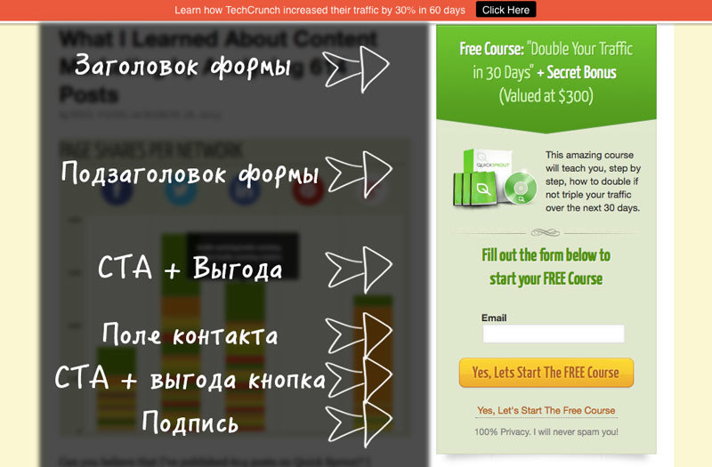
- The title of the form is CTA, which was done before. Ask yourself the question: what do I offer to the visitor? Answer it and write in the form header.
- The subtitle of the form is a confirmation of the benefit. Why is it important to fill out a form right now? What will the user gain? The subtitle is not a mandatory element, if everything fit into the title. Remove too much.
- Fields are data that are critical for communicating with a potential customer. Remember: the more fields, the lower the conversion. Better than 1 field, optimally make 2 fields - e-mail or phone + name (how to handle).
- Contact fields (phone / e-mail / skype / profile in social networks) Something one may be required. The remaining fields should be optional.
- Button - a call to action. It will show what the user will receive, if she clicks on it, what will happen after clicking.
- Signature - the last chance to dispel user doubts. What is there to indicate? Social proof (more than 3000 subscribers), terms (call back in 5 minutes), benefits (free), important details (14 days free period).
An example form on the first screen of the Landing Page

What to do:
- Go to editor
- Add a button or form to your first screen.
9. Identification
With the help of this section you help visitors understand how useful the proposed product is to them. You determine the audience with which you work, and allow the user to immediately determine whether he is in it. This is done immediately, on the forehead, without explanation and reading of the landing page. Customers do not need to understand. Save their time, and they will say thank you. This will bring you closer to them, raise sales.
Examples:
For whom?
- For business owners
- For start-up business
- For web studio owners
Who is not suitable?
- For summer residents
- For housewives
- For car owners
Examples of what this might look like:
What to do:
- Go to editor
- Add identification to first screen
10. Benefits
If there is still space on the first screen and you used a background image instead of a picture, add another 2-3 benefits. They will not interfere.
Compare:
- With us, you greatly increase sales! (Strong - how is that?).
- With us you will increase sales by 2 times! (It's clear).
- With us you will increase sales by 30%! (Immediately it is clear how much).
An example of what this might look like:

What to do:
- Go to editor
- Add another 2-3 benefits.
Why should these elements be present?
All this is an analysis of hundreds of high conversion sites and the experience of creating your own landing pages.
- First, the scheme is guaranteed to work.
- Secondly, customers are already accustomed to this construction of landing pages, and this will not frighten them away.
You ask, where is the uniqueness? It should be in your unique sales offer, title and design, and not in the presence and absence of the required (optional) elements of the landing page.
In the next step, we will create a product card, and I will reveal different "chips" about prices.
PS
We are glad to help, the Bloxy team is a simple editor for quickly creating websites for your tasks (Landing Page, subscription pages, events, conferences, webinars, personal pages, small online stores, etc.). You can try and create a website for free, and with any questions we will help with those. support.
For Habr's readers, we give habr6 promo code - double the paid period at any rate. For example, pay 6 months and 6 months will receive a gift. Valid 1 week from the date of publication.
Source: https://habr.com/ru/post/322752/
All Articles