Open machine learning course. Topic 1. Primary data analysis with Pandas

The course consists of:
- 10 articles on Habré (and the same on Medium in English)
- 10 lectures ( Youtube channel in Russian + more recent lectures in English), a detailed description of each topic - in this article
- reproducible materials (Jupyter notebooks) in the mlcourse.ai repository and in the form of Kaggle Dataset (only a browser is needed)
- excellent Kaggle Inclass competitions (not on "xgboost glass", but on building signs)
- homework for each topic (in the repository - a list of demo versions of tasks)
- motivating rating, an abundance of live communication and quick feedback from the authors
The current launch of the course - from October 1, 2018 in English ( link to the survey to participate, fill in English). Follow the announcements in the VC group , join the OpenDataScience community.
List of articles series
- Primary data analysis with Pandas
- Visual data analysis with Python
- Classification, decision trees and the method of nearest neighbors
- Linear classification and regression models
- Compositions: bagging, random forest
- Construction and selection of signs. Applications for word processing, image and geodata tasks
- Teaching without a teacher: PCA, clustering
- Training in gigabytes with Vowpal Wabbit
- Time Series Analysis with Python
- Gradient boosting
Plan for this article
- About the course
- Homework in the know
- Demonstration of the main methods of Pandas
- First attempts to predict churn
- Homework number 1
- Overview of useful resources
1. About the course
We do not set ourselves the task of developing another comprehensive introductory course on machine learning or data analysis (that is, it is not a substitute for the specialization of Yandex and MIPT, additional education of HSE and other fundamental online and offline programs and books). The purpose of this series of articles is to quickly refresh your knowledge or help find topics for further study. The approach is approximately the same as that of the authors of the book Deep Learning , which begins with a review of mathematics and the basics of machine learning - a brief, very capacious and with an abundance of references to sources.
If you plan to complete the course, then we warn you: when selecting topics and creating materials, we focus on the fact that our students know mathematics at the second-year level of a technical college and at least know how to program in Python . These are not strict selection criteria, but only recommendations - you can enroll in a course without knowing mathematics or Python, and in parallel build up:
- basic mathematics (mathematical analysis, linear algebra, optimization, theorever and statistics) can be repeated on these abstracts of Yandex & MIPT (we share with permission). Briefly, in Russian - what you need. If in detail, matan - Kudryavtsev, linal - Kostrikin, optimization - Boyd (English), theorever and statistics - Kibzun. Plus excellent online courses MIPT and HSE on Coursera;
- Python is enough for a small interactive tutorial on Datacamp or this Python repository and basic algorithms and data structures. Something more advanced is, for example, the St. Petersburg Computer Science Center;
- as for machine learning, that is the classic (but slightly outdated) Andrew Ng "Machine Learning" course (Stanford, Coursera). In Russian there is an excellent specialization of MIPT and Yandex "Machine learning and data analysis." And here are the best books: "Pattern recognition and Machine Learning" (Bishop), "Machine Learning: A Probabilistic Perspective" (Murphy), "The elements of statistical learning" (Hastie, Tibshirani, Friedman), "Deep Learning" (Goodfellow , Bengio, Courville). The book Goodfellow begins with a review of mathematics and a clear and interesting introduction to machine learning and the internal structure of its algorithms. It's nice that now about deep learning there is a book in Russian - “Deep Learning: Immersion in the World of Neural Networks” (Nikolenko S.I., Kadurin A.A., Arkhangelskaya Ye.O.).
Also about the course described in this announcement.
What software is needed
To complete the course you need a number of Python packages, most of them are in the Anaconda build with Python 3.6. Other libraries will be needed a little later, this will be discussed later. The full list can be viewed in the Dockerfile .
You can also use a Docker container in which all the necessary software is already installed. Details are on the Wiki repository page .
How to connect to the course
No formal registration is required, you can connect to the course at any time after the start (10/01/18), but homework deadlines are tight.
But so that we know more about you:
- Fill out the survey , indicating in it the real name;
- Join the OpenDataScience community, the course is under discussion in the channel # mlcourse.ai .
2. Homework in the know
- Each article is accompanied by homework in the form of a notebook Jupyter , in which you need to add the code, and based on this, choose the correct answer in the form of Google;
- Homework solutions are sent to those who sent the solution in the form;
- At the end of a series of articles will be summed up (rating of participants);
- Examples of homework are given in the articles of the series (at the end).
3. Demonstration of the main methods of Pandas
All code can be reproduced in this Jupyter notebook.
Pandas is a Python library that provides extensive data analysis capabilities. The data that datasenists work with is often stored in the form of tablets — for example, in .csv, .tsv, or .xlsx formats. Using the Pandas library, such tabular data is very convenient to load, process and analyze using SQL-like queries. And in conjunction with the libraries Matplotlib and Seaborn Pandas provides ample opportunities for visual analysis of tabular data.
The main data structures in Pandas are the Series and DataFrame classes . The first one is a one-dimensional indexed data array of some fixed type. The second is a two-dimensional data structure, which is a table, each column of which contains data of one type. You can think of it as a dictionary of Series objects. The DataFrame structure is great for representing real data: the rows correspond to feature descriptions of individual objects, and the columns correspond to features.
# Pandas Numpy import pandas as pd import numpy as np We will show the main methods in the business, analyzing a set of data on the outflow of customers of the telecom operator (no need to download, it is in the repository). Let's read the data (the read_csv method) and look at the first 5 lines using the head method:
df = pd.read_csv('../../data/telecom_churn.csv') df.head() 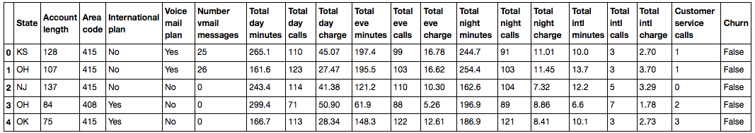
In Jupyter laptops, Pandas data frames are displayed in the form of such beautiful tablets, and print(df.head()) looks worse.
By default, Pandas displays only 20 columns and 60 rows, so if your data frame is more, use the set_option function:
pd.set_option('display.max_columns', 100) pd.set_option('display.max_rows', 100) Each line represents a single client - this is the object of study.
Columns - signs of the object.
| Title | Description | Type of |
|---|---|---|
| State | State letter code | nominal |
| Account length | How long does a customer have been served by the company? | quantitative |
| Area code | Phone number prefix | quantitative |
| International plan | International roaming (connected / not connected) | binary |
| Voice mail plan | Voicemail (connected / not connected) | binary |
| Number vmail messages | Number of voice messages | quantitative |
| Total day minutes | Total duration of conversations in the afternoon | quantitative |
| Total day calls | Total number of calls during the day | quantitative |
| Total day charge | Total amount of payment for services in the afternoon | quantitative |
| Total eve minutes | The total duration of conversations in the evening | quantitative |
| Total eve calls | Total number of calls in the evening | quantitative |
| Total eve charge | The total amount of payment for services in the evening | quantitative |
| Total night minutes | The total duration of conversations at night | quantitative |
| Total night calls | Total number of calls at night | quantitative |
| Total night charge | Total payment for services at night | quantitative |
| Total intl minutes | Total duration of international calls | quantitative |
| Total intl calls | Total international calls | quantitative |
| Total intl charge | Total amount of payment for international calls | quantitative |
| Customer service calls | The number of calls to the service center | quantitative |
Target variable: Churn - Outflow symptom, binary sign (1 - client loss, i.e. outflow). Then we will build models that predict this sign for the rest, so we called it target.
Let's look at the size of the data, the names of features and their types.
print(df.shape) (3333, 20) We see that in table 3333 rows and 20 columns. Let's output the column names:
print(df.columns) Index(['State', 'Account length', 'Area code', 'International plan', 'Voice mail plan', 'Number vmail messages', 'Total day minutes', 'Total day calls', 'Total day charge', 'Total eve minutes', 'Total eve calls', 'Total eve charge', 'Total night minutes', 'Total night calls', 'Total night charge', 'Total intl minutes', 'Total intl calls', 'Total intl charge', 'Customer service calls', 'Churn'], dtype='object') To view general information on the data frame and all features, use the info method:
print(df.info()) <class 'pandas.core.frame.DataFrame'> RangeIndex: 3333 entries, 0 to 3332 Data columns (total 20 columns): State 3333 non-null object Account length 3333 non-null int64 Area code 3333 non-null int64 International plan 3333 non-null object Voice mail plan 3333 non-null object Number vmail messages 3333 non-null int64 Total day minutes 3333 non-null float64 Total day calls 3333 non-null int64 Total day charge 3333 non-null float64 Total eve minutes 3333 non-null float64 Total eve calls 3333 non-null int64 Total eve charge 3333 non-null float64 Total night minutes 3333 non-null float64 Total night calls 3333 non-null int64 Total night charge 3333 non-null float64 Total intl minutes 3333 non-null float64 Total intl calls 3333 non-null int64 Total intl charge 3333 non-null float64 Customer service calls 3333 non-null int64 Churn 3333 non-null bool dtypes: bool(1), float64(8), int64(8), object(3) memory usage: 498.1+ KB None bool , int64 , float64 and object are the types of attributes. We see that 1 sign is logical (bool), 3 signs are of object type and 16 signs are numeric. Also, using the info method, it is convenient to quickly look at the gaps in the data, in our case they are not there, there are 3333 observations in each column.
You can change the column type using the astype method. Apply this method to the Churn feature and translate it to int64 :
df['Churn'] = df['Churn'].astype('int64') The describe method shows the main statistical characteristics of the data for each numeric attribute (types int64 and float64 ): the number of non-omitted values, mean, standard deviation, range, median, 0.25 and 0.75 quartiles.
df.describe() 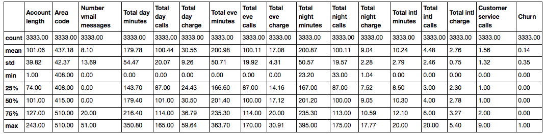
')
To view statistics on non-numeric characters, you need to explicitly specify the types of interest in the include parameter.
df.describe(include=['object', 'bool']) | State | International plan | Voice mail plan | |
|---|---|---|---|
| count | 3333 | 3333 | 3333 |
| unique | 51 | 2 | 2 |
| top | WV | No | No |
| freq | 106 | 3010 | 2411 |
For categorical ( object type) and boolean ( bool type) attributes, you can use the value_counts method. Let's look at the distribution of data on our target variable - Churn :
df['Churn'].value_counts() 0 2850 1 483 Name: Churn, dtype: int64 2850 users out of 3333 are loyal, the value of the Churn variable is 0 .
Let's look at the distribution of users by the variable Area code . Specify the value of the parameter normalize=True to view not absolute frequencies, but relative ones.
df['Area code'].value_counts(normalize=True) 415 0.496550 510 0.252025 408 0.251425 Name: Area code, dtype: float64 Sorting
DataFrame can be sorted by the value of any of the signs. In our case, for example, by Total day charge ( ascending=False for sorting in descending order):
df.sort_values(by='Total day charge', ascending=False).head() 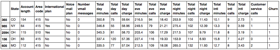
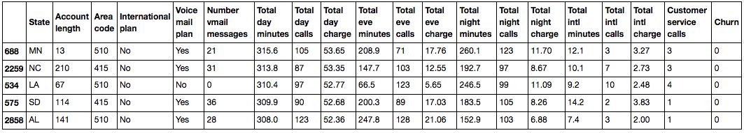
You can also sort by column group:
df.sort_values(by=['Churn', 'Total day charge'], ascending=[True, False]).head() Thanks for the comment about the outdated sort of makkos
Indexing and data retrieval
DataFrame can be indexed in different ways. In this regard, we consider various ways of indexing and extracting the data we need from a data frame using simple questions as an example.
To retrieve a single column, you can use the construction of the form DataFrame['Name'] . We use this to answer the question: what is the proportion of people disloyal users in our data frame?
df['Churn'].mean(). # : 0.14491449144914492 14.5% is a rather bad indicator for a company, with such a percentage of churn you can go broke.
Logical indexing of a DataFrame on one column is very convenient. It looks like this: df[P(df['Name'])] , where P is some logical condition, checked for each element of the Name column. The result of this indexing is a DataFrame, consisting only of rows that satisfy the condition P on the Name column.
We will use this to answer the question: what are the mean values of numerical attributes among disloyal users?
df[df['Churn'] == 1].mean() Account length 102.664596 Number vmail messages 5.115942 Total day minutes 206.914079 Total day calls 101.335404 Total day charge 35.175921 Total eve minutes 212.410145 Total eve calls 100.561077 Total eve charge 18.054969 Total night minutes 205.231677 Total night calls 100.399586 Total night charge 9.235528 Total intl minutes 10.700000 Total intl calls 4.163561 Total intl charge 2.889545 Customer service calls 2.229814 Churn 1.000000 dtype: float64 Combining the previous two types of indexing, we will answer the question: how many on average do disloyal users talk on the phone during the day ?
df[df['Churn'] == 1]['Total day minutes'].mean() # : 206.91407867494823 What is the maximum length of international calls among loyal users ( Churn == 0 ) who do not use the international roaming service ( 'International plan' == 'No' )?
df[(df['Churn'] == 0) & (df['International plan'] == 'No')]['Total intl minutes'].max() # : 18.899999999999999 Data frames can be indexed either by the name of a column or row, or by their sequence number. For indexing by name , the loc method is used, by number - iloc .
In the first case, we say “give us the values for the id rows from 0 to 5 and for the columns from State to Area code” , and in the second, “give us the values of the first five rows in the first three columns” .
Note to the hostess : when we pass a slice object to iloc , the data frame is sliced as usual. However, in the case of loc, both the beginning and the end of the slice are taken into account ( link to the documentation , thanks to arkane0906 for the remark).
df.loc[0:5, 'State':'Area code'] | State | Account length | Area code | |
|---|---|---|---|
| 0 | KS | 128 | 415 |
| one | OH | 107 | 415 |
| 2 | NJ | 137 | 415 |
| 3 | OH | 84 | 408 |
| four | Ok | 75 | 415 |
| five | AL | 118 | 510 |
df.iloc[0:5, 0:3] | State | Account length | Area code | |
|---|---|---|---|
| 0 | KS | 128 | 415 |
| one | OH | 107 | 415 |
| 2 | NJ | 137 | 415 |
| 3 | OH | 84 | 408 |
| four | Ok | 75 | 415 |
If we need the first or last line of the data frame, we use the df[:1] or df[-1:] : construct:
df[-1:] 
Apply functions to cells, columns, and rows
Applying a function to each column: apply
df.apply(np.max) State WY Account length 243 Area code 510 International plan Yes Voice mail plan Yes Number vmail messages 51 Total day minutes 350.8 Total day calls 165 Total day charge 59.64 Total eve minutes 363.7 Total eve calls 170 Total eve charge 30.91 Total night minutes 395 Total night calls 175 Total night charge 17.77 Total intl minutes 20 Total intl calls 20 Total intl charge 5.4 Customer service calls 9 Churn True dtype: object The apply method can also be used to apply a function to each line. To do this, specify axis=1 .
Application of function to each cell of a column: map
For example, the map method can be used to replace values in a column by passing to it as an argument a dictionary of the form {old_value: new_value} :
d = {'No' : False, 'Yes' : True} df['International plan'] = df['International plan'].map(d) df.head() 
A similar operation can be rotated using the replace method:
df = df.replace({'Voice mail plan': d}) df.head() 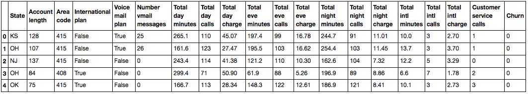
Grouping data
In general, grouping data in Pandas is as follows:
df.groupby(by=grouping_columns)[columns_to_show].function() - The groupby method is applied to the
groupby, which divides the data bygrouping_columns- a feature or set of features. - Select the columns we need (
columns_to_show). - A function or several functions are applied to the received groups.
Grouping data based on the value of the Churn feature and displaying statistics on the three columns in each group.
columns_to_show = ['Total day minutes', 'Total eve minutes', 'Total night minutes'] df.groupby(['Churn'])[columns_to_show].describe(percentiles=[]) 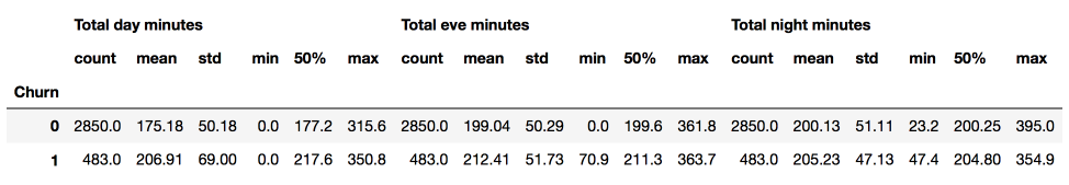
Let's do the same, but a little differently, by transferring to agg list of functions:
columns_to_show = ['Total day minutes', 'Total eve minutes', 'Total night minutes'] df.groupby(['Churn'])[columns_to_show].agg([np.mean, np.std, np.min, np.max]) 
Summary Tables
Suppose we want to see how the observations in our sample are distributed in the context of two traits - Churn and International plan . To do this, we can build a contingency table using the crosstab method:
pd.crosstab(df['Churn'], df['International plan']) | International plan | No | Yes |
|---|---|---|
| Churn | ||
| 0 | 2664 | 186 |
| one | 346 | 137 |
pd.crosstab(df['Churn'], df['Voice mail plan'], normalize=True) | Voice mail plan | No | Yes |
|---|---|---|
| Churn | ||
| 0 | 0.602460 | 0.252625 |
| one | 0.120912 | 0.024002 |
We see that the majority of users are loyal and at the same time use additional services (international roaming / voice mail).
Advanced Excel users will surely remember such a feature as pivot tables. In Pandas, the pivot_table method is responsible for summary tables, which takes as parameters:
values- the list of variables for which you want to calculate the necessary statistics,index- a list of variables by which you need to group data,aggfunc- that, in fact, we need to calculate by groups - the amount, average, maximum, minimum or something else.
Let's look at the average number of day, evening and night calls for different Area code:
df.pivot_table(['Total day calls', 'Total eve calls', 'Total night calls'], ['Area code'], aggfunc='mean').head(10) | Total day calls | Total eve calls | Total night calls | |
|---|---|---|---|
| Area code | |||
| 408 | 100.496420 | 99.788783 | 99.039379 |
| 415 | 100.576435 | 100.503927 | 100.398187 |
| 510 | 100.097619 | 99.671429 | 100.601190 |
Convert Data Frames
Like many things in Pandas, adding columns to a DataFrame is possible in several ways.
For example, we want to count the total number of calls for all users. Create a total_calls object of the Series type and insert it into the data frame:
total_calls = df['Total day calls'] + df['Total eve calls'] + \ df['Total night calls'] + df['Total intl calls'] df.insert(loc=len(df.columns), column='Total calls', value=total_calls) # loc - , Series # len(df.columns), df.head() 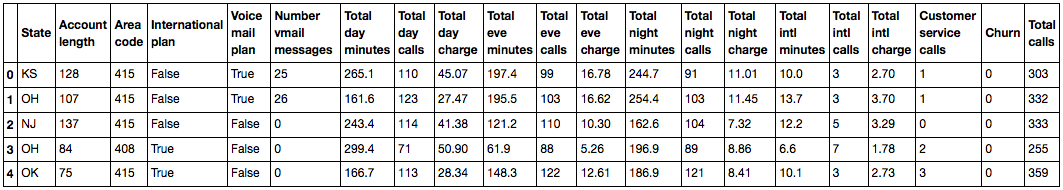
Adding a column from existing ones is possible and easier without creating intermediate Series:
df['Total charge'] = df['Total day charge'] + df['Total eve charge'] + df['Total night charge'] + df['Total intl charge'] df.head() 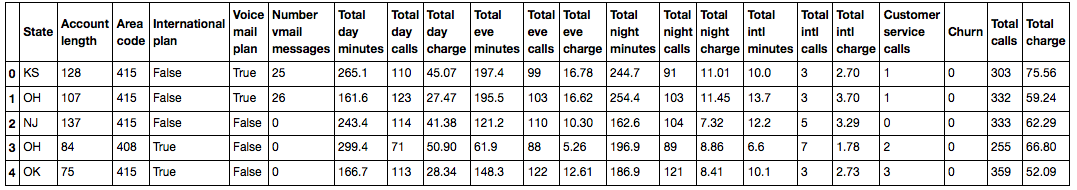
To remove columns or rows, use the drop method, passing in the required indexes as an argument and the required value of the axis parameter ( 1 if deleting columns, and nothing or 0 if deleting rows):
# df = df.drop(['Total charge', 'Total calls'], axis=1) df.drop([1, 2]).head() # 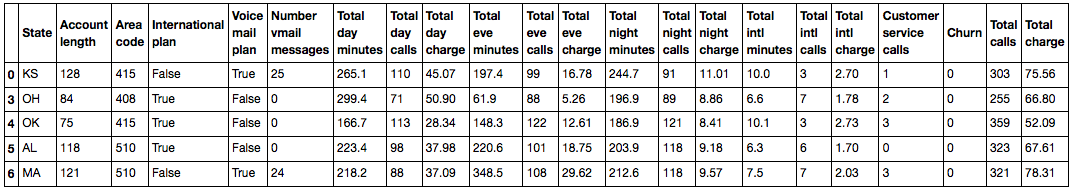
4. The first attempts to predict the outflow
Let's see how the outflow is associated with the sign "Connecting international roaming" (International plan) . We will do this with the help of the crosstab summary tablet, as well as through illustrations with Seaborn (how exactly to build such pictures and analyze graphics with them - the material of the next article).
pd.crosstab(df['Churn'], df['International plan'], margins=True) | International plan | False | True | All |
|---|---|---|---|
| Churn | |||
| 0 | 2664 | 186 | 2850 |
| one | 346 | 137 | 483 |
| All | 3010 | 323 | 3333 |
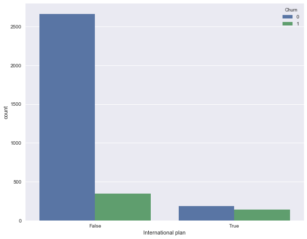
We see that when roaming is connected, the share of outflow is much higher - an interesting observation! It is possible that large and poorly controlled spending in roaming is very conflict-causing and leads to dissatisfaction of customers with a telecom operator and, accordingly, to their outflow.
Next, look at another important feature - "The number of calls to the service center" (Customer service calls) . We will also build a pivot table and a picture.
pd.crosstab(df['Churn'], df['Customer service calls'], margins=True) | Customer service calls | 0 | one | 2 | 3 | four | five | 6 | 7 | eight | 9 | All |
|---|---|---|---|---|---|---|---|---|---|---|---|
| Churn | |||||||||||
| 0 | 605 | 1059 | 672 | 385 | 90 | 26 | eight | four | one | 0 | 2850 |
| one | 92 | 122 | 87 | 44 | 76 | 40 | 14 | five | one | 2 | 483 |
| All | 697 | 1181 | 759 | 429 | 166 | 66 | 22 | 9 | 2 | 2 | 3333 |
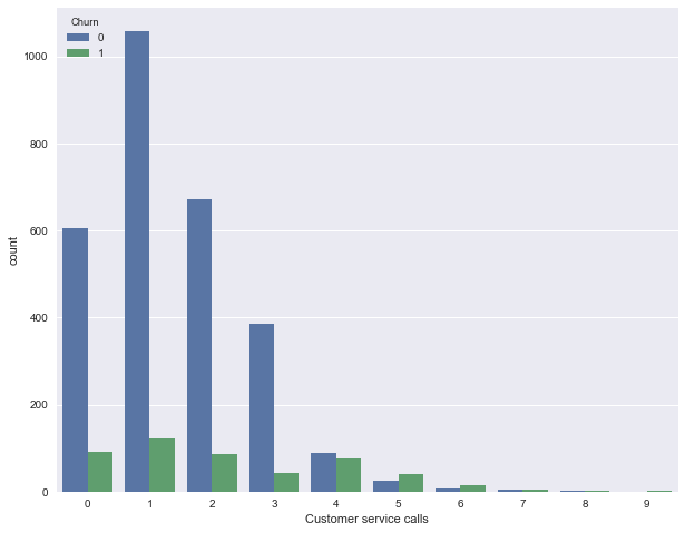
Perhaps, on the summary plate it is not so clearly seen (or it is boring to crawl through the lines with numbers), but the picture eloquently indicates that the share of the outflow increases greatly from 4 calls to the service center.
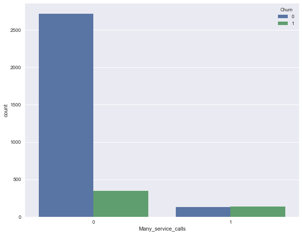
Now we add a binary sign to our DataFrame - the result of comparison of Customer service calls > 3 . And again, let's see how it is associated with the outflow.
df['Many_service_calls'] = (df['Customer service calls'] > 3).astype('int') pd.crosstab(df['Many_service_calls'], df['Churn'], margins=True) | Churn | 0 | one | All |
|---|---|---|---|
| Many_service_calls | |||
| 0 | 2721 | 345 | 3066 |
| one | 129 | 138 | 267 |
| All | 2850 | 483 | 3333 |
Let us combine the conditions discussed above and construct a summary table for this combination and outflow.
pd.crosstab(df['Many_service_calls'] & df['International plan'] , df['Churn']) | Churn | 0 | one |
|---|---|---|
| row_0 | ||
| False | 2841 | 464 |
| True | 9 | nineteen |
So, predicting the outflow of the client in the case when the number of calls to the service center is more than 3 and roaming is connected (and predicting loyalty - otherwise), you can expect about 85.8% of the correct hits (we are mistaken only 464 + 9 times). These 85.8%, which we obtained using very simple arguments, are a good starting point ( baseline ) for further machine learning models that we will build.
In general, before the advent of machine learning, the process of analyzing data looked like this. Summarize:
- The share of loyal customers in the sample is 85.5%. The most naive model, the answer of which "the client is always loyal" on such data will guess in about 85.5% of cases. That is, the proportion of correct answers ( accuracy ) of subsequent models should be at least not less, but better, much higher than this figure;
- With the help of a simple forecast, which can be conditionally expressed by the following formula: "International plan = True & Customer Service calls> 3 => Churn = 1, else Churn = 0", one can expect a share of guesses of 85.8%, which is slightly higher than 85.5%. Subsequently, we will talk about decision trees and figure out how to find such rules automatically based on input data only;
- We received these two baselines without any machine learning, and they serve as a starting point for our subsequent models. If it turns out that by enormous efforts we increase the proportion of correct answers of everything, say, by 0.5%, then perhaps we are doing something wrong, and it suffices to restrict ourselves to a simple model of two conditions;
- Before learning complex models it is recommended to twist the data a bit and check simple assumptions. Moreover, in business applications of machine learning most often begin with simple solutions, and then experiment with their complications.
5. Homework number 1
Further, the course will be conducted in English (there are articles on Medium too). The next launch is October 1, 2018.
For warm-up / training, it is proposed to analyze demographic data using Pandas. You need to fill in the missing code in the Jupyter template and select the correct answers in the web form (there you will also find the solution).
6. Review of useful resources
- Translation of this article into English - Medium story
- Video recording of the lecture based on this article.
- First of all, of course, the official Pandas documentation . In particular, we recommend a short introduction 10 minutes to pandas
- Russian translation of the book "Learning pandas" + repository
- PDF-crib on the library
- Presentation of Alexander Dyakonov "Meeting with Pandas"
- A series of posts "Modern Pandas" (in English)
- There is a collection of Pandas exercises and another useful repository (in English) "Effective Pandas" on the githaba
- scipy-lectures.org - tutorial on working with pandas, numpy, matplotlib and scikit-learn
- Pandas From The Ground Up - video from PyCon 2015
The article was written in collaboration with yorko (Yuri Kashnitsky).
Source: https://habr.com/ru/post/322626/
All Articles