Basic principles of machine learning on the example of linear regression
 Hello colleagues! This is the blog of the open Russian- speaking date of the Scientology Lodge . We are already a legion, more precisely 2500+ people in Slak. For a year and a half, we generated 800k + messages (for the sake of this, we gave us a corporate account. Our people are everywhere and maybe even in your organization. If you are interested in machine learning, but for some reason you don’t know about Open Data Science , then perhaps you are aware of the activities organized by the community. The most ambitious of them is DataFest , which was held recently at the office of Mail.Ru Group , in two days it was visited by 1,700 people. We grow, our lodges open in the cities of Russia, as well as in New York, Dubai and even in Lviv, yes, we do not fight, and sometimes we even drink strong drinks together. And yes, we are a non-profit organization, our goal is education. We do everything for the sake of art. (ps: in the photo you can watch the sitting of the lodge in one of the secret churches in Moscow).
I have the honor of making the first post, and I will probably deviate from my usual neural network subjects and make a post about basic machine learning concepts using the example of one of the simplest and most useful models - linear regression. I will use the python language to demonstrate experiments and draw graphs, you can easily repeat all this on your computer. Go.
Formalism
Machine learning is a subsection of artificial intelligence in which algorithms are studied that are capable of learning without direct programming of what needs to be learned. Linear regression is a typical representative of machine learning algorithms. To begin with, we will answer the question “what does it mean to study at all?”. We take the answer to this question from the book of 1997 (it is worth noting that the table of contents of this book is not much different from modern books on machine learning).
It is said that the program is learning by experience. E regarding the class of tasks T in terms of quality measures L if when solving a problem T quality measured by measure L , increases with the demonstration of new experience E .
We can distinguish the following tasks T solved by machine learning: learning with a teacher , learning without a teacher , reinforcement learning , active learning , knowledge transfer , etc. Regression (as well as classification) belongs to the class of learning tasks with the teacher, when for a given set of features of the observed object it is necessary to predict some target variable. As a rule, in teaching tasks with a teacher, experience E represented as a set of pairs of features and target variables: D = \ left \ {(x_i, y_i) \ right \} _ {i = 1, \ ldots, n}D = \ left \ {(x_i, y_i) \ right \} _ {i = 1, \ ldots, n} . In the case of linear regression, the feature description of the object is a valid vector. vecx in mathbbRm , and the target variable is a scalar y in mathbbR . The simplest measure of quality L for the regression problem is L(y, haty)= left(y− haty right)2 where haty - this is our estimate of the real value of the target variable.
')
We have a task, data and a way to evaluate a program / model. Let's define what a model is and what it means to train a model . A predictive model is a parametric family of functions (a family of hypotheses):
\ Large \ mathcal {H} = \ left \ {h \ left (x, \ theta \ right) | \ theta \ in \ Theta \ right \}
Where
- h:X times Theta rightarrowY
- Theta - many parameters
Thus, from a large family of hypotheses, we must choose some particular one, which, in terms of measure L is the best. The process of this choice is called the learning algorithm :
Large mathcalM: left(X timesY right)n rightarrow mathcalH
It turns out that the learning algorithm is a mapping from a data set to a hypothesis space. Usually the learning process with a teacher consists of two steps:
- training: h= mathcalM left(D right) ;
- application: haty=h left(x right) .
Often, models use the principle of minimizing empirical risk for learning. Risk hypothesis h call the expected value of the cost function L :
\ Large \ begin {array} {rcl} Q \ left (h \ right) & = & \ text {E} _ {x, y \ sim P \ left (x, y \ right)} \ left [L \ left (h \ left (x \ right), y \ right) \ right] \\ & = & \ int L \ left (h \ left (x \ right), y \ right) d P \ left (x, y \ right) \ end {array}
But, unfortunately, such an integral is not calculated, since distribution P left(x,y right) unknown, otherwise there would be no task. But we can calculate the empirical risk estimate as the average value of the cost function:
LargeQ textemp left(h right)= frac1n sumni=1L left(h left(xi right),yi right)
Then, according to the principle of minimizing empirical risk, we must choose such a hypothesis h in mathcalH which minimizes Q textemp :
Large hath= arg minh in mathcalHQ textemp left(h right)
This principle has a significant drawback; solutions found in this way will be prone to retraining . We say that the model has a generalizing ability , then, when an error on a new (test) data set (taken from the same distribution P left(x,y right) ) is small, or predictable. The retrained model does not have a generalizing ability, i.e. on the training data set, the error is small, and on the test data set, the error is much larger.
Linear regression
Let's limit the hypotheses space to linear functions from m+1 argument, we assume that the zero sign for all objects is equal to one x0=1 :
\ Large \ begin {array} {rcl} \ forall h \ in \ mathcal {H}, h \ left (\ vec {x} \ right) & = & w_0 x_0 + w_1 x_1 + w_2 x_2 + \ cdots + w_m x_m \\ & = & \ sum_ {i = 0} ^ m w_i x_i \\ & = & \ vec {x} ^ T \ vec {w} \ end {array}
Empirical risk (cost function) takes the form of a root-mean-square error:
\ Large \ begin {array} {rcl} \ mathcal {L} \ left (X, \ vec {y}, \ vec {w} \ right) & = & \ frac {1} {2n} \ sum_ {i = 1} ^ n \ left (y_i - \ vec {x} _i ^ T \ vec {w} _i \ right) ^ 2 \\ & = & \ frac {1} {2n} \ left \ | \ vec {y} - X \ vec {w} \ right \ | _2 ^ 2 \\ & = & \ frac {1} {2n} \ left (\ vec {y} - X \ vec {w} \ right) ^ T \ left (\ vec {y} - X \ vec {w} \ right) \ end {array}
matrix rows X - these are characteristic descriptions of observed objects. One of the learning algorithms mathcalM such a model is the least squares method. Calculate the derivative of the cost function:
\ Large \ begin {array} {rcl} \ frac {\ partial \ mathcal {L}} {\ partial \ vec {w}} & = & \ frac {\ partial} {\ partial \ vec {w}} \ frac {1} {2n} \ left (\ vec {y} ^ T \ vec {y} -2 \ vec {y} ^ TX \ vec {w} + \ vec {w} ^ TX ^ TX \ vec {w } \ right) \\ & = & \ frac {1} {2n} \ left (-2 X ^ T \ vec {y} + 2X ^ TX \ vec {w} \ right) \ end {array}
we equate to zero and find the solution explicitly:
\ Large \ begin {array} {rcl} \ frac {\ partial \ mathcal {L}} {\ partial \ vec {w} = 0 & \ Leftrightarrow & \ frac {1} {2n} \ left (-2 x ^ T \ vec {y} + 2X ^ TX \ vec {w} \ right) = 0 \\ & \ Leftrightarrow & -X ^ T \ vec {y} + X ^ TX \ vec {w} = 0 \\ & \ Leftrightarrow & X ^ TX \ vec {w} = X ^ T \ vec {y} \\ & \ Leftrightarrow & \ vec {w} = \ left (X ^ TX \ right) ^ {- 1} X ^ T \ vec {y } \ end {array}
Congratulations, ladies and gentlemen, we have just brought a machine learning algorithm with you. We implement this algorithm. Let's start with a dataset consisting of just one attribute. We will take a random point on the sine and add noise to it — in this way we will get the target variable; the sign in this case will be the coordinate x :
def generate_wave_set(n_support=1000, n_train=25, std=0.3): data = {} # 0 2*pi data['support'] = np.linspace(0, 2*np.pi, num=n_support) # sin(x) + 1 # ground truth data['values'] = np.sin(data['support']) + 1 # support , data['x_train'] = np.sort(np.random.choice(data['support'], size=n_train, replace=True)) # sin(x) + 1 , data['y_train'] = np.sin(data['x_train']) + 1 + np.random.normal(0, std, size=data['x_train'].shape[0]) return data data = generate_wave_set(1000, 250) print 'Shape of X is', data['x_train'].shape print 'Head of X is', data['x_train'][:10] margin = 0.3 plt.plot(data['support'], data['values'], 'b--', alpha=0.5, label='manifold') plt.scatter(data['x_train'], data['y_train'], 40, 'g', 'o', alpha=0.8, label='data') plt.xlim(data['x_train'].min() - margin, data['x_train'].max() + margin) plt.ylim(data['y_train'].min() - margin, data['y_train'].max() + margin) plt.legend(loc='upper right', prop={'size': 20}) plt.title('True manifold and noised data') plt.xlabel('x') plt.ylabel('y') plt.show() 
And now we implement the learning algorithm using the NumPy magic:
# X = np.array([np.ones(data['x_train'].shape[0]), data['x_train']]).T # , , numpy # - h w = np.dot(np.dot(np.linalg.inv(np.dot(XT, X)), XT), data['y_train']) # : y_hat = np.dot(w, XT) margin = 0.3 plt.plot(data['support'], data['values'], 'b--', alpha=0.5, label='manifold') plt.scatter(data['x_train'], data['y_train'], 40, 'g', 'o', alpha=0.8, label='data') plt.plot(data['x_train'], y_hat, 'r', alpha=0.8, label='fitted') plt.xlim(data['x_train'].min() - margin, data['x_train'].max() + margin) plt.ylim(data['y_train'].min() - margin, data['y_train'].max() + margin) plt.legend(loc='upper right', prop={'size': 20}) plt.title('Fitted linear regression') plt.xlabel('x') plt.ylabel('y') plt.show() 
As we can see, the line does not really coincide with this curve. The root-mean-square error is 0.26704 conventional units. Obviously, if instead of a line we used a third-order curve, the result would have been much better. And, in fact, we can train non-linear models using linear regression.
Polynomial regression
In linear regression, we limited the hypotheses space only to linear functions of the signs. Let us now expand the space of hypotheses to all polynomials of degree p . Then in our case, when the number of signs is equal to one m=1 , the hypothesis space will be as follows:
\ Large \ begin {array} {rcl} \ forall h \ in \ mathcal {H}, h \ left (x \ right) & = & w_0 + w_1 x + w_1 x ^ 2 + \ cdots + w_n x ^ p \\ & = & \ sum_ {i = 0} ^ p w_i x ^ i \ end {array}
If you pre-calculate all the degrees of attributes in advance, then the problem again comes down to the algorithm described above — the method of least squares. Let's try to draw graphs of several polynomials of different degrees.
# p , degree_list = [1, 2, 3, 5, 7, 10, 13] cmap = plt.get_cmap('jet') colors = [cmap(i) for i in np.linspace(0, 1, len(degree_list))] margin = 0.3 plt.plot(data['support'], data['values'], 'b--', alpha=0.5, label='manifold') plt.scatter(data['x_train'], data['y_train'], 40, 'g', 'o', alpha=0.8, label='data') w_list = [] err = [] for ix, degree in enumerate(degree_list): # dlist = [np.ones(data['x_train'].shape[0])] + \ map(lambda n: data['x_train']**n, range(1, degree + 1)) X = np.array(dlist).T w = np.dot(np.dot(np.linalg.inv(np.dot(XT, X)), XT), data['y_train']) w_list.append((degree, w)) y_hat = np.dot(w, XT) err.append(np.mean((data['y_train'] - y_hat)**2)) plt.plot(data['x_train'], y_hat, color=colors[ix], label='poly degree: %i' % degree) plt.xlim(data['x_train'].min() - margin, data['x_train'].max() + margin) plt.ylim(data['y_train'].min() - margin, data['y_train'].max() + margin) plt.legend(loc='upper right', prop={'size': 20}) plt.title('Fitted polynomial regressions') plt.xlabel('x') plt.ylabel('y') plt.show() 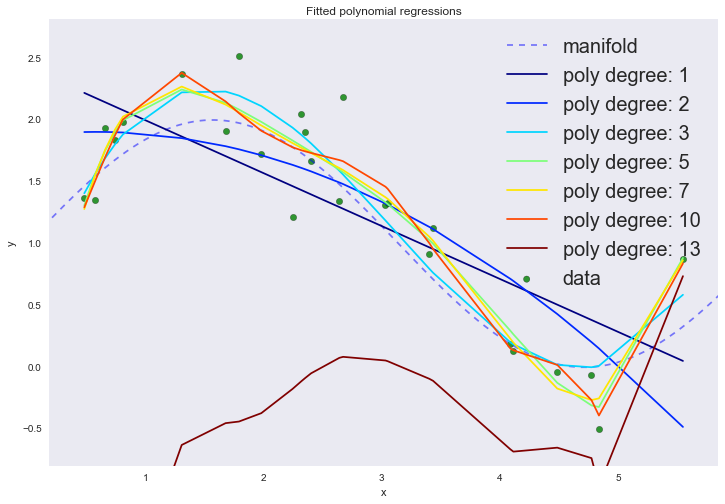
On the graph, we can observe two phenomena at once. Do not pay attention to the 13th degree of the polynomial. With an increase in the degree of the polynomial, the average error continues to decrease, although we sort of believed that it was the cubic polynomial that should best describe our data.
| p | error |
|---|---|
| one | 0.26704 |
| 2 | 0.22495 |
| 3 | 0.08217 |
| five | 0.05862 |
| 7 | 0.05749 |
| ten | 0.0532 |
| 13 | 5.76155 |
This is a clear sign of retraining, which can be seen by visualizing without even using a test data set: as the degree of the polynomial increases above the third, the model begins to interpolate the data, instead of extrapolating . In other words, the graph of the function passes exactly through the points from the training data set, and the higher the degree of the polynomial, the more points it passes. The degree of the polynomial reflects the complexity of the model. Thus, complex models, in which there are a lot of degrees of freedom, can simply remember the entire training set, completely losing their generalizing ability. This is a manifestation of the negative side of the principle of minimizing the empirical risk.
Returning to the polynomial of the 13th degree, something is clearly wrong with him. In theory, we expect that a 13th degree polynomial will describe the training data set even better, but the result shows that this is not the case. From the course of linear algebra, we remember that the inverse matrix exists only for non-singular matrices, i.e. those that do not have a linear dependence of columns or rows. In the least squares method, we need to invert the following matrix: left(XTX right)−1 . For testing linear dependence or multicollinearity, you can use the condition number of the matrix . One way to estimate this number for matrices is the ratio of the modulus of the maximum eigenvalue of the matrix to the modulus of the minimum eigenvalue. A large number of conditionality of the matrix, or the presence of one or several eigenvalues close to zero indicates the presence of multicollinearity (or fuzzy multicollinearity, when ci approxkcj+b ). Such matrices are called weakly conditioned, and the task is incorrectly stated. When inverting such a matrix, the solutions have large variance. This is manifested in the fact that with a small change in the initial matrix, the inverted ones will be very different from each other. In practice, this will emerge when you add just one to the 1000 samples, and the OLS solution will be completely different. Let's look at the eigenvalues of the resulting matrix, there is a surprise waiting for us there:
np.linalg.eigvals(np.cov(X[:, 1:].T)) Out[10]: array([ 9.29965299e+17+0.j , 4.04567033e+13+0.j , 5.44657111e+09+0.j , 3.54104756e+06+0.j , 8.36745166e+03+0.j , 6.82745279e+01+0.j , 8.88434986e-01+0.j , 2.42827315e-02+0.00830052j, 2.42827315e-02-0.00830052j, 1.17621840e-03+0.j , 1.72254789e-04+0.j , -5.68384880e-06+0.j , 2.39611454e-07+0.j ]) 
All so, numpy returned two complex-valued eigenvalues, which goes against theory. For symmetric and positive definite matrices (which is the matrix Xtx ) all eigenvalues must be valid. Perhaps this was due to the fact that when working with large numbers the matrix became slightly asymmetric, but this is not exactly ¯ \ _ () _ / ¯. If you suddenly find the reason for this behavior Numpai, please write in the comments.
UPDATE (one of the members of the box named Andrei Oskin, with a nickname in the skoffer slak, without an account on the habr, prompts):
There is only one remark - it is not necessary to use the formula `(X ^ TX ^ {- 1}) X ^ T` to calculate the linear regression coefficients. The problem with divergent values is well known and in practice use `QR` or` SVD`.
Well, that is, here is such a piece of code will give quite a decent result:degree = 13 dlist = [np.ones(data['x_train'].shape[0])] + \ list(map(lambda n: data['x_train']**n, range(1, degree + 1))) X = np.array(dlist).T q, r = np.linalg.qr(X) y_hat = np.dot(np.dot(q, qT), data['y_train']) plt.plot(data['x_train'], y_hat, label='poly degree: %i' % degree)
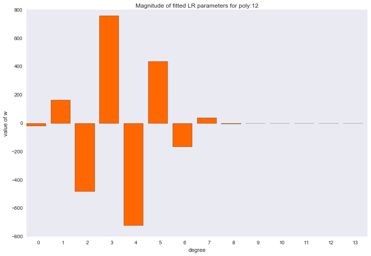
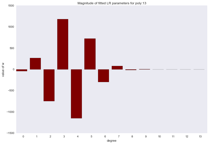
Before proceeding to the next section, let's look at the amplitude of the polynomial regression parameters. We will see that as the degree of the polynomial increases, the range of the coefficients grows almost exponentially. Yes, they also jump in different directions.
for ix, t in enumerate(w_list): degree, w = t fig, ax = plt.subplots() plt.bar(range(max(degree_list) + 1), np.hstack((w, [0]*(max(degree_list) - w.shape[0] + 1))), color=colors[ix]) plt.title('Magnitude of fitted LR parameters for poly:%i' % degree) plt.xlabel('degree') plt.ylabel('value of w') ax.set_xticks(np.array(range(max(degree_list) + 1)) + 0.5) ax.set_xticklabels(range(max(degree_list) + 1)) plt.show() 


L2 Regularization
Regularization is a way to reduce the complexity of the model in order to prevent retraining or correct an incorrectly assigned task. Usually this is achieved by adding some a priori information to the condition of the problem. For example:
Large mathcalLreg left(X, vecy, vecw right)= mathcalL left(X, vecy, vecw right)+ lambdaR left( vecw right)
- lambda - is the coefficient of regularization, then how much we want to take into account the condition R
On the graphs, we saw that the amplitude of the coefficient values is too large, we will try to reduce it by adding a restriction to L2 norm of parameter vector.
LargeR left( vecw right)= frac12 left | vecw right |22= frac12 summj=1w2j= frac12 vecwT vecw
The new cost function will look like this:
Large mathcalL left(X, vecy, vecw right)= frac12 left( vecy−X vecw right)T left( vecy−X vecw right)+ frac lambda2 vecwT vecw
Calculate the derivative of the parameters:
\ Large \ begin {array} {rcl} \ Large \ frac {\ partial \ mathcal {L}} {\ partial \ vec {w}} & = & \ frac {\ partial} {\ partial \ vec {w} } \ left (\ frac {1} {2} \ left (\ vec {y} - X \ vec {w} \ right) ^ T \ left (\ vec {y} - X \ vec {w} \ right) + \ frac {\ lambda} {2} \ vec {w} ^ T \ vec {w} \ right) \\ & = & \ frac {\ partial} {\ partial \ vec {w}} \ left (\ frac {1} {2} \ left (\ vec {y} ^ T \ vec {y} -2 \ vec {y} ^ TX \ vec {w} + \ vec {w} ^ TX ^ TX \ vec {w} \ right) + \ frac {\ lambda} {2} \ vec {w} ^ T \ vec {w} \ right) \\ & = & -X ^ T \ vec {y} + X ^ TX \ vec {w } + \ lambda \ vec {w} \ end {array}
And we will find a solution in explicit form:
\ Large \ begin {array} {rcl} \ frac {\ partial \ mathcal {L}} {\ partial \ vec {w}} = 0 & \ Leftrightarrow & -X ^ T \ vec {y} + X ^ TX \ vec {w} + \ lambda \ vec {w} = 0 \\ & \ Leftrightarrow & X ^ TX \ vec {w} + \ lambda \ vec {w} = X ^ T \ vec {y} \\ & \ Leftrightarrow & \ left (X ^ TX + \ lambda E \ right) \ vec {w} = X ^ T \ vec {y} \\ & \ Leftrightarrow & \ vec {w} = \ left (X ^ TX + \ lambda E \ right) ^ {- 1} X ^ T \ vec {y} \ end {array}
- E - the unit diagonal matrix
This regression is called ridge regression. And the crest is just the diagonal matrix which we add to the matrix Xtx with linearly dependent columns, the resulting matrix is not singular.

For such a matrix, the condition number will be: frace textmax+ lambdae textmin+ lambda where ex - This is the eigenvalue of the matrix. Thus, by increasing the regularization parameter, we decrease the number of conditionality, and the conditionality of the problem improves.
# define regularization parameter lmbd = 0.1 degree_list = [1, 2, 3, 10, 12, 13] cmap = plt.get_cmap('jet') colors = [cmap(i) for i in np.linspace(0, 1, len(degree_list))] margin = 0.3 plt.plot(data['support'], data['values'], 'b--', alpha=0.5, label='manifold') plt.scatter(data['x_train'], data['y_train'], 40, 'g', 'o', alpha=0.8, label='data') w_list_l2 = [] err = [] for ix, degree in enumerate(degree_list): dlist = [[1]*data['x_train'].shape[0]] + map(lambda n: data['x_train']**n, range(1, degree + 1)) X = np.array(dlist).T w = np.dot(np.dot(np.linalg.inv(np.dot(XT, X) + lmbd*np.eye(X.shape[1])), XT), data['y_train']) w_list_l2.append((degree, w)) y_hat = np.dot(w, XT) plt.plot(data['x_train'], y_hat, color=colors[ix], label='poly degree: %i' % degree) err.append(np.mean((data['y_train'] - y_hat)**2)) plt.xlim(data['x_train'].min() - margin, data['x_train'].max() + margin) plt.ylim(data['y_train'].min() - margin, data['y_train'].max() + margin) plt.legend(loc='upper right', prop={'size': 20}) plt.title('Fitted polynomial regressions with L2 reg') plt.xlabel('x') plt.ylabel('y') plt.show() 
| p | error |
|---|---|
| one | 0.26748 |
| 2 | 0.22546 |
| 3 | 0.08803 |
| ten | 0.05833 |
| 12 | 0.05585 |
| 13 | 0.05638 |
As a result, even the 13th degree behaves as we expect. The plots smoothed a bit, although we still see a slight retraining at degrees higher than the third, which is reflected in the interpolation of the data on the right side of the graph.
for ix, t in enumerate(w_list_l2): degree, w = t fig, ax = plt.subplots() plt.bar(range(max(degree_list) + 1), np.hstack((w, [0]*(max(degree_list) - w.shape[0] + 1))), color=colors[ix]) plt.title('Magnitude of fitted LR parameters for poly:%i with L2 reg' % degree) plt.xlabel('degree') plt.ylabel('value of w') ax.set_xticks(np.array(range(max(degree_list) + 1)) + 0.5) ax.set_xticklabels(range(max(degree_list) + 1)) plt.show() 
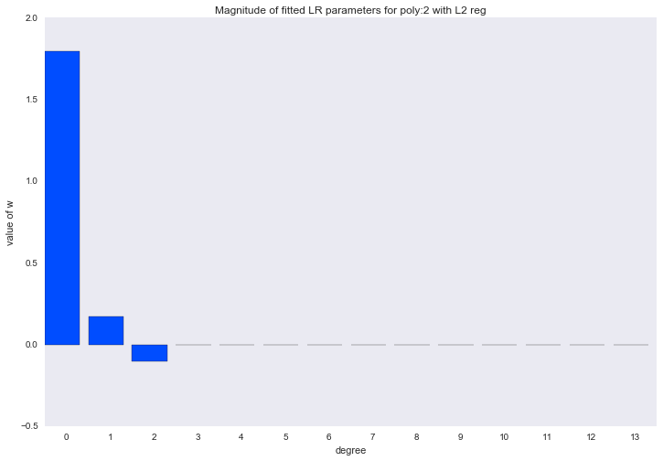


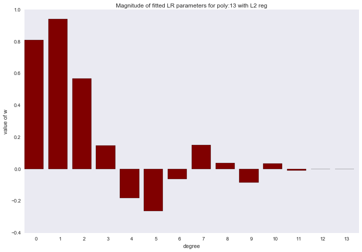
The amplitude of the coefficients also changed, although they did not stop jumping in different directions. We remember that a third degree polynomial should best describe our data, we would like to see that as a result of regularization, all coefficients with polynomial signs of a degree higher than the third would be zero. And it turns out that there is such a regularizer.
L1 regularization
Let us now try to limit the vector of model parameters using L1 rate:
LargeR left( vecw right)= left | vecw right |1= summj=1 left|wj right|
Then the task will look like:
Large mathcalL left(X, vecy, vecw right)= frac12n sumni=1 left( vecxiT vecw−yi right)2+ lambda summj=1 left|wj right|
We calculate the derivative with respect to the model parameters (I hope the distinguished gentlemen will not kick me, because I vzhuh and took the derivative modulo):
Large frac partial mathcalL partialwj= frac1n sumni=1 left( vecxiT vecw−yi right) vecxi+ lambda textsign(wj)
Unfortunately, this problem has no solution in an explicit form. To find a good approximate solution, we will use the gradient descent method, then the formula for updating the weights will take the form:
Large vecw textnew:= vecw− alpha frac partial mathcalL partial vecw
and one more hyper parameter appears in the task alpha responsible for the speed of descent, it is called learning rate (learning rate) in machine learning.
To program such an algorithm is not difficult, but we are waiting for another surprise:
lmbd = 1 degree = 13 dlist = [[1]*data['x_train'].shape[0]] + map(lambda n: data['x_train']**n, range(1, degree + 1)) X = np.array(dlist).T # def mse(u, v): return ((u - v)**2).sum()/u.shape[0] # w = np.array([-1.0] * X.shape[1]) # n_iter = 20 # , lr = 0.00000001 loss = [] for ix in range(n_iter): w -= lr*(np.dot(np.dot(X, w) - data['y_train'], X)/X.shape[0] + lmbd*np.sign(w)) y_hat = np.dot(X, w) loss.append(mse(data['y_train'], y_hat)) print loss[-1] We get this error evolution:
1.3051230958e+38 1.21979102398e+58 1.14003816725e+78 1.06549974318e+98 9.95834819687e+117 9.30724755635e+137 8.69871743413e+157 8.12997446782e+177 7.59841727794e+197 7.10161456943e+217 6.63729401109e+237 6.20333184222e+257 5.79774315864e+277 5.41867283397e+297 inf inf inf inf inf inf Even with such a small learning rate, the error still grows and very rapidly. The reason is that each sign is measured at different scales, from small numbers in polynomial features of 1-2 degrees, to huge ones at 12-13 degrees. In order for the iterative process to converge, it is necessary either to choose an extremely small learning rate or to normalize the signs in some way. Apply the following transformation to the signs and try to start the process again:
\ Large \ begin {array} {rcl} \ overline {\ mu} _ {\ cdot j} & = & \ frac {1} {n} \ sum_ {i = 1} ^ n x_ {ij} \\ \ overline {\ sigma} _ {\ cdot j} & = & \ sqrt {\ frac {1} {n} \ sum_ {i = 1} ^ n \ left (x_ {ij} - \ overline {\ mu} _ { \ cdot j} \ right) ^ 2} \ end {array}
Large vecx textnew= frac vecx− overline mu overline sigma
Such a transformation is called standardization, the distribution of each attribute now has a zero expectation and unit variance.
lmbd = 1 degree = 13 dlist = [[1]*data['x_train'].shape[0]] + map(lambda n: data['x_train']**n, range(1, degree + 1)) X = np.array(dlist).T # x_mean = X.mean(axis=0) # x_std = X.std(axis=0) # X = (X - x_mean)/x_std X[:, 0] = 1.0 w = np.array([-1.0] * X.shape[1]) n_iter = 100 lr = 0.1 loss = [] for ix in range(n_iter): w -= lr*(np.dot(np.dot(X, w) - data['y_train'], X)/X.shape[0] + lmbd*np.sign(w)) y_hat = np.dot(X, w) loss.append(mse(data['y_train'], y_hat)) plt.plot(loss) plt.title('Train error') plt.xlabel('Iteration') plt.ylabel('MSE') plt.show() Everything has become much better.

Now draw all the graphics:
degree_list = [1, 2, 3, 10, 12, 13] cmap = plt.get_cmap('jet') colors = [cmap(i) for i in np.linspace(0, 1, len(degree_list))] margin = 0.3 plt.plot(data['support'], data['values'], 'b--', alpha=0.5, label='manifold') plt.scatter(data['x_train'], data['y_train'], 40, 'g', 'o', alpha=0.8, label='data') def mse(u, v): return ((u - v)**2).sum()/u.shape[0] def fit_lr_l1(X, y, lmbd, n_iter=100, lr=0.1): w = np.array([-1.0] * X.shape[1]) loss = [] for ix_iter in range(n_iter): w -= lr*(np.dot(np.dot(X, w) - y, X)/X.shape[0] +lmbd*np.sign(w)) y_hat = np.dot(X, w) loss.append(mse(y, y_hat)) return w, y_hat, loss w_list_l1 = [] for ix, degree in enumerate(degree_list): dlist = [[1]*data['x_train'].shape[0]] + map(lambda n: data['x_train']**n, range(1, degree + 1)) X = np.array(dlist).T x_mean = X.mean(axis=0) x_std = X.std(axis=0) X = (X - x_mean)/x_std X[:, 0] = 1.0 w, y_hat, loss = fit_lr_l1(X, data['y_train'], lmbd=0.05) w_list_l1.append((degree, w)) plt.plot(data['x_train'], y_hat, color=colors[ix], label='poly degree: %i' % degree) plt.xlim(data['x_train'].min() - margin, data['x_train'].max() + margin) plt.ylim(data['y_train'].min() - margin, data['y_train'].max() + margin) plt.legend(loc='upper right', prop={'size': 20}) plt.title('Fitted polynomial regressions with L1 reg') plt.xlabel('x') plt.ylabel('y') plt.show() 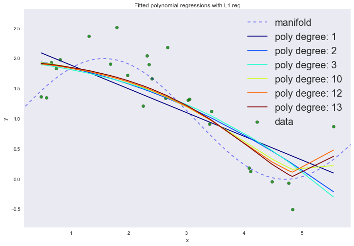
| p | error |
|---|---|
| one | 0.27204 |
| 2 | 0.23794 |
| 3 | 0.24118 |
| ten | 0.18083 |
| 12 | 0.16069 |
| 13 | 0.15425 |
If you look at the coefficients, we will see that most of them are close to zero (the fact that the 13th degree does not have a zero coefficient can be attributed to noise and a small number of examples in the training set; it is also worth remembering that now all signs are measured in the same scales).
for ix, t in enumerate(w_list_l1): degree, w = t fig, ax = plt.subplots() plt.bar(range(max(degree_list) + 1), np.hstack((w, [0]*(max(degree_list) - w.shape[0] + 1))), color=colors[ix]) plt.title('Magnitude of fitted LR parameters for poly:%i with L1 reg' % degree) plt.xlabel('degree') plt.ylabel('value of w') ax.set_xticks(np.array(range(max(degree_list) + 1)) + 0.5) ax.set_xticklabels(range(max(degree_list) + 1)) plt.show() 

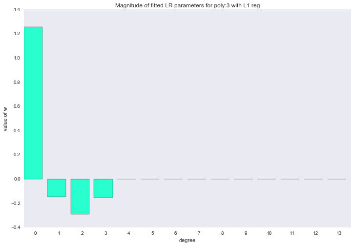
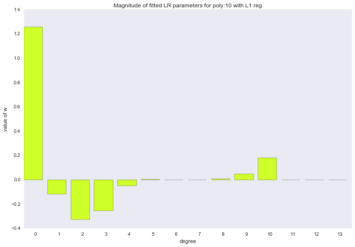


The described method of constructing a regression is called LASSO regression. I would very much like to think that the uncle on a horse throws the rope and steals the coefficients, and zero remains in their place. But no, LASSO = least absolute shrinkage and selection operator.
Bayesian interpretation of linear regression
The two regularizations described above, and the linear regression itself with a quadratic error function, can seem like some dirty empirical tricks. But it turns out that if you look at this model from a different point of view, from the point of view of Bayesian statistics, everything becomes in places. Dirty empirical tricks will become a priori assumptions. At the heart of Bayesian statistics is the Bayes formula:
Large colorgreenp left(y midx right)= dfrac colororangep left(x midy right) colorbluep left(y right) colorredp left(x right)
- colorbluep left(y right) - a priori expectations (prior): how plausible is the hypothesis before observing the data;
- colororangep left(x midy right) - likelihood: how plausible is the data, provided that the hypothesis is correct;
- colorredp left(x right)= sumzp left(x midz right)p left(z right) - marginal probability or evidence: averaged over all possible hypotheses;
- colorgreenp left(y midx right) - posterior distribution: how plausible is the hypothesis with the observed data.
The statistics usually look for a point estimate of maximum likelihood (ML = maximum likelihood):
Large theta textML= arg max thetap left(D mid theta right)
While in the Bayesian approach they are interested in the posterior distribution:
Largep left( theta midD right) proptop left(D mid theta right)p left( theta right)
It often happens that the integral obtained as a result of Bayes output is extremely nontrivial (in the case of linear regression, this, fortunately, is not so), and then a point estimate is needed. Then we are interested in the maximum posterior distribution (MAP = maximum a posteriori):
Large theta textMAP= arg max thetap left( theta midD right)= arg max thetap left(D mid theta right)p left( theta right)
Let's compare the ML and MAP hypotheses for linear regression, this will give us a clear understanding of the meaning of regularizations. We assume that all objects from the training set were taken from the general population independently and uniformly distributed. This will allow us to record the joint probability of data (likelihood) in the form:
Largep(D)= prodni=1p(xi)
We will also assume that the target variable obeys the following law:
Largey= vecwT vecx+ epsilon, epsilon sim mathcalN left(0, sigma2 right)
or
Largep left(y mid vecx, vecw, sigma2 right)= mathcalN left(y mid vecwT vecx, sigma2 right)
Those. the correct value of the target variable is made up of the value of the deterministic linear function and some unpredictable random error, with zero expectation and some variance. Then, we can write the likelihood of the data as:
Largep left( vecy midX, vecw, sigma2 right)= prodni=1 mathcalN left(yi mid vecwT vecxi, sigma2 right)
it is more convenient to recalibrate this expression:
\ Large \ begin {array} {rcl} \ mathcal {L} & = & \ ln p \ left (\ vec {y} \ mid X, \ vec {w}, \ sigma ^ 2 \ right) \\ & = & \ ln \ prod_ {i = 1} ^ n \ mathcal {N} \ left (y_i \ mid \ vec {w} ^ T \ vec {x} _i, \ sigma ^ 2 \ right) \\ & = & \ ln \ frac {1} {\ left (\ sigma \ sqrt {2 \ pi} \ right) ^ n} e ^ {- \ frac {1} {2 \ sigma ^ 2} \ sum_ {i = 1} ^ n \ left (y_i - \ vec {w} ^ T \ vec {x} _i \ right) ^ 2} \\ & = & - \ frac {n} {2} \ ln 2 \ pi \ sigma ^ 2 - \ frac {1} {2 \ sigma ^ 2} \ sum_ {i = 1} ^ n \ left (y_i - \ vec {w} ^ T \ vec {x} _i \ right) ^ 2 \ end {array}
And suddenly we will see that the maximum likelihood estimate is the same as the least squares estimate. We will generate a new data set of a larger size, find the ML solution and visualize it.
data = generate_wave_set(1000, 100) X = np.vstack((np.ones(data['x_train'].shape[0]), data['x_train'])).T w = np.dot(np.dot(np.linalg.inv(np.dot(XT, X)), XT), data['y_train']) w0_support = np.linspace(-3, 3, 1000) w1_support = np.linspace(-3, 3, 1000) # create cartesian product of parameters wx_space = list(it.product(w0_support, w1_support)) w0, w1 = zip(*wx_space) # calculate MSE on dataset for each pairs of parameters y = ((data['y_train'][:, np.newaxis] - np.dot(X, np.array(wx_space).T))**2).mean(axis=0) plt.hexbin(w0, w1, C=y**(0.2), cmap=cm.jet_r, bins=None) plt.axvline(0, color='black', linestyle='-', label='origin') plt.axhline(0, color='black', linestyle='-') plt.axvline(w[0], color='w', linestyle='--', label='ML solution') plt.axhline(w[1], color='w', linestyle='--') plt.axes().set_aspect('equal', 'datalim') plt.title('ML solution') plt.xlabel('w_0') plt.ylabel('w_1') plt.legend(loc='upper left', prop={'size': 20}) plt.show() 
Different values of all two parameters of the model are plotted on the abscissa and ordinate axis (we decide exactly linear regression, not polynomial), the background color is proportional to the likelihood value at the corresponding point of the parameter values. The ML solution is at the very peak, where credibility is at its maximum.
Let us find the MAP estimate of the linear regression parameters, for this we will have to set some prior distribution on the model parameters. Let for a start it will again be a normal distribution:p(→w)=N(→w∣0,σ20E) .
p(x∣μ,σ)=1σ√2πe−(x−μ)22σ2
x = np.linspace(-5, 5, 1000) for scale in np.linspace(0.5, 1.4, 7): plt.plot(x, norm.pdf(x, scale=scale), label='scale=%0.2f' % scale) plt.legend(loc='upper right', prop={'size': 20}) plt.title('Normal distribution with different scale parameter') plt.show() 
Then the posterior distribution takes the form:
p(→w∣→y,X,σ2)∝N(→w∣0,σ20E)n∏i=1N(yi∣→wT→xi,σ2)
If you write the logarithm of this expression, you can easily see that adding a normal prior distribution is the same as adding L2norms to the cost function. Try it yourself. It will also become clear that by varying the regularization parameter, we change the variance of the a priori distribution:λ=12σ20 .
w = np.dot(np.dot(np.linalg.inv(np.dot(XT, X)), XT), data['y_train']) # solve L2 problems for different values of w_l2 = {} lmbd_space = np.linspace(0.5, 1500, 500) for lmbd in lmbd_space: w_l2[lmbd] = np.dot(np.dot(np.linalg.inv(np.dot(XT, X) + lmbd*np.eye(X.shape[1])), XT), data['y_train']) w0_support = np.linspace(-3, 3, 1000) w1_support = np.linspace(-3, 3, 1000) wx_space = list(it.product(w0_support, w1_support)) w0, w1 = zip(*wx_space) y = ((data['y_train'][:, np.newaxis] - np.dot(X, np.array(wx_space).T))**2).mean(axis=0) plt.hexbin(w0, w1, C=y**(0.2), cmap=cm.jet_r, bins=None) plt.axvline(0, color='black', linestyle='-', label='origin') plt.axhline(0, color='black', linestyle='-') # plot prior distribution of parameters for i in range(1, 6): plt.gcf().gca().add_artist(plt.Circle((0, 0), i*0.3, color='black', linestyle='--', alpha=0.1)) plt.axvline(w[0], color='w', linestyle='--', label='ML solution') plt.axhline(w[1], color='w', linestyle='--') # plot MAP solutions flag = True for _, w_l2_solution in w_l2.items(): plt.plot(w_l2_solution[0], w_l2_solution[1], color='c', marker='.', mew=1, alpha=0.5, label='MAP L2 solution' if flag else None) flag = False plt.axes().set_aspect('equal', 'datalim') plt.title('ML and MAP L2 for different values of lambda') plt.xlabel('w_0') plt.ylabel('w_1') plt.legend(loc='upper left', prop={'size': 20}) plt.show() 
Now the circles coming from the center have been added to the chart - this is the density of the prior distribution (circles, not ellipses, because the covariance matrix of this normal distribution is diagonal, and the same number is on the diagonal). The dots indicate various solutions to the MAP problem. By increasing the regularization parameter (which is equivalent to reducing the variance), we force the solution to move away from the ML estimate and move closer to the center of the prior distribution. With a large value of the regularization parameter, all parameters will be close to zero.
Naturally, we can impose another prior distribution on the model parameters, for example, the Laplace distribution, then we will get the same asL1 regularization.
p(x∣μ,β)=12βe−|x−μ|β
from scipy.stats import laplace x = np.linspace(-5, 5, 1000) for scale in np.linspace(0.5, 1.4, 7): plt.plot(x, laplace.pdf(x, scale=scale), label='scale=%0.2f' % scale) plt.legend(loc='upper right', prop={'size': 20}) plt.title('Laplace distribution with different scale parameter') plt.show() 
Then the posterior distribution takes the form:
p(→w∣→y,X,σ2)∝Laplace(→w∣0,β)n∏i=1N(yi∣→wT→xi,σ2)
w_l1 = {} lmbd_space = np.linspace(0.001, 2, 200) for lmbd in tqdm(lmbd_space): w_l1[lmbd] = fit_lr_l1(X, data['y_train'], lmbd, n_iter=10000, lr=0.001)[0] w0_support = np.linspace(-3, 3, 1000) w1_support = np.linspace(-3, 3, 1000) wx_space = list(it.product(w0_support, w1_support)) w0, w1 = zip(*wx_space) y = ((data['y_train'][:, np.newaxis] - np.dot(X, np.array(wx_space).T))**2).mean(axis=0) plt.hexbin(w0, w1, C=y**(0.2), cmap=cm.jet_r, bins=None) plt.axvline(0, color='black', linestyle='-', label='origin') plt.axhline(0, color='black', linestyle='-') # function to plot rhomb def plot_rhomb(cx=0, cy=0, r=0.5): plt.gcf().gca().add_artist(plt.Rectangle((cx, cy - np.sqrt(2*r**2)), 2*r, 2*r, angle=45, color='black', linestyle='--', alpha=0.1)) # plot Laplace distribution density for i in range(1, 6): plot_rhomb(r=0.2*i) plt.axvline(w[0], color='w', linestyle='--', label='ML solution') plt.axhline(w[1], color='w', linestyle='--') # plot MAP solutions flag = True for _, w_l1_solution in w_l1.items(): plt.plot(w_l1_solution[0], w_l1_solution[1], color='c', marker='.', mew=1, alpha=0.5, label='MAP L1 solution' if flag else None) flag = False plt.axes().set_aspect('equal', 'datalim') plt.title('ML and MAP L1 for different values of lambda') plt.xlabel('w_0') plt.ylabel('w_1') plt.legend(loc='upper left', prop={'size': 20}) plt.show() 
Global dynamics has not changed: we increase the regularization parameter - the solution approaches the center of the prior distribution. We can also observe that such a regularization contributes to finding sparse solutions: you can see two segments in which first one parameter is equal to zero, then the second parameter (at the end both are equal to zero).
And in fact, the two regularizers described are special cases of superimposing a generalized normal distribution as an a priori distribution on the linear regression parameters:
p(x∣α,β,μ)=β2αΓ(1β)e−(|x−μ|α)β
from scipy.stats import gennorm x = np.linspace(-5, 5, 1000) for beta in np.linspace(0, 3, 11): plt.plot(x, gennorm.pdf(x, beta=beta), label='beta=%0.2f' % beta) plt.legend(loc='upper right', prop={'size': 20}) plt.title('Generalized normal distribution with different beta parameter') plt.show() 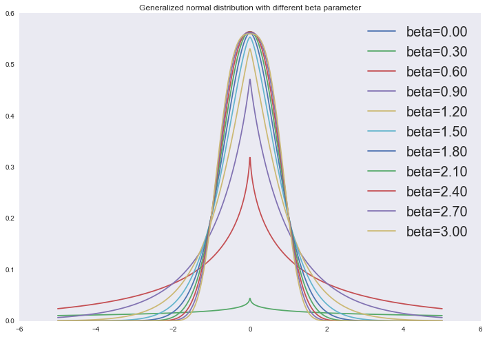
Or we can look at these regularizers in terms of limiting Lp norms, as in the previous part:
‖x‖p=(∞∑i=1|x|p)1p
f, ax = plt.subplots(3, 4) ax = reduce(lambda a, b: a + b, ax.tolist()) a_list = np.linspace(0, 2*np.pi, 361) r_list = np.linspace(0, 1.1, 100) for ix, p in enumerate(np.linspace(0.25, 3, 12)): points = [] for a in a_list: r_inner = [] for r in r_list: if np.linalg.norm([r*np.cos(a), r*np.sin(a)], p) > 1: break r_inner.append(r) r = max(r_inner) points.append([r*np.cos(a), r*np.sin(a)]) points = np.array(points) ax[ix].plot(points[:, 0], points[:, 1]) ax[ix].set_aspect('equal', 'datalim') ax[ix].set_title('Circle in Lp space, p=%0.2f' % p) 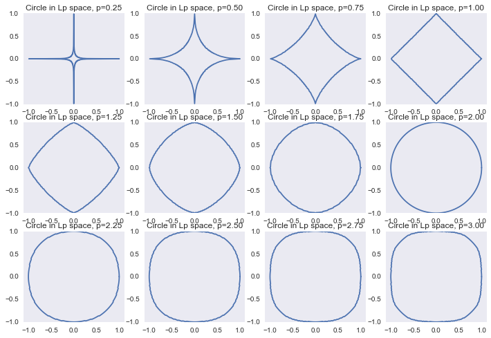
Conclusion
Here you will find jupyter notebook with all of the above and a few bonuses. Special thanks to those who mastered this text to the end.
Those wishing to dig into this topic deeper, I recommend:
- lectures by Sergey Nikolenko , from where the idea of this jupyter notebook was borrowed;
- Boris Demeshev 's lectures on econometrics (from the 146th video), and his own course on the course .
Understanding linear regression is the key to understanding more complex models, right down to deep neural networks. If we take the sigmoid from the linear function, we get a logistic regression. We mix several logrepressors in one layer - we get softmax regression / max entropy regression. And if you stack several layers, there will be a non-network. So it goes.
Join ods.ai , come to our meetings, we will make ML great again!

Source: https://habr.com/ru/post/322076/
All Articles