Science on guard of interfaces: how to make buttons in the application really comfortable

This feeling, which has no name, is precisely familiar to you - a mixture of frustration and irritation when you use an application with a bad interface. Well, when you realize that you need to very carefully press a button on the touch screen right here to make it work.
Imagine that you created an interface in which this problem simply does not exist. An interface that reduces errors, executes commands faster and ultimately makes the product better.
')
It is quite real. And here's how to do it.
You let me down for the last time, iOS 9
I constantly encountered this problem in iOS 9 on the music control panel on a locked screen. Always, whenever I tried to switch a track on the move, I could not do it from the first, second, or even third attempt. But then I accidentally cut the volume to maximum or even paused.

Ultimately, a bad interface made me change habits - I just started to avoid it. This is an absolute failure - the interface, created only to save my time, eventually made me spend much more time.
By some miracle, the iOS 9 control panel violated the key user interface rule. But which one?

Fortunately, the new iOS 10 design changed. Larger controls. Wider area to click. Information about who sings in my headphones is bigger. In other words, the percentage of inaccurate clicks on the go has dropped significantly. Why? Science knows the answer to this question.
What can teach 120 million clicks
In 2006, researchers from the University of Oulu, Finland and the University of Maryland, College Park merged. They were going to figure out the optimal button size for using the smartphone with one hand.
They tested two scenarios . In the first, the participants performed one action (for example, launch an application, put a check mark or switch a track). In the second - a chain of actions, for example, enter the phone number. Researchers worked with buttons of different sizes for each scenario. They found that the percentage of errors increases significantly if the button diameter for a one-time action is less than 9.2 millimeters, and for repetitive, 9.6 millimeters.
It is curious that during the successive work on the screen, the percentage of errors was stable with a button size from 9.6 millimeters to 11.5 millimeters. More on this - a little further.
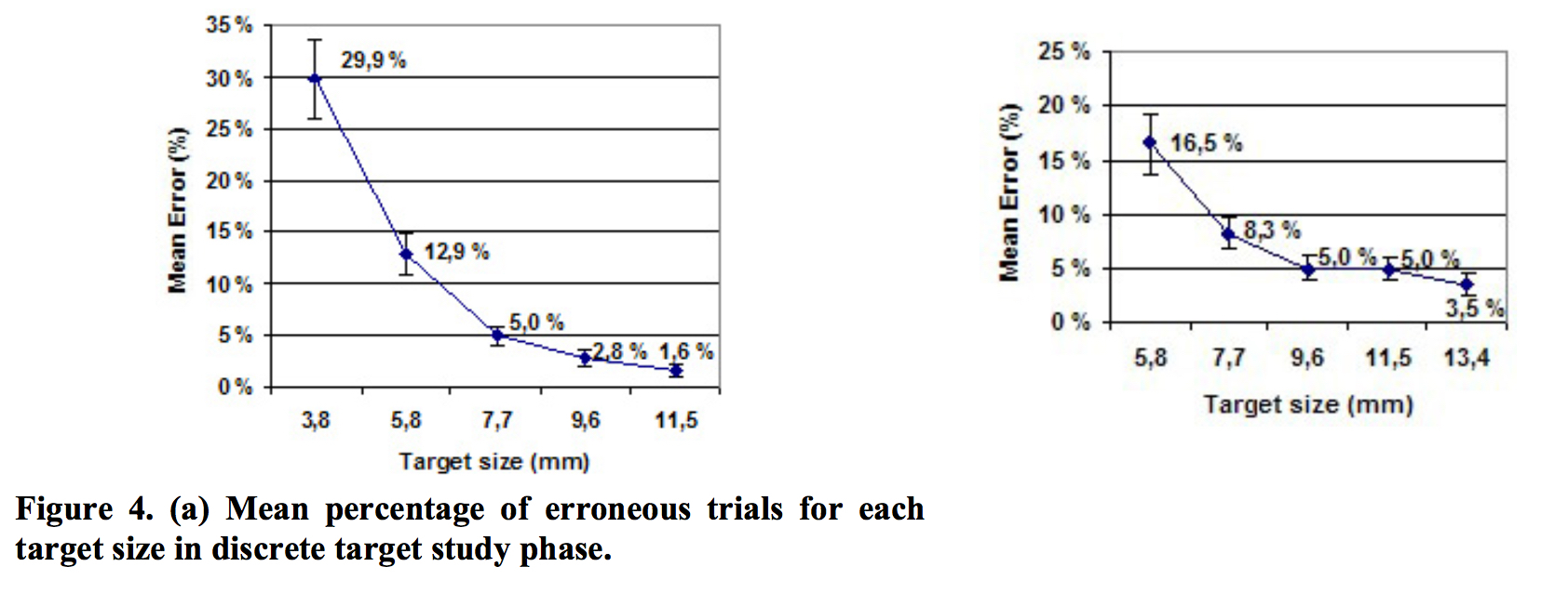
Graph 4: Average error rate for buttons of different diameters
Five years later, researchers from two German institutions conducted a similar study. They planned to find the optimal size for the button on the touchscreen.
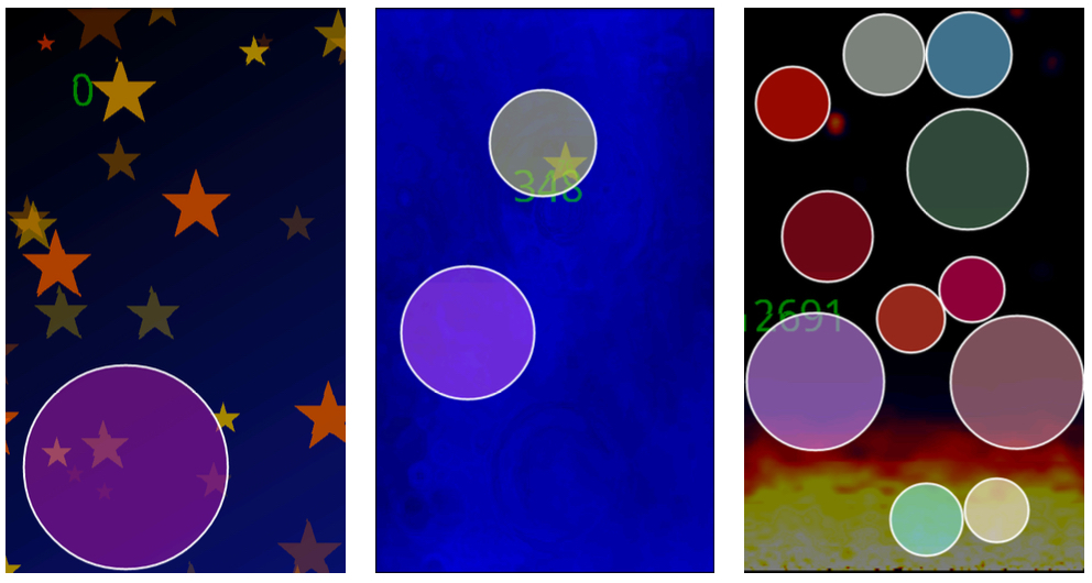
For their experiment, scientists have created a game for Android. It downloaded 100,000 times, and she recorded more than 120 million screen touches. The gameplay was very simple: players using tapas caught circles of different sizes floating around the screen.
After analyzing all the touches, the scientists found that on circles with a diameter of 15 millimeters and less, the number of misses increased, and after 12 millimeters it increased dramatically. And on targets with a diameter of less than 8 millimeters, the players missed almost 40% of cases!
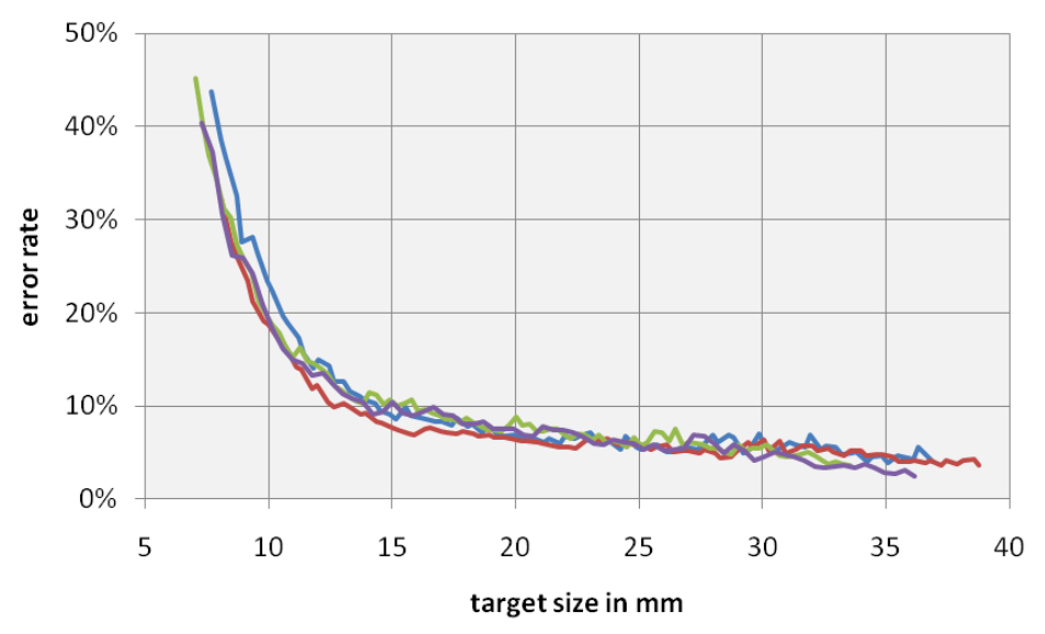
Oddly enough, this study at the same time indicates a slight increase in the accuracy of hits, if the user's goal is more than 12 mm.
There are many other similar studies that can be cited as an example, including the recommended sizes of elements in Apple, Google or Microsoft guidelines (we will return to them later). But let's first turn to the great-grandfather of all these standards - the law of Fitts.
Prehistory
Product creators are simply obliged to use the results of the hard work of their predecessors. Paul Fitts, a psychologist at the University of Ohio, in 1954 developed a principle that would later become known as the Fitts law. It became the basis of human-computer interaction.
The law of Fitts in a general sense is a model of how long it takes to put a hand on an object. Roughly speaking, the closer and bigger the object, the easier and faster a person is able to do it.
Fitts created a mathematical model. And if we use it for touchscreens, we’ll find out how long it takes to put a finger on a section of the screen, if we know the size of the area and the distance to it.
This is the original formula: MT = a + b log2 (2A / W) . In it:
- MT = time taken to move
- a, b = parameters that depend on the situation
- A = movement distance from the beginning to the middle of the target
- W = target width along axis of movement
I'm not a mathematician, but everything I read about this model says that the logarithmic part of the function is very important. The Cognitivist and co-author of the book “Mind Hacks” Tom Stafford very precisely summarizes the importance of the logarithm:
“Although the essence of this formula is trivial (large objects are easier to choose), the most interesting thing about it is an exact mathematical characteristic, and the fact that this characteristic includes a logarithmic function means that the form of the relationship between size and reaction time is curved, so that even a small increase in size for small objects makes them much more achievable (while a slight increase in size for large objects will have almost no effect on the result). The same applies to changes in the distance to the target. "
Even more curiously, modern research confirms this statement again and again. In those two papers that I mentioned above, after a certain size of the button (about 12-15 mm) there were no fundamental changes in the accuracy of the hit.
And now the most pleasant part. How to apply this knowledge in interface design?
Improving the interface with the help of the Fitts law
Using the Fitts law as a basis, and taking into account the studies cited at the beginning, you can create truly user-friendly interfaces.
First look at the recommendations of the size of the buttons from the two studies above:
- 9.2 x 9.2 millimeters
- 9.6 x 9.6 millimeters
- 12 x 12 millimeters
- 15 x 15 millimeters
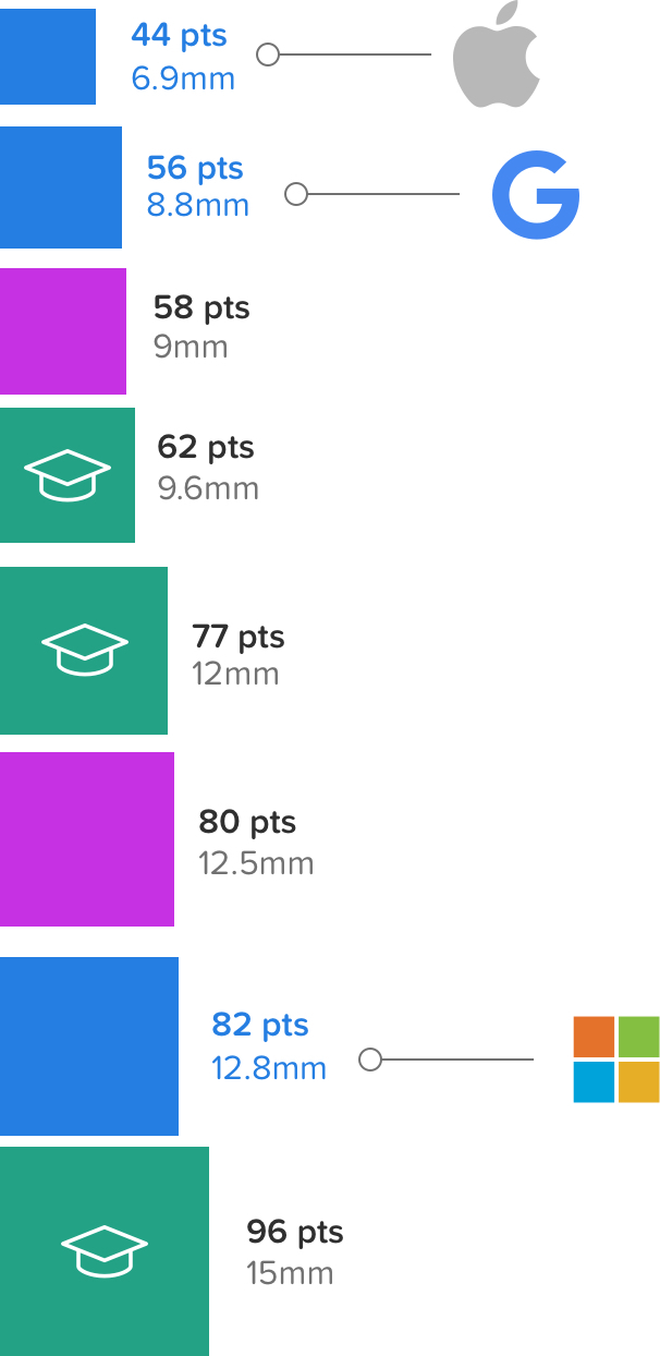
Now we mix them with the minimum recommended sizes from Apple, Google and Microsoft.
- Apple : 44 x 44 dots
- Google : 48 x 48 dp + 8dp or more for indent = 56 x 56 dp
- Microsoft : 9 x 9 millimeters + 2 millimeters per recommended padding on both sides = 13 x 13 millimeters
Oh, how to bring to one denominator all these units?
We need to convert millimeters to pixels, and pixels to points. Since pixels, by definition, do not have a standard dimension, you have to use a formula that takes into account the number of pixels per inch for each individual display.
Pixels = PPI * (. 03937 inches per mm * mm)
Let's say we use the iPhone 7 with a Retina display. According to Apple , the PPI for the iPhone 7 display is 326. All that is left is to substitute the desired value:
Pixels = 336 * (. 03937 inches per mm * mm)
I will assume that many of you are working in Sketch, so let's translate the results into points. For iPhone 7, the pixel density is 200% , so we just need to divide the resulting number into two in order for the x1 scale to display everything correctly. (Confused? Here's a great article on why it’s better to develop a x1-scale design.)
Further, after we have converted all the sizes, let's compare how they will look on the display of the iPhone 7. At the same time, I indicated the standards of the buttons of the main players on the market and the key dimensions of the research I mentioned:
Let's pour oil into the fire. I wonder what were the sizes of those buttons from the music screen in iOS 9 and iOS 10? Do they intersect with any values from research?
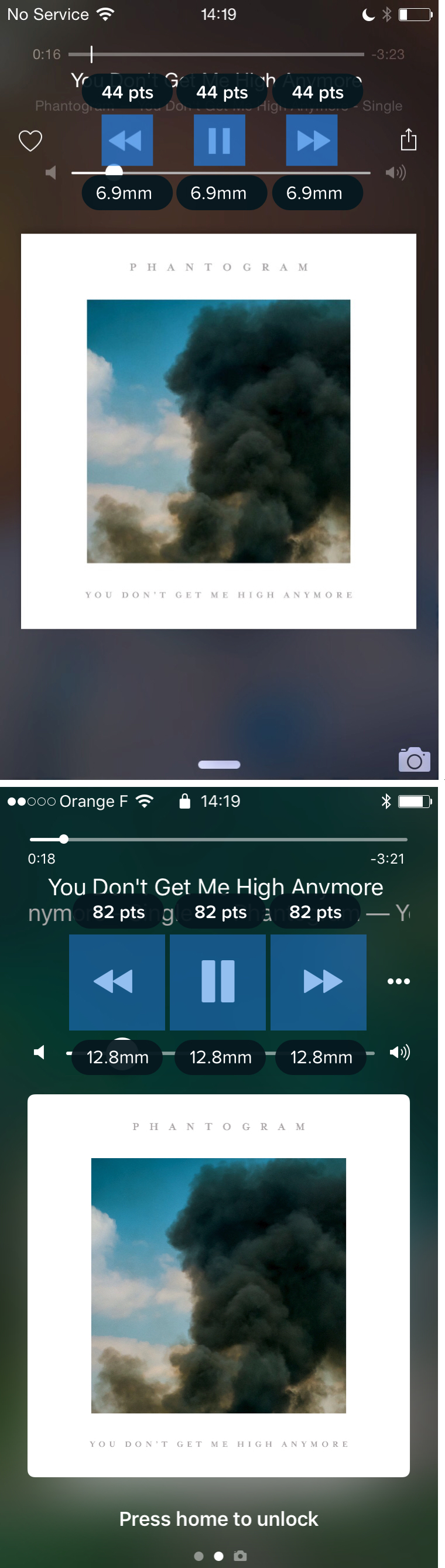
Look! In iOS 10, Apple has increased the size of the buttons from 7 to 12.8 millimeters! Fully coincides with the recommendations in Microsoft guidelines.
How to make a touch interface really comfortable
According to research by MIT Touch Lab , the average size of a person’s fingertip is 10-14 millimeters, and the tip of the finger is 8 to 10 millimeters. I think we can easily deduce the "law of the size of ideal buttons in a perfectly user-friendly interface":
A good interface is based on elements of at least 10 millimeters in size, and ideally around 13 millimeters, which fits into Microsoft standards. Staying within these boundaries, you will definitely be able to create interfaces that will help users minimize errors, complete tasks faster and, as a result, live happily with your application.
Source: https://habr.com/ru/post/322022/
All Articles