Acquaintance with Styled components
We bring to your attention a translation of the fresh introductory article by Sacha Greif, co-author of the book Discover Meteor, on the specifics of working with the Styled components library.
“CSS is a strange thing. You can learn its basics in 15 minutes, but it can take years to find a good way to organize styles.

This is partly due to the peculiarities of the language itself. In its original form, CSS is rather limited — no variables, loops, or functions. At the same time, it unleashes your hands, making it possible to style the elements, classes, IDs, or any combination thereof.
')
Chaotic style sheets
As you must have already experienced, this often leads to total confusion. And although preprocessors, such as SASS and LESS, add many useful features, they are not able to suppress anarchy in CSS.
This organizational work has been provided to methodologies such as BEM, which - although useful in this regard - are still not mandatory and cannot be implemented more universally, at the level of language or tools.
New Wave CSS
Rewind a couple of years ahead: a new wave of JavaScript-based tools is trying to solve these difficulties in a fundamental way, changing the very way of writing CSS.
Styled Components - this is one of these libraries, which quickly attracted the attention of the masses because of its inherent mixture of innovation with familiarity. Therefore, if you use React (and if not, I advise you to familiarize yourself with my articles " Curriculum on JavaScript " and " Introduction to React "), you should definitely look at this alternative to CSS.
I recently used Styled Components to redesign my personal site and want to share some points that I have highlighted for myself in the process.
Components Styled
The main thing to keep in mind when working with Styled Components - the name should be understood almost literally. You no longer stylize HTML elements or components based on their class or HTML element:
Instead, you define stylized components that have their own encapsulated styles. Further you freely use these styles throughout the code:
The difference seems to be small, and in fact both syntaxes are very similar. But the key difference is that styles are now part of the component. In other words, we get rid of CSS classes as an intermediate step between a component and its styles.
As Max Stoyber, one of the creators of Styled-components, said:
Reduced complexity
At first, this seems illogical, because the whole point of using CSS instead of styling HTML elements directly (remember the font tag?) Was to separate styles and markup by introducing classes as an intermediate layer.
But this separation also creates many difficulties, and on this basis it can be argued that a “real” programming language, such as JavaScript, is more suitable for correcting these difficulties than CSS.
Props, not classes
Adhering to this “non-class” philosophy, styled-components use props instead of classes for everything related to customization of the behavior of the component.
So instead:
You write this:
As you can see, styled-components allow you to clean up components in React, taking everything related to CSS and HTML implementation beyond their limits.
However, styled-components CSS is still CSS too. Therefore, this code is also quite acceptable, although not quite common:
This is one of the features that makes styled-components a very easy-to-understand tool: when doubts creep in, you can always go back to what you know!
Reservations
It is also important to note that the styled-components is still a young project and some of its chips are still not fully supported. For example, if you want to repeat the style of the parent component in the child, at this point you will have to use the CSS classes (at least until styled-components v2 comes out).
Also, there is currently no “legitimate” way to pre-render on your CSS on the server, although this can definitely be done by manually inserting styles.
In addition, styled-components create their own random class names, which can make it difficult to use the “developer tools” of your browser to find the initial definition of where your styles are displayed.
But it is clearly encouraging that the development team is aware of these problems and is actively working to correct them. The second version is coming soon, and I am looking forward to it!
Find out more
My goal in this article was not to explain in detail how the styled-components work, but more to give a little tip so that you yourself can decide if you are interested in this.
If I managed to arouse your interest, here are some resources where you can learn more about styled-components:
And if you suddenly want to delve into the topic, you can also look at Glamor - another look at the CSS of a new wave! ”
“CSS is a strange thing. You can learn its basics in 15 minutes, but it can take years to find a good way to organize styles.
This is partly due to the peculiarities of the language itself. In its original form, CSS is rather limited — no variables, loops, or functions. At the same time, it unleashes your hands, making it possible to style the elements, classes, IDs, or any combination thereof.
')
Chaotic style sheets
As you must have already experienced, this often leads to total confusion. And although preprocessors, such as SASS and LESS, add many useful features, they are not able to suppress anarchy in CSS.
This organizational work has been provided to methodologies such as BEM, which - although useful in this regard - are still not mandatory and cannot be implemented more universally, at the level of language or tools.
New Wave CSS
Rewind a couple of years ahead: a new wave of JavaScript-based tools is trying to solve these difficulties in a fundamental way, changing the very way of writing CSS.
Styled Components - this is one of these libraries, which quickly attracted the attention of the masses because of its inherent mixture of innovation with familiarity. Therefore, if you use React (and if not, I advise you to familiarize yourself with my articles " Curriculum on JavaScript " and " Introduction to React "), you should definitely look at this alternative to CSS.
I recently used Styled Components to redesign my personal site and want to share some points that I have highlighted for myself in the process.
Components Styled
The main thing to keep in mind when working with Styled Components - the name should be understood almost literally. You no longer stylize HTML elements or components based on their class or HTML element:
<h1 className="title">Hello World</h1> h1.title{ font-size: 1.5em; color: purple; } Instead, you define stylized components that have their own encapsulated styles. Further you freely use these styles throughout the code:
import styled from 'styled-components'; const Title = styled.h1` font-size: 1.5em; color: purple; `; <Title>Hello World</Title> The difference seems to be small, and in fact both syntaxes are very similar. But the key difference is that styles are now part of the component. In other words, we get rid of CSS classes as an intermediate step between a component and its styles.
As Max Stoyber, one of the creators of Styled-components, said:
"The main idea behind styled-components is to introduce best practices by removing the mapping between styles and components."
Reduced complexity
At first, this seems illogical, because the whole point of using CSS instead of styling HTML elements directly (remember the font tag?) Was to separate styles and markup by introducing classes as an intermediate layer.
But this separation also creates many difficulties, and on this basis it can be argued that a “real” programming language, such as JavaScript, is more suitable for correcting these difficulties than CSS.
Props, not classes
Adhering to this “non-class” philosophy, styled-components use props instead of classes for everything related to customization of the behavior of the component.
So instead:
<h1 className="title primary">Hello World</h1> // will be blue h1.title{ font-size: 1.5em; color: purple; &.primary{ color: blue; } } You write this:
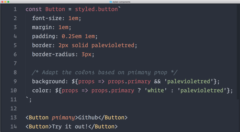
const Title = styled.h1` font-size: 1.5em; color: ${props => props.primary ? 'blue' : 'purple'}; `; <Title primary>Hello World</Title> // will be blue As you can see, styled-components allow you to clean up components in React, taking everything related to CSS and HTML implementation beyond their limits.
However, styled-components CSS is still CSS too. Therefore, this code is also quite acceptable, although not quite common:
const Title = styled.h1` font-size: 1.5em; color: purple; &.primary{ color: blue; } `; <Title className="primary">Hello World</Title> // will be blue This is one of the features that makes styled-components a very easy-to-understand tool: when doubts creep in, you can always go back to what you know!
Reservations
It is also important to note that the styled-components is still a young project and some of its chips are still not fully supported. For example, if you want to repeat the style of the parent component in the child, at this point you will have to use the CSS classes (at least until styled-components v2 comes out).
Also, there is currently no “legitimate” way to pre-render on your CSS on the server, although this can definitely be done by manually inserting styles.
In addition, styled-components create their own random class names, which can make it difficult to use the “developer tools” of your browser to find the initial definition of where your styles are displayed.
But it is clearly encouraging that the development team is aware of these problems and is actively working to correct them. The second version is coming soon, and I am looking forward to it!
Find out more
My goal in this article was not to explain in detail how the styled-components work, but more to give a little tip so that you yourself can decide if you are interested in this.
If I managed to arouse your interest, here are some resources where you can learn more about styled-components:
- Max Stoiber recently wrote an article about the sense of styled-components on Smashing Magazine.
- The styled-components repository itself has extensive documentation.
- Jamie Dixon's article shows several advantages of using styled-components
- If you want to learn more about how the library works in practice, read this article from Max.
And if you suddenly want to delve into the topic, you can also look at Glamor - another look at the CSS of a new wave! ”
Source: https://habr.com/ru/post/321804/
All Articles