Crash course on UI design
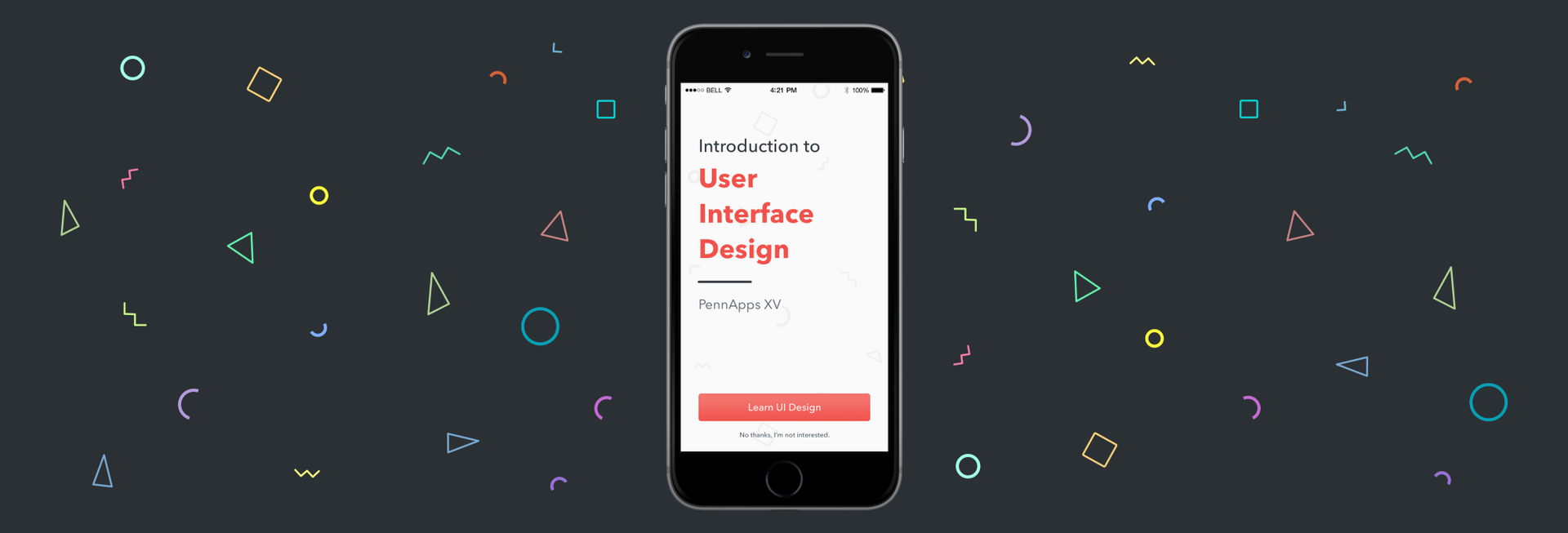
We are always in search of good articles about design, in order to use them later in the work on the site “ I love FE ”. Today we have translated another article that tells how the UI design differs from UX design and on what basic principles the interface design is built.
UI vs. Ux
If you are at least a little interested in the design of applications, you probably have heard the terms "UI" and "UX". But how are they different?
In its simplest form, UX design is what makes the interface useful, and UI design makes it beautiful. Interface design is a mixture of visual hierarchy and interface elements. To understand the difference between a great design and just good, you need to understand that interface design is just one of the layers of the whole design process. Perhaps that is why these two terms are so often confused. In this article I will try to tell you what is the difference between them in terms of the design process.
According to the book by G. Garrett "Elements of Interaction Experience", UX-design can be defined through five main levels. Let's start with the most abstract.
1. Strategy
Site Goals and User Needs
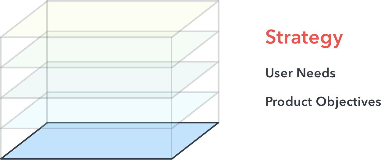
In a broad sense, strategy is the basis of product design. At this stage, various research techniques are applied, including user interviews, competitor analysis, characters, etc., in order to understand:
- What problem are you trying to solve?
- What do users need?
- How does your product fit into your business context (what are its goals)?
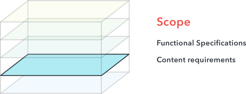
2. A set of opportunities
Functional specifications and content requirements
')
At this stage, you must define the feature set and the amount of information for your platform. In other words:
- How will you solve this problem? What functions do you want to implement and in what order?
The main challenge for the designer here is to correctly prioritize with minimal cost. Surely, you have hundreds of ideas on how to solve a problem, but you cannot implement them all.
3. Structure
Information architecture and interaction design
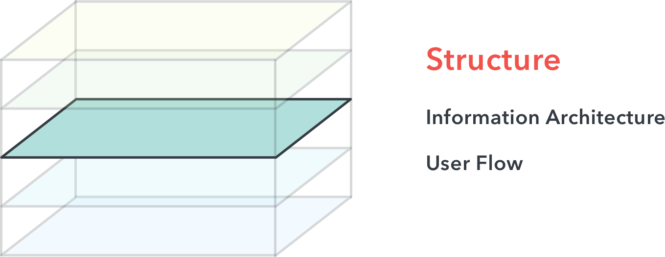
At this stage, your ideas should begin to take shape in the structure. The information architecture is responsible for how information is presented within the application and how it is perceived by users. Interaction design determines the sequence of actions that will help the user to solve a specific task. Together they determine the most logical steps in order to meet user needs.
4. Layout
Interface Design and Information Design
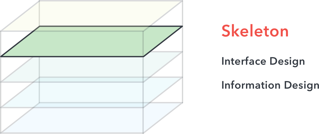
At this stage, things are becoming less abstract and more concrete.
At the layout level, we design the interface design and information design to refine the structure from the previous level. Interface design is responsible for the location of specific interface elements that allow the user to interact with the functionality of the system. Whereas information design is responsible for how this information is presented to facilitate this interaction.
It is at this stage that you will find most of the UX or product designers working on wireframes. Web frames are very approximate, often black and white layouts that demonstrate the purpose of each interface element for users.
And finally:
5. Surface
Visual design and sensory perception
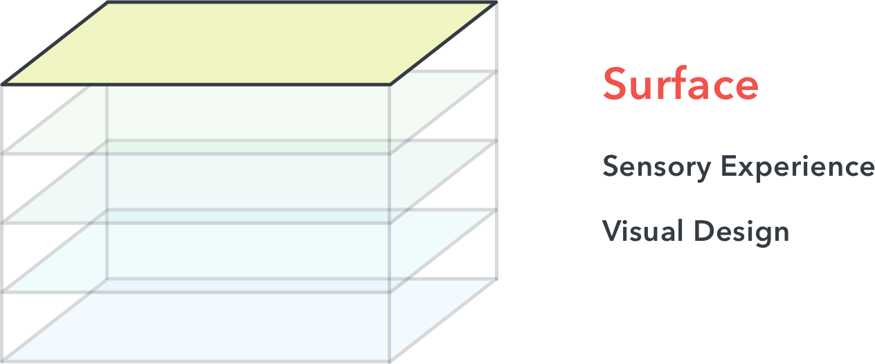
The surface level, as the name suggests, aims to create a superb sensory perception and visual design. The task of the designer here is to create an intuitive connection with users through successful communication of the brand, product, its values and properties in a holistic picture.
This is where you will find UI designers doing most of their work using tools like Sketch, Photoshop, Adobe Experience Design, Illustrator, or Figma.
Now let's get to the basic principles of good UI design.
Principle number 1. Simplicity above all
There is nothing worse than uncertainty in the application. What does this button do? How did I get here? How to get back? In order to avoid this, the designer must always ask himself:
Why is it here? What's the point of this? How else can this be done?
Good designers find a lot of opportunities for creating an interface layout, sees the potential flaws of each of them, and understand which design will best help users achieve their goals. Simplicity in design allows users to feel confident while inside the application.
Principle # 2. Give clear, informative feedback.
We all used such sites and applications where you try to press a button and don’t know whether it worked or not.
In simple terms, every action must have a reaction. For example, if you are a web developer, you know that: hover on a button allows users to understand the change in its state.
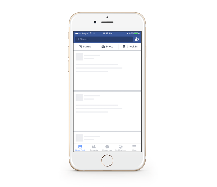
A great example is the Facebook post loading indicator. While the content is loading, the download indicator (in the form of content) informs users that the content is loading.
Principle No. 3. Persistence Matters
When I speak of constancy, I mean constancy in the arrangement of the elements of the interface or language that is used in the application. After your users have learned to use the interface, you do not need to force them to relearn. Let's look at an example of poor constancy.
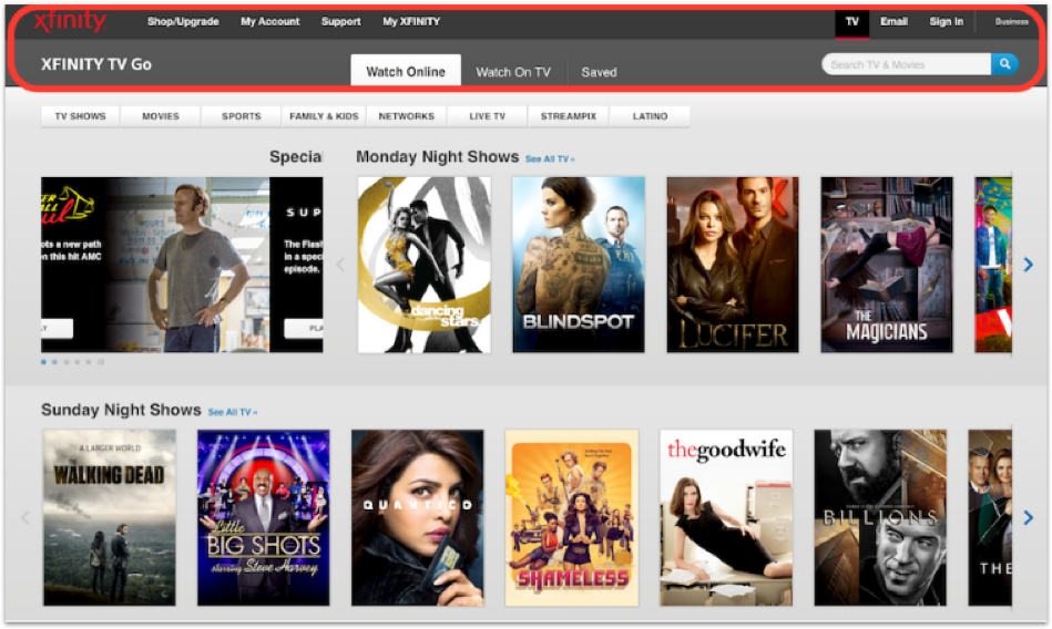
It may seem that these are three different sites from three different companies, but this is not so. Why did it happen? Because the menu on these pages uses different colors, different fonts and different locations. This can confuse the user and confuse him, since it is not at all obvious that these pages belong to the same site.
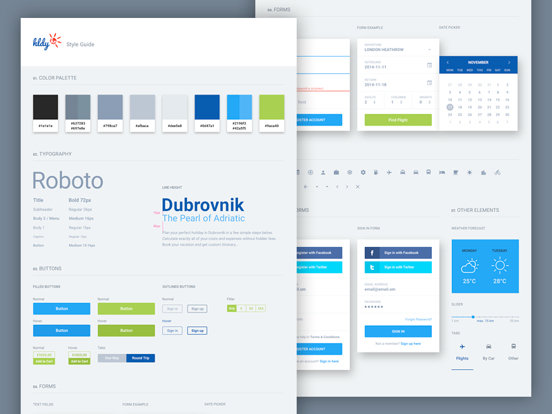
How can you maintain consistency as a designer? You can create a design using a permanent grid, for example, a grid of 8 points , which is often used in icon design and mobile applications. You can also use a constant color scheme and navigation elements on all screens. All these elements can be included in the style guide.
Conclusion: consistency and good structure will make your users feel at home .
Principle # 4. If in doubt, use well-known design patterns.
Do not misunderstand me - innovations are good and welcome in every way, but not to the detriment of the user interaction experience. No need to reinvent the new bike, where the old copes with its task. For example, if you are not sure that the icon accurately and intuitively reflects the meaning of a word, then it is better to use just a word. Or stick with the usual color scheme, where shades of red are used to warn of danger, and green indicates a successful completion.
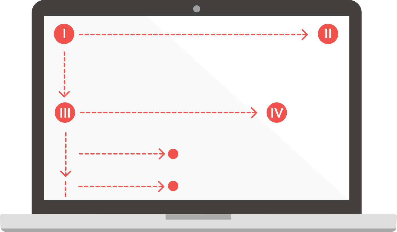
Why do you need to use well-known design patterns? The fact is that many of them are based on human perception. Take for example the F-pattern for scanning information.
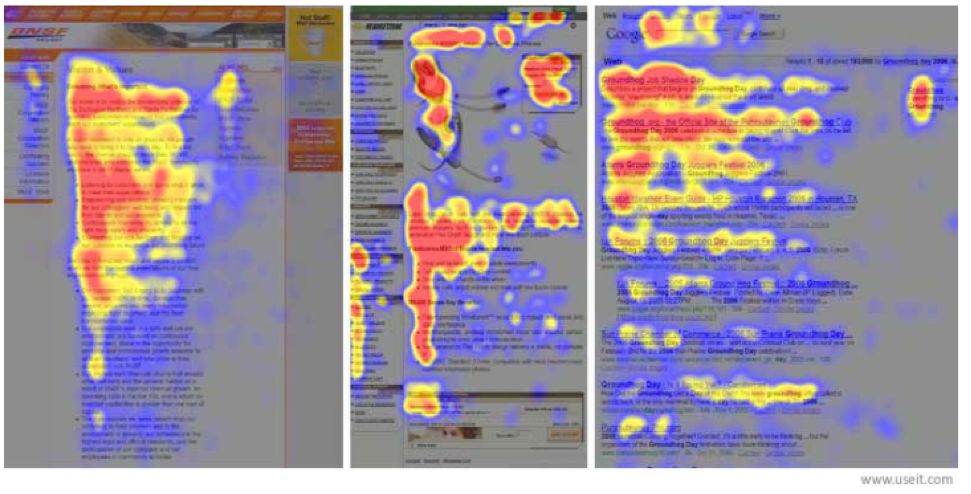
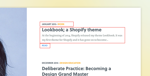
This is a heat map generated during an experiment to track eye movement. The most viewed sections are marked in red, the least - in blue. As you have already noticed, the heat map is somewhat reminiscent of the letter F. But what does this mean for a designer?
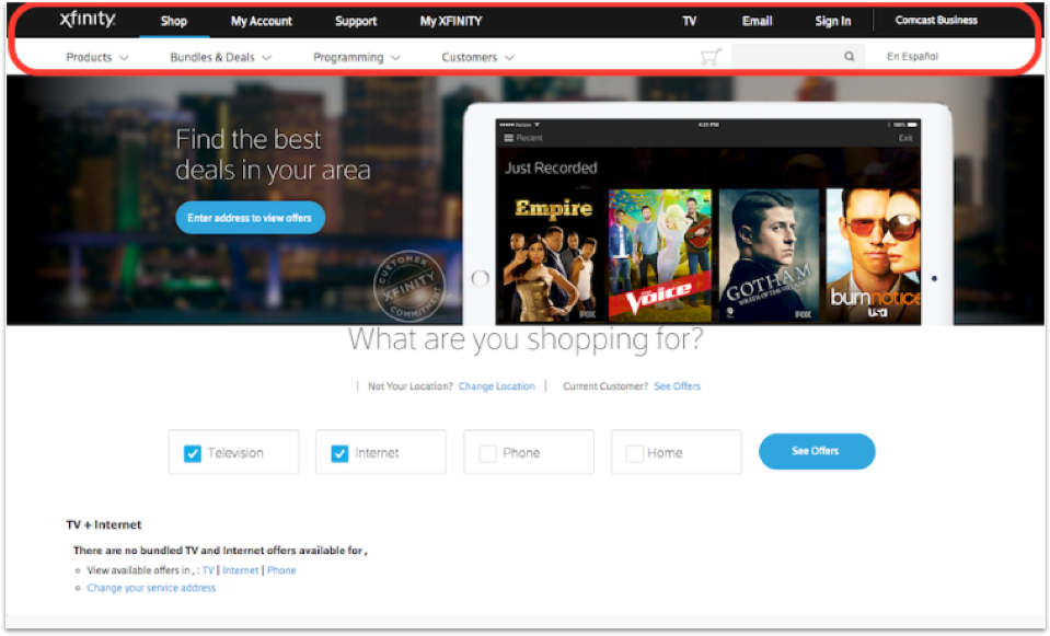
This means that the most important content should be placed in the upper left corner.
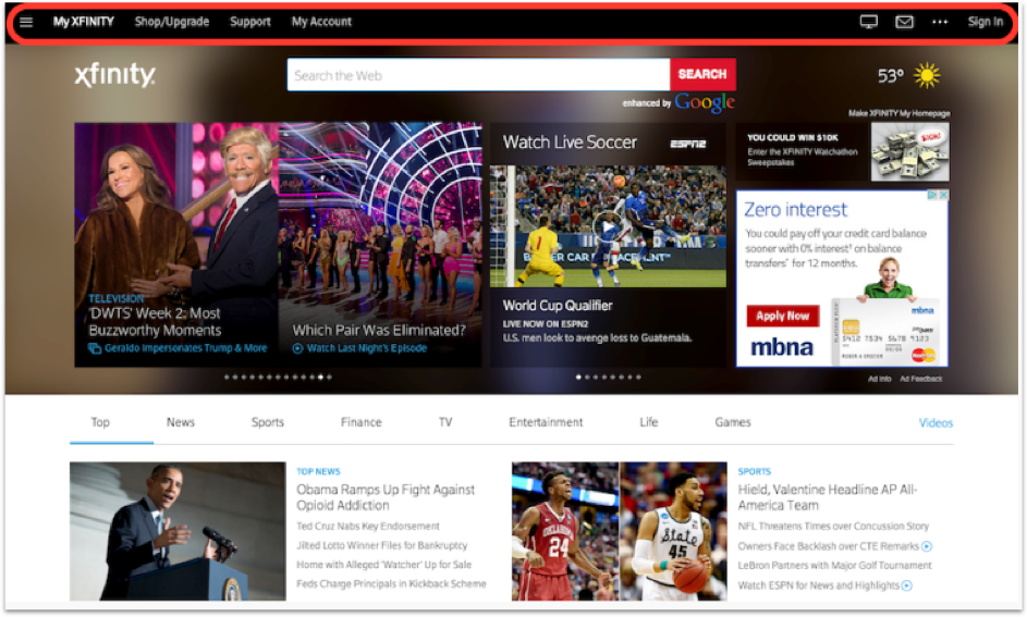
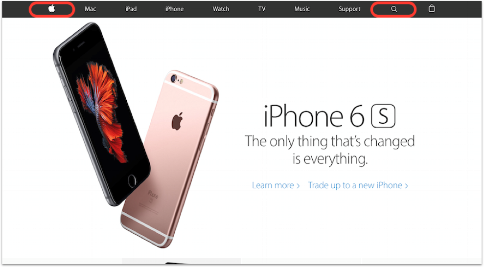
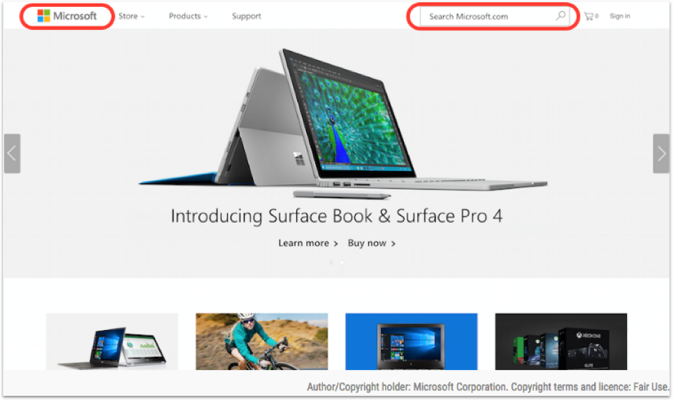
Usually there is a logo. This allows companies to strengthen their brand. In the upper right corner can be located navigation or search. This allows users to easily navigate through the pages, without having to search for navigation elements somewhere else. Here are two examples that adhere to this principle.
The lower you go down the page, the weaker the attention of users becomes. Therefore, try to place the most important information closer to the top and highlight the headlines so that the content can be easily scanned.
Principle # 5. Use the visual hierarchy.
What is the visual hierarchy? This is an order of elements that implies their relative importance. This is an attempt by the designer to influence the order in which the presented information is perceived.
How we perceive information depends on several factors. Let's look at the basics of the visual hierarchy.
1) Typography
What does good typography consist of? The two main factors are clarity and readability.
Sharpness is the properties of a particular font that allow its characters to differ from each other. It completely depends on the font and there is little that can be done. Therefore, choose the appropriate font.
Readability is how you manipulate a separate font to make it easier to read.
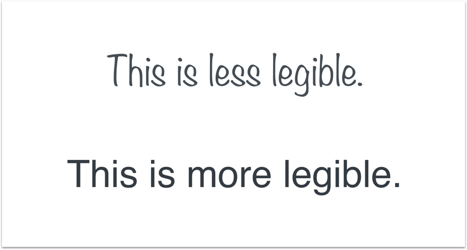
Noticed how the font at the top is perceived worse than the bottom? If not, then…
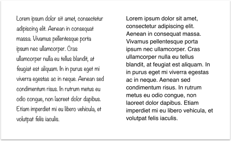
Another factor that affects readability is the length of the string . If the line is too short, the user will constantly jump from line to line, which will make the perception of information more difficult. The same is true if the string is too long - so the eyes get tired faster.
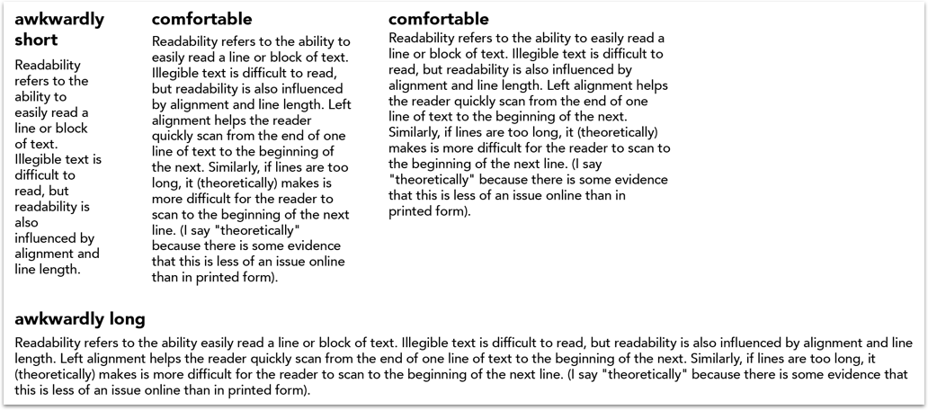
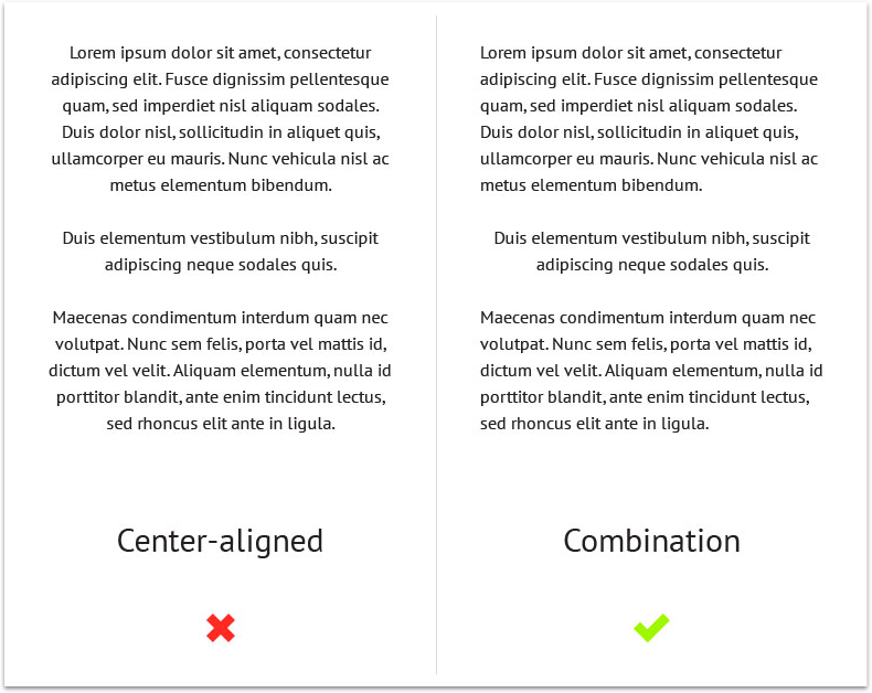
Also never center large blocks of text. It is much easier to perceive text with alignment to the left, because the eye knows exactly where the next line begins .
2) White (or negative) space
Have you ever had such that you look at the menu / site / interface and think: “I like the way it looks, but I don’t know why”? Now you know. It's all about the white space. White space is extremely helpful in perception. A 2004 study showed that a suitable use of white space between paragraphs and for right and left margins improves perception by almost 20% . It is easier for users to focus and process such content.

Dog or cat?
Many people believe that white space is a matter of taste. I think it is much more objective. We can skillfully use the white space in order to strengthen the visual hierarchy. Let's take a look at the Helen Tran website.
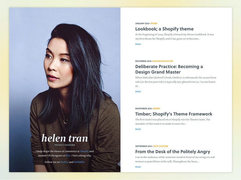
Great portfolio! Now let's look again more closely.

Have you noticed how the content is divided into four distinct blocks? Let's go even further.
Helen uses a combination of leading, font size, color, and white space to separate content within each block. This makes it easier for users to scan.
3) Color
The theory of color, however, is very, very complex. My goal is not to tell you the whole theory of color, but to give you a few principles that you can use in your design right now.
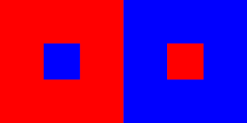
If you look at the picture above, you will see that the blue square on the left appears farther than the red square on the right. Warm colors seem closer, whereas cold ones, on the contrary, merge with the background. Let's look at this example:
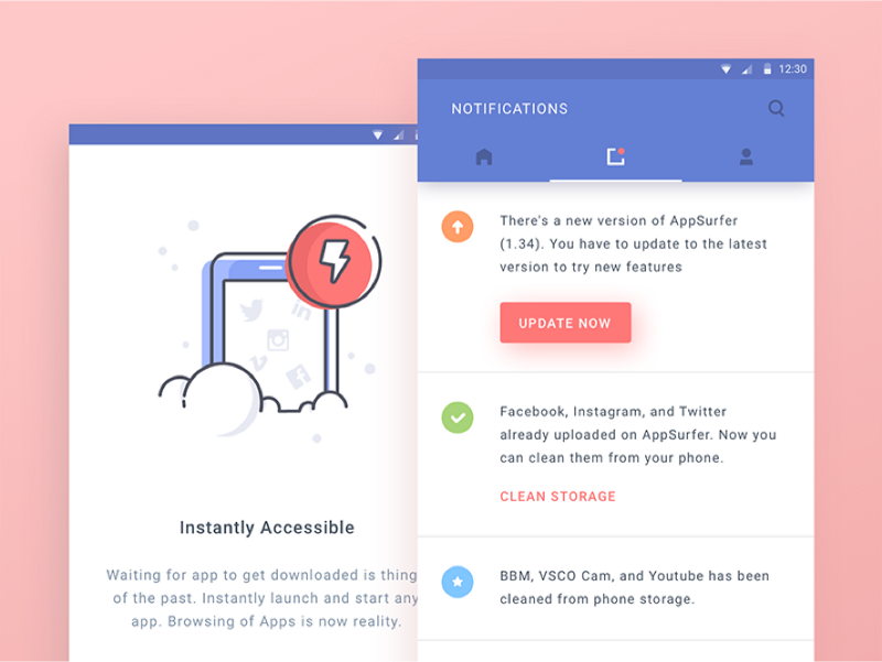
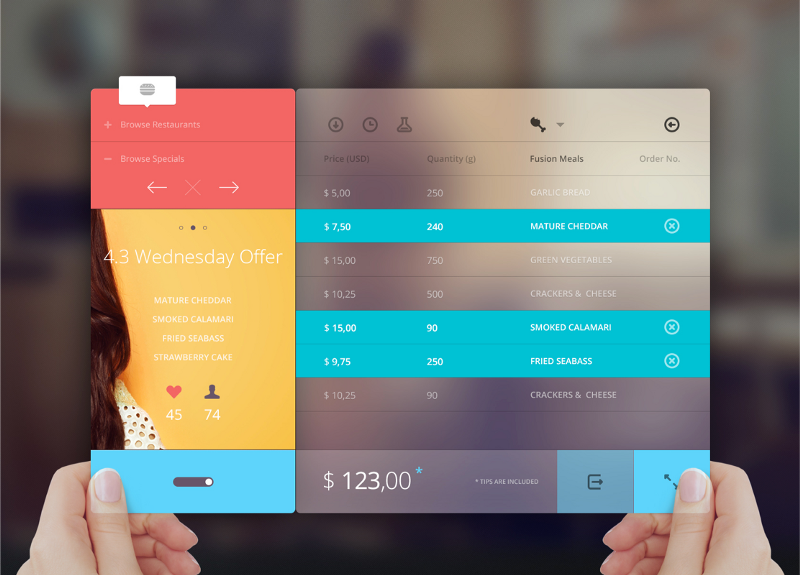
The designer uses warm red to highlight the call to action, and cool blue to drown the navigation. The same technique is used in the illustration on the left. The red icon with a lightning immediately stands out from the rest.
You can also use color to group similar items.
Finally, less is more. The more colors you use, the smaller the value of each of them . A great example is the latest Instagram redesign.

Reducing the number of colors used not only allowed us to highlight photos, but also increased the effectiveness of notifications, since they no longer need to compete with other colors on the top and bottom panels.
Source: https://habr.com/ru/post/321728/
All Articles