Who seeks will always find. If you help him

You made a great app, put it in the store, but there it was immediately lost in thousands of similar products. You did not plan to earn a lot of money on it, you do not have an advertising budget, but you hurt that nobody knows about your creation at all. In this article, focused on small companies and lonely developers, we will describe how to help your application to be found by the target audience with simple and free tools.
The launch of Aword for us was the first experience in the market of mobile applications. Since we plan to work in this market rather tightly, the option “to give promotion to outsourcing and forget” did not suit us, we wanted to figure it out and understand how it works. The result showed that there are enough things that you can do yourself, not only saving, but also getting to know your users better. Today we will share our experience in the App Store, because We have collected enough data on it. If the topic turns out to be interesting to Habra’s readers, we’ll tell you later about the features of Google Play (where the principle is similar, but the devil is known to be in the details) when we type more real numbers.
What is ASO?
ASO is App Store Optimization, or optimization for search engines in app stores. This optimization allows you to bring information about your application to a potential client. It is important to understand that ASO is not an advertisement; It works with users who know what they need and are already active in the search for this application. However, optimization is very important - without it, you will lose ready-made customers simply because they will not see your offer (but they will see offers from competitors). The beauty of ASO is that it does not require costs and is quite simple, and we love it.
')
Since ASO deals with search in the app store (and this is not an ordinary Google search), you first need to understand what it is and how the user behaves in this search. There are several main scenarios:
- the user is looking for something specific, typing it in the search bar;
- the user scans the charts, looking for something that catches the eye;
- he is looking for something, but he notices something else in trend queries that attracts him;
- he does something else that we don’t know about.
Depending on the scenario, we have some set of information tools to attract the user. The biggest choice is, of course, when he purposefully searches for a product similar to ours. In the charts, categories, catalogs, where you can “slip” your offer, there are fewer such tools. However, in any case, there are two categories of information with which you have to work: textual and graphic.
Keywords
Keywords are words that your application can find. Their number is limited, so their selection should be taken very seriously. Colleagues from AppFollow wrote a great text about the semantic core for application stores, which we strongly recommend to read .
Google Adwords makes it easy to check the queries that are used in the Google search engine. This method is suitable for finding similar queries and estimating their monthly average number, however, you need to take into account that Google search and search in the app store are different things. In Google, people most often search for a site, an article, an answer to their question. The search engine is very smart, knows the case, knows the user's preferences, knows how to think out the query for him. Search in the App Store special intelligence does not differ. In addition, the user drives a query into a store search in order to find an application for a specific purpose, assuming in advance that such an application exists.
Apple recently had its own tool for determining the frequency of Ads Search requests. The downside is that for now it only works in the USA and collects data from US accounts.
There are also a number of services and ways to select the desired keywords; we at Skyeng mainly use ASOdesk (shows the number of daily requests), App Annie (does not show the number) and manual input. By the latter, we mean testing requests that seem relevant to us, directly on the stack. For example, we drive in the search string “English” and see what happens:
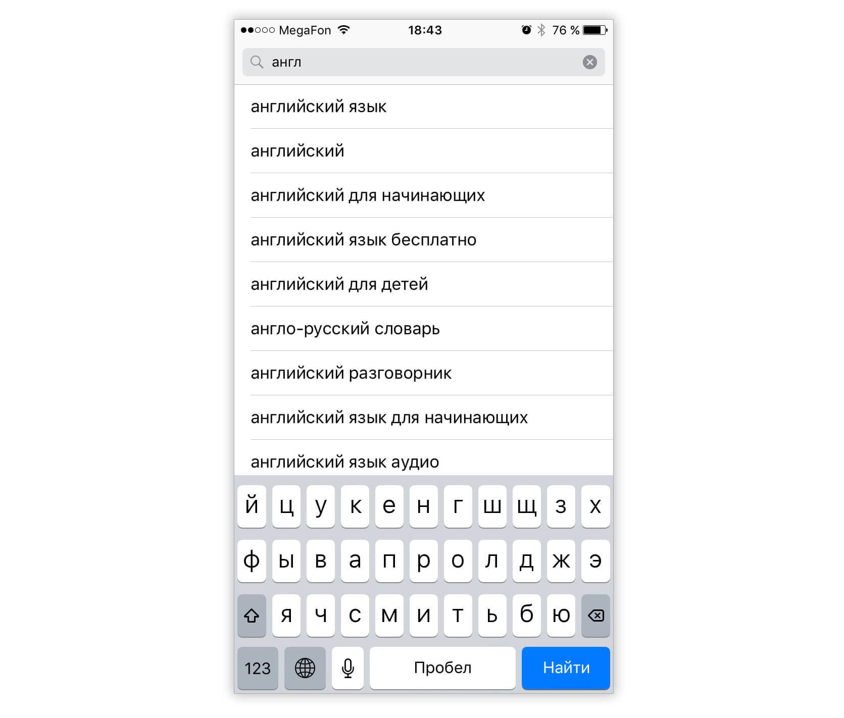
The search offers the most popular queries already by the first letters. This is convenient for the user, but adds a headache to the developer. The fact is that among the substituted popular options there will surely be those that will interest the client, but are completely uninteresting to us. For example, at the request of "English" we see the options "English for free" and "English for children." Far from the fact that the user was looking for exactly the free option, or that he assumed that there were special children's applications. But, seeing such proposals, it will be difficult for him not to choose them. Therefore, the developer who wants to get the target installation, you must appear on such requests, although the percentage of users willing to pay for them will be lower.
Keywords are used in the title and keywords. Since September last year, the size of the title in the App Store is limited to 50 characters, which eliminated the creepy designs in the catalog. "Keywords" are governed by iTunesConnect and are limited to 100 characters - but here you can write any words without worrying about the readability of the entire structure, without spaces, with small letters, separated by commas. The title is indexed above.
Separately, we note the so-called "locale" in the App Store. In Russia, there are three of them: actually Russia, as well as England and Australia. For locales, you can prescribe different keywords and headers, but they do not intersect with each other, so you should not add “English” to one and “language” to another.
And some more lifehacks:
- Words in the Title with capital letters are indexed better by the App Store (irrelevant for keywords);
- The App Store does not know anything about declensions, so if possible, all options should be entered into keywords (English, English, language, language);
- special characters (%, &, -, etc.) are not indexed, they do not need to be used;
- the order of writing words in the title has a meaning, start it with the most important word; In iTunesconnect keywords, order is not important.
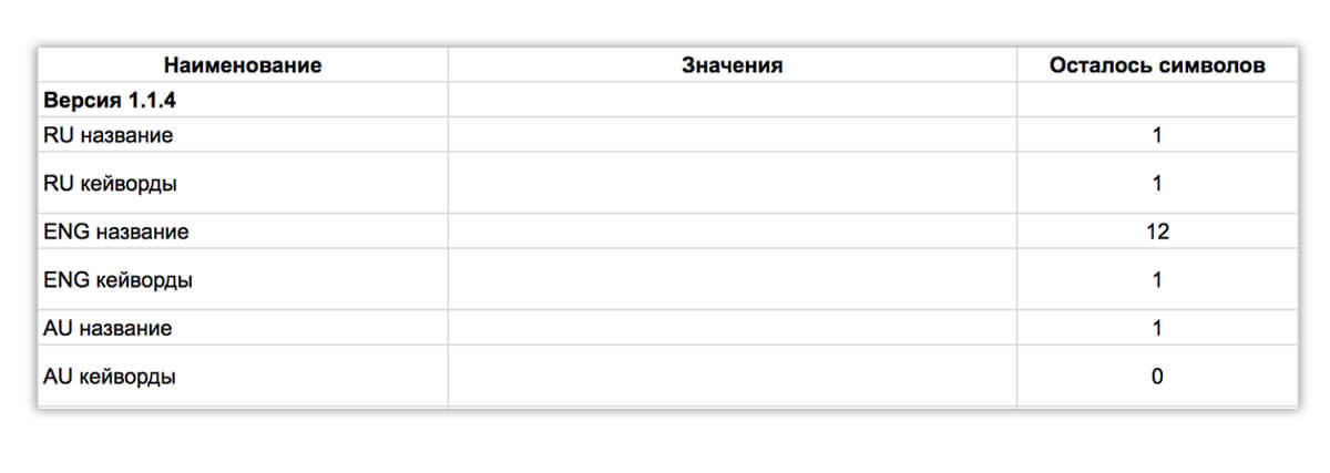
So, it is necessary to make three headings and a list of keywords for each locale. For the convenience of counting the remaining characters, we use Google tables with formulas:
If a small number of characters remain in keywords, it is worth scoring with short prepositions such as “in”, “from”, “from”, etc. These prepositions should make a normal sentence, being used with selected keywords.
For example, we can choose these words:
Title : English with Aword: Learn Words
Keywords : English, vocabulary, tests, exercises, for beginners, free, for children
With this set of keywords, we will be displayed in the App Store for queries:
English
English
English words
english tests
dictionary free
english free
english children
learn words
learn English
learn English
etc.
Using these simple tricks, you can ensure that your application can at least theoretically be found by the active user. Far from the fact that it will be found, so you have to experiment a lot, change words, track changes in your position in the search. In our experience, on average, it takes about two weeks to collect statistics, after which you can more or less understand how well the selected words work.
And to do in the meantime design.
Pictures
Icon and two screenshots - the face of your application, their potential user sees when searching. They can both attract and scare him away, so they should be taken seriously as well, as well as at least primitive A / B testing of various options.
We measure the effectiveness of graphics by simply keeping statistics on Google tables, counting the percentage of conversions from views to installation.

There are special tools for analyzing the design of the application, for example, Splitmetrics and Storemaven , however, in order for them to produce meaningful results, they need a large sample: it means that you need to pour traffic on the test pages, which can lead to serious advertising costs. Therefore, for the new application, manual testing using the weekly uploading of new versions, although taking a lot of time, is quite a reasonable solution, if there is no need to urgently go to the tops right now and run away tomorrow.
For screenshots there are a few simple rules. Obviously, they should be bright and beautiful and show the real, most interesting functionality of the application. They should be readable from any screen on which the application should work. On them and above them should not be a lot of text. They should show your profitable differences from competitors' offers found for the same keywords. The less obvious, but important: the longer a potential user views the screenshots, the lower the probability of installing the application. Use odd numbers in pictures - they are better read. Well, change them every three months.
To create screenshots, you can use the convenient Launchkit service, where you can prepare images for one application for free. But then these screenshots should be corrected in a graphic editor. There should be no trimmed parts of the interface, important things should be highlighted (including a magnifying glass), if necessary, add stickers, well, correct color, brightness, contrast.
The first two screenshots are the most important, since they can be seen in the search, but the remaining three should not be done anyhow: they can sell additional application functionality.
Well, as in the case of keywords, it is worth a lot of experimenting. Sometimes the best screenshot may be the most unexpected.
Few examples from our practice.
1 - made quick screenshots. Conversion - 8.33%

2 - changed the background. Conversion - 8.37%
3 - made a variety in the color gamut of screenshots, reduced texts. The result is 9.05%

4 - changed the first screenshot, putting a more juicy picture there (color and contrast were pulled up in a graphic editor). 9.15%
Preparing the right application icon is more difficult. Ideally, it should be the application logo, the creation of which is best to entrust a professional, and which will allow the use of different colors, well combined with screenshots. The general rules are similar to the rules with screenshots: clarity, conciseness and mandatory experiments.
We have not yet decided on the Aword logo, so we tested various options:
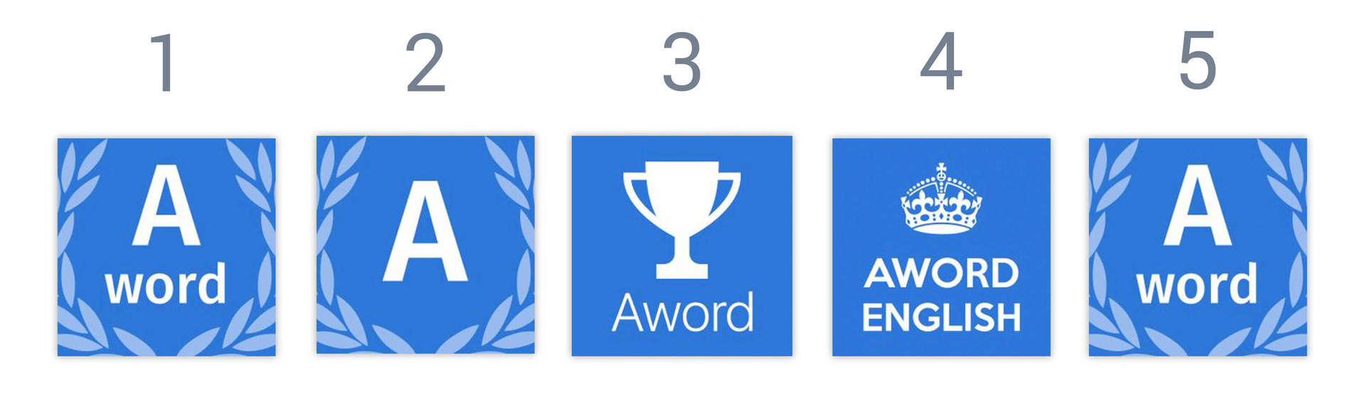
Icon number 1 showed a conversion of 8.35%. Tried to change, CR dropped to 7.7%. Tried to put the cup - lost another 0.22% conversion. They sat down with the designer, thought of associations, and finally, icon number four was born - 9.48% (the crown image from the Don't Panic military poster, which is now in the public domain). Now we have returned to the first version because of the advertising campaign that has already begun, but in the coming months we are planning to conduct another series of experiments with icons.
findings
You can make your application visible without selling a kidney to pay for the services of marketers. ASO tools are quite accessible to the developer: it’s enough to think creatively, work and experiment a lot. And, of course, to be patient: it is necessary to make changes one by one in order to be able to understand which of them worked and which, on the contrary, turned out to be unsuccessful. We must be prepared that before some noticeable monetization begins, it will take a long time, during which it will be necessary to constantly work, change something, track the results.
Well, traditionally, we remind that we are looking for cool people (quite possibly, it is you) in our team!
Source: https://habr.com/ru/post/321520/
All Articles